Web Design Basics
88 articles

Every web application splits into two halves. There’s the part you can see and click, and there’s the part doing the actual work somewhere…

Right-click a page, choose View Source, and what fills that window is frontend. It renders in the browser and reacts when someone clicks, types,…
Ask the W3C or WHATWG what HTML is and the answer comes back the same. It’s a markup language, which means it structures a…
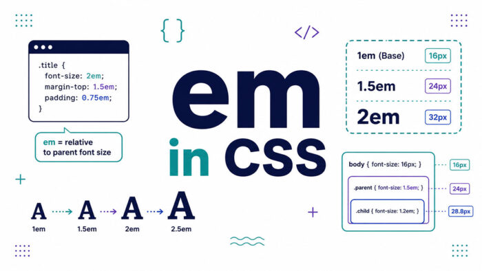
You set a font size, nest a few elements, and suddenly your text is twice the size you wanted. That mess usually traces back…
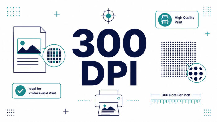
Your design looked flawless on screen. Then the print shop sent it back: low resolution, needs 300 DPI. That rejection trips up a lot…
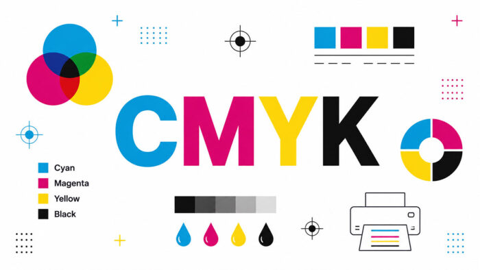
Design a bright blue logo on your screen, send it to print, and watch it come back looking flat. That gap is where CMYK…
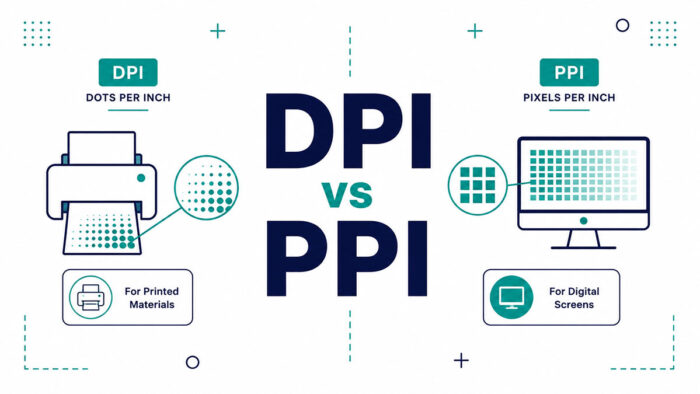
Send a beautiful photo to a printer and get back a blurry mess. The culprit is almost always a mix-up in the DPI vs…
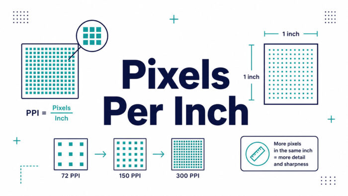
Ask a designer how many pixels in an inch, and you won’t get one number back. You’ll get a question in return: on a…
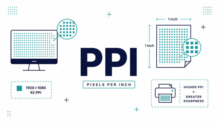
Your photo looks razor sharp on your phone, then prints blurry and pixelated. The gap between those two moments has a name. Understanding PPI…
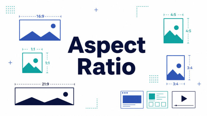
Every screen you look at has a shape, and that shape has a name. If you have ever cropped a photo for Instagram or…
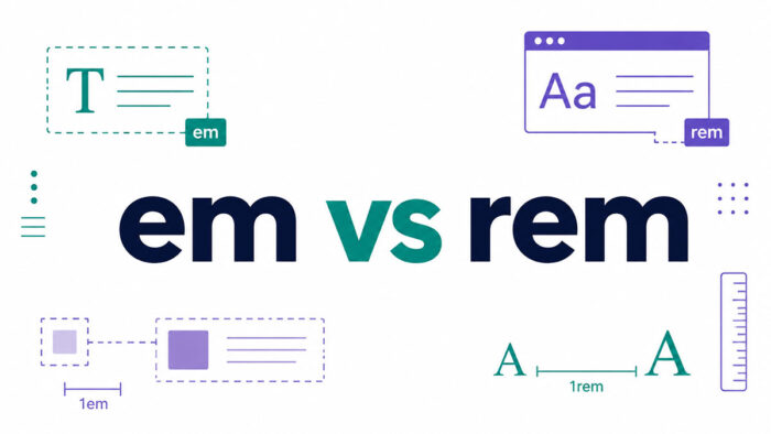
Two CSS units. One letter of difference. A surprising amount of confusion. The em vs rem question trips up developers daily, because both are…
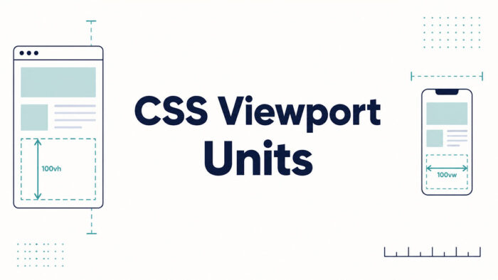
You set an element to 100vh, it looks perfect on your laptop, then a phone chops the bottom off. Welcome to CSS viewport units.…
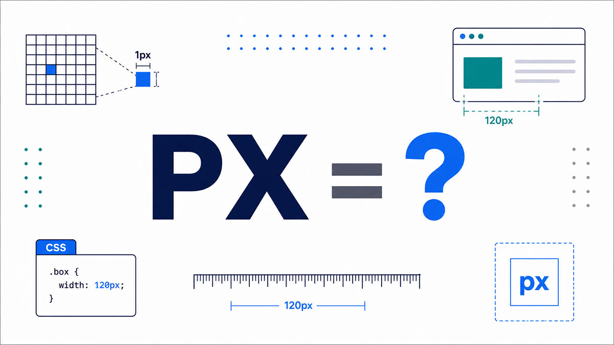
You’ve typed it a hundred times. font-size: 16px, margin: 8px, width: 320px. But stop for a second: what does px stand for, and why…
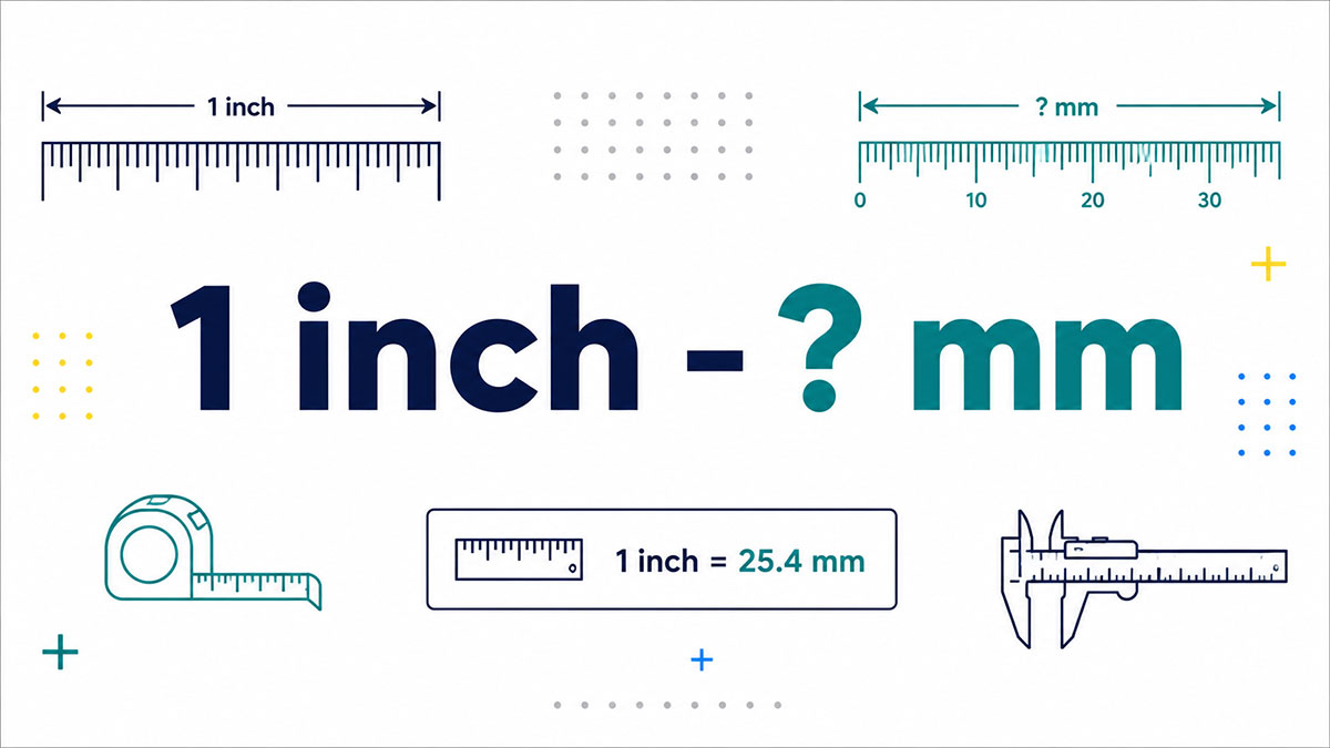
You measure something in inches, then the spec sheet in front of you is written in millimeters. Now what? The short answer: one inch…
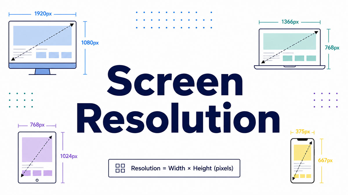
Two screens can carry the exact same specs on paper and look nothing alike in person. The reason usually comes down to one number.…
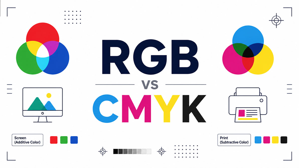
You design something bright and clean on screen. It prints, and the greens look muddy, the blues fall flat. That gap is the whole…
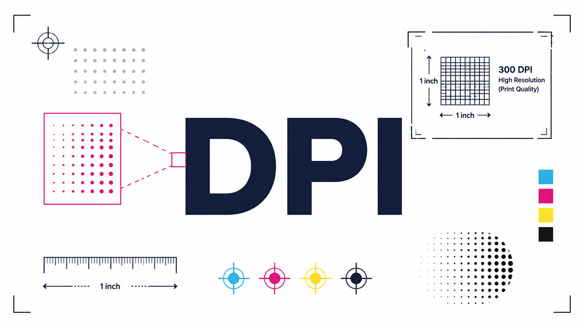
Print a photo and it looks blurry. Set your gaming mouse and the cursor flies off screen. Same three letters, two totally different headaches.…
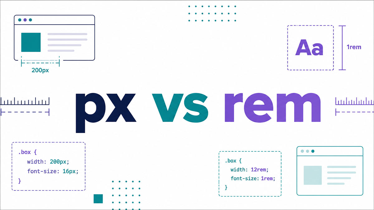
Pick the wrong CSS unit and your text stays frozen while a low-vision reader begs their browser to make it bigger. That single choice…

Buttons, forms, menus, sliders. These are the page components that do something back when a visitor acts on them, and that reaction is what…

Visual hierarchy is a ranking of page elements by importance. Size, color, contrast, spacing and position all feed into it, and together they steer…

Watch someone open a long article and their eyes do something fairly predictable. A sweep across the top. Another sweep a little lower and…

Glassmorphism turns interface panels into frosted glass. A background blur and a semi-transparent fill do the work that heavy shadows and textures used to…

Adaptive design means building several fixed-width layouts ahead of time and serving whichever one fits the visitor’s device or screen width. A responsive layout…

Firefox 52, Safari 10.1 and Chrome 57 all shipped CSS Grid within 20 days of each other. Firefox went first on 7 March 2017,…

Every size, padding and margin in the interface gets set as a multiple of 8 pixels. That is the whole idea behind the 8-point…

Draw two vertical and two horizontal lines across a frame and you get nine equal parts. The rule of thirds says the important elements…

Proximity is a Gestalt grouping principle, and interface designers, typographers and print layout artists all lean on it for form fields, cards, menus, paragraphs…

Atomic design builds interfaces out of small reusable parts that stack up into complete pages. It runs on five levels, and the whole idea…

Both document visual and editorial rules. Only a design system also ships them as reusable components and governs how they change, which makes code…

A designer decides where things go and what they look like. A developer makes the page load, respond and remember data. That’s the short…