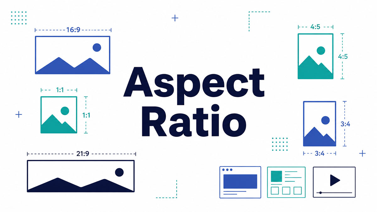
Every screen you look at has a shape, and that shape has a name. If you have ever cropped a photo for Instagram or watched a film with black bars, you already know what aspect ratio is in practice.
The number behind it (16:9, 4:3, 9:16) decides how your image fits any frame.
Get it wrong and content stretches, crops, or floats in empty bars.
This guide breaks down how aspect ratio works, from the math to the fixes:
- How to calculate any ratio from pixel dimensions
- The common formats and where each one belongs
- How ratios differ from resolution
- Ways to change a ratio in editors and CSS
By the end, you will pick the right ratio with confidence.
What Is Aspect Ratio?
Aspect ratio is the proportional relationship between the width and height of an image, screen, or video frame. It is written as two numbers separated by a colon, in the format width:height. A 16:9 frame measures 16 units across for every 9 units of height.
The first number is the width. The second is the height.
Neither number is a pixel count. Both describe proportion, not physical size or resolution.
A 55-inch TV and a 6-inch phone can share the exact same 16:9 shape. Screen size changes. The ratio stays fixed.
You can reduce any pixel dimensions to a ratio. A 1920×1080 frame collapses to 16:9, and a 1080×1080 image is 1:1, a perfect square.
Wikipedia records 16:9 as the standard for televisions and computer monitors since 1999, and the native format for 4K and 8K. It is the shape most screens default to today.
How Is Aspect Ratio Calculated?
Aspect ratio is calculated by dividing the width and height by their greatest common divisor. For 1920×1080, that divisor is 120, which reduces the numbers to 16:9. The same method turns any pixel dimensions into a clean, readable ratio.
Divide both sides until no whole number splits them further. 1440×1080 shares a divisor of 360, landing on 4:3.
| Resolution | Aspect Ratio | Decimal Ratio |
|---|---|---|
| 1920 × 1080 | 16:9 | 1.78 |
| 1440 × 1080 | 4:3 | 1.33 |
| 1080 × 1080 | 1:1 | 1.00 |
| 2560 × 1080 | 21:9 | 2.37 |
The decimal form matters just as much. Editing software often shows 1.78 instead of 16:9, and both point to the same shape.
Skip the math when you want. Photoshop, Figma, and free online ratio calculators read your pixel dimensions and hand back the ratio instantly.
What Are the Most Common Aspect Ratios?
The most common aspect ratios are 16:9 for widescreen displays, 4:3 for legacy screens, 1:1 for square posts, 21:9 for ultrawide monitors, and 9:16 for vertical mobile video. Each ratio maps to a specific device or platform people use every day.
| Aspect Ratio | Decimal | Primary Use |
|---|---|---|
| 16:9 | 1.78 | TVs, YouTube, monitors |
| 4:3 | 1.33 | Legacy TVs, tablets |
| 1:1 | 1.00 | Profile images, square social posts |
| 21:9 | 2.37 | Ultrawide monitors, gaming |
| 9:16 | 0.56 | TikTok, Instagram Reels, YouTube Shorts |
16:9 (Widescreen)
The default for modern screens. HDTVs, YouTube, laptops, and phones in landscape all run it.
- Resolutions from 1280×720 up to 3840×2160
- Native format for HD, 4K UHD, and 8K
- Decimal value of 1.78
StatCounter puts 1920×1080 near 55% of desktop screens, and Roots Analysis projects 16:9 to lead the global display market through 2035.
4:3 (Standard)
4:3 ruled early television and computer monitors before widescreen took over. It survives in some tablets, the iPad among them, and in older presentation slides.
The shape never fully died. Wikipedia notes that by 2024 much of the computer industry had swung back toward taller 16:10 and 4:3-adjacent panels for productivity work.
1:1 (Square)
Square. Equal width and height, decimal 1.0.
Instagram built its early feed on 1:1, and it still rules profile pictures and album covers. Meta now recommends 4:5 portrait posts (1080×1350) over squares for feed reach, per its 2026 guidance.
21:9 (Ultrawide)
Ultrawide 21:9 and 32:9 panels sit near 2-3% of desktop traffic in 2026, per screenres.app, growing steadily in gaming and productivity setups.
The label bends the truth a little. True 21:9 math works out to 64:27 (decimal 2.37), but manufacturers market it as 21:9 because it reads cleaner.
9:16 (Vertical)
Vertical video’s home. TikTok, Instagram Reels, YouTube Shorts, and Stories all render full-screen at 9:16, usually 1080×1920.
Buffer’s 2025 report found vertical clips earn 90% higher engagement than horizontal ones on mobile. Short-form video pulls 2.5x the engagement of long-form, according to Firework data.
Where Does Aspect Ratio Matter Most?
Aspect ratio matters most across four fields: film and video production, web and social media, photography, and display hardware. Each sets its own standard ratios, and matching them decides whether content fills the frame or ends up cropped and boxed.
Film and cinema: theaters run two standards, 1.85:1 flat and 2.39:1 anamorphic scope. The Academy ratio of 1.375:1 held for every film until 1953.
Web and social: platforms dictate the ratio outright. YouTube wants 16:9, Reels wants 9:16, feed posts lean 4:5 or 1:1.
Photography: full-frame and APS-C sensors shoot 3:2, while Micro Four Thirds bodies capture 4:3.
Display hardware: monitors, TVs, and phones each ship in fixed ratios your content has to respect.
Netflix leans on the 2:1 Univisium format for originals like House of Cards, a middle ground between scope and 16:9 that reads cleanly on phones and TVs.
How Does Aspect Ratio Differ From Resolution?
Aspect ratio describes shape. Resolution describes pixel count. A 16:9 frame can hold 1280×720 pixels or 3840×2160 pixels and keep the identical ratio. Two files can share a ratio yet differ wildly in sharpness, file size, and detail.
| Term | Measures | Example |
|---|---|---|
| Aspect ratio | The proportional relationship between width and height | 16:9 |
| Resolution | The total pixel dimensions of an image or video | 3840 × 2160 |
Confusing the two is common. A jump in screen resolution sharpens the picture without touching its proportions.
Scaling a video from 720p to 4K keeps the ratio intact. Cropping changes the ratio, because you are cutting pixels off one side.
Roughly 5-8% of desktop users browse on 4K (3840×2160) screens in 2026, per screenres.app, all still sitting inside the same 16:9 shape.
What Happens When Aspect Ratios Don’t Match?
When aspect ratios do not match, the player either adds black bars or distorts the image. A wide film on a tall screen gets letterboxed. A tall clip on a wide screen gets pillarboxed. Forcing a fit stretches or crops the picture instead.
The player has three ways to reconcile a mismatch: pad it, stretch it, or cut it. None of them come free.
Letterboxing and Pillarboxing
Letterboxing adds black bars above and below the image. It appears when wide content, like a 2.39:1 film, plays on a 16:9 screen.
Pillarboxing adds bars on the left and right. It shows up when a 4:3 clip plays on a widescreen display.
Both preserve the original frame. Nothing gets cut, and nothing gets stretched.
Stretching Versus Cropping
Two ways to kill the bars, each with a price.
Stretching forces the image to fill the frame, distorting faces and circles into ovals.
Cropping keeps proportions but cuts the edges. Converting a horizontal shot to 9:16 vertical drops 56-70% of the original image, per edicionvideopro.
How Do You Choose the Right Aspect Ratio?
Choose the aspect ratio by starting with the delivery platform, not the camera. Match YouTube at 16:9, Reels and TikTok at 9:16, and feed posts at 4:5 or 1:1. Shoot slightly wider than needed so you can reframe for each destination.
Work backward from where the content lands.
- YouTube and TV: 16:9
- TikTok, Reels, Shorts: 9:16
- Instagram feed: 4:5 or 1:1
- Theatrical film: 1.85:1 or 2.39:1
Shoot wider than your final ratio. That padding lets you crop one master file into several formats without losing the subject.
Mind the sound too. 85% of social videos play muted, so captions and centered framing carry more weight than audio, according to Meta.
When Wistia’s CEO switched his LinkedIn posts to vertical video, the company logged a 9.4x jump in impressions over his old mixed-format posting.
How Do You Change an Aspect Ratio?
You change an aspect ratio by cropping, padding, or applying a CSS rule. Editors like Photoshop, Premiere Pro, and CapCut reframe footage directly. On the web, the CSS aspect-ratio property and object-fit control proportions without altering the source file.
Pick the method by where the content lives, in an editor or in a browser.
| Method | Where Used | Trade-off |
|---|---|---|
| Crop | Image and video editors | Loses content around the edges |
| Padding (letterboxing/pillarboxing) | Image and video editors | Adds empty bars to preserve the full image |
aspect-ratio | CSS | Reserves layout space but does not resize content |
object-fit | CSS | Scales content to fit the container; may crop (cover) or leave empty space (contain) |
Crop or Reframe in an Editor
The most common fix. Cropping cuts one dimension until the frame hits the target ratio.
- Photoshop and Lightroom for stills
- Premiere Pro for timeline video
- CapCut for fast social clips
Adobe Premiere Pro holds roughly 42% of the professional editing market, while CapCut passed 800 million downloads in 2024 and serves as the primary editor for 68% of TikTok creators, per Skillademia.
Design tools count too. You can crop a frame in Figma to lock a mockup into 16:9 or 1:1 before handoff.
Pad With Background Fill
Cropping loses the edges. Padding keeps everything.
Instead of cutting the frame, you add bars or a blurred backdrop to reach the new ratio.
Vertical editors lean on this trick. They place a scaled, blurred copy of the clip behind the original, filling a 9:16 frame without cropping the 16:9 source.
Set It in CSS With aspect-ratio
The CSS aspect-ratio property reserves an element’s proportions before the image even loads.
Write aspect-ratio: 16 / 9 on a container, and the browser works out the missing dimension on its own.
MDN marks the property as Baseline since September 2021, with over 95% global browser support. Only retired Internet Explorer misses it.
It also holds space during load, cutting the layout shift that drags down Core Web Vitals on a responsive design.
Control the Fit With object-fit
Once a box has fixed proportions, object-fit decides how the image sits inside it.
cover: fills the box and crops the overflow, keeping the ratio
contain: fits the whole image inside, adding empty space around it
fill: stretches the media to the box, distorting the ratio
LambdaTest lists object-fit as Widely Available across every modern engine, supported in Chrome since version 32. Internet Explorer is the lone holdout.
FAQ on Aspect Ratio
What is the most common aspect ratio?
16:9 is the most common aspect ratio. It powers most TVs, YouTube videos, laptops, and phones in landscape. StatCounter puts 1920×1080 near 55% of desktop screens, and it stays the default for HD, 4K, and 8K.
What does a 16:9 aspect ratio mean?
A 16:9 aspect ratio means the frame is 16 units wide for every 9 units tall, a decimal of 1.78. Resolutions range from 1280×720 up to 3840×2160. It is the widescreen standard for monitors and video.
How do I find the aspect ratio of an image?
Divide the width and height by their greatest common divisor. A 1920×1080 image shares a divisor of 120, reducing to 16:9. Photoshop, Figma, and online ratio calculators return the ratio from your pixel dimensions instantly.
What is the difference between aspect ratio and resolution?
Aspect ratio describes shape. Resolution counts pixels. A 16:9 frame can hold 1280×720 or 3840×2160 and keep the same proportion. Two files share a ratio yet differ in sharpness and file size.
What aspect ratio is best for YouTube?
YouTube uses 16:9 as its standard, ideally 1920×1080 or higher. Upload wider content and the player adds letterbox bars. For Shorts, switch to a vertical 9:16 frame at 1080×1920 to fill mobile screens.
What aspect ratio should I use for Instagram?
Instagram now recommends 4:5 portrait posts (1080×1350) over 1:1 squares for feed reach in 2026. Reels and Stories run full-screen at 9:16. Square 1:1 still works for profile grids and cross-posting.
What is a 9:16 aspect ratio used for?
9:16 is the vertical format for TikTok, Instagram Reels, YouTube Shorts, and Stories, usually 1080×1920. It fills a phone held upright. Buffer found vertical clips earn 90% higher engagement than horizontal ones on mobile.
Why does my video have black bars?
Black bars appear when your video’s ratio does not match the player. A wide clip on a tall screen gets letterboxed. A tall clip on a widescreen display gets pillarboxed. Both preserve the original frame.
Does changing an aspect ratio reduce quality?
Cropping to a new ratio removes pixels, so you lose part of the frame and some resolution. Converting horizontal to 9:16 drops 56-70% of the image. Padding keeps quality but adds bars instead.
What aspect ratio do movies use?
Theaters run two standards: 1.85:1 flat and 2.39:1 anamorphic scope. The Academy ratio of 1.375:1 held until 1953. Netflix favors a 2:1 Univisium format that reads well on phones and TVs.
Conclusion
Understanding what aspect ratio is turns a confusing number into a practical tool.
The ratio is just width over height, reduced by a greatest common divisor to a clean pair like 16:9 or a decimal like 1.78.
Match it to the destination and everything fits. Ignore it and you get letterboxing, pillarboxing, or a stretched, distorted frame.
Different fields set their own standards:
- Cinema leans on 1.85:1 and 2.39:1
- Photography sticks with 3:2 and 4:3
- Ultrawide monitors stretch to 21:9
On the web, the aspect-ratio property and object-fit hold proportions without cropping the source.
Pick the shape your platform expects, shoot a little wider for reframing, and your content stops fighting the frame.

Many of his resources are available on various design marketplaces. Over the years, he's worked with a range of clients and contributed to design publications like Designmodo, WebDesignerDepot, and Speckyboy, Slider Revolution among others.
- What is Backend in Web Development? - September 13, 2026
- What is Frontend Development? - September 11, 2026
- How to Make a Button in Figma: Design Best Practices - September 10, 2026

