Two screens can carry the exact same specs on paper and look nothing alike in person. The reason usually comes down to one number.
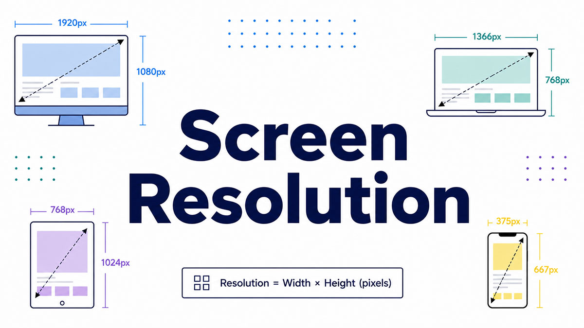
Screen resolution is the count of pixels a display shows, written as width by height, like 1920×1080. That figure shapes how sharp your photos, text, and videos actually appear.
Get it wrong and images turn blocky, text goes jagged, and layouts break. Get it right and everything looks crisp.
This guide breaks down what the number means and how it plays out in real life:
- How resolution differs from pixel density and screen size
- What HD, Full HD, QHD, and 4K really translate to
- Why native resolution, scaling, and aspect ratio matter
- How to check and change resolution on any device
By the end, the spec sheets stop being a mystery.
What Is Screen Resolution
Screen resolution is the number of pixels a display shows horizontally by vertically, written as width x height. A screen at 1920×1080 packs 1,920 pixels across and 1,080 down.
Multiply those two figures and you get the total pixel count. For 1920×1080, that lands at 2,073,600 pixels filling the panel.
Resolution counts pixels, not physical size. A 6-inch phone and a 65-inch TV can share the exact same resolution, which trips people up constantly.
The notation is always spoken and written the same way: width first, height second. “1920 by 1080.” “Twenty-five sixty by fourteen forty.” Once you know the pattern, every spec sheet reads the same.
StatCounter tracks screen resolution across more than 3 billion monthly page views worldwide, and 1920×1080 sits at the top of desktop usage. It has been the default for laptops and monitors for over a decade now.
How Is Screen Resolution Measured
Screen resolution is measured in pixels. The horizontal pixel count multiplied by the vertical pixel count gives the total, and that total is the number displays quote as their resolution.
A pixel is the smallest addressable unit on a display. Every image, letter, and icon you see is built from thousands of these tiny squares switching color.
Two numbers, one format:
- Width: pixels counted left to right (the first number)
- Height: pixels counted top to bottom (the second number)
Resolution is not the same as screen size. Screen size measures the diagonal in inches. Resolution measures pixels. You can change one without touching the other.
Your operating system reports the number for you. Windows lists it under Display settings, and macOS shows it in the Displays panel. No math required on your end.
Where Your Device Shows Its Resolution
Windows 11: Settings, then System, then Display, then Display resolution.
macOS: System Settings, then Displays.
Both label the panel’s built-in value as “Recommended,” which is the native pixel grid the manufacturer intends you to use.
What Is the Difference Between Resolution and Pixel Density
Resolution is the total pixel count. Pixel density is how tightly those pixels are packed into physical space, measured in pixels per inch. Two screens can share a resolution while differing wildly in density and sharpness.
Density is where sharpness actually lives. Cram 2 million pixels into a phone and text looks razor-crisp. Spread the same 2 million across a 27-inch monitor and the edges soften.
Here is the contrast people never expect:
| Display | Resolution | Size | Density |
|---|---|---|---|
| Smartphone | 1920 × 1080 | 5 inches | ~440 PPI |
| Desktop monitor | 1920 × 1080 | 27 inches | ~82 PPI |
Same resolution. Same pixel count. The phone looks more than five times sharper because those pixels sit closer together.
Apple’s “Retina” branding is a density threshold, not a resolution number. It marks the point where a typical viewer stops seeing individual pixels at normal viewing distance. Pixel density is the metric doing the real work there, not raw resolution.
How Is PPI Calculated
The formula: diagonal pixel count divided by diagonal screen size in inches.
First you find the diagonal in pixels using the width and height, then divide by the physical diagonal.
A 27-inch monitor at 2560×1440 works out to roughly 109 PPI. Shrink that same 2560×1440 down to a 13-inch laptop and density jumps past 220 PPI.
Same resolution, different screen size, completely different sharpness. That relationship is the whole reason pixels per inch matters more than resolution alone when you care about clarity.
What Are the Most Common Screen Resolutions
The most common screen resolutions are 1920×1080 on desktop, 360×800 on mobile, and 768×1024 on tablets. These dominate because they match the panels manufacturers ship in the highest volume across each device class.
Per BrowserStack’s 2026 data, desktop is the most concentrated category. 1920×1080 and 1366×768 together account for about half of all desktop usage, which shows how standardized monitor sizing has become.
The mainstream desktop set:
| Label | Pixels | Typical Device |
|---|---|---|
| HD (720p) | 1280 × 720 | Budget displays, streaming |
| Full HD (1080p) | 1920 × 1080 | Mainstream laptops, monitors |
| QHD (1440p) | 2560 × 1440 | Gaming and professional monitors |
| 4K UHD | 3840 × 2160 | TVs, high-end monitors |
| 8K UHD | 7680 × 4320 | Premium flagship TVs |
Mobile is a different animal. BrowserStack found the top 5 mobile resolutions cover only about 35% of usage combined, with the other 65% scattered across hundreds of device variants. That fragmentation is exactly why responsive layouts that adapt to any screen stopped being optional.
Then there is 1366×768. Still clinging to the number two desktop spot worldwide, propped up almost entirely by budget and older laptops. Nobody buys it on purpose. It just ships on cheap machines.
What Do HD, Full HD, QHD, and 4K Actually Mean
These labels are marketing shorthand for exact pixel counts.
- HD: 1280×720, the entry floor for “high definition”
- Full HD: 1920×1080, the current mainstream standard
- QHD: 2560×1440, four times the pixels of HD
- 4K UHD: 3840×2160, over 8 million pixels per frame
“4K” refers to roughly 4,000 horizontal pixels. Consumer 4K (UHD) is 3840×2160, while cinema 4K (DCI 4K) runs 4096×2160. The gap trips up people comparing a TV spec to a movie-theater projector spec.
What Is Aspect Ratio and How Does It Relate to Resolution
Aspect ratio is the proportional relationship between a screen’s width and height. Resolution tells you the pixel count. Aspect ratio tells you the shape those pixels form.
The common ratios:
- 16:9 standard widescreen, on nearly every laptop and TV
- 21:9 ultrawide, for gaming and multitasking
- 4:3 the legacy shape from older monitors and CRTs
- 3:2 taller working area, used on Microsoft Surface devices
A single ratio scales across many resolutions. 1280×720 and 1920×1080 are both 16:9, just at different pixel counts. Divide width by height on each and you land on the same proportion.
Ratio mismatches cause black bars. Play 4:3 content on a 16:9 screen and you get pillarboxing (bars on the sides). Play a wide film on a narrower screen and you get letterboxing (bars top and bottom). The image never stretches to fill unless you force it, which distorts everything. If you want the full breakdown, how aspect ratio works covers every case.
Why Does Screen Resolution Affect Image and Text Sharpness
Screen resolution affects sharpness because more pixels in the same space produce finer detail and smoother edges. Low resolution spreads fewer pixels across the display, so images look blocky and text turns jagged.
Picture a curved letter. On a high-resolution screen, dozens of pixels shape that curve into something smooth. Drop the resolution and the same curve gets built from a handful of chunky blocks. That stair-stepping is pixelation.
Content resolution and display resolution interact:
- A 720p video on a 4K screen gets upscaled, stretched to fill more pixels than it contains
- Upscaling fills gaps with estimated pixels, so it never matches true 4K detail
- Native 4K content on a native 4K screen is where the sharpness actually shows up
Text gets extra help underneath. Subpixel rendering and font anti-aliasing smooth letter edges by blending colors at the boundaries, and both techniques pay off far more on high-density panels where the pixels are small enough to hide the trickery.
This is the practical payoff of resolution. Higher pixel counts mean sharper photos, cleaner text, and less visible pixelation, all in the same physical screen area.
What Is Native Resolution and Why Does It Matter
Native resolution is the fixed physical pixel grid a display is built with. An LCD or OLED panel has a set number of pixels baked into the hardware, and that count is its native resolution. Run anything else and the image softens.
Every flat panel has one resolution it was designed to show. A 3840×2160 monitor physically contains 3,840 columns and 2,160 rows of pixels. That number never changes.
Why native matters:
- At native, each source pixel maps to exactly one physical pixel
- Below native, the panel scales the image to fit, blurring edges
- Above native isn’t possible on the hardware, only through supersampling tricks
CRT monitors handled this differently. An old CRT could show many resolutions cleanly because it had no fixed pixel grid, just an electron beam painting phosphor. Flat panels lost that flexibility the moment they took over.
The practical rule is short. Set your display to its native resolution for the sharpest possible output, then adjust text size separately if things look small.
What Is Display Scaling and How Does It Change Resolution
Display scaling is the operating system enlarging interface elements without lowering the native resolution. High-resolution screens would show tiny text at full pixel density, so scaling makes buttons and menus readable while the panel keeps rendering every pixel.
People confuse scaling with resolution constantly. Resolution sets the pixel count. Scaling sets how big things look on top of that count. They move independently.
How each platform handles it:
| System | Method | Common Values |
|---|---|---|
| Windows | Scaling percentage | 100%, 125%, 150%, 175% |
| macOS | “Looks like” resolution | Retina @2× modes |
Windows recommends 150% scaling for a 27-inch 4K monitor, per multiple display guides, which renders the interface as if it were 2560×1440 while keeping the full 3840×2160 sharpness underneath. That gap between physical and effective resolution is the whole point.
K laptops lean on this hard. A 15-inch 4K panel at 100% scaling shows text so small it’s barely usable, which is why these machines ship at 150% or 200% by default. The physical resolution stays at 4K, but the logical resolution you interact with is much lower.
Physical Versus Effective Resolution
Physical resolution: the actual pixel count on the panel, fixed by hardware.
Effective resolution: the logical workspace the OS presents after scaling.
At 150% on a 4K screen, physical stays 3840×2160 while effective drops to a logical 2560×1440. Integer multiples like 200% stay crisp, while odd values like 175% can introduce slight blur in older apps.
How Does Screen Resolution Affect Performance
Screen resolution affects performance because every pixel is work the GPU has to do. More pixels per frame means more shading, lighting, and texturing, which is why 4K gaming demands far more graphics power than 1080p.
The pixel math is brutal. A 1080p frame holds about 2.07 million pixels. A 4K frame holds roughly 8.29 million, four times as many, and the GPU renders all of them for every single frame.
KTC’s 2026 breakdown puts real numbers on it:
- At 60 fps, a 4K game pushes nearly 498 million pixels per second
- Going 1440p to 4K raises pixel load 2.25x, costing roughly 35% to 55% of your frame rate
- A game running 140 fps at 1440p lands near 62 fps at 4K on pure pixel scaling
Upscaling tech exists to soften the blow. NVIDIA DLSS and AMD FSR render internally at a lower resolution, then reconstruct a 4K-quality image with machine learning, which lets weaker GPUs hit playable frame rates. In Control, DLSS improved 4K performance by up to 70% according to benchmark testing.
Phones and laptops feel it too. Driving more pixels drains battery faster and generates more heat, which is why some Android flagships default to Full HD+ instead of their panel’s full QHD+ resolution to stretch runtime.
What Is the Difference Between Screen Resolution and Screen Size
Screen size is the physical diagonal measured in inches. Screen resolution is the pixel count. They describe two completely different things, and one tells you nothing about the other.
Here is the trap. A 24-inch monitor and a 32-inch monitor can both be 1920×1080, identical resolution, wildly different physical size. The bigger one spreads the same pixels over more space, so it looks softer up close.
Two independent variables:
- Size: how much physical space the screen occupies (diagonal inches)
- Resolution: how many pixels fill that space (width x height)
Bigger screens usually need higher resolution to stay sharp. That’s why a 24-inch display works fine at 1080p, while a 32-inch monitor really wants 4K to keep the same crispness. Density is the bridge between the two, and it depends on both numbers together, the same way dots per inch ties print sharpness to physical dimensions.
BrowserStack’s 2026 data shows the average TV screen size purchased in the US climbed to nearly 57 inches, up from 48 inches in 2020. As screens got bigger, 4K became the sensible pairing, which is part of why roughly 72% of US households now own at least one 4K TV.
How Do You Check and Change Your Screen Resolution
You check and change screen resolution through your device’s display settings. Every major operating system exposes the current resolution and a list of supported alternatives in a few clicks.
Desktop paths:
- Windows 11: Settings, then System, then Display, then Display resolution
- macOS: System Settings, then Displays
Both platforms tag the panel’s native value as “Recommended.” Stick with it unless you have a specific reason not to, since anything lower forces scaling and softens the image.
Mobile is mostly locked. Phones and tablets run at their native resolution with no user control on iOS, and only a handful of Android flagships let you drop from QHD+ to FHD+ to save battery. The Samsung Galaxy S series is one of the rare exceptions.
Need a quick answer without digging through menus? A browser-based checker reports your current resolution and viewport size instantly, handy when you’re testing how a site behaves across devices and want consistent rendering across different browsers.
Resolution Versus Viewport in the Browser
Key distinction: screen resolution is the full panel, while the browser viewport is only the area available to render a page.
A 4K display might report 3840×2160, but the visible area a webpage actually renders into is smaller once you subtract toolbars, and it shrinks further under display scaling.
This gap is why designers test against viewport widths, not raw resolution, when building responsive layouts.
FAQ on Screen Resolution
What does screen resolution mean?
Screen resolution is the number of pixels a display shows, written as width by height. A screen at 1920×1080 has 1,920 pixels across and 1,080 down, totaling over 2 million pixels.
Is higher resolution always better?
Not automatically. Higher resolution adds detail, but sharpness depends on pixel density too. A 4K phone and a 4K TV share the same pixel count, yet the smaller screen looks far crisper.
What is the difference between 1080p and 1440p?
p is 1920×1080, the mainstream standard. 1440p is 2560×1440, packing roughly 78% more pixels. The jump gives sharper text and images, popular on gaming and professional monitors.
How many pixels are in 4K?
Consumer 4K (UHD) is 3840×2160, which works out to about 8.29 million pixels per frame. That’s four times the pixel count of Full HD 1080p in the same frame.
What is native resolution?
Native resolution is the fixed pixel grid built into an LCD or OLED panel. Running your display at native gives the sharpest image. Anything lower forces scaling and softens everything.
Does screen resolution affect performance?
Yes. More pixels mean more work for the GPU per frame. Going from 1080p to 4K quadruples the pixel load, which is why 4K gaming needs much stronger hardware.
How do I check my screen resolution?
On Windows 11, open Settings, then System, then Display. On macOS, open System Settings, then Displays. A browser-based resolution checker gives you the same answer in seconds.
What is the difference between resolution and screen size?
Screen size is the physical diagonal in inches. Resolution is the pixel count. A 24-inch and 32-inch monitor can share 1920×1080, but the larger one looks softer.
What is pixel density and why does it matter?
Pixel density is pixels per inch (PPI), showing how tightly pixels pack into space. Higher PPI means sharper text and edges, which is why Apple’s Retina marketing focuses on density, not raw resolution.
Can I change the resolution on my phone?
Mostly no. iOS locks native resolution entirely. A few Android flagships, like the Samsung Galaxy S series, let you drop from QHD+ to FHD+ to save battery.
Conclusion
Once you know what screen resolution is, spec sheets stop looking like random strings of numbers. That width by height figure tells you exactly how many pixels fill the panel.
The number alone never tells the full story, though. Pair it with screen size and you get pixel density, the real driver behind sharp text and clean edges.
Keep a few things in mind going forward:
- Run displays at their native resolution for the crispest image
- Use scaling to fix small text, not a lower resolution
- Match aspect ratio to your content to dodge black bars
From 1080p laptops to 4K monitors and QHD+ phones, the same logic holds.
More pixels, packed tighter, in the right shape. That’s sharpness in a nutshell.

Many of his resources are available on various design marketplaces. Over the years, he's worked with a range of clients and contributed to design publications like Designmodo, WebDesignerDepot, and Speckyboy, Slider Revolution among others.
- What is Backend in Web Development? - September 13, 2026
- What is Frontend Development? - September 11, 2026
- How to Make a Button in Figma: Design Best Practices - September 10, 2026

