Pick the wrong CSS unit and your text stays frozen while a low-vision reader begs their browser to make it bigger. That single choice is what the px vs rem debate is really about.
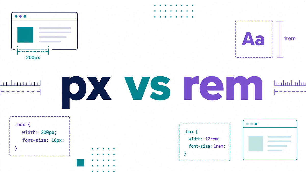
px is an absolute length unit. rem is relative, scaling from the root font size a user actually sets.
One respects browser preferences. The other ignores them completely.
This guide breaks down what each unit does, how they behave under browser zoom, and where each one belongs:
- The core difference and how the root font size drives rem
- Accessibility and WCAG resize-text rules
- When to reach for rem, when px still wins, and how to convert between them
By the end, unit choice stops being a guess.
What is px in CSS?
px is an absolute length unit in CSS. One CSS pixel equals 1/96th of an inch, and it stays fixed no matter what font size a user sets in their browser.
Browser zoom is the only thing that overrides it. Otherwise a 16px heading renders at 16px on Chrome, Firefox, and Safari, every time.
The catch is that the pixel in your stylesheet is not the same as a dot on the hardware. On retina and high-density screens, device pixel ratio maps one CSS pixel to two, three, or more physical dots.
How px measures size
The reference pixel is anchored to a physical measurement. 1in equals 96px, so a 96px block is one inch wide on a standard-density display.
- Absolute: the value never shifts based on parent elements
- Predictable: what you write in your CSS is what renders
- Device-independent: one CSS pixel, not one hardware pixel
Josh Comeau describes the px unit as “a bit of a lie” because it does not map neatly onto the R/G/B rectangles inside a modern display.
Why device pixel ratio matters
A device pixel ratio of 2 means the browser paints four physical dots for every CSS pixel. That is how a single logical pixel stays visually consistent across screen resolution differences.
Without this abstraction, a 300px image would shrink to a postage stamp on a phone with a dense panel.
What is rem in CSS?
rem is a relative length unit calculated from the root font size. It stands for “root em,” and 1rem equals the font-size set on the html element.
Every major browser ships with a default root font size of 16px. So 1rem equals 16px, 1.5rem equals 24px, and 2rem equals 32px unless you change the root.
Adrian Sandu and the W3C spec define one rem as the computed value of font-size on the root element. Nothing more complicated than that.
Where rem gets its value
The html element sets the base. Change it, and every rem across the page recalculates automatically.
Pixels (px) | rem (16px Root) |
|---|---|
| 8px | 0.5rem |
| 16px | 1rem |
| 24px | 1.5rem |
| 32px | 2rem |
Browser support for rem
rem arrived with CSS3 and has worked since Internet Explorer 9. That is well over a decade of support.
No polyfill, no fallback, no vendor prefix. You can reach for the root em unit in production without a second thought about coverage.
What is the difference between px and rem?
The core difference: px stays fixed, rem scales with the root font size.
User zoom and browser font preferences change what rem renders. They leave px untouched.
| Behavior | px | rem |
|---|---|---|
| Type | Absolute | Relative |
| Reference point | Fixed reference pixel | Root (html) font size |
| Responds to user font setting | No | Yes |
| Ignores parent font size | Yes | Yes |
One thing people mix up: rem ignores the parent element’s font size, same as px. It only ever looks at the root. That is what separates it from em.
The cascade behavior nobody explains well
rem answers to one thing only: the html font size.
Nest a rem-sized element five divs deep, and it still calculates from the root. px does the same, ignoring everything above it in the tree.
How does the root font size control rem values?
The root font size is the multiplier for every rem on the page. Set html { font-size } to anything, and all rem values recalculate against that new base instantly.
Default it to 16px, and 2rem is 32px. Bump the root to 20px, and that same 2rem becomes 40px. Nothing else in your stylesheet changes.
The 62.5% trick
Setting html { font-size: 62.5% } makes 1rem equal 10px. Now the math is trivial: 2.4rem is 24px, 1.6rem is 16px.
Not everyone loves it. Harry Roberts points out the trick forces you to rewrite every font size in rem across the whole site, which gets tedious fast.
What breaks when you hardcode the root in px
Setting the root font size in px on the html element cancels the user’s browser preference.
- A user sets their default to 20px for comfort
- Your
html { font-size: 16px }overrides it back to 16px - Their accessibility choice is now dead on your site
The fix: leave the root alone, or set it with a percentage. That way rem values still track the user’s base font size.
How do px and rem affect accessibility and browser zoom?
rem respects user font settings. px does not. When someone raises their default browser font size, rem-based text and spacing grow with it. Pixel values stay locked at whatever you hardcoded.
This is the whole ballgame for low-vision users. It is also the reason the rem versus px argument keeps going.
An Internet Archive study found 3.08% of visitors browse with a non-default font size, a share larger than the market presence of Edge, Internet Explorer, or Opera Mini at the time.
WCAG and the resize-text rule
WCAG 2.2 Success Criterion 1.4.4 requires text to resize up to 200% without loss of content or function.
Sizing body text in px can fail this. Craig Abbott puts it plainly: the browser draws the font at that static size, and font-size settings do nothing.
Zoom versus font-size preference
These are two different behaviors, and people conflate them constantly.
Browser zoom: scales everything proportionally, including px. Works on any layout.
Font-size preference: a more permanent accessibility setting that only affects relative units like rem.
Data cited by q42 suggests around 20% of users increase text size in some form, which works out to millions of people relying on accessible defaults.
Who this actually helps
Low-vision readers, older users, and anyone browsing on a screen too far from their face.
Building type that scales with rem means their preference carries across your whole interface, not just the paragraphs you remembered to size relatively.
When should you use rem over px?
Use rem for anything that should scale with user preference: font sizes, line heights, spacing, and breakpoints. It keeps your whole layout in sync when the root font size shifts.
This is the default choice for most modern work. Frameworks agree.
- Font sizes: the single most important place, full stop
- Line height and vertical rhythm: keeps spacing proportional to text
- Margin and padding: layout that grows with the type
- Media query breakpoints: zoom-friendly responsive behavior
Framework defaults back this up
Bootstrap 5 and Material UI both standardized on rem-based sizing. Tailwind CSS outputs rem under the hood by default, where each spacing unit equals 0.25rem, or 4px at a 16px root.
Write p-4 in Tailwind and it compiles to padding: 1rem, not padding: 16px. That is a deliberate accessibility call.
Responsive typography leans on rem
rem is the backbone of scalable text. Pair it with clamp() and viewport units for fluid sizing that still respects the user’s base font size.
For type that adapts across screens, a rem-first approach gives you a uniform scale that holds together at any zoom level.
When should you use px over rem?
Use px when the value should not scale: borders, hairlines, fixed-size icons, shadows, and outline widths. Some things look wrong when they grow with the font.
The blanket “never use px” advice is wrong. px still earns its place.
Where px wins
- Borders: a 1px hairline should stay 1px, not balloon to 1.5px
- Shadows and outlines: fine detail that scaling only degrades
- Fixed icons: when pixel-perfect precision beats flexibility
Nothing annoys me more than a crisp 1px divider turning fuzzy because someone sized it in rem for consistency’s sake.
A real-world hybrid
Developer David Bushell refactored his site in 2024, moving from rem-everywhere to rem for font sizes and queries, px for spacing.
His reasoning: only rem font sizes scale up when a user raises their base size, which lets more content fit the viewport. Fixed px spacing keeps the layout tight instead of blowing apart.
His honest caveat, though. A base font size below 16px behaves worse under this setup, spreading content out with less visible. Your mileage may vary.
| Property | Recommended Unit |
|---|---|
| Font size | rem |
| Line height | Unitless (preferred) or rem |
| Padding / margin | rem |
| Borders | px |
| Media queries | rem |
How do you convert px to rem?
Stop Converting PX to REM by Hand
Plug in any pixel value and get an instant, accurate REM conversion based on your base font size – no calculator, no guesswork.
Divide the pixel value by the root font size. At the default 16px root, the formula is rem = px / 16.
So 24px becomes 1.5rem, and 8px becomes 0.5rem. That is the whole calculation.
The conversion formula
rem = px / root font size. The W3C fixes the reference at 1px equals 1/96th of an inch, and the browser default root is 16px, so most math runs against 16.
- 16px / 16 = 1rem
- 24px / 16 = 1.5rem
- 40px / 16 = 2.5rem
- 8px / 16 = 0.5rem
Change the root and you change the divisor. Set the 62.5% base and 1rem equals 10px, so you just divide by 10 instead.
Tools that automate the conversion
Manual division works for ten values. It falls apart across a 200-property token file or a component library migrating off pixels.
postcss-pxtorem: write px in your CSS, get rem in the compiled output at build time.
Sass functions: a pxToRem() function divides by 16 and appends the unit, documented by SitePoint and CSS-Tricks as the standard pattern.
Online converters and VS Code extensions: instant two-way conversion when you are reading specs out of Figma.
Why calc() cannot do it
calc() does not convert units. It cannot divide px down to rem, which trips up a lot of people the first time.
What it does well is combine units in one value, like calc(1rem + 4px) for a border offset. Useful, just not a converter.
How do rem and em differ?
em references the parent element’s font size. rem references the root. em compounds through nested elements. rem stays stable no matter how deep an element sits in the tree.
This is the single most confused pair of units in CSS. The rem versus em distinction comes down to one word: parent or root.
| Attribute | em | rem |
|---|---|---|
| Reference point | Parent element’s font size | Root (html) font size |
| Compounds when nested | Yes | No |
| Best for | Local component scaling | Global consistency |
The em compounding trap
Set 1.2em on three nested levels and the math stacks: 1.2 x 1.2 x 1.2 equals 1.728em.
Against a 16px base that resolves to roughly 27.6px, not the 19.2px you would read off the rule in isolation. Nest a list inside a component and the text balloons in a way that is hard to trace.
1.2rem is 19.2px whether it sits at the top of the document or twelve levels deep. It always measures the root.
When em beats rem
Reach for em when a value should track its own component’s text size.
- Button padding that grows with the button’s font size
- Spacing tied to a single component’s type scale
- Chris Coyier’s three-tier setup: root in px, modules in rem, internals in em
Took me a while to accept it, but em is the better tool when you actually want that local relationship. The em unit is not the enemy, it is just misused.
Quick reference
rem for global. em for local. That rule covers roughly 90% of real decisions.
Use rem for font sizes, layout spacing, and anything that should scale with user preference. Reserve em for the rare case where a value should respond to its parent’s type, and avoid it on deeply nested containers where it compounds.
How do px and rem work in media queries and responsive design?
rem and em breakpoints respect the user’s font setting. px breakpoints do not. A pixel query flips at the same viewport width regardless of text size. A rem query grows with the user’s base font.
Zell Liew’s experiments confirmed em and rem media queries behave identically. px queries stayed fixed and ignored font-size changes entirely.
Why px breakpoints ignore font size
Picture a sidebar that appears next to your text at a 600px breakpoint, sized for a comfortable 16px font.
A user bumps their default to 24px. A pixel-based breakpoint adds the sidebar anyway, cramming both columns. A rem breakpoint scales up, keeping the same proportional space you deemed right in the first place.
One caveat worth knowing: Keith Grant’s 2023 testing found Safari behaves differently unless the user configures a minimum font size.
Fluid typography with clamp
Pair rem with viewport units and clamp() for text that scales smoothly.
A pattern like clamp(1rem, 2vw + 1rem, 1.5rem) sets a floor, a fluid middle, and a ceiling. The rem floor still honors the user’s base font, which pure viewport-unit sizing throws away.
Run the numbers with a clamp calculator instead of guessing the middle value. Saves a lot of trial and error.
How frameworks handle it
Most modern frameworks default to relative units for breakpoints.
Zurb Foundation uses em in its media queries. Bootstrap 5 builds its breakpoints and spacing on rem and em, and Tailwind’s spacing scale outputs rem under the hood.
If you want to see how those two stack up on defaults and philosophy, the Tailwind and Bootstrap comparison covers where each lands. Both made the same core call: relative units win for responsive, accessible layouts.
FAQ on PX Vs Rem
What is the difference between px and rem?
px is fixed. rem scales. A pixel value stays the same regardless of user settings, while a rem value multiplies against the root font size and grows when someone raises their browser default.
How many px is 1rem?
By default, 1rem equals 16px, since every major browser sets the root font size to 16px. Change the html font size and that conversion shifts with it.
How do I convert px to rem?
Divide the pixel value by the root font size. At a 16px root, px / 16 gives you rem. So 24px is 1.5rem, and 8px is 0.5rem.
Should I use px or rem for font sizes?
Use rem for font sizes in almost every case. Pixel-based text ignores browser font preferences, which locks out users who raise their default size for readability. rem respects that choice.
Is rem better for accessibility than px?
Yes. rem text scales when a user changes their browser font setting, helping meet WCAG 2.2 resize-text rules. px stays frozen, so pixel-sized body text can fail those accessibility standards.
What is the difference between rem and em?
rem measures from the root element. em measures from the parent, so em compounds through nested elements and can balloon unexpectedly. rem stays stable at any nesting depth.
Should I ever use px?
Yes, for values that should not scale. Borders, hairlines, shadows, and outline widths work well in px. A 1px border should stay crisp, not grow with the font size.
What is the 62.5% trick?
Setting html { font-size: 62.5% } makes 1rem equal 10px, so conversion becomes trivial. A percentage keeps the user’s preference intact, unlike hardcoding the root in px.
Do rem and px affect page performance?
No. Both resolve once during the cascade, and the browser computes the final pixel value at layout. There is no meaningful rendering difference between rem and px.
Should media queries use px or rem?
Use rem or em for breakpoints if you want them to respond to font settings. Pixel breakpoints stay fixed and flip at the same viewport width even when text scales up.
Conclusion
The px vs rem question has a practical answer, not a dogmatic one. Reach for rem when a value should scale with the user’s root font size, and keep px for the fixed details that shouldn’t move.
Font sizes, spacing, and breakpoints belong in rem. Borders, hairlines, and shadows stay in px.
That split respects browser zoom and the reader’s font preference, which is where accessibility quietly lives or dies.
Remember the baseline: 1rem equals 16px until the root changes, and the em unit compounds where rem holds steady.
Frameworks like Tailwind and Bootstrap already default to relative units for a reason.
Pick the unit that matches the job. Your layout, and every low-vision visitor, will thank you.

Many of his resources are available on various design marketplaces. Over the years, he's worked with a range of clients and contributed to design publications like Designmodo, WebDesignerDepot, and Speckyboy, Slider Revolution among others.
- What is Backend in Web Development? - September 13, 2026
- What is Frontend Development? - September 11, 2026
- How to Make a Button in Figma: Design Best Practices - September 10, 2026

