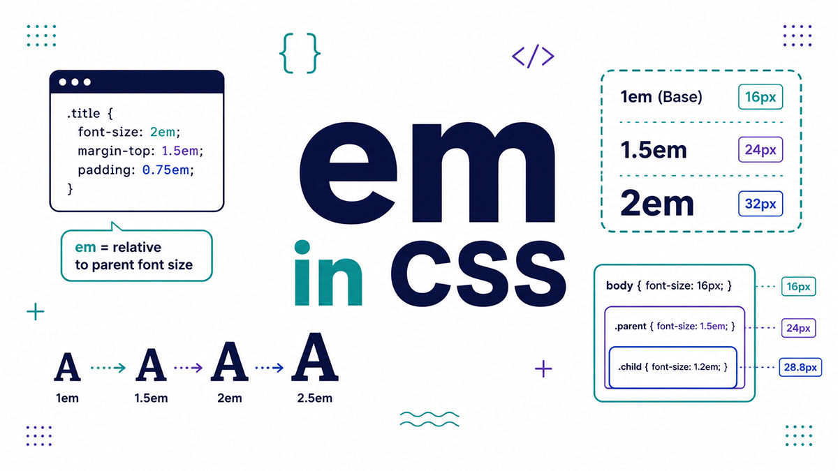
You set a font size, nest a few elements, and suddenly your text is twice the size you wanted. That mess usually traces back to one question: what is em in CSS.
em is a relative length unit tied to font-size. Get it right and your components scale on their own. Get it wrong and you spend an afternoon in DevTools.
This guide breaks down how em calculates its value, why it compounds in nested elements, and how it stacks up against rem and px.
You will also learn when em is the right call, the mistakes that trip people up, and how browser and user font settings change what em actually renders.
What Is em in CSS?
em is a relative length unit in CSS that equals the computed font-size of an element. On the font-size property itself, 1em references the parent element’s font-size. By default, 1em resolves to 16px.
The name comes from typography. Historically the em was tied to the width of the capital letter M in a given typeface (MDN).
One quick calculation makes it click. If font-size is 20px, then 1em equals 20px and 1.5em equals 30px.
Key contrast: em is a relative unit that changes with context, while a pixel value in px is absolute and fixed.
How Does the em Unit Calculate Its Value?
em resolves against different reference points depending on the property. For font-size, em uses the parent element’s font-size. For every other property, em uses the element’s own computed font-size. The default root font-size sits at 16px.
The pixel formula is simple: em = target pixel value / parent font-size in pixels. A parent at 16px with a child set to 1.25em resolves to 20px.
Where em is used | What it references |
|---|---|
font-size | Parent element’s font-size |
padding, margin, width | Element’s own computed font-size |
line-height, border-radius | Element’s own computed font-size |
Every em chain ultimately traces back to that 16px browser default unless something up the tree overrides it.
Why Does em Compound in Nested Elements?
em compounds because each child recalculates from its parent’s font-size, multiplying down the DOM tree. Three nested elements each set to 1.5em produce 1.5, 2.25, then 3.375 times the base. This is the single biggest source of em bugs.
MDN shows the effect cleanly. With nested spans at 1.6em over a 16px base, the outer word renders at 25.6px while the inner word balloons to 40.96px.
Two fixes handle the runaway math:
- Reset font-size on the deep child so the chain restarts
- Switch to rem, which stays locked to the root and never compounds
How Does em Behave on Properties Other Than font-size?
em tracks the element’s own font-size on spacing and sizing properties, not the parent’s. Change the font-size and every em-based dimension inside that element resizes together. This behavior makes em the natural choice for self-scaling components.
Set a button’s font-size once, then size everything around it in em:
padding: grows and shrinks with the button text
margin: keeps proportional spacing at any text size
border-radius: rounds in step with the font
line-height: stays tied to the local text size
Bump the component to a larger font-size and the whole card scales as one piece. No extra media query needed.
How Does em Work in Media Queries?
em in a media query always references the browser’s default font-size (16px), never the root or any element. User zoom and custom browser font settings shift em-based breakpoints. px breakpoints ignore those settings completely.
This one trips up a lot of people. The CSS spec ties relative units in media queries to the initial font value, so setting html { font-size: 20px } does not move an em breakpoint (danburzo).
Safari and older WebKit builds mis-scaled rem here, which is why many developers write breakpoints in em for consistent behavior across Chrome, Firefox, Safari, and Edge.
The accessibility angle is real. A 2024 web accessibility survey found 60.9% of respondents use browser font-size enlargement, and em breakpoints respect that choice.
Example: @media (min-width: 40em) triggers at 640px by default, then adjusts when someone changes their default font size. That is core to web accessibility for low-vision users.
What Is the Difference Between em, rem, and px?
em is relative to the local or parent font-size and compounds when nested. rem is relative to the root html font-size and never compounds. px is absolute and ignores user font preferences entirely.
| Unit | Relative to | Compounds? | Best for |
|---|---|---|---|
em | Parent font-size (for font-size); element’s own computed font-size (for most other properties) | Yes | Component-level scaling |
rem | Root (html) font-size | No | Global typography |
px | Nothing (absolute) | No | Hairline borders, fixed details |
em vs rem
rem was added in CSS3 specifically to solve em’s compounding problem.
rem measures against the root every time, so a value stays predictable no matter how deep the nesting goes. em recalculates from the parent, which is powerful for local control but risky in deep trees.
Full breakdown here: em vs rem compared.
em vs px
The split is scalability versus precision.
- em scales with user and browser font settings, which supports responsive design
- px stays fixed, ideal for 1px borders and exact box-shadow offsets
- px set on font-size will not resize in some browsers, hurting accessibility
When to Use em Instead of rem or px
Reach for em when a value should scale with the element’s own text size. Component padding, spacing, and dimensions are the clearest wins. Reserve rem for global type scales, where it prevents compounding surprises.
Concrete cases where em earns its place:
- Padding and spacing inside buttons, badges, and cards
- line-height and letter-spacing tied directly to text size
- Media query breakpoints that respect user font settings
- Any self-contained component you want to scale with one font-size change
The accessibility case backs this up. WebAIM’s low-vision survey found changing font size is the most common custom style users apply, with adjustments ranging from 112.5% up to 200% of the default.
Where em falls short: global headings and body copy in deeply nested layouts. There, rem keeps responsive typography predictable and compounding-free.
What Are the Common Problems With Using em?
em creates four recurring problems: runaway compounding in nested elements, unpredictable sizing when a font-size sits higher up the tree, debugging pain because the resolved pixel value depends on ancestors, and inconsistent output from mixing em and rem.
Compounding in nested menus and lists is the worst offender. A 1.2em item inside a 1.2em container renders at 1.44 times the root, not 1.2 times.
Assuming 1em always equals 16px is the most common conversion mistake. It is a default, not a constant. A sidebar set to 14px changes the em base for every child inside it.
Debugging gets tricky because the real base is whatever the parent computes to, not the root. The Computed tab in Chrome DevTools shows the resolved value for any element.
The adoption numbers tell the story. The 2024 Web Almanac found em used on just 9% of pages, while 65% of desktop and 66% of mobile pages still set font sizes in px, partly because these gotchas scare people off.
| Problem | Fix |
|---|---|
| Compounding in nested elements | Use rem for font-size |
| Wrong base assumption | Check the computed parent font-size in DevTools |
Mixed em and rem usage | Use rem for global sizing and em for local component scaling |
Real-world tooling reflects this split. Figma’s Dev Mode (introduced at Config 2023) added a unit dropdown that converts px to rem, sidestepping em’s compounding math in handoff.
The pattern that works: rem for structure and global type, em reserved for intentional component-level scaling.
How Do Browsers and User Font Settings Affect em?
em respects the user’s default and custom browser font-size, while px ignores it entirely. Every modern browser resolves em the same way per the CSS spec. Raise the default font size and em and rem layouts scale, while px layouts stay fixed.
Consistency across engines is solid. Chrome, Firefox, Safari, Edge, and Brave all handle em identically, which keeps cross-browser compatibility predictable (aside from the older Safari rem-in-media-query quirk).
The accessibility rules back em directly. WCAG 2.1 Success Criterion 1.4.4 requires text to scale to 200% without breaking layout, and px font sizes fail that test when a user changes their browser default (W3C).
W3C Technique C28 names em as a recommended unit for sizing text containers.
The audience is large. The WHO estimated in 2026 that roughly 2.2 billion people live with some vision impairment, and many adjust their browser font size rather than use a screen magnifier.
Zoom and font-size preference are not the same lever:
Browser font-size preference: shifts em and rem, leaves px untouched
Full-page zoom: scales px, em, and rem together
OS-level magnifier: enlarges everything, unit-agnostic
That single distinction is why em and rem became the default for accessible typography and breakpoints. A layout built entirely in px is invisible to a user’s font-size choice.
FAQ on Em In CSS
What does em stand for in CSS?
em is a relative length unit named after typography, where it once matched the width of a capital letter M. In CSS it equals the computed font-size of an element and acts as a multiplier of that size.
What is 1em equal to in pixels?
By default, 1em equals 16px, the standard browser default font-size. Change the reference font-size and 1em changes with it. At a 20px base, 1em becomes 20px and 2em becomes 40px.
Is em relative to the parent or the element itself?
It depends on the property. For font-size, em references the parent element’s font-size. For padding, margin, width, and line-height, em references the element’s own computed font-size instead.
What is the difference between em and rem?
em is relative to the parent or local font-size and compounds when nested. rem is relative to the root html font-size and never compounds. rem was added in CSS3 to fix that compounding problem.
Why does my em text keep getting bigger when nested?
Compounding. Each nested element recalculates em against its parent’s font-size, so values multiply down the tree. Two 1.5em elements inside each other render at 2.25 times the base. Switch to rem to stop it.
Should I use em or px for font size?
Prefer relative units. px font sizes ignore a user’s browser font preference and fail accessibility resize checks. Both em and rem scale with that preference, which makes them the safer default for readable text.
How do I convert px to em?
Divide the target pixel value by the parent’s font-size in pixels. At a 16px base, 24px becomes 1.5em (24 / 16). Always check the parent’s computed size in DevTools, not the root.
Does em work in media queries?
Yes, with a twist. Inside a media query, em always references the browser default font-size of 16px, never the root or any element. That is why em breakpoints respond to user font settings.
When should I use em instead of rem?
Reach for em on component internals, like padding, margin, and line-height that should scale with the element’s own text. Keep rem for global type scales to avoid compounding surprises across deeply nested layouts.
Is em good for accessibility?
Yes. em scales with a user’s default and custom browser font-size, unlike px. That respects low-vision users who enlarge text, and it supports WCAG 2.1 text-resize requirements up to 200%.
Conclusion
Now you know what is em in CSS: a computed value that measures against the parent element’s font-size, or the element’s own on properties like padding and line-height.
The real takeaway is control. em gives you self-scaling components, while rem keeps root-based type predictable.
Watch the compounding, check the parent’s computed size, and reach for em only where local scaling earns its place.
For media query breakpoints and readable text, relative units respect the reader’s font choice in a way fixed pixels never will.
Use em on purpose, pair it with rem, and your responsive design holds up from the smallest button to the widest layout.
Learn these units once and you stop fighting your own stylesheet.

Many of his resources are available on various design marketplaces. Over the years, he's worked with a range of clients and contributed to design publications like Designmodo, WebDesignerDepot, and Speckyboy, Slider Revolution among others.
- What is Backend in Web Development? - September 13, 2026
- What is Frontend Development? - September 11, 2026
- How to Make a Button in Figma: Design Best Practices - September 10, 2026

