
Most people center everything. And most compositions end up looking flat because of it.
Understanding what is the rule of thirds in design changes how you approach every layout, photo, and screen you build. It’s a composition technique from 1797 that still drives how photographers frame shots, how designers structure landing pages, and how filmmakers position actors in a scene.
This guide covers how the thirds grid works, where it came from, how to apply it across photography, graphic design, web design, and UI/UX, plus when breaking it is actually the smarter move.
What is the Rule of Thirds in Design
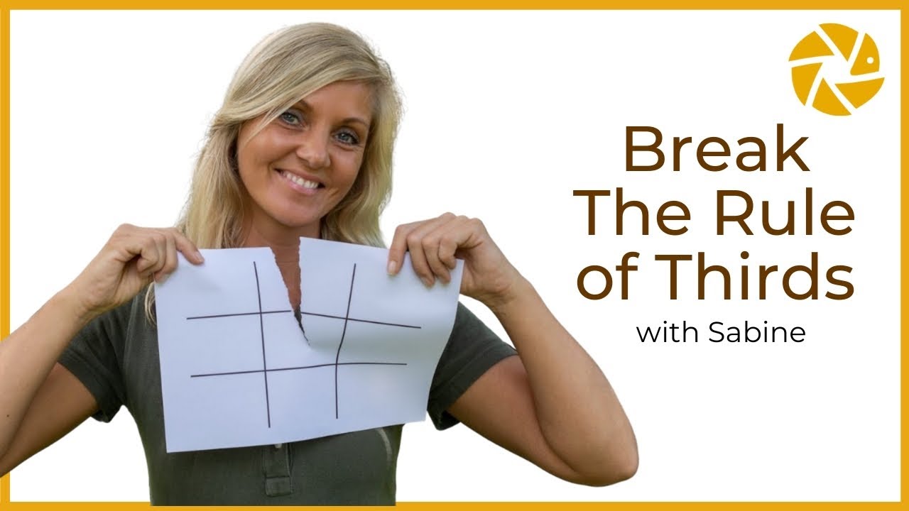
The rule of thirds is a composition technique that divides any image or layout into nine equal parts using two horizontal lines and two vertical lines.
You place your subject along those lines, or better yet, at the four points where they cross. That’s it. The whole concept fits on a napkin.
John Thomas Smith first wrote the term down in 1797 in his book Remarks on Rural Scenery. He was riffing on ideas from Sir Joshua Reynolds, who argued back in 1783 that a two-to-one proportion looks better than splitting things dead center.
Painters used it. Then photographers picked it up. Now it shows up in web design, graphic design, film, and pretty much every visual medium you can think of.
The principle works the same way regardless of the canvas. A phone screen, a billboard, a movie frame. Divide it into thirds, position what matters at the intersections, and the result looks more balanced than centering ever could.
How Does the Rule of Thirds Grid Work
Draw two equally spaced vertical lines and two equally spaced horizontal lines across your frame. You get a 3×3 grid with nine boxes, four gridlines, and four intersection points.
The grid works on any dimension or orientation, landscape or portrait. Most cameras (Canon, Nikon, even your iPhone and Android) have a built-in overlay you can toggle on in settings.
What Are the Focal Points in the Rule of Thirds
The four spots where the lines cross are called focal points, sometimes “sweet spots” or “power points.” These are where the viewer’s eye naturally lands first.
Placing your key element at one of these intersections creates asymmetric balance. The subject sits off-center, which gives the composition tension and energy while the remaining space keeps things from feeling cramped. That interplay between the subject and the white space around it is what makes the whole thing click.
Where Did the Rule of Thirds Come From
The idea predates photography by centuries.
Renaissance painters like Raphael divided their canvases into thirds regularly, though nobody called it a “rule” at the time. It was just how you made a painting look right.
Smith formalized it in 1797. In Remarks on Rural Scenery, he quoted Reynolds and then laid out his own argument: a ratio of roughly two-thirds to one-third produces more pleasing proportions than a half-and-half split.
His exact words suggested that whether you’re breaking up a wall, a sky, or a mass of shade, the two-to-one ratio beats any other proportion. He even compared it to William Hogarth’s “line of beauty” as a standard for curves.
According to PetaPixel’s research with Villanova historian Dr. Gina Talley, the name “rule of thirds” wasn’t formally attached to photographic composition until 1942 in the US, despite the underlying idea circulating in British photography journals for decades before that.
Photography adopted the rule almost immediately once the medium took off. By the mid-1800s, composition guides were already referencing the thirds grid. Scottish photographer David Octavius Hill’s work from the 1840s shows a clear understanding of it, with subjects placed at the intersections of thirds lines.
These days it’s baked into camera firmware, editing software like Adobe Photoshop and Adobe Lightroom, and design tools like Figma. Took me a while to realize just how old this concept actually is.
Why Does the Rule of Thirds Work
Centered subjects feel static. Your brain processes them quickly and moves on.
Off-center placement forces the eye to travel across the frame, which creates visual tension and keeps attention longer. The viewer processes the subject first, then explores the negative space, then circles back. That loop is what makes a composition feel dynamic instead of flat.
A 2024 Journal of Eye Movement Research study confirmed that leading lines and off-center placement directly affect gaze behavior, with subjects at compositional intersections producing longer fixation durations than centered alternatives.
There’s a perception component too. Asymmetric balance feels more natural to humans than perfect symmetry. Look at how your eyes scan a webpage: a visual hierarchy built on off-center placement matches the way people actually read content online.
The grid also solves a practical problem. Without it, most people default to centering everything. Centering is fine sometimes, but it kills movement. The thirds grid gives you a starting framework that almost always produces something more interesting than dead center.
Rule of Thirds vs. Golden Ratio
Both tools split the frame asymmetrically, but they work differently.
| Feature | Rule of Thirds | Golden Ratio |
|---|---|---|
| Split ratio | 33/33/33 | ~38/62 |
| Grid type | Equal thirds | Fibonacci-based spiral |
| Ease of use | Simple, fast | More complex to apply |
| Best for | Minimal, clean scenes | Dynamic movement, portraits |
| Camera overlay | Standard on most devices | Available in Photoshop/Lightroom |
The Golden Ratio splits space at roughly 38/62, while the rule of thirds splits it at a clean 33/33/33. Close enough that they produce similar results, different enough that the rule of thirds is way easier to apply on the fly.
Key difference: The Golden Ratio guides the eye along a curve toward a focal point. The rule of thirds gives you four intersection points and lets you decide.
According to Digital Camera World, the rule of thirds can look rigid when applied too literally. The Golden Ratio is less predictable, which tends to produce a more natural result. But for most shooting situations, especially ones with limited time, the rule of thirds wins on speed and simplicity.
How to Apply the Rule of Thirds in Design
How to Use the Rule of Thirds in Photography

Place the horizon line on the top or bottom horizontal gridline, not in the middle. Top gridline emphasizes the foreground; bottom gridline gives the sky more room.
For portraits, align the subject’s eyes with the upper horizontal line. If you’re shooting someone in motion, leave more space in front of them (the direction they’re moving) than behind. Position them on the vertical gridline opposite to where they’re heading.
Landscape photographers like Ansel Adams used this instinctively. Trees, rocks, buildings, anything vertical gets placed along a vertical gridline. The composition breathes.
How to Use the Rule of Thirds in Graphic Design
Headlines go near the top-left intersection point, because that’s where most readers look first. Supporting imagery sits on the opposite third to create balance across the layout.
Book covers, posters, and thumbnails all follow the same logic. Netflix’s own thumbnail system factors in rule-of-thirds composition as part of its image-ranking criteria, with subject placement at grid intersections scoring higher in their AVA algorithm. The grid system does the heavy lifting so you can focus on the actual design instead of guessing where things should go.
According to Approachable Design, the rule of thirds appears in roughly 90% of streaming thumbnails. The subject’s face almost always lands on one of the four power points.
How to Use the Rule of Thirds in Web Design

The top-left intersection gets maximum attention because of F-pattern reading behavior. Place your most important message there.
Nielsen Norman Group’s eye-tracking research on 232 users found that people spend 80% of their time viewing the left half of a page, scanning horizontally from the top before dropping down. That’s exactly where your top-left thirds intersection sits.
Where to place key elements:
- Call-to-action: top-right or bottom-left focal point depending on page flow
- Hero images: subject follows the thirds grid within the image itself, not just the page layout
- Above-the-fold content: headline, primary image, and CTA all visible before scrolling
CTAs placed above the fold have a 73% visibility rate, versus 44% when placed below, according to Webdesigner Depot data. That placement advantage maps directly to where the thirds grid puts your top focal points.
How to Use the Rule of Thirds in UI and UX Design

In user interface design, the grid helps structure buttons, icons, and content blocks so users find what they need without thinking too hard. Primary actions sit at intersection points; secondary elements fill the remaining space.
One tricky part with responsive design: the intersections shift across screen sizes. What lands on a sweet spot on desktop might be completely off on mobile. Test across devices. The user experience matters more than strict grid adherence.
How to Use the Rule of Thirds in Film and Video

Cinematographers line up actors along vertical gridlines, with their eyes on the upper horizontal line. This framing technique shows up in practically every well-shot film.
Moving subjects get “lead room,” extra space in the direction of travel. If a character walks left to right, they’re placed on the left vertical line with open space ahead.
It gives the audience a sense of where the action is going, which helps with visual storytelling even in a single static frame.
What is the Difference Between the Rule of Thirds and the Golden Ratio
The Golden Ratio splits space at roughly 38% and 62%, based on the mathematical constant phi (approximately 1.618). The rule of thirds splits it evenly at 33/33/33.
In practice, the two grids look similar. The Phi Grid pushes its lines slightly closer to center compared to the rule of thirds grid. Most people can’t tell the difference in a finished composition.
The Golden Ratio ties back to the Fibonacci Sequence, where each number is the sum of the two before it. That sequence produces the golden spiral, which photographers and designers use for compositions with curved leading lines or circular movement.
| Rule of Thirds | Golden Ratio | |
|---|---|---|
| Split ratio | 33/33/33 | ~38/62 |
| Visual tool | Straight grid lines | Fibonacci spiral |
| Ease of use | Fast, camera-native | More complex to apply |
| Best for | Clean, minimal scenes | Flowing, organic shapes |
| Software support | Standard overlay everywhere | Available in Photoshop, Lightroom |
According to Digital Camera World, the rule of thirds can look rigid when applied too literally. The Golden Ratio tends to feel more natural because the spiral guides the eye along a curve rather than parking it at an intersection point.
Pick the rule of thirds when you need speed and simplicity. Pick the Golden Ratio when you’re working with flowing, organic shapes and have time to be precise. Both produce balanced compositions. The rule of thirds is just faster to apply on the fly.
What is the Difference Between the Rule of Thirds and Dynamic Symmetry

Dynamic symmetry uses diagonal, vertical, and horizontal lines to create rhythm and movement across a frame. It’s a more complex system built on root rectangles and baroque/sinister diagonals.
The rule of thirds gives you four intersection points. Dynamic symmetry gives you dozens of potential anchor points depending on the diagonal grid you choose.
| Rule of Thirds | Dynamic Symmetry | |
|---|---|---|
| Grid type | Equal 3×3 | Root rectangles with diagonals |
| Anchor points | 4 intersections | Dozens, varies by aspect ratio |
| Learning curve | Low | High |
| Best use case | Fast, on-location shooting | Studio work, fine art, still life |
| Software support | Standard in most cameras | Post-processing overlay tool |
Dynamic symmetry works differently depending on the aspect ratio of the frame. As noted by AubreyC, the rule of thirds grid and dynamic symmetry grids only actually line up when shooting at a 3:2 aspect ratio. Use any other ratio and they diverge.
Still-life photographers and fine artists tend to prefer dynamic symmetry because it handles intricate compositions better. For web layouts, grid layouts based on the rule of thirds are more practical since they translate cleanly to column-based CSS structures.
Dynamic symmetry is also used more often in post-processing than during the shoot itself. Street and sports photographers rarely have time to think in diagonals. The grid gets applied later to check whether the composition holds.
Took me a while to get comfortable with dynamic symmetry. Your mileage may vary, but master the thirds grid first, then experiment with diagonals once that feels second nature.
When Should You Break the Rule of Thirds
Centered compositions work better than off-center ones when symmetry is the point.
Architectural photography, reflection shots, flat-lay food photography. Dead center is the right call there. As Rick McEvoy Photography puts it, symmetrical buildings should be centered because centering adds the symmetry of the composition to that of the subject itself, doubling the impact.
When to skip the thirds grid entirely:
- Minimalist design with only one or two elements on screen. There’s nothing to balance against.
- Close-up portraits where the face fills 80%+ of the frame. The grid adds nothing at that scale.
- Data-heavy interfaces: dashboards, spreadsheet views, complex admin panels. These need functional structure over compositional beauty.
- Scenes where you want to convey tension or isolation through deliberate centering.
Data-heavy interfaces are a design case worth calling out separately. Dashboards and admin panels work best with a strict column-based set of design principles because users are navigating information, not experiencing a composition.
The whole idea behind calling it a “rule” is a bit misleading. It’s a guideline. Break it when you have a good reason and the composition still holds together without it.
How to Create a Rule of Thirds Grid

Smartphones now capture 92.5% of all photos taken worldwide, according to Photutorial data. That means most people applying a thirds grid are doing it through a phone or editing software, not a DSLR viewfinder.
How to Create a Rule of Thirds Grid in Photoshop
Adobe Photoshop is used by over 90% of the world’s creative professionals, according to Photutorial.
Two ways to get the grid:
- Go to View > Show > Grid, then open Preferences > Guides, Grid & Slices. Set “Gridline Every” to 100 percent with subdivisions at 3. This gives a clean thirds overlay on any canvas size.
- Select the crop tool, look at the overlay options in the top toolbar, and switch to the 3×3 grid. Faster for quick composition checks.
How to Create a Rule of Thirds Grid in Figma
Select your frame, open the Design panel on the right, and add a layout grid.
Set columns to 3 and rows to 3 with zero margin and zero gutter for a pure thirds grid. Figma lets you toggle this overlay on and off while you work.
How to Enable the Rule of Thirds Grid on a Camera
On smartphones:
- iPhone: Settings > Camera > toggle on “Grid”
- Android: open Camera app > Settings > “Grid lines” or “Assistive grid”
On dedicated cameras:
DSLR and mirrorless cameras from Canon, Nikon, and Sony bury it under display settings or custom shooting options. It’s almost always a 3×3 overlay in the viewfinder or live view screen. Adobe Lightroom and Capture One also show the grid when you activate the crop tool.
Common Mistakes When Using the Rule of Thirds
Following the grid too rigidly is the most common one. The intersections are guides, not pixel-perfect targets. A few pixels off still works.
Five mistakes worth knowing:
- Ignoring actual content. The grid doesn’t know what you’re photographing or designing. A sweeping landscape and a product shot on a hero section need different treatment even though they use the same grid.
- Applying it to everything by default. Not every wireframe needs it. Not every photo benefits from off-center placement. User-centered design means picking the composition that serves the viewer, not one that fits a template.
- Confusing gridlines with intersection points. The sweet spot is where two lines cross, not the middle of a grid section. Small difference, big impact on the final result.
- Stacking subjects on all four intersection points at once. This creates visual clutter instead of balance. Pick one or two focal points per composition. Let the rest of the frame breathe.
- Treating it as a rule instead of a starting point. Ansel Adams said composition rules are “invalid, irrelevant and immaterial.” The grid gets you 80% of the way there, but the last 20% comes from looking at the actual image.
The whole point of learning this grid is to internalize it until you stop thinking about it. Once that happens, you’re composing, not just following lines.
FAQ on The Rule Of Thirds In Design
What is the rule of thirds in simple terms?
The rule of thirds is a composition technique that divides an image into nine equal parts using two horizontal and two vertical lines. You place key subjects along those lines or at the four intersection points for a more balanced layout.
Who invented the rule of thirds?
John Thomas Smith first wrote the term in his 1797 book Remarks on Rural Scenery. He built on ideas from Sir Joshua Reynolds, who discussed the two-to-one proportion in painting back in 1783.
Why does off-center placement look better than centering?
Centered subjects feel static. Off-center placement creates visual tension and forces the eye to move across the frame, which keeps attention longer. The asymmetric balance between the subject and negative space feels more natural to human perception.
How do I turn on the rule of thirds grid on my phone camera?
On iPhone, go to Settings > Camera and toggle “Grid” on. On Android, open the Camera app, tap Settings, and enable “Grid lines.” Both display a 3×3 overlay on your live view screen.
Does the rule of thirds apply to web design?
Yes. Web designers use the thirds grid to position headlines, images, and CTA buttons at focal points. The top-left intersection gets the most attention because of how users scan pages in F-pattern and Z-pattern reading behavior.
What is the difference between the rule of thirds and the Golden Ratio?
The rule of thirds splits space into equal 33/33/33 sections. The Golden Ratio splits it at roughly 38/62, based on the mathematical constant phi (1.618). Both produce balanced compositions, but the rule of thirds is simpler to apply quickly.
When should I break the rule of thirds?
Break it for symmetrical compositions, reflection shots, close-up portraits where the face fills the frame, and minimalist layouts with few elements. The grid is a guideline, not a law. If centering serves the image better, center it.
Can I use the rule of thirds in Figma or Photoshop?
Yes. In Adobe Photoshop, go to View > Show > Grid and set subdivisions to 3. In Figma, add a layout grid to your frame and set both columns and rows to 3. Both tools let you toggle the overlay on and off.
How does the rule of thirds improve UI design?
It helps position primary actions at intersection points where users look first. Buttons, icons, and content blocks placed along gridlines create a clear visual hierarchy that makes interfaces easier to scan and use across screen sizes.
Is the rule of thirds the same as a grid system?
Not exactly. The rule of thirds is a specific 3×3 compositional grid focused on subject placement. A grid system in design is broader and can use any number of columns, rows, and gutters to structure an entire page layout.
Conclusion
The rule of thirds in design is one of those principles that looks almost too simple to matter. Two lines one way, two lines the other, four intersection points. Done.
But that simplicity is exactly why it works across every visual medium, from portrait photography to UX layouts to cinematography framing.
Whether you’re positioning a horizon line in Adobe Lightroom, placing a CTA button on a responsive web page, or aligning an actor’s eyes in a film frame, the 3×3 grid gives you a reliable starting point for balanced, dynamic compositions.
Learn it well enough that it becomes instinct. Then break it when the composition demands something different.
The best designers don’t follow rules blindly. They understand why a rule exists, apply it where it adds value, and ignore it when centering or symmetry or the Fibonacci spiral serves the work better.


