You design something bright and clean on screen. It prints, and the greens look muddy, the blues fall flat.
That gap is the whole story behind CMYK vs RGB. One model builds color from light for screens. The other builds it from ink for print.
Miss the difference and you waste money on reprints. Get it right and your colors hold from monitor to paper.
This guide breaks down both color models in plain terms:
- What RGB and CMYK actually are, and why one is additive while the other subtracts
- Which color space shows more colors, and why print dulls vivid tones
- When to use each, plus how to convert and manage color profiles without surprises
By the end, you will know exactly which mode to pick, every time.
I’ll research current data on color models before writing.Good data. Let me search for more specifics on color space coverage and sRGB.Let me get a couple more specifics on the 16.7 million colors figure and print industry data.
What Is the Difference Between CMYK and RGB?
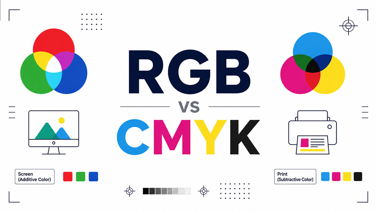
RGB is a light-based color model built for screens. CMYK is an ink-based color model built for print.
RGB mixes red, green, and blue light to create color. CMYK layers cyan, magenta, yellow, and key (black) ink on paper.
Screen work stays in RGB. Anything printed on a physical surface needs CMYK.
| Aspect | RGB | CMYK |
|---|---|---|
| Source | Emitted light | Printed ink |
| Method | Additive | Subtractive |
| Range | Wider gamut | Narrower gamut |
| Best For | Web, video, apps | Print, packaging |
Wikipedia data shows RGB delivers 16,777,216 colors at 8-bit depth. CMYK ink reproduces far fewer, which is the root of every color surprise designers hit at the print stage.
What Is RGB Color Mode?
RGB is an additive color model built from red, green, and blue light channels. Each channel runs from 0 to 255. That range produces 256 x 256 x 256 combinations. Black is the absence of light. White is all three channels at full strength.
Screens, phones, TVs, cameras, and web graphics all run on how RGB color actually works under the hood.
Channel values in practice:
- Black = RGB (0, 0, 0)
- White = RGB (255, 255, 255)
- Pure red = RGB (255, 0, 0)
Those same values map straight to hex codes. RGB (255, 255, 255) equals #FFFFFF, which is why turning an RGB value into its hex equivalent is a daily task in web work.
HP and Microsoft standardized sRGB back in 1996 (Slazzer). It remains the default RGB space for the internet, which keeps color roughly consistent across mismatched devices.
10-bit displays push this to 1.07 billion colors, per multiple display reports. Most web content still ships as 8-bit sRGB to save file weight.
What Is CMYK Color Mode?
CMYK is a subtractive color model using cyan, magenta, yellow, and key (black) inks. Each ink is measured as a percentage from 0 to 100. White comes from the paper itself, not from ink. Black (K) adds depth and saves colored ink on dark areas.
The full breakdown of what CMYK covers as a print standard starts with why the K exists at all.
Why K means “key,” not black: the black plate was historically the key registration plate that all other colored plates aligned to during printing.
Mixing cyan, magenta, and yellow at full does not make a clean black. It makes a muddy brown. The K plate fixes that and sharpens text and shadow detail.
CMYK runs the show across offset printing, digital presses, and home inkjet output. Every business card, brochure, and cereal box you have ever held was built in this model.
Why Is RGB Additive and CMYK Subtractive?
RGB adds light toward white. CMYK subtracts light toward black. Light sources combine and brighten. Inks absorb wavelengths and darken. This single physical difference drives every other gap between the two models.
How Additive Color Builds an Image on Screen
Screens emit their own light. Stack red, green, and blue light at full and you get white.
A single red pixel on a display emits red light directly into your eye. Nothing is being blocked or absorbed. Color is added on.
Result: more light equals brighter, more vivid color.
How Subtractive Color Builds an Image on Paper
Paper reflects light instead of emitting it. Ink sits on top and absorbs (subtracts) certain wavelengths, bouncing the rest back.
A red printed patch absorbs green and blue light, reflecting only red. Layer all inks and you approach black because almost everything gets absorbed.
More ink equals darker, and past a point, muddier.
Which Color Space Shows More Colors?
RGB shows more colors than CMYK, especially bright greens, oranges, and neon blues. The CMYK gamut sits mostly inside the RGB gamut. Colors that glow on a screen often have no printable match in ink.
| Color Space | CIE 1931 Coverage | Typical Use |
|---|---|---|
| sRGB | ~35% | Web, consumer screens |
| Adobe RGB | ~52% | Photography, print preparation |
| ProPhoto RGB | ~90% | RAW image editing |
| CMYK (FOGRA39) | 30–40% | Commercial print |
Wikipedia confirms Adobe RGB (1998) covers 52.1% of CIE 1931, versus roughly 35% for sRGB. ProPhoto RGB reaches about 90% of visible colors (USPTO filing).
Adobe built Adobe RGB in 1998 specifically to wrap around most CMYK printer colors. Smart move, since it lets designers preview print-safe tones without leaving an RGB workflow.
Neon and fluorescent shades are the classic casualties. They live well outside the CMYK gamut and simply cannot print at full intensity.
Why Do Colors Look Different When Printed vs on Screen?
Bright screen colors fall outside the CMYK gamut and get clamped to the nearest printable value. That clamp is why a design can look duller and slightly shifted after printing.
Two things cause the shift:
Gamut clipping: out-of-gamut colors snap to the closest ink match, losing saturation.
Light vs reflection: a backlit screen emits light, while paper only reflects it, which lowers perceived vibrancy no matter how good the ink is.
Rendering intent controls the mapping. Perceptual intent shifts the whole image to keep relationships between colors. Relative colorimetric clips only the out-of-range colors and leaves the rest untouched.
Soft proofing in Photoshop (View then Proof Setup) previews the print result on screen before you commit. Catch the dull greens there, not on the printed proof.
The Pantone Matching System stays the most widely used standard for locking color across print vendors (Dusted). Brands lean on it when a logo has to look identical in every region.
When Do You Use RGB and When Do You Use CMYK?
Use RGB for anything viewed on a screen. Use CMYK for anything printed on a physical surface. That rule covers 95% of real decisions.
RGB territory:
- Websites and landing pages
- Social media graphics
- Video and app interfaces
- Digital ads
CMYK territory:
- Business cards and brochures
- Packaging and labels
- Magazines and posters
- Any professional press job
Design a logo once in RGB, then export a CMYK version for print vendors. Keep both on file so nobody grabs the wrong one.
The trap: sending an RGB file to a commercial printer triggers an automatic, uncontrolled conversion. The press guesses, and your vivid blues come back flat. Convert on your own terms instead.
Researching conversion workflows, color profiles, and RGB printing before writing.Let me confirm the RGB printing details for the final section.
How Do You Convert RGB to CMYK?
Convert RGB to CMYK by assigning a print color profile, then switching the document’s color mode inside your design software. Do the conversion late, near final output. Editing stays in the wider RGB space until then. Colors that dull after the switch get adjusted by hand.
| Software | Conversion Path |
|---|---|
| Photoshop | Image > Mode > CMYK Color |
| Illustrator | File > Document Color Mode > CMYK |
| InDesign | Convert at PDF export |
Skip the software route entirely with a tool that handles the RGB to CMYK switch for quick checks.
PrintNinja and similar print shops will run the conversion for you and send a proof before going to press. Least control, least risk of nasty surprises.
Converting in Adobe Photoshop
Photoshop path: Image then Mode then CMYK Color.
- Assign the print profile first through Edit > Convert to Profile
- Soft proof before committing (View > Proof Setup)
- Fix out-of-gamut colors manually after the mode switch
Highly saturated RGB tones will not translate cleanly, so tweak hue and saturation before you flatten anything (Atlanta Vinyl).
Setting Color Mode in Illustrator and InDesign
Set the mode when you create the file. In Illustrator, choose CMYK under Color Mode in the New Document dialog.
InDesign works differently. Keep RGB images placed, then convert at PDF export using a PDF/X preset with the press profile set as output destination.
Adobe community guidance is blunt about one thing: every placed RGB image needs an embedded profile, or the conversion guesses and the color appearance shifts.
What Are Color Profiles and Why Do They Matter?
A color profile (ICC profile) describes how one specific device reproduces color. Profiles make conversion predictable across screens, printers, and paper stocks. Without them, every device interprets your file its own way.
| Profile | Type | Where Used |
|---|---|---|
| sRGB | RGB | Web, consumer devices |
| U.S. Web Coated (SWOP) | CMYK | US commercial print |
| FOGRA39 | CMYK | European coated print |
sRGB stays the safe default for anything headed to a screen. It is the most compatible RGB space across mismatched hardware.
Paper changes the profile. FOGRA39 suits coated and glossy stock, while FOGRA52 covers uncoated white paper (Imago).
Match the CMYK profile to the actual press, ink, and paper. Get it wrong and you invite color shifts, out-of-gamut surprises, and odd black handling (Quora print pros).
Ask the printer for their profile before you convert. That one step kills most last-minute color problems.
Can You Print in RGB or Only in CMYK?
Yes and no. It depends entirely on the printer, not a universal rule. Home inkjets accept RGB and convert internally. Commercial offset presses want CMYK separations. Photo labs often prefer RGB outright.
Home inkjet (HP, Canon PIXMA, Epson EcoTank): the driver takes RGB by default and converts to CMYK ink itself (Futurescope).
Photo labs and giclee: wet-process paper and most inkjet photo printing actually run on RGB input (Pro Photo Supply).
Commercial offset: needs true CMYK separations, one plate per ink.
Canon’s PIXMA PRO range uses up to 12 inks, adding photo cyan, red, and blue to stretch the gamut past plain CMY mixing (Futurescope). More inks, closer match to what your screen showed.
The takeaway holds across every setup: hand the conversion to a color-managed press with the right profile, and skip letting a generic driver decide your brand colors.
FAQ on CMYK vs RGB
Is RGB or CMYK better for printing?
CMYK wins for print. Commercial presses build color from cyan, magenta, yellow, and black ink, so files land closer to the printed result. RGB is a screen model and prints unpredictably without conversion.
Why do my colors look duller after printing?
Bright RGB tones fall outside the CMYK gamut and clamp to the nearest printable ink value. Screens also emit light while paper only reflects it, which lowers the perceived vibrancy of every printed shade.
Can I convert RGB to CMYK without losing color?
Not fully. Out-of-gamut colors, especially neon greens and blues, shift during conversion. Assign a print profile, soft proof in Photoshop, then adjust the dulled tones by hand to get the closest match.
What does the K in CMYK stand for?
K means key, referring to the black registration plate that other ink plates aligned to during printing. Mixing cyan, magenta, and yellow alone makes muddy brown, so black adds true depth and sharp detail.
Which color model shows more colors?
RGB shows far more. At 8-bit it produces 16.7 million colors, and its gamut covers brighter greens, oranges, and blues than ink can. CMYK reproduces a narrower set that sits mostly inside RGB.
Should websites use RGB or CMYK?
Always RGB for anything on a screen. Websites, apps, video, and social graphics all run on emitted light. sRGB is the safe default that keeps color consistent across mismatched monitors and phones.
Can I convert CMYK back to RGB?
Yes. Switch modes in your editor or use a tool that flips CMYK values into RGB. Colors will not regain lost vibrancy, since the CMYK version already dropped out-of-gamut tones.
What color profile should I use for print?
Match the press. U.S. Web Coated (SWOP) is standard for US commercial print, and FOGRA39 covers European coated stock. Ask your printer for their exact ICC profile before converting.
Do home inkjet printers use RGB or CMYK?
Both, in a way. The driver accepts RGB by default and converts to CMYK ink internally. Photo printers add extra inks like light cyan and red to widen the printable gamut.
What is the difference between sRGB and Adobe RGB?
Gamut size. sRGB covers roughly 35% of visible colors and suits web work. Adobe RGB stretches past 50%, reaching richer cyans and greens for professional photography and print preparation.
Conclusion
Screens use light. Print uses ink. That single fact drives every color decision you’ll make.
Keep your work in RGB while you design. Switch to CMYK only when print is the destination, and do it yourself instead of letting a press guess.
The habits that save you:
- Ask your printer for their exact profile before converting
- Soft proof in Photoshop to catch dull greens early
- Save both RGB and CMYK versions of anything important
Get the profile right and your colors hold, monitor to paper.
No more muddy greens. No more wasted reprints.

Many of his resources are available on various design marketplaces. Over the years, he's worked with a range of clients and contributed to design publications like Designmodo, WebDesignerDepot, and Speckyboy, Slider Revolution among others.
- What is Backend in Web Development? - September 13, 2026
- What is Frontend Development? - September 11, 2026
- How to Make a Button in Figma: Design Best Practices - September 10, 2026

