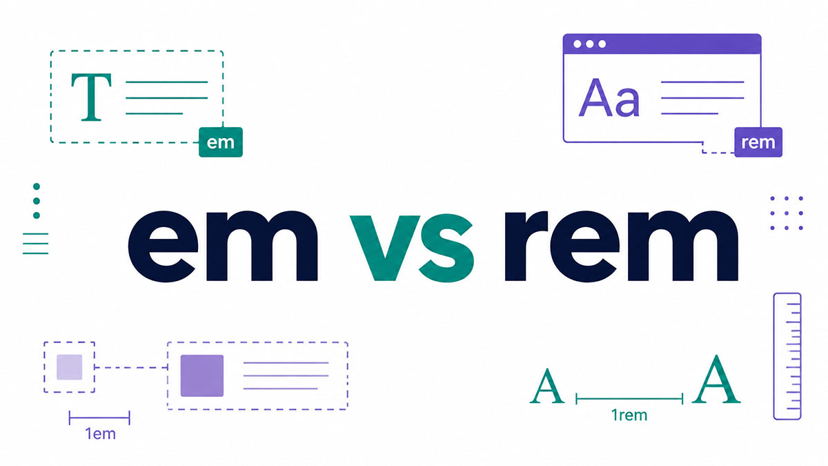
Two CSS units. One letter of difference. A surprising amount of confusion.
The em vs rem question trips up developers daily, because both are relative units, both scale, and both look nearly identical in the stylesheet.
The split comes down to one thing: em is relative to the current element’s font-size, while rem is relative to the root html element.
That single difference decides whether your sizes stay predictable or compound out of control through nested elements.
By the end of this guide, you’ll know exactly when to reach for each unit. We’ll cover:
- How each unit calculates its value against the 16px default
- Why em compounds when elements nest
- When rem wins for type scales and spacing
- How both units affect accessibility and user zoom
- Which units Bootstrap, Tailwind, and other frameworks pick
I’ll research current data on CSS units, browser support, and usage before writing.Let me search for browser support data and accessibility statistics.Let me get WCAG text resize data and default browser font-size confirmation.
What Is the Difference Between em and rem?
em is relative to the font-size of the current element. rem is relative to the root html element’s font-size. The one difference that matters: em compounds through nested elements, while rem always points back to a single fixed root value.
Both are relative length units defined in the CSS Values and Units spec. In every major browser, the default root font-size is 16px unless you change it.
| Unit | Reference Point | Compounds When Nested |
|---|---|---|
| em | Current or parent element font-size | Yes |
| rem | Root html element font-size | No |
Mental model in one line: rem is flat, em is chained. That single behavioral split drives every practical decision you make between them in CSS.
MDN’s own nested-list demo shows it plainly. Swap a class from ems to rems on identical markup and the sizing behavior flips.
How Does the em Unit Calculate Its Value?
1em equals the element’s own computed font-size for most properties. For the font-size property itself, 1em references the parent element’s font-size instead. That parent-versus-self split is the part that trips people up.
Font-size: 1em looks at the parent. Parent at 20px, child set to 1.5em resolves to 30px.
Padding, margin, width: 1em looks at the element’s own font-size, not the parent.
line-height and letter-spacing: both track the element’s font-size, so spacing moves with the type automatically.
This is why em gives fine-grained, local control. The value bends to whatever font-size sits closest, which is useful right up until nesting enters the picture.
Want a deeper single-unit breakdown? The em unit in CSS behaves differently depending on which property you attach it to, and that catches even experienced devs.
Why Does em Compound When Elements Are Nested?
Each nested level multiplies against the resolved font-size directly above it. em doesn’t reset. It stacks.
MDN’s example sets each nested list item to 1.3em. Every successive level of nesting gets progressively larger, because 1.3 multiplies the already-multiplied parent value.
Three nested lists, each at 1.2em, drift like this:
- Level 1: 1.2 x 16px = 19.2px
- Level 2: 1.2 x 19.2px = 23px
- Level 3: 1.2 x 23px = 27.6px
Nobody asked for 27.6px. It just happened.
Component libraries with deep DOM trees hit this constantly. To trace it, open the Chrome DevTools computed tab and follow the font-size up the ancestor chain until you find where the compounding started.
How Does the rem Unit Calculate Its Value?
1rem always equals the html element’s font-size, ignoring every ancestor in between. Parent sizes never enter the math. The root is the only reference point rem cares about.
Run the same nesting test from before. A child at 1.5rem stays 24px whether its parent sits at 20px, 40px, or anything else.
Jonathan Snook popularized rem for font sizing in his “Font sizing with REM” article back in May 2011, specifically to escape the nesting headaches em created in complex layouts.
Predictability is the whole point. Identical rem value, identical pixels, anywhere in the document. If you’ve fought with the rem unit in CSS before, that consistency is exactly the trait you were after.
When Should You Use rem Instead of em?
Reach for rem whenever a value should stay tied to one global source and never drift with local font changes. Typography scales, spacing systems, and layout dimensions all qualify.
| Use Case | Why rem Wins |
|---|---|
| Global type scale | Every heading scales from one root value |
| Spacing and gaps | Margins stay stable regardless of nearby font-size |
| Layout widths | Dimensions track a single scaling source |
rem for Root-Level Font Sizing and Type Scales
Consistent vertical rhythm across the whole page. rem keeps every heading and body size referencing the root, so a change to the html font-size cascades everywhere at once.
This is the backbone of most responsive typography systems. One root adjustment, and the entire type scale re-sizes in proportion.
rem for Consistent Spacing and Layout Units
Spacing set in rem does not react to a component’s local font-size. A 2rem margin stays 2rem whether it sits next to tiny caption text or a giant hero headline.
That stability is why rem became the default for spacing scales. Layout stops shifting in ways you didn’t plan, which matters most in responsive design where dozens of components share one grid.
When Should You Use em Instead of rem?
em is the right pick when a value should scale with its own element rather than the root. That relative-to-self behavior stops being a bug and becomes the feature.
em for Self-Scaling Components
Button and badge padding. Set padding in em and it scales with the component’s own font-size. Bump the button text up, and the internal spacing grows proportionally with zero extra rules.
em in Media Queries
em in media queries respects the user’s default font and browser zoom better than px does. Breakpoints written in em shift when someone enlarges their base text, so the layout responds to the actual reading size, not a fixed pixel grid.
Icon sizing works the same way. Set icon dimensions in em and the icons track adjacent text automatically, staying visually locked to the words beside them.
letter-spacing and text-indent also belong here. Both should move with the font, and em makes that happen without a second declaration.
How Do em and rem Affect Accessibility and User Zoom?
px font-sizes ignore the user’s chosen default text size. em and rem honor it. That single fact is why relative units sit at the center of accessible sizing.
WCAG 1.4.4 (Level AA) requires text to resize up to 200% without loss of content or functionality. Relative units satisfy it because they scale with browser and OS settings instead of locking to a fixed pixel value.
| Unit | Responds to User Font Setting | WCAG 1.4.4 Friendly |
|---|---|---|
px | No | Weak |
em | Yes | Strong |
rem | Yes | Strong |
The W3C even lists specifying text container size in em (technique C28) as a sufficient method for meeting 1.4.4. em containers grow alongside the text they hold, so nothing clips at 200%.
The 62.5% anti-pattern: resetting html to 62.5% so 1rem equals 10px makes the math convenient. It also partially overrides the user’s own font preference, which is the exact thing relative units exist to protect. I avoid it for that reason, though plenty of teams still ship it.
Browser zoom and text-only zoom respond differently, too. Full-page zoom scales everything regardless of unit, but text-only resizing (the browser’s font-size setting) only moves em, rem, and % values. px stays frozen.
Building units into an accessible foundation is mostly this: pick em or rem, skip px for anything type-related, and test at 200% zoom in Chrome, Firefox, and Safari before you call it done.
I’ll research framework unit usage and current browser support before writing sections 8-10.Let me confirm current browser support data for these units.
What Happens When You Mix em and rem Together?
Setting font-size in rem and padding in em on the same element is the standard hybrid pattern. The element pulls its base size from the root, then its internal spacing scales from that rem-derived font-size. You get both behaviors at once.
The button pattern is the textbook case. font-size in rem, padding in em.
.btn { font-size: 1rem; / locked to the root / padding: 0.5em 1em; / scales with the button's own size / }
Bump that button to 1.25rem and the padding grows right along with it. One value changes, the proportions stay intact.
Resolution order per property: rem resolves against the html root, em resolves against the element’s own (now known) font-size. The browser handles each property independently, so there’s no conflict.
This hybrid is the practical default in most design systems. Chris Coyier of CSS-Tricks laid out the approach years ago: root in px or %, modules in rem, module-internal elements in em.
Bootstrap 5 and Tailwind CSS both lean on this split, which is why their components hold proportion even when you rescale the whole page. If you’re weighing the older px versus rem question, this hybrid is usually the answer that ends the debate.
Which Unit Do CSS Frameworks and Design Systems Use?
Most major frameworks default to rem. Bootstrap 5, Tailwind CSS, and Material Design all build typography and spacing on rem, reserving em for component-internal scaling. The convention is simple: rem for global structure, em for local proportion.
| Framework | Default Unit | Spacing Detail |
|---|---|---|
| Bootstrap 5 | rem | 16px root, rem for typography and utilities |
| Tailwind CSS | rem | 1 spacing unit = 0.25rem (4px) |
| Material Design | rem | rem type scale; 62.5% root font-size technique supported |
Bootstrap shifted from pixels to rem back at version 4 and kept it. Bootstrap now defines most dimensions, spacing, and sizes in rem off a 16px root.
Tailwind’s whole spacing scale is rem-based. Its docs state one spacing unit equals 0.25rem, so p-4 compiles to 1rem of padding. Even its breakpoints (md at 48rem, lg at 64rem) ride the root.
Tailwind compiles rem into its output stylesheet even though the config file often reads in px. text-base produces font-size: 1rem, not 16px, so projects respect the user's root setting by default.
Material Design references rem-based type scales and even ships the 62.5% simplification through Material-UI. The pattern repeats everywhere for one reason: accessibility comes free when the whole system floats on the root.
Picking a stack? A Tailwind and Bootstrap comparison mostly comes down to workflow, since both already handle units the same accessible way under the hood.
Do em and rem Work the Same in All Browsers?
Yes. em and rem calculate identically across Chrome, Firefox, Safari, and Edge. rem has shipped since Internet Explorer 9, giving well over a decade of stable support. Only legacy IE8 and a handful of old mobile quirks ever broke the pattern.
em is ancient by web standards. It has been part of CSS since the very beginning, so support was never in question.
rem arrived in CSS3 and landed in browsers around 2011. Firefox 3.6+, Safari 5, Chrome, and IE9 all picked it up quickly, which surprised developers who expected worse.
| Browser or Engine | rem Support | Notes |
|---|---|---|
| Chrome, Firefox, Safari, Edge | Full | No calculation differences |
| Internet Explorer 9–11 | Supported | Minor line-height and pseudo-element bugs |
| Internet Explorer 8 | None | Requires a px fallback |
The IE8 fallback pattern: declare a px value first, then the rem value below it. Old browsers read the pixel line and ignore the rem, modern ones use the rem.
.title { font-size: 16px; / IE8 and older / font-size: 1rem; / everyone else / }
A few historical edge cases exist. iOS Safari 5.0 to 5.1 supported rem but not inside media queries, and older Chrome versions had a font-size bug when the root used a percentage-based size.
Microsoft’s own IE11 and early Edge builds mis-rounded some rem values, logged as a real caniuse issue. None of that touches the engines shipping today.
For anything modern, both units are rock solid. Cross-browser compatibility for em and rem is a settled question, so the only real decision left is which unit fits each job, not whether it will render.
FAQ on Em vs Rem
What is the main difference between em and rem?
em is relative to the current element’s font-size. rem is relative to the root html element. The practical result: em compounds through nested elements, while rem always references one fixed root value.
Is rem better than em?
Neither wins outright. rem gives predictable, consistent sizing for global type and spacing. em gives local, relative scaling for self-contained components. Most projects use both, picking the unit that matches each job.
What is 1rem in pixels?
rem equals the root font-size, which defaults to 16px in every major browser. Change the html font-size to 20px and 1rem becomes 20px. The value is never permanently fixed to 16.
Should I use em or rem for font-size?
Use rem for font-size in most cases. It scales from the root, so your type stays consistent and never compounds through nesting. Reserve em when text should scale relative to its parent.
Why does em compound in nested elements?
Each nested level multiplies against the resolved font-size above it. Three lists at 1.2em keep growing: 19.2px, then 23px, then 27.6px. rem avoids this by ignoring parents entirely.
Are em and rem better than px for responsive design?
Yes, for typography and layout. Unlike px, both relative units respond to the user’s browser font setting, which supports accessibility and WCAG 1.4.4. px still fits borders and fine one-pixel details.
When should I use em instead of rem?
Use em for component padding that should scale with its own text, icon sizing that tracks adjacent words, and media query breakpoints. em shines whenever relative-to-self behavior is the feature you actually want.
Does rem work in all browsers?
rem works in every modern browser and has since Internet Explorer 9. Only IE8 and older lack support, where a simple px fallback covers you. Modern engines show no calculation differences.
What is the 62.5% font-size trick?
Setting html to 62.5% makes 1rem equal 10px, simplifying the math. It also partially overrides the user’s font preference, so many developers now skip it for accessibility reasons.
Can I mix em and rem in the same project?
Yes, and it’s the common approach. Set font-size in rem, padding in em on the same element. Bootstrap 5 and Tailwind CSS both use this hybrid to keep global scale predictable and components proportional.
Conclusion
The em vs rem decision isn’t about which unit is better. It’s about matching the unit’s behavior to the job in front of you.
rem references the root html element, so it stays flat and predictable across the whole document. That makes it the natural pick for type scales, spacing systems, and layout dimensions.
em references the parent’s font-size, which lets it compound through nested elements. Use that on purpose for buttons, icons, and breakpoints that should scale with their own context.
Both units honor the user’s browser font setting, which px never will.
Set your global sizing in rem, keep component-internal spacing in em, and lean on the 62.5% trick only when accessibility allows.
Pick with intent, and both units just work.

Many of his resources are available on various design marketplaces. Over the years, he's worked with a range of clients and contributed to design publications like Designmodo, WebDesignerDepot, and Speckyboy, Slider Revolution among others.
- What is Backend in Web Development? - September 13, 2026
- What is Frontend Development? - September 11, 2026
- How to Make a Button in Figma: Design Best Practices - September 10, 2026

