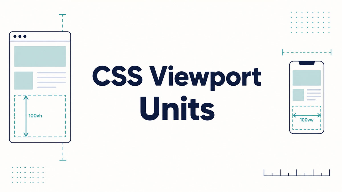
You set an element to 100vh, it looks perfect on your laptop, then a phone chops the bottom off. Welcome to CSS viewport units.
These relative length units size elements against the browser viewport instead of a parent container. One unit equals 1% of the viewport width or height.
They power full-height sections, fluid typography, and layouts that flex without a stack of media queries.
This guide breaks down every unit worth knowing:
- The classic four: vw, vh, vmin, and vmax
- The mobile fix: dvh, svh, and lvh
- Pairing them with clamp() for safe, accessible scaling
By the end, you will know which unit to reach for and which quirks to sidestep.
What Are CSS Viewport Units
CSS viewport units are relative length units that size an element as a percentage of the browser viewport. One unit equals 1% of the axis it references. The base set is vw, vh, vmin, and vmax, defined in the W3C CSS Values and Units Module.
These units read the visible browser window, not the document. So an element set to 50vw takes half the viewport width no matter where it sits in the markup.
Here’s the split between the three length families in CSS that people mix up constantly.
| Unit Type | References | Examples |
|---|---|---|
| Absolute | Fixed physical size | px, pt, cm |
| Font-relative | Root or parent font size | em, rem |
| Viewport-relative | The browser viewport | vw, vh, vmin, vmax |
A pixel stays locked to a device measurement. A viewport unit flexes the moment the window changes size.
That flex is why viewport units became a backbone of responsive design for full-height sections and fluid layouts.
Browser support runs deep. The classic four shipped in 2013, starting with Firefox and Chrome, then Safari and Opera close behind (DEV Community).
How Do Viewport Units Work
Each viewport unit resolves to 1% of one viewport axis, calculated live by the browser. 1vw is 1% of viewport width. 1vh is 1% of viewport height. The browser recalculates on every resize, orientation flip, and (mostly) on zoom.
MDN gives the cleanest example: on an 800px-wide viewport, 50vw resolves to 400px.
Scale that up. On a 1440px laptop screen, 50vw lands at 720px and 100vh fills the full window height.
Key distinction: viewport units read the window, percentages read the parent element. That single difference causes most of the confusion later on.
One catch worth flagging early. Desktop browser zoom does not change vw or vh, because the viewport width in CSS pixels stays the same when you zoom. That quirk turns into an accessibility problem for text sizing, covered further down.
What Are the Types of Viewport Units
The 4 classic viewport units are vw, vh, vmin, and vmax. vw maps to width, vh to height, vmin to the smaller side, and vmax to the larger side. Each equals 1% of its axis.
| Unit | Reads | Best For |
|---|---|---|
vw | Viewport width | Full-bleed layouts, fluid typography |
vh | Viewport height | Full-height sections |
vmin | Smaller viewport dimension | Square elements that must fit |
vmax | Larger viewport dimension | Elements that dominate the screen |
vw and vh
Width-based and height-based sizing:
- vw drives full-bleed banners and edge-to-edge sections
- vh drives hero blocks and split-screen layouts
100vwcarries a nasty quirk: on Windows it includes the scrollbar width, so it overflows past the visible area and triggers a horizontal scrollbar
The fix most developers reach for is width: 100% instead of 100vw when the element already spans the container.
vmin and vmax
vmin and vmax stay orientation-agnostic. vmin locks to whichever axis is shorter, vmax to whichever is longer.
Where they earn their keep: a square badge sized in vmin always fits the screen, portrait or landscape, because it tracks the shorter side.
vmax gets less use in production. It shines for background elements meant to dominate whichever axis is longest.
What Are Dynamic, Small, and Large Viewport Units
Dynamic, small, and large viewport units are svh, lvh, and dvh (plus their width counterparts svw, lvw, dvw). They fix mobile height bugs the classic vh unit never solved. svh assumes browser bars are showing, lvh assumes they are hidden, and dvh updates live as bars slide.
These arrived through Interop 2022, a joint push from Apple, Google, Mozilla, Microsoft, Igalia, and Bocoup (Terluin Web Design).
| Unit | Viewport State | Behavior |
|---|---|---|
svh | Smallest (browser UI visible) | Stable, never overflows |
lvh | Largest (browser UI hidden) | Equivalent to legacy 100vh |
dvh | Dynamic (current viewport) | Resizes as browser UI appears or disappears |
Support baseline: Chrome 108, Firefox 101, and Safari 15.4, per TestMu AI browser data.
One field note from a developer who shipped these to production. svh handles roughly 90% of layout needs, and dvh is worth reaching for only when you have a tested reason, since it can cause a layout shift mid-scroll (Medium, Tharunbalaji).
Why 100vh Broke on Mobile
100vh on mobile measured the viewport with the address bar hidden, even while the bar was visible on load.
The result: content and call-to-action buttons got cut off below the fold the second a user hit the page.
The old workaround: read window.innerHeight with JavaScript, write it into a --vh custom property, then multiply by 100 in CSS (CSS-Tricks).
Developers leaned on that hack for years. dvh replaced the entire thing with one native unit.
How Do Viewport Units Compare to Percentages
Percentages reference the parent container, viewport units reference the browser viewport. A child set to 50% reads its parent’s width. The same child at 50vw ignores the parent entirely and reads the window.
| Scenario | Percentage (%) | Viewport (vw/vh) |
|---|---|---|
| Reference point | Parent element | Browser viewport |
| Height with no parent height set | Collapses to 0 | Works correctly |
| Nested deep in markup | Compounds through the parent hierarchy | Remains relative to the viewport |
The height case trips people up most. height: 100% needs every ancestor to have a defined height, or it collapses.
height: 100vh skips that chain completely. It reads the window directly, no parent setup required.
How to Use Viewport Units for Fluid Typography
Fluid typography scales font size with vw so text grows smoothly across screen sizes without breakpoints. The catch is that pure vw text ignores browser zoom. The fix pairs vw with rem inside clamp() so text still responds to user zoom.
This is the most cited real-world use of viewport units, and the one with the sharpest accessibility trap.
The accessibility problem: a size like font-size: 4vw does not scale when a user zooms, because the viewport width in CSS pixels does not change with zoom.
That fails WCAG Success Criterion 1.4.4, which requires text resizable to 200% without loss of function (web.dev).
clamp() solves both the boundaries and the zoom issue at once. It sets a floor and ceiling, and the rem term inside the middle value keeps zoom working.
A working pattern for responsive typography:
font-size: clamp(1rem, 2.5vw + 1rem, 2rem)- The rem parts respond to zoom and to the user’s browser base font size
- The vw part drives the fluid scaling between the min and max
Accessibility expert Adrian Roselli surfaced this issue, and Max Barvian later ran the math on it. The rule of thumb: keep the max font size at or under 2.5 times the min, and the expression passes SC 1.4.4 in modern browsers (michelecheow.com).
clamp() itself has shipped in every evergreen browser since April 2020, so there is no support gap to plan around. A CSS clamp calculator handles the slope math if you would rather not do it by hand.
Fluid type also cuts down on media queries. One clamp() line can replace three to five breakpoint rules for a single element.
Still test at 200% zoom on a real page. Viewport-relative type that looks perfect on a laptop can quietly break web accessibility audits.
What Are the Common Problems With Viewport Units
The 3 recurring problems are scrollbar-induced horizontal overflow, the mobile 100vh cutoff, and zoom-breaking typography. Each has a known fix that ships in modern CSS today.
| Problem | Cause | Fix |
|---|---|---|
| Horizontal overflow | 100vw includes the scrollbar width on Windows | Use width: 100% |
| Mobile height cutoff | 100vh ignores the browser address bar | Use dvh or svh |
| Zoom-breaking text | Pure vw font sizes ignore user font scaling | Wrap the value in clamp() with rem |
The overflow bug is the sneakiest. It only appears on machines with a permanent scrollbar, so a Mac-only dev team can ship it without ever seeing it.
The zoom failure is the most serious. It breaks accessibility guidance that is legally required in many regions, not just a nice-to-have.
None of these are reasons to avoid viewport units. They are reasons to reach for dvh, svh, and clamp() instead of the raw classic units on layouts that matter.
How Do You Combine Viewport Units With clamp, min, and max
clamp(), min(), and max() wrap viewport units in fixed bounds so a fluid value never runs past a limit. min() sets a ceiling, max() sets a floor, and clamp() sets both at once. All three shipped across every major browser in April 2020.
| Function | Role | Example |
|---|---|---|
min() | Caps a value (maximum limit) | min(90vw, 1200px) |
max() | Sets a minimum value (floor) | max(50vw, 320px) |
clamp() | Combines a minimum, preferred, and maximum value | clamp(1rem, 2.5vw, 2rem) |
The naming trips people up. min() returns the smallest value you hand it, which is why it acts as a ceiling.
max() returns the largest, so it acts as a floor. Backwards from what the words suggest (ishadeed.com).
Cap a container width: width: min(90vw, 1200px) holds a layout at 90% of the viewport until it hits 1200px, then stops growing.
Set a hard floor: max(50vw, 320px) lets an element shrink to half the viewport but never drop under 320px.
Bound both ends: MDN’s own reference uses clamp(1.8rem, 2.5vw, 2.8rem) to keep a heading from getting too small in a narrow window or too big in a wide one.
One rule that saves accessibility headaches. Keep the fixed bounds in rem, not px, so browser zoom and the user’s base font size still take effect.
Viewport units inside min() and clamp() used to be the only way to make a component cap its own size against the screen. That was the container-aware sizing trick before container queries existed.
Container query units (cqw, cqi) now cover component-level scaling directly. They reached baseline support across Chrome, Firefox, Safari, and Edge in February 2023 (clampgen).
clamp() runs on more than 96% of browsers in use, so pairing it with viewport units is production-ready today (OpenReplay).
Which Browsers Support Viewport Units
The classic units vw, vh, vmin, and vmax work in every modern browser and have since 2013. The dynamic, small, and large set (dvh, svh, lvh) arrived later, landing in Chrome 108, Firefox 101, and Safari 15.4. Check Can I Use for exact version thresholds.
| Unit Set | First Full Support | Since |
|---|---|---|
vw, vh, vmin, vmax | Chrome 26, Firefox 19, Safari 6.1 | 2013 |
svh, lvh, dvh (plus svw, lvw, dvw) | Chrome 108, Firefox 101, Safari 15.4 | 2022 |
Edge, Opera, and Samsung Internet track the same Chromium rollout. The dynamic units shipped in Edge 108, Opera 94, and Samsung Internet 21, per TestMu AI browser data.
Can I Use is the reference to verify any specific version before you push to production.
Fallback strategy: declare the classic unit first, then the modern one on the next line. Browsers drop any value they cannot parse, so an older engine keeps vh while a current one applies dvh.
A minimal safe pattern for full-height sections:
min-height: 100vh;min-height: 100dvh;
Two legacy gotchas still worth knowing. Safari 6 and 7 ignore viewport units inside calc(), and no version of Internet Explorer supports the dynamic units at all (TestMu AI).
Emulators miss real mobile toolbar behavior, so cross-browser testing on actual devices stays the only reliable check for dvh and svh layouts.
FAQ on CSS Viewport Units
What are CSS viewport units?
CSS viewport units are relative length units that size elements against the browser viewport. One unit equals 1% of the viewport axis it references. The core set is vw, vh, vmin, and vmax.
What is the difference between vw and vh?
vw measures 1% of the viewport width. vh measures 1% of the viewport height. So 50vw is half the window’s width, and 100vh fills its full height.
What do vmin and vmax mean?
vmin equals 1% of the shorter viewport axis. vmax equals 1% of the longer one. They stay orientation-agnostic, which keeps square elements fitting the screen in both portrait and landscape.
Why does 100vh not work on mobile?
On mobile, 100vh measures the viewport with the address bar hidden, even while the bar shows on load. Content gets cut off below the fold. The dvh unit fixes this natively.
What is the difference between dvh, svh, and lvh?
svh assumes browser bars are visible (smallest height). lvh assumes they are hidden (largest, equal to legacy vh). dvh updates live as bars slide during scroll.
Are viewport units better than percentages?
Neither is better. Percentages read the parent container, viewport units read the window. Use vh for full-height layouts where no parent height exists, and percentages for sizing inside a defined container.
Can I use viewport units for font size?
Yes, vw scales text fluidly across screen sizes. Never use pure vw alone, though. It ignores zoom and fails accessibility. Wrap it in clamp() with a rem term instead.
Why does 100vw cause a horizontal scrollbar?
On Windows, 100vw includes the vertical scrollbar’s width, so the element overflows past the visible area and triggers a horizontal scrollbar. Use width: 100% when the element already spans its container.
Do viewport units respond to browser zoom?
Desktop zoom does not change vw or vh, because the viewport width in CSS pixels stays fixed. This breaks text scaling under WCAG 1.4.4 unless you pair viewport units with rem inside clamp().
Which browsers support viewport units?
The classic vw, vh, vmin, and vmax units work everywhere since 2013. The dynamic dvh, svh, and lvh units need Chrome 108, Firefox 101, or Safari 15.4. Check Can I Use before shipping.
Conclusion
CSS viewport units turn the browser window into a sizing reference, which is what makes them so useful for responsive design.
The classic vw, vh, vmin, and vmax units cover most layout work. The newer dynamic set closes the mobile gaps the old units left open.
Reach for dvh or svh on full-screen mobile sections. Pair vw with rem inside clamp() so text stays fluid without failing zoom.
Mind the two traps: the 100vw scrollbar overflow and the WCAG resize rule. Both have clean fixes.
Browser support is deep and stable, though a quick check on Can I Use never hurts before shipping.
Learn the four axes, respect the accessibility limits, and viewport units will handle almost anything you throw at them.

Many of his resources are available on various design marketplaces. Over the years, he's worked with a range of clients and contributed to design publications like Designmodo, WebDesignerDepot, and Speckyboy, Slider Revolution among others.
- What is Backend in Web Development? - September 13, 2026
- What is Frontend Development? - September 11, 2026
- How to Make a Button in Figma: Design Best Practices - September 10, 2026

