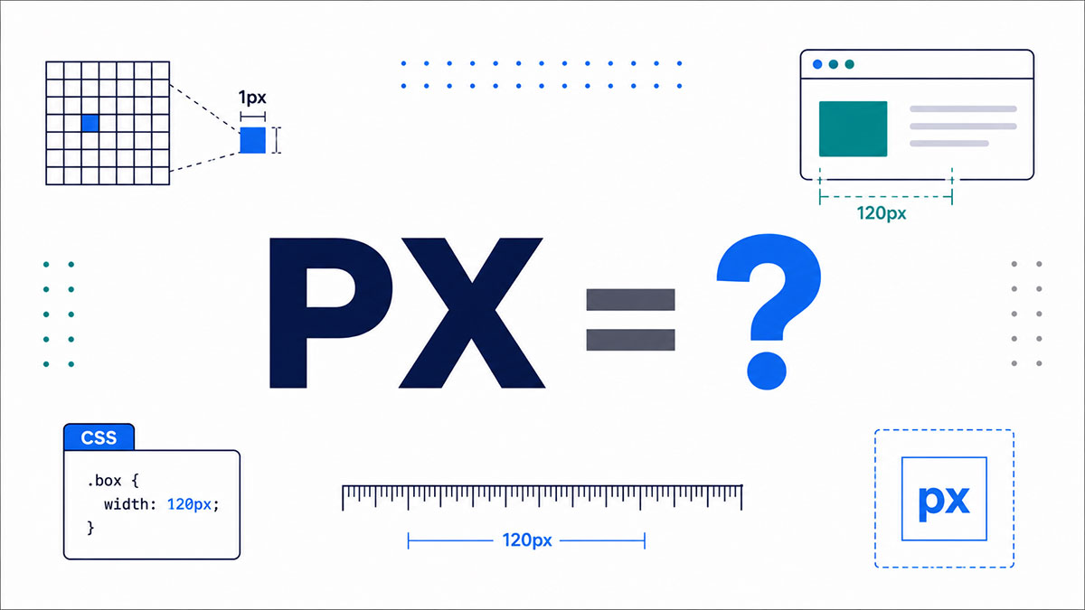
You’ve typed it a hundred times. font-size: 16px, margin: 8px, width: 320px. But stop for a second: what does px stand for, and why did two little letters end up running the whole layout?
Px stands for pixel, short for “picture element.” It’s the base length unit in CSS and the smallest dot your screen can address.
Simple on the surface. Then you hit Retina screens, device pixel ratio, and a CSS pixel that isn’t the same thing as a physical one.
This guide clears that up. By the end you’ll know:
- What a pixel means in CSS versus on hardware
- Why 96px always equals one CSS inch
- How px compares to rem, em, pt, and percent
- When to reach for px and when to skip it
Where the word came from, too. It starts at NASA.
What Does PX Stand For?
PX stands for pixel, short for “picture element.” It’s the smallest addressable unit on a digital screen and the base length unit in CSS. The abbreviation drops the vowels, squeezing “pixel” down to two letters.
You’ll see px almost everywhere a screen size gets written down.
- CSS rules like
font-size: 16px - Image dimensions such as 1920×1080 px
- Display specs and resolution charts
- Design tools like Figma, Photoshop, and Sketch, which measure in px by default
The word carries a bit of space history too. Per Wikipedia and a 1965 SPIE paper, the term “pixel” was first published that year by an engineer at NASA’s Jet Propulsion Laboratory.
One thing to keep straight from the start: px in CSS is not the same thing as a raw dot on your monitor. More on that split further down. If you want the ground-level version first, here’s the smallest unit of a digital image explained on its own.
What Is a Pixel in CSS?
A pixel in CSS is a length unit, written px, used to size fonts, widths, margins, borders, and padding. The number and unit join with no space, like width: 320px. Every major browser sets default body text to 16px.
Chrome, Firefox, Safari, and Edge all ship that same 16px baseline in their user agent stylesheet.
Bootstrap 5 leans on it too, setting body text to 1rem (roughly 16px) as its accessible starting point.
px sits in the absolute length group of the styling language behind every web page, alongside a handful of print-oriented units.
| Unit | Equals | Typical Use |
|---|---|---|
| px | 1/96 inch | Screen layout |
| pt | 1/72 inch | Print, PDF |
| in | 96px | Print stylesheets |
| cm | ~37.8px | Print output |
According to MDN and the W3C, px is the canonical unit here. Every other absolute unit gets defined in terms of it.
Is Px an Absolute or a Relative Unit?
Px is an absolute unit in the CSS spec, but its size anchors to a reference pixel, not a fixed physical dot. The CSS reference pixel equals 1/96th of an inch viewed at arm’s length. So 96px always equals one CSS inch.
The reference pixel: the visual angle of one pixel on a 96 DPI device at roughly 28 inches away (about 0.0213 degrees, per W3C).
The fixed ratio: 96 pixels per inch, locked in so layouts stop breaking across different monitors.
The governing spec: the CSS Values and Units Module Level 4 defines px as the visual angle unit.
The W3C CSS Working Group formalized 96 PPI back in CSS2.1 (2011). Too much existing content had already been built assuming that number, so they made it the standard.
This is why how many pixels fit in an inch has a clean answer on screen (96) but a messier one once you start measuring actual glass.
How Does a CSS Pixel Differ From a Device Pixel?
A CSS pixel is a logical unit browsers use for layout. A device pixel is a physical dot on the panel. Device pixel ratio maps between them. On standard screens 1 CSS px equals 1 device pixel. On Retina screens it covers 4 or 9.
CSS pixel: abstract, resolution-independent, the value your media queries and breakpoints actually respond to.
Device pixel: concrete hardware, the raw dot count baked into the display.
Apple kicked off the split in 2010. The iPhone 4 doubled pixel count in both directions and introduced Retina at 2x, so old sites still rendered at the same logical size.
Modern iPhones now run at 3x. The iPhone 17 hits 460 PPI, and the 2024 MacBook Pro 14 and 16-inch panels run at 254 PPI (Apple specs).
On the desktop side, StatCounter data for 2026 puts 1920×1080 at roughly 55% market share, where a CSS pixel and a device pixel usually line up one to one.
The <meta name="viewport"> tag controls this mapping on mobile. If you’re fuzzy on that layer, here’s the viewport broken down, plus how pixel density and screen resolution feed into it.
What Is Device Pixel Ratio?
Device pixel ratio (DPR) is physical pixels divided by CSS pixels. Read it in JavaScript with window.devicePixelRatio.
| Display | DPR | 1 CSS px Covers |
|---|---|---|
| Standard monitor | 1 | 1 device pixel |
| iPad, older Retina | 2 | 4 device pixels |
| iPhone Pro, Pixel | 3 | 9 device pixels |
DPR is why you serve 2x and 3x image assets through srcset, and why it matters for layouts that adapt across devices.
How Does Px Compare to Em, Rem, Pt, and Percent?
Px is fixed to the reference pixel. Em and rem scale with font-size, percent scales with the parent, and pt is a print unit at 1/72 inch. Rem references the root element. Em references the current element’s parent.
| Unit | Anchored To | Scales With |
|---|---|---|
| px | Reference pixel | Nothing (fixed) |
| rem | Root font-size | The html element |
| em | Parent font-size | Nearest parent |
| % | Parent value | Parent element |
The em trap is compounding. Nest a few 1.25em elements and the text quietly balloons, since each level multiplies the last.
Rem sidesteps that by always pointing at the root. At a 16px root, 1rem is 16px and 1.5rem is 24px, full stop.
pt mostly shows up in print stylesheets, not screen work. If you’re weighing the two type units against each other, here’s em versus rem in detail, and a quick way to convert px to points.
Px to Rem Conversion
Divide the px value by the root font-size (usually 16) to get rem.
- 24px = 1.5rem
- 12px = 0.75rem
- 8px = 0.5rem
PostCSS plugins and Sass functions handle this in a build step. For the reasoning behind picking one over the other, see px vs rem and what the rem unit actually does.
When Should You Use Px Instead of Relative Units?
Use px for 1px borders, box-shadow offsets, and fixed icon sizes where scaling ruins the visual. Avoid px on body font-size, since it can ignore user font preferences. WCAG favors relative units for text so people can resize content.
Reach for px: hairline borders, shadow offsets, precise icon dimensions, and media query breakpoints (though plenty of teams now use em breakpoints instead).
Skip px: body copy and headings, where a hard pixel value pins text at one size no matter what the reader sets.
WCAG 1.4.4 Resize Text says content must survive 200% zoom without breaking. That’s the whole case for relative type.
The gap is real. Per the A11Y Collective, sites built on rem show around a 98% pass rate on resize tests, while fixed-pixel type can fail 40 to 70% of the time.
My own rule: px for structure, rem for type. That covers web accessibility on the text side, keeps accessible typography intact, and still lets media queries hold precise breakpoints.
Where Did the Pixel Come From?
The word pixel was first published in 1965 by Frederic C. Billingsley at NASA’s Jet Propulsion Laboratory. He used it to describe picture elements in images sent back from Moon and Mars probes. Pixel blends “pix,” a 1932 slang term for pictures, with “element.”
Billingsley didn’t invent the word outright. He picked it up from Keith E. McFarland at General Precision, who said it was simply “in use at the time” around 1963.
The underlying idea is older still. A “picture element” shows up as far back as Paul Nipkow’s 1888 German television patent, listed there as “Bildpunkt.”
For a couple of decades pixel stayed a niche term in image processing and computer graphics. It only went mainstream once personal computers and, later, the browser era pulled it into everyday layout work, where the W3C eventually pinned it to that 96 px per inch reference.
How Is Px Used Outside of Web Design?
Outside CSS, px counts the actual dots that make up an image, a screen, or a print job. Photo dimensions, monitor specs, camera sensors, and design canvases all measure in pixels. One megapixel equals 1,000,000 pixels, so the same base unit scales from a favicon to a billboard.
A photo listed as 1920×1080 px is just stating its width and height in pixels.
Screen resolution specs work the same way. 4K UHD is 3840×2160 px, roughly four times the pixel count of 1080p (Wikipedia).
| Format | Pixels | Megapixels |
|---|---|---|
| Full HD (1080p) | 1920 × 1080 | ~2.1 MP |
| 4K UHD | 3840 × 2160 | ~8.3 MP |
| 24MP camera | 6000 × 4000 | 24 MP |
Print flips the priority from raw count to density, measured in pixels per inch.
Photo print: 300 PPI is the standard target for sharp output, per most print labs.
Screen: older displays sat near 72 PPI, though modern panels run far higher.
Large format: billboards drop as low as 10 to 72 DPI, since viewers stand meters back.
The math is simple: print size equals pixels divided by density. An 8×10 inch photo at 300 PPI needs about 7.2 MP, while a 16×20 print jumps to roughly 29 MP (toolstud.io).
Camera history shows how far the unit has stretched. The first camera phone, Sharp’s J-SH04 in 2000, captured just 0.11 MP. Today’s flagships pack 48 to 108 MP.
Design tools keep px as the native ruler. Figma, Adobe Photoshop, and Sketch all default to pixel measurements, which keeps handoff to CSS clean.
If the print side is where you get tripped up, these break it down further: pixels per inch, dots per inch, the 300 DPI print standard, and how aspect ratio shapes the frame. There’s also a quick way to turn a px value into inches when you’re prepping a file for print.
FAQ on What PS Stands For
What does px stand for?
Px stands for pixel, itself short for “picture element.” It’s the base length unit in CSS and the smallest addressable dot on a digital screen. The two letters simply drop the vowels from “pixel.”
Is px the same as a pixel?
Yes and no. Px is the written abbreviation for pixel. In CSS, though, one px is a logical reference pixel, not always one physical dot on the display, especially on high-density screens.
What does px mean in CSS?
In CSS, px is a length unit used to size fonts, widths, margins, borders, and padding. You write it with no space, like font-size: 16px. It belongs to the absolute length group.
Is px an absolute or a relative unit?
Px is an absolute unit per the CSS spec. Its size anchors to a reference pixel defined as 1/96th of an inch at arm’s length, so 96px always equals one CSS inch.
How many px are in an inch?
Ninety-six. The W3C locked 96px to one CSS inch back in CSS2.1 (2011). On screen that ratio is fixed, though a physical inch on glass can differ by device.
What is the difference between px and rem?
Px is fixed to the reference pixel. Rem scales with the root font-size, usually 16px. So 1rem equals 16px by default, but it grows when a user bumps their browser font setting.
Is a CSS pixel the same as a device pixel?
No. A CSS pixel is logical; a device pixel is a physical dot. Device pixel ratio maps them. On a Retina screen at 3x DPR, one CSS px covers nine device pixels.
What is the default font size in px?
px. Chrome, Firefox, Safari, and Edge all set body text to 16px in their default stylesheet. Frameworks like Bootstrap 5 build on that same baseline for readable copy.
Should I use px or rem for font size?
Use rem for text so it respects user preferences and passes WCAG resize rules. Keep px for borders, shadows, and icon sizes, where a fixed value protects the visual.
What does px stand for in image size?
The same thing: pixels. A photo listed as 1920×1080 px states its width and height in pixels. One megapixel equals 1,000,000 pixels, so 4K UHD (3840×2160) is roughly 8.3 MP.
Conclusion
So what does px stand for? Pixel, short for “picture element,” and now you know it runs deeper than a two-letter unit in a stylesheet.
The CSS pixel is a logical reference, pinned at 1/96th of an inch. Device pixels are the physical dots underneath, and device pixel ratio bridges the two.
That gap is why a Retina screen renders one CSS px across four or nine dots.
Keep the working rules close:
- Use px for borders, shadows, and icon sizes
- Reach for rem on type, so text scales with user settings
- Watch the device pixel ratio when serving 2x and 3x assets
From a 1965 NASA lab to your media queries, the pixel still measures the screen.

Many of his resources are available on various design marketplaces. Over the years, he's worked with a range of clients and contributed to design publications like Designmodo, WebDesignerDepot, and Speckyboy, Slider Revolution among others.
- What is Backend in Web Development? - September 13, 2026
- What is Frontend Development? - September 11, 2026
- How to Make a Button in Figma: Design Best Practices - September 10, 2026

