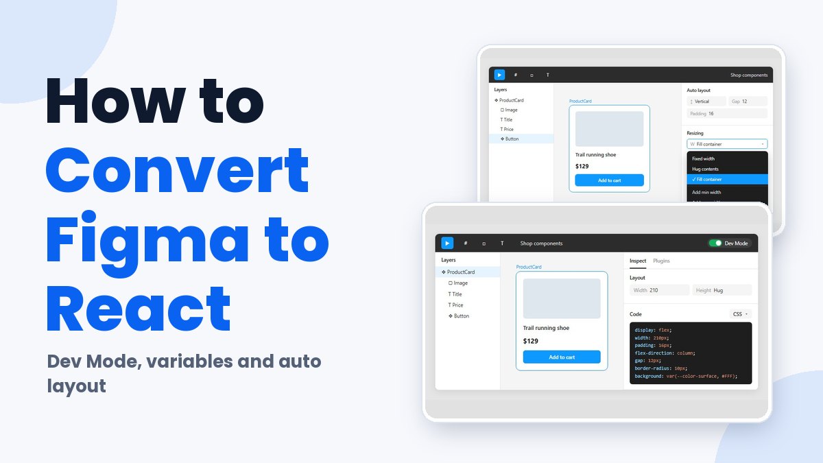
Converting Figma to React comes down to one mapping. Frames become components and variant properties become props, while Figma variables go into the codebase as design tokens.
Code gets there four ways: written by hand from Dev Mode specs, exported through a plugin, produced by a code-generation platform, or written by an AI client connected to the Figma Dev Mode MCP server.
Figma’s 2018 write-up on its own React converter is blunt about the limit. A converted frame gives you a static component, and React doesn’t add much over plain HTML and CSS until functional code gets attached to it.
So the work splits in two. Tools generate layout and styling as a starting point. Behavior is still written by developers.
The Main Paths From a Figma File to React Code
Most teams end up choosing between writing it by hand from Dev Mode specs, exporting with a plugin, using a code-generation platform, or letting an AI coding tool pull from the Figma Dev Mode MCP server.
- Manual builds mean reading specs in Dev Mode and writing JSX and styles by hand.
- Plugin export uses Anima or the open-source Figma to Code plugin to output component files from a selection.
- Locofy and Builder.io Visual Copilot are code-generation platforms that add component mapping on top.
- With MCP, an editor agent pulls design context from Figma and writes components against your codebase.
Dev Mode on its own doesn’t produce a project. According to the help center, it fills a Code section with autogenerated snippets for the selected layer, and a dropdown switches the language or adds a codegen plugin.
Anything that reads a file programmatically goes through the Figma REST API, which exposes nodes, styles and variables. Whichever path you pick, it’s reading the same file structure.
Which makes the handoff the thing that actually varies. Clear conventions for how designers pass files to developers help every path, though none of them gets rid of the cleanup pass.
How to Prepare a Figma File for React Conversion
The tool matters less than the file it reads. How clean the output comes out depends mostly on Auto Layout and on whether colors and spacing are bound to variables.
Have you seen the latest Figma statistics?
Discover comprehensive Figma statistics including revenue growth, market share, user demographics, and funding data.
Check them out →Auto Layout is the only part of a frame that carries real layout intent, meaning direction, gap, padding and resizing. Frames without it give a generator raw coordinates, which is how absolute positioning ends up in the output.
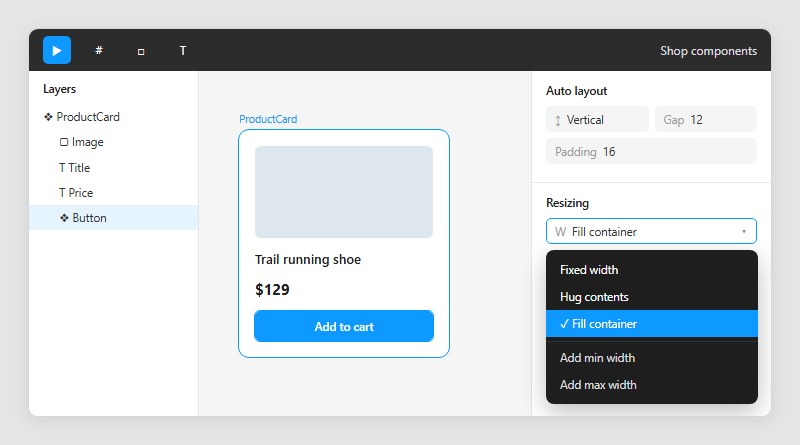
Resizing in Figma comes down to hug contents, fill container or fixed size, with minimum and maximum limits on top. One rule catches people out. When any child is set to fill, the parent frame stops hugging and turns fixed on that axis (Figma Help Center).
Audit those frames before converting, because the code mirrors whatever the panel says. A walkthrough of setting up Auto Layout frames covers the resizing options in detail.
- Layer names should say what the thing becomes (ProductCard, not Frame 214).
- Repeated UI belongs in components, with variants for hover, disabled and the like.
- Text, icons and toggles can be exposed as component properties.
- Colors, spacing and type should point at variables, not raw values.
Component structure matters next, since variant sets and component properties turn into props later. Following component best practices keeps those sets from sprawling into near-duplicates.
Variables come last. Figma has four variable types (color, number, string and boolean), and a layer bound to a variable shows up in a code snippet as a token. A layer with a raw hex value shows up as a one-off literal.
How to Convert a Figma Frame to React Manually With Dev Mode
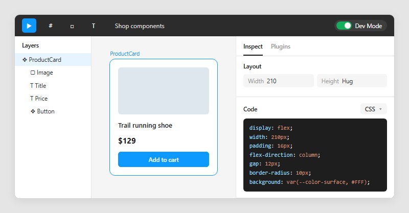
Doing it by hand means reading specs in Dev Mode and writing JSX and styles one frame at a time. It’s slow per screen, but the code comes out cleanest.
- Create the project shell. Vite works for a client-side React app, and Next.js is the pick when you need routing and server rendering.
- Switch the Figma file to Dev Mode and select the frame. The Inspect tab lists layout, color, typography, text strings, component properties, styles and variables.
- List the components inside the frame (cards, buttons, nav items) and the layout that holds them.
- Write the JSX with semantic elements such as header, nav and button, and give each component props that match its Figma variants.
- Copy values from the Code section, swapping raw numbers for variables wherever the panel shows one.
- Export icons and images, then compare the rendered page against the frame at the same width.
As of October 2026, the Code section does not appear when copying and sharing are disabled on the file, per Figma’s help center. A locked-down file blocks this path outright.
The inspect panels get a fuller tour in this Figma Dev Mode guide.
Manual work earns its time on design-system components and shared UI. It’s a poor trade for dozens of one-off marketing pages.
How Do Figma Variants Map to React Components and Props?
One Figma component becomes one React component, and its component properties turn into props. The table below shows how each property type lands in code.
Mapping variants to props
A variant property with the values Primary and Secondary becomes a TypeScript string union, and that union is effectively the contract between design and code.
| Figma property | React prop | Example |
|---|---|---|
| Variant | String union | variant: primary or secondary |
| Boolean | Boolean | disabled: true or false |
| Text | String or children | label |
| Instance swap | Element or component | icon |
Property names in Figma carry spaces and capitals, so expect to rename them to camelCase on the way into code.
One gap sits in Figma itself. As of October 2026, boolean component properties only control layer visibility. The help center lets you apply an existing boolean variable when you create a boolean property, but for any other on/off state the usual route is still a variant property with two values, true and false, built like any Figma variant set. Code Connect’s figma.boolean helper maps that kind of variant to a real boolean.
Connecting existing components with Code Connect
Code Connect replaces Figma’s autogenerated snippets with code from your own design system.
Figma’s Code Connect docs list it for a Dev or Full seat on the Professional, Organization and Enterprise plans, and Professional plans are limited to one active library and one active framework. The @figma/code-connect README still says Organization and Enterprise only, so check the docs for your plan.
In a React file, a few helpers do the mapping.
- figma.connect ties a React component to a Figma component URL.
- figma.enum maps variant options to code values, using the exact option names as written in Figma.
- figma.boolean normalizes Yes/No and True/False variants to true and false.
Code Connect files are never executed. Ternaries and conditionals print verbatim in the snippet, and figma.connect calls cannot be built inside a loop, according to Figma’s developer docs.
Check the docs before starting a new setup. The React guide now sits under legacy integration guides, parser-based setups no longer receive updates, and template files are the maintained route. Code Connect for React also runs alongside existing Storybook files.
How to Move Figma Variables and Styles Into CSS, Tailwind, or styled-components
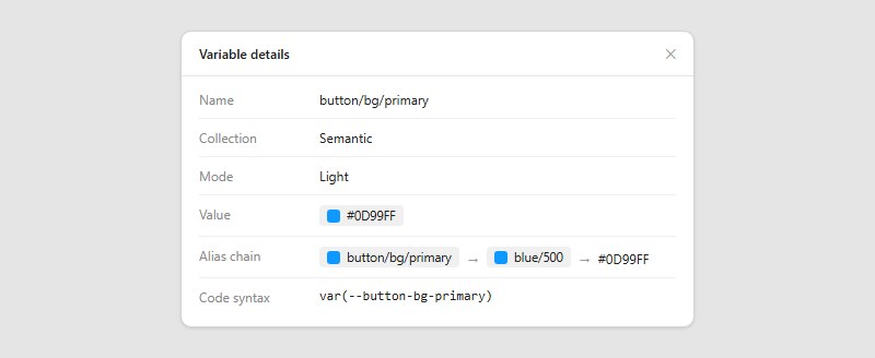
Export the variables as design tokens, transform them into CSS custom properties, then point your styling layer at those properties. Which styling layer you pick changes the syntax and nothing about the token pipeline.
Dev Mode already shows variables in its code snippets. The Variable details modal lists the name, collection, mode, value and alias chain, and Dev Mode adjusts names so they stay valid CSS (Figma Help Center).
Modes are what make themes work. One collection holds light and dark values, and a primer on how Figma variables are organized covers collections and aliasing.
Past a handful of tokens, copying by hand gets old fast, and there are other ways to get variables out of the file.
- Dev Mode copy is fine for a few values and tedious for a full palette.
- Tokens Studio for Figma imports Figma variables, stores tokens as JSON, and syncs them to remote storage such as GitHub or GitLab.
- The Variables REST API returns collections programmatically, though Figma’s REST API docs require a Full seat in an Enterprise organization.
Style Dictionary then turns token files into platform output. Its documentation treats tokens as platform-agnostic input, and the css/variables format writes a :root block of custom properties (LogRocket walks through the setup).
REI’s Cedar tokens repository builds its tokens this way, with Style Dictionary v4 reading JSON files split into global, platform and theme folders.
For Tailwind, the documentation defines tokens as theme variables written with the @theme directive. A variable such as –color-mint-500 creates utilities like bg-mint-500, and Tailwind also emits a regular CSS variable for it.
Plain :root variables stay the right place for values that should not become utilities, and theme variables must sit at the top level. If the project is new to Tailwind, setting up Tailwind CSS in React comes first.
CSS Modules and plain CSS read the same properties through var(–color-brand). styled-components do the same inside template literals, so the token files stay untouched when the styling library changes.
Generated styles are where tokens leak out. A layer with no bound variable exports a raw value, and Figma’s suggested variables feature exists to flag exactly those cases, so a raw hex left in a component will never follow a theme change made in Figma.
Turning Auto Layout, Constraints, and Assets Into Responsive React
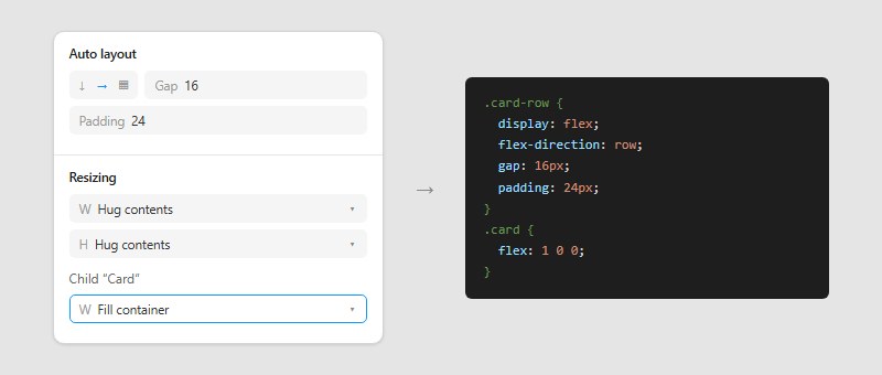
Auto Layout converts to flexbox almost one to one. Constraints need hand-written rules, and exported assets reach React as SVG or raster files.
Auto Layout to flexbox and grid
Dev Mode translates Auto Layout frames into flexbox code, according to LogRocket’s design-to-code analysis. Two sibling rectangles without Auto Layout produce no code that relates them, so the browser stacks them.
- A horizontal flow becomes a flex row and a vertical flow becomes a flex column.
- Gap and padding both land on the container, not on the children.
- Hug contents makes the element size itself to its children.
- Fill container turns into flex-grow on the child, so it takes the free space of its parent.
- Fixed means an explicit width or height.
Figma also added a grid flow to Auto Layout, which launched in open beta in 2025. It suits bento boxes and dashboards, and the help center adds editorial layouts to that list.
Older write-ups, LogRocket’s included, say design tools barely support grid. Check what your converter emits for a grid frame before you rely on it.
Constraints are a separate mechanism. Figma’s help center lists left, right, left and right, center and scale for the horizontal axis, with top and left as the default, and they only describe how a layer responds when its frame resizes.
CSS has no direct counterpart, so a converter turns constraints into percentages, max widths or fixed offsets. None of those say where a layout should reflow, which is the job of media query breakpoints.
That is why separate mobile and desktop frames end up as breakpoint rules. Anima’s blog points to a breakpoints feature in its plugin for exactly this case, where one screen has several layouts.
Exporting icons and images
Icons go out as SVG and photos as JPG. Anything that needs transparency goes out as PNG.
Figma’s export formats article covers PNG, JPG, SVG and PDF. PNG compresses losslessly and keeps transparency but produces much larger files than JPG, which is lossy and cannot hold transparency.
Knowing how SVG and PNG differ settles most choices, since vectors suit icons and logos and pixels suit photographs.
SVG export has its own switches. The help center lists options to include id attributes, outline text and simplify strokes.
SVGR then turns the exported file into a React component. Its README runs the CLI with the icon flag and swaps the fill color for currentColor, so the component inherits color from CSS and sizes itself at 1em.
Which Plugins Generate React Code From Figma?
Anima, Locofy, Builder.io Visual Copilot and the open-source Figma to Code plugin cover most of what people reach for. They differ less in output than in how they connect to your own components.
Anima runs inside Dev Mode and outputs React, Vue or HTML with CSS, SCSS, Tailwind or styled-components, according to its documentation. Its code settings also let you choose between JavaScript and TypeScript.
On the plus side, it builds responsive code from Auto Layout and hands it over as a zip download or a CodeSandbox preview, right where developers already inspect designs. The downsides are that it’s billed separately from Figma, as Anima’s forum team confirms, and that AIMultiple’s June 2026 benchmark says the output often needs significant manual refinement.
Vendor and tester disagree on how finished the output is. Anima’s documentation describes pixel-perfect, runnable code, while AIMultiple says production use still needs refinement. The gap probably comes from what each one measures, which is time to a first draft versus time to a merged component.
Locofy generates code for React, Next.js, Gatsby, Vue, Angular and HTML and CSS on the web, and for Flutter, React Native, Swift and Jetpack Compose on mobile. Importing custom components works for React, Next.js, Angular, React Native, Swift, Jetpack Compose and Gatsby, through its CLI or a GitHub repository (Locofy docs).
The upside is that LocoAI maps your components to their Figma counterparts and wires props automatically. The catch, as of October 2026, is that mapping custom components is limited to Enterprise plans and legacy annual self-service subscriptions, and the monthly Free, Hobby and Pro plans do not include it.
Visual Copilot from Builder.io pairs the open-source Mitosis compiler with a fine-tuned model. It outputs React, Vue, Svelte, Angular, Qwik, Solid, React Native or HTML, styled with CSS, Tailwind, Emotion, Styled Components or Styled JSX (Builder.io blog).
Component mapping ties Figma components to your code components, and a CLI reads your codebase to match its patterns. Its published demo maps Material UI’s Figma components to MUI React components. The cost is an account, since installing the plugin is free but the full pipeline needs a Builder.io account.
Then there’s Figma to Code, a free, open-source plugin that outputs HTML, React (JSX), Svelte, styled-components, Tailwind, Flutter and SwiftUI. Its README says it handles Auto Layout as well as mixed flow and absolute positioning, and that it shows warnings when a detail does not translate cleanly. It does not connect to a codebase, so it cannot map your existing components.
Work from the JSX output when you can. If you start from the HTML tab, an HTML-to-JSX converter handles the attribute renames.
Pick by how well a tool connects to your components, not by its framework list.
How Does the Figma Dev Mode MCP Server Generate React Code?
It hands an AI coding client structured design data for a frame you link or select, and the client writes the component. The default output from get_design_context is React with Tailwind, and a prompt can switch the framework or point the client at your own component folder. Figma describes that default as a React-and-Tailwind-style reference format the agent adapts to your stack, not finished code.
Figma hosts a remote server at mcp.figma.com/mcp, which Figma’s docs and AIMultiple’s June 2026 benchmark both treat as the recommended setup.
The desktop server runs locally at 127.0.0.1:3845/mcp and is the only one that reads your current selection. The remote server needs a link to the frame.
- get_design_context returns layout, styles and code for the selected layer.
- get_variable_defs lists the variables and styles in use, such as colors, spacing and type.
- get_metadata gives a sparse XML outline with layer IDs, names, types, positions and sizes.
- get_code_connect_map shows which code components your Figma components map to.
Older tutorials call the main tool get_code, while Figma’s current developer docs list get_design_context.
Figma’s MCP guidance calls Code Connect the best way to get consistent component reuse. AIMultiple describes what goes wrong without it, where the agent regenerates a Button from scratch instead of using the one in src/components/ui.
Rate limits decide how much you can convert in a day. As of October 2026, Figma’s developer docs cap read tools by seat and plan.
- A Full or Dev seat on an Enterprise plan gets 600 tool calls a day.
- A Full or Dev seat on a Professional, Organization or Education plan gets 200 tool calls a day.
- The Starter plan and View and Collab seats get 20 tool calls a month.
Per-minute caps apply on top (10 a minute on Professional, 15 on Organization, 20 on Enterprise), and Figma reserves the right to change all of them.
Large frames fail in one specific way. Figma’s implement-design skill says output can come back truncated when a design has too many nested layers, and the fix is to pull the layer tree with get_metadata, then request single nodes with get_design_context.
Where Does Generated React Code Fall Short?
It’s a first draft. AIMultiple converted a homepage and a dashboard through Figma’s MCP server in Cursor in 2025, and both needed additional developer work to reach final specifications.
The firm’s June 2026 update widens the point, saying most design-to-code tools produce functional code that still needs review before production.
- Clickable frames need a check to confirm they became real buttons or links, not styled divs.
- Layout and styling convert, but complex business logic still needs manual development (AIMultiple).
- Figma’s own implement-design skill tells agents to prefer existing components and the project’s design system over literal replication of the file.
Radix’s accessibility docs spell out the cost of a div-built button. You add attributes so screen readers and voice tools know what it is, then re-implement the interactions a real button gives for free.
Radix Primitives handle aria and role attributes, plus focus management and keyboard navigation, following the WAI-ARIA authoring practices. Replacing generated div controls with accessible interface components built on them fixes the whole class of problem, and shadcn/ui wraps those same primitives with Tailwind styling (OpenReplay).
Keyboard order, focus visibility and labels are worth checking against a web accessibility checklist before merging.
Sources disagree on interactivity. Anima’s help center mentions stateful interactivity and Locofy’s marketplace listing describes converting prototype actions into navigation and popups, while AIMultiple says application logic stays manual.
The likely reason is scope. Vendors describe UI-level behavior, and AIMultiple’s caveat covers application logic.
Generated code is fine for the repetitive, low-risk parts. Anything stateful or accessible is better written by hand.
Which Figma to React Method Fits Your Project?
Match the method to the codebase you already have. Small component libraries do well with manual builds. Plugins fit one-off pages. Platforms pay off for teams that can use component mapping, and the MCP server mostly makes sense once a design system is already mapped with Code Connect.
| Method | Best fit | Main limit | Access needed |
|---|---|---|---|
| Manual with Dev Mode | Design-system components | Time per screen | File with copying enabled |
| Plugin export | One-off pages, prototypes | Output needs refinement | Plugin account, billed separately for Anima |
| Code-generation platform | Many screens, mapped components | Mapping gated by plan | Vendor plan, Enterprise for Locofy mapping |
| MCP with an AI client | Mapped design systems | Rate limits per seat | Full or Dev seat |
The fastest generator isn’t always the cheapest path. Review time belongs in the estimate, and a hand-built shared button beats patching ten generated copies of it.
Plan limits matter as much as tool quality. According to Figma’s pricing FAQ, a Full seat includes Dev Mode and a Dev seat gives full Dev Mode access, while a Collab seat gets basic inspection only.
Weigh that against what the free and Professional plans include before committing a team to the MCP route.
A hybrid works for most teams. Generate the first pass of a page, then rebuild the repeated pieces as mapped components so the next export reuses them.
Teams with an established design system get the most from that second step, since mapped components are what the generators reuse.
Figma to React Conversion FAQ
Can Figma export React code without a plugin?
Partly. Dev Mode shows autogenerated snippets for a selected layer, not a project.
The Figma MCP server returns React with Tailwind by default, but it works through an AI coding client, not from the Figma interface itself.
Does Figma to React conversion work for React Native?
Yes. Code Connect covers React Native components, and Locofy and Builder.io Visual Copilot both list React Native output.
Plain CSS output from a web-focused plugin does not carry over, because React Native styles components with style objects.
Can Figma prototype interactions become React state?
Not by default. Figma’s own React converter listed prototype links and hover states as future work, and it kept behavior in separate hand-written files.
Some commercial tools claim to map prototype actions to navigation, so test one sample flow before trusting it.
Should converted components use JavaScript or TypeScript?
TypeScript, whenever the design has variants. A variant property becomes a string union, and only TypeScript enforces it.
Anima’s Dev Mode plugin lets you choose between JavaScript and TypeScript.
Which project setup suits converted components, Vite or Next.js?
Either works. Converted components are plain React, so the shell can change later without redoing the conversion.
Locofy lists Next.js as a target, and Builder.io Visual Copilot accepts Next.js as a framework preference, so neither choice locks you out of generation.
Keeping React Components in Sync With Figma Changes
Sync holds up when generated code and hand-written code live in separate files, so a re-export never overwrites a fix. Figma’s own React converter worked this way, regenerating design files on every change while leaving developer-edited files untouched.
Converted output reliably needs developer edits, so those edits need a home that regeneration cannot reach.
Layers react differently to a design change, so maintenance goes in a rough order.
- Start with design tokens, since one value change reaches every component.
- Mapped components are next, because prop mappings absorb variant changes.
- Regenerated layout wrappers can wait, since they’re disposable by design.
The cost is a wrapper layer, meaning one extra file per generated component to hold behavior and accessibility fixes.
Teams that keep this split are effectively running a design system, and design system best practices are the next area to tighten.

Many of his resources are available on various design marketplaces. Over the years, he's worked with a range of clients and contributed to design publications like Designmodo, WebDesignerDepot, and Speckyboy, Slider Revolution among others.
- How to Convert Figma to React [Step-by-Step] - November 6, 2026
- How to Insert Image in Figma With Ease - November 3, 2026
- How to Download Figma Files Fast and Free - October 30, 2026