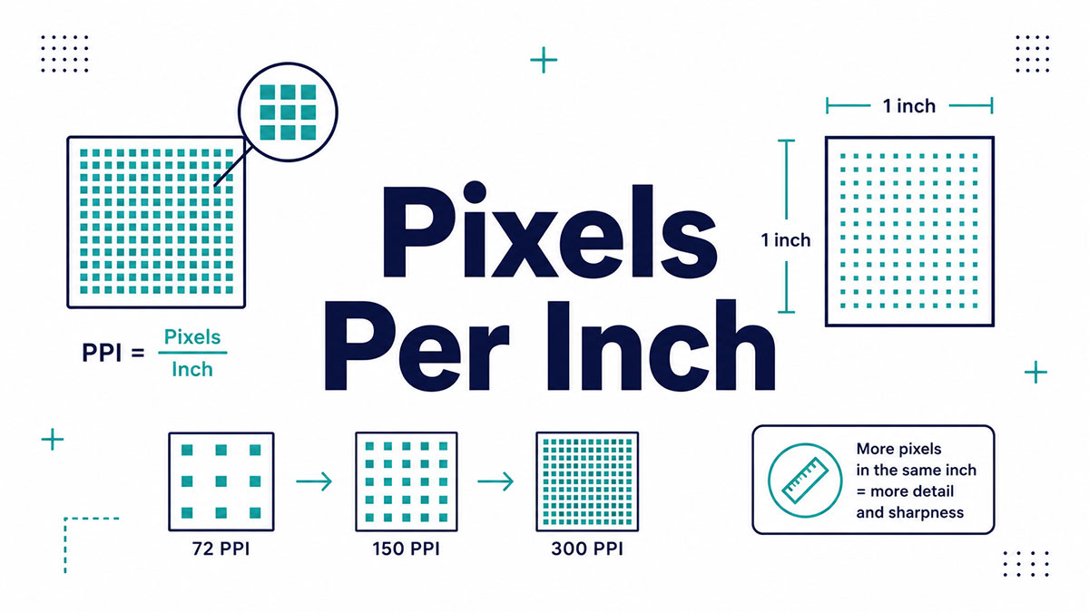
Ask a designer how many pixels in an inch, and you won’t get one number back. You’ll get a question in return: on a screen, or on paper?
That’s because pixel density isn’t fixed. It shifts with the device and the output.
A web browser assumes 96 pixels per inch. A print shop wants 300. An old Mac used 72. Same inch, wildly different counts.
Get this wrong and your images turn blurry, your files bloat, or your print job comes back pixelated.
This guide breaks down the whole thing:
- What PPI actually measures
- How PPI differs from DPI
- The formula to calculate it yourself
- Why 96 rules the web and 300 rules print
- Converting pixels to inches without the guesswork
By the end, you’ll know exactly which number to use, and when.
How Many Pixels Are in an Inch?
There is no single fixed number. The count of individual pixels in one inch depends entirely on the pixel density of the screen or image you’re measuring.
Three reference points cover almost everything:
- 96 pixels per inch for web and CSS rendering
- 300 pixels per inch for high-quality print
- 72 pixels per inch as a legacy typography value from early Macs
The W3C CSS specification fixed 1 inch to 96 CSS pixels back in CSS2.1 (2011), so a 1920-pixel-wide image renders at exactly 20 inches on a standard screen.
Same inch. Different pixel counts. A phone packs 400 to 500 pixels into that inch. A 27-inch 1080p monitor squeezes in about 82. The physical distance stays identical while the pixel math shifts completely.
One thing worth flagging early: physical pixels (the hardware dots) and reference pixels (the CSS unit) are not the same thing on modern high-density screens. Mixing them up is where most blurry-asset headaches start.
What Is Pixels Per Inch (PPI)?
Pixels per inch is the number of pixels along one linear inch of a physical display or digital image. PPI describes density, not total resolution. Higher PPI means smaller, tighter pixels and sharper detail packed into the same physical space.
Density, not headcount. A 4K screen and a 1080p screen can have wildly different PPI at the same physical size, because density measures how crammed the pixels are, not how many exist overall.
The metric applies to two separate things:
- Screens, where PPI describes how sharp the panel looks
- Raster images tagged for print output, where PPI controls physical print size
Croma reports that flagship smartphones now push past 400 PPI, while typical phones sit somewhere between 250 and 500 PPI. Once you climb above roughly 400 PPI at arm’s length, the human eye stops noticing the difference. The pixels are already invisible.
Samsung’s Galaxy S6 hit 577 PPI on a QHD panel, nearly double the iPhone 6’s 326 PPI at the time. Both looked razor-sharp in the hand, which tells you something about diminishing returns.
What Is the Difference Between PPI and DPI?
PPI refers to pixels on a screen or in a digital image. DPI (dots per inch) refers to the ink dots a printer physically sprays onto paper. Same-sounding metrics, two completely different stages of the pipeline.
| Term | Measures | Where It Is Used |
|---|---|---|
| PPI | Pixels per inch | Digital images and display screens |
| DPI | Ink dots per inch | Printed output from printers |
Here’s the part that trips people up. Your design software (Photoshop, Illustrator, Canva) labels the resolution field “DPI” even though it’s actually measuring pixels in the file. Adobe itself has moved toward the correct PPI terminology, but the old label persists everywhere.
One pixel is not one dot. A printer often lays down several ink dots through dithering to reproduce a single image pixel, which is why a 300 PPI image might print on a 1440 DPI machine. The numbers don’t match because they’re measuring different things.
Printing Center USA sums the confusion up cleanly: 96 DPI describes a standard screen, 300 PPI describes a print-ready image, and they aren’t interchangeable even when the raw numbers look comparable. If you want the deeper breakdown, the full comparison between DPI and PPI covers every edge case.
How Do You Calculate PPI?
PPI equals the diagonal pixel resolution divided by the diagonal screen size in inches. You get the diagonal pixel count using the Pythagorean theorem on the width and height, then divide by the physical measurement.
The formula, written out:
PPI = √(width² + height²) ÷ screen size (inches)
Worked example. A phone with a 2960 x 1440 resolution on a 6.4-inch panel:
- Diagonal pixels: √(2960² + 1440²) ≈ 3291.7
- Divide by 6.4 inches
- Result: roughly 514 PPI
A 1080 x 1920 display on a 5-inch screen lands around 441 PPI using the same math. MobileDokan uses that exact example as its reference calculation.
Nobody does this by hand in practice. Free tools like DPI Love or a standard pixel density calculator spit out the answer once you enter resolution and screen size. Still, knowing the formula helps when you’re comparing two panels and one spec sheet leaves PPI off.
Why Is 96 Pixels Per Inch the Web Standard?
96 pixels per inch is the CSS reference pixel baseline defined by the W3C. It decouples the pixel from any physical screen, so a layout renders at a predictable, comfortable size across every device regardless of the panel’s actual density.
The W3C CSS Working Group locked this ratio into CSS2.1 in 2011. Before that fix, browsers tied absolute units to real physical measurements, and the pixel-to-inch ratio drifted from monitor to monitor, breaking layouts everywhere.
Why they couldn’t change it: too much existing web content already assumed 96 DPI. Breaking that assumption would have broken the content, so the ratio got frozen in place.
The reference pixel itself is defined against a device at 96 DPI viewed from arm’s length (about 28 inches). Every major browser, Chrome, Firefox, Safari, and Edge, treats 1in as exactly 96px on screen.
High-density screens handle this through devicePixelRatio. On a screen with a ratio of 2, one CSS pixel maps to a 2×2 block of four physical pixels. So a 100px line spans 200 hardware pixels. This is the mechanism that keeps responsive layouts looking consistent whether they load on a cheap monitor or a Retina laptop.
The in unit does become genuinely useful in one spot: print stylesheets. Inside @media print, CSS maps 1 inch to a true physical inch on paper, which is why print margins get written as margin: 1in.
Why Is 300 DPI the Print Standard?
300 PPI is the density where individual pixels stop being visible at normal reading distance (10 to 12 inches). At that point, printed dots sit about 1/300th of an inch apart, below the threshold most human eyes can distinguish.
Steve Jobs cited this same 300 PPI figure when he introduced the iPhone 4, calling it the limit of the retina’s ability to resolve individual pixels at typical viewing distance.
Print shops enforce it. Printivity calls 300 PPI the optimal resolution for digital presses across every product, from business cards to booklets. Go below and you get visible pixelation. Go above and you just bloat the file with detail nobody can see.
Large-format print flips the rule:
- Standard prints (A4, A3): 300 PPI for close-up viewing
- Posters and banners: 100 to 150 PPI, since viewers stand back
- Billboards: 72 to 100 PPI, viewed from hundreds of feet away
A billboard at full 300 PPI would need a source image 172,800 pixels wide. No camera on earth captures that, and it wouldn’t matter if one did.
Send a 72 PPI web image to a printer and it prints roughly four times too large or visibly blurry. The printer has no pixel data to work with. ABC Printing notes that a website-downloaded image (typically 72 to 96 DPI) is one of the most common causes of soft, fuzzy print jobs. The 300 DPI standard exists precisely to prevent that.
What PPI Do Common Screens Have?
Screen density climbs steadily from desktop monitors up to smartphones. The larger the screen and the closer you hold it, the more the numbers diverge.
| Device Type | Typical PPI | Example |
|---|---|---|
| Desktop monitor (27-inch, 1080p) | ~82 | Standard office display |
| 27-inch QHD monitor | ~109 | 2560 × 1440 desktop monitor |
| 15-inch 1080p laptop | ~141 | Mid-range notebook |
| MacBook Pro 14-inch / 16-inch (2024) | 254 | Apple’s Liquid Retina XDR display |
| Smartphone | 400–500+ | iPhone 17 (~460 PPI) |
The pattern is clear. A 27-inch 1080p and a 27-inch 1440p are the same physical size, yet the QHD panel jumps from about 82 to 109 PPI purely from the resolution bump.
StatCounter data shows 1920 x 1080 still holds the largest share of desktop screens worldwide, which makes ~82 to 96 PPI the density most web layouts actually render against.
What Is a Retina Display?
Marketing term, not a fixed number. Retina is Apple’s label for any screen dense enough that the eye can’t resolve single pixels at that device’s typical viewing distance.
The original iPhone 4 hit 326 PPI on a 3.5-inch panel in 2010. But the iPad Air 2 qualifies as Retina at just 264 PPI, and the 13-inch MacBook Pro at 227 PPI, because you sit farther from those screens.
How High-PPI Phones Handle Pixel Density
Samsung, Google, and Sony ship panels well past 500 PPI. Sony’s Xperia XZ Premium reached 807 PPI on a 4K display.
Past roughly 400 PPI at handheld distance, the gains vanish for the human eye. And density has a cost: the Nexus 6P drew 22 to 48 percent more power on its high-PPI display versus a lower-density equivalent, according to MobileDokan. Manufacturers settle on a PPI that balances sharpness against battery drain and GPU load rather than chasing the highest possible number.
How Do You Convert Pixels to Inches?
Divide the pixel count by the PPI of your output medium. That’s the whole formula: inches = pixels ÷ PPI. The answer changes depending on which density you’re targeting.
Watch what one pixel count does across three densities:
| Pixels | Physical Size at 96 PPI (Screen) | Physical Size at 300 PPI (Print) |
|---|---|---|
| 600 px | 6.25 inches | 2.00 inches |
| 1920 px | 20.00 inches | 6.40 inches |
| 192 px | 2.00 inches | 0.64 inches |
Same pixels, different physical size. A 1920-pixel-wide image spans exactly 20 inches on a standard 96 PPI screen but only 6.4 inches when printed at 300 PPI, per the W3C reference math.
The reverse works the same way: pixels = inches × PPI. A 3-inch element needs 288px at 96 PPI or 900px at 300 PPI.
Here’s the mistake that burns people. Paste that 900px print value into a CSS file targeting a 96 PPI screen and your element renders 9.375 inches wide instead of 3. The number was right for the wrong medium.
You don’t have to run the arithmetic yourself. A pixel-to-inches converter handles both directions once you set the target PPI. Just confirm which density you actually need first, because the conversion is meaningless without it.
Why Does Pixel Density Affect Image Quality?
Low pixel density stretched across a large physical size produces visible pixelation and blur. The image simply doesn’t carry enough pixel data to fill the space cleanly, so edges go soft and detail falls apart.
ABC Printing notes that a 72 DPI web image (screen-standard density) prints visibly pixelated or fuzzy in most applications. The printer has nothing to work with below the threshold.
Upscaling can’t invent detail. Increasing a 72 PPI image to 300 PPI in Photoshop just spreads existing pixels across more space through interpolation. It guesses at new pixels by averaging neighbors, which reduces the blocky look but softens the result. No real detail gets added.
The trade-off runs in both directions:
- Too little density: blurry, pixelated output
- Too much density: bloated files, slower loads, zero visible gain
Resizing images down to match actual web viewing sizes can cut file weight by half or more with no visible quality difference, according to BlogSEO. Serving a 4000px photo into a 400px slot wastes bandwidth on pixels nobody sees.
This is why vector formats like SVG get used for logos and icons. They carry no fixed pixel density at all, so they stay crisp at any size without the file-weight penalty of high-resolution raster images.
How Do You Set the Right PPI for Screen Versus Print?
Match the density to the destination. Screen graphics build against the 96 PPI CSS reference and export at pixel multiples. Print graphics build at 300 PPI at final physical size. The two workflows don’t overlap.
Getting this wrong is one of the most common design handoff problems, since web and print use completely different baselines.
Screen Graphics Setup
Export at density multiples, not fixed inches. Design at 1x against the 96 PPI reference, then export at 2x and 3x for high-density screens.
Noble Desktop’s rule: a 320px asset needs a 640px version for a 2x display. Figma exports at 72 DPI by default, and multiplying by scale gives 144 DPI at 2x, 216 DPI at 3x.
x assets run roughly 4x the file size of 1x, so serve each density only where it’s needed.
Print Graphics Setup
Set document resolution to 300 PPI at the final print dimensions before you place a single element.
Printivity warns that raising resolution after you start still results in blurriness. An 8.5 x 11 inch file at 300 PPI needs to be 2550 pixels wide from the outset (300 × 8.5).
Design at final size or larger. Never scale a small image up. Whenever the artwork allows it, work in vector to sidestep resolution limits entirely.
Where Files Go Wrong in Handoff
“Save for web” strips print density. Web export defaults to screen-standard resolution, which is why a downloaded web image lands in the 72 to 96 DPI range and prints poorly.
Set the target density up front in design tools like Figma, Photoshop, or Illustrator. Resampling a finished file after the fact either bloats it or degrades it. Neither recovers the quality you’d have had by starting correctly.
FAQ on How Many Pixels In An Inch
How many pixels are in one inch?
There’s no single fixed answer. It depends on the density. The web uses 96 pixels per inch, print uses 300, and old Mac systems used 72. The count follows the medium, not a constant.
Why is the web standard 96 pixels per inch?
The W3C locked 96 PPI into CSS2.1 back in 2011. Too much existing content already assumed that ratio, so breaking it would have broken layouts everywhere. Every major browser now defaults to it.
What is the difference between PPI and DPI?
PPI measures pixels in a digital image or on a screen. DPI measures ink dots a printer sprays on paper. Same-sounding, different stages. Your design software often labels pixels as “DPI” anyway.
How do I calculate pixels per inch?
Take the diagonal pixel resolution and divide by the diagonal screen size in inches. Use the Pythagorean theorem on width and height first. A 5-inch 1080×1920 phone lands around 441 PPI.
Why is 300 DPI the standard for printing?
At 300 pixels per inch, individual dots sit below what the eye resolves at normal reading distance. Steve Jobs cited the same figure for Retina. Below 300, close-up prints look soft or pixelated.
How do I convert pixels to inches?
Divide the pixel count by your target PPI. At 96 PPI, 1920 pixels spans 20 inches. At 300 PPI, those same 1920 pixels print at just 6.4 inches. Know the density first.
What PPI does a typical smartphone have?
Most phones fall between 400 and 500 PPI. Flagships push past 500. Sony’s Xperia XZ Premium hit 807 on a 4K panel. Beyond roughly 400, the eye stops noticing gains.
Does higher PPI always mean better quality?
Not past a point. Once pixels become invisible to the eye, extra density adds nothing you can see. It just drains battery and inflates file size. Diminishing returns kick in around 400 PPI.
Why does my web image look blurry when printed?
Web images carry screen-standard density, roughly 72 to 96 PPI. Printers need 300. The low pixel density leaves no data to print sharply, so edges turn fuzzy and soft.
Can I increase an image’s PPI to fix low resolution?
Not really. Upscaling spreads existing pixels across more space through interpolation. It guesses new ones by averaging neighbors. The result softens instead of sharpening. Real detail can’t be added after the fact.
Conclusion
So how many pixels in an inch? The honest answer is: it depends on where the image lives.
Screen work runs on the 96 PPI reference the W3C fixed into CSS. Print work demands 300. Those two numbers cover the vast majority of what you’ll ever build.
Everything else flows from the same formula. Divide pixels by the target density, or multiply inches by it to go the other way.
Keep a few things straight and you’ll rarely slip:
- PPI lives in the image, DPI lives in the printer
- High-density displays scale through the device pixel ratio
- Upscaling can’t rebuild detail that was never captured
Nail the resolution up front. Your layouts stay sharp, your files stay lean, and your print jobs stop coming back fuzzy.

Many of his resources are available on various design marketplaces. Over the years, he's worked with a range of clients and contributed to design publications like Designmodo, WebDesignerDepot, and Speckyboy, Slider Revolution among others.
- What is Backend in Web Development? - September 13, 2026
- What is Frontend Development? - September 11, 2026
- How to Make a Button in Figma: Design Best Practices - September 10, 2026

