
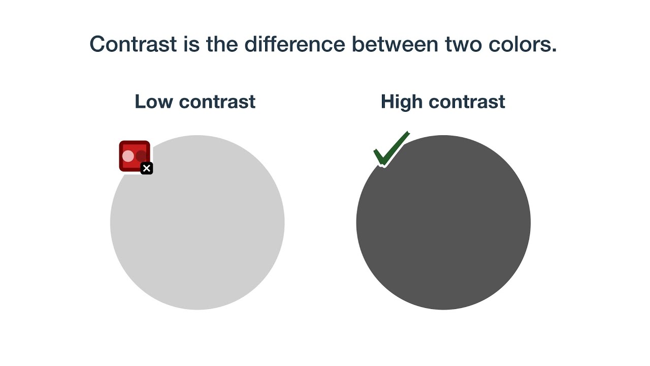
Most websites fail their readers before the first sentence loads. The WebAIM 2024 Million report found low-contrast text on 81% of homepages, the single most common accessibility error six years running.
Accessible typography fixes that. It’s the practice of designing text so people with dyslexia, low vision, color vision deficiency, and aging eyes can actually read what you wrote.
The stakes go beyond UX. ADA digital lawsuits crossed 4,000 filings in 2024 (UsableNet), and contrast failures sit at the top of nearly every demand letter.
This guide covers the practical rules: WCAG 2.2 contrast ratios, font sizing, spacing minimums, color usage, hierarchy, and the typeface choices that hold up across screen readers, zoom levels, and impaired vision.
What is Accessible Typography?

Accessible typography is the practice of designing text systems readable by people with visual, cognitive, and motor impairments, including dyslexia, low vision, and color vision deficiency.
It goes a step beyond regular readable typography. Comfortable reading is one thing. Compliance-grade legibility for impaired users is another.
The discipline ties directly to WCAG 2.2 success criteria 1.4.3 (Contrast Minimum), 1.4.4 (Resize Text), 1.4.8 (Visual Presentation), and 1.4.12 (Text Spacing).
Five core dimensions shape every decision: contrast, size, spacing, font selection, and hierarchy.
The WebAIM Million 2024 report flagged low-contrast text on 81% of the top one million home pages, with 34.5 distinct instances per page on average.
How Accessible Typography Differs from Readable Typography
Readable typography: aims for general comfort and aesthetic balance.
Accessible typography: meets specific compliance thresholds for users with impairments.
Readable can fail accessibility. A beautifully kerned headline at #999 on white still locks out low-vision readers below the 4.5:1 ratio.
Core Dimensions That Define It
The five pillars work together. Drop one and the rest weaken.
- Contrast against background
- Size at the smallest rendered breakpoint
- Spacing across line, letter, and word
- Font selection (letterform recognition)
- Hierarchy through semantic HTML
Skip any of these and the others can’t compensate.
Why Does Accessible Typography Matter for Web Design?
Accessible text isn’t a niche concern. It affects measurable user populations, business metrics, and legal exposure.
The World Health Organization estimates 2.2 billion people globally have some form of vision impairment. That’s roughly 1 in 4 humans alive right now.
Color vision deficiency adds another ~8% of men and ~0.5% of women globally (Color Blind Awareness, 2024).
The Business Cost of Bad Typography
UsableNet recorded over 4,000 ADA digital accessibility lawsuits in U.S. state and federal courts during 2024. Custom-coded sites took the heaviest hit at 1,332 cases (EcomBack 2024).
Repeat litigation matters too. Roughly 41% of federal filings targeted companies already sued before, per UsableNet’s 2024 year-end report.
Audiences That Benefit Most
| Group | Approximate Reach | Primary Need |
|---|---|---|
| Vision impairment | 2.2 billion people (WHO estimate) | High contrast, scalable text, zoom support |
| Color vision deficiency | ~300 million people | Non-color visual cues and clear differentiation |
| Dyslexia | ~10% of the population | Improved letterform clarity and readable spacing |
| Aging readers (60+) | 1.4 billion people | Larger default text sizes and increased line height |
This crosses over into search performance. Cleaner text reduces pogo-sticking, supports better dwell time, and feeds into the broader bucket of web accessibility signals search engines watch.
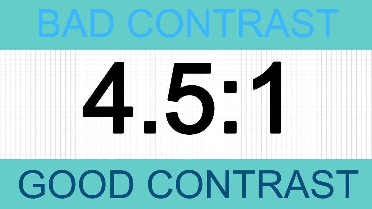
Which Contrast Ratios Meet Accessibility Standards?
WCAG 2.2 sets exact numeric thresholds. Hit them or fail conformance.
Level AA (the practical minimum): 4.5:1 for body text, 3:1 for large text (18pt regular or 14pt bold).
Level AAA (the higher target): 7:1 for body text, 4.5:1 for large text.
The W3C defines these in Success Criterion 1.4.3 and 1.4.6 respectively. Most teams target AA. AAA is the goldilocks zone for users with moderate to severe contrast sensitivity loss.
WebAIM’s 2024 data showed 83.9% of homepages failing the 4.5:1 minimum somewhere on the page (Pressd analysis). The most common offender? Light gray placeholder text and form helper labels.
How APCA Differs from WCAG 2 Contrast
APCA stands for the Accessible Perceptual Contrast Algorithm. It’s part of the WCAG 3.0 draft and behaves differently from the older luminance ratio.
The WCAG 2 formula treats contrast symmetrically. Black on white scores the same as white on black. Real eyes don’t work that way.
APCA returns a polarity-aware score (Lc value) ranging roughly from -108 to +106. It accounts for font weight and size more granularly. A thin 14px body text needs a higher Lc than a bold 24px headline.
Tools like accessible color palette generator tooling now ship APCA checks alongside the legacy ratio.
Contrast for Text on Images and Gradients
Hero overlays are where contrast quietly dies.
Text laid over a photo or a hero image needs to clear 4.5:1 against the darkest and lightest pixels behind every glyph, not the average.
- Add a semi-opaque dark scrim (rgba black at 40-60%)
- Use text shadow as a fallback, not a primary fix
- Constrain text to a fixed background block when the photo varies
For gradients, check the lightest stop. If the text fails there, the gradient fails, full stop.
What Font Sizes and Line Heights Support Readability?

WCAG 1.4.12 spells out the spacing minimums. Cross any of these thresholds without breaking layout and you’ve passed.
Minimum body text: 16px (1rem) on web. iOS Human Interface Guidelines call for 17pt minimum. Material Design accepts 14sp but recommends 16sp.
Line height: 1.5x font size for body copy. 1.2x for headings.
Paragraph spacing: at least 2x the font size between blocks.
Letter spacing: 0.12x font size minimum.
Word spacing: 0.16x font size minimum.
Why 16px Became the Web Default
Browsers default the root to 16px because it matches the average comfortable reading distance for adults at typical screen distances.
Anything below 14px effective size starts excluding aging readers. The 60+ population reads at roughly 80% of the speed of younger readers at the same point size, and that’s before any visual decline.
The fix isn’t bumping every site to 20px. It’s respecting the user’s root size and scaling proportionally with rem units.
Line Length and the 45-75 Rule
Robert Bringhurst’s Elements of Typographic Style puts the comfortable measure at 45-75 characters per line. The web has been ignoring this for years.
Lines wider than 80 characters force readers to track back inaccurately when their eye returns to the start of the next line. Dyslexic readers struggle most here.
Use max-width in ch units (e.g., max-width: 65ch) to lock in the measure regardless of viewport.
Which Fonts Are Considered Accessible?

Some typefaces are engineered for legibility. Others happen to work well. A few are popular but quietly hostile to impaired readers.
Atkinson Hyperlegible from the Braille Institute (released 2020) leads the engineered category. It distinguishes commonly confused glyphs (capital I vs lowercase l, zero vs O, 6 vs 9) through deliberately asymmetric letterforms.
Lexend, developed with input from reading-proficiency research, uses expanded character spacing to support faster word recognition. Schools have adopted it for emerging readers and students with reading disabilities.
Other strong picks for body text: Inter, Source Sans 3, Public Sans, and Charter for serif lovers.
Atkinson Hyperlegible Design Principles
The Braille Institute commissioned this font specifically for low-vision readers. Distinguishing letterforms is the entire point.
- Tail on the lowercase ‘l’ to differentiate from capital ‘I’
- Slashed zero by default
- Open apertures on ‘a’, ‘e’, ‘c’, ‘s’ for better recognition at small sizes
- Free under the Open Font License
It works as a body font and a UI font. The italic version holds up at 14px on most displays.
Lexend and Reading Proficiency Research
Bonnie Shaver-Troup developed Lexend based on hyper-expansion research, the idea that wider character spacing helps the eye chunk words faster.
It ships as a variable font with multiple width axes (Lexend Deca, Lexend Mega, Lexend Giga, etc.). The wider the variant, the more aggressive the spacing.
NASA’s Glenn Research Center referenced reading-proficiency findings during font selection for legibility studies in mission-critical interfaces.
The Comic Sans Defense
Yes, Comic Sans. The internet’s favorite punching bag.
Studies referenced by the British Dyslexia Association have flagged it as one of the easier fonts for dyslexic readers because no two letterforms mirror each other (the ‘b’ and ‘d’ problem). It’s not pretty. It works.
Better-looking dyslexia-considered alternatives include OpenDyslexic and Lexend.
Fonts to Avoid for Body Text
Some popular faces are accessibility traps once they hit 14-16px on a low-DPI screen.
- Ultra-thin weights (Light, Thin, Hairline) at body sizes
- Condensed display fonts pretending to be body fonts
- Fonts with mirror-symmetric glyphs (problematic for dyslexic readers)
- Decorative scripts at any size
Variable fonts let you ship one file and adjust weight or width contextually, which is one of the few unambiguous wins of the last five years in web typography.
How Should Color Be Applied to Accessible Text?
Color is a supplement, never the carrier of meaning. WCAG 1.4.1 is explicit: color cannot be the sole means of conveying information.
Around 300 million people worldwide have some form of color vision deficiency (Color Blind Awareness). Red-green deficiencies make up roughly 99% of cases.
The most common error: marking required form fields with red asterisks and no text label. A protanopic user sees a faded gray asterisk and misses the cue entirely.
Types of Color Vision Deficiency Designers Should Know
| Type | What It Affects | Approximate Prevalence |
|---|---|---|
| Deuteranomaly | Reduced green color perception | 2.32% of population |
| Protanomaly | Reduced red color perception | 0.54% |
| Deuteranopia | Missing green cone cells | 0.64% |
| Protanopia | Missing red cone cells | 0.51% |
| Tritanopia | Missing blue cone cells (rare) | 0.01% |
Source: market.us aggregated 2024 data.
Redundant Cues for Critical Information
Never rely on color alone. Pair it with at least one other signal.
- Underline links in body text (default browser behavior, don’t override it)
- Add icons to error and success states
- Use text labels for status indicators
- Apply shape redundancy in charts and graphs
Tools that simulate the experience: Sim Daltonism on macOS, Coblis online, and Chrome DevTools’ built-in vision deficiency emulation under the Rendering panel. Test with at least deuteranopia and protanopia before shipping.
The Link Color Trap
Default browser links are blue and underlined for good reason.
Many design systems strip the underline because it “feels cluttered.” For users with low vision or color blindness, that underline is the only reliable cue separating a link from regular body text. Putting it back costs nothing. Color contrast alone won’t carry that load.
What Spacing Rules Improve Text Accessibility?

Spacing is the silent half of typography. Most accessibility failures don’t come from font choice. They come from cramming text too tight.
WCAG 1.4.12 Text Spacing requires that users be able to override these values without losing content or function:
- Line height: at least 1.5x the font size
- Paragraph spacing: at least 2x the font size
- Letter spacing: at least 0.12x the font size
- Word spacing: at least 0.16x the font size
Alignment, Justification, and the Rivers Problem
Left-align body text in left-to-right languages. Always.
Justified text creates uneven word spacing, the “rivers of whitespace” that disrupt scanning. Dyslexic readers lose their place faster on justified blocks. The ragged-right edge most designers find ugly is the accessible choice.
Centered body copy is worse. Each line starts at a different horizontal position, forcing the eye to hunt for the next line’s beginning.
The All-Caps Penalty
All-caps reduces reading speed by roughly 13-20% based on the foundational legibility research from Miles Tinker (republished in Legibility of Print).
The reason: word recognition relies on the silhouette of ascenders and descenders. Lowercase “typography” has a distinctive shape. Uppercase “TYPOGRAPHY” is a rectangle. The brain has to spell it out letter by letter.
Reserve all-caps for short labels (single words, acronyms, button text). Never use it for paragraphs.
Mobile Touch Targets Around Text
Tap targets need at least 44×44 CSS pixels per Apple HIG and 48dp per Material Design.
That includes inline links and tappable text. Cramming three links in a row at 14px body size with default line height creates a frustrating mis-tap zone, especially on the smallest viewport sizes. Bump line height to at least 1.5 and add vertical padding.
The Compact Spacing Reference
| Property | WCAG Minimum | Practical Target |
|---|---|---|
| Line height (body) | 1.5× | 1.5–1.7× |
| Line height (heading) | 1.2× | 1.1–1.3× |
| Paragraph spacing | 2× | 1.5–2rem |
| Letter spacing (body) | 0.12× | Default (0) |
| Word spacing | 0.16× | Default |
The minimums apply when users override your CSS. Your defaults should usually be tighter than the WCAG floor since they’re built for general readers, but the design must not break when these overrides kick in.
FAQ on Accessible Typography
What is the minimum font size for accessibility?
px (1rem) is the practical web minimum for body text. Anything smaller starts excluding aging readers and low-vision users.
Apple’s iOS HIG calls for 17pt minimum. Material Design accepts 14sp but recommends 16sp for sustained reading.
What contrast ratio do I need for WCAG compliance?
WCAG 2.2 Level AA requires 4.5:1 for body text and 3:1 for large text (18pt regular or 14pt bold).
Level AAA pushes that to 7:1 and 4.5:1 respectively. AA is the practical legal floor.
Is Comic Sans actually good for dyslexia?
Yes, surprisingly. Its irregular letterforms prevent the b/d mirror confusion many dyslexic readers hit with geometric sans-serifs.
The British Dyslexia Association lists it as acceptable. Better-looking alternatives include Lexend, OpenDyslexic, and Atkinson Hyperlegible.
Can I use serif fonts on accessible websites?
Absolutely. The “sans-serif is more accessible” claim is a myth at typical screen resolutions on modern displays.
Charter, Source Serif, and Lora all hold up well. Avoid serifs with ultra-thin strokes and high contrast like Bodoni for body copy.
How do I test typography accessibility?
Run automated checks through axe DevTools, WAVE, or Lighthouse. Use WebAIM Contrast Checker or Stark for ratio testing.
Then test manually: tab through with a keyboard, zoom to 200%, and run NVDA or VoiceOver on the page.
What is APCA and should I use it instead of WCAG 2 contrast?
APCA is the Accessible Perceptual Contrast Algorithm proposed for WCAG 3.0. It accounts for font weight and polarity, unlike the symmetric WCAG 2 ratio.
Use it as a supplement. Legal compliance still references WCAG 2.2.
Should I use pixels or rem for accessible font sizes?
Use rem for scalable typography. Pixels override the user’s browser default, which breaks WCAG 1.4.4 resize text requirements.
Set the root in your reset, then size everything else in rem or em relative to it.
Is justified text bad for accessibility?
Yes for body copy. Justified alignment creates uneven word spacing that disrupts dyslexic readers and slows scanning for everyone.
Left-align for LTR languages. The ragged right edge is the accessible choice, not the ugly one.
How does typography affect screen reader users?
Visual styling doesn’t reach screen readers. What matters is semantic markup: proper heading hierarchy (H1 through H6), real list elements, and avoiding styled divs that look like headings.
WebAIM’s 2024 survey found 71.6% of screen reader users navigate by headings.
What’s the line length sweet spot for readability?
Forty-five to seventy-five characters per line. Bringhurst’s Elements of Typographic Style set the rule, and reading research has confirmed it across decades.
Use max-width: 65ch in CSS to lock the measure regardless of viewport size.
Conclusion
Accessible typography isn’t a polish-pass at the end of a build. It’s a foundation decision that touches font selection, contrast ratio, line height, and the semantic markup feeding assistive technology.
The math is concrete. 4.5:1 minimum contrast, 16px body text, 1.5x line height, 65 characters per line, and proper H1 to H6 hierarchy.
Get those right and you’ve cleared the WCAG 2.2 Level AA floor for typographic accessibility.
The audience is bigger than most teams realize: 2.2 billion vision-impaired users, 300 million with color vision deficiency, and a growing share of aging readers who depend on text scaling.
Build for them and the experience improves for everyone. Inclusive typography is just typography that respects how human eyes actually work.


