
Every app you’ve ever rage-quit had a UI problem. Every app you love probably nailed it.
So what is UI design, and why does it make or break digital products? It’s the practice of shaping the visual and interactive layer that sits between a user and a piece of software. Buttons, screens, typography, color, spacing, feedback. All of it.
This guide covers what UI design actually involves, how it differs from UX, the core components of any interface, tools professionals use, accessibility requirements, and the most common mistakes that still trip up design teams in 2025.
Whether you’re considering a career shift or trying to improve a product you’re building, this is where you start.
What is UI Design

UI design creates the visual and interactive layer users see and touch on screens. It covers buttons, typography, color palettes, icons, input fields, and navigation systems in software applications, websites, and mobile apps.
The term stands for user interface design. It sits between graphic design, interaction design, and front-end development.
Every screen you tap, every dashboard you check, every checkout form you fill. Someone designed that interface.
It’s not about making things look pretty (though that helps). It’s about making digital products functional, clear, and easy to use. Research from Maze shows that users form opinions about your website in 50 milliseconds. A well-designed interface reduces confusion, speeds up task completion, and keeps people coming back.
Jakob Nielsen and Don Norman, founders of Nielsen Norman Group, have spent decades researching how people interact with screens. Their work shaped much of what we consider standard practice today.
Why Does UI Design Matter for Digital Products
A bad interface costs money.
According to Forrester Research, every $1 invested in usability returns $100 (that’s a 9,900% ROI). Research from Google found that 53% of mobile users abandon sites that take longer than 3 seconds to load, and cluttered interfaces make that problem worse.
UI design directly affects how fast someone can complete a task.
A confusing checkout flow on an e-commerce app loses customers. Study data from Baymard Institute shows that optimizing checkout design can boost conversion rates by 35.26% for large e-commerce sites. A poorly labeled navigation bar on a SaaS dashboard frustrates paying users. According to research from multiple sources, 94% of users say straightforward navigation is the most important factor in interface design.
Think about it this way: two banking apps offer the same features. One has clear button states, consistent spacing, and readable typography. The other has tiny tap targets, inconsistent colors, and labels that make no sense.
Which one gets deleted first?
Real-world impact on key metrics:
- Well-designed UI can increase conversion rates by up to 200%, according to research from Forrester
- Better UX design can achieve conversion rates of up to 400%
- 88% of internet users are less likely to return after a poor user experience, per UX research data
- 1-second page load delay causes a 7% decrease in conversions
User retention, conversion rates, and brand trust all connect to how the interface looks and behaves. Airbnb redesigned their interface in 2014 and saw a significant increase in bookings. Slack’s clean, approachable UI helped it beat enterprise competitors with far bigger budgets.
The UI design market reached $2.43 billion in 2024 and is expected to surpass $7.43 billion by 2032, according to Business Research Insights. This 15.01% annual growth rate shows that companies understand UI design is not decoration.
It’s a business function.
What Are the Core Components of a User Interface

A user interface is built from a specific set of components that work together to create a usable screen. These include input controls, navigation elements, informational displays, and containers.
Each component has a job. Remove the wrong one and the whole screen breaks down.
What Role Does Visual Hierarchy Play in UI Design
Visual hierarchy controls where a user’s eye goes first, second, and third on any screen. Size, color, contrast, and positioning determine what gets attention.
Eye-tracking research from multiple studies shows that users favor the top and left sides of web pages. Research on packaging design found that 64% of consumers try a new product simply because the packaging catches their eye, and 72% say packaging design influences their purchasing decisions. This pattern applies to digital interfaces too.
The F-pattern reading layout works well for text-heavy pages, while landing pages tend to follow a Z-pattern. Content placed above the fold gets the most visibility.
Eye-tracking studies reveal that users determine your site’s value within a few seconds. According to research from Hotjar, 64% of website visitors can assess your site’s value in those first moments.
How Do Color, Typography, and Spacing Affect Interface Usability
Color communicates meaning before text does. Red signals errors or warnings, green confirms success, and blue builds trust (there’s a reason most fintech apps lean heavily on blue).
Research shows that using red buy buttons on e-commerce sites can boost sales and conversions by as much as 34%, according to UI/UX statistics from industry studies.
WCAG accessibility requirements:
Color contrast ratios need to meet WCAG 2.2 standards:
- Minimum 4.5:1 for body text
- Minimum 3:1 for large text
Skip this and you lose users with visual impairments. With 4,605 ADA lawsuits filed in 2024, proper color contrast isn’t just good design. It’s a legal requirement.
Typography handles readability. System fonts like Inter, SF Pro, and Roboto became popular in UI because they render cleanly at small sizes on screens. Font size, line height, and letter spacing all affect how quickly someone processes information.
According to research, 52% of users say the main reason they won’t return to a website is aesthetics. Typography plays a major role in that first impression.
White space is not wasted space. It groups related elements, separates sections, and gives the eye a place to rest. Cramped interfaces feel stressful to use.
What Are Interactive Elements in a User Interface
Interactive elements are the parts users click, tap, swipe, or type into. They include:
- Buttons with clear labels and visible states (default, hover, active, disabled)
- Text input fields and form controls like checkboxes, radio buttons, and toggles
- Dropdown menus for selecting from multiple options
- Sliders and range controls for adjusting values
- Modal windows for focused tasks or confirmations
- Tooltips for contextual help without cluttering the layout
Each element needs proper feedback. When a user clicks a button and nothing visibly happens, they click again. And again.
Research shows that 88% of consumers won’t return after a bad experience. Lack of visual feedback contributes to that frustration. Micro-interactions solve this by giving instant visual or motion-based responses to user actions.
According to multiple UX studies, approximately 60% of digital consumers prioritize usability in web and app design, emphasizing features like search functionality, filter options, and reduced loading times.
What is the Difference Between UI Design and UX Design

People mix these up constantly. They’re related but not the same thing.
UI design focuses on the visual and interactive surface. Colors, buttons, icons, screen layouts, typography, component styling. What users see and touch.
UX design focuses on the entire journey through a product. Research, information architecture, user flows, task analysis, usability testing. How the product works and feels.
Think of it this way: UX determines a checkout needs 3 steps instead of 7. UI determines what those 3 screens look like, where buttons sit, and how the progress indicator behaves.
What UI Designers Do
Create high-fidelity mockups with pixel-perfect layouts. Build design system components (buttons, inputs, cards, toggles). Define visual specifications (spacing, dimensions, font sizes, states). Work with color theory, typography, responsive design.
What UX Designers Do
Conduct user research through surveys and interviews. Develop user personas and journey maps. Create wireframes and information architecture. Perform usability testing and iterate based on data. Focus on making products intuitive and efficient.
Job Market Reality
The U.S. Bureau of Labor Statistics projects 7% growth from 2024-2034 for web developers and digital designers (including UI/UX roles). That’s more than double the 3% average for all occupations. Expect 14,500 job openings per year.
Median annual salary hit $98,090 in 2024 according to BLS data. About $20,000 above the national mean wage across all jobs.
But competition has intensified. In 2019, 67.9% of designers found new roles within three months. By 2024, that dropped to 49.5%. UX Design roles still grew 29.2% since 2019, but more designers are competing for each position.
Don Norman coined “user experience” in 1993 at Apple. UI design predates that, going back to Xerox PARC graphical interfaces in the 1970s.
How These Roles Work Together
Small teams: One person handles both.
Large companies (Google, Spotify): Separate positions with distinct skill sets.
Nielsen research predicts UX professionals will grow from 1 million currently to 100 million by 2050. A 100x growth factor.
Companies increasingly want specialists in AI integration, conversation design, and accessibility. A user-centered design process needs both roles collaborating throughout the entire design process.
What Does the UI Design Process Look Like
UI design follows a structured sequence: research, wireframing, visual design, prototyping, testing, iteration, handoff.
Skipping steps causes rework. Jumping into high-fidelity screens without wireframes almost always backfires.
How Does Wireframing Fit into UI Design
Wireframes are low-fidelity blueprints that map screen structure without visual polish. They show where content blocks, navigation, and call-to-action buttons sit.
Most designers use Figma, Balsamiq, or paper. Speed matters here. You can test 10 layout ideas in wireframes faster than finishing one polished mockup.
Wireframing catches usability issues and logical errors early, preventing costly revisions during development. Teams get stakeholder feedback before any visual design or coding begins.
Research confirms wireframes focus creative attention on user needs and help teams align throughout the design process. Starting simple allows more frequent iteration and creative exploration.
What is the Role of Prototyping in UI Design
Prototypes add interaction to static screens. Users click through them, test flows, and spot confusion before any code gets written.
Figma, Framer, and Adobe XD support interactive prototyping. High-fidelity prototypes catch usability issues that wireframes miss.
Prototypes enable real user testing. Teams conduct usability tests to uncover confusing navigation or unintuitive elements. Key user journeys get tested start to finish.
Prototypes closely resemble the final product with actual fonts, branding, and UI design instead of placeholders.
How Do UI Designers Use Design Systems
A design system is a collection of reusable components, guidelines, and standards that keep interfaces consistent.
Examples: Google’s Material Design, Apple’s Human Interface Guidelines, IBM’s Carbon Design System. These define button sizes, color tokens, spacing scales, and motion behavior.
Measurable impact:
- Shopify: 30% reduction in design time with Polaris
- IBM Carbon: 50% cut in development time, 2,600% ROI
- Airbnb: 34% efficiency boost through design system training
Without a design system, teams create 14 different button styles across 30 screens. A solid design system with proper documentation prevents drift and speeds up design and development work.
Pinterest tracks adoption by measuring what percentage of designs use system components versus custom solutions. High adoption signals relevance. Low usage points to missing documentation or usability issues.
What Are the Different Types of UI Design
Not every interface lives on a screen. UI design covers several distinct categories, each with its own constraints and design patterns.
What is Graphical User Interface (GUI) Design
GUI design is what most people picture when they hear “UI design.” It’s the visual layer of websites, mobile apps, desktop software, and progressive web apps. Users interact through clicks, taps, and swipes on rendered screen elements.
Windows, macOS, iOS, Android. Every operating system ships with its own GUI conventions. Apple’s Human Interface Guidelines and Google’s Material Design set the standard that most product teams follow.
What is Voice User Interface (VUI) Design
VUI design handles interfaces controlled entirely by speech. Amazon Alexa, Google Assistant, Apple Siri.
No buttons. No screens (usually). The entire interaction relies on conversation design, prompt clarity, and error recovery when the system mishears a command.
Market reality:
The VUI market hit $16.5 billion in 2023 and projects 20% annual growth through 2032. As of 2024, 62% of Americans aged 18 and older use voice assistants on smartphones, tablets, or smart speakers. That’s over 160 million people.
According to PWC data, 71% of consumers prefer voice search over typing. Among smart speaker owners, 53% use voice assistants daily. Privacy remains a barrier though. About 41% of users hesitate to adopt voice interfaces due to privacy concerns, with only 28% trusting VUI providers to keep voice data secure.
What is Gesture-Based Interface Design
Gesture interfaces respond to physical movements. Pinch to zoom on a phone, swipe to dismiss a notification, wave your hand in front of a WebXR headset.
Apple Vision Pro and Meta Quest are pushing this category forward. Ray-Ban Meta glasses sold over 2 million units since launching in October 2023, with sales tripling in Q2 2025.
The global AR/VR market reached $75 billion in 2025 and projects growth to $693 billion by 2035 at a 24.87% CAGR. Gesture control devices led revenue in AR/VR hardware in 2025, expected to grow at 19.2% annually.
Why gesture design is different:
Designing for gestures means accounting for zero visual affordance. Users can’t see a button, so the interaction has to feel obvious through spatial cues and haptic feedback. Over 24 million AR/VR headsets shipped globally in 2023, with standalone gesture-based devices accounting for 56% of total shipments.
AI has taken VR gesture tracking to the next level. Devices like Meta’s Orion glasses can interpret hand and finger movements with precision. Combined with eye tracking sensors, these create a complete hands-free interaction system.
Which Tools Do UI Designers Use

Figma dominates the UI design tool market. Browser-based, collaborative, free tier available. Most job postings in 2025 list Figma as a requirement.
Market dominance is real. Figma grew from 7% market share in 2017 to 90% by 2023. Sketch dropped from 45% to 4.5% in the same period. As of 2025, Figma holds 40.65% market share in the design software category and supports 13 million monthly active users.
Revenue tells the story: $749 million in 2024 (48% growth from 2023), projected to cross $1 billion in 2025. The platform is used by 95% of Fortune 500 companies and 78% of the Global 2000.
Sketch still has a loyal user base on macOS. About 1 million users as of 2024, with clients like Netflix, Google, Boeing, and Epic Games. Adobe XD exists but holds only 13.5% market share. Adobe had attempted to acquire Figma for $20 billion in 2022, but the deal was blocked by regulators.
Framer handles design-to-code workflows. Designers build interactive prototypes that export production-ready components.
For handoff to developers, Zeplin generates specs, spacing values, and CSS snippets from design files. This bridges the gap between what a designer creates and what a back-end or front-end developer builds.
Common Tool Pairings
- Figma + FigJam for design and brainstorming
- Figma + Zeplin for design-to-dev handoff
- Framer for interactive prototyping and publishing
- Sketch + Abstract for version-controlled design on Mac
The global UX/UI design tools market reached $9.74 billion in 2024 and projects to $24.52 billion by 2033 at 10.85% CAGR. Cloud-based design platforms captured 67.82% of market share in 2024, growing at 35.12% CAGR through 2030.
Why cloud-based tools won: Real-time collaboration, version control, and distributed team support became non-negotiable. Subscription economics convert capital expense to operating expense, scaling with actual usage.
What Skills Does a UI Designer Need

Visual design fundamentals come first. Color theory, typography, layout composition, spacing systems. You can’t skip these and expect to produce professional work.
According to recent hiring data, 58% of hiring managers say visual polish is one of the five most important skills for designers today. More than 45% point to collaboration, systems thinking, and product strategy as critical.
Interaction design matters just as much. Knowing how a drawer component should behave on mobile versus desktop, or when to use a toast notification instead of an inline alert. These decisions shape how usable a product feels.
A working knowledge of HTML and CSS helps UI designers communicate with developers and understand what’s feasible in a browser. You don’t need to be a programmer, but knowing the constraints of responsive design, CSS animation, and grid systems makes your designs more buildable.
Figma proficiency is non-negotiable. It’s become the industry standard across most companies. Bootcamp graduates with Figma skills are 50% more likely to secure entry-level roles within six months compared to self-taught candidates.
Market Demand Reality
Employment for web developers and digital designers (which includes UI/UX roles) is expected to grow 23% from 2021-2031 according to the U.S. Bureau of Labor Statistics. That’s much faster than average.
LinkedIn data shows UX design ranks among the top five most in-demand skills globally, with job postings increasing 25% year-over-year in 2024. According to Adobe, 87% of hiring managers consider hiring more UX designers a top priority.
The catch: 56% of hiring managers say there’s increasing demand for senior design hires, compared to just 25% hiring for junior roles. Less than 5% of tech companies are open to hiring entry-level talent. Only 49.5% of designers secured new jobs within three months in 2024, down from 67.9% in 2019.
Skills That Separate Good from Average
- Understanding web accessibility standards (WCAG 2.2, ARIA roles, keyboard navigation)
- Ability to build and maintain component libraries
- Basic knowledge of design tokens and how design systems differ from style guides
- Proficiency in user research interpretation
- Clear communication during design critiques and cross-functional reviews
- AI integration in design workflows (emerging requirement for 2025)
Average national salary for UI designers in the U.S. reached $89,877 per year according to Indeed. Entry-level designers from bootcamps earn an average starting salary of $70,000. Senior designers command significantly higher compensation as companies prioritize experience.
How Does Accessibility Influence UI Design
Accessibility is not optional. Around 16% of the global population lives with some form of disability, according to the World Health Organization. That’s over 1.3 billion people.
WCAG 2.2, published by the W3C, is the current standard. It covers four principles: perceivable, operable, understandable, and robust. Every UI design decision connects to at least one of these.
The numbers show how far most sites still fall short. WebAIM’s 2024 Million report found that 95.9% of home pages had detectable WCAG failures, averaging 56.8 errors per page. Low-contrast text alone appeared on 81% of all tested homepages.
Practical accessibility in UI design means:
- Sufficient color contrast for text and interactive components
- Focus indicators visible on every input field and button
- Proper heading structure so screen readers parse content logically
- Touch targets at least 44×44 pixels on mobile (Apple’s guideline) or 48x48dp (Material Design)
- Data tables that remain readable with assistive technology
Section 508 in the United States and the European Accessibility Act make compliance a legal requirement for many organizations. ADA digital accessibility lawsuits hit 4,605 reported cases in 2023 alone, a 14.1% rise from 2022, according to AccessibilityChecker research. McKinsey data adds another angle: consumer companies lose $6.9 billion annually because of inaccessible websites, as users with disabilities move to competitors.
Accessible sites also have a measurable upside. Digital products that meet WCAG 2 standards are expected to outperform competitors by 50%, and accessible sites see 20-30% higher conversion rates compared to non-compliant ones.
An accessibility checklist should be part of every UI review, not something bolted on after launch. Retrofitting is estimated to cost 10x more than building it right from the start.
How Does UI Design Affect Conversion Rates and User Retention
Walmart Canada redesigned their mobile UI and saw a 98% increase in mobile orders. That’s not a typo.
Interface decisions directly move business metrics. Button color, placement, size, and label text all influence whether someone clicks “Buy Now” or bounces. Hero section design on a homepage determines whether visitors scroll or leave within 3 seconds.
Research shows just how much is at stake:
- A well-executed UI can increase conversion rates by up to 200%, according to DesignRush
- Companies that allocate 10% of their development budget to UX see an 83% increase in conversions
- Removing a navigation bar from a landing page doubled Yuppiechef’s signup rate from 3% to 6%, per VWO’s A/B test data
- Bad UX causes a 35% drop in sales, translating to $1.4 trillion in lost revenue annually, according to AWS data
Fitts’s Law is useful here. The time to reach a target depends on its distance and size. Larger, closer buttons get clicked faster and more often. This applies to every button state and hover effect a designer creates.
Retention connects to consistency. When an interface behaves predictably, users build muscle memory. They stop thinking about where things are and start focusing on their task. Break that consistency and frustration builds fast. Forrester research puts every $1 invested in UX at a return of up to $100 (9,900% ROI).
Netflix runs thousands of A/B tests on their UI every year. Small changes to card layouts, thumbnail sizes, and row ordering drive measurable changes in watch time and subscriber retention.
What Are Common UI Design Patterns
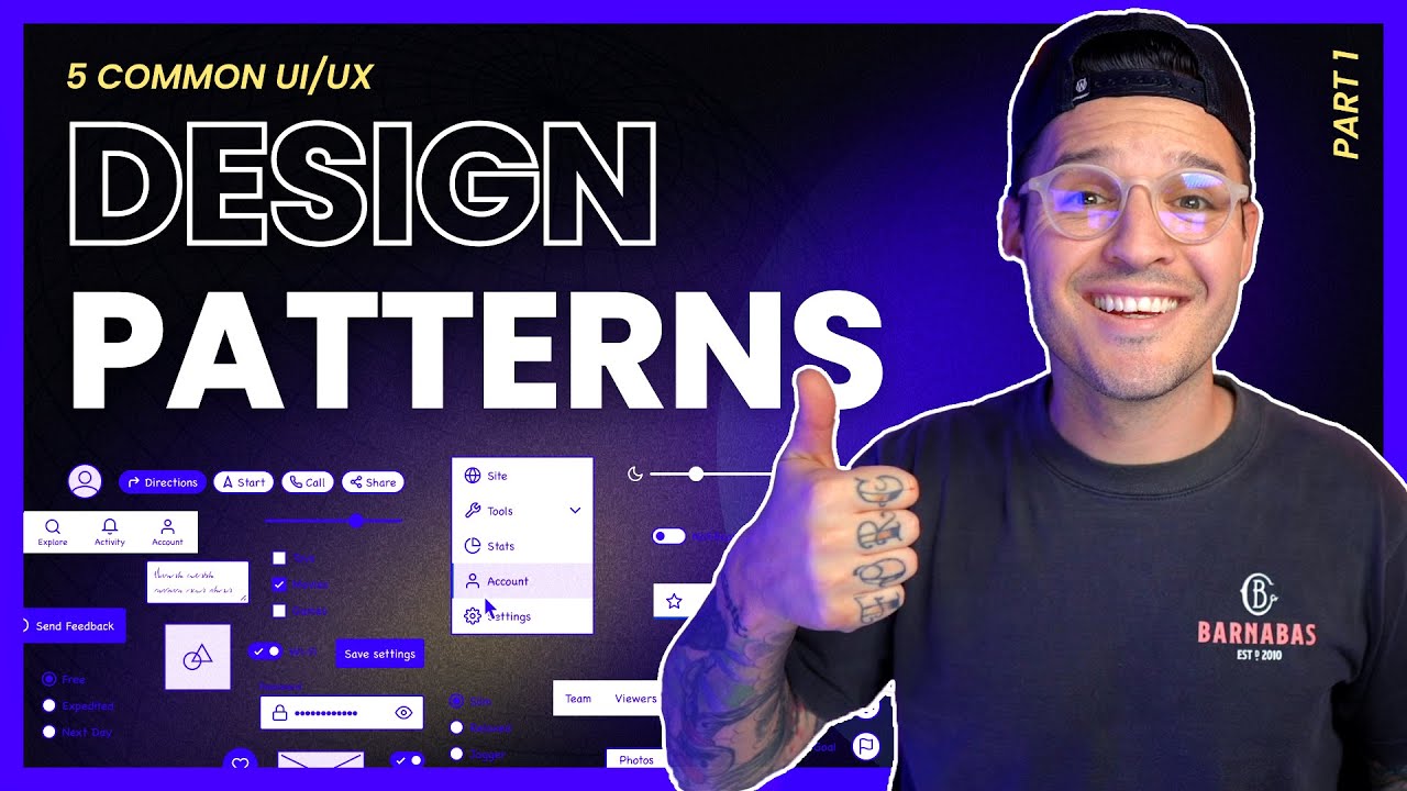
Design patterns are reusable solutions to recurring interface problems. They’re not rigid templates. They’re starting points that have been tested across millions of users.
Widely used patterns include:
- Card layouts for browsing collections of content (Pinterest, Airbnb, app stores)
- Hamburger menus for hiding sidebar navigation on mobile screens
- Breadcrumb trails for showing location within a site hierarchy
- Pagination and infinite scroll for handling long content lists
- Stepper components for multi-step forms and checkout flows
- Skeleton screens for perceived loading speed instead of blank states or spinners
- Carousels for showcasing multiple items in limited horizontal space
- Pagination controls for structured content browsing
Each pattern carries real UX implications. Nielsen Norman Group research found that hidden navigation (like hamburger menus) causes a 20%+ drop in content discoverability compared to visible navigation. Users are also 1.5 times more likely to interact with navigation options that are always in view. That doesn’t make hamburger menus wrong, but it does mean they need a clear reason to exist.
Skeleton screens are worth calling out specifically. With 53% of mobile users abandoning sites that take more than 3 seconds to load (Statista), perceived speed matters as much as actual speed. Skeleton screens reduce that perception of wait time by showing users the page structure before content arrives, which keeps more people engaged during load.
Knowing when to break a pattern matters just as much as knowing when to follow one. Glassmorphism and neumorphism looked great in Dribbble posts but caused real usability problems when applied without enough contrast or clear element boundaries.
A useful check: 94% of users say straightforward navigation is a top priority, according to survey data compiled by MindInventory. If a pattern gets in the way of that, it doesn’t matter how much it trends on design platforms.
What Are Common Mistakes in UI Design

Jakob Nielsen’s 10 usability heuristics, published in 1994, still catch most of the mistakes designers make today. Thirty years later and the same problems keep showing up.
A GoodFirms survey found the most reported website design mistakes are crowded layouts (84.6%), missing calls-to-action (38.5%), and hidden navigation (30.8%). The list below goes deeper.
The biggest ones:
Inconsistent spacing and alignment. If your padding varies randomly between 8px, 12px, and 17px across screens, the interface feels off even if users can’t explain why. Using an 8-point grid system fixes this.
Poor contrast ratios. Light gray text on white backgrounds. Still everywhere in 2025. WebAIM’s 2025 report found low-contrast text on 79.1% of all homepages. Still fails WCAG.
Overloaded navigation. Cramming 15 items into a top nav bar when 6 would cover 90% of user needs.
Ignoring mobile-first principles. Designing for desktop and then squeezing everything into a 375px viewport as an afterthought. Over 61% of global web traffic now comes from mobile devices (Statista), and mobile users are 5x more likely to abandon a task on a non-optimized site. In July 2024, Google stopped indexing sites not accessible on mobile.
No loading states. Users click a button and see nothing. No spinner, no skeleton screen, no feedback at all.
Decorative animations that slow down task completion instead of supporting it.
Using custom components when native UI component patterns would work better and feel more familiar.
FAQ on UI Design
What does UI stand for?
UI stands for user interface. It refers to the visual and interactive layer of any digital product, including buttons, icons, typography, color schemes, and screen layouts that users directly see and interact with.
Is UI design the same as UX design?
No. UI design handles the visual surface and interactive components of a product. UX design covers the full user journey, including research, information architecture, and usability testing. They overlap but require different skill sets.
What tools do UI designers use most?
Figma is the industry standard in 2025. Sketch remains popular on macOS. Adobe XD and Framer are also used. For developer handoff, teams rely on Zeplin to generate specs and spacing values from design files.
Do UI designers need to know how to code?
Not required, but helpful. Understanding JavaScript basics, CSS media queries, and how browsers render layouts makes designs more realistic and cuts back-and-forth with developers during handoff.
What is a design system in UI design?
A design system is a library of reusable components, guidelines, and standards that keep an interface consistent. Google’s Material Design and Apple’s Human Interface Guidelines are two of the most widely adopted systems in the industry.
How does accessibility affect UI design?
Accessibility shapes every UI decision, from color contrast ratios to touch target sizes. WCAG 2.2 sets the current standard. Inclusive design practices ensure interfaces work for users with visual, motor, and cognitive disabilities.
What is the difference between a wireframe and a mockup?
A wireframe is a low-fidelity layout showing structure and content placement without visual detail. A mockup is a high-fidelity, pixel-perfect representation with final colors, typography, and imagery. Wireframes come first in the design process.
Can UI design affect a website’s conversion rate?
Directly. Button placement, color, size, and label text influence click-through rates. Clear visual hierarchy guides users toward key actions. Walmart Canada saw a 98% mobile order increase after a UI redesign.
What is the average salary for a UI designer?
In the United States, mid-level UI designers earn between $75,000 and $110,000 annually as of 2025. Senior roles at companies like Google, Apple, or Spotify push above $150,000 depending on location and experience level.
How long does it take to learn UI design?
Most people reach a job-ready skill level in 6 to 12 months of focused practice. That includes learning Figma, core design principles, typography, color theory, and building a portfolio with 3 to 5 solid case studies.
Conclusion
Understanding what is UI design comes down to one thing: it’s the craft of making digital interfaces that people can actually use without friction. Every screen layout, button state, color choice, and spacing decision either helps or hurts the experience.
The tools change. Figma replaced Sketch for most teams. Design trends like brutalist design and glassmorphism effects come and go.
But the fundamentals stay the same. Clear responsive typography, strong contrast, logical grid layouts, and consistent component behavior matter more than any trend.
Build interfaces that respect your users’ time and cognitive load. Test with real people. Follow adaptive design principles across screen sizes. Keep accessibility at the center, not the edges.
Good UI design is invisible. Users don’t notice it. They just get things done.


