Most designers discover Figma variables mid-project, when manually updating 40 color values across 12 frames finally breaks them.
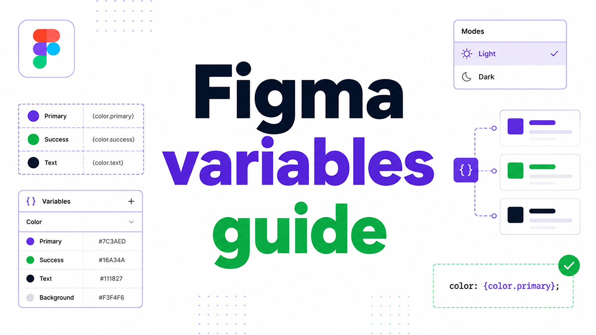
This Figma variables guide covers everything from variable types and variable collections to aliasing, dark mode theming, prototype logic, and managing a token-based design system at scale.
By the end, you will know how to:
- Set up color, number, string, and boolean variables
- Build a primitive and semantic token architecture
- Use modes for light/dark switching
- Connect variables to a developer handoff workflow
No fluff. Just the system, explained clearly.
What Are Figma Variables?
Figma variables are reusable values stored under a name and applied across design tokens, components, and prototypes. A variable holds one of 4 types: color, number, string, or boolean. Each type maps to specific layer properties, and changing a variable’s value updates every element bound to it, instantly, across the entire file.
Variables launched at Config 2023 in June and replaced much of what designers previously managed through styles or manual duplication. They are local to a file by default and become shared only when published to a team library.
Figma held 90% designer adoption by 2023, up from just 7% in 2017 (UX Tools), making it the dominant tool for teams building and managing design systems today.
How Figma Variables Differ from Figma Styles
Styles define formatted, composite properties. A text style, for example, bundles font family, size, weight, and line height into one object.
Variables store a single raw value: one hex color, one number, one string, one boolean. That raw value can then be referenced by any property that accepts it.
Have you seen the latest Figma statistics?
Discover comprehensive Figma statistics including revenue growth, market share, user demographics, and funding data.
Check them out →| Feature | Figma Styles | Figma Variables |
|---|---|---|
| What They Store | Composite Formatted Properties | Single Raw Values |
| Mode Support | No | Yes (Light/Dark, Desktop/Mobile) |
| Best For | Typography, Gradient Fills | Color, Spacing, Radius, Visibility |
| Prototype Use | No | Yes (Counters, Conditionals, Toggles) |
Color styles are still the right choice for gradient fills. Color variables handle flat fills and strokes. For everything related to theming and multi-context design, variables are the tool.
What Are Variable Collections and Modes in Figma?
A collection is a named container for a group of variables. A mode is an alternate value set within that collection. One variable can return a different value depending on which mode is active on the frame.
Switch the mode on a frame, and every variable applied to layers inside it updates at once. No manual color swaps, no duplicate frames to maintain.
How Collections Are Structured
Most design systems use 2 to 3 separate collections: one for primitives (raw hex values), one for semantic tokens (purpose-named references), and sometimes one for component-specific tokens.
Keeping primitives and tokens in separate collections is intentional. It prevents raw values from being applied directly to components, keeping the token architecture clean and enforcing the aliasing chain.
Plan Limits on Modes
Mode limits vary by plan:
- Free plan: 1 mode per collection
- Pro plan: up to 4 modes per collection
- Organization/Enterprise: unlimited modes
For multi-theme workflows (Light/Dark plus brand themes), the Pro plan is the minimum. The Free tier blocks any context-switching use case beyond a single value set.
Applying a Mode to a Frame
Select any frame, open the right sidebar, and use the “Apply variable mode” option under the collection name. Nested frames can carry different modes simultaneously. A child frame set to Dark mode will override the parent’s Light mode setting for all layers inside it.
What Are the Four Figma Variable Types?
Figma supports exactly 4 variable types: color, number, string, and boolean. Each type is identified by a distinct icon in the Variables panel and binds only to compatible layer properties.
84% of design teams had adopted design tokens by 2025, up from 56% in 2024 (Zeroheight Design Systems Report 2025). Variables are how those tokens live inside Figma.
Color Variables: Scope and Application
Color variables store solid color values: hex, rgba, or a reference to another color variable. They bind to fills, strokes, and backgrounds.
They do not support gradients. Gradient fills still require styles. For any flat surface in a component, color variables are the correct choice.
Scope options let you restrict a color variable to specific uses:
- All fills
- Frame fill only
- Shape fill only
- Stroke color
Number Variables: Spacing and Sizing Tokens
Number variables store integers and decimals and are the backbone of a spacing token system.
Bindable number properties include: corner radius, padding (top, bottom, left, right), gap between items in auto layout, width, height, and opacity. This is what makes a responsive spacing system practical inside Figma rather than just in code.
Scope matters here. Set a number variable’s scope to “Corner radius” only, and it won’t appear as an option when binding a spacing field. Scope filtering keeps the panel clean as token libraries grow.
String Variables: Content and Prototype Logic
String variables hold a sequence of characters: a font family name, a content label, a locale-specific phrase. During prototype playback, they swap text content dynamically based on user interaction or flow conditions.
A practical use: bind a string variable to a text layer holding a product name, then switch the variable’s value per prototype state. No duplicate frames, no manually updated text layers.
String variables also set font family and font style on text layers. The value must match the exact font name Figma recognizes, though it tolerates hyphens, underscores, and mixed casing.
Boolean Variables: Visibility Control
Boolean variables hold one of 2 values: true or false. They bind to layer visibility and nothing else at the design level.
In prototypes, they become condition triggers. A “Set variable” action on a button interaction toggles a boolean, which then shows or hides a layer in real time during playback. This is how interactive states like error messages, tooltips, and overlay panels work without requiring duplicate frames.
How to Create Figma Variables
Open the Variables panel by clicking the grid icon in the right sidebar (or via Edit > Local Variables). Create a new collection first, then add variables inside it. Every variable needs a name, a type, and an initial value.
Design teams using a structured system like this see a 38% average efficiency gain and developers working from the same token architecture see a 31% gain (Sparkbox, 2024).
Naming Conventions That Scale
Figma uses slash syntax to group variables into folders inside a collection. Examples:
color/primary/500color/neutral/100spacing/4radius/sm
The slash creates a visual folder structure in the panel. It also matches the naming format most JSON token files use, which makes engineering handoff cleaner when using Token Studio.
Assigning Values and Aliasing
A variable’s value can be a raw input (a hex code, a number, a word) or a reference to another variable. Referencing is called aliasing. It’s what enables the 3-tier token architecture that makes large design systems maintainable.
Raw values go in primitives. Everything above them references down. Change a primitive, and every alias built on it updates automatically.
Publishing to a Library
Variables are local until published. To share them across files, go to Assets > Local variables > Publish. Only variables inside published collections become accessible to other files. Unpublished collections stay file-local regardless of sharing settings.
Microsoft, Squarespace, and eBay all manage their Figma design systems through published libraries, using variable updates to propagate changes across product files without manual intervention (Figma Blog, 2024).
How to Apply Figma Variables to Design Properties
Click any fill, stroke, spacing, corner radius, or opacity field on a selected layer. A small variable icon (a grid of 4 squares) appears to the right of the input. Click it to open the variable picker. Select a variable from the list and the raw value is replaced by the variable name.
That bound property now shows the variable name, not the underlying value. Hover to see the resolved value. The layer stays connected: if the variable changes, the property updates.
What Properties Accept Variables
| Variable Type | Bindable Properties |
|---|---|
| Color | Fill, Stroke, Background Color |
| Number | Corner Radius, Padding, Gap, Width, Height, Opacity |
| String | Text Content, Font Family, Font Style/Weight |
| Boolean | Layer Visibility |
Detaching a Variable
Right-click the bound field and select “Detach variable”. The raw resolved value replaces the variable binding. The variable itself is not deleted, and any other layers still bound to it are unaffected.
This is useful when a one-off component needs a specific value that shouldn’t change with the rest of the system, without breaking the broader token structure.
What Is Variable Aliasing in Figma?
Variable aliasing means one variable references another variable as its value instead of holding a raw input. The alias inherits whatever value the referenced variable holds, and updates automatically when that source value changes.
This is not just a convenience feature. Aliasing is the structural principle behind scalable design systems. Without it, a color change requires touching every variable individually. With it, you change 1 primitive and every alias built on it reflects the update.
Primitive, Semantic, and Component Token Structure
The standard 3-tier token architecture used across teams like Atlassian, Shopify, and Airbnb works like this:
- Primitives: raw values only.
color/blue/500 = #0066FF - Semantic tokens: purpose-named, reference primitives.
color/interactive/defaultaliasescolor/blue/500 - Component tokens: component-specific, reference semantic tokens.
button/backgroundaliasescolor/interactive/default
Change #0066FF to #0052CC in the primitive, and every button background, link color, and interactive element using that chain updates in one edit.
This architecture is what makes design system best practices around token structure actually practical at scale, rather than theoretical. Teams at Figma’s enterprise tier track variable adoption through Library Analytics, with styles and variables tracking available from October 2024 (Figma, 2024).
How Do Figma Variables Work in Prototypes?
Variables in prototypes do more than style layers. They store state values during playback, not just at design time. A variable can increment, toggle, change text, or trigger conditional routing, all in response to user interaction inside the prototype.
This replaces the old approach of building separate frames for every possible state. A single frame with variable-driven logic handles what used to require 8 to 12 duplicate screens. If you want to prototype in Figma with real interactive logic, variables are how you do it.
Number Variables as Counters
Use case: a cart counter, a step progress indicator, a quantity selector.
Set the “Set variable” action on a button to increment a number variable by 1. Bind that variable to a text layer displaying the count. Each tap advances the number in real time during prototype playback without duplicating frames.
Boolean Variables for Visibility Toggling
Bind a boolean variable to a layer’s visibility property. Wire a button’s “On click” interaction to “Set variable” and toggle the boolean between true and false.
The layer appears or disappears during playback. This is how error states, notification badges, tooltips, and micro-interactions work in Figma prototypes without frame duplication.
Conditional Logic with Variables
Figma’s advanced prototyping supports “If/Else” conditionals on navigate actions. The condition checks a variable’s current value and routes to different frames based on the result.
Practical examples:
- Route a login flow to “Welcome back” or “First time setup” based on a boolean
- Show different confirmation messages based on a string variable set earlier in the flow
- Disable a “Next” button until a counter variable reaches a required threshold
Variable modes also apply here. A “Set variable mode” prototype action switches a collection’s active mode for the current page, updating all variable values bound to elements on that page at once. This is how a theme toggle button works inside a Figma prototype.
How to Use Figma Variables for Dark Mode and Theming
By 2025, 82% of mobile users prefer dark mode, and it reduces battery consumption by up to 47% on OLED screens (AlterSquare, 2025). Building dark mode support through Figma variables, rather than duplicate frames or manual overrides, is now the standard approach on any serious design system.
Variable modes make this systematic. One collection, two modes, zero duplicated color palettes.
Setting Up Light and Dark Modes
Step-by-step collection structure:
- Create a color collection named “Tokens” (or “Themes”)
- Rename the default mode to “Light”
- Add a second mode named “Dark”
- For each variable, set 2 values: one per mode
Example: the variable surface/background holds #FFFFFF in Light mode and #1A1A1A in Dark mode. Switch the mode on a frame and every bound layer updates instantly.
Color variables used this way only support flat fills. Gradients still require styles, not variables.
Applying Modes to Frames
Figma applies modes at the frame level, not at the file level. Select a frame, open the right sidebar, and use “Apply variable mode” under the collection name.
Nested frames can carry different modes simultaneously. A modal component inside a Dark mode frame can be explicitly set to Light mode if needed, and it will override the parent’s setting for all layers inside it.
Theme Switching Inside Prototypes
Figma’s “Set variable mode” prototype action switches the active mode for the entire page during playback.
Wire a toggle button’s “On click” action to “Set variable mode,” select the Tokens collection, and point it to Dark. Tap the button in the prototype and the entire screen switches themes. No separate artboards. No Smart Animate workarounds.
This also works for brand theme switching, not just light/dark, making it practical for multi-brand design systems like those managed by teams at Atlassian and Shopify.
How to Share Figma Variables Across Files
Variables are local by default. Sharing them requires publishing the collection to a team library. Once published, any file in the team can access and consume those variables, just like shared component libraries.
Design systems built on shared libraries see a 34% faster completion of design tasks, according to Figma’s own research (2019). Variable libraries extend that benefit to token-level changes as well.
Publishing a Variable Collection
Publish path: Assets panel > Local variables > Publish changes.
Only collections explicitly published become available to other files. Unpublished collections stay file-local regardless of sharing permissions on the file itself. Each update to a published collection requires a new publish action, after which consuming files receive an “Accept library update” prompt.
Consuming Variables in Other Files
In a consuming file, open the Assets panel and find the library name under “Shared libraries.” Variables from that library appear in the variable picker alongside local ones.
Key behavior: Local overrides in a consuming file do not break the library connection. A designer can detach a single variable binding without affecting other layers or losing the library link.
Intuit used this model to link Figma variables directly to their design token CI/CD pipeline across brands including TurboTax, QuickBooks, and Mailchimp, using the Figma REST API to sync variable data into code repositories (Nate Baldwin, Medium, 2023).
Variable Library Updates and Conflicts
Conflicts arise when a consuming file contains a component using an older version of a variable collection that lacks a mode present in the newer version.
Resolution is straightforward: publish the updated collection from the source file, then accept the library update in the consuming file. Layers using the older version will then gain access to the new mode.
How to Manage Figma Variables in Large Design Systems
Design systems that use a structured token architecture cut 30 to 40% of development costs through reduced duplication and fewer rework cycles (McKinsey, 2024).
That efficiency depends on how the variable library is organized. Poorly named or arbitrarily grouped variables create the same maintenance problems they were meant to solve.
Naming Conventions for Scalable Collections
Slash syntax creates folder groups inside a collection. A well-structured library separates concerns across 3 naming tiers:
color/blue/500(primitive, raw value)color/action/default(semantic, references primitive)button/bg/primary(component, references semantic)
Rule: semantic tokens name for role, not appearance. text/secondary outlasts a rebrand. gray/text does not (Figma, 2025).
Syncing Variables with Code Using Token Studio
Token Studio is the most widely used Figma plugin for connecting variables to code repositories. It transforms token values into JSON files and syncs them to GitHub, GitLab, or Azure DevOps via bidirectional workflows.
Smallstep, a developer tools company, used Token Studio to cut UI development time in half by syncing Figma color, typography, and spacing tokens directly to their GitHub UI kit repository. Changes in Figma propagate to every component automatically on rebuild, with no manual CSS updates from developers (Smallstep Blog, 2024).
Token Studio works alongside Figma’s native variables, not as a replacement. Native variables handle design-time binding. Token Studio handles the code sync pipeline and multi-file token management.
Auditing and Deprecating Variables
Variable bloat is a real problem in design systems that have been active for 12 or more months.
As of February 2025, Figma’s Library Analytics tracks variable usage data for Organization and Enterprise customers, with history available from October 10, 2024 (Figma, 2025). Teams can identify unused variables, compare adoption across product files, and make informed deprecation decisions without guesswork.
| Tool | Primary Use | Plan Required |
|---|---|---|
| Figma Library Analytics | Usage Tracking, Adoption Metrics | Organization / Enterprise |
| Token Studio | JSON Sync, Code Handoff | Any Paid Plan |
| Figma REST API | Automated Variable Extraction | Enterprise Only |
| Variables Organizer (Plugin) | Cleanup, Bulk Renaming | Any Plan |
What Are the Current Limitations of Figma Variables?
Variables are powerful. They also have gaps worth knowing before you build a token architecture around them. Hitting a wall mid-project because a required feature does not exist is a genuinely frustrating situation.
These are the real limitations as of 2025, not outdated ones from the original beta release.
Typography Variables: Partial, Not Complete
Figma added typography variable support in April 2024. String variables now control font family and font style. Number variables control font size, line height (px only), letter spacing, and paragraph spacing.
What’s still missing:
- No percentage support for line height. Pixels only, which breaks relative scaling workflows.
- No variable binding for text case (uppercase, title case). Multi-brand systems that toggle casing per theme cannot use native variables for this.
- Styles do not visually reflect the active mode for typography variables in the picker. This is a known open bug reported since May 2024 (Figma Forum).
Variables also cannot store composite typography values. A full text style (family + weight + size + line height) still requires a Figma style to bundle those properties together.
Gradient and Expression Gaps
Variables store one value per type. Gradients require multiple values (multiple stops, positions, angles) and therefore cannot be stored in a variable. Gradient fills must remain in styles.
Variables also have no native support for math expressions or computed values. A spacing token that should equal base * 1.5 cannot do that calculation inside Figma natively. That logic lives in the code pipeline, not the design file.
REST API Access Is Enterprise-Only
The Figma Variables REST API endpoint (/v1/files/:file_key/variables) is available to Enterprise plan customers only. Organizations and Professional plan teams cannot access it.
This is the most friction-generating limitation for small and mid-size teams trying to build automated design-to-code workflows. Token Studio’s plugin API fills part of this gap, but it runs in Figma’s plugin environment rather than as a standalone CI/CD integration.
Teams that cannot access the REST API can still export variables manually via plugins like Token Studio or PRISM Tokens, which handles sync, diffing, and code generation without requiring Enterprise access.
How Do Figma Variables Compare to Figma Styles?
Variables and styles are not competing systems. They solve different problems, and well-structured design systems use both. Knowing which one to reach for, and when, prevents architecture mistakes that are annoying to untangle later.
What Each System Does Well
Styles are better for:
- Composite values: text styles bundle 5+ properties into one object
- Gradient fills: require multiple values, which variables cannot store
- Effect styles: multiple shadows stacked together
Variables are better for:
- Theming: modes enable Light/Dark/brand switching without duplicates
- Spacing and radius: number variables keep these consistent and bindable
- Prototype logic: counters, toggles, and conditionals require variables
- Code handoff: variables carry code syntax metadata that styles do not
Side-by-Side Comparison
| Capability | Styles | Variables |
|---|---|---|
| Multi-Mode Theming | No | Yes |
| Gradient Fills | Yes | No |
| Composite Typography | Yes | No (Partial) |
| Prototype Interaction Logic | No | Yes |
| Code Syntax Metadata | No | Yes |
Migrating Color Styles to Variables
Figma allows in-place conversion of existing color styles to color variables. Right-click any color style in the Styles panel and select “Convert to variable.” The style is removed and replaced with a bound variable in the same collection.
This is the standard migration path for design systems that were built on styles before Config 2023. eBay used this approach when modernizing their 30-year-old design guidelines into the Evo system, announced in November 2024, replacing static style assets with a token-based architecture that scales across product teams (Figma Blog, 2024).
For teams starting fresh, the guidance from Figma is clear: use variables for single raw values and theming, use styles to bundle composite properties. Both working together is the correct setup, not one replacing the other.
If you want to see this in practice, the Figma design system setup process walks through building collections, publishing libraries, and connecting token architecture to components from the ground up.
FAQ on Figma Variables Guide
What are Figma variables?
Figma variables are reusable values stored under a name and applied across components, prototypes, and design tokens. They come in 4 types: color, number, string, and boolean. Changing a variable’s value updates every bound layer instantly across the file.
What is the difference between Figma variables and styles?
Styles store composite properties like full text styles with font, size, and weight bundled together. Variables store a single raw value. Variables support modes for theming. Styles do not. Use both together in a complete design system.
How do variable collections and modes work?
A collection groups related variables. A mode is an alternate value set inside that collection, such as Light and Dark. Switching the mode on a frame updates all bound variables at once, with no manual edits required.
Can Figma variables be used for typography?
Yes, partially. String variables control font family and style. Number variables handle font size, line height in px, and letter spacing. Percentage line heights and text case are not yet supported. Composite text styles still require Figma styles.
What is variable aliasing in Figma?
Aliasing means one variable references another instead of holding a raw value. It enables a primitive, semantic, and component token architecture. Change one primitive and every alias built on it updates automatically across the entire file.
How do Figma variables work in prototypes?
Variables store state values during prototype playback. Number variables act as counters. Boolean variables toggle layer visibility. String variables swap text content. Conditional logic routes users to different frames based on a variable’s current value.
How do I set up dark mode using Figma variables?
Create a color collection with two modes: Light and Dark. Assign separate values per mode to each variable. Apply the mode to a frame using the right sidebar. Use a “Set variable mode” prototype action to switch themes during playback.
How do I share Figma variables across files?
Publish the variable collection via Assets > Local variables > Publish. Consuming files access published variables through the Assets panel under the library name. Unpublished collections stay file-local regardless of file sharing settings.
What are the main limitations of Figma variables?
Variables do not support gradients, math expressions, or percentage line heights. The Figma REST API for variables is restricted to Enterprise plans only. Free plan users are limited to one mode per collection, blocking multi-theme workflows.
What is the best way to manage variables in a large design system?
Use slash naming like color/primary/500 to group variables into folders. Keep primitives and semantic tokens in separate collections. Use Token Studio to sync variables to code. Audit usage with Figma’s Library Analytics on Organization or Enterprise plans.
Conclusion
This conclusion is for an article presenting how Figma variables work across the full token architecture, from variable aliasing and mode switching to prototype logic and library publishing.
The system rewards upfront structure. Get your primitive and semantic token layers right, and global theme switching, dark mode, and design handoff all become manageable rather than painful.
A few things worth keeping in mind:
- Gradient fills and composite typography still need Figma styles
- The REST API variables endpoint requires an Enterprise plan
- Token Studio bridges the gap between variable collections and code
Variables are not a replacement for good system thinking. They just make that thinking easier to maintain.

Many of his resources are available on various design marketplaces. Over the years, he's worked with a range of clients and contributed to design publications like Designmodo, WebDesignerDepot, and Speckyboy, Slider Revolution among others.
- What is Backend in Web Development? - September 13, 2026
- What is Frontend Development? - September 11, 2026
- How to Make a Button in Figma: Design Best Practices - September 10, 2026

