
Most forms fail before a user types a single character.
Accessible forms are the difference between a website that works for everyone and one that quietly locks out 26% of the population. Missing labels, broken keyboard navigation, and color contrast failures are not edge cases – they are the default state of the web.
This guide covers the complete picture: WCAG 2.1 and 2.2 requirements, screen reader behavior, keyboard navigation, error handling, and how to test what you build.
By the end, you will know exactly what makes a form accessible and how to audit the ones you already have.
What Are Accessible Forms?
Accessible forms are form interfaces that all users, including those with visual, motor, cognitive, and auditory disabilities, can perceive, operate, and complete without barriers.
The definition is grounded in technical standards. WCAG 2.1 and 2.2 set the baseline, covering everything from how labels are associated with inputs to how errors are announced to assistive technology.
Scope matters here. Accessible form design applies to login forms, checkout flows, contact forms, registration pages, survey forms, and any other input-based interface a user encounters.
The gap between what exists and what’s needed is significant. According to AudioEye’s 2023 Digital Accessibility Index, 1 in 4 forms is missing descriptive labels for people with disabilities – making those forms functionally broken for screen reader users before a single keystroke is taken.
Web accessibility starts with forms because forms are the primary way users interact with and transact through a website.
What Is the Difference Between Accessible and Usable Forms?
A form can pass automated accessibility checks and still fail real users. These two concepts overlap, but they are not the same thing.
| Dimension | Accessible Form | Usable Form |
|---|---|---|
| Standard | Meets WCAG 2.1/2.2 criteria | Meets user expectations in practice |
| Test method | Automated tools, screen reader testing | Usability testing with real users |
| Common failure | Missing label association | Confusing label wording |
| Who it affects | Assistive technology users | All users |
Key difference: Accessibility is a floor. Usability is the ceiling. A form needs both.
Automated testing catches roughly 30-40% of real accessibility issues (Deque Systems). The rest only surface during manual keyboard testing and screen reader walkthroughs.
Who Uses Accessible Forms?
Motor disabilities: Users who rely on keyboard navigation and cannot use a mouse depend on logical tab order, visible focus indicators, and keyboard-operable controls.
Visual disabilities: Screen reader users hear form fields announced by their label, role, and current state. Missing or incorrect labels make fields completely unusable.
Cognitive disabilities: Clear labels, plain language instructions, and forgiving error messages reduce the cognitive load of completing a form correctly.
Situational limitations: A user filling out a mobile checkout form with one hand benefits from the same touch target sizing and autocomplete support as a user with a permanent motor disability.
According to the CDC, 26% of US adults have some type of disability. Forms that exclude them exclude roughly 1 in 4 potential users.
What Standards and Laws Govern Form Accessibility?
WCAG 2.1 Level AA is the global technical baseline for accessible form design, and it is the standard referenced in most legal accessibility obligations worldwide.
The legal layer sits on top of the technical one. Different regions enforce different laws, but nearly all of them point back to WCAG as the measurement criteria.
| Law / Standard | Region | Applies To |
|---|---|---|
| ADA (Title III) | United States | Public-facing websites |
| Section 508 | United States | Federal agencies and contractors |
| EN 301 549 | European Union | Public sector, EAA scope |
| AODA | Canada (Ontario) | Public and private sectors |
| WCAG 2.1 Level AA | Global | Technical baseline for all of the above |
What Does WCAG Say About Forms Specifically?
WCAG contains 86 success criteria across WCAG 2.2. Several apply directly to form elements.
The most relevant criteria for forms:
- 1.3.1 Info and Relationships – Labels must be programmatically associated with their inputs
- 1.3.5 Identify Input Purpose – Personal data fields require
autocompleteattributes - 2.4.6 Headings and Labels – Labels must describe the purpose of the field
- 3.3.1 Error Identification – Errors must be identified in text, not color alone
- 3.3.2 Labels or Instructions – Instructions must be provided when user input is required
- 4.1.2 Name, Role, Value – Custom controls must expose their accessible name, role, and state
WCAG 2.2, published in October 2023, added new criteria relevant to form interactions. 2.5.8 Target Size (Minimum) requires touch targets of at least 24×24 CSS pixels. 3.3.7 Redundant Entry means users should not have to re-enter information they’ve already provided in the same session.
What Are the Legal Risks of Inaccessible Forms?
In the first half of 2025, more than 2,000 ADA website accessibility lawsuits were filed, a 37% increase compared to the same period in 2024 (AudioEye, 2025).
Nearly 70% of those lawsuits targeted e-commerce businesses. Forms – checkout, login, registration – are frequently cited as the specific failure points.
Average ADA lawsuit settlements run between $50,000 and $150,000 (AllAccessible, 2025). That does not count legal fees or remediation costs.
The European Accessibility Act came into force on June 28, 2025, expanding form accessibility obligations to private-sector digital products and services across EU member states.
How Do Screen Readers Interact with Form Elements?
Screen readers process form elements through the browser’s accessibility tree, not the visible DOM. What renders visually on screen is secondary to what the accessibility tree exposes.
When a screen reader user focuses on a form field, the screen reader announces: label, role, current value, and state – in that order. A field with no programmatically associated label announces only its role (“edit text”), giving users no information about what to type.
How JAWS and NVDA Process Form Fields
JAWS and NVDA are the two most widely used desktop screen readers. According to the WebAIM Screen Reader User Survey 10 (2024), JAWS is the primary desktop screen reader for 40.5% of respondents and NVDA for 37.7%.
Both operate in two modes that directly affect form navigation:
Browse mode (reading mode): The screen reader reads page content sequentially. Users navigate by pressing keys to jump between headings, links, and form elements.
Forms mode (application mode): Activated when the user focuses on an interactive control. Keystrokes are passed to the form element instead of the screen reader. This is where actual input happens.
The mode switch is automatic in most cases, but it can break if form elements are incorrectly coded or if focus management misfires.
JAWS with Chrome is the most common combination (24.7% of users). NVDA with Chrome follows at 21.3% (WebAIM, 2024). Testing both combinations against your form is the minimum viable screen reader test.
How VoiceOver Handles Forms on iOS and macOS
VoiceOver behaves significantly differently on iOS versus macOS. They share a name but diverge in navigation model, gesture set, and how form modes work.
On iOS, VoiceOver uses swipe gestures to navigate. Users double-tap to activate a field. The virtual keyboard appears and VoiceOver enters a direct touch typing mode.
On macOS, VoiceOver uses a modifier key (VO key) combined with arrow keys. Form interaction still requires mode switching, but the mechanics differ from both JAWS/NVDA and iOS.
VoiceOver on mobile accounts for 70.6% of mobile screen reader usage (WebAIM, 2024). Any form tested only on desktop screen readers has a significant blind spot.
What Makes a Form Label Accessible?

Labels are the single most important element in accessible form design. Every <input>, <select>, and <textarea> must have a label that is both visible and programmatically associated.
According to WebAIM’s 2025 Million report, 48.2% of homepages have at least one unlabeled form input – making missing labels the third most common WCAG failure across the entire web.
Explicit vs. Implicit Label Association
Two valid HTML approaches exist for associating a label with its input.
Explicit association uses the for attribute on <label> matching the id on the input:
<label for="email">Email address</label>
<input type="email" id="email" name="email">
Implicit association wraps the input inside the label element:
<label>
  Email address
  <input type="email" name="email">
</label>
Explicit association is more reliable across assistive technologies. JAWS in particular handles explicit labels more consistently than implicit ones in complex form layouts.
Why Placeholder Text Fails as a Label
Placeholder text disappears when a user starts typing. That single behavior creates 3 distinct accessibility failures:
- Users with short-term memory difficulties cannot recall what the field requires after typing begins
- Placeholder text typically fails WCAG 1.4.3 contrast requirements (grey-on-white rarely hits 4.5:1)
- Screen readers do not consistently expose placeholder as the accessible name – behavior varies by browser and screen reader combination
The rule is simple: placeholder text is supplementary hint text. It is not a label. Using it as a label violates WCAG 1.3.1.
Nielsen Norman Group’s eye-tracking research on form label placement (replicated in 2022) found that top-aligned labels produce the fastest completion times and the fewest errors across user groups.
When to Use ARIA Labeling
Native HTML labels are always the first choice. ARIA labeling fills gaps when native HTML is not enough.
aria-label provides an accessible name directly on the element – useful for icon-only buttons inside forms (search, clear, submit):
<button aria-label="Clear search field">✕</button>
aria-labelledby points to an existing element’s text as the label – useful when the visible label is separated from the input in the DOM:
<h2 id="billing-heading">Billing Address</h2>
<input type="text" aria-labelledby="billing-heading" name="address">
aria-describedby adds supplementary description – separate from the label, used for hint text, character limits, or format requirements:
<input type="password" id="pwd" aria-describedby="pwd-hint">
<span id="pwd-hint">Must be at least 8 characters</span>
The key distinction: aria-labelledby replaces the label. aria-describedby adds to it.
How Do Keyboard Users Navigate Forms?
Keyboard navigation is the core accessibility requirement for users with motor disabilities. The entire form must be operable without a mouse.
The tab key moves focus forward through interactive elements. Shift+Tab moves backward. Enter submits. Space activates checkboxes and buttons. Arrow keys navigate radio button groups and <select> menus.
Every one of these interactions must work in sequence, without traps, and with visible focus indicators.
What Is the Required Tab Order for Forms?
Tab order must follow the logical visual reading sequence of the form. When tab order skips fields, jumps backward, or loops unexpectedly, keyboard users lose orientation completely.
The browser’s default tab order follows DOM source order. This works correctly when the visual layout matches the DOM structure. It breaks when CSS positions elements visually out of DOM order.
Positive tabindex values (tabindex=”1″, “2”, “3”) override natural order. This causes more problems than it solves. Avoid them. Use tabindex="0" to make a non-interactive element focusable. Use tabindex="-1" to programmatically move focus without adding the element to the natural tab sequence.
The WebAIM checklist (2024) flags illogical tab order as a Level AA failure under WCAG 2.4.3.
Focus Management in Multi-Step Forms
Multi-step forms require explicit focus management on each step transition.
When a user submits Step 1 and Step 2 loads, focus must move to a logical starting point in the new content. If focus stays on the submit button (which may no longer exist), screen reader users have no signal that the page state has changed.
Correct focus placement on step transitions:
- Move focus to the new step’s heading (
<h2>or<h3>) - Or move focus to the first input field in the new step
- Announce step progress to users via
aria-liveor a visible status update
The step indicator itself – “Step 2 of 4” – must also be exposed to assistive technology. Use aria-valuenow, aria-valuemin, and aria-valuemax on progress bars. Always include a plain-text equivalent.
Keyboard Traps: When They Are Required vs. When They Are a Bug
A keyboard trap locks focus inside a component. In most cases, that is a WCAG 2.1.2 failure. But one case requires it: modal dialogs containing forms.
When a modal form opens (account creation, confirmation dialog, checkout overlay), focus must be trapped inside the modal. If a keyboard user can Tab out of the modal into the background page, they lose context and cannot complete the task.
Required trap (modal form): Focus cycles between interactive elements inside the modal. Escape closes the modal and returns focus to the trigger element.
Bug (unintentional trap): A custom date picker or dropdown holds focus and provides no keyboard exit path. The user is stuck.
The ARIA Authoring Practices Guide (APG) dialog pattern covers the correct implementation. Return focus to the element that opened the modal on close – always.
What Are the Accessibility Requirements for Form Error Messages?
Error handling is where most accessible form implementations fall apart. Visually obvious errors – red borders, warning icons – are completely invisible to screen reader users unless the error is also expressed in text and programmatically associated with the failed field.
WCAG 3.3.1 (Error Identification) requires that errors be identified in text. WCAG 3.3.3 (Error Suggestion) requires that when an error is detected, a description of the fix be provided where possible.
How Should Inline Errors Be Announced?
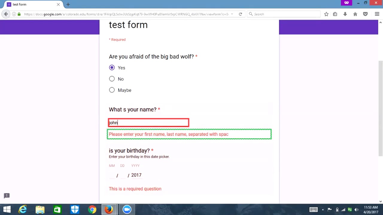
Inline errors that appear after a user leaves a field or submits a form need two things: visible error text and a programmatic connection to the input.
Step 1: Add the error message to the DOM as visible text near the failed field.
Step 2: Link it to the input using aria-describedby:
<input type="email" id="email" aria-describedby="email-error" aria-invalid="true">
<span id="email-error" role="alert">Enter a valid email address.</span>
role="alert" triggers an aria-live announcement automatically. Screen readers announce the error text without requiring the user to navigate to it.
aria-invalid="true" signals to the screen reader that the field contains an error. When set to true, JAWS and NVDA announce the field as “invalid” when focused.
Baymard Institute research (2023) found that inline error validation reduces form abandonment by 22% compared to forms that surface all errors only on submission. That benefit applies to all users, not just those using assistive technology.
What Should an Error Summary Contain?
On form submission with validation failures, provide an error summary at the top of the form in addition to inline errors.
An accessible error summary includes:
- A heading (e.g., “3 errors need to be fixed”)
- A list of each error as a link to the specific field that failed
- Focus moved to the summary heading on submission
Moving focus to the error summary is non-optional for keyboard and screen reader users. Without it, users who submitted the form have no indication of what happened or where to look.
The link-to-field pattern in the summary is what makes it actionable. “Email address is required” as anchor text navigates the user directly to the email field.
How Are Complex Form Components Made Accessible?

Custom form components – date pickers, multi-select dropdowns, comboboxes, file upload buttons – carry the highest accessibility failure rate in audits.
Native HTML controls (<input type="date">, <select>) have built-in accessibility support baked into the browser. Custom components have none of that by default. Every keyboard interaction, every ARIA role, every state announcement must be implemented explicitly.
Accessible Dropdown and Combobox Patterns
A combobox is an input that allows filtering a list of options. It combines a text field with a listbox.
The ARIA roles required: role="combobox" on the input, role="listbox" on the options container, role="option" on each item.
Required keyboard behavior:
- Down Arrow opens the list and moves to the first option
- Up/Down Arrows navigate between options
- Enter selects the focused option and closes the list
- Escape closes the list without selecting
- Home/End move to the first and last options in an open list
aria-expanded="true/false" communicates whether the dropdown is open. aria-activedescendant points to the currently focused option’s id, allowing the screen reader to announce it without physically moving DOM focus.
The ARIA Authoring Practices Guide combobox pattern (APG 1.2) is the reference implementation. Use it exactly.
Accessible Date Picker Implementation
Date pickers are the most consistently inaccessible custom component on the web. Most custom implementations fail at keyboard navigation, fail to announce the selected date, and fail to communicate the current month in context.
Well, the thing is – a native <input type="date"> often outperforms a custom date picker from an accessibility standpoint. At least on Chrome and Edge, native date inputs expose a functional keyboard interface and announce values correctly to screen readers. On Safari, support is weaker.
When a custom date picker is necessary (locale formatting, date range selection, blocked dates), the APG disclosure navigation date picker pattern is the starting point.
Minimum requirements for a custom date picker:
- Calendar grid uses
role="grid"withrole="gridcell"on individual dates - Currently selected date carries
aria-selected="true" - Today’s date carries
aria-current="date" - Navigation buttons (previous month, next month) have clear
aria-labelvalues - The currently displayed month and year are announced when they change
- Keyboard support: Arrow keys navigate days, Enter selects, Escape closes, Page Up/Down change months
Microsoft’s Fluent UI date picker and Adobe’s React Aria DatePicker are two real implementations that get this mostly right. Both are open source and worth studying before building from scratch.
What Color Contrast and Visual Requirements Apply to Form Fields?
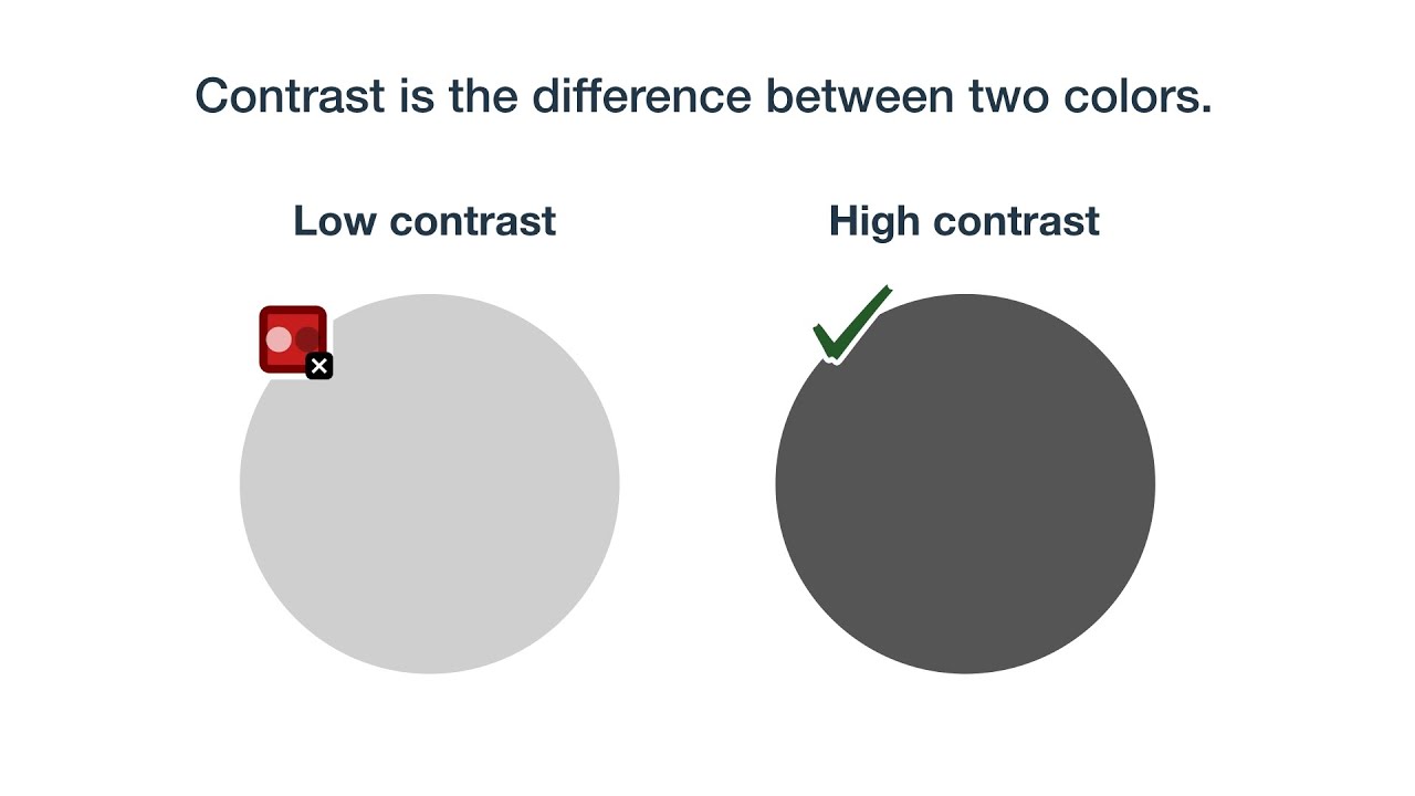
Color contrast in forms covers two distinct WCAG criteria, and most developers only know about one of them.
WCAG 1.4.3 covers text contrast: label text, hint text, and error messages must meet a 4.5:1 minimum ratio against their background. Large text (18pt or 14pt bold) only requires 3:1.
WCAG 1.4.11 covers non-text contrast: the visible borders of input fields, checkboxes, and radio buttons must meet a 3:1 minimum ratio against the adjacent background. This one gets missed constantly.
Low contrast text is the #1 WCAG failure on the web, appearing on 83.6% of homepages analyzed by WebAIM in 2024. A large share of those failures are inside forms.
What Visual Failures Most Commonly Affect Form Fields?
Thin input borders are the most common 1.4.11 failure. A 1px light-grey border on a white background fails immediately. Most design systems default to a border somewhere around #ccc or #d1d5db on white, both of which fail 3:1.
Placeholder text fails 1.4.3 in almost every default implementation. Browsers render placeholders at roughly 60% opacity of the input text color. On most form designs, that’s a failing ratio.
Required field indicators that use color alone (red asterisk without explanation) fail WCAG 1.4.1, which prohibits color as the only means of conveying information.
Focus ring contrast: WCAG 2.4.11 (new in 2.2) requires that the focus indicator itself meets 3:1 against both the unfocused element color and the adjacent background. Browser defaults often fail this on custom-styled inputs.
What Tools Check Form Field Contrast?
| Tool | Type | Best For |
|---|---|---|
| Colour Contrast Analyser (TPGi) | Desktop app | Spot-checking individual elements |
| Stark (Figma/Sketch plugin) | Design-stage | Catching failures before development |
| axe DevTools browser extension | Browser | Automated page-level scanning |
| WebAIM Contrast Checker | Web tool | Quick hex value verification |
The Colour Contrast Analyser eyedropper function is the most useful for checking input border contrast against backgrounds, since automated tools sometimes miss non-text contrast failures on dynamic components.
How Does Autocomplete Affect Form Accessibility?
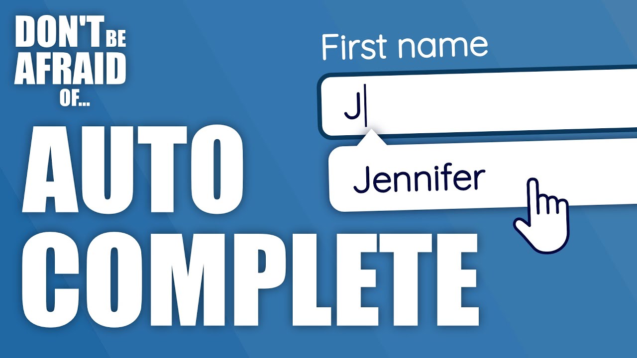
autocomplete is a Level AA WCAG requirement. Most teams treat it as a convenience feature. That’s the wrong framing.
WCAG 1.3.5 (Identify Input Purpose) requires that fields collecting personal data expose their purpose programmatically via valid autocomplete token values. This is a hard compliance requirement, not a suggestion.
Which Fields Require Autocomplete Tokens?
The HTML spec defines 53 valid autocomplete token values. Not every field needs one. Specifically, any field that collects personal user data falls under WCAG 1.3.5.
Fields that require correct autocomplete values:
name,given-name,family-nameemail,tel,usernamestreet-address,postal-code,countrycc-name,cc-number,cc-exp(payment fields)new-password,current-passwordbday,bday-day,bday-month,bday-year
Critical: using an invalid token value (like autocomplete="last-name" instead of autocomplete="family-name") fails WCAG 1.3.5 just as much as omitting the attribute entirely.
Why Autocomplete Matters for Motor and Cognitive Disabilities
Filling out the same personal data repeatedly is exhausting for users with motor impairments. Every keystroke costs effort.
For users with cognitive disabilities, autocomplete removes the memory burden of knowing what a field contains and how to format it correctly. A browser that recognizes autocomplete="tel" can insert a formatted phone number automatically.
According to ivyforms.com’s 2025 analysis of form accessibility patterns, correct inputmode and type attributes combined with autocomplete tokens reduce format-related input errors by 50% on mobile devices.
Turning autocomplete off with autocomplete="off" on general fields like name or address is a WCAG violation. The only fields where this is defensible are sensitive one-time-code fields (autocomplete="one-time-code") and cases with a documented security rationale.
What Accessibility Issues Affect Mobile Form Users?
Mobile form accessibility is not just desktop accessibility on a smaller screen. The interaction model changes completely.
92.3% of internet users access the web through mobile devices (We Are Social, 2023). A form that fails on mobile fails the majority of users.
What Touch Target Requirements Apply to Form Controls?
WCAG 2.5.8, new in WCAG 2.2, sets a minimum touch target of 24×24 CSS pixels for all interactive elements. That is the legal floor.
It is not a comfortable floor. MIT Touch Lab research found the average fingertip is 16-20mm wide. Users with motor impairments experience error rates up to 75% higher on small targets (TestParty, 2025). Apple’s Human Interface Guidelines recommend 44×44 points. Most design systems that take mobile app accessibility seriously target 44-48px minimum.
Where form controls most commonly fail 2.5.8:
- Inline checkboxes and radio buttons styled to their native 13-16px default
- Custom toggle switches sized visually but with a small hit area
- Date picker navigation arrows (previous/next month buttons)
- Dropdown disclosure triangles handled separately from the select element
What Virtual Keyboard and Input Type Requirements Apply?
Triggering the wrong virtual keyboard is a motor accessibility failure that affects all mobile users, not just those with disabilities.
type and inputmode attribute requirements by field:
- Email:
type="email"triggers the email keyboard (@, .com shortcuts) - Phone:
type="tel"triggers the numeric dial pad - Numbers only:
inputmode="numeric"triggers a numeric keypad without the phone layout - Decimal values:
inputmode="decimal"includes a decimal point key
Using type="text" for a phone number field on mobile is an accessibility failure for users with motor disabilities who cannot easily switch keyboards manually.
What Pinch-to-Zoom Restrictions Fail Mobile Form Accessibility?
Any page that sets user-scalable=no or maximum-scale=1 in the viewport meta tag fails WCAG 1.4.4 (Resize Text).
Zooming is a primary accommodation for users with low vision. Blocking it on a form page locks those users out of being able to read labels, hint text, and error messages at a usable size.
The fix is simple: remove the restriction. Remove user-scalable=no. There is no valid accessibility justification for blocking zoom on a form.
How Are Multi-Step and Dynamic Forms Made Accessible?
Dynamic forms are the highest-risk category for accessibility failures. Static forms with fixed fields are relatively easy to audit. Forms that show, hide, update, or transition content based on user input require active, ongoing management.
The core problem: when content changes dynamically, users relying on assistive technology have no way to know a change occurred unless the code communicates it explicitly.
How Should Focus Move on Step Transitions?
When a multi-step form moves from Step 1 to Step 2, focus must move to a deliberate location.
Correct target options, in priority order:
- The heading of the new step (
<h2>Step 2: Shipping Address</h2>) - The first input field in the new step
- A visible status message that announces the transition
What most developers do instead: nothing. The page updates, focus stays on the now-removed Submit button, and screen reader users hear silence.
WCAG 3.3.4 (Error Prevention) also applies to multi-step forms collecting legal or financial data. Users must be able to review and correct entries before final submission. A summary screen before the final Submit is the standard implementation.
How Do ARIA Live Regions Work in Dynamic Forms?
aria-live regions announce content changes to screen reader users without requiring them to navigate to the updated content.
The 2 live region settings that matter for forms:
aria-live="polite"– announces when the user is idle. Use for: character counters, hint text updates, progress indicators, non-urgent status messagesaria-live="assertive"– interrupts the user immediately. Use for: error messages, critical status changes, timeout warnings
role="alert" is shorthand for aria-live="assertive" combined with aria-atomic="true". Use it for inline error messages.
Common mistake: adding aria-live to a container that already has content in it. Screen readers only announce content that is injected after the live region loads. The region must exist in the DOM before the dynamic content is inserted.
What Session Timeout Requirements Apply to Forms?
WCAG 2.2.1 (Timing Adjustable) requires that users have at least 20 seconds to extend a session before it times out.
For forms with auto-save, WCAG 3.3.4 applies: data entered must be preserved for at least 20 hours after a session ends, or users must be warned before data loss occurs.
The GOV.UK design system implements session timeout warnings as accessible modal dialogs that appear 5 minutes before expiry, with a keyboard-operable “Stay signed in” button. That is the production-ready reference implementation for government forms globally.
How Are Accessible Forms Tested?
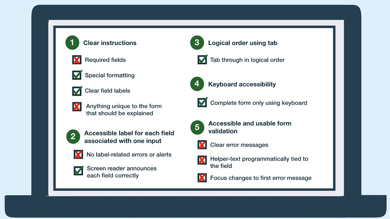
Form accessibility testing requires 3 layers. No single layer covers everything.
Layer 1 (Automated): axe-core, WAVE, IBM Equal Access Checker. Deque’s 2021 study across 13,000+ pages found axe-core detects 57.38% of issues by volume. Combined with Intelligent Guided Tests, that rises to 80.39%.
Layer 2 (Manual keyboard): Tab through every field. Check focus order, focus visibility, error announcements, and form submission behavior using only the keyboard.
Layer 3 (Screen reader): Test the full form completion flow in at least 2 screen reader/browser combinations.
Automated Testing Tools for Forms
axe-core catches the highest volume of form issues among automated tools, with a deliberately low false-positive rate.
Tool comparison for form-specific testing:
| Tool | Best Use | Form-Specific Checks |
|---|---|---|
| axe-core / axe DevTools | CI/CD integration, browser scanning | Labels, ARIA, roles, contrast |
| WAVE | Visual overlay feedback | Missing labels, error handling |
| IBM Equal Access Checker | WCAG 2.1 + 2.2 coverage | Input purpose, autocomplete |
| Google Lighthouse | Dev environment quick check | Label associations, ARIA |
Run axe-core in your CI/CD pipeline to catch regressions before deployment. It prevents the most common form failures from reaching production.
Manual Screen Reader Testing Protocol
Screen reader testing catches what automated tools cannot: announcement order, mode switching, custom component behavior, and the actual user experience of completing a form.
Minimum testing matrix for forms:
- JAWS + Chrome (40.5% of screen reader users, WebAIM 2024)
- NVDA + Firefox (significant European usage)
- VoiceOver + Safari on iOS (70.6% of mobile screen reader users)
8 manual checks for every form:
- Every field announces its label, type, and required state on focus
- Error messages are announced without requiring navigation
aria-invalid="true"is set on failed fields after submission- Tab order matches visual reading sequence
- All custom controls (date pickers, dropdowns) have correct ARIA roles
- Focus is managed correctly on step transitions
- Modal forms trap focus and return it on close
- Form can be completed and submitted using keyboard only
Inclusive design testing with actual disabled users catches issues no automated tool or developer walkthrough will find. At minimum, one round of user testing per major form redesign surfaces real-world barriers that scripted test cases miss.
The web accessibility checklist approach works as a structured final review before launch, but it complements testing rather than replacing it. A checked box on a list does not confirm that a form works for real people.
FAQ on Accessible Forms
What is an accessible form?
An accessible form is one that all users, including those with visual, motor, cognitive, and auditory disabilities, can perceive, operate, and complete. It meets WCAG 2.1 Level AA criteria and works with assistive technologies like screen readers and keyboard-only navigation.
What is the most common accessible form failure?
Missing input labels. According to WebAIM’s 2025 Million report, 48.2% of homepages have at least one unlabeled form input. Screen reader users encounter a field and hear only “edit text” with zero context about what to enter.
Do accessible forms need to comply with WCAG 2.2?
WCAG 2.2 is the current W3C standard as of October 2023. It adds requirements directly relevant to forms: 2.5.8 Target Size (24x24px minimum), 3.3.7 Redundant Entry, and 2.4.11 Focus Not Obscured. Legal obligations vary by region, but WCAG 2.2 is the recommended baseline.
Can I use placeholder text instead of a label?
No. Placeholder text disappears when a user starts typing, fails color contrast requirements in most implementations, and is not consistently announced by screen readers. WCAG 1.3.1 requires a programmatically associated label on every input.
What ARIA attributes are needed for form accessibility?
The most used are aria-label, aria-labelledby, aria-describedby, aria-invalid, and aria-required. Use native HTML labels first. ARIA is a fallback, not a replacement. Misused ARIA creates more barriers than no ARIA at all.
How should form error messages be made accessible?
Error text must be visible and linked to the failed field via aria-describedby. Set aria-invalid="true" on the input. Use role="alert" on inline errors so screen readers announce them immediately. Color alone cannot convey an error state under WCAG 1.4.1.
What makes a multi-step form accessible?
Focus must move to the new step’s heading or first field on each transition. Progress indicators need text equivalents alongside any visual bar. Session timeouts require at least 20 seconds for users to extend their session, per WCAG 2.2.1.
How do I test form accessibility?
Use three layers: automated scanning with axe-core, manual keyboard-only navigation, and screen reader testing across JAWS + Chrome, NVDA + Firefox, and VoiceOver on iOS. Deque’s data shows axe-core detects 57% of issues by volume – manual testing covers the rest.
What touch target size is required for mobile forms?
WCAG 2.5.8 requires a minimum of 24×24 CSS pixels for all interactive targets. Apple’s Human Interface Guidelines recommend 44×44 points for comfortable use. Checkboxes, radio buttons, and toggle switches are the most frequently undersized elements in mobile forms.
Does autocomplete affect form accessibility?
Yes. WCAG 1.3.5 requires valid autocomplete token values on all fields collecting personal data. This is a Level AA requirement, not optional. It directly helps users with cognitive and motor disabilities by letting browsers prefill fields without manual re-entry.
Conclusion
Accessible forms are not a separate discipline from good form design. They are the same thing.
Every requirement covered here, from WCAG 1.3.1 label association to ARIA live regions to touch target sizing, exists because real users fail to complete forms without them.
The tools are available. axe-core, the ARIA Authoring Practices Guide, and screen reader testing with JAWS and VoiceOver remove most of the guesswork.
What remains is priority. Keyboard navigation, visible focus indicators, and error identification in text are not advanced techniques. They are the baseline.
Build that baseline first. Test it with real assistive technology. Then layer in the harder stuff: dynamic form accessibility, multi-step focus management, and cognitive accessibility patterns.
Start with labels. Everything else follows.


