Imagine this: your website, a symphony of motion, each scroll revealing a narrative unfurling with grace. That’s the power of CSS animation at play.
Today’s web is not a static canvas—it’s alive, responsive, and engaging. At the core of these digital experiences are CSS animations, subtly guiding users through their journey on your site.
The shift from static pages has transformed user interactions from mundane to mesmerizing, making your content not just seen, but felt.
In this exploration, you’ll unlock the full potential of CSS animations.
Delving into keyframes that dance to the rhythm of your scroll, easing functions that smooth out the rough edges of motion, and responsive design movements that make every pixel count across devices.
From understanding the nuances of animation-duration to the intricacies of cross-browser compatibility, this article unveils the secrets to crafting interactive web elements that captivate.
After absorbing the insights shared here, you’ll emerge equipped to create web animations that not only function flawlessly but also tell a compelling story.
CSS animation examples
Simple Loading Spinners
See the Pen
Simple HTML & SVG Loading Spinners by Stephen Delaney (@sdelaney)
on CodePen.
Ever wonder about those little spinny things while a page loads? Yeah, that’s a CSS animation! These little fellas keep us entertained while we wait.
Morphing Cube Animation
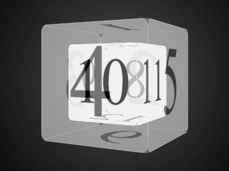
Alright, check this: A cube that transforms in a super slick way. Designers and devs, this one’s for you to jazz up your page. Oh, and the 3D effects? Straight fire!
Cloudy Spiral
See the Pen
Cloudy Spiral CSS animation by Hakim El Hattab (@hakimel)
on CodePen.
Clouds. Spirals. Together in one smooth CSS animation. What more can I say?
Candles (Pure CSS Animation)
See the Pen
Candles (Pure CSS Animation) by Akhil Sai Ram (@akhil_001)
on CodePen.
So, there are these two candles, right? One’s short and lit, the other’s tall and… wait for it… it blows out the smaller one! Darkness everywhere. And it’s all done with just CSS. Dope!
CSS Mouse Hover Transition Effect
See the Pen
CSS mouse-out transition effect by Adam Argyle (@argyleink)
on CodePen.
Light start here. Hover over some text and bam! Highlighted. Simple? Yes. Effective? Totally.
Dragon Loading Animation

Picture this: A kiddo’s website with a dragon that’s just there, chilling, loading. Cute overload!
Signature Animation
See the Pen
Signature animation by Damian Drygiel (@drygiel)
on CodePen.
Want to sign off in style? This CSS animation’s got you. It’s like a signature, but digital and way cooler.
Bits & Bytes | CSS Animation
See the Pen
Bits & Bytes | CSS Animation by Ollie (@Olwiba)
on CodePen.
Two astronauts, floating around. Colors everywhere! Black, navy blue, and a hint of magical red. Breathtaking.
Animated Submit Button
See the Pen
Submit Button pure css animation by Dead Pixel (@dead_pixel)
on CodePen.
Who said buttons are boring? A little animation can spark joy, ya know?
Poster Circle Animation
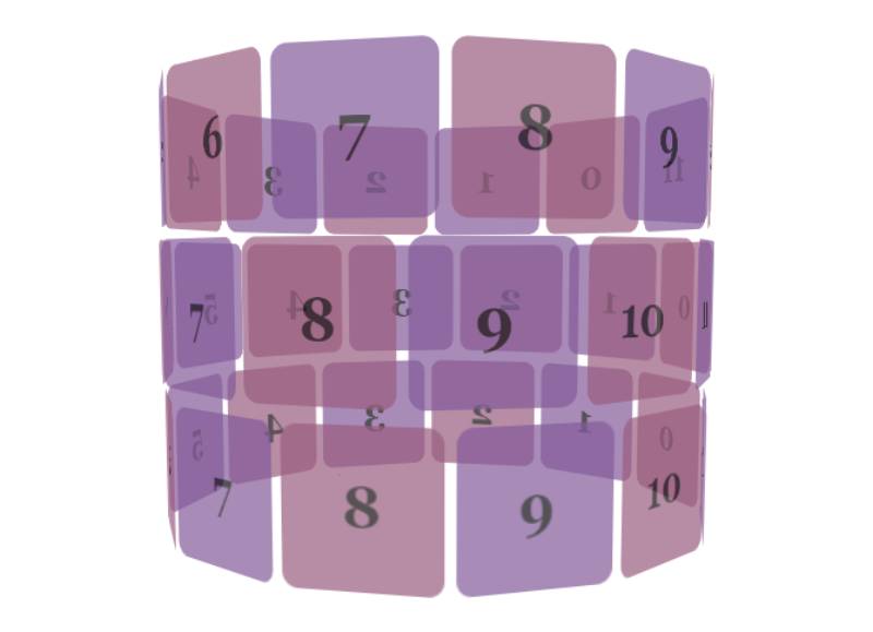
Rotate, rotate, rotate! A spinning wonder for all your web content needs.
CSS Flame Animation
See the Pen
CSS Flame Animation by Adrian Payne (@dazulu)
on CodePen.
It’s getting hot in here! An animated flame, brought to life using just… guess what? CSS animations!
CSS Animation Indoors or outdoors
See the Pen
CSS Animation: Indoors or outdoors? by Olivia Ng (@oliviale)
on CodePen.
Meet this dude in a yellow sweater. Indoors? Outdoors? Where will he go? Only the CSS knows.
Opening Envelope
See the Pen
Animated CSS Mail Button by Jake Giles-Phillips (@jakegilesphillips)
on CodePen.
The joy of getting mail, captured in an animation. Details so fine, you’ll think it’s real. Perfect for buttons or scroll triggers.
Store Loading Animation
See the Pen
CSS open store animation by Mariana Beldi (@marianab)
on CodePen.
A quirky store that comes alive as it loads. Cool, right? All thanks to some mad design skills.
Pure CSS Animated Bubbles
See the Pen
Pure CSS Animated Bubbles by Mark Bowley (@Mark_Bowley)
on CodePen.
Bubbles. Floating. Everywhere. And guess what? All with HTML and CSS. Mind blown.
Magnifying glass scrolling loop animation
See the Pen
Magnifying glass scrolling loop animation by Yancy Min (@yancy)
on CodePen.
Searching for a rad background? Peek into this magnifying glass. Props to Yancy Min for this sleek piece of art.
File Drawers
See the Pen
Pure CSS Drawers ʕノ•ᴥ•ʔノ ︵ ┻━┻ by Jhey (@jh3y)
on CodePen.
Got menus? Want to make ’em pop? Imagine a file drawer, but way cooler and all jazzed up. That’s this CSS animation for ya.
Stepper 3D Transition Animation
See the Pen
Stepper 3D by Oleg Frolov (@Volorf)
on CodePen.
Now picture this: Something steps out, but in 3D! I mean, if you’re looking to add some zing to your site, this is where it’s at.
CSS Animation Material Design
See the Pen
CSS Animation Material Design by Zoë Bijl (@Moiety)
on CodePen.
HTML and CSS teaming up to give you that sleek Material Design vibe. And of course, there’s animation.
Pure CSS Moustached Nanny
See the Pen
Pure CSS “Moustached Nanny” by Julia Miocene (@miocene)
on CodePen.
If you’re after something that shouts “LOOK AT ME!”, this one’s got you. A nanny, a moustache, and tons of character. All decked out in pure CSS. Your site will be the talk of the town.
Hot Coffee
See the Pen
Hot Coffee by Zane Wesley (@zanewesley)
on CodePen.
Who doesn’t love a good cuppa joe? This animation’s like that warm feeling you get sipping on a latte. Simple, but oh-so-effective.
CSS Ghost Loading Animation
See the Pen
ghost by Beep (@scoooooooby)
on CodePen.
Spooky season or not, this floaty ghost is here to make your page load fun! Especially if you’re reaching out to the little ones.
Card Swipe Animation
See the Pen
Card Swipe Animation Material Design by Zoë Bijl (@Moiety)
on CodePen.
Swipe left? Swipe right? No, it’s not that app. It’s a card animation, and it’s pretty fly.
The Handbook Download Animation
See the Pen
The handbook download animation by Yancy Min (@yancy)
on CodePen.
Alright, let me paint you a picture: an online library, shelves stacked with books, and all of ’em just a click away. Yancy Min brought this to life, and it’s like… chef’s kiss.
Color Fan
See the Pen
Color Palette with Pure CSS Animation by Nitish Khagwal (@nitishkmrk)
on CodePen.
Need to show off your colors? Why stick to squares when you can fan it out? Yep, it’s an animation that fans out colors. Artsy and classy!
Click Button Animation
See the Pen
CSS Particles button by Nikhil Krishnan (@nikhil8krishnan)
on CodePen.
Remember those times when you just click and something magical happens? Yeah, that magic’s thanks to folks like Nikhil Krishnan.
CSS & SVG Waves Animation
See the Pen
CSS & SVG Waves Animation by Ted McDonald (@tedmcdo)
on CodePen.
Ride the wave! But, like, digitally. Super smooth, slick, and does wonders for your site’s vibe.
Windmill (Pug + SCSS) – Responsive + Animated
See the Pen
Windmill (Pug + SCSS) – Responsive + Animated by Ashish Bardhan (@AshBardhan)
on CodePen.
Windmills. Fields. A breezy day. All of this, right on your webpage. Shoutout to Ashish Bardhan for bringing in the chill countryside feels with this one. Those wings? Spin city!
Coffee Machine
See the Pen
Coffee Machine Pure CSS Animation by Henrique Rodrigues (@hjdesigner)
on CodePen.
Hey, ya ever wanted a coffee that not just tastes but feels good? The CSS animation on this one doesn’t make things too jazzy. Instead, it’s like a sweet background tune that makes everything around it sound even better.
Login Eye Animation
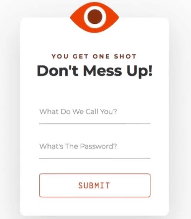
Picture this: You’re typing away, signing up on a rad new website, and there’s this eye, right? As you’re filling stuff in, it’s opening and closing, kinda like it’s watching.
Not in a creepy way, more like an “I gotchu” way. Super interactive vibes!
Flat Design Amusement Park With CSS Animation
See the Pen
Flat design amusement park svg by Lina (animation powered by CSS) by Volodymyr Hashenko (@gxash)
on CodePen.
Ever been to a theme park and thought, “Man, if only this were 2D and on my screen!”? Nah, me neither. But this design? It’s like riding a roller coaster, but just with your eyes. All thanks to the magic of CSS3.
Animation Example for SocialMediaLink
See the Pen
Animation Example for SocialMediaLink by Dmitriy Dubravin (@Dmitriy_Dubravin)
on CodePen.
Three words: Circles. Colors. Movement. Dive into this animated ocean where circles just can’t stay still. And honestly, why should they?
Three Dots Loading
See the Pen
CSS Loader with dots by Aliaksei Peterson (@petersonby)
on CodePen.
Those three dots? Yeah, you know ’em. It’s like they’re telling you, “Hold on, we’re getting there!” All jazzed up with CSS animations.
Tricky CSS Hover Animation
See the Pen
Tricky CSS hover by Piotr Galor (@pgalor)
on CodePen.
Piotr Galor’s the name, and cooking up slick CSS animations? That’s the game.
Animated Back Glow
See the Pen
Animated Back Glow by George Hastings (@georgehastings)
on CodePen.
So we’ve got this pseudo element thing going on, and it’s making waves with gradient animations and blurs. Check. It. Out.
H2O – chemical flask (animation)
See the Pen
H2O – chemical flask (animation) by Ekaterina Vasilyeva (@ekaterina_vasilyeva)
on CodePen.
Ekaterina Vasilyeva’s spinnin’ the chemistry wheel with a flashy flask that says H2O. Trust me, it’s not your regular water!
Submarine
See the Pen
Submarine with CSS by Alberto Jerez (@ajerez)
on CodePen.
Dive deep with this one! Flat, vibrant, and all kinds of animated fun. Who said submarines can’t have flair?
Responsive CSS3 Content Navigation Animation
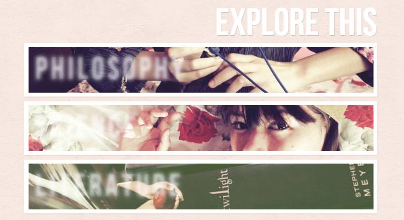
If you’re out here hunting for that perfect navigator design in CSS3, stop scrolling. This is it. Your quest is over.
CSS Reveal Animation
See the Pen
CSS Reveal animation text and image by Anthony Fessy (@antho-fsy)
on CodePen.
This ain’t your regular peek-a-boo. It’s an animation that’s unveiling stuff, but like, with some drama.
CSS Cassette
See the Pen
CSS Cassette by Tony Banik (@banik)
on CodePen.
Tony Banik’s bringing back the 90s! But instead of playing a tune, this cassette’s jammin’ on a blue note.
Cool CSS Animation
Want to up your CSS animation game? Dive into a world where you can code the coolest effects and make those web pages pop!
Whale and the Moon
See the Pen
Whale and the Moon by Aswin Behera (@aswinbehera)
on CodePen.
Picture a night sky in the hottest shade of pink. Now, add a whale. Dreamy, right? This background’s exactly that, but animated.
FAQ On CSS Animation
How do I start with CSS animation?
To embark on the journey of CSS animation, initiate with @keyframes. Define stages of the animation, craft a sequence using the animation-name property linked to your keyframes, and set animation-duration for timing.
This rudimentary setup breathes life into otherwise static elements on your web pages.
What properties are necessary for a basic CSS animation?
The essence of a basic animation lies within a few critical properties: @keyframes establish the scenes, animation-name connects these to an element, animation-duration dictates timing, and animation-timing-function ensures the flow feels natural. Integrate these, and you’ve got the skeleton of your animation.
Can CSS animations run infinitely?
Certainly, through the spell of animation-iteration-count. Set its value to infinite, and watch your animation loop endlessly.
This enchantment is perfect for perpetual motions, like a beating heart on a healthcare site or an eternally spinning gear in a tech blog’s footer.
How do I make animations responsive on mobile devices?
To ensure your animations gracefully adapt to mobile devices, leverage media queries along with fluid units like percentages or viewport units. It’s about your narrative scaling and transforming seamlessly, no matter the size of the screen staring back at you.
What’s the difference between CSS animation and transitions?
Transitions are best for simple states—hovering a button for a color change, while animations are apt for complex sequences with multiple stages and loops. The former sets the stage for a single leap, the latter choreographs an entire performance.
Is it necessary to prefix CSS animations for cross-browser compatibility?
Prefixing was once a passport to compatibility. Now, it’s less a requirement, more a cautious tip of the hat to legacy browsers.
Modern browsers are akin to generous hosts at a global party, often welcoming standard CSS syntax without the need for special salutations.
How do we control the pace of CSS animations?
The rhythm of your animation is governed by animation-timing-function. It’s a symphony conductor, dictating whether the movement accelerates smoothly like a crescendo (ease-in) or decelerates with grace (ease-out). Savor the control, adjusting the pace to enhance the user experience.
Can CSS animations impact website performance?
If overdone, yes. Imagine a theater with too many actors; the stage becomes chaotic. Use them judiciously, as too many elaborate CSS animations may slow down your site, weigh on rendering, or distract users.
Balance is key. A thoughtfully animated element can amplify your message without stealing the show.
How do I animate an element along a path?
Animating along a path is akin to directing a character’s journey. While CSS doesn’t natively support motion paths yet, crafty use of transform combined with keyframes can mimic this motion.
Alternatively, the SVG + CSS combo allows more complex travel routes for any adventurous element.
What are best practices for CSS animations?
Prioritize your story—each animation should enhance, not detract from the user’s journey. Use will-change sparingly to inform browsers of impending changes.
Sync your animations with your site’s rhythm to ensure they feel like a natural part of the user experience, not a forced novelty.
Conclusion
Embarking on the odyssey of CSS animation molds ordinary interactions into an exuberant chorus of motion, transforming the everyday into magic unconfined by static bounds. The curtain falls on our exploration, leaving trails of moving pixels that echo the lessons etched in code and practice.
- We dipped our brushes into the palette of keyframes and painted motions that resonated with user gestures.
- We tuned the tempo with animation-duration and whispered to elements when to sway and when to freeze.
- We embraced responsiveness, crafting animations that flex with the fluidity of water, adapting to the myriad screens of the digital landscape.
In closing, let this be the mantra: animate not for the sake of spectacle but for the rhythm of interaction. Balancing aesthetics and performance, remember the narrative you wish to tell. Revisit, refine, and reanimate, always with the user’s journey at the heart of every loop, every bounce, and every transition.
If you liked this article about CSS animations, you should check out this article about CSS tooltips.
There are also similar articles discussing CSS headers, CSS carousels, CSS perspective, and CSS slideshows.
And let’s not forget about articles on CSS animated backgrounds, CSS cards, CSS progress bars, and CSS parallax effects.

