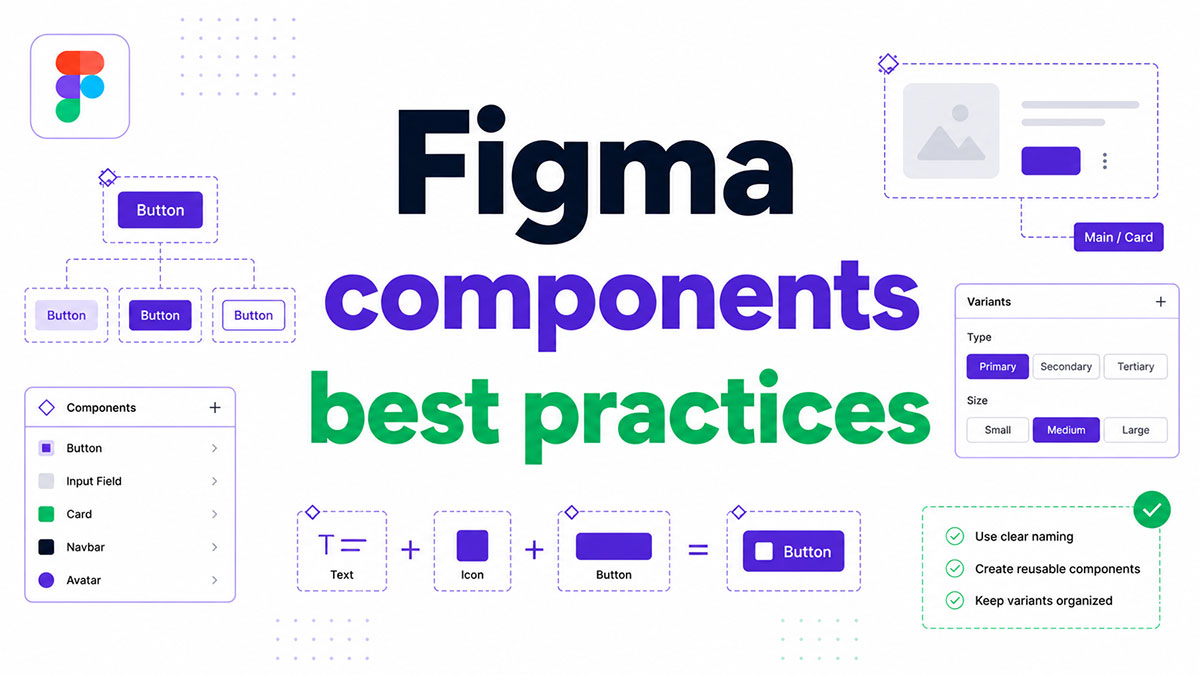
Most Figma files start clean. Six months later, the component library is a mess of detached instances, inconsistent naming, and duplicated states no one can explain.
Following Figma components best practices from the start prevents that. It keeps your design system scalable, your developer handoff accurate, and your team working from a single source of truth.
This guide covers everything from component naming conventions and Auto Layout rules to design token integration, variant structure, and component debt audits. Each section addresses a specific decision point where most teams go wrong.
What Are Figma Components?
A Figma component is a reusable UI element defined once as a main component and referenced across files as instances. Edit the main component, and every instance updates automatically.
This master-instance relationship is what separates a true component system from a folder of copied frames. It is the structural foundation of every scalable design system.
Components live in 3 scopes: local components (single file only), team libraries (shared across a team), and organization libraries (available across an entire enterprise workspace).
Knowing which scope a component belongs to determines how overrides propagate, who can publish changes, and what breaks when a main component is deleted.
| Component Type | Scope | Best For |
|---|---|---|
| Local Component | Single File | One-Off or Prototype Work |
| Team Library | Team Workspace | Shared Product Design Work |
| Organization Library | Enterprise-Wide | Multi-Brand or Multi-Product Systems |
Figma’s 2025 Library Analytics update now tracks component usage, styles, and variables in one place, giving design system teams real data on what is actually being used.
A well-structured component library, built with reusable UI components and a clear component hierarchy, cuts duplication and reduces the manual decisions designers make on every screen. That time adds up fast.
Have you seen the latest Figma statistics?
Discover comprehensive Figma statistics including revenue growth, market share, user demographics, and funding data.
Check them out →What Is the Correct Way to Name Figma Components?
Figma component naming directly affects how your Assets panel organizes components, how fast designers find what they need, and how accurately developers read properties in Dev Mode.
Poor naming is one of the most common causes of component debt. Teams add components without a convention, and within 6 months the library becomes unsearchable.
How the Slash Naming System Works in Figma
Slash-based hierarchy is the standard: a forward slash tells Figma to create a nested folder in the Assets panel.
Button/Primary/Defaultplaces a button in the Primary subfolder under ButtonForm/Input/Errorgroups all input states under the Form section- Prefixing with a period (
.Button/Internal) hides a component from the Assets panel entirely
The pattern to follow: Component type / Variant group / State. Type first, variant second, state third. Always.
This structure maps directly to how Figma parses component names in the Assets panel search, meaning a designer typing “input” finds every input variant without scrolling through unrelated results.
State and Variant Naming Conventions
Figma Config 2024 highlighted that older hash-based naming conventions (#button-primary) have been replaced by property-driven naming using component props and variants.
Consistent case matters. Most teams use Title Case for component names and lowercase for property values.
- Component name:
Button/Primary - Variant property:
Statewith valuesdefault,hover,focus,disabled
This naming approach also determines how component names appear in code when using Figma Dev Mode with Code Connect, where the Figma component name maps directly to the React or Vue component name in the codebase.
How Should Figma Components Be Structured Internally?
Internal structure determines whether a component scales gracefully or breaks under real product conditions. A button that works for 3 states needs the same architecture as one that handles 24 variants.
Teams that invest time on internal component architecture early avoid complete rebuilds when the product or brand evolves. According to a 2025 industry analysis, design systems with poor internal structure are the primary driver of component debt in growing teams.
Auto Layout Rules for Scalable Components
Every production-ready component needs Auto Layout. No exceptions.
Auto Layout translates directly to CSS Flexbox in Figma Dev Mode, which means the values a developer sees in the inspect panel are accurate layout values, not approximations.
- Set padding using spacing tokens, not hardcoded numbers
- Use Hug contents for components that resize around content (buttons, tags, badges)
- Use Fixed width for components with constrained containers (cards, modals, table cells)
- Figma 4.0 introduced wrap support in Auto Layout, enabling grid-style layouts inside a single frame
Applying Auto Layout at every level, including nested components, means the entire component adapts correctly when content changes. Skipping it at even one level breaks the chain.
Layer Naming and Internal Organization
Every layer inside a component needs a name. Rectangle 14 and Group 7 in a production component are signs that the component was built quickly and never cleaned up.
Named layers serve two functions: they make the component readable in Figma, and they appear as named elements in Dev Mode for developer inspection.
- Use semantic names:
icon,label,background,border - Group logically: keep icon and label together inside a
contentframe - Avoid deep nesting beyond 3-4 levels
Deep nesting creates maintenance debt. If changing a border radius requires navigating 6 layers deep, the component architecture needs simplifying.
What Are Figma Variants and When Should You Use Them?
Variants group related component states into a single component set, reducing Assets panel clutter and making it easier for designers to switch between states using the properties panel.
The mistake most teams make: using variants for everything. A component with 5 intersecting variant properties produces a combinatorial explosion. A button with Size (3), Type (4), State (5), and Icon (2) generates 120 variant combinations. Most of those will never be used.
Component Properties vs. Variant Properties
Figma offers 4 component property types. Each one solves a different problem.
| Property Type | What It Controls | Best Used For |
|---|---|---|
| Variant | Visual States That Differ Structurally | Button Types, Sizes, Themes |
| Boolean | Show / Hide a Layer | Optional Icons, Badges, Labels |
| Text | Editable Text Content | Button Labels, Input Placeholders |
| Instance Swap | Replace a Nested Component | Swappable Icons, Avatars, Logos |
Boolean properties handle optional elements far more efficiently than variants. If the only difference between 2 component states is whether an icon is visible, a boolean property replaces what would otherwise be 2 separate variants.
When Variants Create More Problems Than They Solve
Figma Config 2024 flagged variant overuse as a core contributor to information overload in the properties panel.
Stop creating variants when:
- The combined variant count exceeds 20-30 combinations
- The visual difference between variants is only layer visibility
- The state is handled through prototyping interactions, not design content
A toggle component with 2 states (on and off) is a good candidate for variants. A card component that attempts to variant-ize every possible content configuration is not.
The practical test: if a designer using the component needs to scroll through a long variant dropdown to find the right state, split the component or switch to boolean and instance swap properties.
How Do Figma Component Libraries Scale Across Teams?
A component library that works for a 3-person team will fail a 30-person team unless the structure was built to scale. The difference is usually architectural, not cosmetic.
SoftKraft research on enterprise design systems found that organizations with 100+ employees saw a 46% reduction in design and development costs and a 22% faster time to market after implementing a structured system. That only happens when the library architecture matches the team size.
Local, Team, and Organization Libraries
Scope determines governance. Publishing the wrong components to the wrong scope is one of the most common library mistakes in fast-growing product teams.
- Local: prototype work, one-off explorations, nothing that needs sharing
- Team library: components actively used by a specific product team, published and versioned
- Organization library: foundation tokens, brand elements, cross-product components shared at enterprise scale
Google, IBM, and Atlassian all adopted split-library architectures by 2023, separating foundation tokens from component libraries to prevent cascading breaks when base values change.
Structuring Components Around Atomic Design
Brad Frost’s atomic design methodology maps cleanly onto Figma’s library structure. Most mature teams use a version of this, even if they don’t call it by name.
The practical mapping:
- Atoms: color tokens, typography styles, spacing variables (defined in Figma Variables)
- Molecules: buttons, inputs, badges (built using token references)
- Organisms: forms, navigation bars, cards (built using molecule components)
Building organisms from molecules that reference atoms creates a token-linked chain. Update a spacing token and every component using it adjusts automatically, without manual edits.
The design system best practices that hold up at scale all share one structural trait: a named governance owner with authority to approve what gets published and what gets deprecated.
What Is the Role of Design Tokens in Figma Component Practices?
Design tokens are named variables (color, spacing, typography, radius) that components reference instead of hardcoded values. Change the token, and every component using it updates across the entire system.
Supernova’s State of Design Tokens 2024 report found that 69.8% of designers already use Figma Variables in their design systems, and 42.5% use Figma Variables as their primary source of truth for token management.
Figma Variables vs. Styles: Key Differences
Figma Variables (released July 2023) and Figma Styles are both ways to store reusable values, but they solve different problems.
| Feature | Figma Variables | Figma Styles |
|---|---|---|
| Modes / Themes | Yes (Light/Dark/Brand Modes) | No |
| Number / Boolean Values | Yes | No |
| Code Export Mapping | Direct Token Mapping | Manual |
| Component Property Binding | Yes | Limited |
Styles still handle gradient fills, text styles, and effect styles (shadows, blurs) where Variables don’t yet cover. In practice, most mature design systems use both: Variables for primitive and semantic tokens, Styles for composite visual properties.
Syncing Design Tokens to Code
Token naming conventions need to survive the export to code. A token named blue-dark in Figma means nothing to a developer. A token named color/brand/primary/600 maps directly to a CSS custom property or a JavaScript theme object.
3 tools currently handle Figma-to-code token sync:
- Token Studio: Figma plugin, syncs directly to GitHub with W3C-aligned JSON output
- Supernova: manages tokens across Figma and code, exports to multiple platforms
- Style Dictionary (Amazon): transforms token JSON to CSS, iOS, Android, and other formats
The W3C Design Token Community Group specification is gradually becoming the standard format for token exchange between tools. Aligning your token naming to the DTCG spec now avoids migration work later.
How Do You Handle Component States and Interactivity in Figma?
Every interactive component needs its states documented in the design file before handoff. A button component delivered to developers without hover, focus, and disabled states leaves 4 out of 5 states for developers to guess.
Figma’s Library Analytics (updated February 2025) now tracks which components are being used and how frequently, giving teams data to identify which component states are actually making it into production.
Boolean Properties for State Management
Boolean properties handle show/hide logic for optional layers without multiplying variant combinations.
States handled efficiently with booleans:
- Show/hide an error message below an input field
- Toggle a loading spinner inside a button
- Display or hide a tooltip trigger icon
The 5 states every interactive UI component needs: default, hover, focus, active, and disabled. Error and validation states belong in a separate variant group, not mixed into the primary state matrix.
Mixing interaction states with content variants is the single fastest way to create a component set that becomes unmanageable by the third revision cycle.
Interactive Components and Prototype Fidelity
Figma’s Interactive Components feature lets designers wire state transitions directly inside a component, so prototypes built with that component automatically inherit the correct interactions.
Practical setup:
- Use While Hovering triggers to switch from Default to Hover variant
- Use On Click to trigger Active or Loading states
- Keep prototype interactions inside the component, not on every instance in the design file
This approach means a designer can drop a button component into any frame and the hover and click interactions work automatically in preview mode, without rewiring each instance.
Figma’s 2025 internal data shows that teams using a relevant, up-to-date component system with documented states achieve a 34% efficiency boost, which compounds on every new feature built using the library.
What Are the Best Practices for Figma Component Documentation?
Component documentation inside Figma answers 3 questions before a designer or developer even has to ask: what this component does, when to use it, and what it looks like in every state.
UXPin research found that interactive demos inside design system documentation drove a 90% increase in adoption. Documentation is not a nice-to-have at scale. It is the mechanism that determines whether a component library actually gets used.
Writing Component Descriptions That Actually Help
The component description field in Figma is the first thing a designer sees when hovering over a component in the Assets panel. Most teams leave it blank. That is a missed opportunity.
A useful description covers 3 things:
- What the component does in one sentence
- When to use it (and when not to)
- A link to the external documentation page or Storybook story
Razorpay’s design system team, which serves around 70 designers and 100 front-end developers, treats documentation as a required step before any component gets published. No description, no publish. That rule alone keeps the library usable at scale (Figma Blog, 2025).
Cover Components and Assets Panel Presentation
A cover component is the thumbnail that appears for a component set in the Assets panel. Most teams never build one deliberately, which means the panel shows a random frame corner as the preview.
Build a cover component by:
- Creating a frame named
.coveras the first layer inside the component - Sizing it at 200x100px to match the Assets panel preview ratio
- Including the component name, a clean visual preview, and status label (stable, beta, deprecated)
The period prefix hides the cover from published instances. Developers inspecting the component in Figma Dev Mode never see it. It exists purely for the Assets panel thumbnail.
Atlassian’s Atlaskit design system consistently pairs Figma component documentation with Storybook stories, so designers see usage guidance and developers see live code examples from the same source of truth.
How Are Figma Components Handed Off to Developers?
Poor handoff is expensive. IDC research values poor UX at $1.4 trillion in lost productivity annually across businesses, and a broken handoff process is one of the most common sources of that waste inside product teams.
The practical fix is structural, not cultural. Build components so the inspect panel delivers accurate values without requiring a designer to annotate everything manually.
Dev Mode and Component Property Inspection
Figma Dev Mode reads component properties, variant states, and Auto Layout values in one view. What it shows depends entirely on how the component was built.
| Component Setup | What Dev Mode Shows | Developer Impact |
|---|---|---|
| Auto Layout Applied | CSS Flexbox Values (gap, padding, align) | Direct Implementation |
| Figma Variables Bound | Token Name (--color-brand-primary) | No Hex Guesswork |
| Unnamed Layers | Rectangle 14, Group 7 | Manual Interpretation Required |
| Missing States | Default State Only | Developer Builds States from Scratch |
When Figma Variables are bound to a component, Dev Mode surfaces the token name instead of a raw hex value. A developer inspecting a button sees --color-action-primary, not #1D4ED8. That single difference removes an entire class of implementation errors.
Naming Conventions That Match Code Architecture
Teams using Zeplin reduced design handoff time by up to 40% compared to manual processes, according to a 2024 UXPin user survey. Consistent naming is the foundation of that improvement.
Figma component names map directly to code when conventions align:
Button/Primary/Defaultin Figma becomes<Button variant="primary" state="default" />in React- Variant property names match prop names in the component API
- Boolean property names match boolean props in code (
hasIcon,isDisabled,isLoading)
Figma’s Code Connect feature, announced at Framework 2024, lets teams link Figma components directly to their codebase counterparts. When a developer inspects a modal component in Dev Mode, they see the actual production code snippet, not just CSS values.
Validating component designs before development reduces iteration cycles by 25%, avoiding millions in wasted rework costs (UserTesting, 2025). That saving compounds every sprint.
What Causes Figma Component Debt and How Is It Fixed?
Component debt is what happens when a library grows without governance. Components get added, naming conventions drift, and detached instances pile up across production files.
Salesforce’s SLDS 2 design system provides a clear example of the scale: the button icon component alone had over 3,000 detachments in a single year, despite nearly one million instances in active use. Each detached instance missed subsequent border and color updates (Salesforce Blog, 2025).
Running a Component Audit in Figma
A component audit answers 3 questions: what is being used, what has been detached, and what is duplicated.
Audit signals that point to debt:
- More than 20% of instances in production files are detached
- Component names that don’t follow the slash hierarchy convention
- Hardcoded hex values appearing in place of Figma Variable references
3 Figma plugins handle component audits at file scale: ComponentQA (detaches, overrides, token violations), Design System Auditor (adherence score per artboard), and Design System Compliance Checker (remote vs. local vs. detached instance breakdown).
Systems built before 2023 are candidates for a full refactor, according to a 2026 design systems analysis by BiblioKit. The introduction of Figma Variables in July 2023 made legacy style-only systems structurally outdated.
Deprecating and Migrating Old Components
Deprecation without a migration path is the fastest way to break active projects. Teams that remove components without notice create immediate blockers for anyone building with that library.
Deprecation workflow that avoids breakage:
- Mark the component name with a
[deprecated]prefix in Figma - Add a description field note pointing to the replacement component
- Move the deprecated component to a staging library for 2-4 weeks before removal
- Publish a changelog entry with the deprecation date and migration steps
Figma’s Design System Analytics (updated February 2025) shows usage data for every published component. A component with zero usage in the past 90 days is a safe candidate for deprecation. One still in active use needs a migration guide first.
The goal is a library that shrinks as deliberately as it grows. Every component removed with a documented migration path reduces the maintenance surface without breaking the teams depending on it.
For a broader look at how these component practices fit inside a full Figma design system workflow, including file structure, token architecture, and governance models, the linked guide covers the complete setup from foundations to publishing.
FAQ on Figma Components Best Practices
What is the difference between a main component and an instance in Figma?
A main component is the source. Instances are copies placed across your files. Edit the main component and every instance updates automatically. Detach an instance and it becomes a standalone frame, permanently disconnected from the source.
How should you name Figma components?
Use the slash-based hierarchy: Type/Variant/State. For example, Button/Primary/Default. This creates nested folders in the Assets panel. Consistent naming improves search accuracy and maps component names directly to code during developer handoff.
When should you use variants vs. boolean properties?
Use variants when components differ structurally. Use boolean properties when the only difference is a hidden or visible layer. A button with an optional icon needs a boolean, not a separate variant. Mixing both reduces combinatorial explosion.
What is the role of Auto Layout in component architecture?
Auto Layout makes components resize around their content. It maps directly to CSS Flexbox in Figma Dev Mode, so developers get accurate spacing and alignment values without guesswork. Every production-ready component needs Auto Layout applied at every level.
How do design tokens connect to Figma components?
Design tokens are named variables (color, spacing, radius) that components reference instead of hardcoded values. Change a token and every component using it updates automatically. Supernova’s 2024 report found 69.8% of teams already use Figma Variables for token management.
What causes component debt in a Figma library?
Component debt builds when instances get detached, naming conventions drift, and components get added without governance. Hardcoded hex values replacing token references is another sign. Salesforce found over 3,000 detachments on a single button component in one year.
How do you document Figma components effectively?
Fill the component description field with its purpose, usage guidance, and a link to Storybook or your documentation site. Add a cover component for the Assets panel thumbnail. Razorpay requires documentation before any component gets published to their shared library.
How does Figma Dev Mode help with component handoff?
Dev Mode reads component properties, variant states, and Auto Layout values in one view. When Figma Variables are bound, developers see token names instead of raw hex values. Components built without Auto Layout show absolute pixel positions, which increases implementation errors.
What is the correct way to structure a Figma component library for teams?
Separate local, team, and organization libraries by scope. Use atomic design as a structural reference: tokens at the foundation, then molecules, then organisms. Assign a named governance owner who controls what gets published and what gets deprecated.
How do you audit and fix a Figma component library?
Use ComponentQA or Design System Auditor to scan for detached instances, token violations, and duplicate components. Mark outdated components as deprecated with a description pointing to replacements. Figma’s Library Analytics shows usage data to identify what is safe to remove.
Conclusion
This conclusion is for an article presenting how component architecture decisions made early determine whether a Figma design system scales or collapses under its own weight.
Naming conventions, variant structure, and token integration are not optional refinements. They are the difference between a shared library teams actually use and one that accumulates debt sprint after sprint.
Apply Auto Layout consistently. Bind every value to a design token. Document states before handoff. Audit detached instances before they compound.
The teams with the healthiest component libraries treat the system as a product, with governance, deprecation workflows, and usage data informing every publish decision.
Build it right once. Maintain it deliberately. Everything downstream, from developer handoff to UI consistency, gets easier from there.

Many of his resources are available on various design marketplaces. Over the years, he's worked with a range of clients and contributed to design publications like Designmodo, WebDesignerDepot, and Speckyboy, Slider Revolution among others.
- What is Backend in Web Development? - September 13, 2026
- What is Frontend Development? - September 11, 2026
- How to Make a Button in Figma: Design Best Practices - September 10, 2026

