
Every great product starts as a picture before it becomes a reality.
A mockup is that picture. It’s the static, high-fidelity design file that shows exactly how a website, app, or product will look before a single line of code gets written.
Understanding what a mockup is, how it fits into the UI design process, and where it sits between a wireframe and a prototype saves teams from expensive revisions and miscommunication at handoff.
This article covers the definition, types, tools, limitations, and file formats behind mockup design, giving you a complete picture of how the mockup stage works in practice.
What is a Mockup?
A mockup is a static, mid-to-high fidelity visual representation of a design that shows the final layout, color palette, typography, and UI elements without any functional interactivity. It sits between a structural wireframe and a clickable prototype in the design fidelity spectrum.
The defining characteristic of a mockup is visual accuracy without behavior. Buttons look real. Colors are final. Fonts are chosen. But nothing clicks, navigates, or responds.
Mockups apply across web design, app design, product packaging, and print media. The term covers both digital user interface designs and physical product visualizations shown in realistic context.
| Design Stage | Fidelity | Interactive? | Primary Use |
|---|---|---|---|
| Wireframe | Low | No | Structure and layout |
| Mockup | Mid to High | No | Visual design and stakeholder review |
| Prototype | High | Yes | User testing and interaction validation |
Figma’s 2023 design tools survey found that 82% of designers use Figma as their primary UI design tool, making it the dominant platform for building digital mockups today (UXTools.co, 2024).
What is the Purpose of a Mockup in the Design Process?
A mockup gives teams a visual reference point before any development starts. It takes the skeletal structure from the wireframe phase and turns it into something stakeholders can actually react to with specific, useful feedback.
Without a mockup, client feedback tends to be vague. Presenting a high-fidelity design file shifts reviews from “I don’t know, something feels off” to comments about specific font weights, color contrast, and spacing decisions. That precision matters.
What Does a Mockup Solve for Design Teams?
Rework is expensive. Changes made during the mockup phase cost a fraction of what the same changes cost during development.
- Catches visual design problems before any code is written
- Creates a shared reference between designers, developers, and stakeholders
- Separates visual decisions from technical and functional ones
- Gives clients something concrete to approve before the build begins
Adobe research (2025) found that 58% of non-creative employees spend up to 29 hours a week creating their own visual assets when centralized design resources are absent, which signals how much time gets wasted when design artifacts are unclear or missing.
How Mockups Connect to Developer Handoff
Developers use mockups as a build reference. The mockup specifies spacing, color values, typography hierarchy, and component states so developers are not guessing at implementation details.
Miro’s research shows 71% of leaders say switching between tools causes workflow interruptions during design-to-development transitions. A well-structured mockup file reduces that friction by giving developers a single source of visual truth.
When Moladin standardized their design-to-development handoff using annotated design files and clear mockup documentation, they doubled their story points completed and achieved zero critical bugs over two years (Miro, 2024).
What Are the Different Types of Mockups?
Mockups fall into 4 main categories: digital UI mockups, product and packaging mockups, device frame mockups, and print mockups. Each serves a different presentation or review purpose, and the right type depends entirely on what you’re designing and who’s reviewing it.
Digital UI Mockups

Digital UI mockups represent web pages, app screens, and software interfaces at near-final visual quality.
These include applied color schemes, real or representative typography, icon sets, spacing grids, and actual or close-to-final content. Teams use them during the design review process to get stakeholder sign-off on user experience visual direction before prototyping begins.
Figma is the dominant tool here, holding over 80% market share in collaborative UI design as of 2024 (UXTools.co, 2024).
Product and Packaging Mockups

Product mockups place a design onto a physical object, such as a t-shirt, bottle, or box, rendered in a realistic setting.
These are common in e-commerce, brand identity, and merchandise design. Tools like Smartmockups and Placeit provide template-based PSD files where a designer drops in their artwork and the tool handles perspective, shadow, and lighting automatically. This saves hours compared to building product renders from scratch in Adobe Photoshop.
Device Frame Mockups
Device frame mockups show a UI design inside a realistic phone, tablet, or desktop shell.
Why they matter: Showing a design inside a device frame helps clients and stakeholders understand real-world scale and context. A checkout flow looks very different displayed inside a rendered iPhone 15 frame versus a flat artboard. Behance and Dribbble portfolios almost universally use device mockups for exactly this reason.
Print Mockups
Print mockups cover business cards, brochures, posters, and book covers shown in a real-world context.
These are mostly PSD-based smart object files. The designer opens the template, pastes their artwork into a smart object layer, and the mockup automatically maps the design to the surface. Envato Elements and Creative Market are the primary sources for these files.
How Does a Mockup Differ from a Wireframe and a Prototype?
A wireframe defines structure. A mockup defines visual design. A prototype defines behavior. These are 3 distinct deliverables used at different stages, and they are not interchangeable.
Conflating these terms creates real problems in project timelines. A client who expects a prototype but receives a wireframe will feel the project is behind. A developer handed a wireframe instead of a mockup will make visual decisions that belong to the design team.
Wireframe vs. Mockup
Wireframes are low-fidelity, grayscale layouts focused on structure, information architecture, and element placement. No color. No real typography. No brand assets.
Mockups build on top of approved wireframe structures to add the visual layer. Once a wireframe confirms that the layout makes sense, the mockup asks: “Now, what does this actually look like?”
Springboard describes the relationship clearly: wireframes are the blueprint; mockups are the display model. You wouldn’t show a client a blueprint and call it the finished design.
Mockup vs. Prototype
| Attribute | Mockup | Prototype |
|---|---|---|
| Fidelity | High visual detail | High visual and functional detail |
| Interactivity | None | Clickable, navigable |
| Primary purpose | Visual approval | Usability testing |
| Common tools | Figma, Adobe XD, Sketch | Figma, UXPin, Axure RP |
Slack’s design process is a clear example of the distinction. The team first created wireframes to map channel structure and message layout, then moved to high-fidelity mockups to apply Slack’s brand colors and typography, and finally built interactive prototypes with clickable states for usability testing.
What Does a Mockup Include?

A complete mockup includes 6 core visual components: applied typography, a full color palette, real or representative imagery, spacing and grid alignment, brand elements, and defined UI component states.
Missing any of these turns the mockup into a partial design file, which leads to developer questions and revision cycles after handoff.
Typography and Color
Typography choices in a mockup are final or near-final. Font family, size, weight, line height, and hierarchy are all specified, not approximated.
Color is applied to every element. This includes the primary palette, secondary colors, background fills, and text colors. Not color blocks or placeholders. Actual hex values. This matters because the mockup is the artifact developers and developers reference when writing CSS for the front end.
Spacing, Grid, and Layout
Mockups define the grid system the layout follows and apply it consistently across all screen elements.
Padding, margin, and alignment values are visible in the mockup file. Most tools like Figma expose these automatically in inspect mode so developers can pull exact values without asking the designer. That’s one of the most practical reasons to build mockups in Figma rather than exporting static images.
Brand Elements and UI Components
Logos, icons, button styles, form fields, and navigation elements appear in their final design state.
Component states matter here. A button in a mockup should show its default state. Ideally it also shows hover, active, and disabled states within the same file. This removes ambiguity for developers building the frontend.
Adobe’s 2025 research found that half of customers have chosen a brand based primarily on color, which reinforces why getting brand element details right at the mockup stage has direct commercial impact.
What Tools Are Used to Create Mockups?

The 5 most widely used mockup tools are Figma, Adobe XD, Sketch, Smartmockups, and Canva. Each covers a different use case and user type. The right choice depends on whether you’re building UI mockups, product mockups, or quick marketing visuals.
Tools for UI and Web Mockups
Figma leads the UI mockup category by a large margin.
- Figma: Browser-based, real-time collaboration, inspect mode for developer handoff, 40.65% market share in design tools (6sense, 2025)
- Adobe XD: Tight integration with Creative Cloud; effectively discontinued in 2023 as Figma absorbed most of its market share
- Sketch: Mac-only, strong plugin ecosystem, under 5% primary tool usage as of 2023 (UXTools.co)
- UXPin: Code-based components, stronger for design systems and production-accurate mockups
By 2023, Figma was the primary design tool for 82% of designers surveyed for UI work, up from 62% in 2021 (UXTools.co, 2024). Nearly 95% of Fortune 500 companies now use Figma in their workflows (Figma, 2025).
Tools for Product Mockups
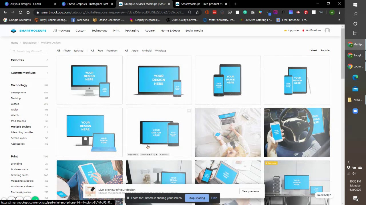
Smartmockups and Placeit handle product mockup creation through a template system. No Photoshop required.
The workflow: upload your design, choose a device or product frame, download the render. Both tools include hundreds of templates covering apparel, packaging, devices, and print. For teams that need product renders quickly without a dedicated motion designer, these tools cut production time from hours to minutes.
Adobe Photoshop smart objects remain the professional standard for custom product mockups where precise control over lighting, perspective, and texture is needed.
What is the Difference Between a Mockup and a Template?
A mockup is an output. A template is an input. They serve opposite functions in a design workflow, and confusing them creates real friction when sharing files with clients or developers.
A template is a reusable starting structure with editable placeholder content, built to be filled in repeatedly for different projects. A mockup is a specific visual representation of one design at one point in time, created to show or review that design.
How Mockup Files Use Templates
Here’s where it gets a little circular. A PSD device frame file downloaded from Smartmockups is technically a template. But when you drop your design into its smart object layer and export the result, that export is your mockup.
The template is the reusable container. The mockup is what you produce using it. Same logic applies in Figma: a component library is a template system, but the screen you design using those components is the mockup file shared with stakeholders.
This distinction matters when managing design assets. Templates live in shared libraries. Mockups live in project folders. Mixing these up leads to accidental edits to reusable assets.
File Format Differences
Templates are typically distributed as .psd, .fig, or .sketch files with smart objects or component slots designed for replacement.
Mockup deliverables are usually exported as .png or .jpg for presentations, .pdf for annotated multi-screen reviews, or shared as Figma links for developer inspection. The source mockup file stays in the native design format; what gets shared depends on who’s receiving it and what they need to do with it.
How Are Mockups Used in Client and Stakeholder Presentations?
Mockups remove ambiguity from design reviews. A stakeholder looking at a high-fidelity screen design gives feedback on specific visual choices, not vague impressions.
28% of designers now use AI to create stakeholder presentations, according to Figma’s 2025 research. But the mockup itself remains the centerpiece. The presentation format changes; the need for a clear visual reference doesn’t.
How Design Reviews Use Mockup Files
Design reviews typically move through 3 structured stages: internal peer review, stakeholder review, and final client sign-off.
Mockups serve all 3 stages, but in different ways.
- Internal reviews: mockup file shared in Figma for team feedback on visual consistency
- Stakeholder review: exported PDF or annotated Figma link shared across departments
- Final client sign-off: device mockups in context, often with annotated callouts
StreamWork’s 2025 research found that design review checklists with mockups as the central artifact keep feedback consistent across rounds, reducing conflicting comments between review cycles.
Annotation and Context in Mockup Presentations
Annotated mockups explain design decisions directly on the file. A label next to a button explains why it’s positioned above the fold. A note beside a color choice references the brand guidelines it follows.
This matters for teams where developers were not involved in the design phase. Without annotations, developers implement the visual design correctly but miss the reasoning behind it. That reasoning becomes important when edge cases come up during the build.
Airbnb’s design team used annotated high-fidelity mockups with full brand color application to align internal teams and present to stakeholders before any prototype work began, keeping review cycles tight and preventing late-stage redesigns.
Sharing Formats for Mockup Presentations
Figma share links have largely replaced exported image files for digital teams. One link gives stakeholders inspect access, comment capability, and the ability to zoom into any element.
When to use each format:
- Figma share link: remote teams, development handoff, async feedback
- PDF: formal presentations, multi-screen flows, client approval documents
- PNG/JPG: quick visual checks, social sharing, portfolio presentation
What Are the Limitations of a Mockup?
A mockup shows what the design looks like. It cannot show how the design behaves. That gap is the source of most post-mockup surprises in development.
Over 61% of global website traffic now comes from mobile devices (Statcounter, 2025). A static mockup approved at desktop size gives no feedback on how the layout holds at 390px. That’s not a minor gap. It’s where most visual breakdowns actually happen.
No Interactivity or Responsive Behavior
Static mockup files do not reveal how elements reflow, stack, or collapse across screen sizes.
73.1% of web designers say non-responsive design is the primary reason visitors leave a website (ColorWhistle, 2024). A mockup approved at one breakpoint doesn’t catch those issues. You need a prototype or live build to test them.
Visual Accuracy Can Create False Confidence
A pixel-perfect mockup can get client sign-off on something that doesn’t work for users. The design looks right. The logic underneath it might not be.
88% of online consumers won’t return to a site after a poor usability experience (HubSpot, 2023). That number exists partly because mockups get approved without usability validation. Visual approval is not the same as user validation.
What Mockups Cannot Test
Performance: load times, animation frame rates, and image rendering under real network conditions.
Accessibility: screen reader compatibility, keyboard navigation flow, and color contrast against WCAG standards. WebAIM’s 2025 data shows 79.1% of home pages contain low-contrast text, a design failure that often only gets caught during accessibility audits, not mockup reviews.
Edge cases: empty states, error states, loading states, and what happens when a user enters unexpected input. Mockups show the happy path. Real users don’t always take it.
What File Formats Are Mockups Saved In?
Mockup files exist in 2 distinct formats: native source files used during the design process, and export formats shared with stakeholders or developers.
Mixing these up creates version control problems. A developer handed an exported PNG cannot inspect spacing values. A client sent a .fig file cannot open it without a Figma account.
| Format | Type | Best Used For |
|---|---|---|
| .fig | Native source | Team collaboration, dev handoff |
| .psd | Native source | Product mockup templates, print |
| .sketch | Native source | Mac-based design teams |
| .png | Export | Client previews, portfolios |
| Export | Multi-screen presentations, sign-off |
Native Source Formats
.fig files are Figma’s native format. They’re cloud-stored by default, which means version control is automatic. Most modern design teams never export .fig files locally because the Figma share link handles distribution.
Adobe Photoshop’s .psd format remains the standard for product mockup templates. Smart object layers in a PSD allow designers to drop artwork into a surface in seconds. Placeit and Smartmockups distribute mockup template packs in PSD format for exactly this reason.
Export Formats and When to Use Each
Figma supports PNG, JPEG, SVG, and PDF natively (Figma Help Center, 2024). Each serves a different purpose after a mockup file is complete.
PNG handles transparency and preserves text readability, making it the right choice for design previews with logos or overlapping elements. JPG works for solid-background designs where file size matters more than pixel precision.
PDF exports from Figma include vector graphics and text glyphs, making them well-suited for multi-screen annotated presentations shared across teams. One PDF, all screens, all annotations, no Figma account required to view it.
The Shift Toward Share Links
Figma share links are replacing file exports in most collaborative workflows.
A share link gives stakeholders comment access, zoom capability, and inspect mode access if dev permissions are enabled. This replaces at least 3 separate file exports. And it removes the version problem entirely, because the link always points to the current file, not a snapshot from last Tuesday.
Nearly 95% of Fortune 500 companies now use Figma in their design workflows (Figma, 2025), which tells you how far the share-link model has spread beyond small design teams into enterprise-level design review processes.
FAQ on Mockups
What is a mockup in web design?
A mockup is a static, high-fidelity visual representation of a web page or app screen. It shows the final layout, color palette, typography, and UI elements without any clickable or interactive functionality.
What is the difference between a mockup and a wireframe?
A wireframe is a low-fidelity structural blueprint with no color or real content. A mockup adds the full visual design layer on top of that structure, showing exactly what the finished product will look like.
What is the difference between a mockup and a prototype?
A mockup is static. A prototype is interactive. Mockups are used for visual approval during the design review process. Prototypes simulate user flows and are used for usability testing before development begins.
What does a mockup include?
A complete mockup includes applied typography, a defined color palette, real or representative imagery, spacing and grid alignment, brand elements like logos and icons, and UI component states such as buttons and form fields.
What tools are used to create mockups?
Figma is the most widely used tool, holding over 80% market share in UI design as of 2024. Other tools include Adobe XD, Sketch, Smartmockups, and Placeit, each suited to different mockup types and workflows.
What is a product mockup?
A product mockup places a design onto a physical object such as a t-shirt, packaging, or bottle, rendered in a realistic setting. These are typically built from PSD smart object templates using tools like Smartmockups or Placeit.
What is a device mockup?
A device mockup displays a UI design inside a realistic phone, tablet, or desktop frame. It gives clients and stakeholders a sense of real-world scale and context, and is widely used in Dribbble and Behance portfolio presentations.
What file formats are mockups saved in?
Source files use .fig, .psd, or .sketch formats. Exports for sharing are typically PNG or JPG for visual previews, and PDF for annotated multi-screen presentations. Figma share links increasingly replace exported files in team workflows.
What are the limitations of a mockup?
Mockups cannot test interactivity, responsive behavior across screen sizes, load performance, or accessibility. A visually approved mockup does not confirm the design works for real users under real conditions.
What is the purpose of a mockup in the design process?
Mockups give teams a visual reference point before development starts. They separate visual decisions from technical ones, reduce costly late-stage revisions, and give clients something concrete to review and approve at the design handoff stage.
Conclusion
This conclusion is for an article presenting what is a mockup, and the core answer is straightforward: a mockup is the visual design stage where layout becomes real, brand decisions get locked in, and developer handoff becomes possible.
It sits between a low-fidelity wireframe and a clickable prototype, covering everything from color palette and typography to UI component states and grid alignment.
Knowing when to use a digital UI mockup, a product mockup, or a device frame mockup makes the difference between a clean design workflow and repeated revision cycles.
Tools like Figma, Sketch, and Smartmockups have made the mockup design process faster, but the underlying purpose hasn’t changed.
Get the visual design file right before any code is written, and everything downstream, from frontend build to client approval, gets easier.


