
Most data tables on the web are broken for screen reader users. Not visually broken. Programmatically broken.
Accessible tables give assistive technology the markup it needs to announce row and column relationships correctly. Without that structure, a screen reader reads cells as a flat stream of disconnected values.
According to WebAIM’s 2025 Million report, 95.9% of the top homepages have detectable WCAG failures. Table markup errors are a consistent contributor.
This guide covers everything from basic HTML table elements and WCAG 2.1 requirements to complex header associations, responsive design trade-offs, and screen reader testing across NVDA, JAWS, and VoiceOver.
What Are Accessible Tables?

Accessible tables are data tables structured so that assistive technology can correctly interpret row and column relationships, not just display them visually.
Sighted users scan a table diagonally. Screen reader users move through it cell by cell, relying entirely on programmatic markup to know which header belongs to which data point. Without that markup, the table becomes a flat stream of disconnected values.
Key distinction: data tables require full semantic HTML structure. Layout tables, the ones used purely for visual arrangement, should avoid <table> elements entirely or carry role="presentation" to remove them from the accessibility tree.
Web accessibility covers a broad range of concerns, but tables are one of the most commonly broken components on the web. WebAIM’s 2025 Million report found 95.9% of the top 1 million homepages have detectable WCAG failures, and table markup errors are a consistent contributor.
WCAG 2.1 ties table accessibility to 2 primary success criteria:
- SC 1.3.1 Info and Relationships (Level A): all visual structure must exist in markup
- SC 1.3.2 Meaningful Sequence (Level A): linearized reading order must be logical
What Is the Difference Between a Simple and a Complex Table?

Simple and complex tables require different markup approaches. Using the wrong one for either type either over-complicates the code or leaves critical relationships undefined.
| Table Type | Structure | Required Markup |
|---|---|---|
| Simple | Single header row or column, no merged cells | <th> with scope attribute |
| Complex | Multi-level headers, colspan/rowspan | headers + id associations |
Simple Tables
Simple tables have one row of column headers, one column of row headers, and no merged cells.
A pricing comparison grid with plan names across the top and features down the left side is a simple table. scope="col" on column headers and scope="row" on row headers is all that’s needed for full screen reader compatibility.
NVDA and JAWS both handle simple, correctly-scoped tables without issues. The announcement sounds like: “Column header, Row header, Cell value” – which gives users the context they need.
Complex Tables
Complex tables use colspan, rowspan, or multiple header levels. A bus timetable with grouped routes and time periods across both axes is a typical example.
scope alone is not enough here. headers and id attributes create explicit cell-to-header associations that assistive technology can follow regardless of visual position.
Penn State’s accessibility documentation notes that many screen readers cannot correctly parse spanned rows and columns without these explicit relationships defined in markup.
What HTML Elements and Attributes Make a Table Accessible?

Accessible table markup uses 6 core elements and attributes. Each one serves a specific role in the programmatic structure that screen readers depend on.
Table Caption
The <caption> element is the table’s programmatic label. Screen readers announce it before reading any cell content, giving users immediate context about what the table contains.
When to use <caption> vs aria-label:
<caption>: visible label, preferred in most casesaria-labelon<table>: when a visible caption would be redundant given surrounding contentaria-labelledby: when an existing heading on the page already describes the table
A missing caption is one of the most common table accessibility errors. Users landing directly on a table via screen reader navigation have no context about its purpose.
Header Cells and the scope Attribute
<th> marks a cell as a header. scope defines its direction.
| scope value | What it marks |
|---|---|
col | Header for an entire column |
row | Header for an entire row |
colgroup | Header spanning multiple columns |
rowgroup | Header spanning multiple rows |
Using <th> without scope in complex tables is a common error. The element exists but the relationship is ambiguous, and assistive technology may misread or skip the association entirely.
headers and id Attributes for Complex Tables
For complex tables where scope can’t resolve multi-level header associations, headers and id create explicit cell-to-header links.
Each header cell gets a unique id. Each data cell lists the id values of all headers that apply to it in its headers attribute. This works regardless of how cells span or where they sit in the visual layout.
Example structure for a merged-header table:
<th id="q1" colspan="2">Q1</th>
<td headers="q1 revenue">$42,000</td>
thead, tbody, and tfoot
These elements group rows semantically. <thead> contains header rows. <tbody> holds data rows. <tfoot> marks summary or total rows.
Some assistive technologies announce <tfoot> content as a summary row. More practically, these elements help screen readers and browsers maintain correct reading order when tables are printed or rendered in non-standard contexts.
How Does WCAG Define Table Accessibility Requirements?

WCAG 2.1 applies 4 success criteria directly to data tables. Meeting Level AA compliance means satisfying all of them.
SC 1.3.1 Info and Relationships (Level A): All structural relationships conveyed visually through a table must exist programmatically. A header cell that visually labels a column must be marked up as <th scope="col">, not just styled to look like one.
SC 1.3.2 Meaningful Sequence (Level A): When a table is linearized, its content must still make sense. Row-by-row reading should produce a logical, understandable sequence without visual context.
SC 4.1.2 Name, Role, Value (Level A): Interactive tables with sortable columns or editable cells must expose their current state through ARIA. A sorted column that provides no programmatic signal that it’s sorted fails this criterion.
SC 1.4.10 Reflow (Level AA): Content must reflow at 320 CSS pixels wide without horizontal scrolling. Tables are the most problematic element for this requirement.
The U.S. Department of Justice published a final rule in April 2024 requiring all state and local government web content and mobile apps to comply with WCAG 2.1 Level AA. This directly applies to any data table those entities publish online.
How Do Screen Readers Interact With HTML Tables?
Screen readers use table keyboard navigation modes that are entirely separate from normal page navigation. Understanding this changes how you think about markup decisions.
WebAIM’s 2024 Screen Reader User Survey found that JAWS and NVDA are nearly tied as the most-used desktop screen readers (41% and 38% respectively), with VoiceOver leading on mobile at 70.6%.
NVDA and JAWS Navigation
Both NVDA and JAWS use Ctrl+Alt+Arrow Keys to move through table cells. Each time the user lands on a cell, the screen reader announces the associated column header, row header, and cell content.
What happens without correct scope:
- Headers may be announced incorrectly or skipped
- Users lose positional context mid-table
- Large tables become practically unusable
JAWS with Chrome and NVDA with Chrome are the 2 most common screen reader and browser combinations, according to WebAIM 2024. Testing in these combinations first covers the largest portion of real users.
VoiceOver on iOS
VoiceOver uses a table rotor that lets users swipe through cells. It announces content in the same header-then-value pattern, but depends more heavily on correct <caption> and <th> markup because the touch navigation model doesn’t allow for the same level of spatial scanning as desktop.
VoiceOver mobile testing tip: use the rotor (two-finger rotation) to switch to Tables mode and swipe through cells. If headers aren’t announced, the scope or headers/id associations are missing.
Where Markup Errors Create Real Failures
| Error | What the user hears |
|---|---|
Missing scope on complex headers | Header is announced for wrong column |
<td> used instead of <th> | No header announced at all |
Missing <caption> | Table has no label when navigated directly |
Empty <th> for visual spacing | Screen reader announces blank header cell |
What Are the Most Common Accessible Table Errors?

96.3% of homepages failed WCAG criteria in WebAIM’s 2023 analysis, with table markup errors appearing across virtually every industry. These are the 7 failures that come up most often.
Missing or empty <caption>: The table exists with no programmatic label. Users navigating by table landmark have no idea what data they’re about to read.
Styling <td> to look like a header: Visual formatting makes a cell appear to be a header, but the markup is a <td>. Screen readers announce no header role, no scope association, nothing.
Using scope on simple tables but ignoring headers/id on complex ones: This is a partial fix applied inconsistently. Simple tables get correct treatment; the more complicated tables that actually need explicit associations are left broken.
Merged cells without explicit associations: A colspan="3" cell with no id and no headers attributes on the data cells below it. Visually spans 3 columns. Programmatically means nothing to assistive technology.
Empty header cells for visual spacing: A blank <th> used to create an offset in the visual layout announces as an empty header to screen readers. This confuses users into thinking a column exists with no label.
Layout tables without role="presentation": Tables used for page layout that contain <th>, scope, or summary attributes trigger accessibility errors. W3C flags this as Failure F46.
Sortable columns missing aria-sort: A column with a visual sort indicator (arrow icon, bold header) that provides no programmatic state. Screen reader users have no way to know the current sort order or that sorting is even available.
The GOV.UK Design System addressed several of these patterns in their table component, explicitly stripping decorative spacing cells and enforcing caption placement as non-optional.
How to Make Sortable and Interactive Tables Accessible?
Static table structure handles display. Interactive tables need ARIA to expose their dynamic state to assistive technology.
aria-sort values and when to use each:
aria-sort="ascending": column is sorted A to Z / lowest to highestaria-sort="descending": column is sorted Z to A / highest to lowestaria-sort="none": column is sortable but not currently sorted- No
aria-sortattribute: column is not sortable at all
Keyboard Accessibility for Sort Triggers
Sort controls placed inside <th> elements must be keyboard-operable. A <button> inside the <th> is the correct pattern. It receives focus via Tab, activates via Enter or Space, and carries the aria-sort attribute that updates on click.
Never use a <div> or <span> with a click event for sort. Keyboard users and screen reader users can’t reach or activate them.
Live Region Announcements
When a sort action changes the table order, the change should be announced. An aria-live="polite" region outside the table can announce “Table sorted by Name, ascending” after the sort completes.
Updating aria-sort on the header alone is often enough for JAWS and NVDA. VoiceOver on iOS sometimes requires the live region as a backup.
Filterable and Paginated Tables
Filterable tables should connect the filter input to the table using aria-controls. When the table updates after filtering, focus management matters: either move focus to the first result or announce the result count via a live region.
Paginated tables need focus management after page changes. After a user activates the “Next page” button, focus should move to the top of the new data set, not stay on the button. The ARIA Authoring Practices Guide (APG) data grid pattern covers this in detail.
Deque’s axe-core found that 57% of accessibility issues can be caught through automated testing alone (Deque, 2024). For interactive tables, the remaining 43% require manual testing – particularly around focus management and live region behavior, which no automated tool can fully evaluate.
How to Make Responsive Tables Accessible on Mobile?
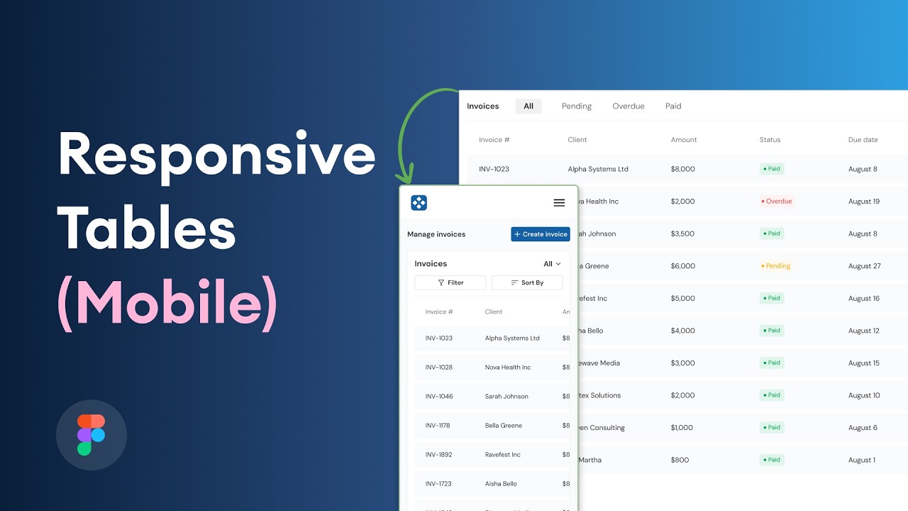
Responsive tables are the hardest element to bring into WCAG 1.4.10 compliance. Most CSS reflow techniques that work visually for sighted users break the programmatic header-cell relationship that screen readers depend on.
91.3% of screen reader users access content on mobile devices, with iOS dominating at 72.4% of disability-related usage (WebAIM, 2024). Getting table markup right on small screens isn’t optional.
The Core Reflow Problem
WCAG SC 1.4.10 requires content to reflow at 320 CSS pixels without horizontal scrolling.
Wide data tables can’t meet this by default. A 6-column table at 320px either clips, overflows, or loses visual meaning when stacked.
The 3 most common approaches, and their accessibility trade-offs:
| Approach | Accessibility Status | Screen Reader Impact |
|---|---|---|
overflow-x: scroll container | Passes WCAG 1.4.10 (exception applies) | Preserves all header associations |
| CSS card reflow (no ARIA) | Visually works, programmatically broken | Headers not announced |
data-label with aria-label per <td> | Passes if implemented correctly | Headers announced via aria-label |
The scroll container approach is the safest. WCAG explicitly allows horizontal scrolling for data tables where two-dimensional layout is necessary for comprehension.
The data-label Pattern
The popular CSS card pattern uses ::before pseudo-elements to visually inject header text into each stacked cell. Screen readers ignore pseudo-element content.
Correct implementation adds aria-label directly on each <td> to replicate the header association:
<td aria-label="Revenue: ">$42,000</td>
This works. But it requires either server-side rendering with dynamic labels or JavaScript that injects aria-label values from the <th> content at load time. Any mismatch between the visual pseudo-element label and the aria-label creates a confusing experience.
When to Replace a Table on Mobile
Some complex tables genuinely can’t reflow without losing meaning. A 7-column financial report with merged headers doesn’t become comprehensible as stacked cards.
Acceptable alternatives on mobile:
- Replace with an accordion showing one row’s full data at a time
- Offer a simplified summary with a link to the full table
- Let users toggle columns to show/hide less important fields
Each alternative needs its own accessible markup. An accordion replacement still needs correct focus management and ARIA expanded/collapsed states. A column toggle needs keyboard-operable buttons and a live region announcing the current visible column set.
How to Test Table Accessibility?

No single testing method catches everything. Deque’s research across 13,000+ pages found that automated tools identify 57% of accessibility issues by volume on average. The remaining 43% requires manual and screen reader testing.
A complete table testing process uses 3 layers.
Automated Testing Tools
axe-core rules for tables:
td-headers-attr: verifies everyidreferenced in aheadersattribute exists and belongs to a<th>th-has-data-cells: checks that every<th>has at least one data cell it headersscope-attr-valid: confirmsscopevalues are one of the 4 valid options
WAVE flags missing table captions as an alert and empty header cells as errors.
Hard limit: both tools catch structural errors in static markup, but neither can evaluate whether aria-sort updates correctly after a user interaction, or whether focus lands in the right place after pagination.
Manual Testing Checklist
Disable CSS first. Read the linearized table top-to-bottom. If the content makes no sense without visual layout, the reading order (SC 1.3.2) is broken.
Then check:
- Every
<th>hasscopeor participates inheaders/idassociations <caption>oraria-labelis present and accurately describes the table- Merged cells (
colspan/rowspan) haveheadersattributes pointing to all relevant<th>elements - Sortable columns carry
aria-sorton the<th>, not just on a child button
Screen Reader Testing
JAWS with Chrome and NVDA with Chrome cover the 2 most common desktop combinations (WebAIM, 2024). VoiceOver with Safari covers the dominant mobile use case at 70.6% of mobile screen reader users.
What to listen for:
- On entering the table: caption or label announced before first cell
- Moving between cells: column header, row header, then cell value, in that order
- Sortable column: “ascending” or “descending” announced when
aria-sortis set
If NVDA announces only a number with no header context, scope is missing or pointing the wrong direction. If JAWS skips a header entirely in a complex table, the headers/id association has a typo or is referencing the wrong element.
The GOV.UK team tests all table components against both NVDA and VoiceOver before including them in the GOV.UK Design System, which is one reason their table pattern is widely referenced as a baseline implementation.
What Are Accessible Table Patterns for Common Use Cases?
These are the 4 table types that come up most often in production. Each has a specific markup pattern that handles both simple and complex header structures correctly.
Pricing Comparison Table
Pricing tables are simple tables. One row of plan names, one column of features.
Correct markup pattern:
<caption>describing what’s being compared (“Plan comparison: Free, Pro, Enterprise”)scope="col"on each plan name<th>scope="row"on each feature name<th>- No merged cells needed
This is the pattern used in the W3C WAI Tables Tutorial simple example. Screen readers announce it as “Plan, Feature name, Yes/No” which gives users full context without memorizing column order.
Financial or Data Reporting Table
These tables often have grouped column headers: “Q1” spanning Revenue and Units, “Q2” spanning the same.
scope="colgroup" on the spanning header marks it as the parent. scope="col" on Revenue and Units marks them as children of that group.
When scope alone breaks down: if the same Revenue header appears under both Q1 and Q2, screen readers may announce the wrong parent header for cells in later columns. Switch to explicit headers/id associations for any table with 3 or more header levels.
Schedule or Timetable
Bus timetables, class schedules, appointment grids. These use both colspan and rowspan and have headers along both axes.
Every merged time slot needs a headers attribute listing all applicable header id values:
<td headers="monday morning" colspan="2">Team Standup</td>
Penn State’s accessibility documentation flags spanned rows and columns as the single most common complex table failure in production. Explicit headers/id is the only reliable fix.
Read-Only Data Grid vs. Interactive Data Grid
This distinction matters more than most teams realise.
| Pattern | When to use | Key markup |
|---|---|---|
Native <table> | Display-only data, no cell editing | Standard <th>, scope, caption |
role="grid" | Interactive: sortable, editable, selectable rows | ARIA grid pattern, roving tabindex |
role="grid" changes keyboard navigation completely. Arrow keys move between cells instead of Tab. Users who encounter a role="grid" expect spreadsheet-style interaction. Using it on a read-only table confuses screen reader users and breaks normal page navigation.
The ARIA Authoring Practices Guide (APG) data grid pattern covers focus management, row selection, and in-cell editing in full. It’s the reference implementation for any interactive data table built with HTML, CSS, and JavaScript.
For teams building accessible tables within a design system, the web accessibility checklist covers table-specific checks alongside broader inclusive design requirements across forms, navigation, and media. Accessible tables sit within the same compliance framework as accessible forms and accessible typography, all governed by the same WCAG 2.1 success criteria.
FAQ on Accessible Tables
What makes a data table accessible?
An accessible table uses semantic HTML markup – <th> for header cells, scope attributes for direction, and <caption> for labeling. These elements give screen readers the programmatic structure needed to announce header-cell relationships correctly.
What is the difference between a data table and a layout table?
Data tables organize relational information in rows and columns. Layout tables use <table> purely for visual positioning. Layout tables should carry role="presentation" to remove them from the accessibility tree entirely.
Which WCAG success criteria apply to tables?
3 criteria apply directly: SC 1.3.1 (Info and Relationships), SC 1.3.2 (Meaningful Sequence), and SC 1.4.10 (Reflow). Interactive tables also fall under SC 4.1.2, which requires sortable columns to expose state via aria-sort.
When should I use the headers and id attributes?
Use headers and id when scope alone can’t resolve multi-level header associations. Complex tables with colspan or rowspan across both axes need explicit cell-to-header links that scope="col" and scope="row" can’t handle reliably.
How do screen readers navigate HTML tables?
NVDA and JAWS use Ctrl+Alt+Arrow Keys to move cell by cell, announcing the column header, row header, and cell value in sequence. VoiceOver on iOS uses the table rotor. Correct scope or headers/id markup drives every announcement.
What is aria-sort and when does it apply?
aria-sort is an ARIA attribute placed on <th> elements in sortable tables. It takes values of ascending, descending, or none. Without it, screen reader users have no way to know the current sort state of a column.
How do I make a responsive table accessible on mobile?
The safest approach wraps the table in a scrollable container using overflow-x: auto. This preserves all header associations. The popular CSS card reflow pattern breaks programmatic structure unless each <td> carries a matching aria-label value.
What automated tools test table accessibility?
axe-core checks td-headers-attr, th-has-data-cells, and scope-attr-valid rules. WAVE flags missing captions and empty header cells. Deque research shows automated tools catch 57% of accessibility issues by volume – manual and screen reader testing covers the rest.
What is the difference between role=”table” and role=”grid”?
role="table" is for read-only data display. role="grid" signals an interactive widget where arrow keys navigate cells, like a spreadsheet. Using role="grid" on a static table changes keyboard behavior unexpectedly and confuses screen reader users.
Does accessible table markup affect SEO?
Semantic table markup using <caption>, <th>, and <thead> helps search engines parse structured data more accurately. Google’s crawlers process HTML tables similarly to how screen readers do – clear structure reduces ambiguity and can support rich result eligibility for tabular content.
Conclusion
Accessible tables aren’t a nice-to-have. They’re the baseline for anyone presenting tabular data to a real audience that includes screen reader users, keyboard navigators, and people relying on assistive technology.
The fixes are specific. <caption>, scope, headers, id, aria-sort – each one solves a concrete failure mode.
Test with axe-core for structural errors. Then test manually. Then open NVDA or VoiceOver and actually listen to how cells are announced.
WCAG 2.1 compliance covers the legal requirement. Correct markup covers the user experience. Both depend on the same semantic HTML table structure covered throughout this guide.
Build it right once. It holds up.


