Every app you use talks back to you. “Message sent.” “File saved.” “Connection lost.” These brief, auto-dismissing messages are called toast notifications, and they’re one of the most common UI feedback patterns in modern software.
But most teams get them wrong. They use toasts for critical errors, let them disappear too fast, or skip accessibility entirely.
This article covers what a toast notification is, how it works, when to use one (and when not to), how it compares to modals, snackbars, and banners, and how to build one that actually serves your users well.
What Is a Toast Notification
A toast notification is a small, temporary message that pops up on screen to give users quick feedback about an action or event. It shows up briefly, then disappears on its own without blocking anything underneath.
The name comes from a toaster. The message rises into view the same way a piece of bread pops up when it’s done. Simple concept, honestly.
These messages sit as a non-modal overlay on the user interface, meaning users can keep working while the notification is visible. No clicking “OK.” No closing a dialog. The toast handles itself.
Typical placement is the bottom-left, bottom-right, or top-right corner of the screen. Most last between 3 and 5 seconds before fading out automatically.
Toast notifications serve one job: confirming something happened without getting in the way. “Message sent.” “File saved.” “Item deleted.” That kind of thing.
They first appeared as a native component in Android development, where the Toast class became the go-to method for showing brief system-level messages. The pattern then spread to web apps, desktop software, and iOS (through third-party libraries, since Apple doesn’t include a native toast component).
What makes them different from other notification types? They don’t demand attention. A modal in UI design forces you to stop and respond before continuing. A banner sticks around at the top of the page. A toast just… appears and leaves.
According to the WebAIM Million 2025 analysis, 94.8% of websites still have at least one detectable WCAG failure. Toast notifications contribute to this when developers skip proper accessibility markup, something we’ll get into later.
How Toast Notifications Work
The mechanics behind a toast notification are straightforward. Something triggers it, it animates into view, it hangs around for a few seconds, and then it goes away.
What Triggers a Toast
User-initiated actions are the most common trigger. Saving a document, sending a message, updating profile settings. The toast confirms the action completed.
System events trigger them too. A lost network connection, a background sync finishing, a new chat message arriving from someone on your team.
The trigger fires a JavaScript function that creates the toast element, injects it into the DOM, and applies the entry animation. A setTimeout function handles the auto-dismiss countdown.
Animation and Display Behavior
Most toast components use CSS animations for their enter and exit transitions. Slide-in from the bottom edge is the default in Material Design. Fade-in works better for top-positioned toasts.
When multiple toasts fire at once, they stack. Newer toasts push older ones up (or down, depending on placement). Good implementations cap this at 3 to 5 visible toasts to prevent screen clutter.
The toast element typically sits at a high z-index value so it renders above other page content. But it stays below truly critical overlays like modals and confirmation dialogs.
Dismiss Behavior
| Dismiss Method | How It Works | Platform |
|---|---|---|
| Auto-dismiss timer | Disappears after 3–5 seconds | All platforms |
| Close button (X) | User clicks to remove manually | Web, desktop |
| Swipe gesture | User swipes the toast off-screen | Mobile apps |
| Click anywhere | Clicking outside dismisses it | Some web implementations |
The ideal display time is roughly 3 seconds for short messages, according to UX practitioners. Longer messages or toasts with action buttons need closer to 5–10 seconds.
Gmail’s approach is a good reference. When you archive an email, the toast reads “Conversation archived” with an Undo button. The undo option stays available for about 5 seconds before disappearing, giving you enough time to reverse the action without pressure.
Common Use Cases for Toast Notifications
Toasts work best in situations where the feedback is nice to have, not need to have. If someone misses the message entirely, nothing breaks.
Success Confirmations
“Message sent.” “Settings saved.” “Profile updated.”
These are the bread and butter. The user did something, the system processed it, and the toast confirms it worked. Green color coding and a checkmark icon are standard here. Slack uses this pattern constantly, popping a brief confirmation toast whenever you update your status or adjust notification preferences.
Undo Actions
This is where toasts really earn their keep. The combination of a confirmation message with a reversible action button is one of the most user-friendly patterns in modern user experience design.
Gmail pioneered this. When you delete an email, a toast appears with “Undo” as a clickable option. Google Docs, Trello, and Asana all follow the same pattern. It removes the anxiety of accidental actions without adding friction to the normal workflow.
Non-Critical Errors and Warnings
Lost your internet connection for a second but it came back? Toast. A background upload finished while you were reading something else? Toast.
The key word here is “non-critical.” If the error actually prevents the user from continuing their task, a toast is the wrong choice. You’d want an inline error message or a dialog instead.
Real-Time Collaboration Cues
Tools like Figma and Google Docs show toast messages when another collaborator joins the document or makes a significant change. These keep everyone loosely aware of team activity without turning the screen into a notification storm.
Wisernotify research shows that 88% of users reported higher app engagement when push notifications (including in-app toasts) were implemented properly. The trick is “properly.” Badly timed toasts have the opposite effect.
Toast Notifications vs. Other UI Notification Types
Picking the right notification type is one of those decisions that seems small until you get it wrong. Each type exists for a specific level of urgency and required user attention.
| Notification Type | Blocks UI? | Auto-Dismisses? | Action Required? | Best For |
|---|---|---|---|---|
| Toast | No | Yes | No | Success confirmations, status updates |
| Snackbar | No | Yes | Optional | Actions with undo capability |
| Modal | Yes | No | Yes | Critical decisions, destructive actions |
| Banner | No | No | Optional | Persistent warnings, system status |
| Push notification | No (external) | Varies | Optional | Re-engagement, external alerts |
Toasts vs. Modals
A toast lets users keep working. A modal stops everything.
If you’re confirming a file was saved, use a toast. If you’re asking a user to confirm they want to permanently delete their account, that’s a modal. The distinction is about consequence. Low-stakes feedback gets a toast. High-stakes decisions get a modal with explicit confirmation buttons.
Toasts vs. Snackbars
This one trips people up because the terms overlap, especially in Material Design. Google’s own documentation draws the line here: snackbars can include an action button (like “Undo” or “Retry”), while traditional toasts are purely informational with no interactive elements.
In practice, most web developers use “toast” as the umbrella term for both. React Toastify, for example, supports action buttons inside its toast components even though they’re technically closer to snackbars by Material Design’s definition.
Toasts vs. Push Notifications
Different layer entirely. Push notifications are system-level messages delivered by the operating system, even when the app isn’t open. Toasts live inside the app’s own interface.
The Business Research Company reported the push notification software market hit $21.97 billion in 2024. Toasts, by contrast, are free, built-in UI components with zero infrastructure cost.
Toasts vs. Banners
Banners persist. They sit at the top of the page and stay there until the user dismisses them or the condition resolves. Cookie consent notices are banners. “Your trial expires in 3 days” is a banner.
Toasts disappear. If your message needs to stick around, it’s not a toast.
Design Best Practices for Toast Notifications
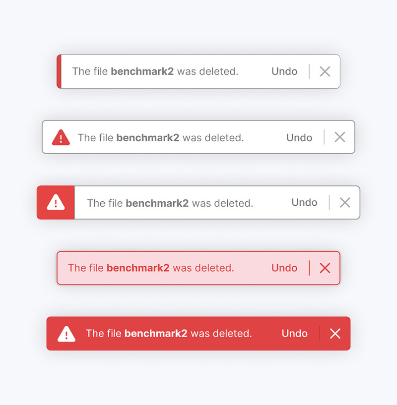
Getting the visual design right matters more than most people think. A toast that’s too flashy distracts. A toast that’s too subtle gets missed entirely.
Keep Messages Short
One to two lines. Maximum. Ideally under 3 words for the core message.
“Saved.” “Sent.” “Deleted.” These work. “Your document has been successfully saved to the cloud storage system” does not. If you need that many words, the information probably belongs somewhere else.
Use Consistent Placement
Pick a corner and stick with it across your entire application. Bottom-right is the most common position for web apps. Bottom-center works well on mobile.
Denovers’ product design team recommends top-center or top-right for best visibility with minimal disruption. The key is consistency. Users learn where to look after seeing a couple of toasts. Changing positions between pages kills that learned behavior.
Color and Icon Conventions
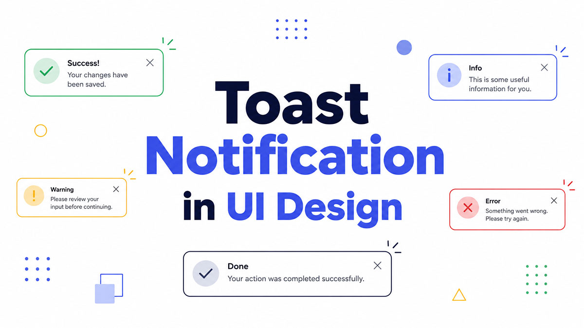
Success: Green background or green icon. Checkmark.
Error: Red. X icon or exclamation mark.
Warning: Yellow or orange. Triangle with exclamation.
Info: Blue. Circle with “i” icon.
These conventions come from years of design system standardization across platforms. Material UI, Chakra UI, and Bootstrap all follow this same color logic. Breaking from it confuses users.
But here’s something the LogRocket UX team points out, and I agree with: toast notifications aren’t critical messages, so you don’t always need aggressive color reinforcement. A neutral-toned toast with a small icon can work just fine for routine confirmations.
Don’t Stack Too Many
Three toasts on screen at once. That’s the ceiling for most implementations.
Anything beyond that and you’re building a notification wall. If your app fires that many toasts in quick succession, the real problem is probably elsewhere in the flow.
Provide Adequate Display Time
A Localytics survey found that 46% of users will opt out of push notifications if they receive 2 to 5 messages per week. In-app toast fatigue follows the same psychology. Too many, too fast, and users start tuning them out completely.
Give people time to actually read the message. Three seconds for two words. Five to eight seconds if there’s an action button.
Accessibility Considerations
This is the part most teams skip, and it shows. The WebAIM Million 2025 study found low-contrast text on 79.1% of homepages. Toast notifications are frequent offenders here.
ARIA live regions are non-negotiable. A toast should use role="status" for routine messages or role="alert" for urgent ones. Without this, screen readers won’t announce the message at all.
Other requirements that matter:
- Sufficient color contrast (minimum 4.5:1 ratio for text)
- Don’t rely on color alone to communicate meaning, always pair with icons or text labels
- Keyboard-accessible dismiss controls for users who can’t use a mouse
- Long enough display time for people who read at different speeds or use assistive technology
React Toastify v11 added built-in ariaLabel support and a keyboard shortcut (Alt + T by default) to focus the first visible toast. This kind of web accessibility feature should be standard, not an afterthought.
How to Build a Toast Notification
You have two paths. Build it yourself with vanilla HTML, CSS, and JavaScript. Or use a library that handles the heavy lifting. Both are valid, depending on the project.
Vanilla JavaScript Approach
A basic toast needs three things: a container element positioned with position: fixed, a CSS transition for the enter/exit animation, and a setTimeout call to auto-remove it from the DOM.
The container sits at a high z-index. You inject the toast message as a child element, add a CSS class to trigger the slide-in, then remove both the class and the element after your timer runs out.
It’s maybe 30 lines of code total. Took me about 15 minutes the first time I built one from scratch, and that included fiddling with the CSS keyframes for the fade effect. Nothing fancy.
React Libraries
If you’re working in React, there’s no shortage of options. But three dominate the ecosystem right now.
React Toastify: Over 2.6 million weekly downloads on npm (npm trends, 2026). It’s the most popular by a wide margin. Built-in themes, swipe-to-close on mobile, progress bars, queue system. Version 11 added automatic stylesheet injection and better accessibility hooks.
Sonner: The newer contender. Gained roughly 500K weekly downloads within its first year. Stacked notifications by default. Cleaner API. Looks polished out of the box.
React Hot Toast: Lightweight, fast, minimal setup. A good fit if you want something simple without a lot of configuration overhead.
| Library | Weekly Downloads | Key Strength | Bundle Size |
|---|---|---|---|
| React Toastify | ~2.6M | Feature-rich, highly customizable | ~16KB gzipped |
| Sonner | ~500K+ | Clean defaults, stacked layout | ~5KB gzipped |
| React Hot Toast | ~600K+ | Lightweight, fast setup | ~5KB gzipped |
Design System Components
Material UI ships a Snackbar component. Chakra UI and Radix both include toast primitives. These are built to match their respective design system components, so if you’re already using one of these libraries, the toast component will look consistent with everything else.
Bootstrap’s toast component is another popular choice. Lightweight, dependency-free (beyond Bootstrap itself), and handles stacking and auto-dismiss out of the box.
Mobile Implementations
Android has a native Toast class built into the SDK. Two duration options: Toast.LENGTHSHORT (2 seconds) and Toast.LENGTHLONG (3.5 seconds). Simple, limited, and increasingly replaced by Snackbar in Material Design guidelines.
iOS has no native toast equivalent. Developers use third-party libraries or build custom views. It’s one of those platform differences that catches people off guard when they start building responsive cross-platform apps.
For progressive web apps, toast implementations need to account for both desktop and mobile viewport sizes. Media queries help adjust placement and width, switching from corner-positioned on desktop to full-width at the bottom on smaller screens.
Toast Notification Patterns on Mobile vs. Desktop
The same toast notification behaves differently depending on the screen it’s displayed on. What works on a 27-inch monitor falls apart on a phone held in one hand.
Batch’s 2025 Push Notification Benchmark (covering 800 billion messages across 10,000 apps) shows 72.8% of web push traffic now comes from mobile devices. Toast design has to account for that shift.
Mobile Toast Behavior
Full-width layout is the standard. On screens under 480px, corner-positioned toasts waste space and feel cramped. Most implementations stretch the toast across the bottom of the screen, edge to edge.
Swipe-to-dismiss is expected on mobile. Users are trained by years of gesture-based interaction. A toast that just sits there waiting for its timer to run out feels broken on a phone.
Android has a built-in Toast class at the OS level. Two options: LENGTHSHORT (2 seconds) and LENGTHLONG (3.5 seconds). Straightforward, but limited. No action buttons, no custom styling, no swipe. Material Design now recommends Snackbar over the native Toast for anything beyond basic system messages.
iOS doesn’t ship with a native toast component at all, which surprises a lot of developers coming from Android. Third-party libraries or custom views fill the gap.
Desktop Toast Behavior
| Aspect | Desktop | Mobile |
|---|---|---|
| Position | Corner (top-right or bottom-right) | Full-width bottom |
| Dismiss method | Close button or auto-timer | Swipe gesture + auto-timer |
| Stacking | Vertical stack in corner | Single or minimal stack |
| Width | Fixed (300–400px) | Edge-to-edge |
Desktop toasts have more room to breathe. They sit in a corner, usually 300 to 400 pixels wide, and can stack vertically without dominating the screen.
Close buttons (the small X) work fine on desktop because mouse precision makes clicking a small target easy. On mobile, that same 16×16 pixel target becomes a frustration. Touch targets need at least 44×44 pixels to meet WCAG guidelines.
Cross-Platform Considerations
Building toast notifications for apps that run on both platforms means accounting for the differences up front. Most teams handle this in their wireframes during the early design phase.
Batch’s benchmark also found that Android opt-in rates dropped from 85% to 67% in a single year after Android 13 aligned its consent model with Apple’s. Notification behavior is converging across platforms, even if the visual presentation still differs.
Mobile-first design thinking applies here. Build the mobile toast first, then adjust for desktop. The constraints of a small screen force clarity. If the message works at 320px, it’ll work anywhere.
Mistakes to Avoid with Toast Notifications
Toast notifications seem simple. That’s exactly why teams mess them up. The mistakes are usually about using toasts in situations where a different notification type would be the better pick.
Using Toasts for Critical Errors
This is the single biggest misuse. If the user needs to read the message to continue their task, a toast is the wrong choice.
LogRocket’s UX team described a scenario where a banking app used a toast for “Incorrect username or password.” The user looked away for a second, missed the toast, and had no idea why the login failed. They kept pressing the button, confused.
Login failures, payment errors, form validation problems. These need inline error messages or alert dialogs that persist until the user acknowledges them. Not a message that vanishes in 3 seconds.
Disappearing Too Fast
Adam Silver, a UX designer who has written extensively on this topic, argues that auto-dismissing messages create a race against time. Users with cognitive impairments, motor difficulties, or just someone in a busy environment can miss the toast entirely.
WCAG Success Criterion 2.2.1 (Timing Adjustable) exists for this reason. If your toast disappears before the user can read or interact with it, you have an accessibility failure.
The fix: Pause the dismiss timer on hover (desktop) or touch (mobile). Give toasts with action buttons at least 8–10 seconds. And for error-type messages, don’t auto-dismiss at all.
Notification Overload
Sleeknote’s 2025 analysis found that receiving just 2 to 5 push messages per week causes 46% of users to disable notifications entirely. In-app toast fatigue follows the same curve.
If your app fires a toast for every single micro-action (saved, synced, refreshed, updated, loaded), users stop noticing any of them. The toast becomes visual noise.
Atlassian’s Jira uses toasts selectively. Keyboard shortcut actions like pressing “I” to self-assign a task trigger a brief toast. But routine saves and page transitions don’t. That selective approach keeps toasts meaningful.
Stuffing Too Much Content into a Toast
Wrong: “Your document ‘Q3 Marketing Report – Final Draft v2’ has been successfully saved to the shared team folder in Google Drive. Click here to view it or here to share with your team.”
Right: “Document saved.”
If the message needs more than two lines, it doesn’t belong in a toast. Use a drawer component, a banner, or an inline message instead.
Ignoring Screen Reader Users
The WebAIM Million 2025 analysis found that 55.5% of pages had missing alternative text, with linked images being the worst offenders. Toast notifications often suffer from the same neglect.
Without proper ARIA live region markup, a toast is completely invisible to screen reader users. The message appears visually, the timer runs, and it disappears. The user never knew it was there.
Adrian Roselli, an accessibility specialist, notes that there is no native toast-like element in HTML. The semantics and interaction patterns must be defined with ARIA roles. role="status" for routine updates. role="alert" for things that need immediate attention.
The DEV Community published a 2025 article cataloging how toasts frequently violate multiple WCAG 2.2 success criteria: timing issues, missing screen reader announcements, keyboard inaccessibility, and unexpected layout shifts. Replacing auto-dismissing toasts with persistent status areas was their recommended fix for critical messages.
A good starting checklist for avoiding these mistakes:
- If the message is critical, don’t use a toast
- If the message has more than one sentence, don’t use a toast
- If users can’t afford to miss it, don’t use a toast
- If there’s no ARIA live region, the toast doesn’t exist for accessible UI component standards
FAQ on Toast Notifications
What is a toast notification in simple terms?
A toast notification is a small, temporary message that pops up on screen to confirm an action or share a status update. It disappears on its own after a few seconds without blocking anything the user is doing.
Why is it called a “toast” notification?
The name comes from how the message pops up, similar to bread rising from a toaster. The notification slides into view briefly, then drops back out of sight automatically.
What is the difference between a toast and a snackbar?
A snackbar can include action buttons like “Undo” or “Retry.” A traditional toast is purely informational with no interactive elements. Material Design draws this distinction, though many developers use the terms interchangeably.
Where do toast notifications appear on screen?
Most appear in the bottom-right or top-right corner on desktop. On mobile, they typically span the full width at the bottom of the screen. Consistent placement across your app helps users know where to look.
How long should a toast notification stay visible?
Short messages need roughly 3 seconds. Toasts with action buttons should stay for 5 to 10 seconds. Pausing the timer on hover or touch is a good accessibility practice for users who need more reading time.
Are toast notifications accessible to screen readers?
Only if built correctly. Toasts need ARIA live regions (role="status" or role="alert") to be announced by screen readers. Without this markup, the notification is invisible to assistive technology users.
When should you not use a toast notification?
Don’t use toasts for critical errors, form validation failures, or any message the user absolutely cannot miss. These situations call for inline error messages, banners, or modal dialogs that persist until acknowledged.
Can toast notifications contain buttons or links?
Yes, many implementations support action buttons. Gmail’s “Undo” button after archiving an email is a well-known example. Technically, this makes them closer to a snackbar by Material Design’s definition.
What are the best libraries for building toast notifications?
React Toastify leads with over 2 million weekly npm downloads. Sonner and React Hot Toast are popular alternatives. For non-React projects, Bootstrap’s toast component and vanilla JavaScript implementations work well.
Do toast notifications work on both mobile and desktop?
Yes, but the design adapts. Desktop toasts sit in a corner at a fixed width. Mobile toasts stretch full-width and support swipe-to-dismiss. Android has a native Toast class, while iOS relies on third-party solutions.
Conclusion
A toast notification is one of those UI patterns that looks deceptively simple. Get it right and users feel informed without being interrupted. Get it wrong and you’re either annoying people or leaving screen reader users completely in the dark.
The rules aren’t complicated. Keep messages short. Use consistent placement. Add ARIA live regions for accessibility. Don’t use toasts for anything critical.
Pick the right notification type for the situation. Toasts handle low-priority confirmations. Modals handle high-stakes decisions. Banners handle persistent warnings. Mixing them up creates confusion.
Whether you’re building with React Toastify, Bootstrap’s toast component, or vanilla JavaScript, the implementation matters less than the design thinking behind it. A well-placed, properly timed toast notification with the right accessibility markup does more for user satisfaction than any fancy animation ever will.
Test with real users. Test with assistive technology. Then ship it.

Many of his resources are available on various design marketplaces. Over the years, he's worked with a range of clients and contributed to design publications like Designmodo, WebDesignerDepot, and Speckyboy, Slider Revolution among others.
- What is Backend in Web Development? - September 13, 2026
- What is Frontend Development? - September 11, 2026
- How to Make a Button in Figma: Design Best Practices - September 10, 2026