Every icon button you’ve hovered over. Every settings gear that whispered its name when your cursor passed by. That small text bubble? That’s a tooltip.
So what is a tooltip in UI, exactly? It’s one of the smallest components in any interface, yet it quietly shapes how people understand and interact with a product. Get it right and users move through your design without friction. Get it wrong and you’ve hidden critical information behind an invisible trigger.
This guide covers how tooltips work across desktop and mobile, the common types you’ll find in real products, accessibility requirements under WCAG, implementation options in frameworks like Bootstrap and Radix UI, and the mistakes that silently break usability for a large portion of your audience.
What Is a Tooltip in UI
A tooltip is a small text label that appears when a user hovers over, focuses on, or long-presses a user interface element. It provides brief, supplementary information about the element’s function.
Think of the bell icon in Stripe’s dashboard. No label next to it. But hover over it, and a small bubble says “Notifications.” That’s a tooltip doing its job.
Tooltips are non-interactive by default. They disappear the moment you move your cursor away or shift keyboard focus elsewhere. Their entire purpose is contextual help, delivered right where the user needs it, without cluttering the screen.
Here’s what separates a tooltip from similar patterns:
- Popovers are click-triggered and can contain links, buttons, or rich content
- Toast notifications are system-generated messages that appear temporarily regardless of user action
- Inline hints sit permanently in the layout, usually below form fields
A tooltip does none of that. It stays hidden until triggered, shows text-only content, and vanishes when the trigger ends.
The distinction matters because picking the wrong pattern causes real problems. I’ve seen teams stuff paragraph-length instructions inside tooltips when a modal would have been the right call. The result? Tiny text that disappears before anyone finishes reading it.
Tooltips work best when the information is short, supplementary, and tied directly to a single UI element. If your tooltip content needs a scroll bar, you’ve already lost.
How Tooltips Work in Practice
The mechanics behind tooltip behavior are simpler than most people assume. A trigger element (button, icon, link) fires the tooltip into view. The tooltip positions itself relative to that element. Then it disappears when the trigger condition ends.
But the details get tricky fast.
Timing behavior matters more than you’d think. Most implementations use an entrance delay between 100ms and 300ms. This prevents tooltips from flashing every time a user casually moves their mouse across the interface. Without that delay, the screen becomes a mess of flickering text labels.
Tooltip placement follows a priority system. The default is usually top-center, directly above the trigger element. But when the element sits near the edge of the viewport, the tooltip auto-flips to the opposite side. Libraries like Popper.js handle this viewport collision detection automatically.
Maze research shows that 88% of internet users won’t return to a site after a poor experience. Poorly timed or misplaced tooltips contribute to exactly that kind of frustration.
Desktop vs. Mobile Tooltip Behavior
On desktop, hover is the standard trigger. Mouse enters the element, tooltip shows. Mouse leaves, tooltip hides. Keyboard focus works the same way for accessibility.
Mobile is a different story entirely. There’s no hover state on a touchscreen. Long-press is the closest equivalent, but it conflicts with other gestures like context menus and text selection.
Some teams skip tooltips on mobile altogether. Instead, they replace them with persistent inline labels or info icons that reveal text on tap (a pattern called a toggletip). Figma does this well, swapping hover tooltips for tappable info buttons in their mobile app.
If you’re building a progressive web app or any product that must work across devices, plan your tooltip fallback early. Don’t wait until QA finds broken tooltips on an iPhone.
Common Tooltip Types
Not every tooltip serves the same purpose. The type you choose depends on what information the user needs and when they need it.
| Type | Trigger Content | What It Shows |
|---|---|---|
| Icon tooltip | Unlabeled icon button | Button’s name or action |
| Truncated text | Clipped text in a table cell | Full text string |
| Definition tooltip | Jargon or abbreviation | Plain-language meaning |
| Rich tooltip | Complex data point | Formatted content, small images |
Icon Tooltips
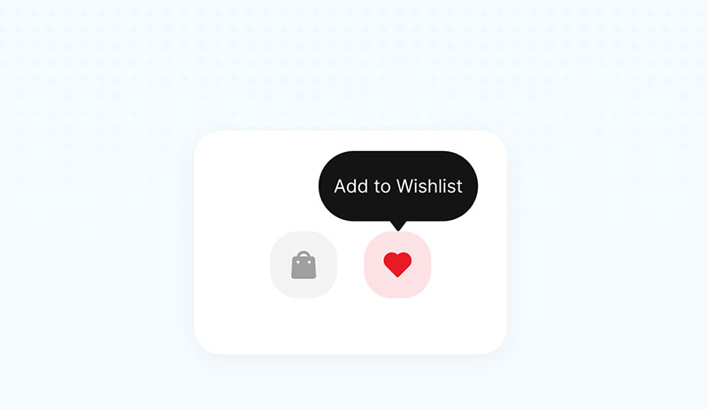
The most common type. GitHub’s interface is full of them. Every icon button in their toolbar, from “Fork” to “Star” to “Watch,” uses a tooltip to label the action. Without these, users would have to guess what each icon does.
Material Design’s guidelines specifically require tooltips on all icon-only buttons. If there’s no visible text label, a tooltip fills that gap.
Truncated Text Tooltips
Data tables are the classic use case here. When a column is too narrow to show the full cell content, the text gets clipped with an ellipsis. Hovering reveals the complete string.
This pattern appears constantly in dashboards, admin panels, and CRM tools like Salesforce. The tricky part is detecting truncation programmatically. You need to compare the element’s scrollWidth against its clientWidth in JavaScript to decide whether a tooltip is even necessary.
Definition Tooltips
These show up in financial platforms, medical software, and any product that uses specialized language. Hover over “APR” in a banking app, and the tooltip explains what annual percentage rate means.
UserGuiding research reports that 55% of customers stop using a product they don’t understand. Definition tooltips directly address that problem by making jargon accessible without forcing users to leave the page.
Rich Tooltips
This is where the line between tooltip and popover starts to blur. Rich tooltips can include formatted text, small icons, or even thumbnail images. LinkedIn uses these for profile preview cards that appear on hover.
But here’s the catch. Once the content inside a tooltip becomes interactive (clickable links, buttons), it stops being a tooltip by definition. The WAI-ARIA specification is clear on this: role="tooltip" means non-interactive content only. If users need to click something inside the popup, build a popover or a dropdown instead.
When to Use a Tooltip and When to Skip It
The decision to use a tooltip comes down to one question: is this information supplementary or critical?
If the user needs it to complete their task, don’t hide it inside a tooltip. Put it on the screen. Tooltips are too easy to miss, especially for keyboard users, screen reader users, and anyone on a touchscreen.
Good Reasons to Use a Tooltip
Labeling icon buttons: When white space is limited and adding visible labels would break the layout, tooltips fill the gap.
Clarifying abbreviations: Hover-to-define patterns reduce the cognitive load for new users without slowing down experienced ones.
Showing full text on truncation: Tables and card layouts with limited width benefit from this approach.
Flowla, a sales enablement tool, increased user activation rates by 24% after adding tooltips and a product tour to their onboarding flow (UserGuiding).
When to Skip Tooltips
Some situations where tooltips actively hurt usability:
- The information is critical to completing a form or transaction
- The content requires user interaction (links, buttons, video)
- Your audience is primarily on mobile devices
- The trigger element already has a visible text label that says the same thing
Notion made an interesting design choice here. Instead of using icon tooltips for their sidebar actions, they use persistent inline labels. It takes up more space, but user experience research at their scale apparently justified the tradeoff.
The 2025 WebAIM Million report found that 94.8% of home pages had detectable WCAG failures. A lot of those come from interactive elements like tooltips that lack proper keyboard support or ARIA attributes.
Tooltip Accessibility Requirements
Accessibility isn’t optional for tooltips. WCAG 1.4.13 (Content on Hover or Focus) sets three hard requirements for any content that appears on hover or keyboard focus. The tooltip must be dismissible, hoverable, and persistent.
Dismissible: Users must be able to close the tooltip without moving their pointer. Pressing Escape should do it.
Hoverable: When a tooltip appears, the user must be able to move their cursor over the tooltip content without it vanishing. Screen magnifier users especially depend on this.
Persistent: The tooltip stays visible until the user actively dismisses it or moves focus away. No auto-hiding on a timer.
An estimated 16% of the world’s population, about 1.3 billion people, lives with a significant disability (WHO). Ignoring tooltip accessibility excludes a huge portion of your potential users.
Screen Reader Behavior with Tooltips
The aria-describedby attribute links a trigger element to its tooltip content. When a screen reader lands on the trigger, it reads the element’s label first, then announces the tooltip text as a description.
Here’s the markup pattern that works across NVDA, VoiceOver, and JAWS:
<button aria-describedby="tip1">Settings</button> <div id="tip1" role="tooltip">Manage your account preferences</div>
Avoid using the native HTML title attribute for tooltips. Most screen readers treat it inconsistently. Some ignore it entirely. And you can’t style it with CSS, which means no color contrast control, no positioning logic, and no way to meet WCAG requirements.
The web accessibility checklist maintained by most web accessibility organizations recommends custom tooltip implementations over native title attributes for exactly these reasons.
Tooltip Design Patterns and Styling
A tooltip that works and a tooltip that works well are two different things. Design details make the difference between a helpful hint and an annoying overlay.
Visual Conventions
Arrow carets: Most tooltip designs include a small triangular arrow pointing toward the trigger element. It’s a visual anchor. Without it, users can lose track of which element the tooltip belongs to, especially in dense interfaces.
You can generate these arrows purely with CSS using border tricks, or use an SVG element for more control. The CSS tooltip approach using ::after pseudo-elements is still the most lightweight option for simple implementations.
Contrast requirements: WCAG AA demands at least 4.5:1 contrast between tooltip text and its background. Dark tooltips on light interfaces (or light tooltips on dark themes) usually meet this without effort. But double-check with a contrast checker, especially if you’re using semi-transparent backgrounds.
Content Length and Animation
Keep tooltip text under 150 characters. Once you pass that threshold, you’re probably dealing with content that belongs in a popover or a help panel.
For animation, a subtle fade-in between 100ms and 200ms feels natural. Bounce effects, slides, and scale transitions look flashy but distract from the content. The tooltip isn’t the main event. It’s a supporting actor.
The CSS animation property handles simple fade-ins well. Use opacity transitions paired with a slight transform: translateY(4px) for a polished entrance without going overboard.
Z-Index and Overflow
This is the part that trips up most developers. Tooltips are floating elements. They sit on top of everything. That means managing z-index conflicts with CSS modals, sticky headers, and other overlapping UI components.
A common approach is to render the tooltip at the DOM’s root level (using a portal in React or appending to document.body) instead of nesting it inside the trigger’s parent. This avoids overflow: hidden clipping issues that silently break tooltips inside scrollable containers.
Took me longer than I’d like to admit to figure that one out on a project with nested scrollable panels. The tooltip kept getting cut off at the container boundary, and no amount of z-index tweaking fixed it until I moved it to a portal.
Tooltip Implementation in Popular Frameworks
How you build a tooltip depends entirely on your stack. The gap between a native HTML title attribute and a fully accessible custom component is wider than most beginners expect.
npm trends data shows Bootstrap pulls over 4 million weekly downloads, and its tooltip component remains one of the most used implementations on the web. But it’s far from the only option.
| Library / Method | Positioning | Accessibility | Styling Control |
|---|---|---|---|
HTML title attribute | Browser-controlled | Poor (inconsistent) | None |
| Bootstrap Tooltip | Popper.js | Basic ARIA | CSS variables, Sass |
| Radix UI Tooltip | Built-in collision | Full WAI-ARIA | Completely unstyled |
CSS-only (::after) | Manual | None by default | Full CSS control |
The HTML Title Attribute (and Why It Falls Short)
The simplest tooltip method. Add title="Your text" to any element and the browser renders a small yellow box on hover. Zero dependencies. Zero setup.
But the problems stack up fast. You can’t style it. You can’t control its position. Most screen readers treat it inconsistently, and it doesn’t appear on touch devices at all. CSS-Tricks recommends against using title for anything beyond decorative hints.
Bootstrap Tooltip Component
Bootstrap uses Popper.js under the hood for all tooltip positioning. The frontend setup is straightforward: add a data-bs-toggle="tooltip" attribute plus a title value, then initialize with one line of code.
Popper.js handles the collision detection automatically, flipping tooltips when they approach viewport edges. The base Popper library is only 2 KB minzipped (Popper.js docs), which keeps the performance overhead low.
One thing that catches people off guard: Bootstrap tooltips are opt-in for performance reasons. They won’t work until you manually initialize them with JavaScript.
Radix UI and Headless Tooltip Primitives
Radix UI takes the opposite approach. It ships completely unstyled, accessible tooltip components that handle ARIA attributes and keyboard interactions out of the box.
The Radix Tooltip package has nearly 5,000 dependent projects on npm (npm registry). Its WCAG 2.1 Content on Hover compliance is built in by default, meaning the tooltip content stays visible when users hover over it.
Headless UI by Tailwind Labs offers a similar philosophy but with a smaller component set. Radix covers more ground for complex user interface components like sliders, accordions, and nested menus alongside tooltips.
Building a Tooltip from Scratch
Sometimes a library is overkill. For a lightweight custom tooltip, the CSS hover effects approach using ::after pseudo-elements and data- attributes works well.
The basic structure:
- A trigger element with a
data-tooltipattribute holding the text - CSS that shows a positioned
::afterpseudo-element on:hoverand:focus - A sprinkle of JavaScript for entrance delay logic and Escape key dismissal
- ARIA attributes (
role="tooltip"andaria-describedby) added programmatically
The pure CSS method gets you 80% of the way there. But to meet WCAG 1.4.13 fully, you’ll still need JavaScript for keyboard dismissal and hover persistence on the tooltip content itself.
Tooltip Mistakes That Hurt Usability
Most tooltip problems aren’t about bad code. They’re about bad decisions on when and how to use tooltips in the first place.
UserGuiding research found that products with interactive onboarding flows (including tooltips) see 50% higher activation rates than static tutorials. But poorly implemented tooltips do the opposite. They frustrate users and increase support tickets.
Hiding Critical Information
This is the number one mistake. Teams put instructions, warnings, or required context inside a tooltip that only appears on hover. Users who navigate with keyboards or touchscreens might never see it.
If removing the tooltip would make the interface confusing or unusable, that content belongs on the screen permanently. Put it in a label, a help section, or an inline hint below the form field. Accessible forms always show required context directly.
Tooltip Content That’s Too Long
A tooltip with three paragraphs isn’t a tooltip anymore. It’s a poorly disguised help panel.
Material Design’s guidelines cap tooltip text at brief, descriptive labels. If you need more room, use a popover with a close button, or link to a dedicated help page. The drawer component is a better fit for longer contextual content.
No Keyboard Support
The WebAIM Million 2025 report found that 94.8% of home pages had detectable WCAG failures. Missing keyboard triggers on tooltips contribute to this directly.
If your tooltip only responds to mouseenter and ignores focus, keyboard users and screen reader users are locked out. Every tooltip trigger must be focusable (using a button or link element, never a plain div).
Flashing Tooltips Without Entrance Delay
No delay = visual noise. When a user drags their cursor across an interface with 20 icon buttons, every single tooltip fires instantly. The result looks like a broken strobe light.
Set a minimum entrance delay of 100ms to 300ms. Radix UI’s delayDuration prop handles this. Bootstrap defaults to 0ms, which means you need to configure it yourself.
Tooltips That Block What They Describe
A tooltip that covers the element it’s trying to explain defeats its own purpose. This happens when the tooltip content is long and the placement logic puts it directly on top of the trigger.
Fix this with proper placement priority. If the default top position causes overlap, set a fallback chain: top, then right, then bottom. Popper.js and Floating UI both support this out of the box.
Tooltips vs. Popovers vs. Toggletips
These three patterns look similar on screen. Under the hood, they serve different purposes, respond to different triggers, and carry different accessibility rules.
Picking the wrong one creates problems. A tooltip with interactive content breaks WAI-ARIA rules. A popover where a simple tooltip would do adds unnecessary complexity. A toggletip gets skipped when a standard tooltip would have been fine on desktop.
| Feature | Tooltip | Popover | Toggletip |
|---|---|---|---|
| Trigger | Hover / focus | Click | Click (button) |
| Content | Text only | Rich (links, buttons) | Text, announced via live region |
| Interactive | No | Yes | No |
| Mobile-friendly | Poor (no hover) | Good | Good |
| ARIA role | tooltip | dialog or none | status (live region) |
When a Tooltip Is the Right Choice
Use tooltips when: the content is purely descriptive, the trigger element is focusable, and the text fits in one short sentence. Icon buttons are the classic case.
The WAI-ARIA Authoring Practices specification defines role="tooltip" as non-interactive content only. The moment you add a link or button inside, you’ve violated the pattern.
When a Popover Fits Better
Popovers are click-triggered containers that can hold structured content. Links, action buttons, small forms, media. They stay open until the user explicitly closes them.
IBM’s Carbon design system made a clear architectural split in 2021: tooltips can no longer contain interactive descendants. That functionality moved entirely into their popover and disclosure components.
CSS-Tricks notes that aria-haspopup doesn’t include tooltip as a valid value, precisely because aria-haspopup signals interactive content while tooltips must not contain any.
Where Toggletips Fill the Gap
Steve Faulkner created the toggletip pattern to solve a specific accessibility problem: screen reader users and mobile users can’t trigger hover-based tooltips.
A toggletip wraps its content in a button element. Clicking the button reveals a text bubble announced through a role="status" live region. Screen readers pick it up automatically, no hover required.
The markup looks like this:
<button type="button" aria-label="more info">i</button> <span role="status">This explains the feature</span>
Toggletips work on every device and input method. They’re the mobile-first design answer to the “tooltips don’t work on touch” problem. If your audience is primarily on phones or tablets, toggletips are often a smarter default than trying to retrofit hover tooltips with long-press fallbacks.
FAQ on Tooltips in UI
What is a tooltip in UI design?
A tooltip is a small text label that appears when a user hovers over or focuses on an interface element. It provides brief, supplementary information about that element’s function. Tooltips are non-interactive and disappear when the trigger action ends.
What is the difference between a tooltip and a popover?
Tooltips show text-only content on hover or focus. Popovers are click-triggered and can contain interactive content like links, buttons, or forms. The WAI-ARIA specification treats them as fundamentally different patterns with separate accessibility rules.
Are tooltips accessible to screen readers?
Yes, when built correctly. The trigger element needs an aria-describedby attribute pointing to the tooltip’s ID, and the tooltip container needs role="tooltip". The native HTML title attribute is unreliable across screen readers.
Do tooltips work on mobile devices?
Not by default. Mobile screens lack a hover state, so traditional tooltips don’t trigger. Most teams use toggletips (tap-to-reveal patterns) or persistent inline labels as fallbacks for touch interfaces.
What WCAG rule applies to tooltips?
WCAG 1.4.13 (Content on Hover or Focus) requires tooltips to be dismissible, hoverable, and persistent. Users must be able to move their cursor over the tooltip content and close it with the Escape key.
When should I avoid using a tooltip?
Skip tooltips when the information is critical for task completion. If users need it to fill out a form or complete a transaction, display it directly on the screen. Tooltips are too easy to miss for many users.
What is a toggletip?
A toggletip is a button-activated alternative to hover tooltips. Clicking the button reveals text announced through a live region (role="status"). It works on every device, including touchscreens and screen readers.
How long should tooltip text be?
Keep it under 150 characters. Tooltips are meant for brief, descriptive labels. If your content needs multiple sentences, links, or formatting, use a popover or a help panel instead.
Which frameworks have built-in tooltip components?
Bootstrap, Material UI, Radix UI, and Headless UI all ship tooltip components. Bootstrap uses Popper.js for positioning. Radix UI provides unstyled, fully accessible primitives with built-in WCAG compliance.
Can I build a tooltip with CSS only?
Partially. The ::after pseudo-element approach with data- attributes handles visual display and positioning. But you still need JavaScript for keyboard dismissal, entrance delay, and proper ARIA attributes to meet accessibility standards.
Conclusion
Understanding what is a tooltip in UI comes down to one thing: knowing when a small text label helps users and when it gets in the way. The pattern is deceptively simple, but the details around tooltip accessibility, placement logic, and device compatibility make or break the experience.
Pick the right pattern for the job. Use tooltips for brief descriptions on icon buttons and truncated text. Switch to popovers when content needs interaction. Use toggletips when your audience is on touch devices.
Build with keyboard focus and screen reader support from the start, not as an afterthought. Test across NVDA, VoiceOver, and JAWS. Check your contrast ratios. Add entrance delays.
The best tooltip is the one users barely notice. It shows up exactly when needed, says just enough, and disappears without disrupting the flow. That’s good interaction design at its smallest scale.

Many of his resources are available on various design marketplaces. Over the years, he's worked with a range of clients and contributed to design publications like Designmodo, WebDesignerDepot, and Speckyboy, Slider Revolution among others.
- What is Backend in Web Development? - September 13, 2026
- What is Frontend Development? - September 11, 2026
- How to Make a Button in Figma: Design Best Practices - September 10, 2026