24 CSS hover effects for buttons, images, text and interface elements. Every one is plain HTML and CSS with no JavaScript, works on keyboard focus where the element is interactive, and has a live demo you can try right here before copying the code.
Buttons carry the most important click on a page, so these effects stay readable at every frame and work on keyboard focus too.
Ink spread fill
clip-path
::before
isolation
A pseudo-element grows from the bottom-left corner with an animated clip-path circle. isolation: isolate keeps the fill behind the label without a z-index fight.
<button class="hv-ink" type="button">Start a project</button>
Border trace
transition-delay
::before
::after
Two pseudo-elements draw the outline in sequence: top and right first, then bottom and left. The trick is the staggered transition-delay on width and height.
<button class="hv-trace" type="button">Book a call</button>
Rolling letters
attr()
custom properties
calc()
Every letter is a span that duplicates itself with content: attr(data-l). A --i index on each span staggers the roll, so the word turns over left to right. The button keeps an aria-label because the letters are hidden from screen readers.
A registered @property angle makes the conic gradient animatable, so a streak of light circles the border. The solid fill sits on the padding-box layer and the conic layer only shows through the transparent border.
<button class="hv-orbit" type="button">Join the beta</button>
Pressable key
box-shadow
:active
transform
A hard, unblurred shadow works as the side of a physical key. Hover lifts it, :active pushes it flush with the page, and only transform and box-shadow change.
The arrow carries a copy of itself as a text-shadow 38px to the left. Sliding the glyph right pushes the original out of the circle while the shadow copy slides into its place.
Reveals, color shifts and depth for photos and thumbnails. Each one keeps the image in a single element where it can, so you can drop it into a grid.
Duotone to full color
mix-blend-mode
filter
figcaption
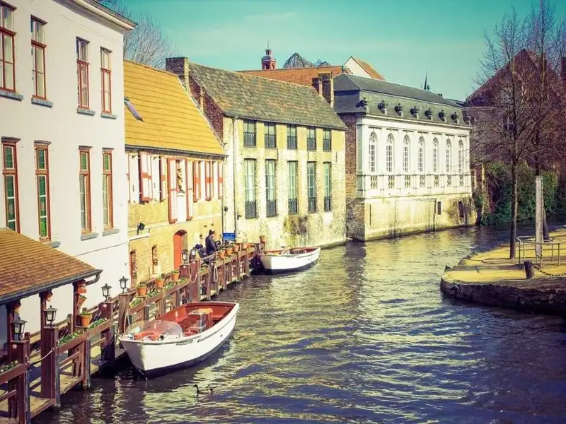
Canal houses
A grayscale photo under a blue layer set to mix-blend-mode: screen reads as a two-tone print. Hover fades the layer, restores color and lifts the caption in.
<figure class="hv-duo">
  <img src="canal-houses.webp" alt="Canal lined with gabled houses and moored boats" width="800" height="600" loading="lazy">
  <figcaption>Canal houses</figcaption>
</figure>
Iris color reveal
clip-path: circle()
filter
stacking
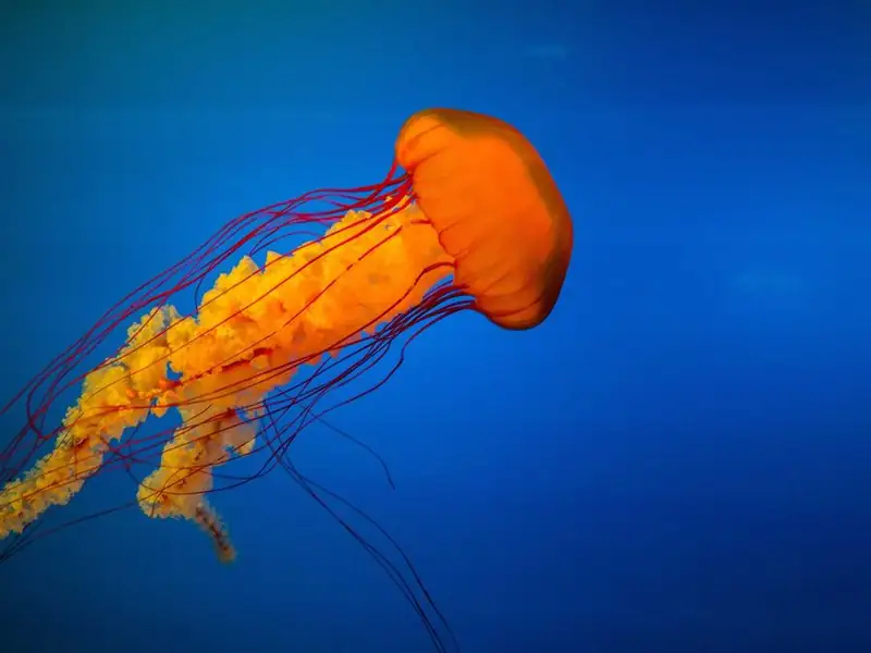
Two copies of the same image sit on top of each other. The top one starts as a zero-size circle and opens from the center, so color pours out of a gray frame. The second copy has an empty alt so it is announced only once.
<figure class="hv-iris">
  <img src="jellyfish.webp" alt="Orange jellyfish drifting in deep blue water" width="800" height="600" loading="lazy">
  <img src="jellyfish.webp" alt="" width="800" height="600" loading="lazy">
</figure>
Shutter slices
background-position
custom properties
nth-child
One image is painted across four strips with background-size: 400% 100%, and each strip shows its own quarter. On hover the strips shift up and down in a staggered wave. Keep the image ratio equal to the container ratio so nothing stretches.
<div class="hv-slices" role="img" aria-label="Winding road through green highland cliffs" style="--hv-src: url('highland-road.webp')">
  <span style="--i:0"></span><span style="--i:1"></span><span style="--i:2"></span><span style="--i:3"></span>
</div>
Angled caption wipe
clip-path: polygon()
transform
flexbox
Coast roadTravel series, 12 photos
The caption panel is always there, clipped to a zero-height polygon at the bottom edge. Hover animates it to a slanted shape while the photo drifts up behind it.
The wrapper sets the perspective, the card tilts in 3D, and the caption moves toward the viewer with translateZ, so it floats above the photo. The tilt direction is fixed, so no JavaScript is needed.
<div class="hv-tilt">
  <figure class="hv-tilt__card">
    <img src="mountain-hiker.webp" alt="Hiker with a backpack looking over a misty mountain valley" width="800" height="600" loading="lazy">
    <figcaption>Into the valley</figcaption>
  </figure>
</div>
Curtain split
::before
::after
transform: scale()
Downtown at dawn
Two dark panels cover the photo like stage curtains, with the title on top. They slide out to the sides while the image settles from a slight zoom, which gives the reveal some weight.
<figure class="hv-curtain">
  <img src="city-skyline.webp" alt="City skyline beside a lake with the sun low on the horizon" width="800" height="600" loading="lazy">
  <figcaption>Downtown at dawn</figcaption>
</figure>
Text hover effects
Headline and inline text treatments. They suit hero titles, portfolio names and short calls to action, not long paragraphs.
Marker sweep
background-size
inline elements
Good design is mostly invisible until it breaks.
A solid highlight is drawn as a background image on an inline span and grows from 0% to 100% width. On an inline element the stripe follows the text across line breaks.
<p class="hv-mark-demo">Good design is <span class="hv-mark">mostly invisible</span> until it breaks.</p>
Letter wave
@keyframes
animation-delay
custom properties
Makewaves
Each letter runs the same keyframes with a delay taken from its --i index, so a wave travels through the word. The animation plays once per hover, then the letters settle back.
The word starts as an outline drawn with -webkit-text-stroke. A solid background clipped to the text grows from the left and fills the letters like ink. It is set as inline-block so the fill tracks the word width, not the container.
Red and cyan copies of the word, made with content: attr(data-text), jump between horizontal slices with steps() timing. mix-blend-mode: screen makes the overlapping channels add up to white, like a misaligned screen.
The top and bottom halves of the word are separate pseudo-elements clipped with inset(). Hover pulls them apart sideways and recolors the lower half, as if the word was cut with a blade.
The list asks itself whether any link is hovered with :has(), then fades and blurs every other row. It also responds to keyboard focus, which a JavaScript mouseover version usually forgets.
The same :has() idea applied to a photo grid. The hovered image grows a little, and its neighbors drop to dim grayscale, so the eye lands where the cursor is.
<div class="hv-spot">
  <img src="fjord.webp" alt="Deep blue fjord between steep rocky cliffs" width="800" height="600" loading="lazy">
  <img src="red-rock-canyon.webp" alt="Red rock canyon glowing in evening light" width="800" height="600" loading="lazy">
  <img src="forest-waterfall.webp" alt="Waterfall dropping into a mossy green forest gorge" width="800" height="600" loading="lazy">
</div>
Expanding panels
flex-grow
transition-delay
background: var()
Granite valley
Snow camp
Brick alley
Red rock
Four flex items share the row equally. The hovered one grows to flex: 4 and the others shrink to make room, and its label fades in after a short delay so it never shows squashed.
<div class="hv-panels">
  <div class="hv-panels__item" role="img" aria-label="Granite valley with pine trees" style="--hv-src: url('granite-valley.webp')"><span>Granite valley</span></div>
  <div class="hv-panels__item" role="img" aria-label="Tents pitched in a snowy mountain camp" style="--hv-src: url('snow-camp.webp')"><span>Snow camp</span></div>
  <div class="hv-panels__item" role="img" aria-label="Narrow brick alley between city buildings" style="--hv-src: url('brick-alley.webp')"><span>Brick alley</span></div>
  <div class="hv-panels__item" role="img" aria-label="Red rock canyon at sunset" style="--hv-src: url('red-rock-canyon.webp')"><span>Red rock</span></div>
</div>
Card fan
transform: rotate()
cubic-bezier overshoot
Draft
Review
Shipped
Three stacked cards fan out like a hand of playing cards. The cubic-bezier with a value above 1 makes them overshoot and spring back, which reads as playful without any keyframes.
The tooltip scales up from its arrow tip with an overshooting curve, so it pops instead of fading. It is tied to the button with aria-describedby and opens on keyboard focus as well.
<button class="hv-tip" type="button" aria-describedby="hv-tip-1">Share<span class="hv-tip__bubble" role="tooltip" id="hv-tip-1">Copy link to this page</span></button>
Expanding search
:focus-within
width transition
SVG icon
A round icon button opens into a full search field on hover and stays open while the input has focus, thanks to :focus-within. The focus ring sits on the wrapper because the input itself has no outline.
A square in the top-right corner, split diagonally with a hard color stop, grows on hover and looks like the card corner lifting off the page. Match the first color to the page background for the illusion to hold.
<div class="hv-peel"><strong>Summer offer</strong><span>30% off every template this week</span></div>
Before you ship a hover effect
Pair every :hover rule on a link or button with :focus-visible, so keyboard users get the same feedback. The button and menu demos above already do this.
Wrap decorative hovers in @media (hover: hover) if they hide content, because touch screens apply hover styles on the first tap and keep them until the next one.
Respect prefers-reduced-motion: reduce. Turning off the transform and keeping a color change is usually enough.
Animate transform, opacity, clip-path and filter where you can. Width and flex changes, as in the search and panel demos, trigger layout, so keep them on small groups of elements.
:has() and @property work in current Chrome, Edge, Safari and Firefox. Check your own browser support targets before using them on a client site.
An enterprise landing page needs style. Transition to the interactive by experimenting with animated service cards. HTML and CSS are your palette. No outside help-pure code. Engaging without extra fluff.
Hover effects can improve the affordance of your website by clearly indicating which elements are interactive. For example, a slight zoom on a button on hover tells the user they can click it.
The browser tracks the pointer on its own, so there is no event listener to write and no JavaScript to load.
Hover feedback belongs on interactive elements such as links, buttons and cards, because it tells a mouse user that a click will do something.
Every effect comes down to a resting rule and a hover rule. The transition goes on the resting rule, so the change animates on the way in and on the way out.
Write the resting rule with the element’s normal styles.
Add a second rule with the same selector plus :hover, holding only the properties that change.
Add transition to the resting rule: property name, duration, easing.
Pair the hover selector with :focus-visible so keyboard users get the same change.
Links should follow the LVHA order, :link, :visited, :hover, :active. A later rule with equal specificity overrides the hover styles, according to MDN Web Docs.
Put a combinator after :hover and the style lands on a different element than the one under the pointer.
.card:hover .title restyles every title inside the hovered card.
Swap in .menu-item:hover > .submenu and the change is limited to direct children.
.icon:hover + .label hits the element right after the icon.
And .icon:hover ~ .label reaches every sibling that follows, not just the next one.
Reveal-on-hover captions use this pattern, usually with opacity and transform on the child.
Add :focus-within to the parent selector. It matches when the parent or any of its descendants holds focus, so the caption is not mouse-only. Note that it also matches after a mouse click on a focusable child, not only during keyboard navigation.
How Do Transitions and Keyframes Control Hover Timing?
Nothing animates until a duration is set. The default transition-duration is 0s, so the hover state just appears. A transition fills that gap by setting how long a property takes to move between the resting and hover state.
Per the CSS Transitions specification, as documented by MDN Web Docs (page updated September 2026), the defaults are a transition-duration of 0s, a transition-timing-function of ease, a transition-property of all and a transition-delay of 0s. In the shorthand, the first time value is the duration and the second is the delay.
Published references land between 0.3s and 0.5s. The Hover.css README runs its grow effect for 0.3s, while an example on MDN’s @media page uses 0.5s.
I start at 0.3s and only lengthen it when the motion looks abrupt.
Easing: ease, ease-in-out and cubic-bezier()
Pure CSS: Cubic Bezier Explained · Arjun Khara
The default, ease, suits most hover effects. Change it when the motion feels wrong, not before.
ease-out starts fast and slows to a stop, which makes the response feel immediate. Hover.css uses it on several effects.
ease-in-out is slow at both ends and works better for bigger movements.
linear keeps a constant speed. Fine for color and opacity fades, stiff for movement.
cubic-bezier() draws a custom curve from four numbers, and the two x values have to stay between 0 and 1.
The cubic-bezier editor in Chrome DevTools previews a curve before it goes into the stylesheet.
transition-delay postpones the start. A short delay on hover-out keeps a dropdown open while the pointer crosses a gap.
A transition handles a change between two states, and keyframes handle anything with intermediate steps. Transitions reverse on hover-out by themselves, need no extra rules, and cover color, scale, shadow and shift effects.
Keyframes run step by step and can loop. The catch is that the animation is removed when the hover ends, so the element snaps back to its resting style.
Multi-step motion such as a pulse needs CSS keyframes. Hover.css builds its pulse-grow effect that way, with a @keyframes rule fired from :hover.
Which CSS Properties Are Best to Animate on Hover?
transform and opacity are the safest choices. web.dev’s animation guidance says limiting motion to those two keeps the work on the compositing stage, so the browser skips layout and paint.
Anything else needs a check. A layout change also forces a repaint, so a property that triggers layout pays for both stages.
Width, height, margin, top and left sit at the expensive end because they trigger layout. Color, background-color, border-color and box-shadow cost a paint, which is the middle ground. Scale, translate and rotate through transform, plus opacity, are the cheap ones.
filter falls outside the cheap group too. A blur() on hover works, but profile it on large images like any property beyond transform and opacity.
box-shadow is the usual offender in card effects. Build the values once in a box shadow generator, put them on a pseudo-element, and fade that element’s opacity instead of animating the shadow itself.
Why transition: all Is a Risky Shortcut
transition: all animates every property that differs between the two states, including ones added to the hover rule later. Someone adds width to :hover, and the layout change animates too.
List the properties instead, for example transition: transform 0.3s ease, opacity 0.3s ease. Comma-separated entries let each property carry its own duration, per MDN Web Docs.
When will-change Helps and When It Hurts
Skip it unless profiling shows dropped frames, and never apply it to many elements at once. Setting it to values such as opacity creates a stacking context up front, which changes how z-index layers stack.
MDN warns against premature optimization with the property. A page that already runs well gains nothing from it. MDN also advises against putting it straight into stylesheets and shows setting it from script instead.
To check a hover effect, record it in the Chrome DevTools Performance panel. Then open the Rendering tab and switch on Paint flashing, which highlights every repaint. The FPS meter in the same tab shows dropped frames (web.dev).
Common Hover Effect Patterns and What Each One Uses
CSS Card Hover Effects That Feel Premium · WPDean
Link underlines, button fills, image zooms, card lifts and icon rotations cover most of what shows up on real sites. Each pairs one visible change with one or two properties.
Add an ::after layer with content: "", absolute positioning along the bottom edge, a 2px height, transform: scaleX(0) and transform-origin: left.
Set transform: scaleX(1) on a:hover::after and a:focus-visible::after.
scaleX beats animating width because transform stays on the compositor. MDN confirms transitions apply to ::before and ::after, so the line animates like any other element.
For an image zoom, wrap the image in a container with overflow: hidden, then scale the image on hover. The wrapper clips the enlarged image, so nothing around it moves.
Hover.css shows the numbers in its grow effect. It uses transform: scale(1.1) over 0.3s, applied on :hover and :focus alike (Ian Lunn, project README).
An overlay reveal works by fading an ::after layer from opacity 0 to 1 on hover, with caption text sliding in through translateY.
Card lifts usually run translateY(-4px) plus a shadow. Keep the lift small, because a card that moves out from under the pointer drops the hover and flickers.
Why Do Hover Effects Stick on Touch Screens, and How Do You Fix It?
Dealing with hover on mobile · Kevin Powell
Touch browsers emulate a hover when an element is tapped, and that state can stay active until another element is touched. Wrapping the hover rule in @media (hover: hover) keeps it away from devices whose primary input cannot hover.
Which outcome you get depends on the browser, and the sticky one causes the most trouble. It is deliberate, though. Developer Stefan Judis notes that browsers added it so touch users have some way to reach hover states.
The fix scopes only the hover rule. The resting rule and the transition stay outside the query.
The media queries that report input capability differ in whether they test the primary input or any input.
Feature
Tests
True when
hover: hover
Primary input
The primary input can hover
any-hover: hover
Any input
At least one input can hover
pointer: fine
Primary input
The pointer is precise, like a mouse
any-pointer: fine
Any input
At least one precise pointer is present
any-hover has worked across browsers since December 2018, according to MDN.
Where the Hover Media Query Falls Short
Sources disagree on how far to trust it.
Guides such as Smashing Magazine’s treat the hover media feature as the standard fix and simply move the :hover rule inside it. Judis’s post on the topic is more cautious. Its title warns that it may include false positives, and he edited it after feedback from experts. The advice it relays is to design for touch, mouse, stylus and keyboard instead of detecting touch devices, since hybrid machines like the Microsoft Surface carry several input mechanisms at once.
A WebKit bug report (bug 209292) shows the mechanism. A user found that hover and pointer: fine did not reflect the mouse with iOS 13.4 mouse support, and the any-* features did not either. Web developer Patrick H. Lauke explained in related bug reports that hover and pointer describe the primary input only. WebKit’s Maciej Stachowiak said any-hover and any-pointer: fine should be true whenever a pointing device is attached.
Both positions hold, because the feature measures the primary input alone.
The workable rule is to gate decorative effects with (hover: hover) and accept that a hybrid user with a mouse may miss them. Effects that carry meaning get (any-hover: hover) so a connected mouse counts, with the catch that sticky hover can return when that user taps the screen.
Making Hover Effects Accessible
CSS PRO TIPS for Cleaner, Smarter and Accessible Hover Effects · Optimistic Web
Every hover effect needs a keyboard equivalent and a reduced-motion variant. Anything that reveals new content on hover also falls under WCAG 1.4.13.
W3C Technique C45 states that browsers always show :focus-visible styles during keyboard navigation and generally skip them after a mouse interaction.
:focus fires on clicks too, so a clicked button keeps its hover look after the pointer leaves.
Color changes need a check in both states. The hover color has to stay readable against its background, which is where color contrast ratios apply.
Respecting prefers-reduced-motion
Drop the large scale and translate movement but keep the color and opacity changes. MDN names scaling or panning large objects as vestibular motion triggers. The query matches when the user has switched on a reduced motion setting in the operating system.
Reduced does not mean removed. MDN notes that the media feature’s value is reduce, not none, so a quieter color or opacity change can replace the movement and keep the interface lively.
Put the media block after the hover rules, because source order decides the winner. MDN explains that a reduced-motion rule with the same specificity wins only when it comes later in the stylesheet.
What WCAG 1.4.13 Requires for Content Revealed on Hover
The W3C sets this at Level AA in WCAG 2.1. Revealed content has to be dismissible, meaning there is a way to close it, such as the Escape key, without moving pointer or focus. It has to be hoverable, so the pointer can travel onto the new content without it vanishing. And it has to be persistent: it stays until hover or focus leaves, the user dismisses it, or it stops being valid.
The criterion covers custom tooltips, sub-menus and similar non-modal popups, and excludes tooltips the browser draws from the title attribute.
Content that appears on hover must also appear on focus. Plain color, scale or underline effects add no content, so the criterion does not apply to them.
Why a Hover Effect Fails, Flickers or Does Not Apply
Hover effects usually fail because the pointer leaves the element mid-effect, the transition sits on the wrong rule, another selector wins, or the property cannot animate on that element type.
Common Failures and Their Fixes
A flicker at the edge means a scaled or lifted element moved out from under the pointer, :hover dropped, the element snapped back, and the loop repeated. Put :hover on a stationary wrapper and transform the child.
If the element snaps back instantly on hover-out, the transition sits on the :hover rule instead of the resting rule, so only the way in animates.
A hover rule that gets ignored is usually losing to a more specific selector. Compare the specificity of the competing selectors before adding !important.
Links that show nothing are inline elements, and those ignore transform. Set display: inline-block, which Hover.css does on its effects.
When the neighbors jump, a border or width change on hover is pushing surrounding content around. Reserve a transparent border at rest, or use outline.
When Hover Is the Wrong Tool
If removing the hover effect would hide information or block an action, it is not a hover effect. It is a control, and it needs a tap path and a keyboard path.
Color shifts, underlines, lifts and zooms that only give feedback are fine on hover alone. Dropdown menus, tooltips that carry real information, revealed buttons and captions holding essential details are not.
The usual replacement is a button that toggles the panel and reports its state through an ARIA expanded attribute. Keep the hover as an extra for mouse users, not as the only way in.
Should You Use a Hover Library or Write the CSS Yourself?
Write the CSS yourself for one to three effects. A library pays off when many effects must look consistent across a site, and each option brings its own constraint.
Hover.css
Ian Lunn’s Hover.css ships its effects as CSS, Sass and Less.
It’s free for personal and open-source use under the MIT license, while commercial use needs a paid license. The icon effects work with Font Awesome, another icon library or an image. Everything leans on transitions, animations, transforms and pseudo-elements, so older browsers may not render the effects fully (project README).
A separate project by a different author, imagehover.css, lists over 40 image effect classes at 19KB minified, according to its README.
One stylesheet gives consistent effects, though loading it for two of them is unused weight.
Animate.css
The unminified animate.css source file is 93.1 KB across about 4,070 lines, per the Animate.css GitHub repository.
The library fires on classes, such as animate__animated plus a name like animate__bounce, not on :hover. Hover use needs JavaScript to add the class, or the keyframes copied into your own :hover rule, which the docs allow.
The default –animate-duration is 1s, which is slow for hover feedback, so override the variable. The docs also advise against animating large elements and against endless loops.
Animate.css is one entry in the wider field of CSS animations libraries, and it suits entrance and attention animations better than hover feedback.
Tailwind hover: Variants
Utility classes such as hover:bg-blue-500 put the hover state in the markup.
Tailwind v3.1 added an opt-in hoverOnlyWhenSupported flag that limits hover: variants to hover-capable devices (Tailwind Labs pull request 8394). In Tailwind v4 the hover: variant is wrapped in @media (hover: hover) by default, so check the version you run. The same pull request warns about a catch, which is that menus depending on hover firing at tap stop opening once variants are scoped.
Whether utilities beat hand-written rules is a larger question, compared in this Tailwind CSS vs CSS breakdown.
Hand-written CSS covers one to three effects. Hover.css earns its place when a design needs many consistent ones, and if the project already runs on utilities, Tailwind variants are the obvious pick.
CSS Hover Effects FAQ
Does cursor: pointer belong in the :hover rule?
Not really. The resting rule is the cleaner home for it, since the cursor only shows while the pointer is over the element and the placement changes nothing visually.
Links get the hand by default and buttons keep the arrow. eBay’s accessibility guidance recommends leaving buttons that way, so add cursor: pointer to non-link controls only on purpose.
How do you force :hover in Chrome DevTools?
Select the element in the Elements panel, open the Styles pane and click the :hov (Toggle Element State) button. Then tick the :hover checkbox under Force element state.
The same panel forces :focus, :focus-within and :focus-visible, so keyboard styles can be checked without tabbing.
Can a hover swap a background image smoothly?
For a fade, stack a second layer in a pseudo-element and transition its opacity.
Which Sass syntax writes a hover rule inside nested styles?
Nest &:hover inside the rule. Sass replaces the ampersand with the outer selector, so .alert { &:hover { ... } } compiles to .alert:hover, according to the Sass documentation.
Leave out the ampersand and the output becomes a descendant selector, which matches any hovered element inside the outer one.
Testing CSS Hover Effects Before They Ship
CSS hover effects pass release when they work with a mouse, a finger and a keyboard, and the cheapest check order is keyboard, then touch, then reduced motion.
Start with the keyboard and tab through every hover target. It needs no hardware, and a missing :focus-visible pair shows up within minutes. Touch comes next and does need a real device, so tap each target and watch for stuck states. The motion pass goes last: enable reduced motion, hover again, and adjust only the effects that already work.
The price is three passes per effect, and skipping one pushes the failure onto users of that input.
Verified October 2026 against MDN pages updated in April and September 2026. A change in how hybrid devices report their primary input would alter the touch pass.