
Dropdowns are everywhere. Every form you fill out, every navigation menu you hover over, every filter you apply on a shopping site. But most people never stop to ask: what is a dropdown in UI, and why does this one component cause so many usability headaches?
The answer matters more than you’d think. A poorly built dropdown can tank form completion rates, break keyboard accessibility, and frustrate users on mobile devices.
This article covers how dropdowns actually work, the different types you’ll run into, when to use them (and when not to), accessibility requirements, implementation with HTML and CSS, and how major design systems like Material Design and Apple’s HIG handle them differently.
What Is a Dropdown in UI
A dropdown is a graphical control element that lets users pick a value from a hidden list. The list stays collapsed until someone clicks, taps, or hovers over a trigger element. Then it expands.
You’ll hear it called different things depending on who you ask. Select menu, pulldown menu, combo box, dropdown list. These names get tossed around interchangeably, but they actually describe slightly different behaviors.
The anatomy is always the same, though. Every dropdown has four parts:
- Trigger element: a button or input field that opens the list
- Option list: the expanded panel showing available choices
- Selected state: visual confirmation of the current pick
- Dismiss behavior: how and when the list closes
Nielsen Norman Group classifies dropdowns into four functional categories: command menus that start an action, navigation menus that take users to a new location, form-filling controls for data entry, and attribute selectors for picking a value like size or color.
What makes this component tricky is that it looks simple on the surface. A closed box with an arrow. But the interaction complexity underneath is real.
Dropdowns sit at the intersection of user interface design and form control logic. They need to handle keyboard input, screen reader announcements, touch targets on mobile, positioning relative to the viewport, and z-index stacking. That’s a lot of moving parts for something people take for granted.
According to the 2025 WebAIM Million report, 94.8% of the top one million websites have at least one detectable WCAG failure. Form controls like dropdowns are among the most common offenders.
How Dropdowns Work in Practice
The basic interaction goes like this. User clicks the trigger. A floating list appears, anchored to the trigger element. User picks an option. The list closes, and the selected value displays in the trigger area.
Sounds straightforward. But under the hood, there’s a lot more going on.
Click, Tap, or Hover
A usability study by Infinum found that hover-to-open menus produced smoother and faster information foraging than click-to-open interactions. But hover doesn’t exist on touchscreens.
So most modern implementations default to click-to-open. It works on desktop and mobile. It’s predictable.
The trigger fires a JavaScript event listener that toggles the list’s visibility. On mobile, native <select> elements hand off to the operating system’s built-in picker, which looks and behaves differently from the browser version.
Keyboard Interaction
Arrow keys move through options. Enter or Space confirms a selection. Escape closes the list. Tab moves focus out of the component entirely.
There’s also type-ahead search. Start typing “Ca” in a country dropdown, and the focus jumps to “Cambodia” or “Cameroon” or “Canada,” depending on what’s there. Most people don’t know this feature exists, but keyboard-only users depend on it.
Baymard Institute’s checkout usability research found that dropdowns with more than 10 options (like country selectors) create real friction. Users have to scroll carefully through long lists, which is governed by what interaction designers call the steering law. The longer and narrower the tunnel, the more time it takes to move through it.
Positioning and Dismissal
When a dropdown sits near the bottom of the screen, the option list needs to flip upward. This is viewport-aware positioning, and it’s handled through CSS with position: absolute and JavaScript calculations.
Close-on-click-outside is the standard dismissal pattern. Click anywhere that isn’t the dropdown, and it collapses. This seems obvious, but getting it right requires careful event delegation in JavaScript.
Types of Dropdowns
Not all dropdowns behave the same way. The label “dropdown” covers a whole family of UI components that share one trait: a hidden list that appears on demand.
| Type | Behavior | Common Use |
|---|---|---|
Native <select> | Single pick from OS-rendered list | Forms, checkout flows |
| Custom styled dropdown | Full CSS/JS control over appearance | Branded interfaces, SaaS products |
| Action menu | Triggers commands, not selections | Toolbars, settings panels |
| Autocomplete / combo box | Searchable with type-ahead filtering | Address fields, tagging systems |
| Multi-select | Checkboxes inside the list | Filters, category pickers |
Cascading or nested dropdowns (where hovering one option opens a sub-list) are the most controversial. They’re hard to use with a mouse and nearly impossible on touch devices. Dell and Porsche have tried multi-level flyouts, but the steering precision required frustrates most users.
Native Select vs. Custom Dropdown
This is the decision that trips up most frontend developers. And honestly, there’s no clean answer.
The native HTML <select> element gives you free accessibility out of the box. Screen readers announce it correctly. Keyboard navigation works without any extra code. On mobile, it triggers the OS picker, which is honestly better than anything you’d build yourself.
But it looks… like a native select. And for years, you couldn’t change that.
Chrome 135 changed things. As of early 2025, the new appearance: base-select CSS property lets developers fully customize the <select> element. The ::picker(select) pseudo-element, the ::picker-icon, the ::checkmark inside selected options. All styleable now.
Before this, developers had to build custom dropdowns from scratch using <div> elements, JavaScript event handlers, and manual ARIA role assignments. That’s how libraries like Radix UI, Headless UI, and Downshift by Kent C. Dodds came to exist. They handle the accessibility wiring so you don’t have to reinvent it every time.
When to Use a Dropdown
Dropdowns work when three conditions line up: limited screen space, a moderate number of options, and selections users don’t need to compare side by side.
Think country pickers, sort-order menus, or language selectors. Stanford’s web services team recommends keeping dropdown lists between 5 and 8 items for best results.
They’re also appropriate when the input must arrive in a structured format. Amazon uses a 12-option “Reasons for Return” dropdown because free-text entry would produce messy, unstructured data that’s harder to analyze.
Good Fit Scenarios
- Options are familiar enough that users don’t need to see them all at once (months, countries, sort order)
- The selection happens once or infrequently during the task
- Screen real estate is tight, especially on mobile-first layouts
- The value needs validation against a known set
A McKinsey report found that consumer companies with inaccessible digital interfaces lose $6.9 billion annually as disabled consumers switch to competitors. Dropdowns that work well for everyone, including keyboard and screen reader users, directly affect the bottom line.
When Not to Use a Dropdown
Luke Wroblewski said it years ago: dropdowns should be the UI of last resort. That advice still holds.
The CXL research institute ran a controlled study with 354 participants and found that forms with radio buttons were completed an average of 2.5 seconds faster than forms with dropdown menus, at a 95% confidence level. WPForms separately reported that forms with dropdown fields tend to have the highest abandonment rates.
Here’s the real problem. Dropdowns hide information. Users have to click to discover what’s available. That extra interaction adds cognitive load every single time.
Better Alternatives by Context
Binary choices (yes/no, on/off): use a toggle switch. Two options don’t deserve a dropdown.
2 to 5 options: radio buttons. All options visible at a glance. No clicking required to see them. The meta-research by Bargas-Avila and colleagues confirmed that visible options reduce decision time.
Very long lists (50+ items): searchable autocomplete input. Scrolling through 200 countries in a dropdown is painful. Google Flights solved this with a multi-column searchable panel. Way better.
Date entry: almost always better with a date picker. Three separate dropdowns for month, day, and year is the worst pattern still in active use. Took me too long to accept that, honestly.
Why Dropdowns Get Overused
They’re the Swiss Army knife of form controls. Compact. Scalable from 2 to 200 options. Part of every design system ever built.
But that flexibility is the problem. Just because you can use a dropdown doesn’t mean you should. And the data consistently shows they slow users down compared to more visible alternatives.
Zuko Analytics found that 23% of users rely on autofill when completing forms, and dropdown fields break that flow. Users who can’t autofill see completion rates drop to 59%.
Dropdown Accessibility Requirements
The 2025 WebAIM Million report found an average of 51 errors per page across the top one million websites. Form controls, including dropdowns, account for a big chunk of those failures.
AudioEye’s research shows that 1 in 4 forms is missing descriptive labels for people with disabilities. Dropdowns without labels are completely invisible to screen reader users.
ARIA Roles and States
Which ARIA role you use depends on the dropdown type:
| Dropdown Type | ARIA Role | When to Use |
|---|---|---|
| Selection list | listbox + option | Picking a value from a predefined set |
| Searchable input | combobox | Typing to filter, then selecting |
| Action menu | menu + menuitem | Commands, navigation triggers |
The aria-expanded attribute tells assistive technology whether the list is open or closed. aria-activedescendant tracks which option has focus. aria-selected marks the current choice.
Getting this wrong isn’t a small mistake. The WebAIM report also found that pages using ARIA had over twice as many errors (57 average) compared to pages without ARIA (27 average). Bad ARIA is worse than no ARIA.
WCAG Success Criteria
Four WCAG 2.1 guidelines hit dropdowns directly:
- 1.3.1 Info and Relationships: the dropdown’s label, options, and selected value must be programmatically connected
- 2.1.1 Keyboard: every interaction (open, navigate, select, close) must work without a mouse
- 4.1.2 Name, Role, Value: the component’s state must be exposed to assistive technology at all times
- 2.4.7 Focus Visible: focus indicators must remain visible as users move through options
Companies leading in disability inclusion generate 1.6x more revenue and 2.6x more net income than peers, according to Accenture. Making dropdowns accessible isn’t charity work. It’s a competitive edge.
Common Mistakes
The same errors come up over and over in usability audits.
No visible label. Placeholder text that disappears on selection. Focus vanishing when the list closes, dumping keyboard users somewhere random on the page. Options that can’t be reached with arrow keys.
Target scored a perfect 100/100 on Clutch’s 2026 accessibility audit of 95 major websites, partly because of changes made after its landmark accessibility lawsuit. That kind of score is achievable. Most companies just haven’t prioritized it yet.
Building a Dropdown with HTML, CSS, and JavaScript
The simplest dropdown is just a native <select> element. Two lines of HTML and you have a working, accessible selection control. No JavaScript needed.
But that simplicity comes with a hard ceiling. The <select> element has been notoriously difficult to style across browsers for decades. Its internal structure lives inside the Shadow DOM, which blocks most CSS from reaching it.
Baymard Institute’s checkout research found the ideal checkout flow can be reduced to just 12 form elements, including 2 dropdowns. Every dropdown on that page needs to work flawlessly, which is why implementation choices matter so much.
Dropdown Styling Limitations in Native HTML
The core problem: you can style the closed <select> box, but you can’t touch the open option list in most browsers. Background color, font size, padding on individual <option> elements. All off-limits through standard CSS.
Chrome and Chromium-based browsers use the Shadow DOM for the dropdown panel, making full customization impossible with CSS alone. Firefox has its own rendering quirks.
That’s why appearance: none became the go-to first step. It strips the native styling, removes the default arrow, and gives you a blank canvas for the closed state. But the option list still looks like whatever the OS decides.
The New CSS Customizable Select
Chrome 135 shipped appearance: base-select in early 2025. This changes everything.
The CSS property unlocks full styling of the <select> element. The ::picker(select) pseudo-element targets the dropdown panel. ::picker-icon handles the arrow. ::checkmark styles the selected indicator. And the :open pseudo-class lets you style the expanded state.
You can even put images, SVG icons, and rich HTML inside <option> elements now. Flag icons next to country names. User avatars in a people picker. Things that used to require a fully custom JavaScript component.
The catch? Cross-browser support is still limited as of early 2026. Progressive enhancement is the only safe approach.
Custom Dropdown Libraries
Until browser support catches up, most production apps still use JavaScript component libraries.
| Library | Approach | Components |
|---|---|---|
| Radix UI | Unstyled primitives, full ARIA support | 32 components |
| Headless UI | Unstyled, Tailwind-friendly | 10 components |
| Downshift | Hooks for select/combobox | Focused on selection |
| React Aria | Accessible hooks by Adobe | 40+ components |
Radix UI has accumulated over 20,000 GitHub stars and powers shadcn/ui, which became one of the most popular React component starters in 2023-2024. The library handles focus management, keyboard interaction, and screen reader announcements so developers don’t have to build that from scratch.
Dropdown Patterns in Popular Design Systems
Every major design system includes a dropdown component. But they don’t all agree on how it should work.
A McKinsey study from 2024 found that companies with mature design systems save 20-30% in design and development costs annually. Dropdown components are among the most reused elements in those systems. Headspace reported up to 50% time savings on complex projects through token and variable reuse across their component library.
Material Design
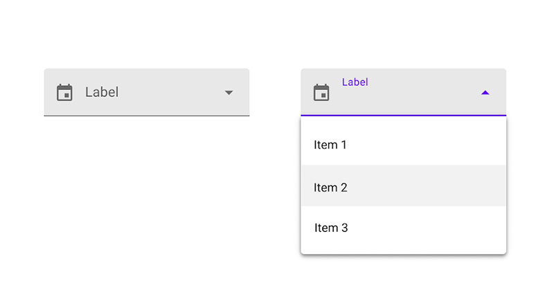
Two distinct components: the Exposed Dropdown Menu (for form selection) and the standard Menu (for action commands). Material Design treats these as separate patterns with different interaction rules.
The Exposed Dropdown shows the selected value in a text field. It supports both filled and outlined variants. Material guidelines specifically advise against using dropdowns inside dialogs.
Apple Human Interface Guidelines
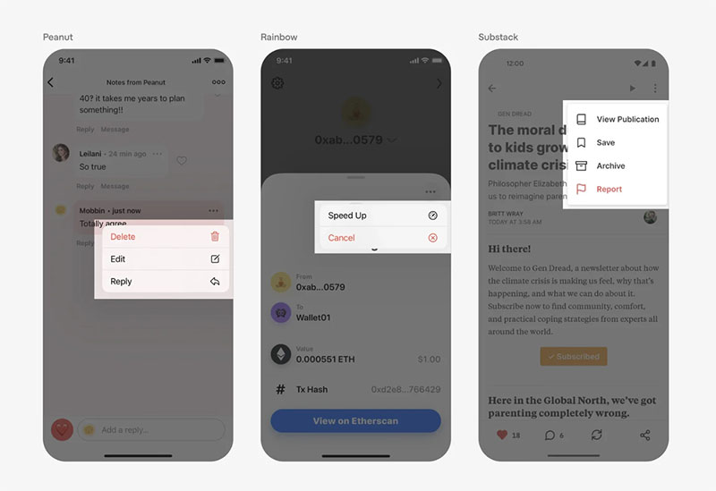
Apple separates pull-down buttons (action lists) from pop-up buttons (selection lists). On iOS, the picker control replaces traditional dropdowns entirely, presenting options as a native scrolling wheel.
Apple recommends keeping options to a bare minimum. Their guidelines explicitly warn against long scrollable lists in pickers because the interaction is tedious on touch devices.
IBM Carbon and Ant Design
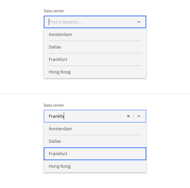
Carbon’s breakdown: dropdown (single select), combo box (searchable), multi-select (checkboxes). Three separate components with distinct APIs and behaviors, rather than one overloaded element.
Ant Design follows a similar split. Their Select component alone has over 30 props, covering search filtering, tag mode, virtual scrolling for large datasets, and custom option rendering. It’s one of the most feature-complete dropdown implementations in any React component library.
How Mobile Handling Differs
This is where design systems diverge the most. Material Design relies on the native Android picker. Apple uses its proprietary wheel picker. Web-based systems like Carbon fall back to the browser’s native <select> on mobile, or they render a bottom sheet.
Baymard Institute’s mobile UX research found that 81% of mobile users abandon forms perceived as too long. A dropdown that’s easy on desktop can become a real problem on a 5-inch screen if it’s not using the OS-native picker.
Common Dropdown Usability Problems
Dropdowns fail in predictable ways. If you’ve built or tested enough forms, you’ve seen these same issues repeat across projects.
Baymard Institute’s checkout benchmark found the average US ecommerce site has 23.48 form elements in its checkout flow, nearly double the ideal 12-14. Dropdowns account for a meaningful portion of that bloat, and each poorly implemented one adds friction.
Overflow and Positioning Failures
A dropdown that opens downward near the bottom of the screen will overflow off the visible area. Users can’t see or reach the options they need.
Viewport-aware positioning fixes this by flipping the list upward when space below is limited. But many custom implementations skip this step entirely. And z-index conflicts are even more common, where a dropdown renders behind a modal or sticky header because the stacking context wasn’t set up correctly.
Missing Labels and Disappearing Placeholders
The invisible dropdown problem. A <select> with no associated <label> element is completely silent to screen readers. The user has no idea what it’s asking for.
Placeholder text (“Select a country…”) that vanishes after selection is almost as bad. Once the user picks an option, the context for what they just selected disappears. Persistent visible labels solve both problems.
Long Lists Without Search
Nielsen Norman Group’s research on the steering law explains why long dropdown lists are so difficult. The user has to carefully move their cursor through a narrow tunnel without leaving the dropdown boundaries. One slip and the list closes.
Any dropdown with more than 15-20 options should include a search filter. Type-ahead helps, but a visible search field is better. Google Flights solved their country dropdown with a searchable multi-column panel that’s far easier to scan than a single scrolling list.
Keyboard and Mouse Inconsistency
Some custom dropdowns work perfectly with a mouse but completely break with keyboard input. Arrow keys do nothing. Tab skips past the component. Enter doesn’t confirm a selection.
The 2025 WebAIM Million report found that 94.8% of top websites have at least one detectable WCAG failure, and keyboard accessibility is a recurring offender. If your dropdown doesn’t respond to arrow keys, Escape, and Enter the same way a native <select> does, it’s broken for keyboard users.
Dropdown vs. Other Selection Components
The dropdown gets picked by default when designers need a selection control. But default doesn’t mean best. Each alternative has specific strengths that make it the right choice in certain contexts.
| Component | Visibility | Best For | Avoid When |
|---|---|---|---|
| Dropdown | Options hidden until click | 5–15 familiar options, tight space | Under 4 options or 50+ options |
| Radio buttons | All options visible | 2–5 mutually exclusive choices | More than 7 options |
| Toggle switch | Always visible | Binary on/off settings | More than 2 states |
| Autocomplete | Filtered as user types | Large datasets, open-ended input | Fewer than 10 known options |
| Action sheet (mobile) | Full-width bottom panel | Touch-friendly selections | Desktop-first interfaces |
Dropdown vs. Radio Buttons
CXL’s research showed users complete radio button forms 2.5 seconds faster than dropdown forms. That gap adds up across multi-field forms.
Radio buttons win when you have 2 to 5 options that users need to compare before choosing. The meta-research by Bargas-Avila confirmed that all-options-visible layouts reduce decision time because users don’t have to click to discover what’s available.
Dropdowns win when space is limited or the list exceeds 6-7 items. At that point, radio buttons start eating up too much vertical space and actually hurt scannability.
Dropdown vs. Autocomplete
The tipping point is around 15-20 options. Beyond that, scrolling through a dropdown list becomes painful. A searchable autocomplete input (the combobox pattern) lets users type to filter, which is dramatically faster for large datasets.
Google Flights uses a searchable panel for airport and country selection. Tradeshift tested a slide-out panel against traditional dropdowns and modals, finding that the panel reduced cognitive load significantly.
Dropdown vs. Action Sheet on Mobile
On mobile devices, traditional dropdowns compete with the bottom action sheet pattern. An action sheet slides up from the bottom of the screen, using the full width of the device.
Apple’s iOS uses action sheets as the default for many selection patterns because they’re easier to reach with one hand. The touch targets are larger. The options are more readable. For any responsive project, consider swapping custom dropdowns for action sheets when the screen width drops below a certain breakpoint.
The Decision Framework
Four factors determine which component fits:
- Number of options: under 5 favors radio buttons, 5-15 favors dropdowns, 15+ favors autocomplete
- Frequency of use: frequent selections should stay visible, infrequent ones can hide behind a click
- Space constraints: dropdowns and autocomplete fields take up one line, radio buttons need vertical room
Baymard’s research found checkout optimization can increase conversion rates by up to 35.26%. Picking the right input control for each field is a big part of how you get there.
FAQ on Dropdowns in UI
What is a dropdown menu in web design?
A dropdown menu is an interactive UI component that reveals a list of options when a user clicks or taps a trigger element. The list stays hidden until activated. It’s used for navigation, form input, and action commands across websites and apps.
What is the difference between a dropdown and a select element?
A select element is the native HTML <select> tag built into browsers. A dropdown is the broader design pattern. Custom dropdowns are built with JavaScript and div elements, while the native select relies on the operating system’s built-in rendering.
When should I use a dropdown instead of radio buttons?
Use a dropdown when you have more than 5-7 options and limited screen space. Radio buttons are faster for users when there are fewer than 5 choices because all options stay visible without requiring a click.
Are dropdowns accessible to screen reader users?
Native <select> elements are accessible by default. Custom dropdowns need manual ARIA roles like listbox or combobox, plus keyboard navigation support. Without these, screen reader users can’t interact with the component at all.
What ARIA roles does a dropdown need?
Selection dropdowns use listbox and option roles. Searchable inputs use combobox. Action menus use menu and menuitem. Each type also needs aria-expanded and aria-selected attributes to communicate state.
Why are dropdowns considered bad UX?
Dropdowns hide options behind an extra click, which adds cognitive load. They slow down form completion compared to visible alternatives. Luke Wroblewski famously called them the “UI of last resort” because simpler controls usually work better.
How do I style a native HTML select element with CSS?
Historically, styling was limited to the closed box only. Chrome 135 introduced appearance: base-select in 2025, allowing full CSS customization of the option list, arrow icon, and checkmark. Other browsers are still catching up.
What is a combo box in UI design?
A combo box combines a text input with a dropdown list. Users can type to filter options or select from the full list. It’s the best pattern for large datasets where scrolling through all options would be impractical.
What libraries help build accessible custom dropdowns?
Radix UI, Headless UI, and Downshift by Kent C. Dodds are the most widely used. They handle focus management, keyboard interaction, and ARIA attributes out of the box, so developers don’t need to build accessibility from scratch.
How do design systems handle dropdowns differently on mobile?
Material Design uses the native Android picker. Apple’s HIG uses a proprietary scroll wheel. Web-based systems like IBM Carbon fall back to the browser’s native select on small screens or render a bottom drawer panel instead.
Conclusion
Understanding what is a dropdown in UI goes beyond knowing it’s a clickable list. It’s about recognizing when this form control helps users and when it gets in their way.
The right dropdown implementation depends on context. Native ` elements handle accessibility automatically. Custom builds with libraries like Radix UI or Headless UI give you styling freedom but demand careful attention to ARIA roles and keyboard interaction.
Pick radio buttons for short lists. Use searchable autocomplete for long ones. Save the dropdown for that middle ground where screen space is tight and options are familiar.
Design systems from Google, Apple, and IBM all treat the dropdown differently on mobile. Test yours on real devices. What feels fine on a desktop monitor can fall apart on a 5-inch touchscreen.
Get the selection component right, and your user experience improves at every interaction point. Get it wrong, and users click away without telling you why.

Many of his resources are available on various design marketplaces. Over the years, he's worked with a range of clients and contributed to design publications like Designmodo, WebDesignerDepot, and Speckyboy, Slider Revolution among others.
- What is Backend in Web Development? - September 13, 2026
- What is Frontend Development? - September 11, 2026
- How to Make a Button in Figma: Design Best Practices - September 10, 2026