
Buttons are everywhere. Every app you use, every website you visit, they all depend on these small clickable elements to guide users toward action.
Learning how to make a button in Figma is one of the first skills any UI designer needs to master.
The good news? It takes about 3 minutes once you know the steps.
This guide walks you through creating a responsive button using the Text Tool, auto layout, fill colors, and proper padding. You’ll build a button that automatically resizes when the label changes.
By the end, you’ll have a professional button component ready for your wireframes, mockups, and interactive prototypes.
How to Make a Button in Figma
Making a button in Figma is the process of creating an interactive UI element using text layers, frames, and auto layout to produce a responsive clickable component.
Designers need this when building user interfaces, prototyping apps, or creating design systems with consistent button styles.
This guide covers 5 steps requiring approximately 3 minutes and basic familiarity with Figma’s interface.
Prerequisites
Before you start, make sure you have:
- Figma account (free or paid)
- Figma desktop app or browser access at figma.com
- Basic knowledge of the Layers panel and right sidebar
- New or existing design file open on your canvas workspace
Time needed: approximately 3 minutes.
Have you seen the latest Figma statistics?
Discover comprehensive Figma statistics including revenue growth, market share, user demographics, and funding data.
Check them out →Step One: How Do You Create the Button Label Text?
Select the Text Tool from the toolbar or press T on your keyboard, click anywhere on the canvas, and type your button label text.
The layer panel on the left sidebar will show a new text layer.
Double-click the layer name and rename it to “Label” for better organization in your design file.
Action
- Toolbar > Text Tool (T): Click to activate
- Canvas: Click once and type “Button”
- Layers panel (left sidebar): Double-click layer name, rename to “Label”
Purpose
The text layer becomes the visible label that users read before clicking.
Clear button labels improve usability and help users understand what action will happen.
Step Two: How Do You Apply Auto Layout to the Text Layer?

Select the Label text layer you just created.
Press Shift + A to wrap it in an auto layout frame.
This keyboard shortcut creates responsive padding that adjusts automatically when your text length changes.
Action
- Selection: Click the Label text layer
- Keyboard shortcut: Press Shift + A
- Layers panel: Double-click the new frame, rename to “Button”
- Right sidebar > Auto layout section: Confirm Horizontal and Vertical resizing are set to “Hug contents”
Purpose
Auto layout allows the button to resize automatically when label text changes length.
Type “Subscribe” or “Continue” and watch the frame expand. This is how you build responsive design elements that work across different screen sizes.
Learn more about how to use auto layout in Figma for advanced techniques.
Step Three: How Do You Style the Button Background?
Select the Button frame in the Layers panel.
Add a fill color using the right sidebar, then adjust the corner radius to create rounded edges.
Action
- Selection: Click the Button frame in Layers panel
- Right sidebar > Fill section: Click the plus (+) icon
- Color picker: Enter hex code (example: #33B249 for green or #000000 for black)
- Right sidebar > Appearance section > Corner radius: Set to 8
Purpose
Background color and rounded corners make the element visually recognizable as a clickable button.
Users expect call-to-action elements to stand out from surrounding content.
If you need to round corners in Figma with more precision, you can adjust individual corner values separately.
Step Four: How Do You Adjust the Button Padding?
Modify the auto layout padding values in the right sidebar.
Create appropriate spacing between text and button edges, with horizontal padding larger than vertical.
Action
- Selection: Click the Button frame
- Right sidebar > Auto layout section > Padding: Set Horizontal padding to 16
- Vertical padding: Set to 10
- Gap (if icon present): Set Horizontal gap to 10
Purpose
Proper padding creates visual breathing room around text.
This follows standard button design patterns and improves readability. Good use of white space makes interactive elements feel clickable and professional.
Step Five: How Do You Style the Button Label Text?
Select the text layer inside the button frame.
Change the fill color to white or a contrasting color for readability against the button background.
Action
- Selection: Click the Label layer inside the Button frame
- Right sidebar > Fill section: Click the color swatch
- Hex code field: Enter #FFFFFF for white text
- Right sidebar > Text section (optional): Adjust font weight to Medium or Semi Bold
Purpose
High color contrast between text and background makes the button readable and accessible.
This is a core principle of web accessibility that applies to all interactive elements.
You can also edit text in Figma to adjust typography settings like line height and letter spacing.
Verification
Select the Button frame and double-click the text to edit it.
Type a longer word like “Continue” or “Subscribe” and confirm the button automatically resizes.
The frame should expand horizontally while maintaining consistent padding on all sides.
If the button doesn’t resize, check that both Horizontal and Vertical resizing are set to “Hug contents” in the auto layout section.
Troubleshooting
Button Does Not Resize When Text Changes
Issue: The frame stays fixed width when you edit the label.
Solution: Select the Button frame > Right sidebar > Auto layout section > Set both Horizontal resizing and Vertical resizing to “Hug contents”
Fixed width settings override the responsive behavior. The Hug contents property tells the frame to wrap tightly around its contents.
Text Is Not Visible Against Background
Issue: Button label disappears or is hard to read.
Solution: Select Label layer > Right sidebar > Fill section > Change hex code to #FFFFFF (white) or #000000 (black) depending on background darkness
Always check accessible typography guidelines. WCAG recommends a minimum contrast ratio of 4.5:1 for normal text.
Padding Appears Uneven
Issue: Spacing around text looks off or inconsistent.
Solution: Select Button frame > Right sidebar > Auto layout section > Click the padding input fields and manually enter values: 16 horizontal, 10 vertical
Dragging the padding handles can create uneven spacing values. Typing exact numbers gives precise control.
Corner Radius Not Applying
Issue: Button corners stay sharp despite entering a radius value.
Solution: Make sure you’ve selected the Button frame, not the text layer inside it. Corner radius applies to frames, not text layers.
Auto Layout Not Available
Issue: Shift + A doesn’t work or auto layout option is grayed out.
Solution: You might have multiple layers selected. Click away to deselect, then click only the single text layer before pressing Shift + A.
Related Processes
Once you’ve made your basic button, you’ll want to expand your Figma skills.
Learn how to make components in Figma to turn your button into a reusable element across your design file.
Add hover and pressed states by learning how to create variants in Figma. This creates a component set with multiple button states.
Connect your button variants with prototype interactions to create interactive button behavior.
Want to add icons? You can use Figma plugins like Phosphor Icons or Iconify. Place the icon inside your auto layout frame and adjust the gap setting for proper spacing.
For more complex UI work, explore how to create a design system in Figma with consistent button styles, colors, and typography.
Additional Figma Tutorials
- How to make a gradient in Figma for gradient button backgrounds
- How to blur in Figma for glassmorphism button effects
- How to animate in Figma for button hover animations
- How to make Figma interactive for clickable prototypes
- How to use components in Figma for design consistency
From Design to Code
After designing your button in Figma, developers can implement it using HTML and CSS.
Use the CSS Button Generator to create matching button styles for your website.
The CSS Border Radius Generator helps replicate your Figma corner radius values in code.
For framework-based projects, check out Bootstrap button styles that match common UI patterns.
Learn how to export Figma to HTML for direct code conversion.
FAQ on How To Make A Button In Figma
What is the fastest way to create a button in Figma?
Type your label using the Text Tool (T), select it, and press Shift + A to apply auto layout. Add a fill color and corner radius. Done in under 60 seconds.
How do I make my Figma button resize automatically?
Set both Horizontal and Vertical resizing to “Hug contents” in the auto layout section. The frame will expand or shrink based on your text label length.
What keyboard shortcut applies auto layout to a button?
Shift + A is the keyboard shortcut. Select your text layer first, then press the shortcut. Figma wraps the layer in an auto layout frame instantly.
How do I add padding to a button in Figma?
Select your button frame and find the auto layout section in the right sidebar. Enter horizontal padding (16 recommended) and vertical padding (10 recommended) in the input fields.
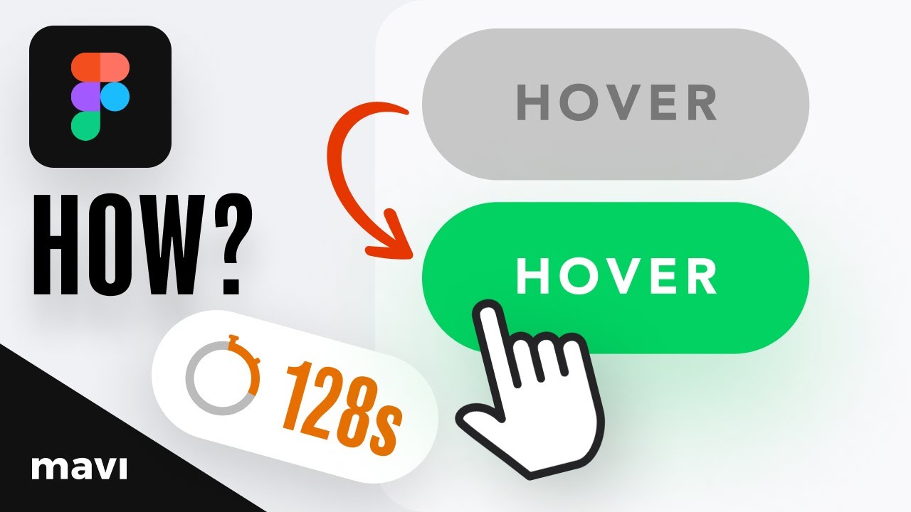
Can I create button hover states in Figma?
Yes. Create your button as a component, then add variants for hover, pressed, and disabled states. Connect them using prototype interactions with “While hovering” triggers. Learn more about micro-interactions for better button feedback.
What is the best corner radius for buttons?
Most UI buttons use 4px to 8px corner radius. Fully rounded buttons use half the button height. There’s no universal standard, so match your design system’s visual hierarchy.
How do I add an icon to my Figma button?
Place an icon inside your auto layout frame next to the text label. Set the gap value to control spacing between icon and text. Use plugins like Iconify or Phosphor Icons.
Why isn’t my button auto layout working?
You likely have multiple layers selected or selected a group instead of a frame. Click away to deselect everything, then select only the single layer before pressing Shift + A.
How do I turn my button into a reusable component?
Select your finished button frame and click “Create component” in the right sidebar, or press Ctrl/Cmd + Alt + K. The button becomes a main component you can reuse as instances.
What colors work best for primary buttons?
Use your brand’s primary color with white or black text for contrast. Check accessibility guidelines for a minimum 4.5:1 contrast ratio. Test with inclusive design principles.
Conclusion
You now know how to make a button in Figma using five straightforward steps.
The process covers everything from creating a text label to applying auto layout, styling the background, adjusting padding, and setting proper text contrast.
These fundamentals apply to every button you’ll ever design. Primary buttons, secondary buttons, icon buttons, they all follow the same core pattern.
Practice building different button variants. Experiment with corner radius values, color combinations, and hover states.
Turn your buttons into reusable components to maintain consistency across your design files.
The skills you’ve learned here extend beyond buttons. Auto layout, padding, and fill colors are building blocks for form elements, cards, navigation bars, and entire app designs.
Start simple. Build complexity over time.


