
Your Assets panel is a mess. Dozens of button components scattered everywhere, each slightly different.
Learning how to create variants in Figma solves this chaos instantly.
Variants let you group similar components into a single container called a component set. One entry in your library instead of fifty.
This guide walks you through the complete process: creating components, naming them correctly, combining as variants, and configuring properties.
You’ll also learn how to troubleshoot common errors like conflicting values and generic property names.
By the end, you’ll build cleaner design systems and spend less time hunting for the right component.
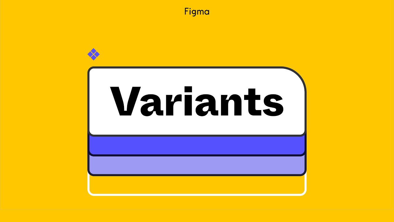
How to Create Variants in Figma
Creating variants in Figma is the process of grouping similar components into a single component set using the variant system.
Users need this when building design systems with multiple button states, icon sizes, or theme variations.
This guide covers 5 main steps requiring approximately 10 minutes and basic Figma component knowledge.
Prerequisites
Before you start combining components as variants, make sure you have these ready:
Have you seen the latest Figma statistics?
Discover comprehensive Figma statistics including revenue growth, market share, user demographics, and funding data.
Check them out →- Figma desktop app or browser version (2024 or later)
- Basic understanding of how to use components in Figma
- At least one existing design element ready for conversion
- Can edit access to the Figma file
- 10 minutes of time
You should also know how to make components in Figma before attempting variant creation.
Step One: How Do You Create Components Before Combining Them?
Select your design element on the canvas and convert it to a main component using the Create Component button or keyboard shortcut.
Each component needs proper naming with slash convention for property recognition during variant conversion.
Action
- Select design element on canvas
- Go to Object menu > Create Component (or ⌥⌘K on Mac / Ctrl+Alt+K on Windows)
- Component appears with purple diamond icon in Layers panel
Purpose
Variants require existing components to group together into a component set.
Without main components first, you cannot combine as variants.
Step Two: How Do You Name Components Using Slash Convention?
The slash naming convention follows this structure: ComponentName/Property1Value/Property2Value.
Text before the first slash becomes your component set name.
Each additional slash creates a new variant property automatically.
Action
- Double-click component name in Layers panel
- Type name following structure: Button/Primary/Large/Default
- Apply same slash count to all related components
Purpose
Figma uses slash naming to auto-generate properties and values during variant conversion.
Consistent slash count across all components prevents conflicting value errors later.
Step Three: How Do You Combine Components as Variants?
Select multiple components and use the Combine as variants option in the right sidebar.
Figma adds all selected components into a single component set with a dashed purple border.
Properties auto-generate from your component names based on the slash convention.
Action
- Select all related components (Shift+Click or drag selection)
- Right sidebar > Click “Combine as variants” button
- Components appear inside dashed purple component set frame
Purpose
Groups similar components into one manageable container for your design system in Figma.
This simplifies the Assets panel and makes component discovery easier for your team.
Step Four: How Do You Rename Variant Properties?
Figma creates generic property names like Variant, Property 2, Property 3.
These need descriptive renaming for clarity.
Select the component set and find the Properties section in the right sidebar panel.
Action
- Click component set (dashed purple frame)
- Right sidebar > Properties section
- Double-click property name > Type descriptive name (Size, State, Type) > Press Enter
Purpose

Descriptive variant property values communicate options clearly to team members using your component library.
This aligns your design system with frontend development naming conventions.
Step Five: How Do You Add New Variants to an Existing Component Set?
Click the plus icon below the component set or duplicate an existing variant using ⌘D on Mac / Ctrl+D on Windows.
You can also drag other components directly into the set.
Each new variant needs a unique property value combination to avoid conflicts.
Action
- Select component set > Click + icon in right sidebar OR click + below component set
- Modify new variant design as needed
- Right sidebar > Current variant section > Assign unique property values
Purpose
Expands your component set to accommodate additional states like hover, pressed, or disabled.
Once complete, you can prototype in Figma using interactive components that switch between variant states automatically.

Verification
Confirm your variant configuration works correctly before publishing to your team library.
Check these indicators:
- Component set shows all variants inside dashed purple border
- No conflicting value errors appear in the right sidebar
- Each variant displays a unique property/value combination
- Assets panel shows single component entry (not multiple separate components)
- Instance of component set allows switching between variants via property dropdown
Test by dragging a component instance onto your canvas.
The Design panel should display all variant properties with dropdown menus for each.
Troubleshooting
Conflicting Value Error Appears
Issue: Two or more variants share identical property combinations.
Solution: Select affected variants > Right sidebar > Change property values so each variant has a unique combination.
Properties Show Generic Names
Issue: Properties display as “Property 1, Property 2” instead of descriptive names like Size or State.
Solution: Click component set > Properties section > Double-click each property name > Rename to descriptive terms matching your wireframe specifications.
Variants Not Appearing in Assets Panel
Issue: Published library doesn’t show your new variants.
Solution: Verify you have a paid plan > File menu > Publish to library > Confirm component set is included in publish selection.
Component Creates Separate Instance Instead of Variant
Issue: Dragging a component into the set creates a separate component rather than adding it as a variant.
Solution: Ensure dragged item is already a main component (purple diamond icon) before dropping into the component set frame.
Boolean Property Not Toggling
Issue: True/false toggle doesn’t appear for icon visibility or similar properties.
Solution: Create exactly two variants with values “True” and “False” for that specific property, Figma auto-converts to toggle.
Nested Components Losing Overrides
Issue: Component overrides disappear when switching between variants.
Solution: Ensure nested instances use identical layer names across all variants; Figma preserves overrides only when layer structure matches.
Related Processes
After mastering variant creation, explore these connected Figma workflows:
- How to make a button in Figma with multiple states
- How to use auto layout in Figma for responsive variants
- How to edit a component in Figma after variant creation
- How to make Figma interactive with variant transitions
- How to animate in Figma for smooth state changes
Understanding user interface design principles helps you decide which component states need variants.
Good user experience design requires consistent interactive states across your entire design system.
FAQ on How To Create Variants In Figma
What is a variant in Figma?
A variant is a version of a component that shares the same component set but has different property values.
Button states like default, hover, and pressed are typical variants. They stay grouped in one container in the Assets panel.
How do I combine existing components as variants?
Select all related components on your canvas. Click “Combine as variants” in the right sidebar.
Figma creates a component set with a dashed purple border containing all selected components as variants.
What is the slash naming convention for variants?
Structure component names as ComponentName/Value1/Value2/Value3. Text before the first slash becomes the set name.
Each additional slash creates a new variant property. Keep slash count consistent across all components.
Can I add variants to an existing component set?
Yes. Select the component set and click the + icon below it. You can also duplicate existing variants or drag other main components directly into the set.
How do I fix conflicting value errors?
This error appears when two variants share identical property combinations. Select affected variants and change their property values in the right sidebar so each has a unique combination.
What is the difference between variants and component properties?
Variants create separate component versions with different designs. Component properties (text, boolean, instance swap) modify a single variant without creating additional versions.
Use both together for flexible systems.
How do I rename variant properties?
Click the component set frame. Find the Properties section in the right sidebar.
Double-click any property name like “Property 1” and type a descriptive name such as Size, State, or Type.
Can I publish variants to a team library?
Yes, but only on paid Figma plans. Go to File menu > Publish to library.
Your component set appears as a single entry. Team members switch variants using the Design panel dropdowns.
How do I create interactive components with variants?
Select a variant and open the Prototype tab. Drag a connection to another variant in the same set.
Choose “Change to” as the action. The interactive component now switches states automatically during prototypes.
What happens to overrides when switching variants?
Figma preserves component overrides when switching variants if the layer names match across variants.
Text changes, nested instance swaps, and style overrides carry over. Mismatched layer names cause overrides to reset.
Conclusion
You now know how to create variants in Figma from start to finish.
The process comes down to five core actions: build your main components, apply the slash naming convention, combine as variants, rename properties, and add new variants as needed.
Your component library stays organized. Your team finds what they need faster.
Variants bring your design system closer to actual frontend code by mirroring the prop/value structure developers already use.
No more duplicate components cluttering the Assets panel. No more confusion about which button state to grab.
Start with a simple component like a button. Add hover and disabled states as variants.
Once that clicks, scale up to more complex component sets with multiple properties.
The time you invest now pays off across every project that uses your library.


