Forms can make or break your web application. Clunky inputs, broken validation, inconsistent styling across browsers. We’ve all been there.
Bootstrap form examples solve these problems with pre-built components that work everywhere.
The Bootstrap framework gives you form controls, validation states, and layouts that adapt to any screen size. No fighting with CSS forms from scratch.
This guide covers everything from basic text inputs to complex checkout forms. You’ll find copy-paste code snippets, layout options, and real-world templates.
Login forms, registration forms, contact forms, search boxes. All ready to drop into your next project.
What is a Bootstrap Form
Bootstrap Form is a pre-styled HTML form component that provides consistent styling, responsive layouts, and built-in validation states across all browsers and devices.
The Bootstrap CSS framework handles the heavy lifting. You get form-control classes, input styling, and responsive design out of the box.
No custom CSS required for basic forms. Just add the right classes and Bootstrap does the rest.
Cool Bootstrap Forms
Modern Bootstrap Form Collection
See the Pen
Modern Bootstrap Form Collection by Bogdan Sandu (@bogdansandu)
on CodePen.
Register Form

Bootstrap 5 Payment form with payment methods

Bootstrap Form Layout

Bootstrap 4 login form with footer

Colorlib Booking Form V1

Registration Form With Photo (Epic Bootstrap)

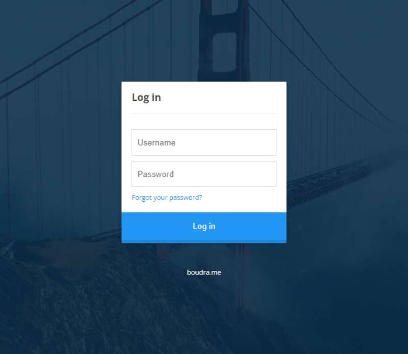
Bootstrap login with overlay image

Bootstrap Form Elements

Colorlib Reg Form V6

Inline Form Bootstrap (yoris on CodePen)

Bootstrap Authentication Forms

Doctors Appointment Form

CSS Accordion Bootstrap Form

Animated Login Form
Contact Form v1

Meeting Booking Form

Dual Design Registration Form

Login Form By Ace Subido

Colorlib Wizard 1

Reset Password Form (Ihor Sukhorada on CodePen)

Responsive Contact Us Form

Multi-Step Survey Form

Inline and Horizontal Bootstrap Form

Elegant Login Page

Sitepoint Bootstrap Form with Email Validation

How Does a Bootstrap Form Work
Bootstrap forms use a class-based system. Apply form-control to inputs, form-label to labels, and form-check to checkboxes.
The framework integrates with Bootstrap’s grid system for layout control. Wrap form groups in row and col classes to create multi-column layouts.
Every form element adapts to screen size automatically. Mobile users see full-width inputs while desktop users get the layout you designed.
Cross-browser compatibility comes standard. Chrome, Firefox, Safari, Edge all render forms identically.
What Are the Types of Bootstrap Form Layouts
Bootstrap offers 3 distinct form layout types: vertical (default), horizontal, and inline.
Each layout serves different user interface needs and space requirements.
What is a Vertical Form Layout in Bootstrap
Labels stack above inputs. This is the default Bootstrap form layout and requires no extra classes.
Best for mobile-first designs and forms with many fields.
What is a Horizontal Form Layout in Bootstrap
Labels sit beside inputs on the same row. Add the row class to form groups and col classes to labels and inputs.
Works well on wider screens where horizontal space is available.
What is an Inline Form Layout in Bootstrap
All form elements appear on a single line. Apply the form-inline class (Bootstrap 4) or use flex utilities (Bootstrap 5).
Perfect for search bars, newsletter signups, and navigation bar forms.
What Are the Bootstrap Form Components
Bootstrap provides pre-styled components for every standard form element:
- Text inputs and textareas
- Select dropdowns
- Checkboxes and radio buttons
- File inputs
- Range sliders
- Color pickers
How to Create a Text Input in Bootstrap
Add the form-control class to any input element. The class applies consistent padding, borders, and focus states.
<input type="text" class="form-control" placeholder="Enter text">
Use form-control-lg for larger inputs, form-control-sm for smaller ones.
How to Create a Select Dropdown in Bootstrap
Apply form-select to your select element. Bootstrap styles the dropdown with custom arrows and consistent spacing.
<select class="form-select">
<option selected>Choose option</option>
<option value="1">Option 1</option>
</select>
How to Create Checkboxes and Radio Buttons in Bootstrap
Wrap inputs in a div with form-check class. Add form-check-input to the input and form-check-label to the label.
<div class="form-check">
<input class="form-check-input" type="checkbox" id="check1">
<label class="form-check-label" for="check1">Check me</label>
</div>
For toggle switches, add the form-switch class to the wrapper. See more Bootstrap checkbox examples for advanced styling.
How to Create a File Input in Bootstrap
The form-control class works for file inputs too. Bootstrap 5 dropped the custom-file component in favor of this simpler approach.
<input class="form-control" type="file" id="fileInput">
What is Bootstrap Form Validation
Bootstrap form validation provides visual feedback for user input through CSS pseudo-classes and JavaScript.
Two validation styles exist: browser defaults and Bootstrap custom styles with was-validated or needs-validation classes.
How to Add Required Field Validation in Bootstrap
Add the required attribute to inputs. Apply needs-validation to the form and prevent submission until validated.
<form class="needs-validation" novalidate>
<input type="email" class="form-control" required>
<button type="submit">Submit</button>
</form>
The novalidate attribute disables browser defaults so Bootstrap styles take over.
How to Display Validation Feedback Messages in Bootstrap
Add valid-feedback and invalid-feedback divs after inputs. These display automatically based on validation state.
<input type="text" class="form-control" required>
<div class="valid-feedback">Looks good!</div>
<div class="invalid-feedback">Please enter a value.</div>
Green borders and messages appear for valid inputs. Red for invalid. Building accessible forms means pairing these visual cues with proper ARIA attributes.
What Are Bootstrap Form Sizing Options
Bootstrap provides 3 input sizes: default, large (form-control-lg), and small (form-control-sm).
Apply sizing classes to Bootstrap input elements, selects, and textareas. Labels and buttons have matching size classes for visual consistency.
<input class="form-control form-control-lg" placeholder="Large">
<input class="form-control" placeholder="Default">
<input class="form-control form-control-sm" placeholder="Small">
What is a Floating Label Form in Bootstrap
Floating labels sit inside the input field, then float above when the user types. Clean, modern look that saves vertical space.
Wrap your input and label in a div with the form-floating class. The input must come before the label in the markup.
<div class="form-floating">
<input type="email" class="form-control" id="email" placeholder="name@example.com">
<label for="email">Email address</label>
</div>
The placeholder attribute is required but won’t display. Bootstrap uses it for the floating animation.
What Are Bootstrap Input Groups
Input groups attach text, icons, or buttons to form inputs. Use them for currency symbols, @ signs, search icons, or action buttons.
<div class="input-group">
<span class="input-group-text">$</span>
<input type="text" class="form-control" placeholder="Amount">
</div>
Add multiple addons, dropdowns, or buttons to either side. Great for building complex front-end form interfaces.
Bootstrap Form Examples for Common Use Cases
Ready-to-use form templates for the most common web application needs.
Bootstrap Login Form Example
A Bootstrap login form needs email input, password field, remember me checkbox, and submit button.
<form class="w-50 mx-auto">
<div class="mb-3">
<label for="loginEmail" class="form-label">Email</label>
<input type="email" class="form-control" id="loginEmail" required>
</div>
<div class="mb-3">
<label for="loginPassword" class="form-label">Password</label>
<input type="password" class="form-control" id="loginPassword" required>
</div>
<div class="mb-3 form-check">
<input type="checkbox" class="form-check-input" id="remember">
<label class="form-check-label" for="remember">Remember me</label>
</div>
<button type="submit" class="btn btn-primary w-100">Sign In</button>
</form>
Add the needs-validation class and novalidate attribute for client-side validation.
Bootstrap Registration Form Example
Registration forms collect more data: name, email, password confirmation, terms checkbox.
<form class="needs-validation" novalidate>
<div class="row mb-3">
<div class="col">
<input type="text" class="form-control" placeholder="First name" required>
</div>
<div class="col">
<input type="text" class="form-control" placeholder="Last name" required>
</div>
</div>
<div class="mb-3">
<input type="email" class="form-control" placeholder="Email" required>
</div>
<div class="mb-3">
<input type="password" class="form-control" placeholder="Password" required>
</div>
<div class="mb-3">
<input type="password" class="form-control" placeholder="Confirm password" required>
</div>
<div class="mb-3 form-check">
<input type="checkbox" class="form-check-input" id="terms" required>
<label class="form-check-label" for="terms">I agree to terms</label>
</div>
<button type="submit" class="btn btn-success w-100">Register</button>
</form>
Bootstrap Contact Form Example
A Bootstrap contact form captures name, email, subject, and message. Essential for any business landing page.
<form>
<div class="mb-3">
<label class="form-label">Name</label>
<input type="text" class="form-control" required>
</div>
<div class="mb-3">
<label class="form-label">Email</label>
<input type="email" class="form-control" required>
</div>
<div class="mb-3">
<label class="form-label">Subject</label>
<input type="text" class="form-control">
</div>
<div class="mb-3">
<label class="form-label">Message</label>
<textarea class="form-control" rows="5" required></textarea>
</div>
<button type="submit" class="btn btn-primary">Send Message</button>
</form>
Bootstrap Newsletter Signup Form Example
Inline form layout works best for newsletter signups. Single email field with subscribe button.
<form class="row g-2 align-items-center">
<div class="col-auto flex-grow-1">
<input type="email" class="form-control" placeholder="Your email" required>
</div>
<div class="col-auto">
<button type="submit" class="btn btn-primary">Subscribe</button>
</div>
</form>
Place in footer sections, modals, or sidebar widgets.
Bootstrap Search Form Example
Input groups create polished search box designs with icons or buttons attached.
<form class="d-flex">
<div class="input-group">
<input type="search" class="form-control" placeholder="Search...">
<button class="btn btn-outline-primary" type="submit">
<i class="bi bi-search"></i>
</button>
</div>
</form>
Add Bootstrap icons for visual clarity. The bi-search icon from Bootstrap Icons works perfectly here.
Bootstrap Checkout Form Example
Checkout forms need multiple sections: billing info, shipping address, payment details. Use Bootstrap cards to organize each section.
<form class="needs-validation" novalidate>
<!-- Billing Section -->
<h5 class="mb-3">Billing Address</h5>
<div class="row g-3">
<div class="col-sm-6">
<label class="form-label">First name</label>
<input type="text" class="form-control" required>
</div>
<div class="col-sm-6">
<label class="form-label">Last name</label>
<input type="text" class="form-control" required>
</div>
<div class="col-12">
<label class="form-label">Address</label>
<input type="text" class="form-control" required>
</div>
<div class="col-md-5">
<label class="form-label">Country</label>
<select class="form-select" required>
<option value="">Choose...</option>
<option>United States</option>
</select>
</div>
<div class="col-md-4">
<label class="form-label">State</label>
<select class="form-select" required>
<option value="">Choose...</option>
</select>
</div>
<div class="col-md-3">
<label class="form-label">Zip</label>
<input type="text" class="form-control" required>
</div>
</div>

<hr class="my-4">

<!-- Payment Section -->
<h5 class="mb-3">Payment</h5>
<div class="row gy-3">
<div class="col-md-6">
<label class="form-label">Name on card</label>
<input type="text" class="form-control" required>
</div>
<div class="col-md-6">
<label class="form-label">Card number</label>
<input type="text" class="form-control" required>
</div>
<div class="col-md-3">
<label class="form-label">Expiration</label>
<input type="text" class="form-control" required>
</div>
<div class="col-md-3">
<label class="form-label">CVV</label>
<input type="text" class="form-control" required>
</div>
</div>

<hr class="my-4">
<button class="btn btn-primary btn-lg w-100" type="submit">Complete Order</button>
</form>
The user experience improves when you group related fields visually. Clear section headings and proper spacing reduce form abandonment.
Consider adding ARIA labels for screen readers, especially on complex multi-section forms like checkout.
FAQ on Bootstrap Form Examples
What is the difference between form-control and form-select in Bootstrap?
Form-control styles text inputs, textareas, and file inputs. Form-select styles dropdown menus specifically.
Both classes apply consistent padding, borders, and focus states. Use form-control for typing fields, form-select for selection fields.
How do I make Bootstrap forms responsive?
Bootstrap forms are responsive by default. Inputs with form-control expand to full container width automatically.
For multi-column layouts, use the row and col classes. Columns stack vertically on smaller viewport sizes.
How do I add validation to Bootstrap forms?
Add the needs-validation class to your form and the novalidate attribute. Include required on mandatory fields.
Use valid-feedback and invalid-feedback divs for custom messages. Trigger validation on form submission with a small script.
What is the form-floating class in Bootstrap 5?
Form-floating creates floating label inputs where labels animate from inside to above the field on focus.
The input must appear before the label in your markup. A placeholder attribute is required for the animation to work.
How do I create inline forms in Bootstrap 5?
Bootstrap 5 removed the form-inline class. Use flex utilities instead: apply d-flex and gap classes to your form element.
Alternatively, use row and col-auto classes for inline layouts with more control over spacing.
Can I use Bootstrap forms with React or Vue?
Yes. Bootstrap’s CSS classes work with any backend or frontend framework. Just apply the same class names to your components.
Libraries like React-Bootstrap and BootstrapVue provide pre-built form components with framework-specific features.
How do I style disabled inputs in Bootstrap?
Add the disabled attribute to any input. Bootstrap automatically applies muted colors and removes pointer events.
For readonly fields that should look active but prevent editing, use the readonly attribute instead of disabled.
What is an input group in Bootstrap?
Input groups attach addons like text, icons, or buttons to form inputs. Wrap elements in a div with the input-group class.
Use input-group-text for static addons. Common uses include currency symbols, @ signs, and search icons.
How do I change the size of Bootstrap form inputs?
Add form-control-lg for larger inputs or form-control-sm for smaller ones. These classes adjust padding and font size.
Matching classes exist for selects (form-select-lg) and buttons (btn-lg) to maintain visual hierarchy.
How do I submit Bootstrap forms without page reload?
Use Ajax to submit form data asynchronously. Prevent the default form action with event.preventDefault() in your submit handler.
Send data to your API endpoint using fetch or axios. Display success or error messages without refreshing the page.
Conclusion
These Bootstrap form examples give you production-ready code for any project. From simple input fields to multi-section checkout forms, the framework handles the complexity.
You’ve seen vertical, horizontal, and inline layouts. Client-side validation with custom feedback messages. Floating labels, input groups, and sizing options.
The form-control class alone saves hours of custom styling. Add the Bootstrap components library from npm or CDN and you’re ready to build.
Start with one of the templates above. Modify the fields to match your needs. Test on mobile devices to confirm the mobile-first design works as expected.
Your users get consistent, accessible forms. You ship faster. That’s the point of using a CSS framework in the first place.