
Lists appear on every website. Navigation menus, feature highlights, pricing breakdowns, step-by-step guides. They structure content and guide users through information.
Yet styling them with traditional CSS feels tedious. You write the same margin, padding, and marker rules repeatedly.
Tailwind list examples show a faster approach. Apply utility classes directly to your ul, ol, and li elements. No separate stylesheet hunting.
This guide covers unordered lists, ordered lists, horizontal layouts, custom markers, and responsive patterns.
You’ll learn which classes control spacing, how to remove default bullets, and the mistakes that trip up most frontend developers.
Copy the code. Adapt it to your projects.
What is a Tailwind List
A Tailwind list is an HTML list element styled using Tailwind CSS utility classes.
Instead of writing custom CSS for your ul, ol, or dl elements, you apply pre-built classes directly in your markup.
The utility-first approach gives you complete control over list markers, spacing, typography, and layout without leaving your HTML file.
Tailwind strips default browser styles from lists. You build exactly what you want from scratch.
Tailwind List Examples
Tailwind CSS List Group Magic
Digital Ocean Tutorials with a Twist
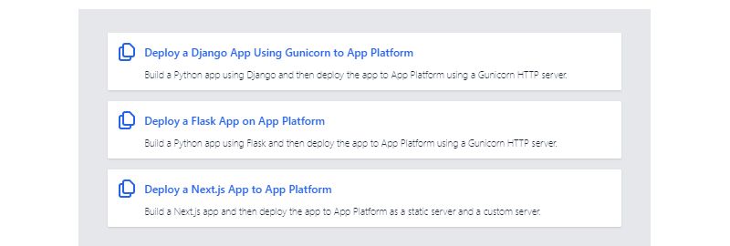
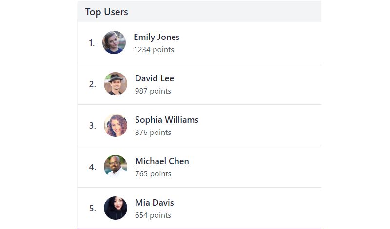
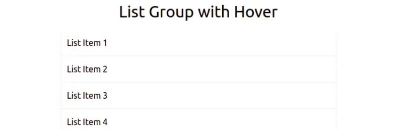
The Stacked List Sensation
Flowbite’s Tailwind List Extravaganza

Dispatch Listing – A Sykespro Special
Leif99’s Tailwind Masterpiece
Simple Yet Stunning Tailwind Lists
Blurred Beauty by Adityacs001

Three’s Not a Crowd

Preline’s List Group Perfection

Leon’s Feature Finesse
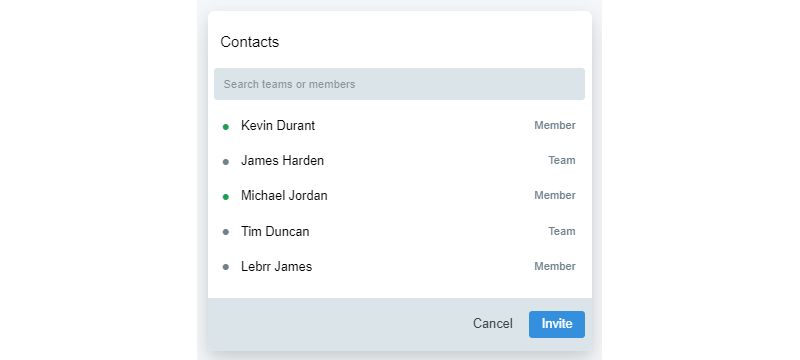
Doguskysilva’s Contact Craze
Simon’s Twitter Twist

Tailwind’s List Magic

Leon’s List Lounge
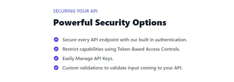
Amit’s Highlight Haven
How Does Tailwind CSS Handle List Styling
Tailwind’s Preflight base styles remove all default list styling. No bullets. No numbers. No indentation.
This reset gives you a blank canvas. You add back only what you need using utility classes.
Core list utilities include:
- list-disc – adds bullet markers
- list-decimal – adds numbered markers
- list-none – removes all markers
- list-inside – positions markers inside content flow
- list-outside – positions markers in the margin
Spacing between items comes from space-y utilities like space-y-2 or space-y-4.
The responsive design approach works here too. Add breakpoint prefixes like md:list-disc to change styles at different screen sizes.
What Are the Types of Tailwind Lists
Five main list types work with Tailwind: unordered, ordered, definition, inline, and nested structures.
Each serves different content needs and accepts different styling approaches.
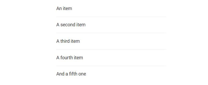
Unordered Lists in Tailwind
Unordered lists use the ul element with li children. Add list-disc for bullet points, list-inside for marker positioning.
Common use cases: feature lists, navigation menus, benefit summaries, and content groupings.
Ordered Lists in Tailwind
Ordered lists use ol with list-decimal for numbered sequences. Perfect for step-by-step instructions, rankings, and prioritized content.
The marker color inherits from text color utilities. Apply text-gray-500 to the ol for muted numbers.
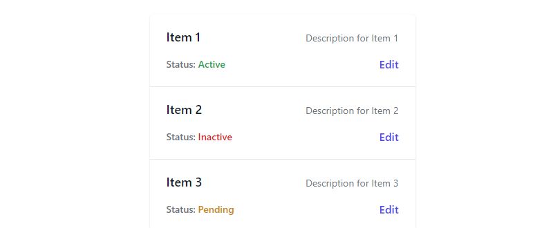
Definition Lists in Tailwind
Definition lists pair dt (term) and dd (description) elements inside a dl container. Great for glossaries, FAQs, and metadata displays.
Style terms with font-medium or font-bold. Add margin-bottom to dd elements for vertical spacing between pairs.
Inline Lists in Tailwind
Inline lists display horizontally using flex or inline-flex on the ul element.
Add gap-4 or space-x-4 between items. Works well for tag lists, breadcrumb navigation, and horizontal menus.
Nested Lists in Tailwind
Nested structures place lists inside li elements. Apply pl-4 or pl-6 for visual indentation on child lists.
Mix list-disc on parents with list-circle on children for visual hierarchy.
How to Style List Markers in Tailwind
Marker styling controls the bullets or numbers beside each list item.
Basic marker classes:
- list-disc – filled circle bullets
- list-circle – hollow circle bullets
- list-square – square bullets
- list-decimal – 1, 2, 3 numbering
- list-decimal-leading-zero – 01, 02, 03 format
The marker: modifier targets marker color directly. Use marker:text-blue-500 for colored bullets.
For custom markers, combine list-none with before: pseudo-elements or inline SVG icons.
How to Remove Default List Styles in Tailwind
The list-none class strips all markers from any list. No bullets, no numbers, no disc shapes.
Combine with p-0 and m-0 for a completely reset list structure.
Common scenarios for unstyled lists:
- Navigation bar links
- Card components with list semantics
- Custom icon lists using flexbox
- Sidebar menu structures
The semantic HTML remains intact for accessibility. Screen readers still announce list items correctly.
How to Create Horizontal Lists with Tailwind
Add flex to your ul element. Items flow horizontally instead of stacking.
Control spacing with gap-x-4, gap-x-6, or space-x utilities between list items.
Essential classes for horizontal lists:
- flex – enables flexbox container
- flex-wrap – allows items to wrap on smaller screens
- items-center – vertically centers list items
- justify-between – spreads items across full width
- gap-4 – adds consistent spacing between items
Pair with list-none to remove bullets. Horizontal bullets look strange.
Works perfectly for tab navigation, tag clouds, social links, and footer menus.
How to Build Custom Styled Lists Without Markers
Remove default markers with list-none, then build your own visual indicators.
Three approaches work well:
Icon-Based Lists
Wrap each li in a flex container. Place an icon before the text content using inline SVG or icon libraries like Heroicons.
Add gap-2 or gap-3 between icon and text for proper spacing.
Checkbox Lists
Combine form inputs with list semantics. Each li contains a checkbox element and label.
Style checkboxes using Tailwind’s form plugin or custom accent-color utilities.
Custom Bullet Alternatives
Use the before: pseudo-element to insert custom content. Apply before:content-[‘-‘] or before:content-[‘*’] for simple text markers.
Add before:mr-2 for spacing, before:text-blue-500 for colored markers.
How to Control List Spacing with Tailwind
Vertical spacing between list items uses space-y utilities. Apply space-y-2, space-y-4, or space-y-6 directly on the ul or ol element.
Individual item padding uses py-2 or py-4 on each li. Better for lists with borders or backgrounds.
Key spacing utilities:
- space-y-{n} – vertical gap between children
- gap-{n} – works with flex and grid containers
- py-{n} – padding top and bottom on items
- my-{n} – margin top and bottom on items
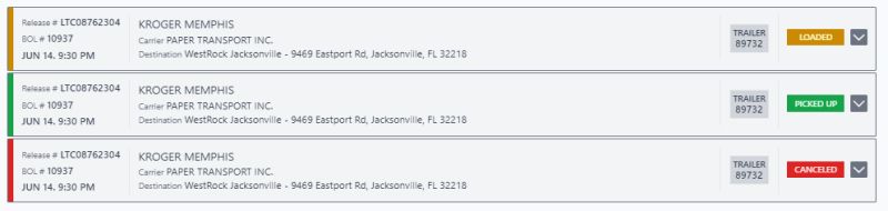
- divide-y – adds borders between items automatically
The divide-y utility adds horizontal separators. Combine with divide-gray-200 for subtle lines between list items.
How to Create Responsive Lists in Tailwind
Tailwind’s mobile-first approach starts with base styles, then adds breakpoint prefixes for larger screens.
Common responsive patterns:
- flex-col md:flex-row – vertical on mobile, horizontal on desktop
- space-y-2 md:space-y-4 – tighter spacing on small screens
- text-sm md:text-base – smaller text on mobile
- grid-cols-1 md:grid-cols-2 – single column to multi-column
A navigation list might use list-none flex-col on mobile, then switch to flex-row gap-6 at the md: breakpoint.
Test across viewport sizes. Lists that look great on desktop can feel cramped on phones.
Which Tailwind Utilities Work Best for List Styling
Different list types need different utility combinations.
Feature lists (benefits, specs): list-none with flex items, custom icons, space-y-3 for breathing room.
Navigation lists: list-none, flex or flex-col, hover states on li elements, gap utilities for spacing.
Content lists (articles, blog posts): list-disc list-inside, prose class from typography styling, marker:text-gray-400.
Data lists (specs, metadata): definition list structure, grid layout on dl, font-medium on dt terms.
Ranked utility combinations by use case:
- Basic bullets: list-disc list-inside space-y-1
- Clean nav: list-none flex gap-4
- Icon list: list-none space-y-3 with flex on each li
- Bordered list: list-none divide-y divide-gray-200
Common Tailwind List Styling Mistakes to Avoid
These errors show up constantly in code reviews.
Forgetting Preflight resets. Developers expect default bullets. Tailwind removes them. Always add list-disc explicitly if you want markers.
Using margin instead of space-y. Adding mb-4 to every li creates extra work. One space-y-4 on the parent handles everything.
Ignoring marker positioning. list-outside (default) places markers in the margin. list-inside keeps them within the content flow. Choose based on your layout needs.
Overcomplicating icon lists. Skip complex grid layouts. Simple flex with gap on each li works better and stays readable.
Missing ARIA labels on styled lists that lose visual list appearance. Screen readers need context when bullets disappear.
Not testing cross-browser rendering. Marker styling varies between Chrome, Firefox, and Safari. The marker: modifier has inconsistent support in older browsers.
FAQ on Tailwind List Examples
How do I add bullets to a Tailwind list?
Apply list-disc to your ul element. Tailwind’s Preflight removes default browser styles, so bullets don’t appear automatically.
Add list-inside to position markers within the content flow instead of the margin.
Why are my list bullets not showing in Tailwind?
Tailwind’s base styles reset all list formatting. The list-style-type defaults to none.
Add list-disc for bullets or list-decimal for numbers explicitly. This applies to both ul and ol elements.
How do I create a horizontal list in Tailwind CSS?
Add flex to the ul element. List items flow horizontally instead of stacking vertically.
Use gap-4 or space-x-4 for spacing between items. Combine with list-none to remove bullet markers.
How do I change list marker color in Tailwind?
Use the marker: modifier followed by a text color utility. Apply marker:text-blue-500 or marker:text-gray-400 directly on the ul or ol element.
Browser support varies for this feature.
What is the difference between list-inside and list-outside?
list-outside places markers in the margin, outside the content box. list-inside positions markers within the text flow.
Use list-inside when your list has background colors or borders to keep markers contained.
How do I add spacing between list items in Tailwind?
Apply space-y-2, space-y-4, or similar utilities to the parent ul or ol element.
This adds vertical margin between child li elements automatically. No need to style each item individually.
Can I use custom icons instead of bullets in Tailwind lists?
Yes. Apply list-none to remove default markers, then use flexbox on each li element.
Place an inline SVG icon or icon component before your text content with gap-2 for spacing.
How do I style nested lists in Tailwind CSS?
Add padding-left utilities like pl-4 or pl-6 to child ul elements for visual indentation.
Use different marker styles on nested lists. Parent with list-disc, children with list-circle creates clear hierarchy.
Does Tailwind work with definition lists?
Yes. Style dl, dt, and dd elements using standard Tailwind utilities.
Apply font-medium to dt terms, add margin-bottom to dd descriptions. Use grid layouts for side-by-side term-definition pairs.
How do I make Tailwind lists responsive?
Add breakpoint prefixes to your utility classes. Use flex-col on mobile, then md:flex-row for horizontal layout on larger screens.
Adjust spacing with space-y-2 md:space-y-4 for different screen size breakpoints.
Conclusion
These Tailwind list examples give you ready-to-use patterns for any project. Unordered lists, ordered lists, definition lists, icon-based layouts. Each one built with utility classes you can copy and modify.
The key takeaways: Preflight resets everything, so add list-disc or list-decimal explicitly. Use space-y for vertical gaps. Apply flex when you need horizontal alignment.
Tailwind’s approach to list styling fits the same workflow you use for buttons, tables, and dropdowns. Consistent utility patterns across every component.
Start with the basic examples. Customize marker colors, spacing, and typography to match your design system.
Build once, reuse everywhere.


