
- Cards are everywhere. Product grids, testimonials, pricing tables, user profiles.
Building them with Tailwind card examples gives you complete control over every pixel without writing custom stylesheets.
The utility-first approach from Tailwind CSS means no more fighting framework defaults. No more specificity wars.
This guide covers card types, responsive layouts, hover effects, and copy-paste code snippets you can drop into any project.
Whether you’re building e-commerce interfaces or dashboard components, you’ll find practical patterns that work with React, Vue.js, or plain HTML.
Let’s build some cards.
What is a Tailwind Card
A Tailwind card is a flexible container component built entirely with utility classes from the Tailwind CSS framework.
Unlike pre-built components in Bootstrap or Material Design, Tailwind cards have no default styling. You construct every visual detail from scratch using classes like
rounded-lg,shadow-md, andp-6.This approach gives you complete control over padding, borders, backgrounds, and layout without writing custom CSS.
Adam Wathan and Tailwind Labs designed the framework this way intentionally. Cards become whatever you need them to be.
Tailwind Cards To Use
Tailwind CSS Cards Collection

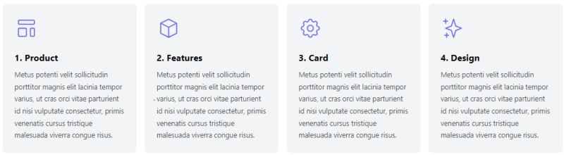
Tailwind Card: Product Features
Social Cards With Tailwind CSS

Info Card – Forest

Tailwind CSS Card for Various Uses

Tailblocks Image Cards
Tailwind CSS Cards – Flowbite

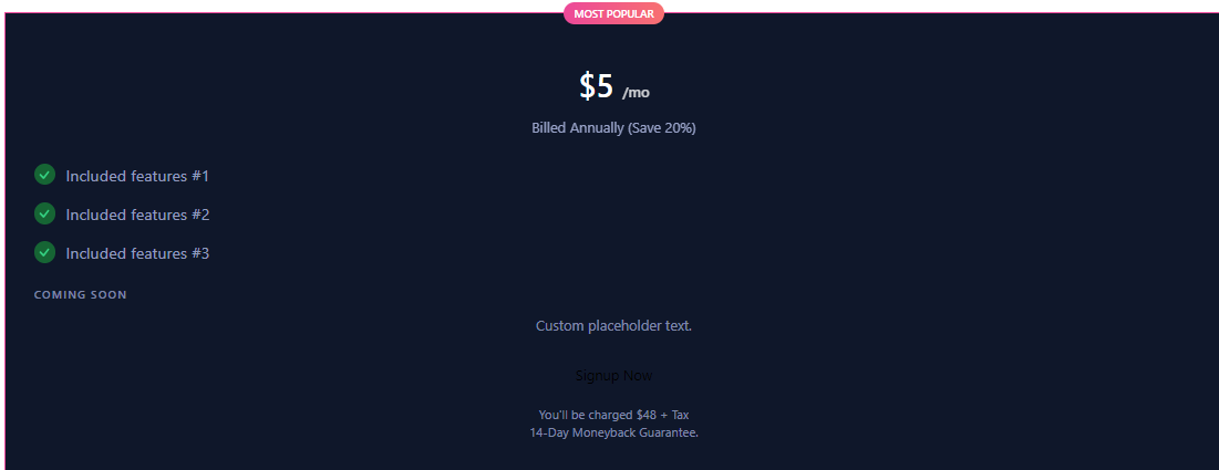
Product Pricing Card – Tailwind CSS by Alex Ivanovs
Tailwind CSS Responsive Card List

Tailwind Card Magic: Preline UI

Shopping Time: Tailwind CSS Card with Add to Cart

Material World: Tailwind CSS Card – Material Tailwind

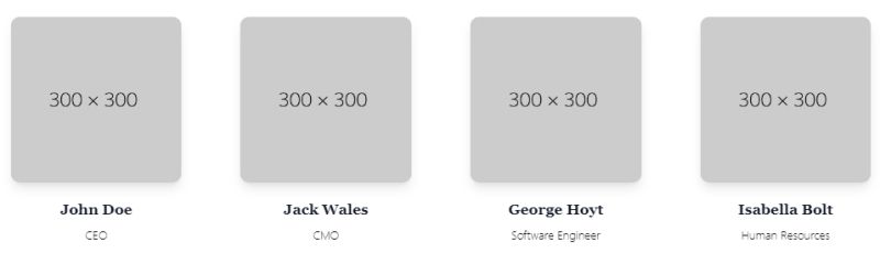
Meet the Team: Team Members Card
Tailwind CSS Cards – Tailwind Elements

eCommerce Magic: Product Card
Introducing You: Profile Card with Header Image – Tailwind Component

Innovative Design: Overlapping Product Card

Keep It Simple: Tailwind Responsive Product Card

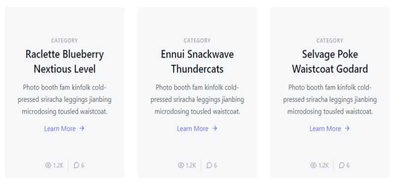
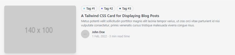
Blogging in Style: Blog Post Card – Tailwind CSS
Rate It: Product Card With Evaluation

Read More: Blog Post Previews

How Does a Tailwind Card Component Work
The card component works through utility-first CSS composition.
You start with a base HTML container, typically a div element. Then you stack utility classes to define width, padding, background color, border radius, and shadow effects.
Here’s the basic structure:
- Outer container holds all card content
- Optional image section at top or side
- Content area with heading, text, metadata
- Footer section for buttons or links
The framework processes these classes through PostCSS and the JIT compiler. Only the classes you actually use end up in production.
No JavaScript required for basic card layouts. Add Alpine.js or React for interactive states.
What Are the Main Types of Tailwind Cards
Tailwind supports virtually any product card design pattern you can imagine.
The framework doesn’t limit you to predefined variations. But certain patterns appear across most frontend projects.
Basic Card with Border and Shadow
The simplest card pattern. White background, subtle border, soft shadow for depth.
Uses bg-white, border, border-gray-200, rounded-xl, and shadow-sm.
Card with Image Header
Image spans full width at top. Content sits below with standard padding.
Apply overflow-hidden on the container so rounded-t-lg clips the image corners properly.
Horizontal Card Layout
Image on left, content on right. Built with flex and flex-row utilities.
Works well for blog post previews and list-style layouts.
Card with Overlay Content
Text positioned directly over the image using absolute positioning.
Add a gradient overlay with bg-gradient-to-t from-black/60 for readability.
Card with Action Buttons
Footer section contains primary and secondary Tailwind buttons.
Separate footer from body with border-t or extra margin.
Card with Badge or Tag
Small label indicates category, status, or special offers.
Position badges with absolute top-2 right-2 for corner placement.
Card with Avatar and Meta Information
Combines user photo, name, date, and other metadata. Common in social feeds and comment sections.
Use flex items-center gap-3 for avatar and text alignment.
Pricing Card
Displays plan name, price, feature list, and CTA button. Often uses visual hierarchy to highlight recommended plans.
Scale featured cards with scale-105 and ring-2 ring-blue-500.
Testimonial Card
Quote text, customer name, company, and optional photo.
Large quotation marks work well as decorative elements with text-6xl text-gray-200.
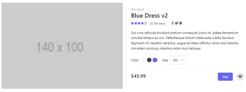
Product Card
Image, title, price, rating, and add-to-cart button. The backbone of e-commerce user interface design.
Include hover effects like hover:shadow-lg and transition-shadow.
How to Create a Basic Tailwind Card
Start with this minimal structure that you can expand for any use case.
The outer div needs max-w-sm to constrain width. Add mx-auto if you want it centered.
Core utility classes for the container:
bg-whitesets the backgroundrounded-lgorrounded-xlfor cornersshadow-mdcreates depthoverflow-hiddenclips child elements
Inside, create separate sections for image, body, and footer. The body typically uses p-4 or p-6 for internal white space.
Headings go in h3 or h4 tags with classes like text-lg font-semibold text-gray-900.
Paragraph text uses text-gray-600 or text-gray-500 for softer contrast.
What CSS Classes Does a Tailwind Card Use for Layout
Layout classes control how card elements arrange themselves and respond to different viewport sizes.
Width and sizing:
w-fullfills available spacemax-w-sm,max-w-md,max-w-lgset upper limitsmin-h-[200px]ensures minimum height
Flexbox utilities:
flex flex-colstacks content verticallyflex flex-rowarranges horizontallyitems-centeraligns on cross axisjustify-betweenspaces elements apart
Spacing:
p-4,p-6,p-8for paddingspace-y-4adds vertical gaps between childrengap-4works with flex and grid systems
For responsive design, prefix any class with breakpoints like sm:, md:, or lg:.
A card might use flex-col md:flex-row to stack on mobile and go horizontal on larger screens.
What CSS Classes Control Tailwind Card Appearance
Appearance classes handle everything visual: colors, borders, shadows, and corner radius.
Background colors:
bg-white,bg-gray-50,bg-slate-100for light cardsdark:bg-gray-800enables dark mode support- Gradient backgrounds with
bg-gradient-to-r from-blue-500 to-purple-600
Border styling:
borderadds 1px solid borderborder-gray-200sets border colorborder-t-4 border-blue-500creates accent borders
Shadow utilities:
shadow-smfor subtle depthshadow-md,shadow-lgfor more prominenceshadow-xlandshadow-2xlfor dramatic CSS shadow effects
Corner radius scales from rounded-sm through rounded-3xl. Use a CSS border radius generator to visualize exact pixel values.
How to Add an Image to a Tailwind Card
Images typically sit at the card top or alongside content in horizontal layouts.
The img tag needs w-full to span container width. Add h-48 or h-56 to set fixed height.
Critical classes for card images:
object-covermaintains aspect ratio while filling spaceobject-centerpositions the focal pointaspect-videooraspect-squarefor consistent ratios
The parent container must have overflow-hidden when using rounded-t-lg on the card.
Consider SVG graphics for icons and illustrations. They scale perfectly at any size.
Lazy loading with loading="lazy" improves page performance for card grids with many images.
How to Make a Tailwind Card Responsive
Tailwind uses mobile-first design principles. Base styles apply to all screens; breakpoint prefixes add larger-screen rules.
Breakpoint prefixes:
sm:starts at 640pxmd:starts at 768pxlg:starts at 1024pxxl:starts at 1280px
A responsive card might use w-full md:w-1/2 lg:w-1/3 inside a flex container.
Switch layouts with flex-col sm:flex-row. Horizontal cards stack vertically on mobile automatically.
These breakpoints work the same as media queries in CSS but with cleaner syntax.
How to Add Hover Effects to a Tailwind Card
Hover states add micro-interactions that improve user experience.
Prefix any utility with hover: to trigger on mouseover.
Common card hover patterns:
hover:shadow-lgincreases shadow depthhover:scale-105subtle zoom effecthover:-translate-y-1lifts card upwardhover:border-blue-500changes border color
Always pair with transition-all duration-300 for smooth animation. Without transition classes, changes appear instant and jarring.
For CSS flip card effects, you’ll need custom CSS or a JavaScript library. Tailwind handles the basics well though.
What is the Difference Between Tailwind Card and Bootstrap Card
The core difference comes down to philosophy. Bootstrap cards ship with predefined styles; Tailwind cards start from zero.
Bootstrap approach:
- Add
.cardclass, get instant styling - Override defaults with custom CSS
- Consistent look across projects
- Heavier file size
Tailwind approach:
- Build every style with utilities
- No defaults to override
- Unique designs without fighting the framework
- Smaller production builds via purging
Check the full Tailwind vs Bootstrap comparison for deeper analysis.
Bootstrap works faster for prototypes. Tailwind wins for custom design systems and production sites.
When to Use a Card Grid Layout in Tailwind
Card grids display multiple cards in organized rows and columns. Product listings, team pages, blog archives.
CSS Grid utilities handle this cleanly:
grid grid-cols-1 sm:grid-cols-2 lg:grid-cols-3gap-4orgap-6for spacingauto-rows-frequalizes row heights
Flexbox alternative: flex flex-wrap with percentage widths on children.
Grid is better when you need consistent column counts. Flexbox handles variable-width cards more naturally.
Pair card grids with Tailwind pagination for large datasets.
What Accessibility Features Should a Tailwind Card Include
Web accessibility requirements apply to cards like any other component.
Semantic structure:
- Use
articletag for self-contained cards - Proper heading hierarchy inside cards
- Descriptive
alttext on all images
ARIA attributes:
role="group"for card collectionsaria-labelledbyconnecting to card titlearia-describedbyfor supplementary text
Ensure sufficient color contrast between text and backgrounds. Gray text on light gray cards often fails WCAG standards.
Interactive cards need visible focus states. Add focus:ring-2 focus:ring-blue-500 focus:outline-none to clickable containers.
Test with keyboard navigation. Tab order should flow logically through card content.
Common Tailwind Card Code Examples
Real code you can copy into your projects. Each example uses standard Tailwind v3 classes.
Simple Content Card
“ <div class="max-w-sm rounded-xl bg-white p-6 shadow-md"> <h3 class="text-lg font-semibold text-gray-900">Card Title</h3> <p class="mt-2 text-gray-600">Card description text goes here.</p> </div> `
Card with Image
` <div class="max-w-sm overflow-hidden rounded-xl bg-white shadow-lg"> <img class="h-48 w-full object-cover" src="image.jpg" alt="Description"> <div class="p-6"> <h3 class="text-xl font-bold text-gray-900">Featured Item</h3> <p class="mt-2 text-gray-600">Supporting text content.</p> </div> </div> `
Horizontal Card
` <div class="flex max-w-2xl overflow-hidden rounded-xl bg-white shadow-md"> <img class="h-auto w-1/3 object-cover" src="image.jpg" alt="Description"> <div class="p-6"> <h3 class="text-lg font-semibold">Horizontal Layout</h3> <p class="mt-2 text-gray-600">Image on left, content on right.</p> </div> </div> `
Card with Hover Effect
` <div class="max-w-sm rounded-xl bg-white p-6 shadow-md transition-all duration-300 hover:-translate-y-1 hover:shadow-xl"> <h3 class="text-lg font-semibold">Interactive Card</h3> <p class="mt-2 text-gray-600">Lifts and shadows on hover.</p> </div> `
Dark Mode Card
` <div class="max-w-sm rounded-xl bg-white p-6 shadow-md dark:bg-gray-800"> <h3 class="text-gray-900 dark:text-white">Dark Mode Ready</h3> <p class="text-gray-600 dark:text-gray-300">Adapts to system preference.</p> </div> `
These examples work with Tailwind v3.x installed via npm or CDN. Customize colors, spacing, and typography to match your design system.
Component libraries like DaisyUI, Flowbite, and Tailwind UI offer pre-built card variations if you prefer ready-made solutions.
FAQ on Tailwind Card Examples
What is the basic structure of a Tailwind card?
A Tailwind card uses a container div with utility classes for background, padding, border radius, and shadow. Inside, you add sections for images, content, and actions. No predefined component exists; you build everything with individual classes.
How do I make Tailwind cards responsive?
Use breakpoint prefixes like sm:, md:, and lg: before any utility class. Cards can switch from vertical to horizontal layouts with flex-col md:flex-row. Grid columns adjust with grid-cols-1 md:grid-cols-2 lg:grid-cols-3.
Can I add hover effects to Tailwind cards?
Yes. Prefix utilities with hover: to trigger on mouseover. Common effects include hover:shadow-lg, hover:scale-105, and hover:-translate-y-1. Always add transition-all duration-300 for smooth CSS animation between states.
How do I create a card grid in Tailwind?
Wrap cards in a container with grid grid-cols-3 gap-6. Adjust column count per breakpoint for responsive behavior. The gap utility controls spacing between cards without margins on individual items.
What shadow classes work best for cards?
Start with shadow-md for standard depth. Use shadow-sm for subtle cards, shadow-lg or shadow-xl for prominent ones. Colored shadows work with shadow-blue-500/50 syntax in Tailwind v3.
How do I add images to Tailwind cards?
Place an img tag with w-full object-cover inside the card container. Set fixed height with h-48 or h-56. The parent needs overflow-hidden when using rounded corners on the card.
Are Tailwind cards accessible?
They can be. Use semantic elements like article for card containers. Add alt text to images, ensure accessible typography contrast ratios, and include focus states with focus:ring-2 for interactive cards.
How do Tailwind cards compare to Bootstrap cards?
Bootstrap provides ready-made card styles; Tailwind requires building from scratch. Tailwind offers more customization without overriding defaults. Bootstrap is faster for prototypes; Tailwind produces smaller, more unique production builds.
Can I use Tailwind cards with React or Vue?
Absolutely. Tailwind works with any frontend framework. Create reusable card components that accept props for title, image, and content. Libraries like Headless UI pair well with Tailwind for interactive card patterns.
What are the best Tailwind card component libraries?
Tailwind UI offers official premium components. Free alternatives include DaisyUI, Flowbite, and Shadcn UI. These provide pre-built card variations you can customize while staying within the Tailwind ecosystem.
Conclusion
These Tailwind card examples give you a foundation for building any card-based interface. The patterns work whether you’re using Vite, Next.js, or a simple CDN setup.
Start with the basic card structure. Add responsive breakpoints for mobile-first layouts. Layer in hover animations and shadow effects as needed.
The JIT compiler keeps your production builds lean. Only the utility classes you actually use end up in the final stylesheet.
Component libraries like DaisyUI and Flowbite speed things up when deadlines are tight. But building cards from scratch teaches you the framework deeply.
Copy the code snippets. Customize the colors and spacing. Ship something.
Cards aren’t complicated. With Tailwind, they’re just utility classes stacked intentionally.


