Ever felt like your web forms fell flat, like a pancake that never fluffed up? That’s about to change. Picture this: forms that don’t just function, they sing. They’re the digital handshake for your users, greeting them like an old friend with their sleek layout and intuitive design—thanks to the magic of Tailwind CSS.
Now, imagine we’ve compiled a showcase—Tailwind forms examples to rev up your design engine. These aren’t your run-of-the-mill setups. They’re crafted to spark ideas, transforming the mundane into the extraordinary.
By the article’s end, you’ll know how to craft forms that not only look good on any device but also speak the unspoken language of your brand. We’re talking mobile-friendly, accessible, and honestly, just plain beautiful.
Get ready to dive into a selection of handpicked examples where form meets function, beauty pairs with brains, and every input feels like a natural next step. You’ll walk away with inspiration tucked in your toolkit, poised to create your own magic on the screen.
Tailwind Forms Examples
Tailwind Forms: Responsive Form on Personal Details By maddog986
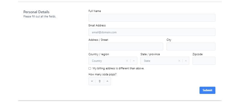
Hey, you know what’s cool? A form that’s clean as a whistle and moves like a breeze on your mobile. Maddog986’s Responsive Form? Yeah, that’s the one. It’s all about Tailwind CSS 3.0.18 and thinking about you, the user. It’s like a chameleon, adapting to whatever gadget you’re using. Personal information? It’s got you covered.
Multi Section Form: A New Wave in Forms
So, you want flexibility? Check out the Multi-Section Form. It’s like a Swiss army knife with its scrollspy and multi-section form. And guess what? Tailwind Custom Forms are in the mix, jazzing up those form fields. On your phone? No worries, the sticky sidebar turns into a dropdown list. It’s like magic but cooler.
Simple Donate Form By wahyusa: Tailwind at Its Best

Donation time? Make it simple with wahyusa’s Simple Donate Form. It’s like a sleek sports car built on Tailwind CSS version 3.0.18. Want to give more or less? Easy peasy. It’s all about you and what you want to do.
Lo-fi Login Screen – with Tailwind CSS: A Fresh Look

Logins can be boring, right? Not with LO-FI LOGIN SCREEN – WITH TAILWIND CSS by Rob Stinson. It’s like a fresh coat of paint using HTML, CSS, and Tailwind CSS 2.0.1. Works everywhere, looks amazing. It’s like Rob’s telling all the web developers, “Hey, let’s make something beautiful together.”
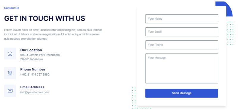
Tailwind CSS Simple Contact Form: Keep It Simple
Need a contact form? Why complicate things? “Tailwind CSS Simple Contact Form” is like your friendly neighbor. It’s attractive, strong, and built on the popular Tailwind CSS framework. It’s like having a chat over the fence.
Simple Registration Form: No Fuss, Just Function
Registering for something? Make it simple. This form is like a friendly guide, leading you through memberships, plans, or events. No coding, no fuss. It’s like a piece of cake you can enjoy on any site. Just copy-paste and add your FormBold API endpoint URL. It’s like making things work, without breaking a sweat.
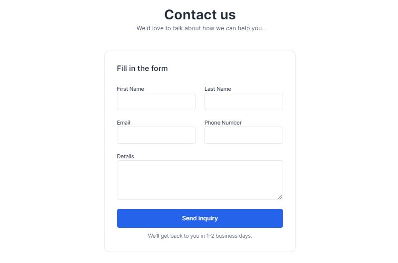
Tailwind Forms: Sales Inquiry Form
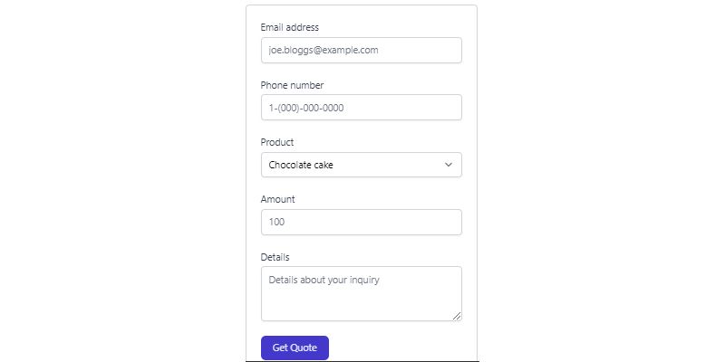
You know when you want to get those personalized sales requests? Yeah, this form’s got your back. It’s like having a personal assistant, but online.
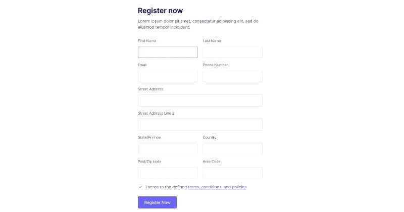
Register Form with Tailwind CSS – Flowbite Style

Ever wanted to make account creation a breeze? This Tailwind forms example lets users sign up with an email and password. And hey, there’s a checkbox for terms and conditions. It’s like a handshake agreement, but digital.
Shipping Label Address Form: Tailwind Magic By Martin-Hausleitner
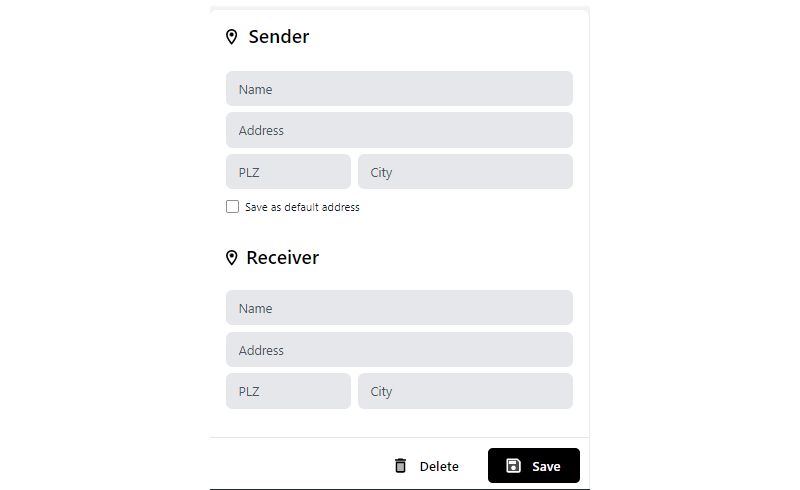
Shipping labels? No problem. Buttons, icons, animations, and even a checkmark. It’s like a control panel for your shipping needs. Addresses? Built right into the UI. It’s like having a shipping department in your pocket.
Tailwind Form By Burakcanince: Simple and Sweet

Just need a login form? This Tailwind form is as simple as pie. Don’t like the image? Change the code. It’s like playing with LEGO, but for your website.
Complaint Form with Tailwind CSS: Speak Your Mind
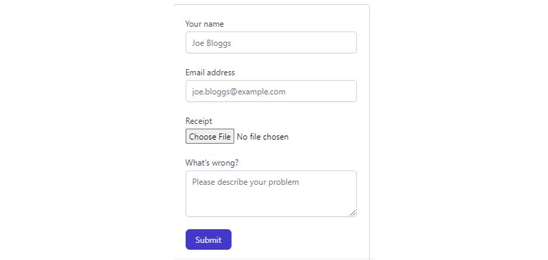
Got complaints? This form’s all ears. It’s like a suggestion box, but it’s always open.
Tailwind CSS Login Form – Flowbite’s Touch

Email, password, logo, and some helpful texts and links. It’s like a welcome mat for your website’s front door.
Railwind Form by Sher: Pure and Simple

Tailwind form by Sher, made with pure HTML and CSS. Tweak it, twist it, make it yours. It’s like a blank canvas waiting for your touch.
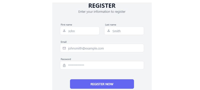
Simple Register/Sign Up Form: Tailwind Beauty By Scott Windon

Just a simple sign-up form. Responsive and with icons. It’s like a friendly hello to new users.
Tailwind Forms 2 by Dante: Back to Basics

New to Tailwind CSS? Want something simple? Dante’s form is as basic as it gets. It’s like training wheels for your website.
Reset Password Form with Tailwind CSS – Flowbite’s Collection

Forgot your password? These reset password forms have got you covered. It’s like a spare key for your online world.
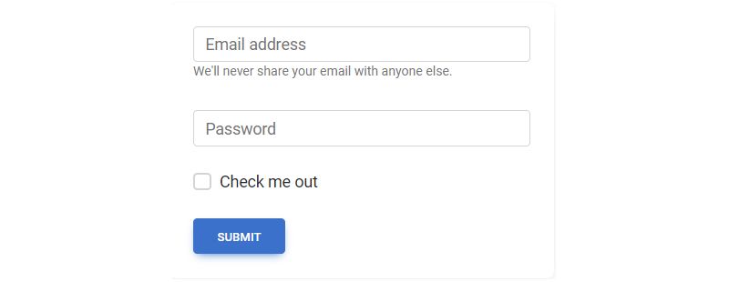
Tailwind CSS Login Form: Many Ways to Say Hello

Sign in forms, login pages, social login, and more. It’s like a handshake, a wave, and a smile, all in one.
Responsive Sign-Up Form: Tailwind CSS Template

A simple responsive signup form. Want to use it as a login form? Go ahead. It’s like a two-in-one tool for your site.
Tailwind CSS Address Form: Delivery Made Easy

Collecting delivery addresses? This form’s like your delivery guy’s best friend. It’s all about getting things where they need to go.
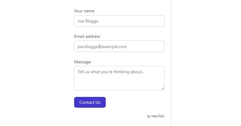
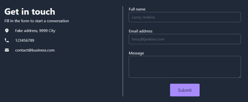
Tailwind CSS Contact Form – Flowbite’s Way

Ever wanted to reach out to someone? This Tailwind forms example is like a digital handshake. Email, subject, message, and a button to send it all. It’s like sending a letter, but faster.
Tailwind CSS Registration / Sign Up Form: Join the Party

Want to sign up? This responsive registration component is like a welcome mat. Sign up forms, registration pages, registration cards, and more. It’s like an open door, and you’re invited.
Preline UI Contact Form Example: Quick Start
Need to kickstart a project? These examples are like a toolbox for Tailwind CSS. Custom components, layouts, and more. It’s like having a head start in a race.
Tailwind CSS Billing Details Form: Keep It Organized
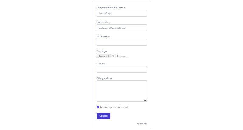
Collecting billing details? This form’s like your personal accountant. It’s all about keeping things in order.
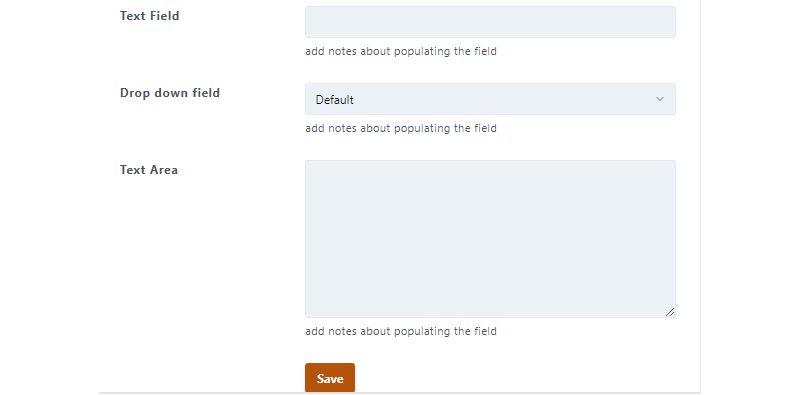
Tailwind CSS Update Forms (CRUD) – Flowbite’s Touch
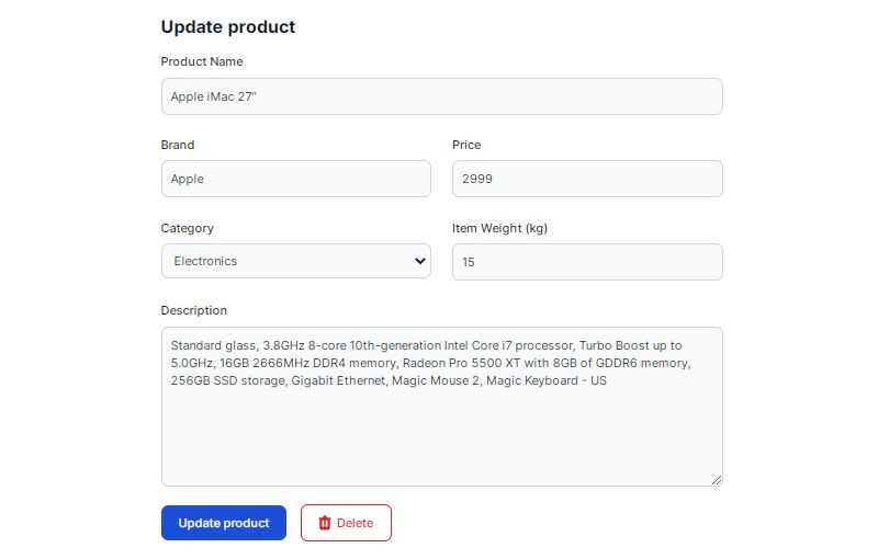
Updating data? This free CRUD form layout is like a control panel. Text fields, select boxes, and more. It’s like having a remote control for your data.
Subscription form: Stay in the Loop
Want to keep your customers updated? This subscription form is like a digital newsletter. Names, emails, and new products. It’s like a friendly reminder in your inbox.
Form With Links: Meraki UI’s Style

Looking for something special? Meraki UI’s got you covered. Split-screen design, contact form on one side, alternate methods on the other. It’s like having two tools in one.
Tailwind CSS Sales Lead Form: Get Those Leads

Need sales leads? This form’s like a magnet for gated content. It’s all about making connections.
Tailwind Form by Scott Zirkel: Play Around

Want a detailed form? Scott Zirkel’s Tailwind form is like a playground. Lots of input fields, maybe too many, but hey, you can change things. It’s like a customizable toy.
Tailwind CSS Contacts: TailGrids’ Templates
Contact forms, sections, and UI components. TailGrids’ Tailwind CSS templates are like building blocks for your contact page. It’s like having a designer on call.
Mamba UI: Dark Theme Magic
Got a dark theme site? Mamba UI’s contact form is like a perfect match. Add it to your Tailwind project, and voila! It’s like finding the perfect accessory for your outfit.
FAQ about Tailwind forms
Are There Any Free Resources for Tailwind Forms Examples?
Absolutely. You’ve got a buffet of freebies out there. Places like GitHub are gold mines with repositories chock-full of Tailwind CSS templates. Plus, the official Tailwind UI library serves up some tasty free examples for your form design needs, even if you’re just dipping your toes in.
How Do You Customize Tailwind Forms for Different Devices?
Customizing forms gets a whole lot easier with responsive design principles. Tailwind’s utility-first approach lets you pepper in classes that adapt layout and size. Think of it as giving your form a personal trainer—flexibility and strength for every screen, big or small.
Can Tailwind Forms Handle Validation?
They sure can. While Tailwind CSS isn’t a JavaScript sheriff, it plays nice with client-side validation scripts. Add in your fave JS for the logic, and use those Tailwind classes to visually communicate the validation states – success is green pastures, and errors like a stop sign.
What Makes Tailwind Forms Different from Bootstrap Forms?
Tailwind forms aren’t about ready-to-go components; they’re the Lego blocks for UI design. You get to decide the look piece by piece—utility-first means creativity unleashed. Meanwhile, Bootstrap serves you a prepared dish; it’s nice, but maybe you wanted to tweak the recipe a bit.
How Do I Ensure Tailwind Forms Are Accessible?
First, high-five for thinking about web accessibility! Tailwind form fields encourage A11y best practices. Use semantic HTML, proper labels for screen readers, and manage focus states. Accessibility with Tailwind isn’t an afterthought; it’s part of the process, like salt in a dish.
Can Tailwind Forms Be Integrated with React or Vue?
Certainly. They’re like that friend who gets along with everyone. Bring in your React state magic, or Vue’s reactive powers, and bind them with Tailwind’s styling. Cohesion between form and function, all while keeping it looking sharp.
What Are the Best Practices for Styling Tailwind Forms?
Stay consistent with rhythms and riffs. Meaning, keep spacing, color schemes, and font sizes uniform. Tailwind’s utility classes are perfect for creating a harmonious user interface design. Balance form and function, and you’ll have a form that’s both a sight to behold and a breeze to fill out.
How Can I Tackle Complex Form Layouts in Tailwind?
Think modular. Break that complex form into chunks. Take advantage of Tailwind’s grid and flex utilities to arrange fields and sections. It’s like Tetris – find the right fit for each part, and you’ll create a design that’s both intricate and coherent.
What Are Some Common Mistakes to Avoid with Tailwind Forms?
Don’t overclass. It’s tempting to slap a hundred classes everywhere, but moderation is key. Also, remember responsiveness—don’t let mobile users tap through a microscopic form. And keep an eye on form accessibility standards; everyone should have a hassle-free experience.
How Can I Improve User Experience with Tailwind Forms?
User Experience is king. Ensure your forms talk the user’s language – label clearly, provide helpful validation messages, and make the journey through the form enjoyable. Leverage Tailwind’s arsenal to sculpt an interactive form elements path that feels intuitive, like it’s guiding you through.
Conclusion
So, we’ve been on a bit of a journey, haven’t we? We scrolled through the colorful world of Tailwind forms examples, witnessed the mingling of utility classes and user interface design, and got our hands digitally dirty with all sorts of layouts and form elements.
What’s the big takeaway? With Tailwind, you’ve got the freedom to make forms as unique as a fingerprint, as accessible as your local grocery store, and as responsive as a quick-witted chatbot.
- Sleek styling? Check.
- Seamless user experience? Double-check.
- A boost in frontend bravado? You bet.
You’re now armed to the teeth with the knowledge to craft forms that could very well become the unsung heroes of user interfaces. Remember, in the sea of digital forms, make yours the lighthouse – clear, bright, and guiding your users safely home.
So go forth, summon those utility-first superpowers, and create something that even the screen-weary will want to engage with.
If you liked this article about Tailwind forms, you should check out this article about Tailwind buttons.
There are also similar articles discussing Tailwind navbars, Tailwind tables, Tailwind modals, and Tailwind tooltips.
And let’s not forget about articles on Tailwind cards, Tailwind dropdowns, Tailwind spinners, and Tailwind lists.