Buttons make or break your interface. They’re the primary way users interact with your site.
These Tailwind button examples show you exactly how to build buttons that look professional and work across every device.
You’ll learn the core utility classes for styling, hover effects, focus states, and size variations.
We cover primary buttons, outline styles, icon buttons, button groups, and loading states.
Each example includes copy-ready code you can drop into your frontend projects immediately.
Whether you’re building a simple landing page or a complex Tailwind dashboard, these patterns scale with your needs.
What is a Tailwind Button
A Tailwind button is an HTML button element styled using Tailwind CSS utility classes.
Instead of writing custom CSS, you apply pre-built classes directly in your markup.
This utility-first approach gives you full control over padding, colors, border radius, and hover states without leaving your HTML file.
Tailwind buttons work across React, Vue.js, Next.js, and plain HTML projects.
Tailwind Buttons Examples
Tailwind CSS Button Collection

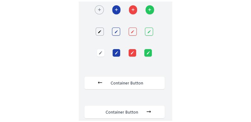
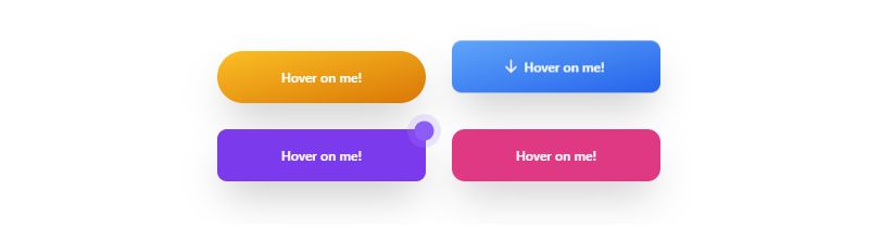
Fancy Tailwind Button with Icon
Hey, check out this fancy Tailwind button with an icon. It’s a creation by andrymuharyo. You can tweak it, twist it, make it your own. It’s all about your style and what you need.
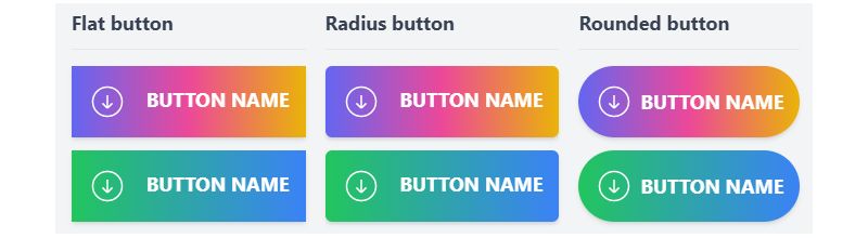
Tailwind CSS Gradient Button – A Colorful Experience

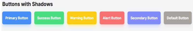
Shadows and More: Tailwind CSS Buttons
Modern Buttons – Tailwind / CSS: Style Meets Function
Glowing Gradient Button: Tailwind Magic

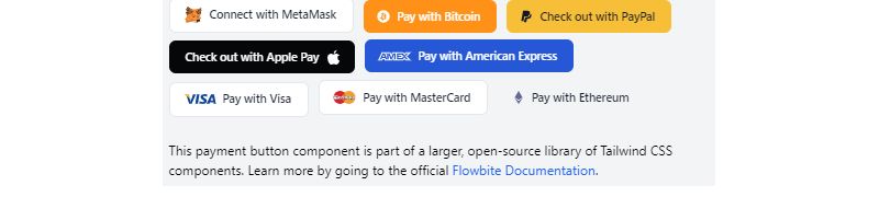
Payment Buttons: Tailwind at Checkout
Bouncy Tailwind CSS Download Button

Elevated Buttons: Tailwind Style

Outline Buttons: Tailwind CSS Collection

Material Buttons: Tailwind Art
Gradient Buttons Collection: Tailwind & More
Simple Animated Button: Tailwind Creativity

Tailwind CSS Search Input With Button: Find in Style

Tailwind CSS Button with Badge: Wear it Proud
Hover Magic: Tailwind Button Popups

Dropdown Delight: Tailwind CSS Button

Social Media Buttons: Tailwind Style

Premium Banner Around Button: Tailwind Art
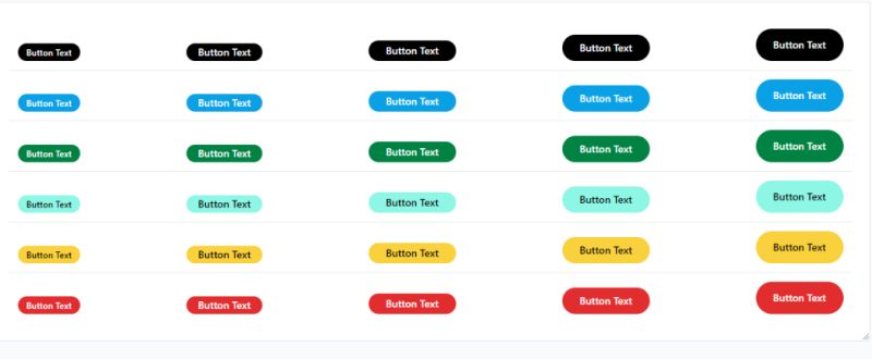
Pill Buttons: Tailwind CSS Collection

Hamburger Menu Button: Tailwind Animation

TechButton: Tailwind CSS 3 Button Template
Size Matters: Tailwind CSS Button Variants

Gradient Glory: Tailwind Buttons

Links with Buttons: Tailwind CSS Flowbite

Menu Button: Tailwind Flex

Tailwind CSS Button Group: A Symphony of Buttons

Buttons with a Twist: Tailwind and CSS Keyframes
Border Beauty: Tailwind Buttons with Border Bottom

Button with a Surprise: Loader Inside

Rounded Icon Buttons: Tailwind CSS Elegance
SVG Icons Meet Tailwind: Buttons with Style
Link Buttons: Tailwind CSS Magic

Loading Button: Tailwind CSS + Font Awesome
Play Media Button: Tailwind CSS Creation

How Do You Create a Button in Tailwind CSS
Start with a standard button element, then stack utility classes to define its appearance.
Here is a basic example:
“ <button class="bg-blue-500 text-white px-4 py-2 rounded"> Click me </button> `
The bg-blue-500 sets background color. The text-white handles text color. Padding comes from px-4 and py-2. The rounded class adds border radius.
That is the entire process. No separate stylesheet needed.
What Are the Core Tailwind Button Classes
Four class categories control most button styling: background, padding, border radius, and text.
Master these and you can build any button component.
What Is the bg Class for Button Background Color
The bg class sets button background color using Tailwind’s color palette.
Format: bg-{color}-{shade}. Shades range from 50 (lightest) to 950 (darkest).
- bg-blue-500 (standard blue)
- bg-red-600 (deeper red)
- bg-green-400 (lighter green)
- bg-gray-800 (dark gray)
What Is the px and py Class for Button Padding
The px class controls horizontal padding, py handles vertical.
Values use Tailwind’s spacing scale: 1 equals 0.25rem, 4 equals 1rem, 8 equals 2rem.
- px-2 py-1 (compact button)
- px-4 py-2 (standard button)
- px-6 py-3 (large button)
- px-8 py-4 (extra large)
What Is the rounded Class for Button Border Radius
The rounded class adds corner curvature to your button borders.
- rounded-none (sharp corners)
- rounded (default 0.25rem)
- rounded-md (0.375rem)
- rounded-lg (0.5rem)
- rounded-full (pill shape)
What Is the text Class for Button Text Styling
Text classes handle color, size, and font weight inside buttons.
- text-white, text-black, text-gray-700 (colors)
- text-sm, text-base, text-lg (sizes)
- font-medium, font-semibold, font-bold (weights)
What Are the Different Tailwind Button Styles
Five button styles cover most user interface needs.
Each serves a different purpose in your design system.
Primary Buttons
Primary buttons drive main actions like form submissions and checkouts.
Use solid backgrounds with high color contrast.
` <button class="bg-blue-600 text-white px-6 py-2 rounded-lg font-semibold"> Submit </button> `
Secondary Buttons
Secondary buttons handle less critical actions. Softer colors, lower visual weight.
` <button class="bg-gray-200 text-gray-800 px-6 py-2 rounded-lg font-medium"> Cancel </button> `
Outline Buttons
Outline buttons use transparent backgrounds with visible borders.
Good for secondary actions that still need visibility.
` <button class="border-2 border-blue-600 text-blue-600 px-6 py-2 rounded-lg bg-transparent"> Learn More </button> `
Ghost Buttons
Ghost buttons are minimal. No background, no border, just text.
` <button class="text-blue-600 px-4 py-2 font-medium"> Skip </button> `
Icon Buttons
Icon buttons pair SVG icons with text or stand alone.
Heroicons from Tailwind Labs works well here.
` <button class="bg-blue-600 text-white px-4 py-2 rounded-lg flex items-center gap-2"> <svg class="w-5 h-5" fill="currentColor" viewBox="0 0 20 20">...</svg> Download </button> `
How Do You Add Hover Effects to Tailwind Buttons
Tailwind uses the hover: prefix for micro-interactions on mouseover.
Stack it before any utility class to trigger on hover.
` <button class="bg-blue-600 hover:bg-blue-700 text-white px-6 py-2 rounded-lg transition-colors"> Hover Me </button> `
The transition-colors class adds smooth animation between states.
Common hover patterns:
- hover:bg-blue-700 (darken background)
- hover:scale-105 (slight grow effect)
- hover:shadow-lg (add box shadow)
- hover:opacity-90 (reduce opacity)
Combine multiple hover effects for richer button hover effects.
` <button class="bg-blue-600 hover:bg-blue-700 hover:shadow-lg hover:scale-105 text-white px-6 py-2 rounded-lg transition-all duration-200"> Interactive </button> `
How Do You Add Focus States to Tailwind Buttons
Focus states improve web accessibility by showing keyboard users which element is active.
Tailwind uses the focus: prefix to style these states.
` <button class="bg-blue-600 text-white px-6 py-2 rounded-lg focus:outline-none focus:ring-2 focus:ring-blue-400 focus:ring-offset-2"> Accessible Button </button> `
The focus:ring classes create visible focus indicators that meet ARIA guidelines.
Key focus utilities:
- focus:outline-none (removes default browser outline)
- focus:ring-2 (adds 2px ring width)
- focus:ring-blue-400 (ring color)
- focus:ring-offset-2 (gap between button and ring)
Always include visible focus states. Screen readers and keyboard navigation depend on them.
How Do You Create Disabled Buttons in Tailwind
Disabled buttons prevent user interaction and signal inactive states.
Add the disabled attribute plus the disabled: prefix for styling.
` <button disabled class="bg-blue-600 text-white px-6 py-2 rounded-lg disabled:bg-gray-400 disabled:cursor-not-allowed disabled:opacity-50"> Unavailable </button> `
Common disabled state patterns:
- disabled:bg-gray-400 (muted background)
- disabled:opacity-50 (reduced visibility)
- disabled:cursor-not-allowed (blocked cursor)
- disabled:pointer-events-none (no click events)
Disabled buttons communicate that an action requires completing other steps first, like filling out Tailwind forms.
What Are the Button Size Variations in Tailwind
Button sizes establish visual hierarchy and match different UI contexts.
Adjust padding and text size classes to create consistent size scales.
Small Buttons
Small buttons work for compact interfaces, Tailwind table actions, and inline elements.
` <button class="bg-blue-600 text-white px-3 py-1 text-sm rounded"> Small </button> `
Medium Buttons
Medium is the default size for most interactive elements.
` <button class="bg-blue-600 text-white px-4 py-2 text-base rounded-md"> Medium </button> `
Large Buttons
Large buttons suit call-to-action placements and Tailwind hero sections.
` <button class="bg-blue-600 text-white px-8 py-4 text-lg rounded-lg"> Large </button> `
How Do You Create Button Groups in Tailwind
Button groups combine related actions into a single visual unit.
Use flexbox utilities and remove inner border radius for connected buttons.
` <div class="flex"> <button class="bg-blue-600 text-white px-4 py-2 rounded-l-lg">Left</button> <button class="bg-blue-600 text-white px-4 py-2 border-l border-blue-400">Center</button> <button class="bg-blue-600 text-white px-4 py-2 rounded-r-lg border-l border-blue-400">Right</button> </div> `
The rounded-l-lg and rounded-r-lg classes handle end caps while inner buttons stay flat.
Button groups appear in Tailwind pagination, toolbars, and segmented controls.
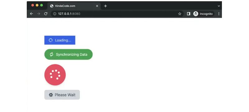
How Do You Add Loading States to Tailwind Buttons
Loading states show users that an action is processing.
Combine a Tailwind spinner with disabled styling.
` <button disabled class="bg-blue-600 text-white px-6 py-2 rounded-lg flex items-center gap-2 disabled:opacity-75"> <svg class="animate-spin h-5 w-5" viewBox="0 0 24 24"> <circle class="opacity-25" cx="12" cy="12" r="10" stroke="currentColor" stroke-width="4"></circle> <path class="opacity-75" fill="currentColor" d="M4 12a8 8 0 018-8V0C5.373 0 0 5.373 0 12h4z"></path> </svg> Processing... </button> `
The animate-spin class rotates the spinner icon continuously.
JavaScript toggles between normal and loading states based on form submission or API calls.
How Do You Create Responsive Buttons in Tailwind
Responsive design requires buttons that adapt across screen sizes.
Tailwind’s breakpoint prefixes (sm:, md:, lg:, xl:) handle this through media queries.
` <button class="w-full sm:w-auto bg-blue-600 text-white px-4 sm:px-6 py-2 sm:py-3 text-sm sm:text-base rounded-lg"> Responsive </button> `
This button spans full width on mobile, then shrinks to content width on larger screens.
Key responsive patterns:
- w-full sm:w-auto (full width mobile, auto desktop)
- px-4 md:px-6 lg:px-8 (increasing padding)
- text-sm md:text-base (scaling text size)
- hidden sm:inline-flex (show/hide at breakpoints)
Test buttons across viewport sizes using Chrome DevTools responsive mode.
The mobile-first design approach means base classes target small screens, then breakpoint prefixes override for larger displays.
FAQ on Tailwind Button Examples
How Do I Create a Basic Button in Tailwind CSS?
Add utility classes directly to your button element. Use bg-blue-500 for background, text-white for color, px-4 py-2 for padding, and rounded for border radius.
No separate stylesheet required.
What Classes Make a Button Rounded in Tailwind?
Use rounded for slight curves, rounded-md for medium, rounded-lg for larger curves, or rounded-full for pill-shaped buttons.
Each class applies a different border-radius value to your button corners.
How Do I Add Hover Effects to Tailwind Buttons?
Prefix any utility class with hover: to trigger on mouseover. Common patterns include hover:bg-blue-700 for darker backgrounds and hover:scale-105 for growth effects.
Add transition-all for smooth animations.
Can I Create Outline Buttons in Tailwind CSS?
Yes. Set bg-transparent for no fill, add border-2 border-blue-600 for the outline, and use text-blue-600 for matching text color.
Outline buttons work well as secondary actions.
How Do I Make Buttons Responsive in Tailwind?
Use breakpoint prefixes like sm:, md:, and lg: before utility classes. A common pattern is w-full sm:w-auto, making buttons full-width on mobile and auto-width on larger screens.
What Is the Best Way to Add Icons to Tailwind Buttons?
Place an SVG in HTML inside your button element. Use flex items-center gap-2 on the button to align the icon with text.
Heroicons pairs well with Tailwind projects.
How Do I Disable a Button in Tailwind CSS?
Add the disabled attribute to your button, then style with disabled: prefix classes. Use disabled:bg-gray-400, disabled:opacity-50, and disabled:cursor-not-allowed for standard disabled appearance.
Can I Create Button Groups in Tailwind?
Wrap buttons in a flex container. Remove inner border radius and use rounded-l-lg on the first button, rounded-r-lg on the last.
Add border-l classes between buttons for separation.
How Do I Add Loading States to Buttons?
Insert an animated spinner using the animate-spin class on an SVG icon. Disable the button during loading and update text to show progress.
Toggle states with Ajax or framework methods.
What Is the Difference Between Tailwind Buttons and Bootstrap Buttons?
Tailwind uses utility classes you combine yourself, while Bootstrap button components come pre-styled.
Tailwind offers more customization. Bootstrap provides faster implementation with less flexibility.
Conclusion
These Tailwind button examples give you a solid foundation for building reusable button components in any project.
You now understand the core utility classes for backgrounds, padding, border radius, and text styling.
Hover effects, focus states, and disabled styling handle user interaction patterns. Size variations create clear usability across your interface.
Button groups and loading states cover advanced use cases.
The responsive patterns ensure your buttons work on every screen size with cross-browser compatibility.
Start with primary and secondary buttons. Then expand to Tailwind modal triggers, Tailwind navbar actions, and Tailwind card components.
Copy these code snippets, customize the colors to match your design system, and build faster.