
Users abandon pages that feel frozen. A spinning loader tells them something is happening.
Building Tailwind spinner examples takes just a few utility classes, no custom stylesheets required.
The animate-spin class handles rotation. Border utilities create the shape. You get a working loading indicator in under a minute.
This guide covers border spinners, dot loaders, pulse animations, and SVG ring variants.
You will learn how to size them, color them, center them, and make them accessible.
Each example includes copy-ready code that works in any React project using Tailwind or plain HTML setup.
What is a Tailwind Spinner
A Tailwind spinner is a loading animation component built with utility classes from the Tailwind CSS framework.
It provides visual feedback during asynchronous operations like API requests, form submissions, or page transitions.
Unlike traditional CSS loaders that require custom stylesheets, Tailwind spinners use predefined utility classes directly in your HTML markup.
The animate-spin class handles the rotation. Border utilities create the circular shape. Color classes add visual styling.
Most Tailwind spinners render in under 1KB of code, making them lightweight for frontend projects.
Tailwind Spinner Examples
Tailwind CSS Spinner – Flowbite

Centered spinner By tesar-tech
Tailwind spinner – loading spinner component

Tailwind CSS Spinner / Loader

Tailwind CSS Spinner inside button

Loading spinner examples

Tailwind CSS loading Spinner Examples
Awesome Loading spinner

Ovel shaped loading spinner

Tailwind CSS Spinners – Preline

Clean spinner

Loding spinner with image inside

ReactJS loading spinner using tailwind CSS
Gradient Spinner

Tailwind Spinner

Full Page loading overlay

Svelte Spinner – Flowbite

Spinner By Mohamed-Kaizen

Dashed spinners

Tailwind CSS simple colorful spinner

Animate-spin spinner

Tailwind CSS double border spinner

Spinners with shadow

How Does a Tailwind CSS Loading Spinner Work
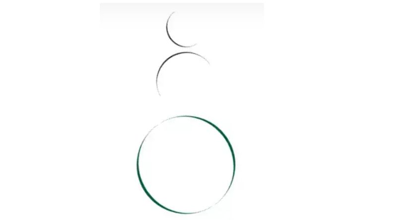
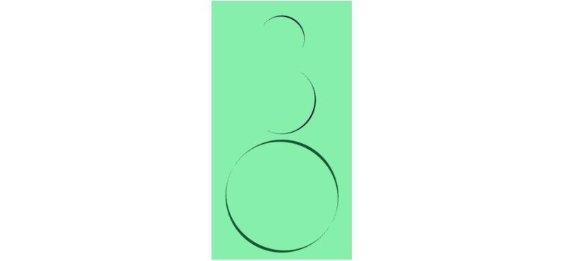
The spinner relies on CSS keyframes that Tailwind includes by default.
When you apply animate-spin, the framework triggers a 360-degree rotation that loops infinitely.
The animation runs at a linear timing function, creating smooth continuous movement without acceleration or deceleration.
Border transparency on one side creates the visual gap that makes rotation visible. Without this gap, you would see a static circle.
What CSS Classes Create the Spin Animation in Tailwind
The core class is animate-spin, which applies a one-second infinite rotation.
Supporting classes include rounded-full for circular shape, border-4 for thickness, and border-t-transparent for the visual gap.
What Are the Types of Tailwind Spinners
Tailwind supports multiple spinner patterns through different class combinations.
Each type serves specific user interface contexts and loading scenarios.
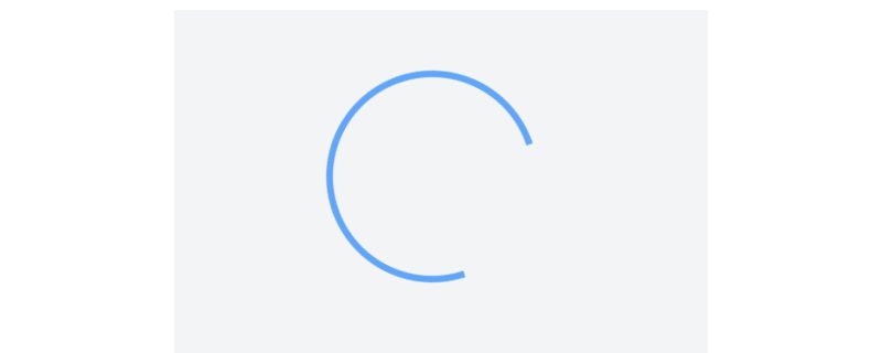
What is a Border Spinner in Tailwind
The border spinner uses border utilities with one transparent side. It is the most common pattern, requiring only four classes: animate-spin rounded-full border-4 border-t-transparent.
What is a Dot Spinner in Tailwind
Dot spinners use multiple small circles with staggered CSS animations. They require custom animation delays applied to each dot element.
What is a Pulse Loader in Tailwind
The pulse loader uses animate-pulse instead of spin. It creates a fading opacity effect, useful for skeleton screen patterns and content placeholders.
What is a Ring Spinner in Tailwind
Ring spinners use SVG elements with stroke animations. They offer more control over thickness and can display progress percentages.
How to Create a Custom Tailwind Spinner
Custom spinners extend the default animate-spin behavior through Tailwind’s configuration file or arbitrary values.
You can modify size, color, speed, and border thickness without writing traditional CSS stylesheets.
What Size Options Exist for Tailwind Spinners
Width and height utilities control spinner dimensions:
w-4 h-4(16px) for inline button spinnersw-8 h-8(32px) for standard loadersw-12 h-12(48px) for prominent loading statesw-16 h-16(64px) for full-page overlays
What Colors Can Tailwind Spinners Use
Border color utilities like border-blue-500 or border-indigo-600 style the visible portion.
For proper color contrast, pair dark spinners with light backgrounds and light spinners with dark backgrounds.
How to Adjust Spinner Speed in Tailwind
The default spin duration is one second. Override it using arbitrary values: animate-[spin0.5slinearinfinite] for faster rotation or animate-[spin2slinearinfinite] for slower.
How to Add a Spinner to a Tailwind Button
Button spinners appear during form submission or async actions, replacing or accompanying the button text.
Combine the spinner with disabled state styling on your Tailwind button to prevent double submissions.
“ <button type="submit" class="flex items-center gap-2 px-4 py-2 bg-blue-600 text-white rounded disabled:opacity-50" disabled> <span class="animate-spin h-4 w-4 border-2 border-white border-t-transparent rounded-full"></span> Processing... </button> `
What is the Best Spinner Position Inside a Button
Left placement works best for action buttons since users read left-to-right. Use flex items-center gap-2 for consistent spacing between spinner and text.
How to Center a Spinner in Tailwind
Centering a loading indicator requires positioning utilities that work across different container types.
Tailwind’s flexbox and grid system classes handle both horizontal and vertical alignment.
Flexbox Centering Method
Apply flex items-center justify-center to the parent container. The spinner centers automatically regardless of its size.
` <div class="flex items-center justify-center h-screen"> <div class="animate-spin h-12 w-12 border-4 border-blue-500 border-t-transparent rounded-full"></div> </div> `
Grid Centering Method
Use grid place-items-center for single-line centering. Cleaner syntax, same result.
Absolute Positioning Method
For overlay spinners, combine absolute inset-0 with flexbox centering on the parent. Works inside Tailwind modals and card components.
What Are Accessible Tailwind Spinner Practices
Loading animations must communicate state changes to all users, including those using screen readers.
Web accessibility guidelines require non-visual alternatives for animated content.
ARIA Attributes for Spinners
Add role=”status” and aria-label=”Loading” to the spinner element. This announces the loading state to assistive technology.
` <div role="status" aria-label="Loading" class="animate-spin h-8 w-8 border-4 border-indigo-600 border-t-transparent rounded-full"> <span class="sr-only">Loading...</span> </div> `
Screen Reader Text
The sr-only class hides text visually while keeping it accessible. Place descriptive text inside the spinner element using this utility from ARIA best practices.
Motion Sensitivity Considerations
Some users experience discomfort from animations. Use motion-reduce:animate-none to disable spin effects when the user has enabled reduced motion in their system preferences.
What Are Common Tailwind Spinner Mistakes
Several implementation errors reduce spinner effectiveness or break functionality entirely.
Missing Animation Class
Forgetting animate-spin renders a static circle. Double-check this class exists on the rotating element, not the container.
Incorrect Border Setup
All four borders set to the same color produces no visible rotation. You need border-t-transparent (or another side) to create the visual indicator gap.
Poor Color Contrast
Light gray spinners on white backgrounds fail usability standards. Test spinner visibility across all background colors in your design system.
Oversized Inline Spinners
Large spinners inside buttons or form inputs break layout flow. Match spinner height to text line-height: h-4 for standard buttons, h-5 for larger ones.
No Loading State Management
Spinners that never disappear frustrate users. Connect spinner visibility to actual API response states using JavaScript or framework reactivity.
Missing Fallback for Slow Connections
Add timeout logic that displays alternative content or error messages after extended loading periods. Ten seconds is a reasonable threshold before showing retry options.
FAQ on Tailwind Spinner Examples
How Do I Create a Basic Spinner in Tailwind CSS?
Apply animate-spin rounded-full border-4 border-blue-500 border-t-transparent to a div element with width and height utilities like h-8 w-8.
The transparent border creates the visual gap that makes rotation visible.
Why Is My Tailwind Spinner Not Spinning?
The animate-spin class is likely missing or overridden. Check that your Tailwind configuration includes the animation utilities.
Verify the class appears on the element itself, not just the parent container.
How Do I Change the Color of a Tailwind Spinner?
Use border color utilities like border-indigo-600 or border-red-500 for the visible portion.
Keep border-t-transparent on one side to maintain the spinning effect.
How Do I Make a Tailwind Spinner Larger or Smaller?
Adjust width and height classes together. Use h-4 w-4 for small inline spinners, h-12 w-12 for standard loaders, or h-16 w-16 for full-page loading overlays.
How Do I Center a Spinner on the Page?
Wrap the spinner in a container with flex items-center justify-center h-screen.
For overlay spinners inside Tailwind cards, use absolute inset-0 with the same flex utilities.
Can I Use Tailwind Spinners With React or Vue?
Yes. Tailwind utility classes work in any framework. Create a reusable spinner component that accepts size and color props.
Toggle visibility with conditional rendering based on your loading state.
How Do I Add a Spinner Inside a Button?
Use flex items-center gap-2 on the button to align spinner and text.
Add a small spinner (h-4 w-4) before the label and disable the button during loading to prevent double submissions.
How Do I Make My Tailwind Spinner Accessible?
Add role=”status” and aria-label=”Loading” to the spinner element.
Include a sr-only span with descriptive text for screen readers following web accessibility checklist standards.
How Do I Change the Spinner Animation Speed?
Override the default one-second duration with arbitrary values. Use animate-[spin0.5slinearinfinite] for faster rotation or animate-[spin2slinearinfinite] for slower, smoother movement.
What Is the Difference Between animate-spin and animate-pulse?
The animate-spin class rotates elements 360 degrees continuously. The animate-pulse class fades opacity in and out, better suited for placeholder content and skeleton loading patterns.
Conclusion
These Tailwind spinner examples give you ready-to-use loading indicators for any project.
The framework handles animation timing, rotation, and styling through simple class combinations.
Pick the right spinner type for your context. Border spinners work for quick operations. Pulse loaders fit content placeholders. Ring spinners suit progress tracking.
Size matters. Match spinner dimensions to surrounding elements for visual balance.
Accessibility cannot be skipped. Add ARIA roles and screen reader text to every loading component you build.
Test your spinners on slow connections. Users on 3G networks experience longer waits, and your user experience depends on how loading states behave under pressure.
Start with the basic border spinner, then customize as your responsive design requirements grow.


