
Dropdowns look simple until you build one from scratch.
Positioning, animations, click-outside detection, keyboard support. These Tailwind dropdown examples solve all of it with copy-ready code.
Tailwind CSS utility classes make dropdown components faster to build than traditional frameworks. No custom stylesheets. No fighting specificity wars.
This guide covers basic menus to advanced implementations with Alpine.js and React.
You’ll find working code for navigation dropdowns, select inputs, mega menus, and animated panels. Each example includes the exact utility classes for positioning, shadows, and CSS page transitions.
Whether you’re building a Tailwind sidebar or a complex multi-level menu, these patterns will save you hours of trial and error.
What is a Tailwind Dropdown
A Tailwind dropdown is a collapsible UI component built with Tailwind CSS utility classes.
It displays hidden content when a user clicks or hovers over a trigger element.
The component uses utility-first CSS to style menus, selection lists, and navigation items without custom stylesheets.
Adam Wathan created Tailwind Labs to provide this atomic CSS approach. The framework pairs well with Alpine.js and Headless UI for toggle functionality.
How Does a Tailwind Dropdown Work
A trigger element (button, link, icon) activates the dropdown panel through JavaScript event listeners or CSS pseudo-classes like :focus-within.
The panel uses absolute positioning inside a relative container, with opacity and transform classes handling visibility transitions.
What Are the Main Components of a Tailwind Dropdown
- Trigger element – button or link that activates the menu
- Dropdown panel – container holding menu items
- Menu items – clickable options inside the panel
- Overlay – optional backdrop for click-outside detection
Tailwind Dropdown Menus
Flowbite’s Take on Tailwind CSS Dropdown

Nested Magic by Emrys11
Maddog986’s Select Dropdown

All Things Dropdown with Tailwind Elements

Alok’s No-JS Magic
M.Appelman’s TailwindCSS Dropdown Delight

Akshay’s Onhover Dropdown

Surjithctly’s Animated Dropdown

Preline’s Dropdown

BBBootstrap’s Tailwind Dropdown Menu

Iconic User Dropdown

The No-JS FAQ Dropdown

Vue’s TDropdown Magic

Stay Notified with khatabwedaa

TUK’s Tailwind Dropdown Delight

Flowbite’s Svelte Dropdown

Simple Yet Sassy Dropdowns
Level Up with Icons
Zoltanszogyenyi’s Dropdown Delight

Dropdown Components Ready to Rock

Rob’s Iconic Dropdown

Types of Tailwind Dropdowns
Different dropdown types serve different purposes in user interface design.
Your choice depends on content structure and user needs.
What is a Navigation Dropdown in Tailwind
Navigation dropdowns organize site links into collapsible categories within a Tailwind navbar.
Common in headers and hamburger menus for mobile-first layouts.
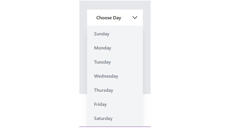
What is a Select Dropdown in Tailwind
A Tailwind select dropdown replaces native browser select elements with styled alternatives.
Supports single selection, custom styling, and keyboard navigation for form inputs.
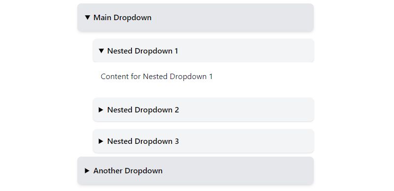
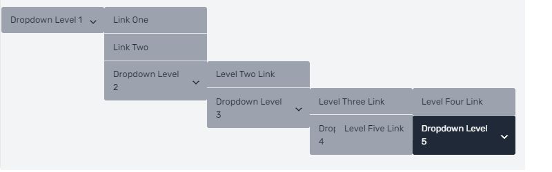
What is a Multi-Level Dropdown in Tailwind
Multi-level dropdowns contain nested submenus that expand on hover or click.
Requires careful z-index stacking and positioning to prevent overlap issues.
What is a Mega Menu Dropdown in Tailwind
Mega menus display multiple columns of links, images, and content in a large panel.
Best for e-commerce sites and content-heavy platforms with complex information architecture.
Tailwind Dropdown Examples
These dropdown implementations cover common use cases with copy-ready code.
Each example works with Tailwind CSS v3.x and v4.x.
Basic Tailwind Dropdown Example
The simplest dropdown using HTML structure with Tailwind utility classes:
“ <div class="relative inline-block"> <button class="px-4 py-2 bg-blue-600 text-white rounded-lg"> Menu </button> <div class="absolute mt-2 w-48 bg-white rounded-md shadow-lg hidden group-focus:block"> <a href="#" class="block px-4 py-2 hover:bg-gray-100">Option 1</a> <a href="#" class="block px-4 py-2 hover:bg-gray-100">Option 2</a> <a href="#" class="block px-4 py-2 hover:bg-gray-100">Option 3</a> </div> </div> `
The relative container positions the absolute panel. Toggle visibility with JavaScript or CSS :focus states.
Tailwind Dropdown with Icons Example
Adding Heroicons or SVG icons to menu items:
` <div class="absolute mt-2 w-56 bg-white rounded-md shadow-lg"> <a href="#" class="flex items-center px-4 py-2 hover:bg-gray-100"> <svg class="w-5 h-5 mr-3 text-gray-400">...</svg> Edit </a> <a href="#" class="flex items-center px-4 py-2 hover:bg-gray-100"> <svg class="w-5 h-5 mr-3 text-gray-400">...</svg> Delete </a> </div> `
Use flex items-center to align icons with text. The mr-3 class adds spacing between icon and label.
Tailwind Dropdown with Dividers Example
Separating menu sections with horizontal lines:
` <div class="py-1"> <a href="#" class="block px-4 py-2">Account Settings</a> <a href="#" class="block px-4 py-2">Preferences</a> <div class="border-t border-gray-200 my-1"></div> <a href="#" class="block px-4 py-2 text-red-600">Sign Out</a> </div> `
The border-t class creates the divider. Add my-1 for vertical spacing around the line.
Tailwind Dropdown with Search Input Example
Filterable dropdown with a Tailwind input field:
` <div class="absolute mt-2 w-64 bg-white rounded-md shadow-lg"> <div class="p-2"> <input type="text" placeholder="Search..." class="w-full px-3 py-2 border rounded-md focus:outline-none focus:ring-2"> </div> <div class="max-h-48 overflow-y-auto"> <a href="#" class="block px-4 py-2 hover:bg-gray-100">Result 1</a> <a href="#" class="block px-4 py-2 hover:bg-gray-100">Result 2</a> </div> </div> `
The max-h-48 overflow-y-auto creates a scrollable list. JavaScript filters items based on input value.
Tailwind Animated Dropdown Example
Adding CSS animation with transition utilities:
` <div class="absolute mt-2 w-48 bg-white rounded-md shadow-lg transform transition-all duration-200 ease-out opacity-0 scale-95 group-focus:opacity-100 group-focus:scale-100"> <!-- menu items --> </div> `
The transition-all duration-200 smooths the animation. Scale and opacity changes create a subtle fade-in effect similar to micro-interactions.
Tailwind Dropdown with Alpine.js Example
Using Alpine.js for state management and click-outside handling:
` <div x-data="{ open: false }" class="relative"> <button @click="open = !open" class="px-4 py-2 bg-blue-600 text-white rounded-lg"> Menu </button> <div x-show="open" @click.away="open = false" x-transition:enter="transition ease-out duration-200" x-transition:enter-start="opacity-0 scale-95" x-transition:enter-end="opacity-100 scale-100" class="absolute mt-2 w-48 bg-white rounded-md shadow-lg"> <a href="#" class="block px-4 py-2 hover:bg-gray-100">Option 1</a> </div> </div> `
Caleb Porzio created Alpine.js specifically for this kind of toggle functionality. The @click.away directive closes the menu when clicking outside.
Tailwind Dropdown with React Example
React component using useState hook, perfect when using Tailwind CSS in React:
` function Dropdown() { const [open, setOpen] = useState(false);
return ( <div className=”relative”> <button onClick={() => setOpen(!open)} className=”px-4 py-2 bg-blue-600 text-white rounded-lg”> Menu </button> {open && ( <div className=”absolute mt-2 w-48 bg-white rounded-md shadow-lg”> <a href=”#” className=”block px-4 py-2 hover:bg-gray-100″>Option 1</a> </div> )} </div> ); } `
Add a click-outside hook or use Headless UI’s Menu component for production apps.
Tailwind Responsive Dropdown Example
Adapting dropdown behavior across breakpoints with responsive design:
` <div class="relative"> <!-- Full dropdown on desktop --> <div class="hidden md:block absolute mt-2 w-48 bg-white rounded-md shadow-lg"> <a href="#">Option 1</a> </div>
<!– Full-width on mobile –> <div class=”md:hidden fixed inset-x-0 bottom-0 bg-white rounded-t-xl shadow-lg”> <a href=”#”>Option 1</a> </div> </div> `
Mobile uses fixed positioning with inset-x-0 bottom-0 for a bottom sheet pattern. Desktop shows traditional absolute positioning.
How to Create a Tailwind Dropdown
Building a dropdown requires proper markup structure and utility class combinations.
What HTML Structure Does a Tailwind Dropdown Need
Minimum structure: a relative wrapper, trigger element, and absolutely positioned panel.
` <div class="relative"> <!-- wrapper --> <button>Trigger</button> <!-- trigger --> <div class="absolute"> <!-- panel --> <!-- items --> </div> </div> `
Which Tailwind Classes Are Used for Dropdown Positioning
- relative
- establishes positioning context on wrapper
- absolute
- removes panel from document flow
- mt-2
- adds gap between trigger and panel
- top-full
- positions below trigger
- right-0
orleft-0- horizontal alignment
- z-50
- ensures panel appears above other content
How to Show and Hide a Tailwind Dropdown
Three common approaches:
- CSS only – use group
andgroup-focus:blockorpeerclasses
- Alpine.js – toggle with x-show
directive
- JavaScript – add/remove hidden
class via event handlers
How to Add Keyboard Navigation to Tailwind Dropdowns
Keyboard support requires ARIA attributes and JavaScript for web accessibility.
Add role=”menu”, aria-expanded, and aria-haspopup to elements. Handle Arrow keys, Enter, Escape, and Tab with event listeners.
Tailwind Dropdown Styling Options
Customize appearance using Tailwind’s utility classes without writing custom CSS.
How to Change Tailwind Dropdown Colors
Apply background and text color utilities:
` <!-- Light theme --> <div class="bg-white text-gray-900">
<!– Dark theme –> <div class=”bg-gray-800 text-white”>
<!– Hover states –> <a class=”hover:bg-blue-50 hover:text-blue-600″> `
How to Add Shadows to Tailwind Dropdowns
Shadow utilities add depth, similar to CSS hover effects:
- shadow-sm
- subtle elevation
- shadow-lg
- standard dropdown shadow
- shadow-xl
- prominent floating effect
- shadow-2xl
- maximum depth
How to Round Corners on Tailwind Dropdowns
Border radius options:
- rounded-md
- 6px radius, most common
- rounded-lg
- 8px radius
- rounded-xl
- 12px radius for softer look
How to Add Borders to Tailwind Dropdowns
Border utilities for defined edges:
` <div class="border border-gray-200 rounded-md"> <!-- or with specific sides --> <div class="border-t border-gray-100"> `
Combine with divide-y divide-gray-100 to add borders between menu items automatically.
FAQ on Tailwind Dropdown Examples
How do I create a basic dropdown in Tailwind CSS?
Wrap a button and panel inside a relative container. Position the panel with absolute and mt-2 classes.
Toggle visibility using Alpine.js, React state hooks, or CSS :focus-within pseudo-class. Add z-50 to prevent stacking issues.
Why is my Tailwind dropdown not showing?
Check for missing relative on the parent container. The absolute panel needs a positioned ancestor.
Verify the hidden class is being removed on click. Inspect z-index conflicts with other elements like Tailwind modals or headers.
How do I close a Tailwind dropdown when clicking outside?
Alpine.js handles this with @click.away=”open = false” directive. For vanilla JavaScript, add a document click listener that checks if the target is outside the dropdown container.
Headless UI includes this behavior by default.
Can I make a Tailwind dropdown without JavaScript?
Yes. Use the group class on the wrapper and group-focus-within:block on the panel. The dropdown stays open while any child has focus.
Limited compared to JS solutions but works for simple CSS menus.
How do I add animations to a Tailwind dropdown?
Apply transition-all duration-200 with opacity-0 scale-95 as the hidden state. Toggle to opacity-100 scale-100 when open.
Alpine.js offers x-transition directives for cleaner animation control.
What is the best way to position a Tailwind dropdown?
Use top-full for below trigger, bottom-full for above. Align horizontally with left-0 or right-0.
For dynamic positioning that avoids viewport edges, use Floating UI library with Tailwind.
How do I make a Tailwind dropdown accessible?
Add aria-expanded, aria-haspopup=”true”, and role=”menu” attributes. Implement keyboard navigation for Arrow keys, Enter, and Escape.
Include focus management following web accessibility checklist standards and WCAG 2.1 guidelines.
How do I create a multi-level nested dropdown in Tailwind?
Each submenu needs its own relative wrapper inside the parent menu item. Position submenus with left-full top-0 to appear beside the parent.
Manage multiple open states with separate Alpine.js variables or React state objects.
What is the difference between Tailwind dropdown and Bootstrap dropdown?
Tailwind requires manual JavaScript setup while Bootstrap dropdown includes built-in toggle functionality. Tailwind offers more styling flexibility with utility classes.
Bootstrap provides faster implementation. Tailwind vs Bootstrap depends on project needs.
How do I style dropdown items on hover in Tailwind?
Apply hover:bg-gray-100 for background changes. Add hover:text-blue-600 for color shifts.
Combine multiple hover utilities like hover:bg-gray-50 hover:text-gray-900 for subtle CSS link hover effects on menu items.
Conclusion
These Tailwind dropdown examples give you production-ready code for any project.
From basic toggle menus to complex mega menu implementations, each pattern uses utility-first CSS for consistent component styling.
The key takeaways: use relative and absolute` positioning, add proper ARIA attributes for screen reader support, and pick the right state management approach for your stack.
Vue.js, Next.js, or vanilla JavaScript all work. Headless UI simplifies accessible dropdown patterns if you need built-in keyboard navigation and focus trap functionality.
Start with the basic example. Add animations once it works. Build your design system one dropdown at a time.
Need more UI components? Check out Tailwind button styles and Tailwind card layouts to complete your frontend toolkit.


