Tooltips are small. Their impact on usability is not.
These hover-triggered popups clarify icons, explain form fields, and guide users without cluttering your layout.
Building them with Tailwind CSS means no custom stylesheets, no bloated plugins.
Just utility classes that work.
This collection of Tailwind tooltip examples covers everything from basic implementations to animated, accessible, and responsive variants.
You will learn positioning techniques, color theming, CSS-only builds, JavaScript integrations, and component library options like Flowbite and daisyUI.
Each example includes copy-ready code.
What is a Tailwind Tooltip
A Tailwind tooltip is a small popup element that displays extra information when users hover over or focus on a trigger element.
Built entirely with Tailwind CSS utility classes, these components require no custom stylesheets.
Tooltips appear above buttons, icons, or text links to clarify meaning without cluttering the user interface.
Common uses include form field hints, icon explanations, and abbreviated text expansions.
Tailwind Tooltip Examples
Tailwind CSS Tooltips Collection

Tailwind Elements’ Tooltip Magic

Harrishash’s Generous Tooltip Gift

Flowbite’s Tooltip Extravaganza

ThannhNhut’s Stylish Tooltip Solution

TailGrids’ Tooltip Treasure

Material Tailwind’s Tooltip Delight

Tailwind and Alpine’s Tooltip Masterpiece

Flowbite’s Svelte Magic

Horizon UI’s React Spin
Robstinson’s Lo-fi Version

MerakiUI’s Ready-to-Use Components

TUK’s Tooltip Extravaganza

Prashant’s Right Aligned Masterpiece

Notus JS’s Tooltip Dance

JefteCaro’s Flipping Magic

Keepin’ It Simple

Radix’s Informative Pop-Up

How Does a Tailwind Tooltip Work
Tailwind tooltips rely on CSS positioning and visibility toggling through utility classes.
The trigger element wraps around a hidden tooltip container that becomes visible on hover or focus states.
What CSS Classes Control Tooltip Visibility
The invisible and opacity-0 classes hide the tooltip by default.
On hover, group-hover:visible and group-hover:opacity-100 reveal it.
The z-index utility (like z-50) keeps tooltips above other page elements.
What Triggers a Tailwind Tooltip to Appear
The group hover pattern is the standard approach.
Add group to the parent container, then use group-hover: modifiers on the tooltip element.
Focus states work too with group-focus:visible for keyboard accessibility.
How to Create a Basic Tailwind Tooltip
A working tooltip needs just two elements: a trigger and the tooltip content itself.
The entire component uses pure CSS with no JavaScript required for basic implementations.
What HTML Structure Does a Tooltip Require
The HTML structure follows this pattern:
- Parent wrapper with
relativeandgroupclasses - Trigger element (button, link, or icon)
- Tooltip container with
absolutepositioning
“ <div class="relative group"> <button>Hover me</button> <div class="absolute invisible group-hover:visible"> Tooltip text here </div> </div> `
What Utility Classes Style a Basic Tooltip
Core styling classes for the tooltip container:
- bg-gray-900 text-white
for dark theme
- px-3 py-2
for padding
- rounded-md
for border radius
- text-sm
for font sizing
- whitespace-nowrap
to prevent text wrapping
- shadow-lg
for depth
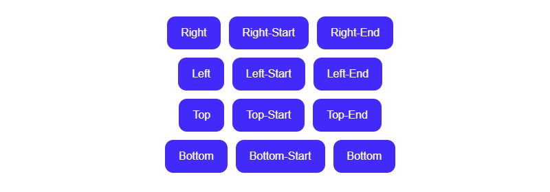
Tailwind Tooltip Position Variations
Tooltip placement depends on absolute positioning classes combined with transform utilities.
Four standard positions exist: top, bottom, left, and right.
How to Position a Tooltip on Top
Use bottom-full to place the tooltip above the trigger.
Add left-1/2 -translate-x-1/2 for horizontal centering and mb-2 for spacing.
` <div class="absolute bottom-full left-1/2 -translate-x-1/2 mb-2"> Top tooltip </div> `
How to Position a Tooltip on Bottom
Replace bottom-full with top-full and change margin to mt-2.
The transform classes stay the same for centering.
` <div class="absolute top-full left-1/2 -translate-x-1/2 mt-2"> Bottom tooltip </div> `
How to Position a Tooltip on Left
Use right-full for left placement with top-1/2 -translate-y-1/2 for vertical centering.
Add mr-2 to create space between tooltip and trigger.
` <div class="absolute right-full top-1/2 -translate-y-1/2 mr-2"> Left tooltip </div> `
How to Position a Tooltip on Right
Switch to left-full and use ml-2 for the gap.
Vertical centering remains top-1/2 -translate-y-1/2.
` <div class="absolute left-full top-1/2 -translate-y-1/2 ml-2"> Right tooltip </div> `
How to Add Animations to Tailwind Tooltips
Smooth CSS animations make tooltips feel polished instead of abrupt.
Tailwind’s transition utilities handle fade and scale effects without custom code.
What Classes Control Tooltip Fade Effects
Add transition-opacity to the tooltip element.
Pair opacity-0 (default) with group-hover:opacity-100 for the fade effect.
This creates smooth micro-interactions that improve user experience.
What Classes Control Tooltip Transition Duration
Duration classes: duration-150, duration-200, duration-300.
Easing options include ease-in, ease-out, and ease-in-out.
A typical setup: transition-opacity duration-200 ease-in-out.
` <div class="absolute bottom-full left-1/2 -translate-x-1/2 mb-2 opacity-0 group-hover:opacity-100 transition-opacity duration-200 ease-in-out bg-gray-900 text-white px-3 py-2 rounded-md text-sm"> Animated tooltip </div> `
Tailwind Tooltip Color Variations
Tooltip theming matches your site’s design system through simple class swaps.
Dark, light, and colored variants each serve different visual hierarchy needs.
How to Create a Dark Tooltip
Dark tooltips use bg-gray-900 text-white or bg-black text-white.
High color contrast makes text readable against any background.
` <div class="bg-gray-900 text-white px-3 py-2 rounded-md text-sm shadow-lg"> Dark tooltip content </div> `
How to Create a Light Tooltip
Swap to bg-white text-gray-900 border border-gray-200 for light themes.
Add shadow-md to separate the tooltip from white page backgrounds.
` <div class="bg-white text-gray-900 border border-gray-200 px-3 py-2 rounded-md text-sm shadow-md"> Light tooltip content </div> `
How to Create a Colored Tooltip
Brand colors work with classes like bg-blue-600 text-white or bg-emerald-500 text-white.
Match tooltip colors to your Tailwind button styles for consistency.
` <div class="bg-blue-600 text-white px-3 py-2 rounded-md text-sm shadow-lg"> Branded tooltip </div> `
How to Build a CSS-Only Tailwind Tooltip
Pure CSS tooltips need zero JavaScript dependencies and work everywhere.
The group-hover pattern handles all visibility logic through Tailwind utilities alone.
` <div class="relative inline-block group"> <button class="px-4 py-2 bg-blue-500 text-white rounded"> Hover me </button> <span class="absolute bottom-full left-1/2 -translate-x-1/2 mb-2 px-3 py-2 bg-gray-900 text-white text-sm rounded-md opacity-0 invisible group-hover:opacity-100 group-hover:visible transition-all duration-200 whitespace-nowrap"> CSS-only tooltip </span> </div> `
No npm packages. No event listeners. No DOM manipulation required.
How to Create a Tailwind Tooltip with JavaScript
JavaScript tooltips offer dynamic content, programmatic control, and click triggers.
Libraries like Floating UI (formerly Popper.js) handle smart positioning that avoids viewport edges.
` <div id="tooltip-trigger" class="relative inline-block"> <button class="px-4 py-2 bg-indigo-600 text-white rounded"> Click me </button> <div id="tooltip" class="absolute hidden px-3 py-2 bg-gray-900 text-white text-sm rounded-md"> JavaScript tooltip </div> </div>
<script> const trigger = document.getElementById(‘tooltip-trigger’); const tooltip = document.getElementById(‘tooltip’);
trigger.addEventListener(‘click’, () => { tooltip.classList.toggle(‘hidden’); }); </script> `
Use JavaScript when you need tooltips on click, delayed appearance, or Ajax-loaded content.
How to Make Tailwind Tooltips Accessible
Screen readers and keyboard users need proper tooltip accessibility markup.
Missing ARIA attributes make tooltips invisible to assistive technology.
What ARIA Attributes Does a Tooltip Need
Required attributes for accessible tooltips:
- role=”tooltip”
on the tooltip element
- aria-describedby
on the trigger linking to tooltip ID
- id
attribute on the tooltip for reference
` <button aria-describedby="my-tooltip">Help</button> <div id="my-tooltip" role="tooltip"> This button saves your work </div> `
How to Handle Tooltip Keyboard Navigation
Add group-focus:visible and group-focus:opacity-100 alongside hover states.
Users tabbing through your interface can then access tooltip content without a mouse.
` <div class="relative group"> <button class="focus:outline-none focus:ring-2">Info</button> <div class="opacity-0 invisible group-hover:opacity-100 group-hover:visible group-focus-within:opacity-100 group-focus-within:visible"> Keyboard accessible tooltip </div> </div> `
How to Create Responsive Tailwind Tooltips
Responsive design means tooltips must work across all screen sizes.
Touch devices lack hover states, so mobile-first approaches matter.
What Classes Adjust Tooltip Behavior on Mobile
Use media queries via Tailwind’s responsive prefixes:
- hidden md:block
hides tooltips on mobile, shows on tablet+
- sm:left-0 md:left-1/2
adjusts positioning per breakpoint
- text-xs sm:text-sm
scales font size
` <div class="absolute bottom-full left-0 sm:left-1/2 sm:-translate-x-1/2 text-xs sm:text-sm w-48 sm:w-auto"> Responsive tooltip </div> `
Tailwind Tooltip Component Libraries
Pre-built tooltip components save development time with tested, accessible implementations.
Each library takes a different approach to styling and JavaScript integration.
| Library | JavaScript | Best For | | | | | | Flowbite | Optional | Vanilla JS projects, data attributes | | daisyUI | None | CSS-only, semantic class names | | Material Tailwind | Required | React/Vue projects, Material Design | | Headless UI | Required | Full accessibility, unstyled base |
Flowbite uses data-tooltip-target attributes for initialization.
daisyUI provides the simplest syntax: class=”tooltip” data-tip=”text”.
Compare these to Bootstrap tooltip if migrating between frameworks.
FAQ on Tailwind Tooltip Examples
How do I create a simple tooltip in Tailwind CSS?
Wrap your trigger element in a relative group container. Add the tooltip with absolute invisible group-hover:visible classes. Position it using bottom-full or top-full with transform utilities for centering.
Can I build a Tailwind tooltip without JavaScript?
Yes. Pure CSS-only tooltips work using the group-hover pattern. The group class on the parent combined with group-hover:opacity-100 on the tooltip handles all visibility toggling without any scripts.
How do I position a tooltip on different sides?
Use bottom-full for top, top-full for bottom, right-full for left, and left-full for right placement. Combine with translate utilities and margin classes like mb-2 for spacing.
How do I add animation to a Tailwind tooltip?
Apply transition-opacity duration-200 to the tooltip element. Set opacity-0 as default and group-hover:opacity-100 on hover. Add ease-in-out for smooth easing. This creates a fade effect.
What makes a Tailwind tooltip accessible?
Add role=”tooltip” to the tooltip element and link it via aria-describedby on the trigger. Include group-focus-within:visible for keyboard users. Screen readers need these attributes to announce tooltip content.
How do I change tooltip colors in Tailwind?
Swap background and text classes. Use bg-gray-900 text-white for dark, bg-white text-gray-900 border for light, or brand colors like bg-blue-600 text-white for themed variants.
Do Tailwind tooltips work on mobile devices?
Hover-based tooltips fail on touch screens. Use click triggers with JavaScript or hide tooltips on mobile using hidden md:block. Consider Tailwind modal components for mobile info displays instead.
Which Tailwind tooltip libraries should I use?
Flowbite offers data-attribute initialization. daisyUI provides CSS-only components with simple syntax. Material Tailwind suits React projects. Headless UI delivers unstyled, fully accessible primitives for custom designs.
How do I add an arrow to a Tailwind tooltip?
Create a small rotated square using absolute w-2 h-2 bg-gray-900 rotate-45. Position it at the tooltip edge with -bottom-1 left-1/2 -translate-x-1/2. Match the background color to your tooltip.
What is the difference between Tailwind tooltips and Bootstrap tooltips?
Tailwind tooltips use utility classes requiring manual structure. Bootstrap provides ready-made components with built-in JavaScript. Tailwind offers more customization; Bootstrap delivers faster implementation with less flexibility.
Conclusion
These Tailwind tooltip examples give you production-ready patterns for any project.
You now have the positioning classes, visibility toggles, and transition effects to build tooltips that match your design system.
CSS-only builds handle most cases. JavaScript adds click triggers and dynamic content when needed.
Accessibility matters. Always include ARIA roles and keyboard focus states.
Component libraries like Flowbite, daisyUI, and Headless UI speed up development with tested implementations.
Pick the approach that fits your stack, whether that is vanilla frontend code, React, or Vue.js.
Start with a basic hover tooltip, then add animations and Tailwind card integrations as your UI grows.