
Modals can make or break your user experience. Done right, they guide users through critical actions. Done wrong, they frustrate and drive people away.
These Tailwind modal examples show you exactly how to build dialog components that work.
No pre-built CSS frameworks. No bloated dependencies. Just clean utility classes you control completely.
You’ll learn to create basic popups, confirmation dialogs, form modals, image galleries, and slide-in drawers.
Each example includes the Tailwind CSS classes you need, accessibility requirements, and the JavaScript toggle logic to make everything functional.
Copy the code. Customize the styles. Ship faster.
What is a Tailwind Modal
A Tailwind modal is a dialog component built entirely with utility classes from Tailwind CSS.
It creates a popup window that appears above your main page content, blocking interaction until the user responds or closes it.
Unlike Bootstrap modal components that come pre-styled, Tailwind modals require you to construct every visual element yourself.
This gives you complete control over the look and behavior.
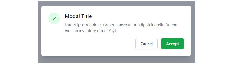
Modal windows handle confirmations, display forms, show images in a lightbox, or present critical messages that need immediate attention.
Tailwind Modal Examples
Tailwind CSS Modals Collection

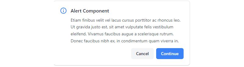
Simple Alret Modal – Minimal Modal

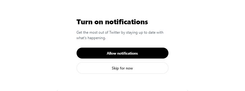
Tailwind CSS Notification Modal By Coding4Ethiopia
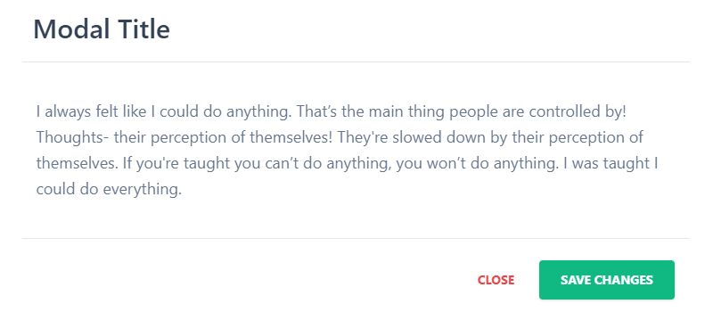
Tailwind CSS Modal
Tailwind CSS Modal – Flowbite
Confirmation modal
Awesome Modal By harsh07bharvada
Modal popup – Working modal in tailwind CSS
Responsive modal popup
Alpine Modal By khatabwedaa
Modal with background overlay
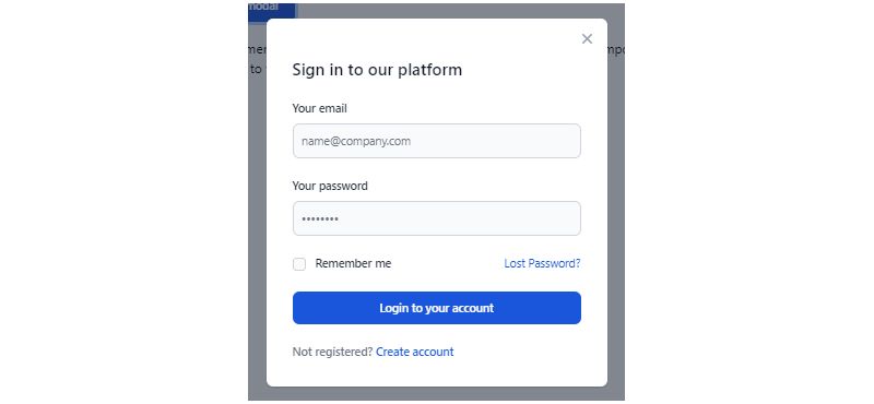
Tailwind CSS login/register modal
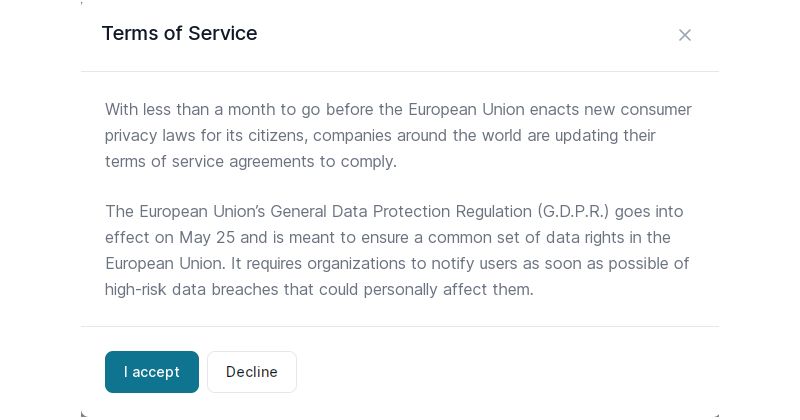
Tailwind CSS Simple Modals Examples
Confirmation modal with blurred background

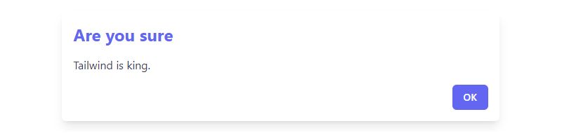
Modal (TModal)
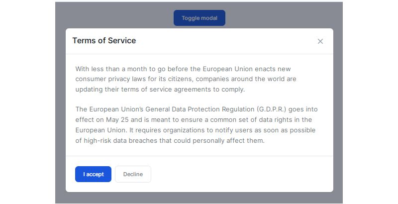
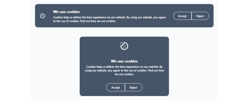
Tailwind CSS Cookie Banner Modal By Arif Khan
React Regular Modal
Error popup modal

React Modal – Flowbite
Tailwind CSS Modal – Preline

Tailwind CSS React Modal – Horizon UI
Blurred Background Modal

Tailwind CSS Modal / Dialog

Tailwind Modal -Dev
Social media login modal

Free Tailwind CSS Modal Component By Harrishash
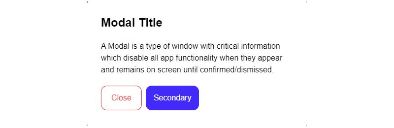
Tailwind CSS Modals Components
Svelte Modal – Flowbite
How Does a Tailwind Modal Work
The modal operates through CSS positioning combined with JavaScript toggle functionality.
A backdrop overlay covers the entire viewport with a semi-transparent layer, usually black at 50% opacity.
The modal container sits centered on screen using flexbox alignment or fixed positioning with transform utilities.
JavaScript handles state changes by adding or removing visibility classes like hidden or opacity-0.
Users close the modal through multiple triggers: clicking the dismiss button, clicking the backdrop area, or pressing the escape key.
What are the Core Components of a Tailwind Modal
Every functional modal dialog needs these structural parts:
- Overlay/Backdrop – Semi-transparent layer that dims the page behind the modal
- Container – Wrapper element that centers and positions the modal window
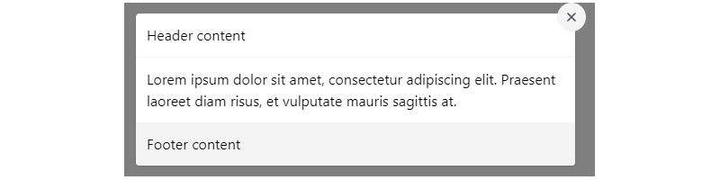
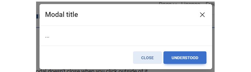
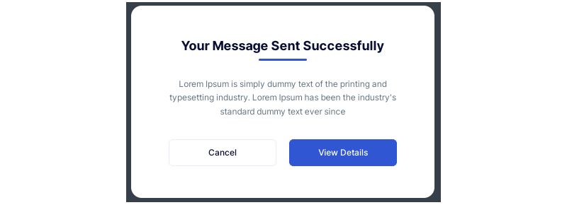
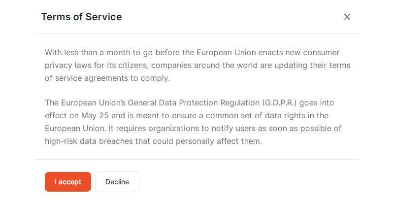
- Header – Contains the modal title and close button
- Body – Main content area for text, forms, or images
- Footer – Optional section for action buttons like “Confirm” or “Cancel”
- Close button – Triggers the dismiss action, typically an X icon
Missing any of these creates usability problems.
The overlay prevents accidental clicks on background elements while providing visual hierarchy.
What CSS Classes Does Tailwind Use for Modals
Tailwind provides utility classes across several categories for modal construction.
Positioning Classes
fixed, inset-0, z-50 for full-screen overlay coverage.
flex, items-center, justify-center for centering the modal box.
Backdrop Styling
bg-black, bg-opacity-50 creates the dark overlay effect.
backdrop-blur-sm adds a frosted glass appearance to the background.
Modal Container
bg-white, rounded-lg, shadow-xl for the modal box appearance.
max-w-md, w-full, mx-4 controls width and margin on smaller screens.
Transition Effects
transition-opacity, duration-300, ease-in-out for smooth fade animations.
transform, scale-95, scale-100 creates subtle zoom effects on open and close.
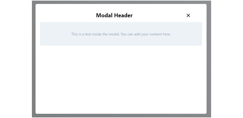
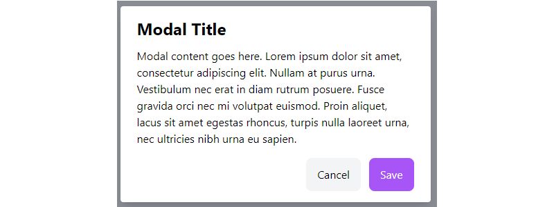
How to Create a Basic Tailwind Modal
Start with the HTML structure: a fixed overlay div containing a centered modal box.
The backdrop needs fixed inset-0 bg-black bg-opacity-50 flex items-center justify-center.
Place your modal content inside a container with bg-white rounded-lg shadow-xl max-w-md w-full mx-4 p-6.
Add a header with the title and an SVG close icon button.
Include the body content and optional footer with action buttons.
Wire up JavaScript to toggle the hidden class when users click the trigger button or close elements.
The click outside close functionality requires checking if the click target matches the backdrop element, not the inner modal.
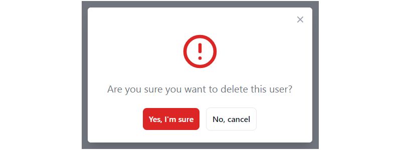
How to Build a Confirmation Modal with Tailwind
Confirmation modals ask users to verify destructive actions like deleting accounts or canceling subscriptions.
Keep the modal body content short: one clear question, two buttons.
Use bg-red-600 for the confirm delete button, bg-gray-200 for cancel.
Add a warning icon from Heroicons or a similar icon library to signal danger visually.
The footer should place the cancel button first (left), destructive action second (right).
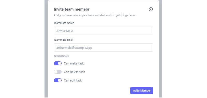
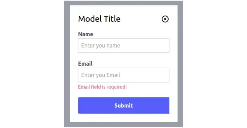
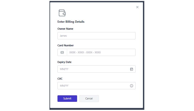
How to Create a Form Modal in Tailwind CSS
Form modals collect user input without navigating away from the current page.
Structure the modal with input fields, labels, and validation messages inside the body section.
Apply space-y-4 to the form element for consistent vertical spacing between fields.
Use focus:ring-2 focus:ring-blue-500 on inputs to show clear focus states.
Handle form submission with Ajax to keep the modal open during processing, then close on success.
How to Make a Fullscreen Modal with Tailwind
Fullscreen modals work well for complex content: multi-step wizards, document previews, video players.
Replace max-w-md with w-screen h-screen and remove rounded corners.
Add overflow-y-auto to the modal container for scrollable content.
Position the close button at the top-right corner using absolute top-4 right-4.
How to Build an Image Gallery Modal
Gallery modals display images in a lightbox format with navigation controls.
Set the backdrop to bg-black bg-opacity-90 for maximum image contrast.
Center the image with max-h-[80vh] object-contain to preserve aspect ratios.
Add previous/next buttons on the sides using absolute left-4 and absolute right-4.
Include thumbnail navigation below the main image for quick jumping between photos.
How to Create a Slide-in Modal (Drawer)
Slide-in drawers enter from screen edges instead of fading in from center.
For a right-side drawer: fixed inset-y-0 right-0 w-80 transform translate-x-full as the hidden state.
Toggle to translate-x-0 when open, combined with transition-transform duration-300.
Drawers suit sidebar navigation, shopping carts, and filter panels.
How to Add Animations to Tailwind Modals
Smooth transitions make modals feel polished rather than jarring.
Fade Animation
Apply transition-opacity duration-200 to the backdrop, toggle between opacity-0 and opacity-100.
Scale Animation
Add transform transition-all duration-200 to the modal box.
Start at scale-95 opacity-0, animate to scale-100 opacity-100.
Slide Animation
Use translate-y-4 for the closed state, translate-y-0 for open.
Creates a subtle upward motion as the modal appears.
How to Make Tailwind Modals Accessible
Web accessibility requires proper ARIA attributes and keyboard support.
Add role="dialog" and aria-modal="true" to the modal container.
Include aria-labelledby pointing to the modal title’s ID.
Implement focus trap to keep keyboard navigation inside the modal while open.
Return focus to the trigger button when the modal closes.
How to Close a Modal When Clicking Outside
Check if the click event target matches the backdrop element, not any child.
Use event.target === event.currentTarget on the overlay click handler.
Alternative: add pointer-events-none to the modal box wrapper, pointer-events-auto to the inner content.
How to Handle Keyboard Navigation in Modals
Listen for the keydown event on the document when the modal is open.
Close on Escape key press using event.key === 'Escape'.
Tab key should cycle through focusable elements inside the modal only.
Trap focus by redirecting tab from the last element back to the first.
How to Manage Multiple Modals with Tailwind
Stacking modals requires z-index management and proper state tracking.
Increment z-index for each new modal: z-50, z-60, z-70.
Maintain an array of open modal IDs in your frontend state.
Close modals in reverse order (last opened, first closed).
What JavaScript is Needed for Tailwind Modals
Tailwind CSS provides no built-in JavaScript. You write the toggle logic yourself.
Minimum requirements:
- Click handler on trigger button to show modal
- Click handler on close button to hide modal
- Click handler on backdrop for outside click dismissal
- Keydown listener for Escape key
- Focus management functions
Vanilla JS works fine. Libraries like Alpine.js reduce boilerplate significantly.
How to Use Alpine.js with Tailwind Modals
Alpine.js pairs perfectly with Tailwind for interactive elements.
Add x-data="{ open: false }" to a parent element.
Use @click="open = true" on the trigger, x-show="open" on the modal.
Built-in transition directives handle animations: x-transition:enter, x-transition:leave.
The @click.away modifier handles click-outside closing automatically.
What are Common Modal Sizes in Tailwind
Tailwind’s max-width utilities control modal size options:
max-w-sm(384px) – Simple alerts, confirmationsmax-w-md(448px) – Standard dialogs, short formsmax-w-lg(512px) – Longer forms, content previewsmax-w-xl(576px) – Complex forms, detailed contentmax-w-2xl(672px) – Large content areasmax-w-full– Fullscreen modals
Add media queries using sm:, md: prefixes to adjust sizes per breakpoint.
Which Tailwind Modal Plugins Exist
Several libraries provide pre-built modal components for Tailwind projects.
Headless UI offers unstyled, accessible modal primitives from the Tailwind Labs team.
Flowbite includes ready-made modal variants with Alpine.js integration.
daisyUI adds component classes like modal and modal-box on top of Tailwind.
Tailwind UI Kit provides commercial templates with production-ready modal designs.
What are the Differences Between Modal and Dialog in Tailwind
The terms get used interchangeably, but technical distinctions exist.
A dialog refers to the native HTML <dialog> element with built-in show/close methods.
A modal describes any overlay that blocks page interaction until dismissed.
Tailwind works with both approaches. The native dialog element reduces JavaScript needs but has older browser limitations.
Custom div-based modals offer more styling control and consistent cross-browser compatibility.
FAQ on Tailwind Modal Examples
Does Tailwind CSS have a built-in modal component?
No. Tailwind CSS provides utility classes only, not pre-built components. You construct modals yourself using positioning, flexbox, and opacity classes. Libraries like Headless UI or Flowbite offer ready-made modal components built on Tailwind.
How do I center a modal in Tailwind?
Apply fixed inset-0 flex items-center justify-center to the backdrop overlay. The modal box inside will center both vertically and horizontally. Add mx-4 for side padding on mobile screens.
How do I close a Tailwind modal when clicking outside?
Add a click handler to the backdrop element. Check if event.target === event.currentTarget to confirm the click hit the overlay, not the modal content. Then toggle your hidden state.
What JavaScript do I need for a Tailwind modal?
You need click handlers for open and close buttons, an escape key listener, and click-outside detection. Alpine.js simplifies this with x-show and @click.away directives. Vanilla JS works fine too.
How do I add animations to a Tailwind modal?
Use transition-all duration-300 with opacity and transform classes. Start at opacity-0 scale-95, animate to opacity-100 scale-100. The CSS animation triggers when toggling visibility classes.
How do I make a Tailwind modal accessible?
Add role="dialog", aria-modal="true", and aria-labelledby pointing to your title. Implement focus trap to keep keyboard navigation inside. Return focus to the trigger button on close.
What is the best modal size in Tailwind?
Use max-w-md for standard dialogs and forms. Apply max-w-sm for simple alerts, max-w-lg or larger for complex content. Add responsive design prefixes to adjust sizes per breakpoint.
How do I create a fullscreen modal in Tailwind?
Replace width constraints with w-screen h-screen. Remove rounded-lg and margins. Add overflow-y-auto for scrollable content. Position the close button absolutely at top-4 right-4.
Can I use the native HTML dialog element with Tailwind?
Yes. The <dialog> element works with Tailwind utility classes. It provides built-in showModal() and close() methods, reducing JavaScript needs. Browser support is solid in modern browsers.
How do I prevent body scroll when a modal is open?
Add overflow-hidden to the <body> element when the modal opens. Remove it when the modal closes. This scroll lock prevents background content from moving while users interact with the dialog.
Conclusion
These Tailwind modal examples give you the building blocks for every popup component your project needs.
You now know how to structure the backdrop overlay, center the dialog box, and wire up the open close modal logic.
Accessibility matters. Add proper ARIA attributes, implement focus trap, and handle escape key dismissal.
Animation makes the difference between clunky and polished. Use transition effects with opacity and transform classes for smooth fade animations.
Pair Tailwind with Alpine.js or Headless UI to speed up development without sacrificing control.
Start with the basic modal pattern. Then expand to confirmation dialogs, form components, and fullscreen layouts as your user interface demands grow.
Build once. Reuse everywhere.


