Tabs keep interfaces clean. Instead of cramming everything onto one screen, you split content into logical sections users can switch between.
These Bootstrap tabs examples show you exactly how to build tabbed navigation that works. Copy the code, paste it into your project, done.
You’ll find horizontal tabs, vertical layouts, pill styles, and tabs with fade animations. Each example includes working code for Bootstrap 5.
We also cover the JavaScript methods, accessibility requirements, common errors, and CSS customization options you’ll actually use in production.
What is Bootstrap Tabs
Bootstrap tabs is a JavaScript-based navigation component that organizes content into clickable panels within the Bootstrap CSS framework.
Mark Otto and Jacob Thornton created Bootstrap at Twitter in 2011. The tab component uses the nav-tabs class combined with JavaScript plugins to toggle between content sections without page reloads.
Each tab links to a corresponding tab pane container. Click a tab header, the matching panel becomes visible. Simple content switching interface that keeps users on the same page.
Bootstrap Tabs Examples
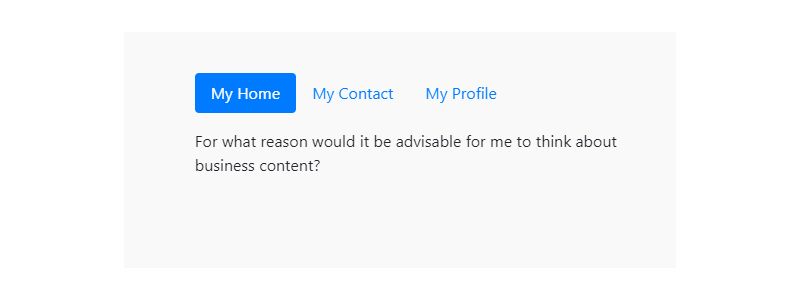
Bootstrap 4 Styled Horizontal Tab
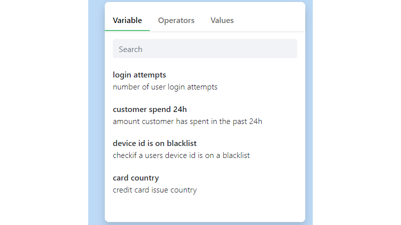
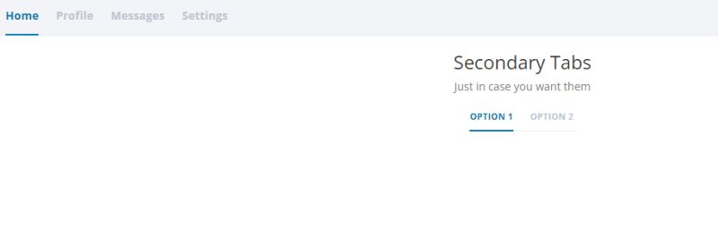
Colorlib Tab 16
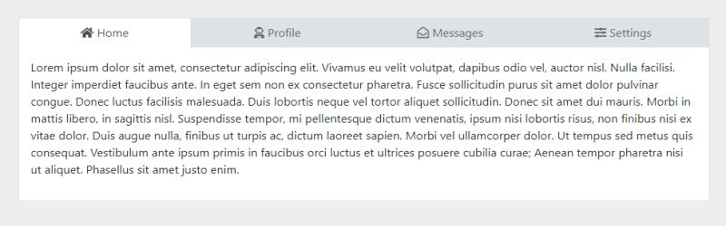
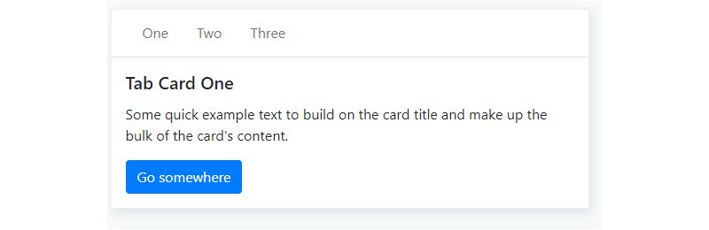
Bootstrap 5 Simple Tabs
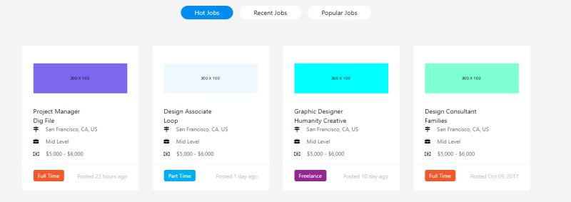
Bootstrap Jobs tabs
Bootstrap-tabs-x
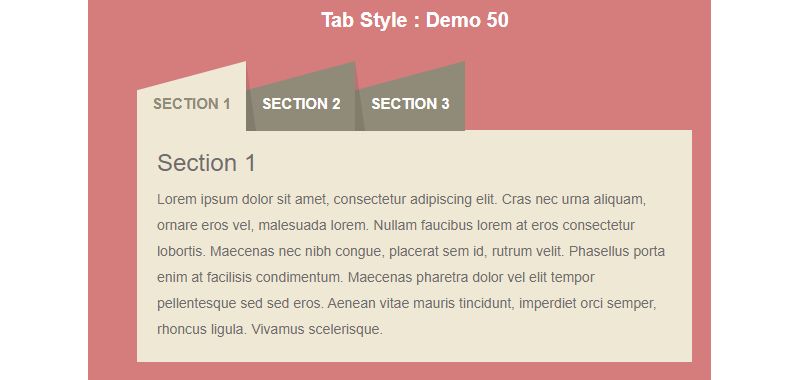
Bootstrap Tab Style
Bootstrap Tab/Collapse by Ivan Melgrati
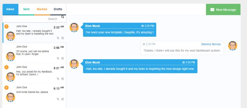
Bootstrap Messages Chat With Tabs
Bootstrap 4 Tabs With Forms And Listings
Circular Bootstrap Tabs
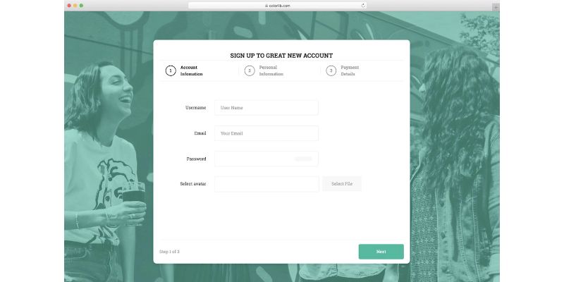
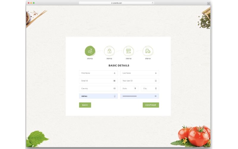
Colorlib Wizard 8 – Bootstrap Tabs Responsive
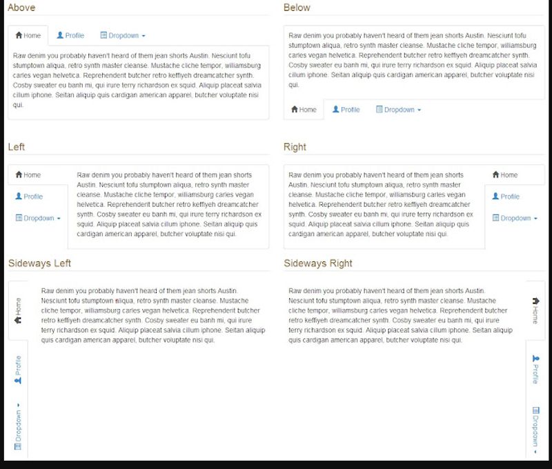
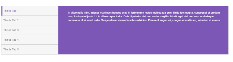
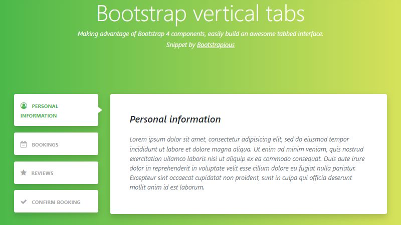
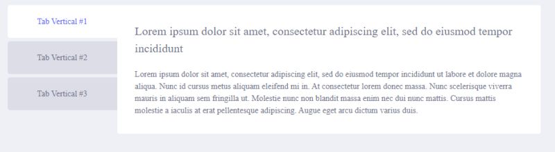
Bootstrap Vertical Tabs
Bootstrap 4 Card With Line-Tabs
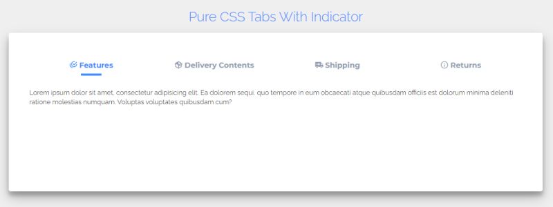
Bootstrap 4 Tabs With Indicators
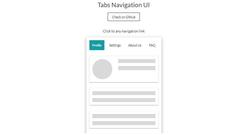
Tabs Navigation UI
Bootstrap 4 Simple Vertical Tabs With Fonts
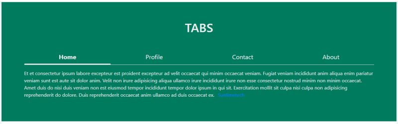
Bootstrap Tabs by Boomer
Bootstrap Tabs With Elegant Smooth Design
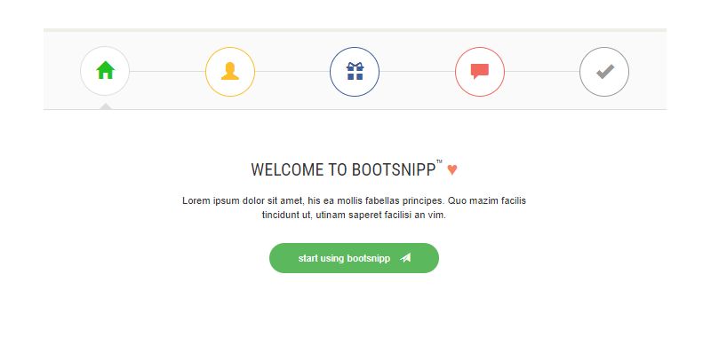
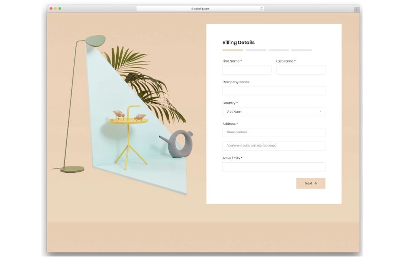
Colorlib Wizard
How Do Bootstrap Tabs Work
Bootstrap tabs combine HTML structure, CSS styling, and JavaScript event handling into one cohesive user interface component.
What HTML Structure Do Bootstrap Tabs Require
Two main parts: a nav element with tab links, and a div containing tab panes.
Tab links use data-bs-toggle="tab" attributes. Each link’s href points to a tab pane ID. The active tab state gets the active class on both the nav-link and tab-pane elements.
What JavaScript Events Do Bootstrap Tabs Trigger
Four events fire during tab transitions: show.bs.tab, shown.bs.tab, hide.bs.tab, and hidden.bs.tab.
Event listeners let you run custom code when users switch tabs. Useful for loading dynamic content or tracking user behavior.
What CSS Classes Style Bootstrap Tabs
Core classes include nav, nav-tabs, nav-item, nav-link, tab-content, and tab-pane.
The fade and show classes add smooth CSS transition effects between panel switches.
What Are the Types of Bootstrap Tabs
Bootstrap offers several tab navigation styles out of the box. Each serves different user experience needs.
What Are Basic Horizontal Tabs
The default tab layout. Links arranged horizontally above content panels.
Uses nav-tabs class on the nav element. Works for most standard tabbed content scenarios.
What Are Vertical Tabs
Tabs stacked in a column alongside content. Add flex-column class to create the vertical tab layout.
Good for sidebars, settings pages, or when you have many tab options. Requires CSS flexbox positioning.
What Are Pills Navigation Tabs
Rounded button-style tabs instead of traditional underlined links. Swap nav-tabs for nav-pills class.
Creates a softer, more modern pill navigation style. Popular in dashboard interfaces.
What Are Justified Tabs
Tabs that stretch to fill the entire container width. Add nav-justified or nav-fill class.
Equal width distribution across all tab items. Clean justified tab alignment for symmetrical layouts.
What Are Card Header Tabs
Tabs integrated into Bootstrap cards component headers.
Use card-header-tabs class. Creates card header tabs that blend with the card’s border styling.
Bootstrap Tabs Examples with Code
Working code snippets you can copy directly into your projects. Each example uses Bootstrap 5.3 syntax.
How to Create a Simple Tab Component
“ <ul class="nav nav-tabs" id="myTab" role="tablist"> <li class="nav-item" role="presentation"> <button class="nav-link active" id="home-tab" data-bs-toggle="tab" data-bs-target="#home" type="button" role="tab">Home</button> </li> <li class="nav-item" role="presentation"> <button class="nav-link" id="profile-tab" data-bs-toggle="tab" data-bs-target="#profile" type="button" role="tab">Profile</button> </li> </ul> <div class="tab-content" id="myTabContent"> <div class="tab-pane fade show active" id="home" role="tabpanel">Home content here</div> <div class="tab-pane fade" id="profile" role="tabpanel">Profile content here</div> </div> `
How to Create Dynamic Tabs with JavaScript
` const tabEl = document.querySelector('#myTab button[data-bs-target="#profile"]'); const tab = new bootstrap.Tab(tabEl);
// Switch tabs programmatically tab.show();
// Listen for tab changes tabEl.addEventListener(‘shown.bs.tab’, function(e) { console.log(‘Tab activated:’, e.target); }); `
The JavaScript tab plugin handles all DOM manipulation. Event listener binding gives you control over tab click handler behavior.
How to Create Tabs with Icons
Add Bootstrap icons or Font Awesome icons inside tab buttons.
` <button class="nav-link" data-bs-toggle="tab"> <i class="bi bi-house"></i> Home </button> `
Icons improve scanability. Keep icon and text together for better web accessibility.
How to Create Responsive Tabs
Mobile responsive tabs need media queries for smaller screens.
Common pattern: horizontal tabs on desktop, vertical stack or Bootstrap accordion on mobile. Use responsive design breakpoints to control layout shifts.
How to Create Tabs with Fade Animation
` <div class="tab-pane fade show active" id="home">...</div> <div class="tab-pane fade" id="profile">...</div> `
Add fade class to each tab pane. The show class triggers the tab fade animation on the active panel.
How to Create Nested Tabs
Tabs inside tabs. Each nested tab structure needs unique IDs to prevent conflicts.
Keep nesting to two levels max. Deeper nested tabs create confusing navigation.
What Are Common Bootstrap Tab Methods
Bootstrap’s JavaScript API exposes three methods for programmatic tab control.
What Does the show() Method Do
Activates a tab and shows its corresponding tab pane. Triggers the show.bs.tab and shown.bs.tab events.
` const tab = bootstrap.Tab.getInstance(tabElement); tab.show(); `
What Does the dispose() Method Do
Destroys the tab instance and removes stored data. Use when dynamically removing tabs from the DOM.
` tab.dispose(); `
What Does the getInstance() Method Do
Returns an existing tab instance attached to a DOM element. Returns null if no instance exists.
` const existingTab = bootstrap.Tab.getInstance(tabElement); `
What Bootstrap Tab Events Can Developers Use
Four events fire during tab transitions. Attach event listeners to run custom code at specific moments.
What is the show.bs.tab Event
Fires immediately when a tab is about to be shown, before the new tab becomes visible.
Access e.target for the activating tab, e.relatedTarget for the previous active tab. Perfect for pre-loading content.
What is the shown.bs.tab Event
Fires after the tab is fully visible and CSS transitions complete.
Use this for analytics tracking, initializing plugins inside the tab pane, or triggering micro-interactions.
What is the hide.bs.tab Event
Fires when the current tab is about to be hidden. Runs before the new tab’s show event.
Good for saving form data or pausing video players in the outgoing panel.
What is the hidden.bs.tab Event
Fires after the previous tab is completely hidden. All transitions finished.
Clean up resources, destroy plugin instances, or reset scroll position in the hidden pane.
What Are Bootstrap Tab Accessibility Features
Bootstrap tabs follow WAI-ARIA patterns for accessible tab interfaces. Screen reader support built in.
What ARIA Attributes Do Bootstrap Tabs Require
Required attributes on tab elements:
- role=”tablist”
on the nav container
- role=”tab”
on each tab button
- role=”tabpanel”
on each content pane
- aria-selected=”true/false”
indicates active state
- aria-controls
links tab to its panel ID
Bootstrap 5 adds these automatically when using data-bs-toggle=”tab”.
What Keyboard Navigation Do Bootstrap Tabs Support
Arrow keys move between tabs. Enter or Space activates the focused tab.
Home key jumps to first tab, End key to last. Tab key moves focus out of the tablist entirely. Matches W3C keyboard navigation patterns.
What Are Common Bootstrap Tab Errors
Debugging tab issues usually comes down to three categories: missing dependencies, ID conflicts, or initialization timing.
Why Do Bootstrap Tabs Not Switch Content
Most common causes:
- Bootstrap JS not loaded or loaded before the DOM
- Missing Popper.js dependency (Bootstrap 4)
- Mismatched data-bs-target
and panel ID values
- Duplicate IDs on the page
Check browser DevTools console for errors. Verify Bootstrap version matches your syntax.
Why Do Bootstrap Tabs Flicker on Load
Content flashes before JavaScript initializes. Add opacity: 0 to inactive tab panes in your CSS, then let Bootstrap's JS reveal them.
Or use the fade class consistently on all panes to smooth the initial render.
Why Do Nested Tabs Not Work Properly
ID collisions between parent and child tab structures. Every tab and panel needs a unique ID across the entire page.
Use prefixes like outer-tab-1 and inner-tab-1 to prevent conflicts.
How to Customize Bootstrap Tabs with CSS
Override default styles using higher specificity selectors or custom Bootstrap CSS overrides.
How to Change Tab Background Colors
` .nav-tabs .nav-link { background-color: #f8f9fa; }
.nav-tabs .nav-link.active { background-color: #0d6efd; color: #fff; } `
Target both default and active states. Check color contrast ratios for accessibility.
How to Modify Tab Border Styles
` .nav-tabs { border-bottom: 2px solid #dee2e6; }
.nav-tabs .nav-link.active { border-color: #0d6efd #0d6efd transparent; border-width: 2px; } `
Match border colors to your brand. Consider CSS hover effects for better interactivity.
How to Adjust Tab Spacing and Padding
` .nav-tabs .nav-link { padding: 1rem 1.5rem; margin-right: 0.5rem; }
.nav-tabs .nav-item:last-child .nav-link { margin-right: 0; } `
Larger padding improves touch targets on mobile. Test across cross-browser compatibility to catch rendering differences in Chrome DevTools, Firefox, and Safari.
FAQ on Bootstrap Tabs Examples
How do I create basic Bootstrap tabs?
Add a nav element with nav-tabs class containing nav-link buttons. Create a tab-content div with tab-pane children. Link tabs to panes using data-bs-toggle=”tab” and matching IDs. Bootstrap's JavaScript handles the rest.
Why are my Bootstrap tabs not working?
Check if Bootstrap’s JavaScript file loads after jQuery (Bootstrap 4) or standalone (Bootstrap 5). Verify data-bs-target values match panel IDs exactly. Duplicate IDs on the page break tab functionality. Open DevTools console for error messages.
How do I make Bootstrap tabs responsive on mobile?
Use mobile-first design with breakpoint classes. Convert horizontal tabs to vertical stacks or collapsible accordions on small screens. The flex-column class combined with responsive utilities handles most mobile responsive tabs layouts.
Can I use Bootstrap tabs with dynamic content?
Yes. Load content via Ajax when tabs activate. Listen for the shown.bs.tab event, fetch data, then inject it into the active tab pane. This keeps initial page load fast while supporting dynamic tab content.
How do I style Bootstrap tabs differently?
Override default styles in your custom stylesheet loaded after Bootstrap. Target .nav-tabs .nav-link for tab styling and .nav-tabs .nav-link.active for the active state. Use CSS animations library classes for transition effects.
What is the difference between tabs and pills in Bootstrap?
Tabs use underlined links with the nav-tabs class. Pills create rounded button-style navigation with nav-pills. Both function identically. Pills offer a softer appearance popular in dashboards and Bootstrap sidebar layouts.
How do I make Bootstrap tabs accessible?
Bootstrap adds ARIA roles automatically. Ensure each tab has role=”tab” and panels have role=”tabpanel”. Keyboard navigation works by default. Test with screen readers and follow the web accessibility checklist for compliance.
Can I nest tabs inside other tabs?
Yes, but use unique IDs for every nested tab and panel. Prefix child tabs differently than parent tabs. Keep nesting to two levels maximum. Deeper structures confuse users and complicate keyboard navigation patterns.
How do I trigger Bootstrap tabs with JavaScript?
Get the tab element, create a new bootstrap.Tab instance, then call the show() method. This tab activation method works for programmatic switching based on URL parameters, form submissions, or other interactive elements.
Do Bootstrap tabs work with jQuery?
Bootstrap 4 requires jQuery for tab functionality. Bootstrap 5 uses vanilla JavaScript with no jQuery dependency. For jQuery tabs in Bootstrap 5, use the native API or import jQuery separately for legacy code compatibility.
Conclusion
These Bootstrap tabs examples give you working code for every common tab pattern. Copy them directly into your projects.
The nav-tabs class handles horizontal layouts. Add flex-column for vertical stacks. Swap to nav-pills when you want that rounded button look.
Accessibility matters. Bootstrap’s built-in ARIA roles and keyboard support meet WCAG standards out of the box.
For production sites, combine tabs with other Bootstrap components like modals and dropdowns. Check the official documentation on getbootstrap.com when you need deeper customization.
Start with a basic tab component. Test on mobile. Add Bootstrap animations if you want smoother transitions.
The tab-content container does the heavy lifting. Your job is just wiring up the IDs correctly.


