
Tables look simple until you try to style them. Then borders double up, cells collapse, and mobile layouts fall apart.
Tailwind table examples solve these problems with utility classes that give you precise control over every element.
This guide covers practical patterns you can copy directly into your projects. Responsive tables that scroll on mobile. Striped rows with hover states. Sticky headers for long datasets. Dark mode variants that actually work.
Each example includes the exact Tailwind CSS classes needed. No guesswork, no digging through documentation.
Whether you are building admin dashboards, data grids, or pricing comparisons, these patterns will save you hours of trial and error.
What is a Tailwind Table
A Tailwind table is an HTML table element styled entirely with Tailwind CSS utility classes.
No custom stylesheets needed. You apply padding, borders, colors, and responsive behavior directly in your markup.
The utility-first approach gives you full control over table rows, cells, and headers without writing a single line of traditional CSS.
Data tables, pricing grids, comparison charts. All built with the same atomic class system.
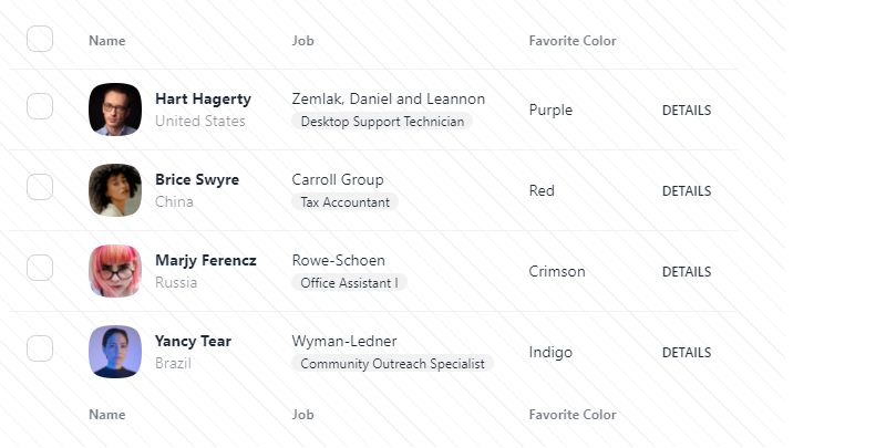
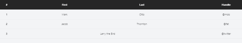
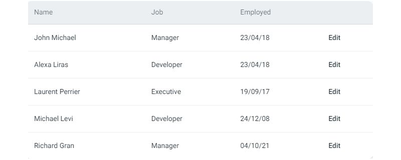
Examples of Tailwind Tables
Tailwind CSS Tables Collection

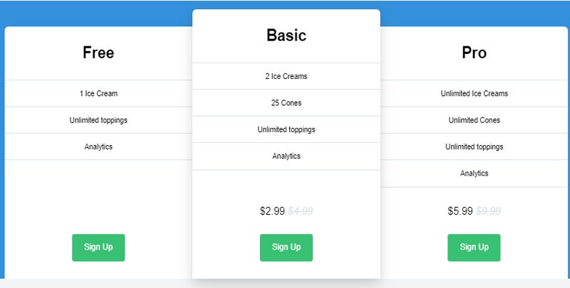
Tailwind CSS – Pricing Table 2 by Rhythm Ruparelia
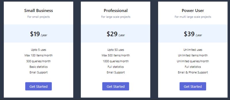
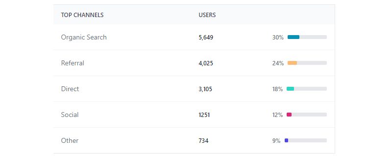
Table With Progress Column
Pricing Table By tormorten
Vue Table – Flowbite
Tailwind CSS Tables – 12 Styles

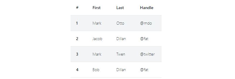
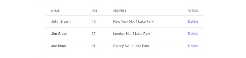
Simple Responsive Table

Tailwind CSS Responsive Table
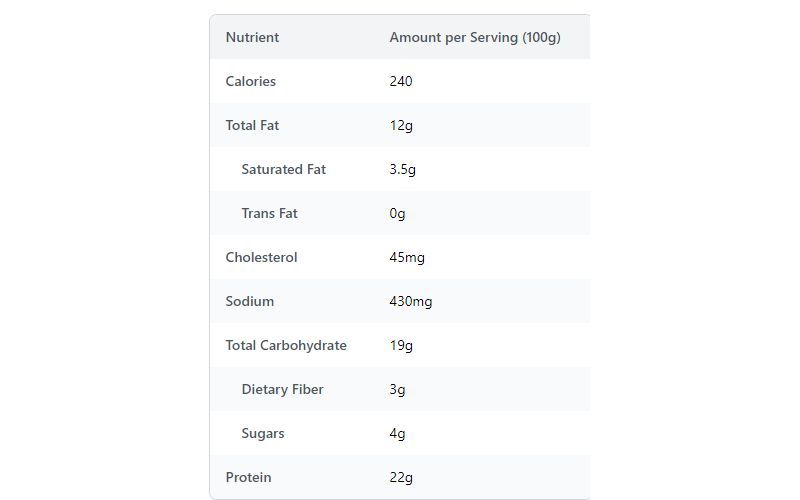
Nutrient Facts Table – Show Nutrient contents with stripped table
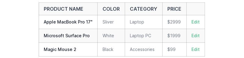
Tailwind CSS Simple Table Example

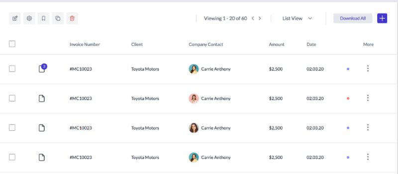
Advance Table
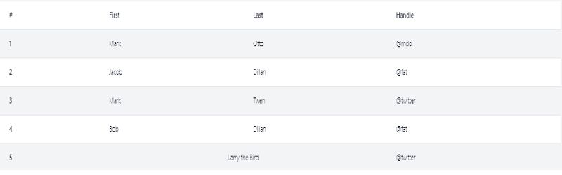
Stripped Table With Tailwind CSS
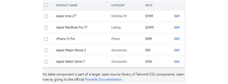
Tailwind CSS Table – Flowbite
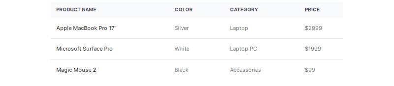
Table by Tailwind
Simple Table With Border

Tailwind CSS Tables Dark Head By iglxpopk
Tailwind CSS Table – React
Tailwind CSS Tables – Preline
Free Tailwind CSS Advance Table Component By Harrishash
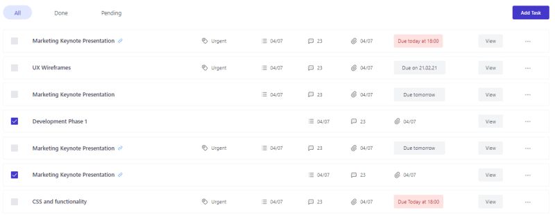
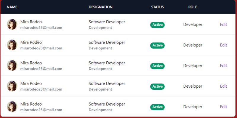
Table For User Management

Striped Table By vacjet
Tailwind CSS Tables – Tailwind Elements

Tailwind CSS Table By zoltanszogyenyi
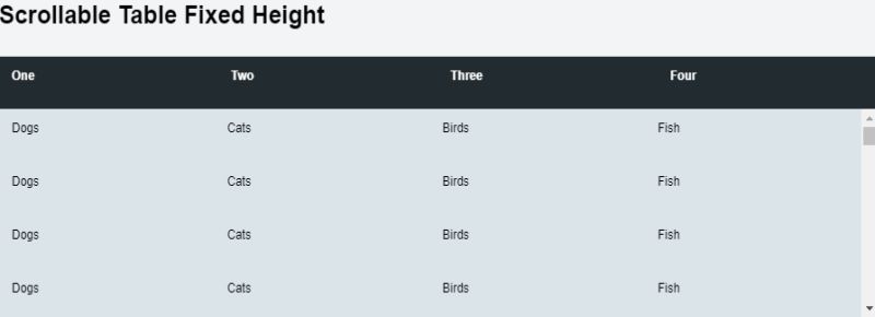
Fixed Height Scrollable Table
How Does a Tailwind Table Differ from Standard HTML Tables
Standard HTML tables require separate stylesheet rules. Every border, every padding value, every hover state lives in a CSS file somewhere.
Tailwind tables keep styling inline with the markup. Classes like border-collapse, px-4, and hover:bg-gray-100 go directly on your elements.
The difference becomes clear when you compare approaches to something like Bootstrap tables. Bootstrap gives you pre-built components. Tailwind gives you building blocks.
You trade convenience for precision. Worth it when default component styles never quite match your design system.
What Are the Core Tailwind Table Utility Classes
Border utilities handle cell separation: border, border-collapse, border-separate, border-spacing-*.
Spacing classes control cell padding: p-2, px-4, py-3. These go on td and th elements.
Text alignment uses text-left, text-center, text-right. Vertical alignment gets align-top, align-middle, align-bottom.
Background colors alternate rows: bg-white, bg-gray-50, even:bg-gray-100.
Width control happens with w-full for full-width tables or fixed column widths like w-1/4.
Basic Tailwind Table Structure
Every Tailwind table starts with semantic HTML. The framework styles your markup; it does not replace it.
What HTML Elements Create a Tailwind Table
Use table, thead, tbody, tfoot, tr, th, and td elements. Same structure you would use for any CSS table.
Tailwind adds styling through classes, not custom elements.
How to Apply Border Utilities to Tailwind Tables
Add border and border-gray-300 to cells for visible borders.
Use border-collapse on the table element to merge adjacent borders. Or use border-separate with border-spacing-2 for gaps between cells.
How to Control Table Cell Padding in Tailwind
Apply padding classes directly to th and td elements: px-6 py-4 for comfortable spacing, px-2 py-1 for compact data grids.
Consistent padding across all cells creates proper white space and readability.
Responsive Tailwind Table Examples
Tables break on small screens. Wide data grids overflow the viewport and create horizontal scroll bars.
Tailwind offers multiple patterns for responsive design with tables.
How to Create a Mobile-Friendly Tailwind Table
Wrap tables in a container with overflow-x-auto. This allows horizontal scrolling without breaking your layout.
For true mobile-first design, consider card-based layouts on small screens with hidden md:table to show the table only on larger breakpoints.
What is the Horizontal Scroll Pattern for Tailwind Tables
Add overflow-x-auto to a wrapper div. The table inside scrolls horizontally while the page stays fixed.
Combine with min-w-full on the table element to maintain column widths.
How to Stack Table Cells on Small Screens
Use block on table elements at mobile breakpoints: md:table-cell becomes block below the md breakpoint.
Add data-label attributes and use before: pseudo-elements to display column headers inline with stacked cells. This pattern works well with media queries in Tailwind.
Striped and Hoverable Tailwind Table Examples
Striped rows improve scanability. Hover states give users feedback when interacting with data grids.
How to Add Alternating Row Colors in Tailwind
Apply even:bg-gray-50 or odd:bg-white to table rows. Tailwind handles the alternation automatically through pseudo-class modifiers.
No JavaScript required.
How to Create Hover Effects on Tailwind Table Rows
Add hover:bg-blue-50 to tr elements for row-level highlighting. Combine with transition-colors for smooth state changes.
Similar approach to CSS hover effects but applied through utility classes.
Tailwind Table with Fixed Header
Long data tables need headers that stay visible during scroll. Users lose context when column labels disappear.
How to Make a Sticky Table Header in Tailwind
Apply sticky top-0 to thead or individual th elements. Add bg-white to prevent content showing through.
Works like sticky navigation patterns.
What CSS Properties Control Fixed Header Behavior
The position: sticky property combined with top: 0 keeps headers anchored. Tailwind translates this to sticky top-0.
Add z-10 to ensure headers stay above scrolling content.
Sortable Tailwind Table Examples
Sortable columns help users organize data by different criteria. Price, date, name, status.
How to Style Sort Indicators in Tailwind Tables
Use inline-flex items-center gap-1 on header cells to align text with sort icons.
Toggle between rotate-0 and rotate-180 classes to flip arrow direction based on sort state.
What Icons Work Best for Sortable Tailwind Columns
Heroicons and Lucide provide clean arrow icons. Use SVG icons at 16×16 or 20×20 pixels for proper scaling.
Chevron-up, chevron-down, or combined arrows-up-down for unsorted states.
Tailwind Table with Pagination
Large datasets need pagination. Showing 10,000 rows at once kills performance and usability.
How to Style Pagination Controls Under a Tailwind Table
Place pagination below the table using flex justify-between items-center mt-4.
Style page buttons with Tailwind button patterns: px-3 py-1 rounded border hover:bg-gray-100. Use bg-blue-500 text-white for the active page.
Check Tailwind pagination examples for complete component patterns.
Tailwind Data Table Examples
Data tables display structured information from databases, APIs, or spreadsheets. They need careful column management.
How to Display Large Datasets in Tailwind Tables
Combine sticky headers, horizontal scroll, and pagination. Use whitespace-nowrap on cells to prevent text wrapping in dense data grids.
Virtual scrolling with frontend libraries handles datasets beyond 1,000 rows.
What Column Width Techniques Work in Tailwind Tables
Fixed widths use w-32, w-48, or w-64 on header cells. Proportional widths use w-1/4, w-1/3, w-1/2.
Add table-fixed to the table element for predictable column sizing.
Tailwind Table with Action Buttons
Most data tables include row-level actions. Edit, delete, view details, download.
How to Add Edit and Delete Buttons to Table Rows
Create an actions column with text-right alignment. Add interactive elements using icon buttons or text links.
Style with text-blue-600 hover:text-blue-800 for edit, text-red-600 hover:text-red-800 for delete.
Dark Mode Tailwind Table Examples
Dark mode requires inverted color schemes. Light text on dark backgrounds, adjusted border colors, proper contrast ratios.
How to Apply Dark Mode Classes to Tailwind Tables
Use the dark: variant prefix: bg-white dark:bg-gray-800, text-gray-900 dark:text-gray-100, border-gray-200 dark:border-gray-700.
Test color contrast ratios meet WCAG standards in both modes.
Accessible Tailwind Table Practices
Web accessibility requires proper semantic markup and screen reader support. Tables present unique challenges.
What ARIA Attributes Should Tailwind Tables Include
Add role="table" only when using non-table elements. Native table elements have implicit roles.
Use aria-sort="ascending" or aria-sort="descending" on sortable column headers. ARIA attributes communicate state changes to assistive technology.
How to Structure Table Headers for Screen Readers
Use scope="col" on column headers, scope="row" on row headers. Add caption elements to describe table purpose.
Follow accessible tables patterns for complex data structures with merged cells.
Common Tailwind Table Mistakes
Bad table styling creates poor user experience. Some mistakes appear constantly in production code.
What Styling Errors Break Tailwind Table Layouts
- Missing
w-fullcauses tables to collapse to content width - Forgetting
border-collapsecreates double borders between cells - Applying
rounded-lgto tables withoutoverflow-hiddenon the wrapper - Using
divide-yon tbody without removing individual cell borders - Neglecting
min-w-0on cells with truncated text
Consistent padding across all cells improves visual hierarchy. Inconsistent spacing makes tables look unprofessional.
FAQ on Tailwind Table Examples
How do I make a Tailwind table responsive?
Wrap your table in a div with overflow-x-auto. This enables horizontal scrolling on small screens without breaking your page layout. Combine with min-w-full on the table element to maintain proper column widths across all breakpoints.
What classes add borders to Tailwind table cells?
Apply border and border-gray-300 to individual td and th elements. Add border-collapse to the table element to merge adjacent borders. Use divide-y on tbody for horizontal lines only between rows.
How do I create striped rows in a Tailwind table?
Use the even:bg-gray-50 or odd:bg-gray-100 utility on table rows. Tailwind’s pseudo-class variants handle alternating colors automatically. No custom CSS or backend logic required for this common data grid pattern.
Can I make a sticky header in Tailwind tables?
Yes. Apply sticky top-0 bg-white z-10 to your thead element. The header stays fixed while tbody content scrolls beneath it. Works well for long datasets where users need constant column reference.
How do I add hover effects to table rows?
Add hover:bg-blue-50 or any background color to tr elements. Include transition-colors duration-150 for smooth state changes. This improves user interface feedback when users scan through data rows.
What is the best way to handle wide tables on mobile?
Three options work well. Horizontal scroll with overflow-x-auto is simplest. Card-based layouts using hidden md:table show tables only on larger screens. Stacked cells with block md:table-cell transform rows into vertical lists.
How do I style a Tailwind table for dark mode?
Use the dark: prefix on color utilities. Apply bg-white dark:bg-gray-800 to cells and text-gray-900 dark:text-gray-100 to text. Border colors need adjustment too: border-gray-200 dark:border-gray-700 maintains proper contrast.
How do I control column widths in Tailwind tables?
Add table-fixed to the table element for predictable sizing. Then apply width utilities like w-1/4 or w-48 to header cells. Without table-fixed, browsers auto-calculate widths based on content length.
Are Tailwind tables accessible by default?
Tailwind styles do not affect accessibility. Semantic markup matters. Use proper th elements with scope attributes, add caption for table descriptions, and follow web accessibility checklist guidelines for complex data structures.
How does Tailwind compare to Bootstrap for table styling?
Tailwind offers granular control through utility classes. Tailwind vs Bootstrap comes down to customization needs. Bootstrap provides ready-made table components. Tailwind lets you build exactly what your design system requires from scratch.
Conclusion
These Tailwind table examples give you ready-to-use patterns for any project. From basic data grids to complex sortable columns with pagination controls.
The utility-first approach means you control every detail. Cell alignment, column width, border spacing. Nothing is locked behind pre-built components.
Pair these table patterns with other Tailwind components like Tailwind forms for complete admin interfaces. Add Tailwind modal dialogs for row editing. Build full Tailwind dashboard layouts around your data.
Start with the basic structure. Layer in features as needed. Sticky headers, action buttons, dark mode support.
Your tables will load fast, look consistent, and work across screen sizes. That is what good web design principles deliver.


