
Building a navbar from scratch takes time. Tailwind navbar examples cut that time dramatically.
Tailwind CSS lets you build responsive navigation components using utility classes directly in your HTML. No custom stylesheets. No switching between files.
This collection covers everything from simple horizontal menus to complex mega menu layouts with dropdowns.
You’ll find copy-paste code snippets for:
- Basic and responsive navbars
- Sticky and transparent headers
- Mobile toggle menus
- Dark mode implementations
- Accessible navigation patterns
Each example includes the exact Tailwind utility classes you need. Ready to use in your next frontend project.
What is a Tailwind Navbar
A Tailwind navbar is a navigation component built with utility-first CSS classes from the Tailwind CSS framework.
Instead of writing custom stylesheets, you apply pre-built utility classes directly to your HTML elements.
The result? A fully functional navigation bar with minimal code and maximum flexibility.
Tailwind Labs created this utility-first approach to speed up frontend development. No more switching between HTML and CSS files constantly.
You can build responsive navigation menus, sticky headers, and mobile hamburger menus using nothing but class names like flex, justify-between, and items-center.
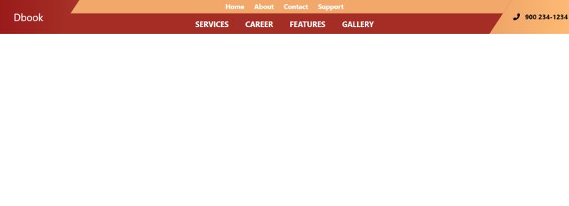
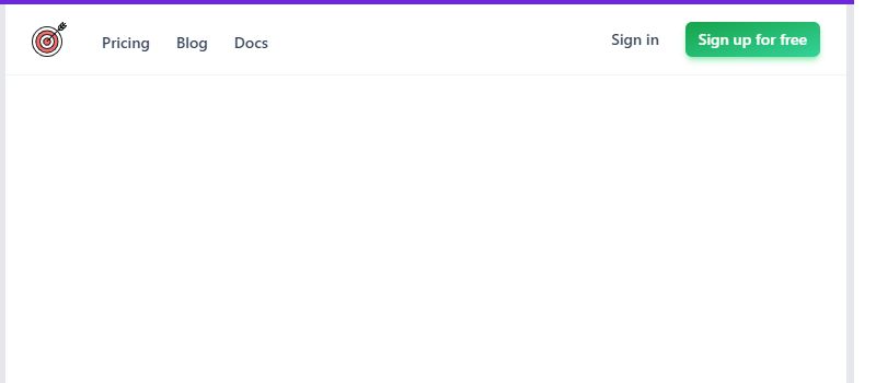
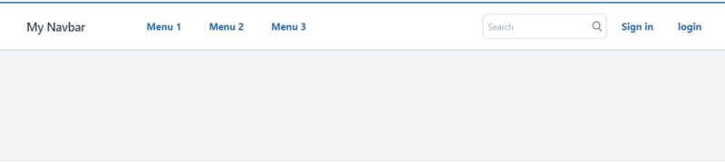
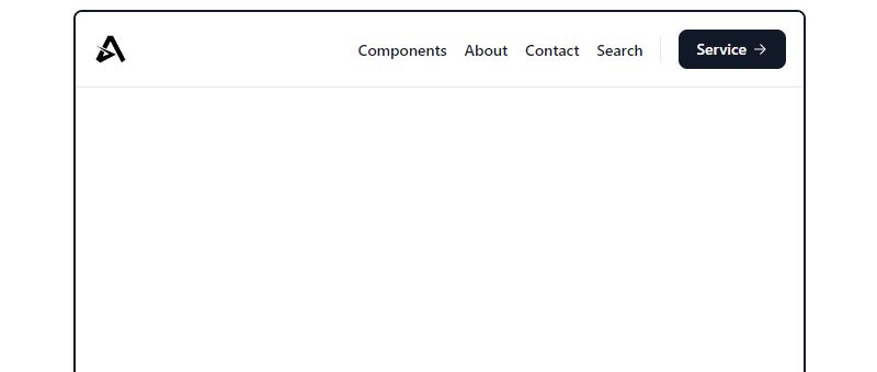
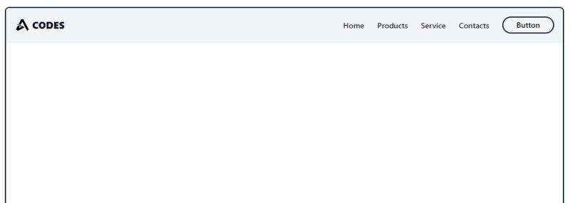
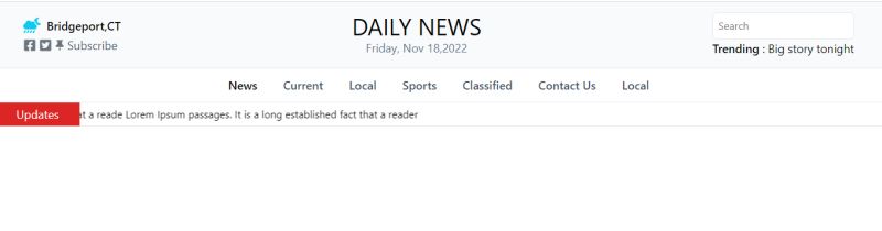
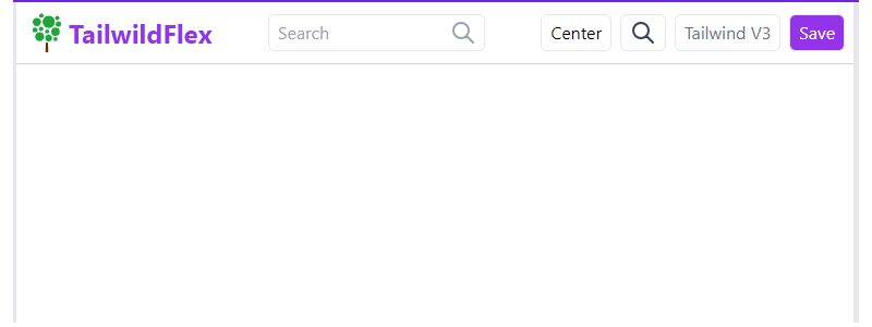
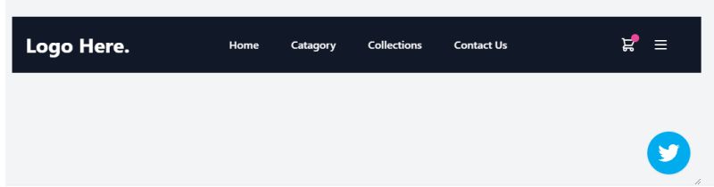
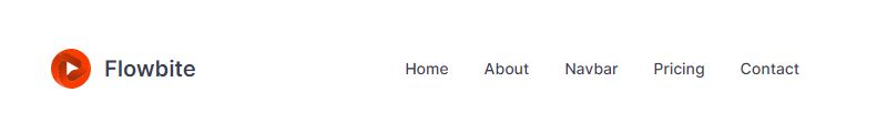
Tailwind Navbar Examples
Tailwind CSS Navbars Collection

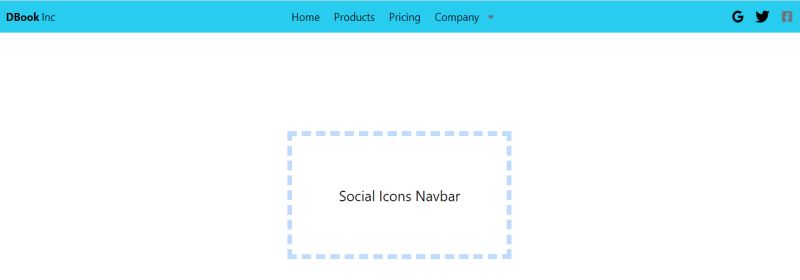
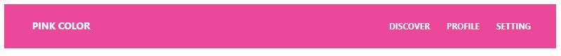
Tailwind Navbar With Social Media
Minimalistic Tailwind Navbar
Responsive Tailwind CSS Navbar By zoltanszogyenyi
Dark Tailwind Navbar
Multiple Tailwind Navbars
Semi Transparent Tailwind Navbar
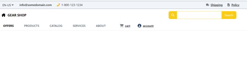
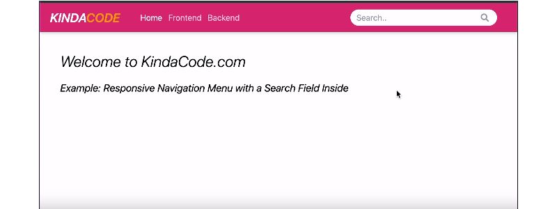
Responsive Tailwind Navbar with Search Bar By Pavlove BIOKOU
Tailwind Navbar, Marketing UI | Muted
Multi Tailwind Nav With Search Bar
Responsive Tailwind Navbar Example
Responsive Tailwind Navbar By Hulya
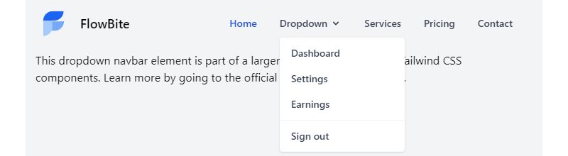
Tailwind CSS Dropdown Navigation Bar By zoltanszogyenyi
Tailwind Navbar with Buttons
Scrolling News Tailwind Navbar
Tailwindflex Tailwind Navbar
Tailwind Navbar & Hamburger Menu for Ecommerce By Asad Ali Haider
Tailwind CSS Navbars – 8 Styles

Very Simple Tailwind Navbar
Fixed Tailwind Navbar
Horizontal Tailwind Navigation
Tailwind Navbar By shuvro_008
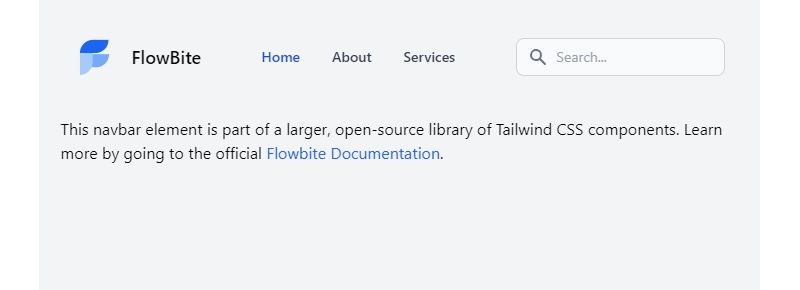
React Tailwind Navbar – Flowbite

Tailwind CSS Navbar Galore

Custom Vertical Tailwind Navbar
Svelte Tailwind Navbar – Flowbite
Tailwind CSS Navbar UI Example
Tailwind CSS Navbar – Tailwind Starter
Responsive Tailwind Navbar with a Search Box
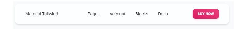
Tailwind CSS Navbar – Material Tailwind
How Does a Tailwind Navbar Work
Tailwind navbars rely on flexbox utilities, spacing classes, and responsive modifiers to create layouts that adapt across screen sizes.
What CSS Utilities Create the Navbar Container
The nav element typically uses flex for layout, bg-white or bg-gray-800 for backgrounds, and px-4 for horizontal padding.
Add shadow-md for depth. Combine with w-full to span the full viewport width.
What Flexbox Classes Position Navbar Items
Use justify-between to push logo left and links right. Apply items-center for vertical alignment.
The flex-row class keeps items horizontal. Switch to flex-col for mobile menu stacking.
What Classes Control Navbar Spacing and Alignment
Gap utilities like gap-4 or space-x-6 create consistent spacing between navigation links.
Padding classes (py-3, px-6) control the navbar height and internal white space.
What Are the Types of Tailwind Navbars
Different projects need different navbar styles. Here are the main types you can build with Tailwind CSS.
What is a Basic Horizontal Navbar
A simple row with logo on the left, links on the right. Uses flex, justify-between, and basic background colors.
Perfect for landing pages and simple websites.
What is a Responsive Navbar
Shows full navigation on desktop, collapses to a hamburger menu on mobile.
Built with responsive design breakpoint prefixes like md:flex and hidden.
What is a Sticky Navbar
Stays fixed at the top while users scroll. Uses sticky top-0 or fixed top-0 positioning classes.
Add z-50 to keep it above other content. Learn more about sticky navigation patterns.
What is a Transparent Navbar
Starts with bg-transparent and often changes color on scroll using JavaScript.
Common on hero sections with background images.
What is a Sidebar Navigation
Vertical navigation fixed to the left or right side. Uses flex-col instead of flex-row.
Check out Tailwind sidebar examples for dashboard layouts.
What is a Mega Menu Navbar
Expands to show categorized links in a large dropdown panel. Common on e-commerce sites.
Requires more complex positioning with absolute and relative classes.
How to Create a Responsive Tailwind Navbar
Responsive navbars follow a mobile-first design approach. Start with mobile styles, then add desktop overrides.
What Breakpoints Control Mobile and Desktop Views
Tailwind uses breakpoint prefixes: sm: (640px), md: (768px), lg: (1024px), xl: (1280px).
Most navbars switch layouts at the md: breakpoint, similar to how media queries work in traditional CSS.
What Classes Hide Elements on Mobile
Apply hidden to desktop-only navigation links. They disappear on mobile by default.
The mobile menu button gets md:hidden to show only on small screens.
What Classes Show Elements on Desktop
Add md:flex or md:block to reveal hidden elements at the medium breakpoint and above.
Combine with hidden for a complete show/hide system.
How to Add a Mobile Menu Toggle Button
Create a button with hamburger icon (three horizontal lines). Use Heroicons or simple span elements.
Toggle the mobile menu visibility with Alpine.js or vanilla JavaScript click handlers. The button should have md:hidden to hide on desktop.
How to Style a Tailwind Navbar
Tailwind’s utility classes give you complete control over navbar styling without writing custom CSS.
What Background Classes Work for Navbars
Solid colors: bg-white, bg-gray-900, bg-blue-600.
For dark mode support, use dark:bg-gray-800. Gradients work too: bg-gradient-to-r from-purple-500 to-pink-500.
What Text Color Utilities Apply to Navigation Links
Light backgrounds need text-gray-700 or text-gray-900. Dark backgrounds use text-white or text-gray-100.
Active link states often use brand colors like text-blue-600.
What Hover States Improve Navbar Interactivity
Add hover:text-blue-500 for color changes. Combine with transition-colors for smooth animations.
Explore more CSS hover effects to enhance user interface feedback.
What Border and Shadow Classes Add Depth
Bottom borders: border-b border-gray-200. Shadows: shadow-sm, shadow-md, or shadow-lg.
These subtle details improve visual hierarchy and separate the navbar from page content.
How to Add a Dropdown Menu to a Tailwind Navbar
Dropdown menus let users access nested navigation links without cluttering the main navbar.
What Classes Position the Dropdown Container
The parent link needs relative. The dropdown panel uses absolute top-full left-0 to position below.
Add min-w-48 or w-64 to control dropdown width.
What Classes Control Dropdown Visibility
Start with hidden or opacity-0 invisible. Toggle to block or opacity-100 visible on hover or click.
Group hover works too: group-hover:block on the dropdown with group on the parent.
What Transition Utilities Animate the Dropdown
Add transition-all duration-200 for smooth reveal. Combine with transform origin-top scale-95 to scale-100.
These micro-interactions improve perceived usability.
How to Make a Tailwind Navbar Sticky
Sticky headers keep navigation accessible as users scroll through long pages.
What is the Difference Between Sticky and Fixed Positioning
sticky top-0 stays in flow until scroll threshold, then sticks. fixed top-0 removes element from flow entirely.
Sticky is usually better. Fixed requires adding top padding to prevent content overlap.
What Z-Index Values Prevent Overlap Issues
Use z-50 for most navbars. Increase to z-[100] if modals or other overlays conflict.
Check that Tailwind modal components use higher z-index values than your navbar.
How to Build a Dark Mode Tailwind Navbar
Dark mode reduces eye strain and saves battery on OLED screens. Tailwind makes implementation simple.
What Dark Variant Classes Apply to Navbars
Prefix any utility with dark: to apply in dark mode: bg-white dark:bg-gray-900, text-gray-800 dark:text-white.
Border colors need updates too: border-gray-200 dark:border-gray-700.
How to Toggle Dark Mode Navbar Styles
Add darkMode: 'class' to tailwind.config.js. Toggle the dark class on the html element.
Store user preference in localStorage for persistence across page loads.
What Are Common Tailwind Navbar Code Examples
Copy these navbar component templates and customize for your project.
Example: Simple Navbar with Logo and Links
“ <nav class="flex items-center justify-between px-6 py-4 bg-white shadow-sm"> <a href="/" class="text-xl font-bold text-gray-900">Logo</a> <div class="flex gap-6"> <a href="#" class="text-gray-600 hover:text-gray-900">Home</a> <a href="#" class="text-gray-600 hover:text-gray-900">About</a> <a href="#" class="text-gray-600 hover:text-gray-900">Contact</a> </div> </nav> `
Example: Responsive Navbar with Hamburger Menu
` <nav class="flex items-center justify-between px-6 py-4 bg-gray-900"> <a href="/" class="text-xl font-bold text-white">Logo</a> <button class="md:hidden text-white"> <svg class="w-6 h-6" fill="none" stroke="currentColor" viewBox="0 0 24 24"> <path stroke-linecap="round" stroke-width="2" d="M4 6h16M4 12h16M4 18h16"/> </svg> </button> <div class="hidden md:flex gap-6"> <a href="#" class="text-gray-300 hover:text-white">Home</a> <a href="#" class="text-gray-300 hover:text-white">Services</a> <a href="#" class="text-gray-300 hover:text-white">Contact</a> </div> </nav> `
Example: Navbar with Dropdown
` <div class="relative group"> <button class="text-gray-600 hover:text-gray-900">Products</button> <div class="absolute hidden group-hover:block top-full left-0 bg-white shadow-lg rounded-md py-2 min-w-48"> <a href="#" class="block px-4 py-2 hover:bg-gray-100">Product 1</a> <a href="#" class="block px-4 py-2 hover:bg-gray-100">Product 2</a> </div> </div> `
Example: Sticky Transparent Navbar
` <nav class="sticky top-0 z-50 bg-transparent backdrop-blur-md border-b border-white/10"> <div class="flex items-center justify-between px-6 py-4"> <a href="/" class="text-xl font-bold text-white">Logo</a> <div class="flex gap-6"> <a href="#" class="text-white/80 hover:text-white">Home</a> <a href="#" class="text-white/80 hover:text-white">About</a> </div> </div> </nav> `
Example: Navbar with Search Input
` <nav class="flex items-center justify-between px-6 py-3 bg-white shadow-sm"> <a href="/" class="text-xl font-bold">Logo</a> <div class="flex-1 max-w-md mx-8"> <input type="search" placeholder="Search..." class="w-full px-4 py-2 border rounded-lg focus:ring-2 focus:ring-blue-500"/> </div> <div class="flex gap-4"> <a href="#" class="text-gray-600 hover:text-gray-900">Login</a> </div> </nav> `
Check out more Tailwind searchbar variations for advanced implementations.
Example: Centered Navbar Layout
` <nav class="flex justify-center px-6 py-4 bg-white border-b"> <div class="flex items-center gap-8"> <a href="#" class="text-gray-600 hover:text-gray-900">About</a> <a href="#" class="text-gray-600 hover:text-gray-900">Work</a> <a href="/" class="text-2xl font-bold text-gray-900">Logo</a> <a href="#" class="text-gray-600 hover:text-gray-900">Blog</a> <a href="#" class="text-gray-600 hover:text-gray-900">Contact</a> </div> </nav> `
Example: Navbar with CTA Button
` <nav class="flex items-center justify-between px-6 py-4 bg-white"> <a href="/" class="text-xl font-bold">Logo</a> <div class="flex items-center gap-6"> <a href="#" class="text-gray-600 hover:text-gray-900">Features</a> <a href="#" class="text-gray-600 hover:text-gray-900">Pricing</a> <a href="#" class="px-4 py-2 text-white bg-blue-600 rounded-lg hover:bg-blue-700"> Get Started </a> </div> </nav> `
A strong call-to-action button increases conversions. See Tailwind button styles for more options.
How to Customize Tailwind Navbar Spacing
Proper spacing creates visual balance and improves readability.
What Padding Utilities Work for Navbar Height
Compact: py-2 (32px height). Standard: py-4 (48-56px). Spacious: py-6 (64px+).
Horizontal padding of px-4 to px-8 keeps content away from screen edges.
What Gap Classes Space Navigation Links
Use gap-4 for tight spacing, gap-6 or gap-8 for more breathing room.
The older space-x-6 utility works too but gap handles wrapping better.
How to Add Icons to a Tailwind Navbar
Icons improve scannability and reduce text clutter in navigation menus.
What Icon Libraries Work with Tailwind CSS
Heroicons (by Tailwind Labs) integrates seamlessly. Other options: Lucide, Phosphor, Feather Icons.
Inline SVG gives the most control. Icon fonts like Font Awesome work but add extra HTTP requests.
How to Size and Align Icons in Navigation Links
Size with w-5 h-5 or w-6 h-6. Align with text using inline-flex items-center gap-2.
Add flex-shrink-0 to prevent icons from squishing on small screens.
What Accessibility Features Should a Tailwind Navbar Include
Accessible navbars work for everyone, including users with disabilities and those using assistive technology.
What ARIA Labels Apply to Navigation Elements
Add role=”navigation” and aria-label=”Main navigation” to the nav element.
Dropdown toggles need aria-expanded=”false” and aria-haspopup=”true”. Learn more about ARIA attributes.
How to Handle Keyboard Navigation
All interactive elements must be focusable. Use semantic HTML: button for toggles, a for links.
Trap focus inside mobile menus when open. Enable Escape key to close dropdowns.
What Focus States Indicate Active Elements
Add focus:ring-2 focus:ring-blue-500 focus:outline-none to all clickable elements.
Visible focus indicators are required for web accessibility compliance.
What Performance Considerations Apply to Tailwind Navbars
Optimized navbars load fast and maintain smooth interactions across devices.
How to Reduce Unused CSS in Navbar Components
Tailwind’s JIT compiler only generates classes you actually use. No manual purging needed in v3+.
Keep your HTML clean. Avoid adding utility classes “just in case.”
What File Size Impact Do Navbar Utilities Have
A typical navbar adds 2-5KB of CSS after compression. Negligible impact on page load.
Test across browsers for cross-browser compatibility. Check user experience on actual mobile devices, not just Chrome DevTools.
FAQ on Tailwind Navbar Examples
What is the best way to create a responsive Tailwind navbar?
Use the hidden and md:flex utility classes to toggle visibility at breakpoints. Hide desktop links on mobile, show a hamburger icon instead. Add Alpine.js or vanilla JavaScript for the mobile menu toggle functionality.
How do I make a Tailwind navbar sticky?
Apply sticky top-0 z-50 to your nav element. The navbar stays in document flow until you scroll, then fixes to the top. Add bg-white and shadow-md so content doesn't bleed through when scrolling.
Can I use Tailwind CSS with React for navbars?
Yes. Tailwind works seamlessly with React, Vue.js, and Next.js. Install via npm, configure your tailwind.config.js, and apply utility classes directly to JSX elements. Component state handles mobile menu toggles and dropdown visibility.
How do I add a dropdown menu to a Tailwind navbar?
Wrap the trigger in a relative group container. Position the dropdown with absolute top-full. Use hidden group-hover:block for hover activation. Add transition-all for smooth animations on reveal.
What is the difference between Tailwind navbar and Bootstrap navbar?
Tailwind uses utility classes for complete customization. Bootstrap navbar provides pre-built components with less flexibility. Tailwind requires more markup but offers pixel-perfect control. Bootstrap is faster for prototyping standard layouts.
How do I center navigation links in a Tailwind navbar?
Use justify-center on the flex container to center all items. For logo-left with centered links, use a three-column grid system layout: grid grid-cols-3 with links in the middle column.
How do I add a search bar to a Tailwind navbar?
Insert an input element with px-4 py-2 border rounded-lg classes. Wrap in a flex container with flex-1 max-w-md to control width. Add focus states with focus:ring-2 focus:ring-blue-500.
Can Tailwind navbars support dark mode?
Yes. Enable darkMode: ‘class’ in your config file. Prefix utilities with dark: for dark mode styles: bg-white dark:bg-gray-900. Toggle the dark class on the HTML element to switch themes.
How do I make a transparent navbar with Tailwind?
Apply bg-transparent or remove background classes entirely. Add absolute w-full to overlay on hero image sections. Use backdrop-blur-md for a frosted glass effect over content.
What accessibility features should a Tailwind navbar include?
Add role=”navigation” and descriptive aria-label attributes. Include visible focus states with focus:ring-2. Ensure keyboard navigation works for all links. Use semantic HTML elements like nav, button, and a tags.
Conclusion
These Tailwind navbar examples give you a solid starting point for any project. Copy the code, tweak the utility classes, and ship faster.
The flexbox-based layouts handle most use cases. Sticky headers, collapsible mobile menus, dropdown navigation, dark mode support.
Tailwind’s utility-first approach means you spend less time writing custom stylesheets. More time building actual features.
Remember the fundamentals. Semantic HTML structure matters. Keyboard navigation and focus states keep your navbar accessible. Test on real devices, not just browser dev tools.
Start with a basic navbar component. Add complexity only when needed.
The Tailwind forms and card components pair well with these navigation patterns for complete page layouts.


