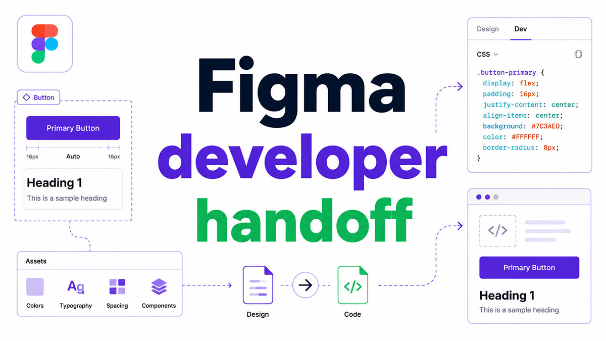
Most design-to-code workflows break at the same point: the moment a designer shares a Figma file and assumes the developer has everything they need.
The Figma developer handoff process is where design quality is either preserved or lost. Done right, it gives developers complete component specs, interaction documentation, design tokens, and asset exports without a single back-and-forth clarifying question.
This guide covers everything from Dev Mode and file preparation to token architecture, plugin selection, responsive handoff, and the metrics that tell you whether your process is actually working.
What Is Figma Developer Handoff?
Figma developer handoff is the process of transferring finalized design specifications from Figma to developers for implementation. It covers everything developers need to build the product accurately: component specifications, interaction behavior, state documentation, spacing values, typography tokens, color styles, and asset export settings.
This is not the same as design collaboration. Collaboration is ongoing. Handoff is a discrete delivery moment where design stops and implementation begins.
Before Figma, teams juggled multiple tools: source files in Dropbox, specs exported from plugins, separate InVision projects, and scattered font files. Figma replaced this with a single shareable URL that acts as the source of truth for the entire team.
Key distinction: Handoff quality directly controls how closely the final product matches the original design. Poor handoff documentation is one of the most common sources of implementation drift, and research shows design errors contribute to 68% of rework costs in product development (Questworks, 2025).
Figma’s current handoff mechanism is Dev Mode, which replaced the legacy Inspect panel. Dev Mode surfaces CSS, Swift, and Kotlin code snippets, spacing measurements, design tokens, and component properties directly to developers, without requiring a full editor seat.
What Gets Transferred During Handoff
A complete Figma developer handoff delivers 5 categories of information:
Have you seen the latest Figma statistics?
Discover comprehensive Figma statistics including revenue growth, market share, user demographics, and funding data.
Check them out →- Visual specs: spacing values, color styles, typography tokens, grid system alignment
- Component specs: all states (default, hover, focus, disabled, error, empty), variants, and properties
- Interaction notes: animation behavior, transition types, conditional display logic
- Assets: exported SVG files, icons, images with defined naming conventions and resolutions
- Context: edge cases, content rules, accessibility requirements, and business logic
Most teams deliver the visual specs and miss the rest. That gap is where implementation diverges from design.
Where Figma Handoff Sits in the Design-to-Code Workflow
84% of designers say they collaborate with developers at least weekly (Figma, 2025). The handoff is not a one-time event in most modern teams. It happens incrementally, frame by frame, as sections move from work-in-progress to ready for dev status.
Teams at Dropbox, Expedia, and Cash App all reported that involving developers earlier in the Figma file, before handoff, reduced miscommunication and improved implementation accuracy.
| Handoff Stage | What Happens | Who Owns It |
|---|---|---|
| Design Review Sign-Off | Frames Approved, States Documented | Designer + PM |
| Ready for Dev Marking | Frames Flagged in Dev Mode | Designer |
| Developer Inspection | Specs, Tokens, Assets Extracted | Developer |
| Design QA | Implementation Checked Against Figma Specs | Designer + Developer |
What Does Figma Dev Mode Include?
Dev Mode is Figma’s dedicated space for developer handoff. It replaced the old Inspect panel and gives developers a structured view of design files without requiring an editor license.
42% of companies now have their developers working inside Figma’s Dev Mode, according to a 2024 survey of 500 designers by CollabSoft.
What “Ready for Dev” Status Means in Practice
The Ready for Dev status is a signal, not just a label. Designers mark specific frames as ready, and Dev Mode surfaces these in a dedicated view that shows what needs to be built, what has changed, and what is already done.
What the status controls:
- Developers get real-time notifications when frames move to ready
- Changed frames are flagged automatically so developers never build on outdated specs
- The view filters out work-in-progress frames, reducing file navigation friction
This single feature addresses one of the most common handoff failures: developers building from design files that are still changing.
How Dev Mode Handles Design Tokens and Variables
Token output in Dev Mode is the most technically dense part of the handoff workflow. When a designer applies Figma variables to a component, Dev Mode surfaces those token names alongside their resolved values in the code snippet panel.
For example: a button background set to Surface/Primary in Figma appears in Dev Mode as both the token name and the underlying hex value. The developer sees the exact token to reference in the codebase rather than a hardcoded color.
Dev Mode also supports variable modes, letting developers toggle between light and dark themes, or mobile and desktop variants, directly in the inspection view.
| Dev Mode Panel | What It Outputs | Platform |
|---|---|---|
| Code Snippets | CSS, Swift, Kotlin Property Values | Web, iOS, Android |
| Variables Panel | Token Name + Resolved Value + Alias Chain | All Platforms |
| Annotations | Designer Notes, Interaction Specs, A11y Requirements | All Platforms |
| Dev Resources | Storybook Links, GitHub PRs, Confluence Docs | All Platforms |
HP surveyed 400 employees using Dev Mode and found it cut development time by 50% for specific projects. Their VP of Engineering noted a significant reduction in routine task time, freeing developers to focus on functionality rather than spec translation (Figma Blog, 2024).
What Are the Most Common Figma Handoff Mistakes?
Design errors contribute to 68% of rework costs in product development, and the majority trace back to information lost or never communicated at the handoff boundary (Questworks, 2025).
Companies with formal handoff practices reduce rework cycles by 47% compared to teams without them (Boston Consulting Group, 2025).
Missing Component States
The most skipped step in any Figma handoff.
Designers deliver the happy path. A button looks right in its default state. But the developer needs 6 states to build it completely:
- Default
- Hover
- Focus
- Disabled
- Loading
- Error
When states are missing, developers either implement their own interpretation or raise tickets for missing designs. Both outcomes cost time and increase design-to-code discrepancy rates.
Hardcoded Values Instead of Design Tokens
Figma’s own documentation illustrates this clearly: a designer hands off spacing values of 25pt, but the codebase uses an 8-point grid. The developer assumes it is intentional, updates the codebase, and the error propagates.
With design tokens applied, the spacing value points to a named token. The token maps to the correct value. The ambiguity disappears entirely.
3 other frequent token-related mistakes:
- Colors applied as hardcoded hex values instead of color style references
- Typography set with raw pixel values instead of text style tokens
- Component properties defined visually but not tied to the shared component library
Detached Components and Missing Library Connections
A detached component looks identical to its library counterpart in the canvas. In Dev Mode, it breaks the connection to the component specification entirely.
Developers inspecting a detached component see raw property values rather than component-level metadata. They lose the link to the shared design system, the component description, and any attached Dev Resources.
Running a plugin like Design Lint before handoff catches detached components, missing styles, and inconsistent layer naming. It takes minutes and prevents hours of developer confusion.
How Should Designers Prepare Files Before Handoff?
Validating designs before development allows teams to reduce iteration cycles by 25%, avoiding significant developer rework costs (UserTesting, 2025).
File preparation is where that validation happens. A well-structured Figma file makes Dev Mode more useful and reduces the clarifying questions developers ask before building.
Structuring Figma Pages for Developer Navigation
Page structure determines how fast a developer finds what they need. When a developer opens a file for the first time, the structure should communicate the project status immediately.
A workable page structure for handoff:
- Cover: project name, version, last updated date, design owner
- Ready for Dev: only production-ready frames, nothing in progress
- Components: all UI components with states, variants, and annotations
- Flows: full user flows with interaction notes and edge cases
- Archive: previous iterations kept but clearly separated
Figma’s default “Page 1” naming is where developer confusion begins. Rename every page before sharing a file link.
Using Annotations and Notes Directly in Figma
Figma’s native annotation tool, introduced in 2024 and refined through 2025, lets designers attach structured notes directly to components and frames.
Annotations should cover what Dev Mode cannot capture automatically:
- Interaction behavior (“On click, open dropdown with 4px offset below trigger”)
- Token references (“Background maps to
--color-surface-subtlein the codebase”) - Accessibility requirements (“Minimum touch target 44x44px,
role='button'“) - Content rules (“Truncate after 2 lines with ellipsis; minimum 1 character”)
For complex interaction flows, linking a FigJam diagram directly inside the Figma file keeps everything in one place. Developers do not need to hunt through Confluence or Notion for flow documentation.
Pre-handoff plugin checks worth running: Design Lint for style inconsistencies, Similayer for identifying near-duplicate layers, and the A11y Annotation Kit for documenting web accessibility requirements inline.
How Do Design Tokens Connect Figma to Code?
Design tokens are named key-value pairs that store visual decisions: color, spacing, typography, radius, shadow. They create a shared vocabulary between Figma and the codebase, so a change in the design system propagates to production without manual re-entry.
When tokens are set up correctly, the whole team moves faster. Designers stop asking developers which color they used. Developers stop translating hex values into token names. Global updates stop requiring an all-hands effort (Figma, 2025).
Tokens Studio and the Figma Variables API
2 main paths for token export from Figma:
Tokens Studio (formerly Figma Tokens): a plugin that manages token definitions and exports them as a JSON file. It supports primitive tokens, semantic tokens, and component tokens with full alias chain support. Teams using Tokens Studio connect the JSON output directly to their CI pipeline for automated style updates.
Figma Variables API: Figma’s native REST API for reading variable collections programmatically. Teams with engineering resources use the API to pull token data into build tools without a plugin dependency. Variables surfaced in Dev Mode through the API show the token name, resolved value, and alias chain in one view.
Shopify’s design team, as noted by former Shopify engineer Max Stoiber, has moved past the traditional static handoff entirely by building a shared token system between Figma and code. When that foundation is in place, AI tools can translate designs to HTML and CSS accurately because the naming and values are already consistent.
Mapping Tokens to CSS, Tailwind, and Native Platforms
A token exported from Figma as JSON needs a transformation step before it works in a codebase. Style Dictionary (by Amazon) is the most widely used tool for this. It takes the raw JSON and outputs platform-specific formats.
| Target Platform | Token Output Format | Example |
|---|---|---|
| Web (CSS) | CSS Custom Properties | --color-primary: #0055FF |
| Tailwind | tailwind.config.js Extension | colors.primary: '#0055FF' |
| iOS | Swift Constants | Color.primary |
| Android | Kotlin Resource File | R.color.primary |
The token hierarchy matters for maintainability. 3 token layers are standard: primitive tokens (raw values like blue-500: #0055FF), semantic tokens (purpose-based aliases like color-action: blue-500), and component tokens (component-specific references like button-background: color-action).
Skipping the semantic layer is the most common token architecture mistake. It creates a direct dependency between component tokens and raw values, so a brand color change requires updating every component token individually.
What Plugins Improve the Figma Developer Handoff Process?
Figma’s built-in annotation system handles baseline spec documentation, but it does not cover everything. Plugins fill gaps in accessibility documentation, token export, spec generation, and external tool connections.
Tokens and Spec Plugins
Tokens Studio handles the heaviest lifting for token-based workflows. It stores token definitions inside the Figma file, exports them as JSON, and supports syncing with GitHub, GitLab, or any URL endpoint. Teams running a design system with multi-brand or multi-theme requirements use Tokens Studio to manage variable modes that would be impractical to maintain manually.
Design Lint runs a pre-handoff audit. It flags missing styles, detached components, and inconsistent layer naming before the file reaches developers. Running it takes 2 minutes. Fixing the issues it catches prevents hours of developer questions.
Accessibility and Quality Plugins
Accessibility documentation rarely makes it into handoff files. The A11y Annotation Kit fixes this by providing annotation components for focus order, ARIA roles, touch targets, and color contrast requirements.
Why this matters: developers building without accessibility specs make their own accessibility decisions. Those decisions are often wrong, and fixing them after implementation costs significantly more than documenting them at handoff.
Similayer identifies layers with near-identical properties across a file. It catches cases where a designer created a one-off version of an existing component instead of using the library instance, which is a common source of detached component issues.
External Tool Integration Plugins
Zeplin’s Figma integration generates a separate developer-facing spec environment. It adds team discussion threads per component and a changelog that Figma’s native Dev Mode does not provide. Teams with large developer groups who prefer a dedicated handoff workspace over direct Figma access often add Zeplin on top of Figma rather than replacing one with the other.
For teams using Storybook, Figma’s Dev Resources panel accepts direct Storybook story links attached to individual components. Developers inspecting a button in Dev Mode can click through to the live Storybook implementation for reference.
How Does Figma Handoff Work With Component Libraries?
A published Figma component library changes the handoff dynamic completely. Developers inspecting a library component in Dev Mode get consistent specs tied to the published source, not whatever the designer last adjusted in the working file.
This eliminates one of the most persistent handoff problems: specs that drift between the design file and the underlying component definition.
Using Figma Branches to Manage Handoff Across Design System Updates
Figma does not natively version component libraries. When a designer updates a component mid-sprint, every file using that component receives the update automatically. That is powerful, but it creates a specific handoff risk: a developer might start building from a spec that changes before they finish.
Figma branches solve this by creating an isolated copy of the file for design system updates. Changes are developed in the branch and merged back to main only after review, keeping the main file stable during active development sprints.
GitHub uses FigJam’s code block tool to align on component APIs in their design system documentation, creating a clear connection between the Figma component specification and the codebase implementation before handoff begins (Figma Blog, 2025).
3 practices that reduce library-related handoff issues:
- Publish library updates with descriptive changelogs (“Added Button error state, updated Input border radius token”)
- Use Figma branches for all breaking component changes rather than editing main directly
- Apply atomic design methodology to library structure so primitive components are stable before composite ones are published
Teams building on Brad Frost’s Atomic Design methodology structure their Figma library in layers: atoms (color, typography, icon tokens), molecules (input fields, buttons), organisms (forms, navigation bars), and templates (full page layouts). Each layer depends on the one below it, so token changes propagate correctly through the entire library.
How Does Figma Handoff Integrate With Developer Workflows?
Figma works where developers already are. The VS Code extension, GitHub connections, and JIRA integrations all reduce context switching, which is one of the biggest sources of developer inefficiency in design-to-code workflows.
According to Figma, more developers than designers now hold active accounts with paid plans. The tool has crossed from design territory into development territory, and the integrations are why.
Figma’s VS Code Extension for Developers
Zero screen switching is the main value here.
The Figma for VS Code extension lets developers open and inspect Figma files directly from their code editor. They can view component specs, check spacing values, read annotations, and receive real-time design update notifications without leaving the IDE.
- Select a component in Figma to see linked code files in VS Code
- Get notified of design changes while actively coding
- Access code autocompletion tied to connected component properties
Volkswagen Group’s lead UX expert described Dev Mode and the VS Code extension as tools that “reduce friction between designers and developers” in production workflows (Figma, 2024).
Linking Storybook Stories to Figma Components
Storybook Connect is a Figma plugin that embeds live component stories directly inside Figma files. Developers inspecting a component in Dev Mode see the Storybook link attached to it, not just the static Figma spec.
What this closes: the gap between the design spec and the live coded implementation. Instead of asking “does this component exist in the codebase?”, developers click through to the Storybook story and verify instantly.
Figma’s Code Connect takes this further. It connects Figma components directly to a GitHub repository, providing component paths, component names, and AI-generated code examples with actual codebase context in Dev Mode.
2 connection methods for Code Connect:
- Code Connect UI: runs inside Figma, connects to GitHub visually, ideal for design-engineering teams who want fast setup
- Code Connect CLI: runs locally in the repository, gives developers more precision and flexibility for complex systems
JIRA, Linear, and GitHub in the Handoff Loop
Dev Resources in Figma accepts direct links to GitHub PRs, JIRA tickets, Linear issues, and Confluence docs, attached at the component level.
A developer inspecting a button component in Dev Mode can click straight through to the open GitHub PR for that component’s implementation. The handoff and the task tracker become one lookup, not two.
Figma’s REST API extends this further. Teams with engineering resources use the API to pull design data into CI pipelines, generate automated documentation, or build internal tooling that reads design tokens directly from Figma without manual export steps.
How Does Figma Handle Responsive and Multi-Platform Handoff?
Responsive handoff is where most Figma files break down. Designers document the desktop state. Developers need to know what happens at 375px, 768px, and 1440px, with full breakpoint logic, not just a single viewport.
Figma handles the structural side of responsive design well through Auto Layout and constraints. The gap is in what it cannot generate: complex media query logic, animation breakpoints, and conditional rendering rules.
Auto Layout and Its Code Output in Dev Mode
Auto Layout in Figma maps directly to CSS Flexbox. A frame with horizontal Auto Layout, a gap of 16px, and padding of 24px renders in Dev Mode as:
display: flex; flex-direction: row; gap: 16px; padding: 24px;
This is accurate and usable. It covers a large percentage of standard layout implementations without any manual translation.
What Auto Layout does not generate:
- Media queries for breakpoint-specific layout changes
- CSS Grid output (Auto Layout maps only to Flexbox)
- JavaScript-driven responsive behaviors
Apple recommends a minimum touch target of 44x44px for iOS. Google Material Design recommends 48x48px. Neither enforcement happens automatically in Figma handoff, so documenting touch targets in annotations before marking frames ready for dev is the designer’s responsibility (Orbix Studio, 2025).
Variable Modes for Theming and Platform Variants
Figma variable modes let a single component file hold values for light mode, dark mode, mobile, and desktop simultaneously. Developers toggle modes in Dev Mode to inspect the correct values for each context without switching between separate frames.
| Variable Mode | Use Case | Dev Mode Behavior |
|---|---|---|
| Light / Dark | Theme Switching | Toggle Shows Correct Token Values per Theme |
| Mobile / Desktop | Responsive Variants | Spacing and Type Tokens Update per Breakpoint |
| Brand A / Brand B | Multi-Brand Systems | Color and Typography Tokens Switch per Brand |
The Figma MCP server update in March 2026 added bidirectional sync with GitHub Copilot, letting developers push rendered UIs from VS Code back into Figma as editable frames. This closes a gap that previously made multi-platform iteration slow: developers could build from Figma, but could not easily return divergences to the design file for correction.
How Is Figma Developer Handoff Different From Zeplin and InVision Inspect?
Figma owns the entire workflow from first wireframe to production spec. Zeplin is purpose-built for the handoff moment only. InVision Inspect was discontinued in 2024 after InVision shut down, making migration to Figma or Zeplin necessary for teams still using it.
| Feature | Figma Dev Mode | Zeplin |
|---|---|---|
| Source of Truth | Live Design File, Always Current | Exported Snapshot, Can Go Stale |
| Component Changelog | Not Available Natively | Yes, Per-Component History |
| Discussion Threads | File-Level Comments Only | Per-Component Discussion Threads |
| Style Guide Generation | Manual via Design System | Auto-Generated from Imported Designs |
| Pricing Model | Included in Figma Paid Plan | Separate Paid Tool on Top of Design Tool |
Where Figma Wins
Single source of truth is Figma’s defining advantage over Zeplin. When a designer updates a component in Figma, the developer sees the change immediately in Dev Mode. No export step. No snapshot that goes stale mid-sprint.
By 2023, Figma held 90% market share among UI designers, up from 7% in 2017, partly because it eliminated the multi-tool workflow that required separate handoff tools (UX Tools survey, 2023).
Where Zeplin Still Has an Edge
Per-component discussion threads and automatic style guide generation from imported designs are features Zeplin does better than Figma’s native Dev Mode.
Zeplin also performs better with very large project files. Figma’s browser-based rendering can slow on complex files with hundreds of frames. Zeplin’s native app handles large projects more consistently.
The practical decision: teams with 1-10 developers who already live in Figma rarely need Zeplin. Teams with larger development groups who want dedicated component discussion history and auto-generated style guides add Zeplin on top rather than replacing Figma.
What Metrics Indicate a Healthy Figma Handoff Process?
Most teams know their handoff is broken. Few measure it. Without measurement, improvements are guesses.
An IBM study found 47% faster development time for teams using a structured design system versus starting from scratch. HP’s Veneer system showed the same 47% figure for specific project types using Dev Mode (Figma Blog, 2024).
Developer Rework Rate and Cycle Time
Developer rework rate measures what percentage of implemented components require design revision after handoff.
This is the single most direct indicator of handoff quality. A high rework rate means specs were incomplete, states were missing, or annotation coverage was insufficient. Tracking it per sprint reveals whether process changes are working.
Handoff-to-implementation cycle time measures days from “Ready for Dev” marking to first code PR. Shorter cycle times correlate with well-structured files, complete annotations, and established token systems. Teams that see cycle times above 5 days for standard components typically have documentation gaps that are slowing developers down.
Annotation Completeness and Design QA Pass Rate
UserTesting research shows validating designs before development reduces iteration cycles by 25%. Annotation completeness tracks the percentage of frames with documented edge cases, interaction behaviors, and all component states.
3 metrics worth tracking in design QA:
- Percentage of frames with complete state documentation
- Design-to-code discrepancy rate tracked in QA review
- Number of developer clarifying questions per sprint
HP tracked developer clarifying questions directly after rolling out Dev Mode across 400 employees. The reduction in those questions was one of the primary qualitative signals they used to validate the investment in the new handoff workflow (Figma Blog, 2024).
Building a Feedback Loop Between Design and Development
Metrics only work when both teams see them.
A shared dashboard tracking rework rate, cycle time, and annotation completeness gives designers visibility into implementation outcomes. Developers who flag which annotations were useful versus which were missing create a feedback loop that improves future handoffs without requiring a full process overhaul.
Airbnb and Spotify eliminated the traditional sequential handoff by making design and development a continuous collaboration rather than a relay race. Their approach reduces rework by catching implementation gaps before a component reaches the “ready for dev” stage, not after it reaches production.
A complete Figma developer handoff is not a one-time deliverable. It is an ongoing process between user interface design and frontend implementation, built on consistent token architecture, complete component documentation, and a shared vocabulary between the people who design and the people who build.
FAQ on Figma Developer Handoff
What is Figma developer handoff?
Figma developer handoff is the process of transferring finalized design specifications to developers for implementation. It includes component specs, spacing values, typography tokens, color styles, interaction notes, and exported assets. The goal is giving developers everything they need to build accurately without repeated clarifying questions.
What is Figma Dev Mode?
Dev Mode is Figma’s dedicated developer workspace that replaced the legacy Inspect panel. It surfaces CSS, Swift, and Kotlin code snippets, design tokens, spacing measurements, and component annotations. Developers access it without a full editor seat, using a paid developer license instead.
How do I mark designs as ready for handoff in Figma?
Use the Ready for Dev status in Dev Mode. Select the frame, then mark it ready from the Dev Mode panel. Developers receive a notification and the frame appears in their Ready for Dev view, filtered away from work-in-progress content.
What should a Figma handoff file include?
A complete handoff file includes all component states (default, hover, focus, disabled, error), design tokens, interaction annotations, asset exports with naming conventions, and edge case documentation. Missing component states are the most common gap that causes developer rework after implementation.
What are design tokens in Figma handoff?
Design tokens are named key-value pairs storing visual decisions like color, spacing, and typography. In Figma, they are created as variables. Dev Mode surfaces the token name alongside the resolved value, so developers reference the token directly in the codebase instead of hardcoded values.
Is Figma Dev Mode better than Zeplin for developer handoff?
Figma Dev Mode keeps design and specs in a single live file, so specs never go stale. Zeplin offers per-component discussion threads and auto-generated style guides that Figma lacks natively. Small teams rarely need Zeplin. Larger teams sometimes add it on top of Figma for those specific features.
How do design tokens get from Figma to code?
Tokens export as JSON via Tokens Studio or the Figma Variables API. A transformation tool like Style Dictionary converts the JSON into CSS custom properties, Tailwind config, Swift constants, or Kotlin resource files, depending on the target platform. The token hierarchy covers primitive, semantic, and component layers.
How does Figma handle responsive design in handoff?
Auto Layout maps to CSS Flexbox and outputs accurate code snippets in Dev Mode. Variable modes handle light/dark and mobile/desktop token variants. Figma does not generate media queries or complex responsive logic, so designers must document breakpoint behavior separately in annotations.
What plugins improve the Figma handoff process?
The most useful plugins are Tokens Studio for design token export, Design Lint for pre-handoff file audits, the A11y Annotation Kit for accessibility documentation, and Storybook Connect for linking live component stories to Figma components in Dev Mode.
How do I measure whether my Figma handoff process is working?
Track 3 metrics: developer rework rate (components requiring revision after implementation), handoff-to-implementation cycle time (days from Ready for Dev to first PR), and the number of developer clarifying questions per sprint. All 3 drop consistently when annotation completeness and token coverage improve.
Conclusion
This conclusion is for an article presenting the full design-to-code workflow that separates teams who ship accurate products from those who spend sprints on rework.
A reliable handoff process is not about sharing a file link. It comes down to complete component states, a working token architecture, and documentation that covers what Dev Mode cannot generate automatically.
Whether you are using auto layout for responsive specs, Tokens Studio for JSON export, or Code Connect for live Storybook integration, each layer reduces the gap between design intent and frontend implementation.
Measure your rework rate. Track your cycle time. The numbers will tell you exactly where your developer handoff process still needs work.

Many of his resources are available on various design marketplaces. Over the years, he's worked with a range of clients and contributed to design publications like Designmodo, WebDesignerDepot, and Speckyboy, Slider Revolution among others.
- What is Backend in Web Development? - September 13, 2026
- What is Frontend Development? - September 11, 2026
- How to Make a Button in Figma: Design Best Practices - September 10, 2026

