Static hero sections don’t cut it anymore. Users expect movement, interaction, and content that cycles without endless scrolling.
That’s where Bootstrap carousel examples come in handy.
The slideshow component handles image sliders, product showcases, and testimonial rotators with minimal code. No jQuery plugins needed. No custom JavaScript from scratch.
This guide covers everything from basic slide-only setups to multi-item carousels with fade transitions and touch swipe support.
You’ll learn the carousel options, JavaScript methods, and accessibility fixes that separate amateur implementations from production-ready sliders.
Code snippets included for every example.
What is Bootstrap Carousel
A Bootstrap carousel is a slideshow component for cycling through images, text, or custom markup on web pages.
Built with CSS 3D transforms and JavaScript, it handles slide transitions, touch swipe navigation, and keyboard controls out of the box.
The component shipped with Bootstrap version 2.0 back in 2012.
Mark Otto and Jacob Thornton designed it as a lightweight alternative to jQuery slider plugins that dominated frontend development at the time.
Today it powers hero banners, product showcases, and testimonial sliders across millions of websites.
The carousel respects the Page Visibility API, so it pauses when browser tabs become inactive. Good for performance. Great for battery life on mobile devices.
Bootstrap Carousel Examples
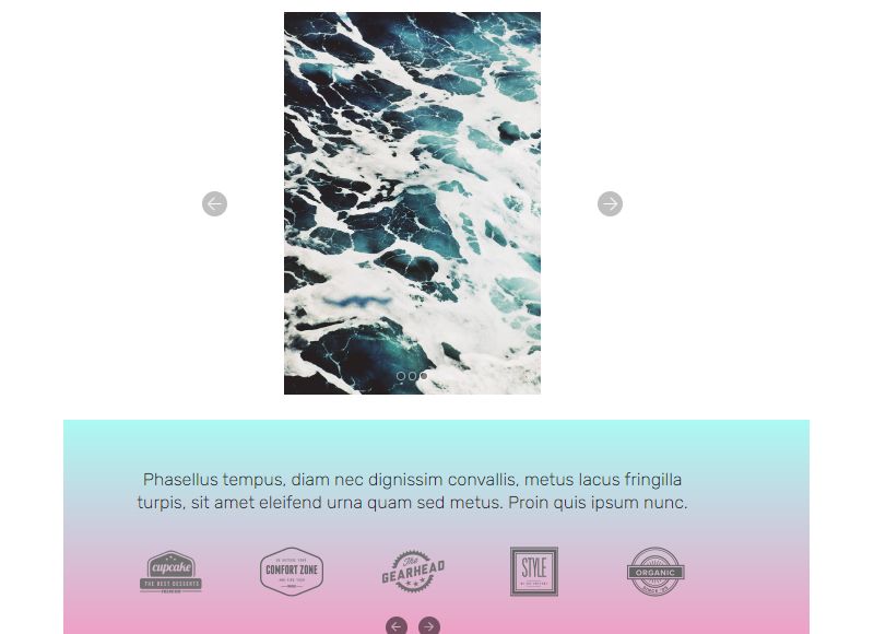
Carousel V05 for Colored Background

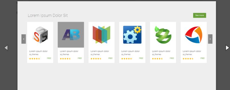
Multiple Items Carousel
MiriUI Free

Full Page Bootstrap 4 Carousel Example

Broken Grid Carousel Slider

Bootstrap 4 Carousel Responsive
Bootstrap Carousel with Text

Carousel V11 for Slider

Fixed Height Carousel

Partner/Client Carousel

Sneaky for vertical carousel

Product Showcase Carousel Template

Bootstrap Carousel Fade-in, Fade-out

Carousel V16 for Minimalism

Bootstrap Swipe Carousel

Bootstrap Carousel With Time Indicators

Thumber To Manage Large Number Of Images

JS 3D Carousel Template

Responsive bs-carousel with Hero Headers

Carousel V20

Autoplay Carousel Feature

Bootstrap 4 Carousel with Responsive Slides

Motion Reveal Carousel

Pure CSS Netflix Video Carousel Template

Bootstrap Carousel Tooltip

What are the Main Components of a Bootstrap Carousel
Every Bootstrap 5 carousel consists of four structural parts that work together.
Carousel Container
The outer wrapper uses .carousel and .slide classes with a unique ID for targeting controls.
Carousel Inner
The .carousel-inner div holds all slides. Each slide lives inside a .carousel-item element.
One item must have the .active class or nothing displays.
Navigation Controls
Previous and next buttons let users manually cycle through content.
These use .carousel-control-prev and .carousel-control-next classes.
Slide Indicators
Small dots at the bottom show current position and total slide count.
Clicking an indicator jumps directly to that slide index.
How to Create a Basic Bootstrap Carousel with Slides Only
The simplest implementation needs just the container and slides. No controls, no indicators.
Start with this HTML structure:
“ <div id="basicCarousel" class="carousel slide" data-bs-ride="carousel"> <div class="carousel-inner"> <div class="carousel-item active"> <img src="slide-1.jpg" class="d-block w-100" alt="First slide"> </div> <div class="carousel-item"> <img src="slide-2.jpg" class="d-block w-100" alt="Second slide"> </div> <div class="carousel-item"> <img src="slide-3.jpg" class="d-block w-100" alt="Third slide"> </div> </div> </div> `
The data-bs-ride=”carousel” attribute triggers autoplay on page load.
Add .d-block and .w-100 to images for proper sizing. These utility classes prevent browser default alignment issues.
Default interval sits at 5000 milliseconds between slides.
How to Add Navigation Controls to Bootstrap Carousel
Navigation controls give users manual cycling through slides using previous and next buttons.
Place these buttons inside the carousel container, after .carousel-inner:
` <button class="carousel-control-prev" type="button" data-bs-target="#myCarousel" data-bs-slide="prev"> <span class="carousel-control-prev-icon" aria-hidden="true"></span> <span class="visually-hidden">Previous</span> </button>
<button class=”carousel-control-next” type=”button” data-bs-target=”#myCarousel” data-bs-slide=”next”> <span class=”carousel-control-next-icon” aria-hidden=”true”></span> <span class=”visually-hidden”>Next</span> </button> `
The data-bs-target must match your carousel's ID exactly.
Use data-bs-slide=”prev” or data-bs-slide=”next” to set direction.
The .visually-hidden spans handle web accessibility for screen readers. Don't skip these.
How to Add Indicators to Bootstrap Carousel
Carousel indicators display clickable dots showing the current slide position and total count.
Add this markup inside the carousel container, before .carousel-inner:
` <div class="carousel-indicators"> <button type="button" data-bs-target="#myCarousel" data-bs-slide-to="0" class="active" aria-current="true" aria-label="Slide 1"></button> <button type="button" data-bs-target="#myCarousel" data-bs-slide-to="1" aria-label="Slide 2"></button> <button type="button" data-bs-target="#myCarousel" data-bs-slide-to="2" aria-label="Slide 3"></button> </div> `
The data-bs-slide-to attribute uses zero-based indexing. First slide is 0, second is 1.
Match indicator count to your total slides. Add .active to the first indicator button.
ARIA labels improve accessibility for users with assistive technology.
How to Add Captions to Bootstrap Carousel Slides
Slide captions add headings and description text over your images.
Place the .carousel-caption div inside any .carousel-item:
` <div class="carousel-item active"> <img src="slide-1.jpg" class="d-block w-100" alt="..."> <div class="carousel-caption d-none d-md-block"> <h5>First Slide Title</h5> <p>Description text goes here.</p> </div> </div> `
The d-none d-md-block classes hide captions on small screens, showing them only on medium viewport sizes and up.
Captions position at the bottom center by default. Override with custom CSS animation for entrance effects.
How to Create a Bootstrap Carousel with Fade Transition
The default slide animation moves content horizontally. Fade transition creates a smoother crossfade effect between slides.
Add the .carousel-fade class to your carousel container:
` <div id="fadeCarousel" class="carousel slide carousel-fade" data-bs-ride="carousel"> <!-- slides here --> </div> `
That’s it. One class changes the entire animation style.
Fade works better for hero banners and image galleries where horizontal movement feels jarring.
How to Set Custom Time Intervals Between Bootstrap Carousel Slides
Default carousel interval is 5000ms (5 seconds). Too slow for some projects, too fast for others.
Set a global interval on the container:
` <div class="carousel slide" data-bs-ride="carousel" data-bs-interval="3000"> `
Or set different timing per slide:
` <div class="carousel-item active" data-bs-interval="10000"> <!-- This slide shows for 10 seconds --> </div> <div class="carousel-item" data-bs-interval="2000"> <!-- This slide shows for 2 seconds --> </div> `
Per-slide intervals override the global setting. Useful when some slides need more reading time.
How to Create an Autoplay Bootstrap Carousel
Two data attributes control autoplay behavior in Bootstrap 5.
Use data-bs-ride=”carousel” to start cycling immediately on page load:
` <div class="carousel slide" data-bs-ride="carousel"> `
Use data-bs-ride=”true” to autoplay only after user interaction (first manual slide).
The carousel pauses on hover by default. Set data-bs-pause=”false” to disable this.
How to Disable Touch Swipe on Bootstrap Carousel
Bootstrap carousels support touch swipe navigation on mobile devices by default.
Disable it with the touch option:
` <div class="carousel slide" data-bs-ride="carousel" data-bs-touch="false"> `
Or via JavaScript initialization:
` const carousel = new bootstrap.Carousel(element, { touch: false }); `
Disable swipe when carousel contains interactive elements like forms or input fields that need horizontal scrolling.
How to Create a Bootstrap Carousel with Multiple Items Per Slide
Standard carousels show one item per slide. Multi-item carousels display product cards, team members, or logos in groups.
Combine Bootstrap’s grid system with carousel structure:
` <div class="carousel-item active"> <div class="row"> <div class="col-md-4"> <!-- Card 1 --> </div> <div class="col-md-4"> <!-- Card 2 --> </div> <div class="col-md-4"> <!-- Card 3 --> </div> </div> </div> `
Each .carousel-item contains a full row of content. Items cycle together as a group.
Add media queries to adjust column counts across breakpoints for responsive design.
How to Control Bootstrap Carousel with JavaScript
The JavaScript API provides programmatic control over carousel behavior.
Initialize with options:
` const myCarousel = document.querySelector('#myCarousel'); const carousel = new bootstrap.Carousel(myCarousel, { interval: 2000, wrap: false, keyboard: true }); `
Available carousel methods:
- cycle()
- Start auto-rotating
- pause()
- Stop cycling
- prev()
- Go to previous slide
- next()
- Go to next slide
- to(index)
- Jump to specific slide (zero-based)
- dispose()
- Destroy the carousel instance
All methods are asynchronous; they return before the transition completes.
What are the Bootstrap Carousel Events
Bootstrap fires two carousel events for hooking into slide transitions.
slide.bs.carousel fires immediately when the slide method triggers.
slid.bs.carousel fires after the transition completes.
Both events include these properties:
- direction
- "left" or "right"
- relatedTarget
- The slide element becoming active
- from
- Index of current slide
- to
- Index of next slide
` myCarousel.addEventListener('slid.bs.carousel', event => { console.log('Moved to slide: ' + event.to); }); `
What are the Bootstrap Carousel Options
Pass options via data attributes or JavaScript object.
| Option | Type | Default | Description | | | | | | | interval | number | 5000 | Delay between slides in ms | | keyboard | boolean | true | React to keyboard events | | pause | string/boolean | “hover” | Pause on mouseenter | | wrap | boolean | true | Cycle continuously or stop | | touch | boolean | true | Allow swipe on touchscreens |
Set interval: false to disable auto-cycling entirely.
Set wrap: false for hard stops at first and last slides.
How to Create a Full-Width Background Image Bootstrap Carousel
Full-screen carousels work great for hero image sections and landing pages.
Use CSS background-image instead of inline img tags:
` .carousel-item { height: 100vh; background-size: cover; background-position: center; background-repeat: no-repeat; }
.slide-1 { background-image: url(‘hero-1.jpg’); } .slide-2 { background-image: url(‘hero-2.jpg’); } `
This approach ensures consistent framing regardless of image aspect ratio.
Content overlays position above the fold with call-to-action buttons.
How to Make Bootstrap Carousel Accessible
Carousels present usability challenges for screen reader users and keyboard navigation.
Accessibility requirements:
- Add aria-label
to all indicator buttons
- Use .visually-hidden
for control button text
- Include descriptive alt
text on all images
- Set aria-hidden=”true”
on decorative icons
- Test with keyboard-only navigation
Consider adding pause/play controls for users with vestibular disorders.
Auto-playing carousels can trigger motion sickness. Respect prefers-reduced-motion media queries when possible.
How to Create a Bootstrap Carousel for Product Cards
Ecommerce sites use product carousels to showcase merchandise without endless scrolling.
Combine Bootstrap cards with multi-item carousel structure:
` <div class="carousel-item active"> <div class="row"> <div class="col-lg-3 col-md-6"> <div class="card"> <img src="product-1.jpg" class="card-img-top" alt="Product"> <div class="card-body"> <h5 class="card-title">Product Name</h5> <p class="card-text">$29.99</p> <a href="#" class="btn btn-primary">Add to Cart</a> </div> </div> </div> <!-- More product cards --> </div> </div> `
Add card hover effects for micro-interactions that improve user experience.
How to Create a Bootstrap Testimonial Carousel
Customer reviews build trust. A testimonial slider displays social proof without cluttering the page.
` <div class="carousel-item active text-center p-5"> <blockquote class="blockquote"> <p>"This product changed everything for our team."</p> </blockquote> <figcaption class="blockquote-footer mt-3"> Jane Smith, <cite>CEO at TechCorp</cite> </figcaption> </div> `
Use styled blockquotes for proper semantic markup.
Add customer photos and star ratings to increase credibility. Fade transitions work better than sliding for text-heavy content.
Bootstrap Carousel Common Problems and Solutions
Carousel Not Visible
Missing .active class on the first .carousel-item. Add it manually.
Images Not Sizing Correctly
Add .d-block and .w-100 classes to images. Or use CSS object-fit: cover for consistent aspect ratios.
Autoplay Not Working
Check that data-bs-ride=”carousel” exists on the container. Verify Bootstrap JavaScript loaded correctly.
Touch Gestures Not Responding
Conflicting JavaScript libraries can interfere. Check console for errors. Verify data-bs-touch isn't set to false.
Controls Not Functioning
The data-bs-target value must match the carousel ID exactly, including the hash symbol.
Slides Jumping Instead of Animating
Bootstrap CSS not loading properly. Verify CDN links or local file paths. Check for CSS conflicts with other frameworks.
FAQ on Bootstrap Carousel Examples
How do I make a Bootstrap carousel autoplay?
Add data-bs-ride=”carousel” to your carousel container. This triggers automatic cycling when the page loads. Default interval is 5000 milliseconds. Change timing with data-bs-interval=”3000″ for faster rotation.
Why is my Bootstrap carousel not showing?
The most common cause is a missing .active class on the first .carousel-item. Without it, no slide displays. Also verify Bootstrap CSS and JavaScript files loaded correctly in your project.
How do I add fade transition to Bootstrap carousel?
Add the .carousel-fade class alongside .carousel and .slide on your container element. This replaces the default horizontal sliding animation with a smooth crossfade effect between slides.
Can I display multiple items per slide in Bootstrap carousel?
Yes. Place a row with multiple columns inside each .carousel-item. Use Bootstrap's grid components like .col-md-4 to show three items per slide. Items cycle together as groups.
How do I disable touch swipe on Bootstrap carousel?
Set data-bs-touch=”false” on the carousel container. Alternatively, pass touch: false in the JavaScript initialization options. Useful when slides contain form elements needing horizontal scroll.
What is the default carousel interval in Bootstrap 5?
The default slide interval is 5000 milliseconds (5 seconds). Override globally with data-bs-interval on the container, or per-slide by adding the attribute to individual .carousel-item elements.
How do I stop Bootstrap carousel on hover?
Pause on hover is enabled by default. The carousel stops when users mouse over it and resumes on mouse leave. Disable this behavior with data-bs-pause=”false” if continuous cycling is required.
How do I control Bootstrap carousel with JavaScript?
Create an instance with new bootstrap.Carousel(element). Call methods like .next(), .prev(), .pause(), and .to(index) for programmatic control. All methods return before transitions complete.
Are Bootstrap carousels accessible?
Not fully by default. Add aria-label attributes to indicators, use .visually-hidden text for controls, and include descriptive alt text on images. Consider providing pause controls for users with vestibular sensitivities.
How do I create a full-screen Bootstrap carousel?
Set height: 100vh on .carousel-item elements. Use CSS background-image with background-size: cover instead of inline images for consistent framing across different screen sizes and aspect ratios.
Conclusion
These Bootstrap carousel examples cover the full range of implementations, from basic slideshows to advanced multi-item sliders with JavaScript control.
You now have the code for navigation controls, indicators, captions, and fade animations.
The carousel events and methods give you programmatic flexibility. Keyboard navigation and ARIA attributes keep things accessible.
Test your implementation across browsers using Chrome DevTools and Firefox Developer Tools. Mobile responsiveness matters, so verify touch gestures work correctly on actual devices.
Check the official documentation on GetBootstrap.com for updates. The Bootstrap 5 carousel continues to evolve.
Copy the snippets, adapt them to your user interface, and build something users actually want to interact with.


