Dropdowns break or make your site’s navigation. Get them wrong, and users leave frustrated.
These Bootstrap dropdown examples show you exactly how to build toggleable menus that work across all devices and browsers.
You’ll learn the required markup, direction variations, dark themes, form integration, and JavaScript control methods.
Each example includes copy-ready code you can drop into your project today.
Whether you’re building a simple action menu or a complex multi-level navigation system, this guide covers the Bootstrap dropdown component from basic structure to advanced customization and accessibility requirements.
What is a Bootstrap Dropdown
A Bootstrap dropdown is a toggleable menu component that displays a list of links or actions when triggered.
It’s built into the Bootstrap 5 framework and requires minimal setup.
Click a button, and a menu appears. Click again or click outside, and it disappears. Simple.
Dropdowns work for navigation menus, action lists, form selects, and context menus throughout your site.
The component uses Popper.js for positioning, which handles all the tricky stuff like screen edge detection and automatic flipping.
Bootstrap Dropdown Examples
Bootstrap 5 Dropdown Menu with Checkbox (Switch)

Offcanvas Dropdown

Dropdown Animation With CSS
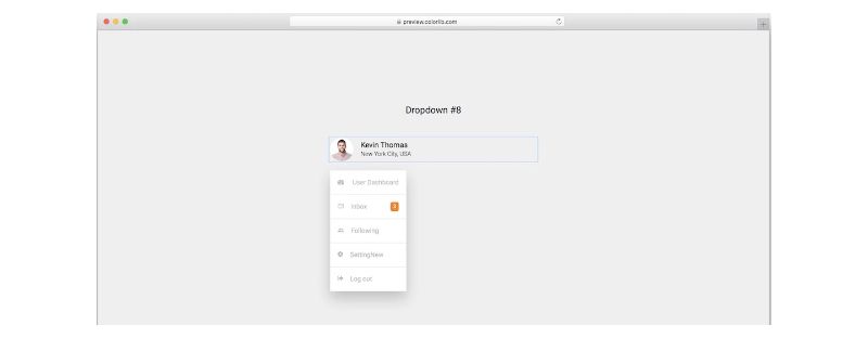
Bootstrap Profile Dropdown
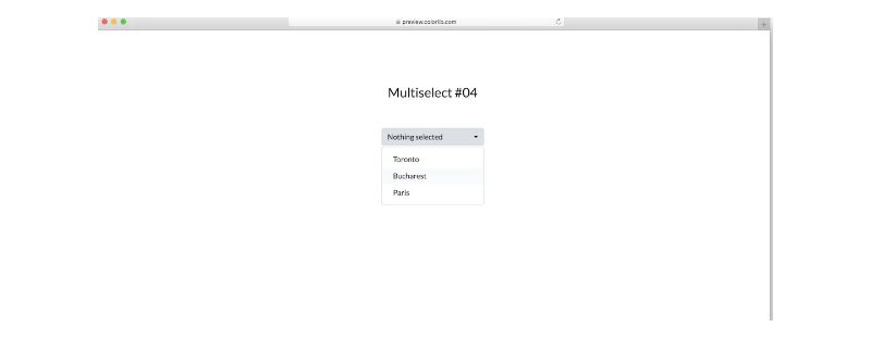
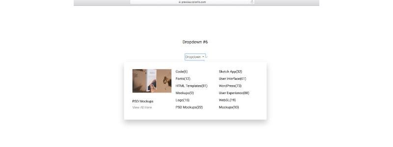
Multiselect V04
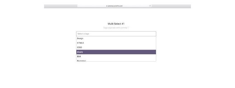
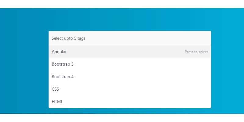
Bootstrap Multiselect Dropdown
NavBar Menu Dropdowns
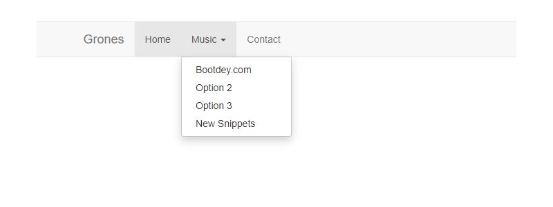
Bootstrap Dropdown Navigation
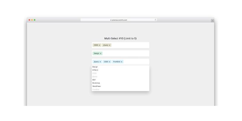
Multiselect V11
Bootstrap 4 Dropdown Megamenu

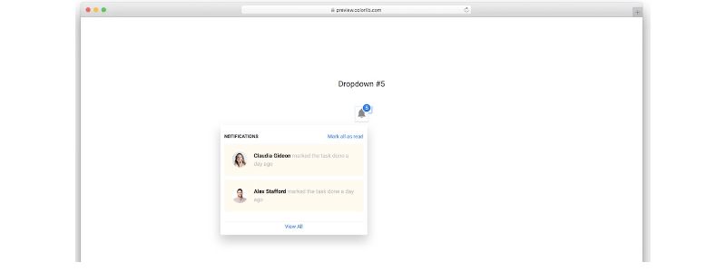
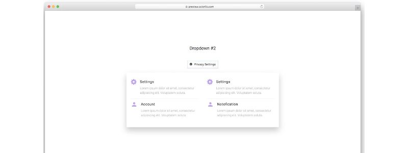
Bootstrap Notification Dropdown
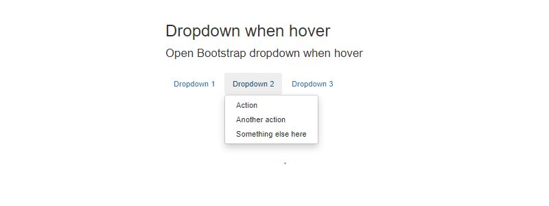
Bootstrap Dropdown Menu on Hover
Bootstrap Advanced Dropdown
Full-Width Bootstrap Dropdown
Hexashop Template

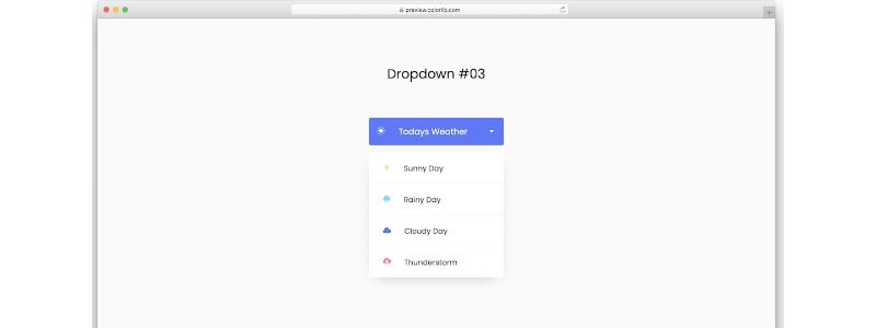
Bootstrap Weather Dropdown Menu
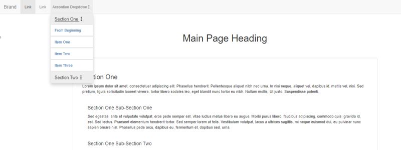
Bootstrap Dropdown With Accordion and Scroll Spy
Bootstrap 4 Multiselect Dropdown List
Venue Template

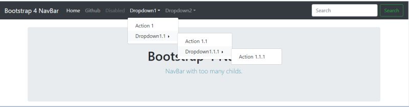
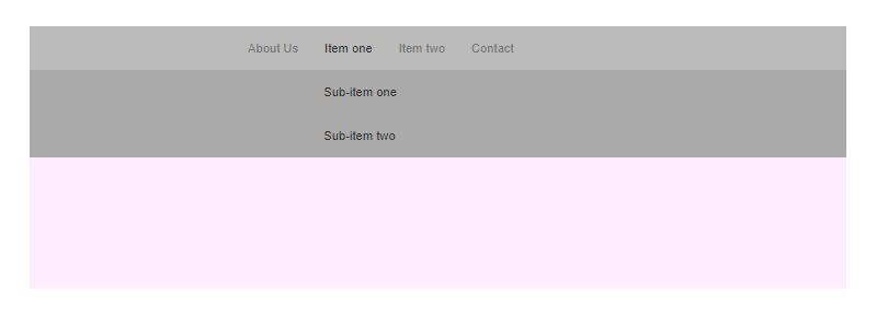
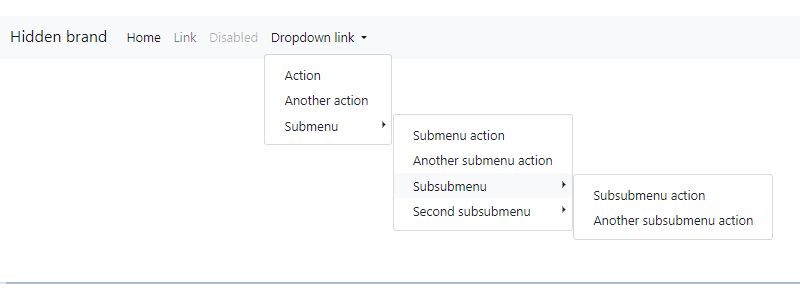
Bootstrap 4 Responsive Dropdown Submenu
Multiselect V20
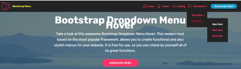
Bootstrap Dropdown Menu Hover
How Does a Bootstrap Dropdown Work
The dropdown toggle button uses the data-bs-toggle attribute to trigger visibility changes on the connected menu.
When you click the toggle, JavaScript adds or removes the show class from the dropdown menu element.
ARIA attributes update automatically for web accessibility.
The click event listener handles opening and closing. By default, clicking anywhere outside the menu triggers the auto close behavior.
Popper.js calculates the menu position relative to the toggle button, adjusting for viewport boundaries and scroll containers.
What are the Required Bootstrap Dropdown Classes
Three classes make a dropdown function:
.dropdown– wrapper container that establishes positioning context.dropdown-toggle– applied to the button or link that triggers the menu.dropdown-menu– the actual menu container holding your items
Each menu item needs the .dropdown-item class for proper styling and hover states.
Optional classes include .dropdown-divider for separators and .dropdown-header for section labels.
What is the Basic Bootstrap Dropdown HTML Structure
The markup follows a parent-child pattern.
Wrap everything in a div with the dropdown class. Inside, place your Bootstrap button with toggle attributes, followed by a ul or div for the menu.
“ <div class="dropdown"> <button class="btn btn-secondary dropdown-toggle" type="button" data-bs-toggle="dropdown" aria-expanded="false"> Dropdown button </button> <ul class="dropdown-menu"> <li><a class="dropdown-item" href="#">Action</a></li> <li><a class="dropdown-item" href="#">Another action</a></li> <li><a class="dropdown-item" href="#">Something else</a></li> </ul> </div> `
The aria-expanded attribute starts as false and switches to true when open.
This basic structure works with any button style from the Bootstrap components library.
What are the Bootstrap Dropdown Variations
Bootstrap provides four dropdown direction options plus a split button variant.
Each variation changes where the menu appears relative to the toggle.
What is a Split Button Dropdown
A split button dropdown separates the main action from the menu trigger into two distinct buttons.
Use .dropdown-toggle-split on the second button. The first button performs an action, the second opens the menu.
` <div class="btn-group"> <button type="button" class="btn btn-danger">Action</button> <button type="button" class="btn btn-danger dropdown-toggle dropdown-toggle-split" data-bs-toggle="dropdown" aria-expanded="false"> <span class="visually-hidden">Toggle Dropdown</span> </button> <ul class="dropdown-menu"> <li><a class="dropdown-item" href="#">Action</a></li> <li><a class="dropdown-item" href="#">Another action</a></li> </ul> </div> `
What is a Dropup Menu
Dropup menus open above the toggle button instead of below.
Replace .dropdown with .dropup on the wrapper. Useful when the toggle sits near the bottom of the viewport.
` <div class="dropup"> <button class="btn btn-secondary dropdown-toggle" type="button" data-bs-toggle="dropdown"> Dropup </button> <ul class="dropdown-menu"> <li><a class="dropdown-item" href="#">Action</a></li> </ul> </div> `
What is a Dropstart Menu
Dropstart positions the menu to the left of the toggle.
Use .dropstart on the wrapper for left-side expansion.
` <div class="dropstart"> <button class="btn btn-secondary dropdown-toggle" type="button" data-bs-toggle="dropdown"> Dropstart </button> <ul class="dropdown-menu"> <li><a class="dropdown-item" href="#">Action</a></li> </ul> </div> `
What is a Dropend Menu
Dropend opens the menu to the right of the toggle button.
Apply .dropend to the wrapper container.
` <div class="dropend"> <button class="btn btn-secondary dropdown-toggle" type="button" data-bs-toggle="dropdown"> Dropend </button> <ul class="dropdown-menu"> <li><a class="dropdown-item" href="#">Action</a></li> </ul> </div> `
All four directions respect responsive design principles and flip automatically when hitting screen edges.
How to Create a Bootstrap Dropdown with Links
Use anchor elements inside your dropdown menu items when you need clickable navigation links.
Each link gets the .dropdown-item class for consistent styling and hover states.
` <ul class="dropdown-menu"> <li><a class="dropdown-item" href="/dashboard">Dashboard</a></li> <li><a class="dropdown-item" href="/settings">Settings</a></li> <li><a class="dropdown-item" href="/profile">Profile</a></li> </ul> `
Links work best for page navigation. For actions that don’t navigate anywhere, use buttons instead.
How to Create a Bootstrap Dropdown with Buttons
Button elements inside dropdowns trigger actions without page navigation.
Swap the anchor tags for buttons when handling click events through your JavaScript code.
` <ul class="dropdown-menu"> <li><button class="dropdown-item" type="button">Copy</button></li> <li><button class="dropdown-item" type="button">Cut</button></li> <li><button class="dropdown-item" type="button">Paste</button></li> </ul> `
Context menus and action lists typically use buttons. The styling stays identical to link-based items.
How to Add Headers and Dividers to Bootstrap Dropdowns
Group related menu items using dropdown header text and visual separators.
Add .dropdown-header to label sections and .dropdown-divider for horizontal lines between groups.
` <ul class="dropdown-menu"> <li><h6 class="dropdown-header">Account</h6></li> <li><a class="dropdown-item" href="#">Profile</a></li> <li><a class="dropdown-item" href="#">Settings</a></li> <li><hr class="dropdown-divider"></li> <li><a class="dropdown-item" href="#">Sign out</a></li> </ul> `
Headers improve user experience by making long menus scannable.
How to Disable Bootstrap Dropdown Items
Add the .disabled class to any dropdown item that shouldn't be clickable.
Disabled items appear grayed out and ignore pointer events.
` <li><a class="dropdown-item disabled" href="#" aria-disabled="true">Disabled link</a></li> `
Include aria-disabled=”true” for screen reader compatibility. The link still exists in the DOM but won't respond to clicks.
How to Align Bootstrap Dropdown Menus
By default, dropdown menus align to the left edge of the toggle button.
Bootstrap provides classes for right alignment and responsive positioning based on breakpoints.
How to Right-Align a Bootstrap Dropdown
Add .dropdown-menu-end to the menu element for right-side alignment.
` <ul class="dropdown-menu dropdown-menu-end"> <li><a class="dropdown-item" href="#">Action</a></li> </ul> `
How to Create Responsive Dropdown Alignment
Combine alignment classes with breakpoint suffixes: .dropdown-menu-lg-end right-aligns on large screens and up.
Available breakpoints match the standard grid system: sm, md, lg, xl, xxl.
` <ul class="dropdown-menu dropdown-menu-lg-end"> <li><a class="dropdown-item" href="#">Responsive item</a></li> </ul> `
How to Create a Dark Bootstrap Dropdown
Apply .dropdown-menu-dark for a dark mode dropdown with inverted colors.
` <ul class="dropdown-menu dropdown-menu-dark"> <li><a class="dropdown-item" href="#">Action</a></li> <li><a class="dropdown-item" href="#">Another action</a></li> <li><hr class="dropdown-divider"></li> <li><a class="dropdown-item" href="#">Separated link</a></li> </ul> `
Dark dropdowns pair well with dark navbars and nighttime user interface themes.
How to Add Forms Inside Bootstrap Dropdowns
Embed a complete Bootstrap form inside your dropdown menu for login prompts or quick filters.
Wrap form elements in a div with padding classes instead of using list items.
` <div class="dropdown-menu p-4"> <form> <div class="mb-3"> <label for="email" class="form-label">Email</label> <input type="email" class="form-control" id="email"> </div> <div class="mb-3"> <label for="password" class="form-label">Password</label> <input type="password" class="form-control" id="password"> </div> <button type="submit" class="btn btn-primary">Sign in</button> </form> </div> `
Set data-bs-auto-close=”outside” on the toggle to prevent the menu from closing when users interact with form fields.
How to Create a Navbar Dropdown in Bootstrap
Integrate dropdowns into your Bootstrap navbar using the nav-item and nav-link classes.
` <nav class="navbar navbar-expand-lg bg-body-tertiary"> <div class="container-fluid"> <ul class="navbar-nav"> <li class="nav-item dropdown"> <a class="nav-link dropdown-toggle" href="#" role="button" data-bs-toggle="dropdown"> Dropdown </a> <ul class="dropdown-menu"> <li><a class="dropdown-item" href="#">Action</a></li> <li><a class="dropdown-item" href="#">Another action</a></li> </ul> </li> </ul> </div> </nav> `
Navbar dropdowns collapse into the mobile hamburger menu automatically on smaller screens.
How to Open Bootstrap Dropdown on Hover
Bootstrap dropdowns open on click by default. Add CSS or custom JavaScript for hover activated menu behavior.
CSS-only method using the :hover pseudo-class:
` .dropdown:hover .dropdown-menu { display: block; margin-top: 0; } .dropdown-menu { margin-top: 0; } `
The CSS approach works but lacks touch device support. Consider keeping click behavior for mobile-first design compatibility.
How to Control Bootstrap Dropdown with JavaScript
The dropdown JavaScript methods give you programmatic control over menu visibility.
` const dropdown = new bootstrap.Dropdown(element);
// Available methods dropdown.toggle(); // Toggle visibility dropdown.show(); // Open the menu dropdown.hide(); // Close the menu dropdown.update(); // Update position dropdown.dispose(); // Destroy instance `
Use bootstrap.Dropdown.getInstance(element) to access an existing dropdown instance. The update method recalculates Popper.js positioning after DOM changes.
What are Bootstrap Dropdown Events
Four events fire during the dropdown lifecycle:
- show.bs.dropdown
- fires immediately when show is called
- shown.bs.dropdown
- fires after menu is visible and transitions complete
- hide.bs.dropdown
- fires immediately when hide is called
- hidden.bs.dropdown
- fires after menu is hidden and transitions complete
` element.addEventListener('shown.bs.dropdown', function () { // Menu is now visible });
element.addEventListener(‘hidden.bs.dropdown’, function () { // Menu is now hidden }); `
Attach event listeners to the dropdown toggle element, not the menu.
What are Bootstrap Dropdown Data Attributes
Configure dropdown behavior through HTML data attributes without writing JavaScript:
- data-bs-toggle=”dropdown”
- activates dropdown functionality
- data-bs-auto-close=”true|inside|outside|false”
- controls close behavior
- data-bs-offset=”10,20″
- sets menu offset from toggle
- data-bs-reference=”toggle|parent”
- defines positioning reference element
The auto-close attribute accepts four values: true closes on any click, inside closes only on menu clicks, outside closes only on external clicks, false requires manual closing.
What are Bootstrap Dropdown Accessibility Requirements
Proper ARIA markup makes dropdowns work with screen readers and keyboard navigation.
Required accessibility features:
- aria-expanded
on toggle (updates automatically)
- role=”menu”
on dropdown-menu element
- role=”menuitem”
on each dropdown-item
- Arrow key navigation between items
- Escape key closes the menu
Bootstrap handles most keyboard interactions automatically. Tab moves focus out of the menu, arrow keys navigate between items.
How to Create a Multi-Level Bootstrap Dropdown
Nest a dropdown inside another dropdown item for submenu nested items.
Bootstrap 5 doesn’t include native multi-level support, but the structure works with minimal custom CSS dropdown menus styling.
` <li class="dropend"> <a class="dropdown-item dropdown-toggle" href="#" data-bs-toggle="dropdown"> Submenu </a> <ul class="dropdown-menu"> <li><a class="dropdown-item" href="#">Submenu item</a></li> <li><a class="dropdown-item" href="#">Another item</a></li> </ul> </li> `
Use the dropend class on the nested container to position submenus to the right of the parent item.
What are Common Bootstrap Dropdown Problems
Two issues cause most dropdown failures: missing dependencies and markup errors.
Why is Bootstrap Dropdown Not Working
Check these common causes:
- Bootstrap JS file not loaded or loaded before the DOM
- Popper.js missing (required for positioning)
- Incorrect data attribute spelling (data-bs-toggle
notdata-toggle)
- Z-index conflicts with parent containers
- Missing dropdown wrapper element
Load scripts in order: Popper.js first, then Bootstrap JS. Or use the bundled version that includes both.
Why Does Bootstrap Dropdown Close Immediately
The auto close behavior might trigger unexpectedly when event propagation conflicts with custom click handlers.
Try data-bs-auto-close=”false” to disable automatic closing, then handle close events manually through your own JavaScript logic.
Parent elements with click listeners can also cause premature closing. Use event.stopPropagation() if needed.
FAQ on Bootstrap Dropdown Examples
How do I create a basic Bootstrap dropdown?
Wrap a button with data-bs-toggle=”dropdown” and a ul with the dropdown-menu class inside a div with the dropdown class.
Add dropdown-item to each link. The toggle button needs the dropdown-toggle class.
Why is my Bootstrap dropdown not working?
Check that Bootstrap’s JavaScript file loads after Popper.js.
Verify you’re using data-bs-toggle (Bootstrap 5) not data-toggle (Bootstrap 4). Missing wrapper elements and z-index conflicts also cause failures.
How do I make a Bootstrap dropdown open on hover?
Add custom CSS: .dropdown:hover .dropdown-menu { display: block; }
This method lacks touch device support. For better cross-browser compatibility, combine CSS with JavaScript event listeners.
Can I use Bootstrap dropdown in a navbar?
Yes. Use nav-item dropdown on the li element and nav-link dropdown-toggle on the anchor.
The dropdown integrates with Bootstrap menus and collapses into mobile navigation automatically.
How do I align a Bootstrap dropdown to the right?
Add the dropdown-menu-end class to your dropdown-menu element.
For responsive alignment, use breakpoint classes like dropdown-menu-lg-end to right-align only on larger screens.
How do I prevent Bootstrap dropdown from closing when clicking inside?
Set data-bs-auto-close=”outside” on the toggle button.
The menu stays open when users click inside but closes on outside clicks. Use false to disable all automatic closing.
How do I create a multi-level dropdown in Bootstrap?
Nest a dropdown inside a dropdown-item using the dropend class on the submenu wrapper.
Bootstrap 5 lacks native multi-level support, so you’ll need custom CSS for proper submenu positioning and hover states.
What is the difference between dropup, dropstart, and dropend?
Dropup opens menus above the toggle, dropstart opens left, dropend opens right.
Replace the dropdown class with the direction class you need. All three respect screen boundaries and flip when necessary.
How do I add a form inside a Bootstrap dropdown?
Place your form directly inside the dropdown-menu div with padding classes like p-4.
Set data-bs-auto-close=”outside” so form interactions don't close the menu unexpectedly during Bootstrap input focus.
How do I trigger Bootstrap dropdown programmatically with JavaScript?
Create an instance with new bootstrap.Dropdown(element) then call .show(), .hide(), or .toggle() methods.
Use bootstrap.Dropdown.getInstance(element) to access existing dropdown instances in your code.
Conclusion
These Bootstrap dropdown examples give you the foundation for building any menu component your project needs.
You’ve seen the core markup structure, direction variations, alignment options, and JavaScript control methods.
The dropdown component handles positioning through Popper.js, keyboard navigation automatically, and responsive behavior across breakpoints.
Start with the basic structure. Add headers and dividers as your menu grows. Test on touch devices before shipping.
Pair dropdowns with other interactive elements like Bootstrap tabs and Bootstrap accordion components to build complete navigation systems.
Keep accessibility in mind. Proper ARIA roles and keyboard support make your menus work for everyone.
Now build something.


