Tooltips feel like small details until they’re missing. Then users hover over icons with no clue what they do.
These tiny popup messages guide people through your interface without cluttering the screen. Done right, they improve user experience significantly.
This collection of Bootstrap tooltip examples covers everything from basic implementation to advanced customization.
You’ll learn positioning options, trigger types, custom HTML content, styling techniques, JavaScript methods, and accessibility requirements.
Each example includes working code you can copy directly into your Bootstrap projects. Whether you’re building forms, navigation bars, or card components, these patterns apply.
What is a Bootstrap Tooltip
A Bootstrap tooltip is a small popup message that appears when users hover over or focus on an element.
It displays hint text, descriptions, or helper information without cluttering the user interface.
Tooltips work as micro-interactions that improve usability by providing contextual guidance exactly when needed.
How Does a Bootstrap Tooltip Work
Bootstrap tooltips use Popper.js for positioning and JavaScript for DOM manipulation.
The component reads the title attribute or data-bs-title attribute, then renders an information bubble near the trigger element.
What Are the Required Bootstrap Tooltip Dependencies
Bootstrap 5 tooltips require the Bootstrap CSS file, Bootstrap JS bundle (includes Popper.js), and proper initialization code.
Without the JS bundle, tooltips display nothing.
Bootstrap Tooltip Examples
Animated CSS Tooltip

Simple Bootstrap Tooltips Example
Bootstrap 4 Tooltip HTML CSS Example

Basic Tooltip with Anchor Tag

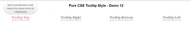
Tooltip Style 12
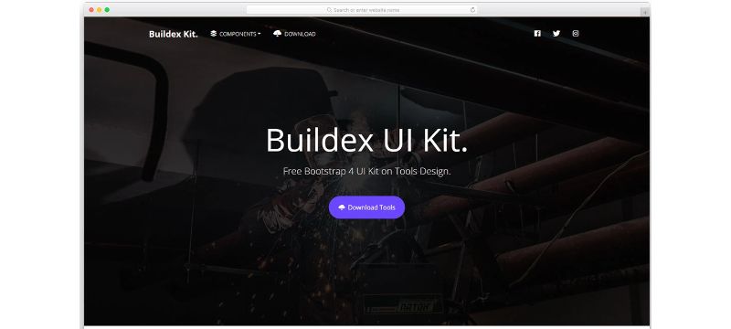
Buildex
Basic Tooltip with Position
Guided Tour Tooltip

Steps Flow Hover

Bootstrap’s Tooltip Hover Delay

Bootstrap Tooltip Pagination

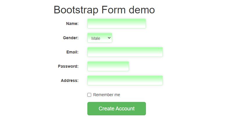
Custom Tooltips in Bootstrap form
Bootstrap Carousel Tooltip

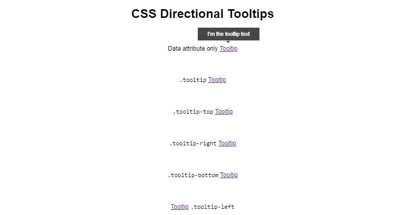
CSS Directional Tooltips
Bootstrap 4 Tooltip Positioning Examples
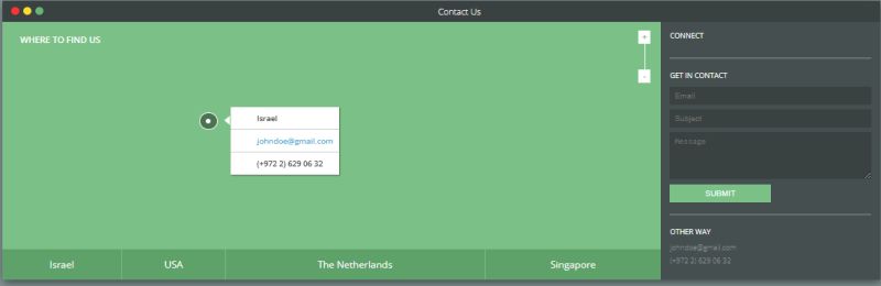
Map Tooltip
Heads Up! If You’re Using the Tooltip Plugin:
Hey, just a quick note if you’re diving into the world of tooltips. There are some things you gotta know:
- 3rd Party Pal: Tooltips are best buddies with the 3rd party library Popper. They work together for positioning.
- Choose to Use: You’ve got to turn these tooltips on yourself. They’re opt-in for performance reasons.
- No Title, No Show: If your tooltip’s got no title, it won’t show up. It’s shy like that.
- Can’t Hide from the Hidden: If something’s hidden, you can’t trigger a tooltip on it. It just doesn’t work.
- Hide Before You Say Goodbye: You have to make sure to hide tooltips before their corresponding elements leave the DOM. It’s like a proper farewell.
- Multiline Hyperlink Party: If you’ve got hyperlinks over multiple lines, the Bootstrap tooltips will center themselves. It’s like they know where to be.
How to Create a Bootstrap Tooltip
Creating a tooltip takes three steps: add the HTML markup, include Bootstrap files, initialize with JavaScript.
The initialization step trips up most beginners. Tooltips are opt-in components, meaning they require manual activation.
What is the Basic Bootstrap Tooltip Syntax
Add data-bs-toggle="tooltip" and data-bs-title="Your text" to any HTML element.
The data attributes handle trigger configuration and tooltip content automatically.
How to Initialize Bootstrap Tooltips with JavaScript
“ const tooltipTriggerList = document.querySelectorAll('[data-bs-toggle="tooltip"]') const tooltipList = [...tooltipTriggerList].map(el => new bootstrap.Tooltip(el)) `
Place this code after the DOM loads. Use DOMContentLoaded event or put scripts before .
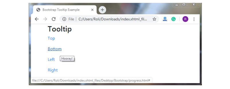
Bootstrap Tooltip Examples by Position
Tooltip placement controls where the popup appears relative to the trigger element.
Bootstrap supports four positions: top, bottom, left, right. The framework handles boundary detection and overflow automatically.
How to Create a Top Position Tooltip
Top placement is the default. Add data-bs-placement=”top” or omit the attribute entirely.
` <button type="button" data-bs-toggle="tooltip" data-bs-placement="top" data-bs-title="Tooltip on top"> Top tooltip </button> `
How to Create a Bottom Position Tooltip
` <button type="button" data-bs-toggle="tooltip" data-bs-placement="bottom" data-bs-title="Tooltip on bottom"> Bottom tooltip </button> `
Bottom works well for elements near the top of the viewport.
How to Create a Left Position Tooltip
` <button type="button" data-bs-toggle="tooltip" data-bs-placement="left" data-bs-title="Tooltip on left"> Left tooltip </button> `
Use left placement for elements positioned on the right side of containers.
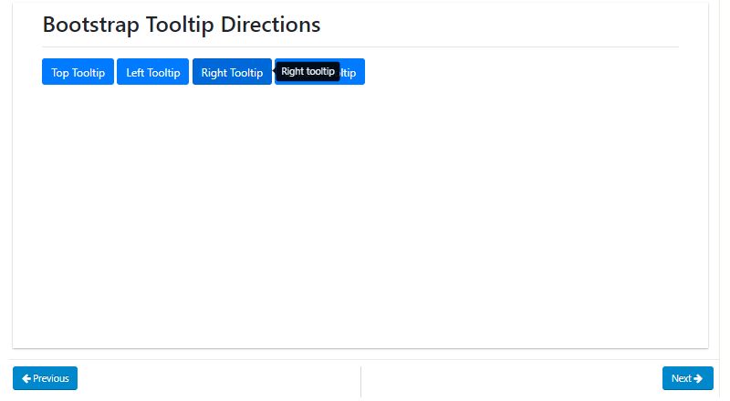
How to Create a Right Position Tooltip
` <button type="button" data-bs-toggle="tooltip" data-bs-placement="right" data-bs-title="Tooltip on right"> Right tooltip </button> `
Right placement suits left-aligned elements in sidebars or navigation menus.
Bootstrap Tooltip Examples by Trigger Type
The tooltip trigger determines what user action displays the popup.
Four trigger options exist: hover, click, focus, manual. Combine multiple triggers by separating them with spaces.
How to Create a Hover Trigger Tooltip
Hover is the default trigger. The tooltip appears on mouseenter and disappears on mouseleave.
` <button type="button" data-bs-toggle="tooltip" data-bs-trigger="hover" data-bs-title="Hover tooltip"> Hover over me </button> `
How to Create a Click Trigger Tooltip
` <button type="button" data-bs-toggle="tooltip" data-bs-trigger="click" data-bs-title="Click tooltip"> Click me </button> `
Click triggers keep the tooltip visible until another click occurs. Good for mobile devices.
How to Create a Focus Trigger Tooltip
` <a href="#" data-bs-toggle="tooltip" data-bs-trigger="focus" data-bs-title="Focus tooltip"> Focus on me </a> `
Focus triggers support web accessibility by responding to keyboard navigation.
How to Create a Manual Trigger Tooltip
` const tooltip = new bootstrap.Tooltip(element, { trigger: 'manual' }) tooltip.show() // Call programmatically tooltip.hide() `
Manual triggers give complete control through JavaScript methods. Perfect for custom interactive elements.
Bootstrap Tooltip Examples with Custom HTML Content
Default tooltips render plain text only.
Enable the html option to include formatted content, images, or links inside the tooltip container.
How to Add HTML Inside a Bootstrap Tooltip
Set data-bs-html=”true” on the element, then include HTML tags in your title attribute.
` <button type="button" data-bs-toggle="tooltip" data-bs-html="true" data-bs-title="<strong>Bold</strong> and <em>italic</em> text"> HTML tooltip </button> `
How to Add Images in Bootstrap Tooltips
` <button type="button" data-bs-toggle="tooltip" data-bs-html="true" data-bs-title="<img src='icon.png' width='20'> With image"> Image tooltip </button> `
Keep images small. Large images break the tooltip layout and slow rendering.
How to Add Links in Bootstrap Tooltips
` <span data-bs-toggle="tooltip" data-bs-html="true" data-bs-trigger="click" data-bs-title="Visit <a href='#'>this link</a>"> Tooltip with link </span> `
Use click or manual triggers for link tooltips. Hover triggers disappear before users can click the link.
Consider using a Bootstrap modal or popover for complex interactive content instead.
Bootstrap Tooltip Customization Examples
Default Bootstrap tooltips use black backgrounds with white text.
Custom styling through CSS overrides lets you match tooltips to your brand colors and design system.
How to Change Bootstrap Tooltip Colors
Target the .tooltip-inner class for background changes and .tooltip-arrow for the arrow color.
` .tooltip-inner { background-color: #007bff; color: #fff; } .bs-tooltip-top .tooltip-arrow::before { border-top-color: #007bff; } `
How to Change Bootstrap Tooltip Arrow Style
The tooltip arrow inherits colors from border properties. Each placement direction requires separate arrow styling.
` .bs-tooltip-bottom .tooltip-arrow::before { border-bottom-color: #28a745; } .bs-tooltip-start .tooltip-arrow::before { border-left-color: #28a745; } `
How to Add Custom CSS to Bootstrap Tooltips
Use the customClass option to add your own class without overriding global styles.
` new bootstrap.Tooltip(element, { customClass: 'my-custom-tooltip' }) `
Pair this with CSS shadow effects or border animations for unique designs.
How to Change Bootstrap Tooltip Animation Speed
Override the .tooltip.fade transition property. Default animation takes 150ms.
` .tooltip.fade { transition: opacity 0.3s ease-in-out; } `
Bootstrap Tooltip Examples with Delay Options
Delay options control timing between trigger events and tooltip visibility.
Add delays to prevent tooltips from appearing during accidental hovers or quick mouse movements across the interface.
How to Add Show Delay to Bootstrap Tooltips
Set the delay option with a show value in milliseconds.
` new bootstrap.Tooltip(element, { delay: { show: 500, hide: 100 } }) `
How to Add Hide Delay to Bootstrap Tooltips
Hide delay keeps tooltips visible briefly after the mouse leaves. Useful when users need time to read longer tooltip content.
` new bootstrap.Tooltip(element, { delay: { show: 0, hide: 300 } }) `
Bootstrap Tooltip Methods and Events
Bootstrap tooltips expose JavaScript methods for programmatic control and events for tracking state changes.
Use these for complex interactions in frontend applications.
What Are Bootstrap Tooltip Methods
Five methods control tooltip behavior: show(), hide(), toggle(), dispose(), update().
How to Use the Show Method
` const tooltip = bootstrap.Tooltip.getInstance(element) tooltip.show() `
Reveals the tooltip programmatically. Triggers the shown.bs.tooltip event after animation completes.
How to Use the Hide Method
` tooltip.hide() `
Hides the tooltip. Works even when trigger type is set to manual.
How to Use the Toggle Method
` tooltip.toggle() `
Switches between visible and hidden states. Equivalent to calling show/hide conditionally.
How to Use the Dispose Method
` tooltip.dispose() `
Removes the tooltip instance completely. Call this before removing elements from the DOM to prevent memory leaks.
What Are Bootstrap Tooltip Events
Four events fire during tooltip lifecycle: show, shown, hide, hidden. Attach event listeners for custom behavior.
How to Use the shown.bs.tooltip Event
` element.addEventListener('shown.bs.tooltip', function() { console.log('Tooltip is now visible') }) `
Fires after the tooltip becomes fully visible and CSS animation completes.
How to Use the hidden.bs.tooltip Event
` element.addEventListener('hidden.bs.tooltip', function() { // Cleanup or tracking code here }) `
Fires after the tooltip is completely hidden. Good for analytics tracking.
Bootstrap Tooltip Accessibility Best Practices
Tooltips must work for keyboard users and screen readers.
Bootstrap handles basic ARIA attributes automatically, but additional considerations apply for full inclusive design.
How to Make Bootstrap Tooltips Accessible
Use focusable elements like buttons or links as tooltip triggers. Add tabindex=”0″ to non-focusable elements.
Ensure sufficient color contrast between tooltip text and background.
What ARIA Attributes Does Bootstrap Tooltip Require
Bootstrap automatically adds aria-describedby linking the trigger to tooltip content.
For icon-only buttons, add aria-label describing the action. Screen readers announce tooltip content when focus reaches the trigger.
Common Bootstrap Tooltip Problems and Solutions
Most tooltip issues stem from missing initialization, incorrect dependencies, or container conflicts.
Why Is My Bootstrap Tooltip Not Showing
Check these common causes:
- Missing JavaScript initialization code
- Bootstrap JS bundle not loaded
- Popper.js missing (required for positioning)
- Element added to DOM after initialization
Reinitialize tooltips after dynamically adding elements with Ajax.
How to Fix Bootstrap Tooltip Flickering
Flickering occurs when the tooltip overlaps its trigger element. Set boundary: ‘window’ or adjust placement.
` new bootstrap.Tooltip(element, { boundary: 'window', fallbackPlacements: ['top', 'bottom'] }) `
How to Fix Bootstrap Tooltip Position Issues
Position problems usually relate to CSS overflow: hidden on parent containers or incorrect z-index values.
Use the container option to append tooltips to body instead of the parent element.
` new bootstrap.Tooltip(element, { container: 'body' }) `
This fixes clipping issues in dropdowns, modals, and scrollable containers. Test across browsers for cross-browser compatibility.
FAQ on Bootstrap Tooltip Examples
What is the difference between Bootstrap tooltip and popover?
Tooltips display brief hint text on hover, while popovers show richer content with headers and can include icons, images, or interactive elements. Popovers typically require a click to open and close. Use tooltips for short labels, popovers for detailed information.
Why is my Bootstrap tooltip not working?
Bootstrap tooltips require JavaScript initialization. Unlike other components, they don’t activate automatically. Ensure you’ve included the Bootstrap JS bundle with Popper.js and added initialization code after the DOM loads. Missing dependencies cause most failures.
How do I change Bootstrap tooltip color?
Override the .tooltip-inner class for background color and .tooltip-arrow for the arrow. Use the customClass option to apply styles without affecting global tooltips. Each placement direction requires separate arrow border-color properties in your stylesheet.
Can I add HTML content inside a Bootstrap tooltip?
Yes. Set data-bs-html=”true” on the trigger element. Then include HTML tags within the data-bs-title attribute. You can add bold text, images, links, and formatted content. Keep HTML minimal to maintain tooltip readability and performance.
How do I position Bootstrap tooltips?
Use data-bs-placement with values: top, bottom, left, or right. Bootstrap handles boundary detection automatically, flipping tooltips when they would overflow the viewport. Set fallbackPlacements in JavaScript options for custom flip behavior.
Are Bootstrap tooltips accessible for screen readers?
Bootstrap adds aria-describedby automatically linking triggers to tooltip content. Use focusable elements like input fields or buttons as triggers. Add tabindex=”0″ to non-focusable elements. Screen readers announce content when users focus on triggers.
How do I add delay to Bootstrap tooltips?
Pass a delay object during initialization with show and hide values in milliseconds. Show delay prevents accidental triggers during quick mouse movements. Hide delay gives users time to read longer content before it disappears.
Can I trigger Bootstrap tooltips on click instead of hover?
Set data-bs-trigger=”click” on the element. Click triggers work better on responsive mobile interfaces where hover states don't exist. Combine multiple triggers like hover focus to support both mouse and keyboard users.
How do I destroy or remove a Bootstrap tooltip?
Call the dispose() method on the tooltip instance. This removes event listeners and DOM elements created by the tooltip. Always dispose tooltips before removing their trigger elements from the page to prevent memory leaks in single-page applications.
Do Bootstrap tooltips work with dynamically added elements?
Tooltips initialized on page load won’t work on elements added later. Reinitialize tooltips after adding new elements via API calls or DOM manipulation. Use event delegation or initialize individual tooltips immediately after creating dynamic elements.
Conclusion
These Bootstrap tooltip examples give you the foundation to implement effective hover hints across any project.
Start with basic positioning and triggers. Then layer in custom styling, delay options, and HTML content as needed.
The JavaScript methods and events unlock programmatic control for complex Bootstrap components and dynamic interfaces.
Accessibility matters. Always test tooltips with keyboard navigation and screen readers before shipping.
Tooltips work best alongside other UI patterns like accordions, tabs, and carousels to create cohesive experiences.
Keep tooltip content short. If you need more than a sentence, consider a popover or CSS tooltip alternative instead.
Now grab the code snippets above and build something useful.


