Picture this: You’ve crafted the perfect website. Sleek design, seamless navigation. But it’s missing that oomph. A gallery. A statement piece to showcase your talent. Now, enter the game-changer – Bootstrap gallery. It’s the duct tape of the web world, making everything hold together in harmonious, responsive grids on any device that dares to display your site.
Together, we’ll unlock the treasure trove of presenting visuals that shout pizzazz without saying a word. It’s about letting your work be the star of the show, nestled within a grid that’s sleeker than a black-tie event.
This isn’t just about throwing pictures into a box. It’s the art of storytelling through images – crystal clear, without a pixel out of place.
Here’s the lowdown: By the article’s end, you’ll have the know-how to create an enticing Bootstrap gallery that’ll intrigue visitors and keep eyeballs glued.
We’ll demystify CSS lightbox, HTML5 intricacies, and the magic behind that oh-so-user-friendly interface.
If you’ve got your images ready, we’re about to turn them into an online exhibition worthy of a virtual ribbon cutting.
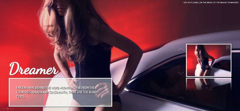
Bootstrap gallery examples
Bootstrap Gallery

Wanna showcase your photos in a stylish way? The Bootstrap Gallery’s got you covered. In just a few clicks, you’ll have a sleek, mobile-friendly image gallery that’s all yours.
Peep the video tutorial and live demo, or just hit the download button. Don’t sweat the price – the Bootstrap Photo Gallery is a freebie, whether you’re using it for fun or for work.
Legendary

Legendary’s not just a name, it’s a promise. This Bootstrap Gallery template brings a whole new vibe to your online space. From the unique, eye-catching design to the human-centered focus, it’s all about making your brand and content pop. Planning a page for a special event or promotion? This one-page parallax template has your back.
Shutter

Looking for fresh? Shutter’s where it’s at. Running on the Bootstrap Framework and keeping up with all the newest web trends, it’s got the look you want. Home page, bio, photos, blog, contact – it’s all in there.
Plus, the creative, minimalist approach means the user’s experience is second to none. Say goodbye to boring and hello to your unbeatable online photography portfolio website.
Bootstrap Zoom Gallery

Here’s something cool: the Bootstrap Zoom Gallery. Thanks to Bharath Kurapati, this Bootstrap 4.0.0 snippet is giving you a responsive, interactive image gallery with the power of zoom. Want a closer look at those images? With Bootstrap’s magic, zoom right in and enjoy the view.
V09 Gallery Example

Keep it simple with the V09. This Bootstrap image gallery template hits the sweet spot. Not too big, not too small, just right for any part of your site. If elegance is what you’re after, this is the one.
Bootstrap Lightbox Image Gallery Grid

Take your gallery up a notch. This Bootstrap Lightbox Image Gallery Grid’s got style and a pinch of CSS effects to leave your users wanting more.
And don’t worry about complexity; this one’s all about simple yet captivating design. Hover over, click, and watch those image holders do their thing.
Bootstrap Photo Gallery

Here’s a thought: why not create a photo gallery that’s clean, simple, and fits anywhere? This Bootstrap snippet does just that. Photos are neatly organized into cards, complete with titles and texts. Add some extra tidbits like tags or image filetypes in the footer, and you’re set. Your Bootstrap gallery just got even better.
Strategy

Check out Strategy’s Bootstrap gallery. Designed specifically for portfolio websites, it’s all about elegance and that smooth touch. Scroll animations, hover-effects, you name it.
And hey, you can even share a bit about each project. The cherry on top? Strategy’s not just a gallery; it’s a fully functional website template loaded with features.
Responsive Photo Gallery Grid In Bootstrap

Here’s another one for your portfolio. But wait, this Bootstrap image gallery’s got a twist. Clean, dynamic, and lively against a white backdrop. Uniform grid layout? Nope.
This one’s all free-form, fitting both landscape and portrait-oriented images. No cropping needed. It’s minimal, it’s neat, and it’s all yours.
Kiamo

Kiamo’s not just any gallery template. Running on the Bootstrap framework, it’s top-notch. Need to control your site like a pro? It’s got a super-powerful theme control panel, packed with tools like Block builder and SliderLayer. Customize to your heart’s content and watch your Bootstrap gallery come alive.
Image Gallery Bootstrap with Isotope

HTML, CSS, JS, and Bootstrap version 3.3.6 – combine them, and you get this image gallery. Responsive and visually inviting, but that’s not all. Isotope’s part of the deal, enhancing the filtering and sorting abilities of the gallery. It’s a tech-savvy way to put your Bootstrap gallery on the map.
Fullscreen Gallery with Thumbnail Flip
A fullscreen Bootstrap gallery, and it’s all yours. Break from the usual image slider and jump into this unique design. Supports keyboard inputs, scroll inputs, and interaction that feels real. A few tweaks to the code, and you’re good to go. Who said fullscreen can’t be fun?
3D Cube Image Gallery

Ever seen a three-dimensional Bootstrap gallery? Now you have. An animated cube displaying your selected images, six in the demo, but you can show even more.
Bring your gallery to life with this 3D cube concept. It’s not just pictures; it’s an experience. Don’t settle for flat when you can have 3D.
Photo Gallery Grid with Bootstrap 4

Ever felt like pictures are just too crammed in a gallery? This Bootstrap gallery has got room to breathe. Pictures spread out nicely, no congestion. Plus, there’s a handy navigation bar at the top.
Searching for something specific? No problem, just hit that search option. Neat and user-friendly, it’s like a breath of fresh air.
Simplicity – Simple Image Gallery With Cool Transition Effects
Simplicity’s not just a name. It’s a promise. Elegant and clean, this Bootstrap image gallery can fit on a full page or just be a small part of your site. But don’t be fooled by its simplicity.
The fluid animation effects for image transitions? Oh, they’re smooth! Perfect for adding a touch of life to eCommerce websites, or anywhere you need a dash of charm.
Bootstrap Hover Card Effect Gallery Ravi

Imagine your images sliding in from the top and right with smooth animations. Hover over them, and the text just glides into place. Ravi’s Bootstrap gallery is not just showing pictures; it’s telling a story.
Functional and elegant, it even lets you add text links to guide your visitors to another page for more details. Let your images do more than just look pretty.
FreeBie 4

FreeBie’s a Bootstrap image gallery that’s got everything, and it’s free! Modern and simple, it’s great for personal blogs and business alike. Responsive? Check. Beautiful sliders and layouts? Yep. Search engine optimized and easy to handle? Absolutely.
Add in the multiple color presets and a design based on Bootstrap, HTML5, and CSS3, and you’ve got a gallery that’s more than just a looker.
Cameroll Photography HTML5 Template

Cameroll is more than just a gallery. It’s a full-fledged HTML5 Template made for portfolios, photography sites, and even corporate business websites.
Best part? It’s built on the Twitter Bootstrap 3 framework, so it’s ready for anything from big screens to smartphones. Whatever your needs, this Bootstrap gallery’s got the flexibility and responsiveness to make it shine.
FAQ On Bootstrap Gallery
How do you set up a Bootstrap gallery on your website?
Bingo, setting up a Bootstrap gallery is like piecing together a puzzle. Grab the latest Bootstrap files, sprinkle in your HTML with gallery-specific classes, a dash of CSS for styling, and voila. Don’t forget to inject some jQuery if you’re jazzing things up with interactive elements.
Is Bootstrap gallery responsive by default, or do I need extra tweaking?
Out of the box, Bootstrap’s as responsive as they come. It flexes with devices like a yoga master. But hey, sometimes you want that extra finesse. Custom media queries or a bit of CSS might be your ticket to pixel perfection across all screens.
Can you customize the appearance of a Bootstrap gallery?
Heck, yeah! Bootstrap’s your canvas, and CSS is your palette. Override styles, get jiggy with SASS variables or plop in some custom classes. Make that gallery yours. It’s like giving your website a personal tattoo, but less permanent and less painful.
How can you add captions or descriptions to images in a Bootstrap gallery?
Slip in some <figcaption> tags or use Bootstrap’s caption classes right under your images. Keep it short and sweet. Like serving appetizers with the main dish, it complements without overshadowing the main visual feast.
What’s the best way to optimize images for a Bootstrap gallery for faster loading?
Compress them but keep it classy – no one likes a pixelated mess. Tools like Adobe Photoshop can help. Also, pick the right format: JPEGs for photos, PNGs for graphics with fewer colors. Balance is key; beautiful yet streamlined, just like a fine-tuned sports car.
How do you make a Bootstrap gallery accessible for all users?
Alt text is your friend for screen readers, and keyboard navigation’s a must. Keep contrasts high for visibility, and label your controls clearly. Being inclusive is not just nice; it’s necessary. Think of it as building ramps alongside stairs.
Can Bootstrap galleries be nested within other Bootstrap components, such as tabs or modals?
Absolutely. Bootstrap plays well with others, like a charming guest at a dinner party. It nestles snugly inside tabs, modals, or cards. Just sync up with Bootstrap’s grid system, and they’ll be holding hands in no time.
Are there SEO benefits to using a Bootstrap gallery on your website?
Absolutely! An organized, responsive Bootstrap gallery can score big with search engines. Remember, neatness plus speed equals love in the eyes of search engines. This duo is like the power couple of the SEO world.
What are the common mistakes to avoid when using a Bootstrap gallery?
Overloading it is like stuffing a suitcase until the zipper protests. Also, mismatching Bootstrap versions – that’s asking for a headache. And remember, update your dependencies or risk the digital equivalent of stained teeth in your perfect smile.
How do you ensure that a Bootstrap gallery is mobile-friendly?
It’s all about testing. Shrink that browser window, switch between devices, and keep a lookout for oddballs. Mobile-friendly is taking your digital handshake and making sure it doesn’t turn into an awkward fist bump.
Conclusion
Whew, there it is, the Bootstrap gallery, wrapped up. Think of it as the final piece in the web design puzzle, sitting pretty on your site, showcasing your images with ease and style.
- Remember: keep it lightweight, responsive, and don’t skimp on the alt text.
- Accessibility isn’t just a good deed; it’s your site waving a friendly hello to everyone.
Crafting something stunning is one thing, but making sure it loads like greased lightning and morphs sleekly across different devices is where the true craft comes in. Armed with the insights from this piece, you’re set to stitch together an image tapestry that sings harmony on any screen.
Tailor away with CSS, tweak those transitions, and before you know it, visitors will be sticking around for the visual banquet. So, crank up that code editor – those breathtaking galleries aren’t going to build themselves. Now go on, be the maestro of your own Bootstrap masterpiece.
If you liked this article about Bootstrap galleries, you should check out this article about Bootstrap headers.
There are also similar articles discussing Bootstrap login forms, Bootstrap contact forms, Bootstrap animations, and Bootstrap timelines.
And let’s not forget about articles on Bootstrap charts, Bootstrap search boxes, Bootstrap profiles, and Bootstrap menus.