Collapsible content saves screen space. It keeps interfaces clean while letting users access detailed information on demand.
Bootstrap accordion examples show you exactly how to build these expandable panels for FAQ sections, product details, and multi-step forms.
The accordion component is one of the most useful Bootstrap components for organizing content without overwhelming visitors.
This guide covers basic implementation, flush styling, custom icons, JavaScript control, and accessibility features.
You’ll find working code snippets ready to copy into your projects, plus tips for combining accordions with cards, forms, and interactive elements.
What is Bootstrap Accordion
Bootstrap accordion is a collapsible UI component built with the Bootstrap CSS framework.
It displays content sections in a vertical stack where users expand or collapse individual panels by clicking header buttons.
The component relies on the collapse JavaScript plugin and data attributes to toggle visibility of content areas.
You’ll find accordions on FAQ pages, product specifications, pricing breakdowns, and documentation sites.
How Does Bootstrap Accordion Work
Bootstrap accordion works by nesting collapsible elements inside a parent container with the .accordion class.
Each accordion item contains a header button that triggers the collapse functionality and a content panel that expands or collapses based on user interaction.
The data-bs-parent attribute links child elements to the parent container, creating the single-open-panel behavior.
What Are the Main Parts of Bootstrap Accordion
The accordion component contains three main structural parts:
- Accordion container – the parent wrapper using
.accordionclass - Accordion items – individual sections with headers and collapsible content
- Collapse panels – the expandable content areas users toggle open and closed
Each item includes a header with .accordion-header, a button with .accordion-button, and body content wrapped in .accordion-collapse and .accordion-body classes.
Bootstrap Accordion Examples
Bootstrap Accordion V04
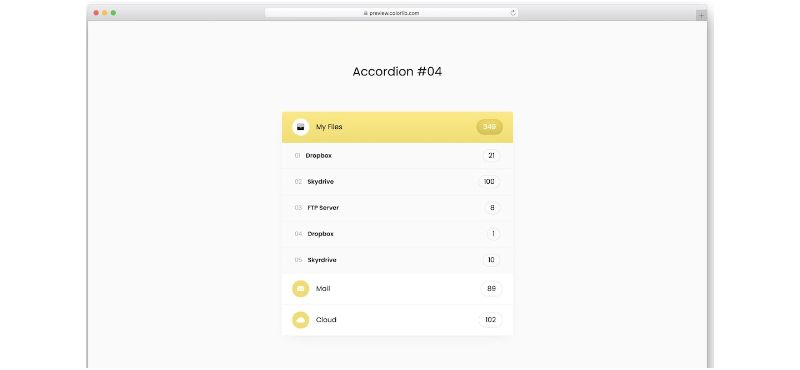
Full Page Horizontal Accordion

Bootstrap 4 Accordion With Card And Font Awesome Icons
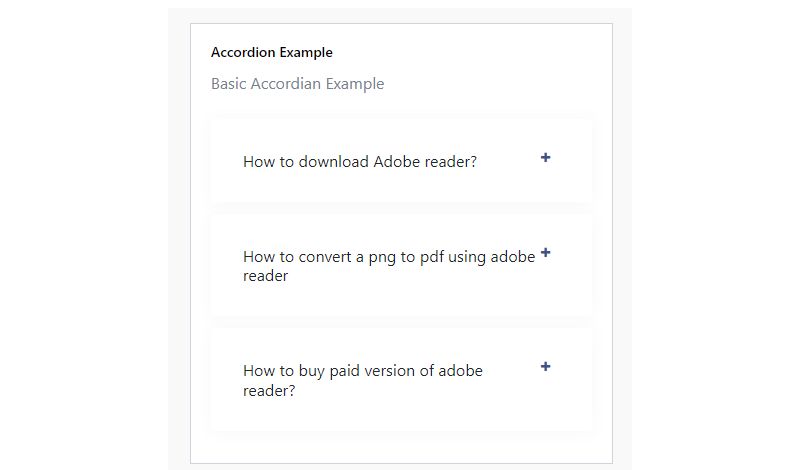
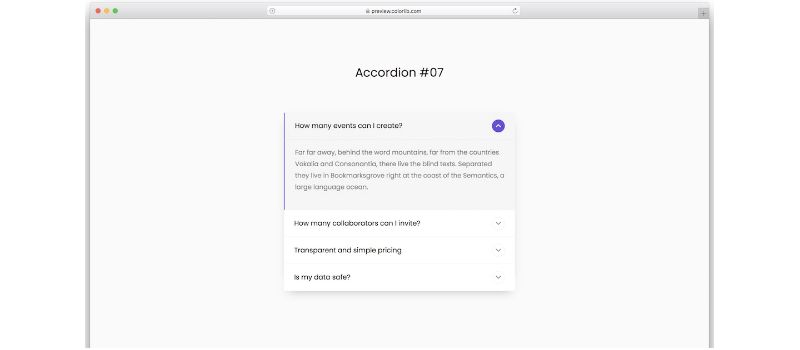
Bootstrap Accordion V07
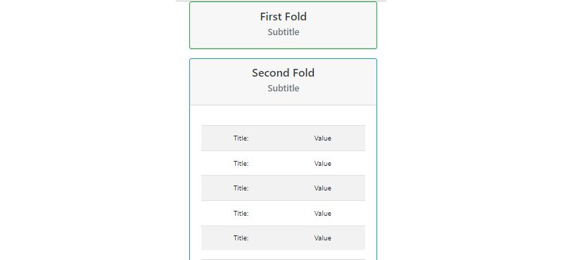
Accordion List with Nested Tabbed Elements and Table
Bootstrap Accordion with Highlighted Item
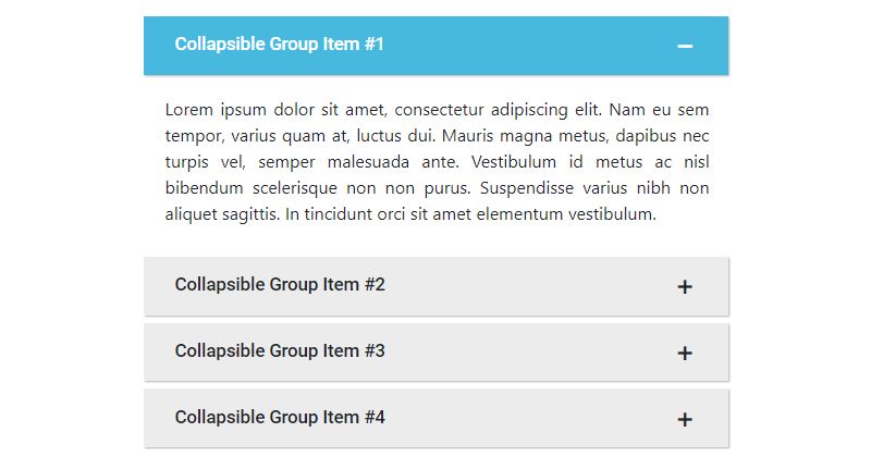
Pure CSS Accordion
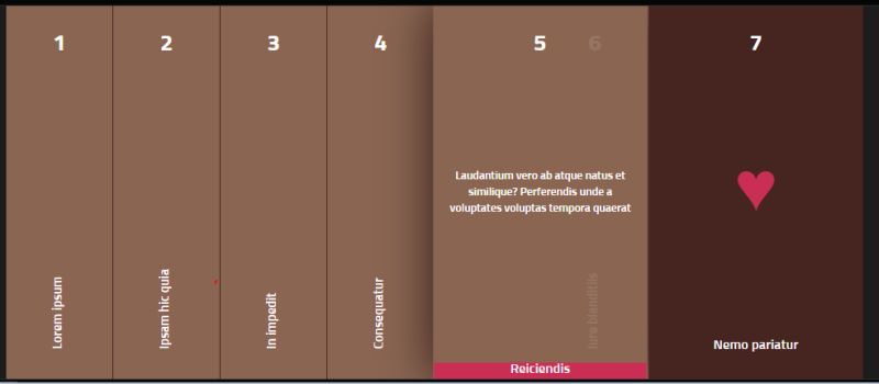
Accordion Image Gallery

Bootstrap Accordion V09
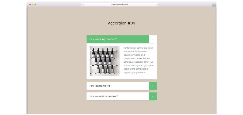
Multi-level Accordion
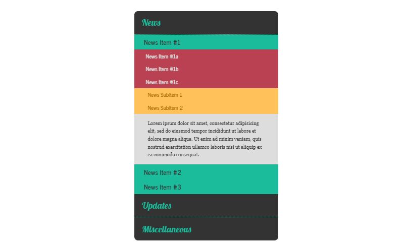
Horizontal Accordion
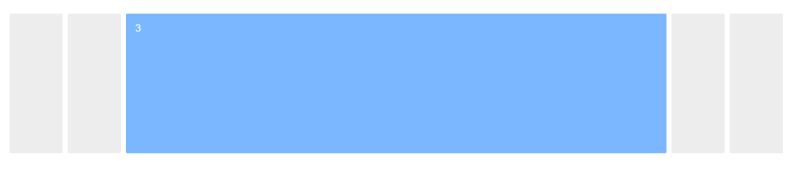
Accordion With Image Background
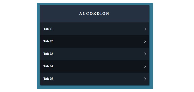
Tabs and Accordion Collaboration

Bootstrap Accordion V13
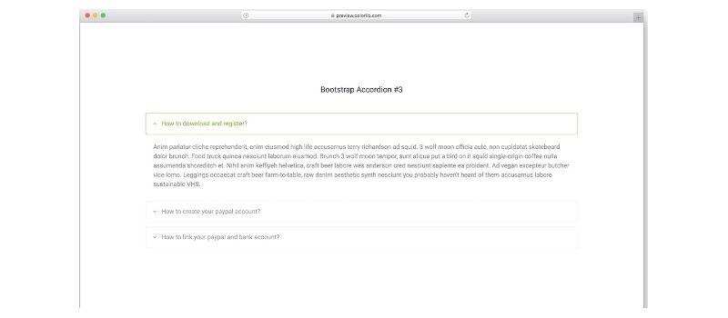
Accordion Details and Summary
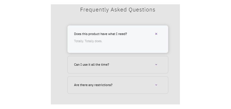
Bootstrap 4 FAQ Accordion With Arrow Example
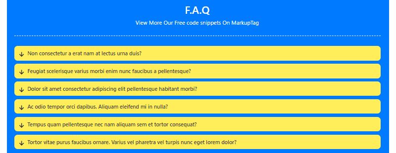
Material Design Accordion
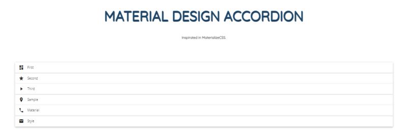
Bootstrap Accordion Table by JayaDev Akkiraju
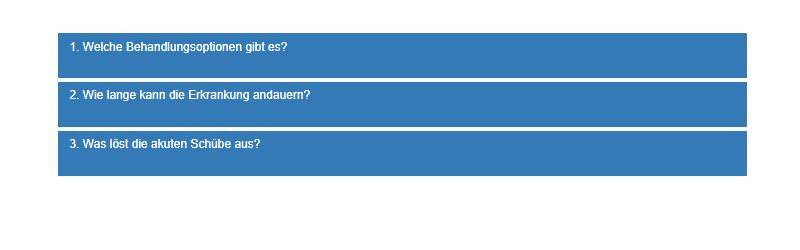
Bootstrap CSS Accordion 48
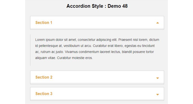
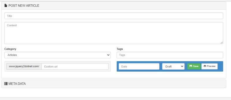
Articles Submission Accordion
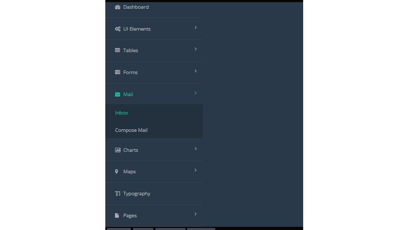
Bootstrap Accordion Menu Sidebar Awesome Example
How to Create a Basic Bootstrap Accordion
Building a basic accordion requires proper HTML structure with nested div elements and specific Bootstrap classes.
The parent container holds all items while data attributes handle the toggle functionality.
“ <div class="accordion" id="basicAccordion"> <div class="accordion-item"> <h2 class="accordion-header"> <button class="accordion-button" type="button" data-bs-toggle="collapse" data-bs-target="#collapseOne" aria-expanded="true" aria-controls="collapseOne"> Accordion Item #1 </button> </h2> <div id="collapseOne" class="accordion-collapse collapse show" data-bs-parent="#basicAccordion"> <div class="accordion-body"> Your content goes here. </div> </div> </div> </div> `
The first panel stays open by default with the show class on the collapse element.
Remove show to start with all panels closed.
What Classes Does Bootstrap Accordion Require
Bootstrap accordion requires these CSS classes for proper functionality:
- .accordion
- parent wrapper element
- .accordion-item
- each collapsible section
- .accordion-header
- clickable header area
- .accordion-button
- the toggle trigger with chevron icon
- .accordion-collapse
- the collapsible panel wrapper
- .collapse
- enables the collapse JavaScript plugin
- .accordion-body
- inner content container
The .accordion-button.collapsed state applies automatically when a panel closes, rotating the arrow indicator.
What Data Attributes Does Bootstrap Accordion Use
Data attributes connect accordion elements without writing custom JavaScript:
- data-bs-toggle=”collapse”
- activates collapse functionality
- data-bs-target
- references the panel ID to toggle
- data-bs-parent
- links to parent container for single-panel behavior
These attributes handle click events, CSS transitions, and open/close state management automatically.
What ARIA Attributes Does Bootstrap Accordion Use
Bootstrap accordion includes accessibility attributes for screen reader support.
The aria-expanded attribute indicates open or closed state on buttons, aria-controls references the controlled panel ID.
These attributes update automatically as users interact with the component.
Bootstrap Accordion with Always Open Panels
The default accordion behavior closes open siblings when a new panel expands.
Remove this restriction to let users keep multiple panels open simultaneously.
` <div class="accordion" id="alwaysOpenAccordion"> <div class="accordion-item"> <h2 class="accordion-header"> <button class="accordion-button" type="button" data-bs-toggle="collapse" data-bs-target="#panelOne"> Panel One </button> </h2> <div id="panelOne" class="accordion-collapse collapse show"> <div class="accordion-body"> First panel content. </div> </div> </div> </div> `
How to Keep Multiple Accordion Panels Open
Remove the data-bs-parent attribute from all accordion collapse elements.
Without this parent reference, each panel operates independently; users can expand any number of sections without triggering automatic collapse of other open panels.
Bootstrap Accordion with Flush Style
The accordion flush variant removes default borders, background colors, and rounded corners.
This creates a cleaner look that blends with surrounding content blocks.
` <div class="accordion accordion-flush" id="flushAccordion"> <div class="accordion-item"> <h2 class="accordion-header"> <button class="accordion-button collapsed" type="button" data-bs-toggle="collapse" data-bs-target="#flushOne"> Flush Item </button> </h2> <div id="flushOne" class="accordion-collapse collapse" data-bs-parent="#flushAccordion"> <div class="accordion-body"> Flush panel content. </div> </div> </div> </div> `
What is Accordion Flush in Bootstrap
Apply .accordion-flush alongside .accordion on the parent container.
Flush accordions integrate better with Bootstrap cards and edge-to-edge layouts where borders create visual clutter.
Bootstrap Accordion with Custom Icons
The default chevron icon rotates on expand/collapse.
Replace it with custom icons using CSS custom properties or Font Awesome.
` .accordion-button::after { background-image: url("data:image/svg+xml,..."); }
.accordion-button:not(.collapsed)::after { background-image: url(“data:image/svg+xml,…”); } `
How to Change Bootstrap Accordion Arrow Icons
Override –bs-accordion-btn-icon and –bs-accordion-btn-active-icon CSS variables with custom SVG data URIs.
Alternatively, hide default icons with background-image: none and add icons via pseudo-elements or inline SVG.
Bootstrap Accordion with JavaScript Control
The collapse JavaScript plugin provides programmatic control over accordion panels.
Open, close, or toggle panels without user clicks through the Bootstrap Collapse API.
` // Get the collapse element const collapseEl = document.getElementById('collapseOne');
// Create Collapse instance const collapse = new bootstrap.Collapse(collapseEl);
// Control methods collapse.show(); // Open panel collapse.hide(); // Close panel collapse.toggle(); // Toggle state `
How to Open Accordion Panel with JavaScript
Create a new Collapse instance with new bootstrap.Collapse(element) and call .show().
Target accordion collapse elements by ID or querySelector; the .toggle() and .hide() methods provide additional control.
Bootstrap Accordion Inside Cards
Accordions nest inside card components for grouped content with consistent styling.
Use the flush variant to avoid border conflicts between card and accordion elements.
` <div class="card"> <div class="card-header"> Card with Accordion </div> <div class="card-body p-0"> <div class="accordion accordion-flush" id="cardAccordion"> <div class="accordion-item"> <h2 class="accordion-header"> <button class="accordion-button" type="button" data-bs-toggle="collapse" data-bs-target="#cardCollapseOne"> Section One </button> </h2> <div id="cardCollapseOne" class="accordion-collapse collapse show" data-bs-parent="#cardAccordion"> <div class="accordion-body"> Card accordion content. </div> </div> </div> </div> </div> </div> `
How to Add Accordion to Bootstrap Card
Place the accordion structure inside .card-body with p-0 to remove padding.
Match the accordion’s parent ID with collapse elements’ data-bs-parent attributes for proper single-panel behavior.
Bootstrap Accordion with Forms
Accordions organize long forms into logical sections.
Users complete one section before moving to the next, reducing cognitive load.
` <div class="accordion" id="formAccordion"> <div class="accordion-item"> <h2 class="accordion-header"> <button class="accordion-button" type="button" data-bs-toggle="collapse" data-bs-target="#personalInfo"> Personal Information </button> </h2> <div id="personalInfo" class="accordion-collapse collapse show" data-bs-parent="#formAccordion"> <div class="accordion-body"> <div class="mb-3"> <label class="form-label">Full Name</label> <input type="text" class="form-control"> </div> <div class="mb-3"> <label class="form-label">Email</label> <input type="email" class="form-control"> </div> </div> </div> </div> </div> `
Multi-step checkout flows, registration wizards, and settings panels benefit from this pattern.
Bootstrap Accordion Events
The collapse plugin fires events during panel transitions.
Attach listeners to run custom code when panels open or close.
` const accordion = document.getElementById('myAccordion');
accordion.addEventListener(‘show.bs.collapse’, event => { console.log(‘Panel opening:’, event.target.id); });
accordion.addEventListener(‘shown.bs.collapse’, event => { console.log(‘Panel opened:’, event.target.id); });
accordion.addEventListener(‘hide.bs.collapse’, event => { console.log(‘Panel closing:’, event.target.id); });
accordion.addEventListener(‘hidden.bs.collapse’, event => { console.log(‘Panel closed:’, event.target.id); }); `
What JavaScript Events Does Bootstrap Accordion Fire
Four collapse events available:
- show.bs.collapse
- fires before panel starts opening
- shown.bs.collapse
- fires after panel finishes opening
- hide.bs.collapse
- fires before panel starts closing
- hidden.bs.collapse
- fires after panel finishes closing
Use event.preventDefault() on show or hide events to cancel transitions.
Bootstrap Accordion vs Collapse Component
Both components use the same collapse JavaScript plugin.
The accordion adds structure, styling, and automatic sibling management on top of basic collapse functionality.
What is the Difference Between Accordion and Collapse
Accordion is a structured implementation with predefined classes, automatic panel management through data-bs-parent, and built-in styling including borders, backgrounds, and the rotating chevron.
Standalone collapse operates independently without sibling interaction; requires custom CSS for appearance.
Use accordion for FAQ sections and organized content. Use collapse for single toggleable elements like “read more” links or navbar mobile menus.
Bootstrap Accordion Styling Options
Customize accordion appearance with CSS variables or utility classes.
Bootstrap 5 exposes these CSS custom properties on the accordion component:
` .accordion { --bs-accordion-color: #212529; --bs-accordion-bg: #fff; --bs-accordion-transition: color 0.15s ease-in-out, background-color 0.15s ease-in-out; --bs-accordion-border-color: #dee2e6; --bs-accordion-border-width: 1px; --bs-accordion-border-radius: 0.375rem; --bs-accordion-btn-padding-x: 1.25rem; --bs-accordion-btn-padding-y: 1rem; --bs-accordion-btn-color: #212529; --bs-accordion-btn-bg: #fff; --bs-accordion-btn-focus-box-shadow: 0 0 0 0.25rem rgba(13, 110, 253, 0.25); --bs-accordion-active-color: #0c63e4; --bs-accordion-active-bg: #e7f1ff; } `
Override variables at the component level or globally in your stylesheet.
How to Change Accordion Background Color
Set –bs-accordion-bg and –bs-accordion-active-bg for closed and expanded states.
Apply directly on the accordion element or create custom CSS classes for themed variations.
How to Remove Accordion Borders
Set –bs-accordion-border-width: 0 or use the .accordion-flush class.
For partial border removal, target specific elements with border-top: 0 or border-bottom: 0 utilities.
Bootstrap Accordion Responsive Design
Accordions adapt to different screen sizes using the Bootstrap grid system and media queries.
The component works on mobile devices without additional configuration.
How to Make Accordion Mobile Friendly
Accordions are mobile friendly by default; buttons respond to touch events, content reflows within the viewport.
Increase tap target size by adding padding to .accordion-button on small screens; use @media (max-width: 576px) for breakpoint-specific styles.
Bootstrap Accordion with Tabs
Combine accordions with tabs for complex content organization.
Common pattern: tabs on desktop, accordion on mobile for the same content sections.
` <!-- Desktop: Tabs --> <ul class="nav nav-tabs d-none d-md-flex" role="tablist"> <li class="nav-item"> <button class="nav-link active" data-bs-toggle="tab" data-bs-target="#tab1">Tab 1</button> </li> </ul>
<!– Mobile: Accordion –> <div class=”accordion d-md-none” id=”mobileAccordion”> <!– Accordion items here –> </div> `
Use Bootstrap display utilities (d-none, d-md-flex, d-md-none) to show/hide each version based on breakpoint.
FAQ on Bootstrap Accordion Examples
What is a Bootstrap accordion used for?
A Bootstrap accordion displays collapsible content sections in a vertical stack.
Common uses include FAQ pages, product specifications, documentation, and settings panels where users need organized access to multiple content areas without scrolling through everything at once.
How do I create a simple accordion in Bootstrap 5?
Create a parent div with the .accordion class containing accordion items.
Each item needs an .accordion-header with a button and an .accordion-collapse div wrapping the .accordion-body content. Add data attributes for toggle functionality.
Why is my Bootstrap accordion not working?
Check that Bootstrap’s JavaScript bundle is loaded after the accordion markup.
Verify data-bs-toggle=”collapse” and data-bs-target attributes match the collapse element ID. Missing or mismatched IDs cause toggle failures.
How do I keep multiple accordion panels open at once?
Remove the data-bs-parent attribute from all .accordion-collapse elements.
Without the parent reference, panels operate independently. Users can expand multiple sections simultaneously without automatic closing of sibling panels.
How do I change the accordion arrow icon?
Override CSS custom properties –bs-accordion-btn-icon and –bs-accordion-btn-active-icon with custom SVG data URIs.
Alternatively, set background-image: none on .accordion-button::after and add icons using CSS arrows or icon fonts.
What is the difference between accordion and collapse in Bootstrap?
Accordion is a structured component with predefined styling and automatic sibling management through data-bs-parent.
Collapse is the underlying plugin that toggles visibility. Standalone collapse requires custom CSS and operates independently without affecting other elements.
How do I open an accordion panel by default?
Add the show class to the .accordion-collapse element you want open initially.
Remove the collapsed class from its corresponding .accordion-button. Set aria-expanded=”true” on the button for proper accessibility state.
Can I put forms inside a Bootstrap accordion?
Yes. Place form elements directly inside the .accordion-body container.
Accordions work well for multi-step forms, checkout flows, and contact forms with optional sections. Form validation and submission work normally within accordion panels.
How do I trigger accordion events with JavaScript?
Listen for show.bs.collapse, shown.bs.collapse, hide.bs.collapse, and hidden.bs.collapse events on accordion elements.
Use new bootstrap.Collapse(element) to create instances, then call .show(), .hide(), or .toggle() methods programmatically.
Is Bootstrap accordion accessible for screen readers?
Yes. Bootstrap includes proper accessibility attributes by default.
Buttons have aria-expanded and aria-controls attributes that update automatically. Collapse panels use appropriate roles. Keyboard navigation works with Tab and Enter keys.
Conclusion
These Bootstrap accordion examples give you ready-to-use code for building collapsible panels in your projects.
From basic implementation to advanced JavaScript control, you now have the tools to create organized content sections that improve user experience.
The accordion component handles toggle functionality, smooth animation, and accessibility out of the box.
Combine it with the flush style for cleaner layouts. Add custom icons to match your brand. Use events to trigger actions when panels open or close.
Start with the simple accordion structure, then layer in customizations as needed.
Test on mobile devices since the component is already responsive. Check keyboard navigation for usability.
Your UI stays clean while users access exactly what they need.

Many of his resources are available on various design marketplaces. Over the years, he's worked with a range of clients and contributed to design publications like Designmodo, WebDesignerDepot, and Speckyboy, Slider Revolution among others.
- What is Backend in Web Development? - September 13, 2026
- What is Frontend Development? - September 11, 2026
- How to Make a Button in Figma: Design Best Practices - September 10, 2026