A footer can make or break your website’s user experience. Too often, developers treat it as an afterthought.
These Bootstrap footer examples give you ready-to-use code snippets for any project. Corporate sites, portfolios, e-commerce stores, SaaS platforms.
You will find 10 different footer types with complete HTML and CSS code.
Each template uses Bootstrap 5’s component library, utility classes, and responsive breakpoints. Copy the code, paste it into your project, customize the content.
The examples cover simple copyright bars, multi-column layouts, newsletter forms, sticky footers, dark themes, and social icon integration.
No fluff. Just working code you can use today.
What is a Bootstrap Footer
A Bootstrap footer is an HTML5 semantic section element positioned at the bottom of a webpage using the Bootstrap CSS framework.
It uses the grid system and utility classes to create responsive layouts without custom CSS code.
The footer tag holds navigation links, company information, social media icons, contact details, newsletter subscription forms, and copyright notices.
Bootstrap provides pre-built responsive classes that handle spacing, text alignment, and mobile adaptation automatically.
Most developers combine the semantic footer element with Bootstrap’s container and row structure for clean, accessible markup.
Links used in this artifact:
- HTML: https://wpdean.com/what-is-html/
- CSS: https://wpdean.com/what-is-css-in-web-design/
- grid system: https://wpdean.com/what-is-a-grid-system-in-web-design/
Bootstrap Footer Examples
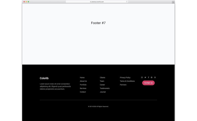
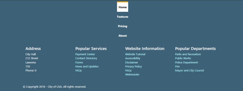
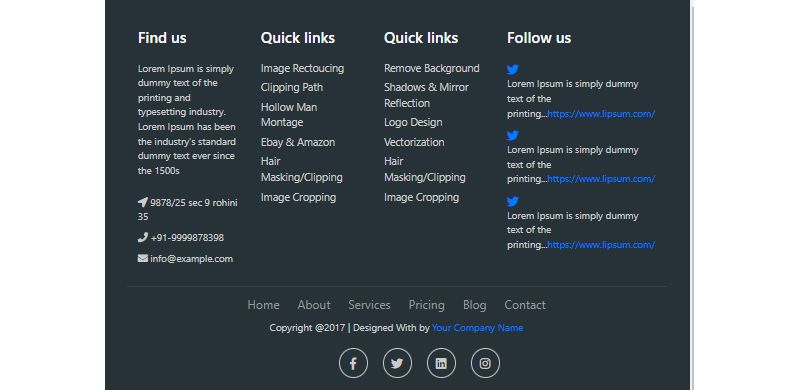
Footer made in Bootstrap
Bootstrap Footer V19
Bootstrap Footer by Cristian
Basic Bootstrap Footers
Footer Link Navigation
Three Columns Footer

Bootstrap Footer By Sebastian Sabadus

Bootstrap Footer V13
Simple Slide-Up Footer

Stylish Color Footer
Sticky Footer
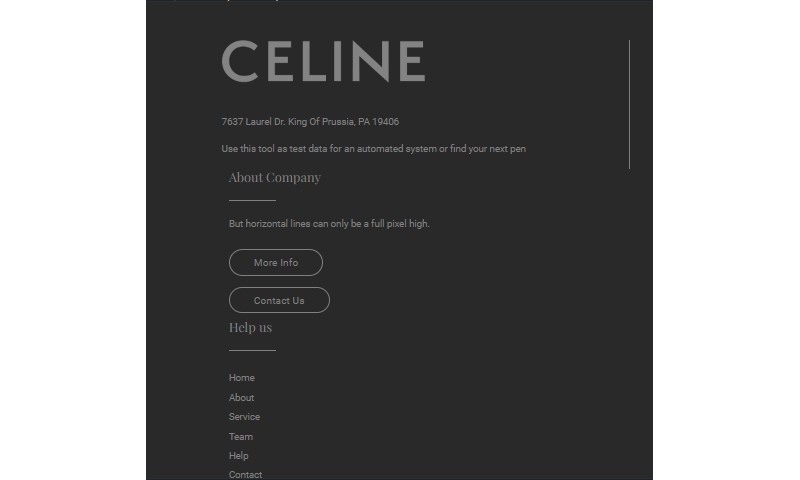
Bootstrap Elegant Footer
Simple Clean Bootstrap Footer Design
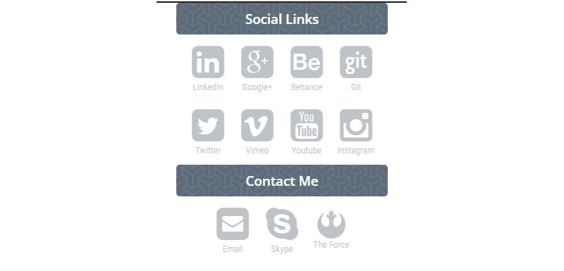
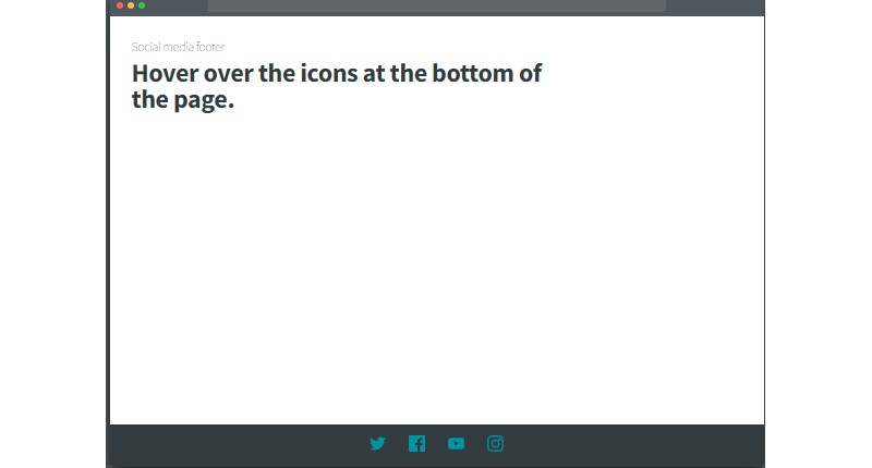
Social Media Footer
Responsive Bootstrap Footer
Bootstrap Footer V07
Fullscreen Background Image Bootstrap Footer Template

Bootstrap 4 Footer and Sub Navigation
Beautiful Aurora Footer Lights

Bootstrap Footer With External And Internal Links
What Are the Types of Bootstrap Footers
Simple Footer
Contains only copyright text and basic links. Uses minimal HTML markup with bg-light or bg-dark utility classes.
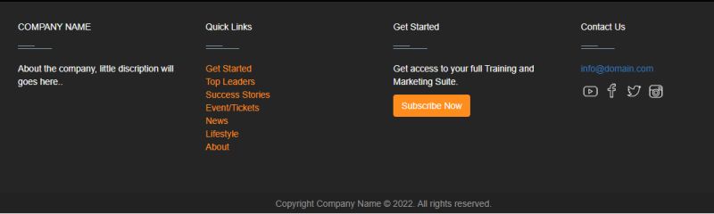
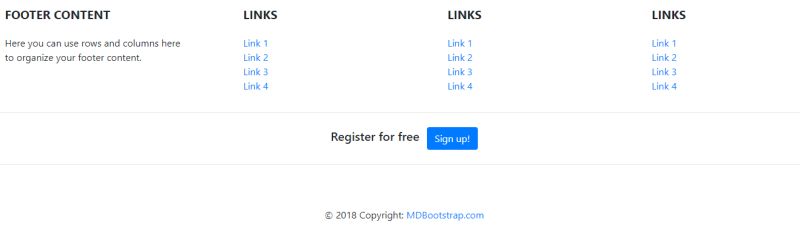
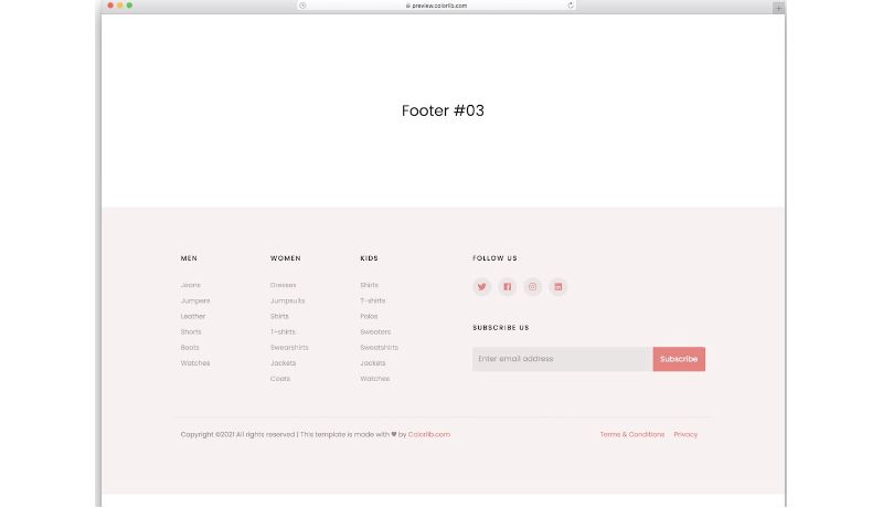
Multi-Column Footer
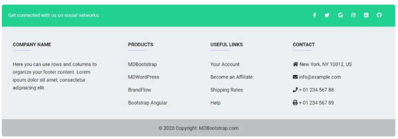
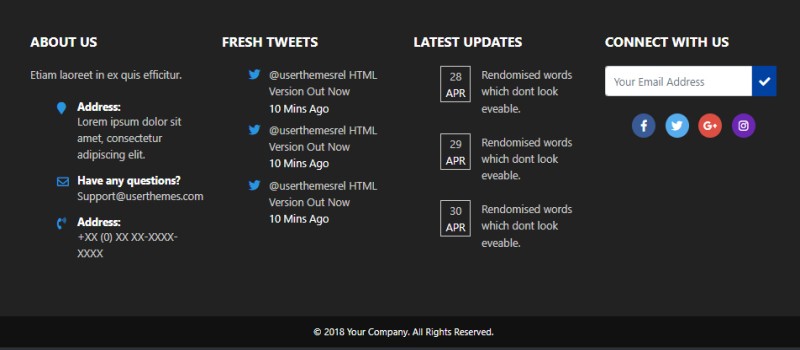
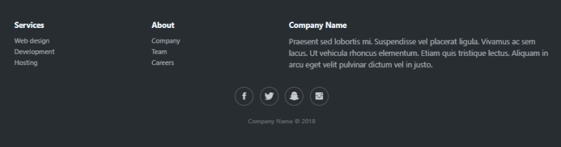
Splits content into 3-4 vertical columns using Bootstrap’s col classes. Each column holds different content categories: about, links, services, contact.
Dark Theme Footer
Applies bg-dark and text-white classes for a professional look. Works well with light-themed websites to create visual contrast at the page bottom.
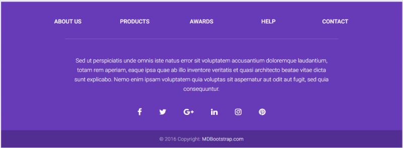
Footer with Social Icons
Integrates Bootstrap icons or Font Awesome for social media buttons. Icons align horizontally using Flexbox utilities.
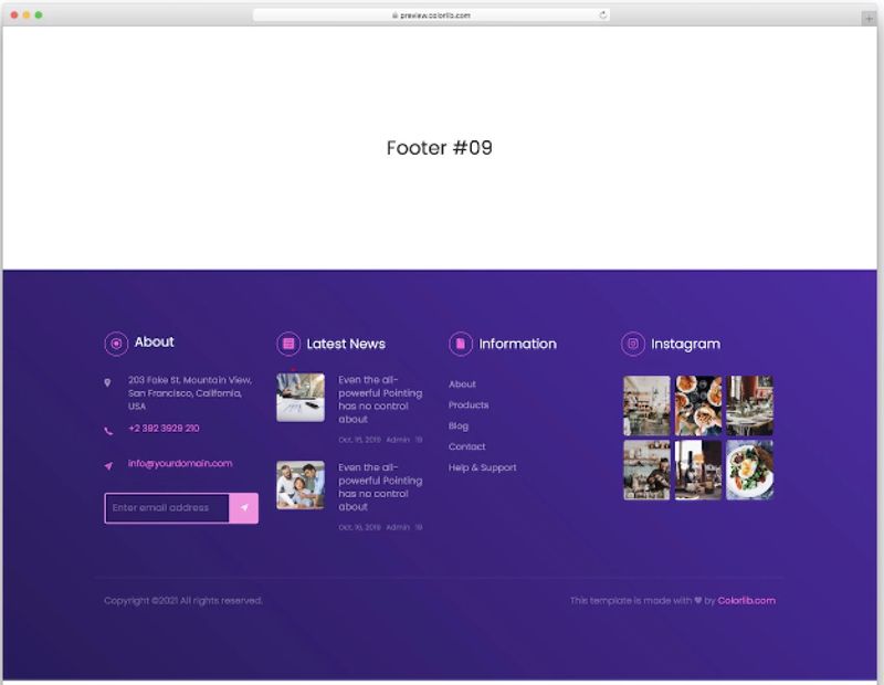
Footer with Newsletter Subscription Form
Includes a Bootstrap form with input-group components for email capture. Drives conversions directly from the footer section.
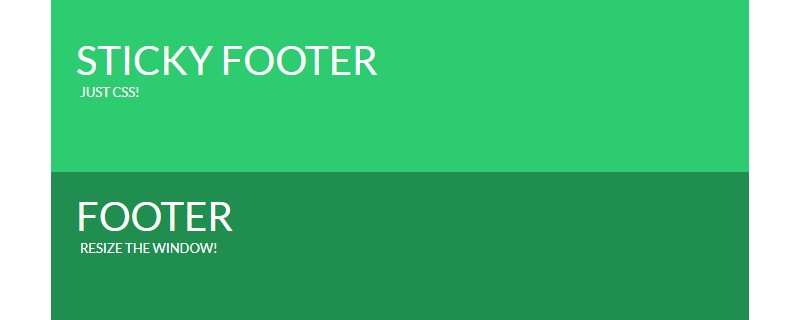
Sticky Footer
Stays fixed at the viewport bottom regardless of content height. Uses fixed-bottom or sticky-bottom positioning classes.
Footer with Contact Information
Displays address, phone number, email, and business hours. Often includes a small embedded map or location icon.
Footer with Sitemap Navigation
Provides comprehensive site links organized by category. Mirrors the main Bootstrap navbar structure for secondary navigation.
Minimalist Footer
Shows only the bare minimum: logo, copyright, privacy link. Uses generous white space and clean typography.
Full-Width Footer
Spans the entire browser width using container-fluid class. Creates a strong visual anchor at the page bottom.
How to Create a Bootstrap Footer
What HTML Structure Does a Bootstrap Footer Need
Start with the semantic footer tag wrapped in a container div.
Add row and column classes to organize content into a responsive grid layout.
Basic structure:
- footer tag with background class (bg-dark, bg-light, bg-primary)
- container or container-fluid div
- row div for horizontal grouping
- col-md-3, col-lg-4 divs for columns
- list-unstyled class for clean link lists
What Bootstrap Classes Style a Footer
Background colors: bg-dark, bg-light, bg-primary, bg-secondary.
Text colors: text-white, text-muted, text-reset for links.
Spacing: py-4, py-5 for vertical padding; px-3 for horizontal padding.
Typography: text-center, text-md-start, fw-bold, text-uppercase.
How Does the Grid System Work in Bootstrap Footers
The 12-column grid divides footer content into responsive sections.
Use col-12 for mobile, col-md-6 for tablets, col-lg-3 for desktop to create adaptive multi-column layouts.
Columns stack vertically on small screens and align horizontally on larger viewports.
How to Add Social Media Icons to a Bootstrap Footer
What Icon Libraries Work with Bootstrap Footers
Bootstrap Icons is the native choice, offering 2,000+ SVG icons that scale without quality loss.
Font Awesome provides the largest selection with brand icons for every major social platform.
Other options: Feather Icons, Heroicons, Material Icons.
How to Align Social Icons with Flexbox
Wrap icons in a div with d-flex and gap-3 classes for even spacing.
Use justify-content-center to center icons or justify-content-end to align right.
Add hover effects with CSS hover styles or Bootstrap’s link-opacity utilities.
How to Make a Bootstrap Footer Responsive
What Breakpoint Classes Control Footer Layout
Bootstrap 5 uses six breakpoints: xs (default), sm (576px), md (768px), lg (992px), xl (1200px), xxl (1400px).
Apply different column widths at each breakpoint: col-12 col-sm-6 col-lg-3.
The mobile-first design approach means styles cascade upward from smallest screens.
How to Center Footer Content on Mobile
Add text-center class for small screens, then text-md-start to left-align on tablets and up.
Use mx-auto on inner containers to center fixed-width content blocks.
Media queries in custom CSS can fine-tune alignment beyond Bootstrap’s utility classes.
How to Add a Newsletter Form to a Bootstrap Footer
What Form Components Does Bootstrap Provide
Bootstrap offers ready-made input components with form-control class for text fields and email inputs.
The input-group component combines text fields with Bootstrap buttons into a single visual unit.
Add form-floating for modern floating labels or input-group-text for inline icons.
How to Style Input Groups in Footer Forms
Apply btn-primary or btn-outline-light classes to the submit button depending on footer background.
Use rounded-pill on both input and button for a softer look; form-control-lg increases touch target size on mobile.
Create accessible forms by including proper label elements and aria attributes for screen readers.
How to Create a Sticky Footer in Bootstrap
What CSS Properties Keep Footers at Bottom
The sticky-bottom class uses position: sticky with bottom: 0 to anchor the footer at the viewport base.
For pages with minimal content, use a flexbox wrapper: d-flex, flex-column, min-vh-100 on the body, then mt-auto on the footer.
Fixed-bottom keeps the footer visible during scroll. Sticky-bottom shows it only when you reach the page end.
When Should You Use a Fixed Footer
Fixed footers work for call-to-action elements like “Buy Now” or “Contact Us” buttons that need constant visibility.
Avoid fixed positioning on mobile where screen space is limited. It blocks content and frustrates users.
Test cross-browser compatibility since sticky positioning behaves differently in Safari and older browsers.
How to Customize Bootstrap Footer Colors
What Background Utility Classes Change Footer Color
Built-in options: bg-primary, bg-secondary, bg-success, bg-danger, bg-warning, bg-info, bg-dark, bg-light.
Bootstrap 5.3+ includes bg-body-tertiary for subtle backgrounds that adapt to light/dark mode automatically.
Pair with matching text classes: text-white on dark backgrounds, text-dark on light backgrounds.
How to Apply Custom Colors with Inline CSS
Add style=”background-color: #1a1a2e;” directly to the footer element for hex colors outside Bootstrap’s palette.
For reusable styles, override Bootstrap CSS by creating custom utility classes in your stylesheet.
Maintain proper color contrast ratios (4.5:1 minimum) between text and background for web accessibility compliance.
What Code Examples Show Bootstrap Footer Implementation
Simple Footer Code
“ <footer class="bg-light py-3 mt-auto"> <div class="container text-center"> <span class="text-muted">© 2025 Company Name</span> </div> </footer> `
Minimal markup. Works for portfolios, landing pages, and single-page sites.
Multi-Column Footer Code
` <footer class="bg-dark text-white py-5"> <div class="container"> <div class="row"> <div class="col-lg-3 col-md-6 mb-4"> <h5 class="text-uppercase mb-3">About</h5> <p class="text-muted">Company description here.</p> </div> <div class="col-lg-3 col-md-6 mb-4"> <h5 class="text-uppercase mb-3">Links</h5> <ul class="list-unstyled"> <li><a href="#" class="text-muted">Home</a></li> <li><a href="#" class="text-muted">Services</a></li> <li><a href="#" class="text-muted">Contact</a></li> </ul> </div> <div class="col-lg-3 col-md-6 mb-4"> <h5 class="text-uppercase mb-3">Contact</h5> <p class="text-muted">info@example.com</p> </div> <div class="col-lg-3 col-md-6 mb-4"> <h5 class="text-uppercase mb-3">Follow Us</h5> <a href="#" class="text-muted me-2">Facebook</a> <a href="#" class="text-muted">Twitter</a> </div> </div> </div> </footer> `
Four-column layout that stacks to two columns on tablets, single column on mobile. Standard for corporate sites and e-commerce.
Footer with Newsletter Form Code
` <footer class="bg-dark text-white py-4"> <div class="container"> <div class="row align-items-center"> <div class="col-md-6"> <h5>Subscribe to our newsletter</h5> </div> <div class="col-md-6"> <div class="input-group"> <input type="email" class="form-control" placeholder="Enter email"> <button class="btn btn-primary" type="button">Subscribe</button> </div> </div> </div> </div> </footer> `
Combines headline and form in a two-column responsive grid. Input-group creates a unified form element.
Sticky Footer Code
` <body class="d-flex flex-column min-vh-100"> <main class="flex-grow-1"> <!-- Page content --> </main> <footer class="bg-light py-3 mt-auto"> <div class="container text-center"> <span>© 2025 Company</span> </div> </footer> </body> `
The mt-auto class pushes the footer down when content is short. Requires flex-column and min-vh-100 on the body wrapper.
Dark Theme Footer with Social Icons Code
` <footer class="bg-dark text-white py-4"> <div class="container"> <div class="row"> <div class="col-md-6"> <p class="mb-0">© 2025 Brand Name</p> </div> <div class="col-md-6 text-md-end"> <a href="#" class="text-white me-3"> <i class="bi bi-facebook"></i> </a> <a href="#" class="text-white me-3"> <i class="bi bi-twitter"></i> </a> <a href="#" class="text-white"> <i class="bi bi-instagram"></i> </a> </div> </div> </div> </footer> `
Uses Bootstrap Icons (bi-facebook, bi-twitter, bi-instagram). Icons align right on desktop, center on mobile with text-md-end class.
Full-Width Footer with Copyright Bar Code
` <footer class="bg-dark text-white"> <div class="container-fluid py-5"> <div class="row justify-content-center"> <div class="col-lg-8"> <div class="row"> <div class="col-md-4"> <h6 class="text-uppercase">Company</h6> <ul class="list-unstyled"> <li><a href="#" class="text-muted">About</a></li> <li><a href="#" class="text-muted">Careers</a></li> </ul> </div> <div class="col-md-4"> <h6 class="text-uppercase">Support</h6> <ul class="list-unstyled"> <li><a href="#" class="text-muted">Help Center</a></li> <li><a href="#" class="text-muted">Contact</a></li> </ul> </div> <div class="col-md-4"> <h6 class="text-uppercase">Legal</h6> <ul class="list-unstyled"> <li><a href="#" class="text-muted">Privacy</a></li> <li><a href="#" class="text-muted">Terms</a></li> </ul> </div> </div> </div> </div> </div> <div class="bg-black py-3"> <div class="container text-center"> <small class="text-muted">© 2025 All rights reserved.</small> </div> </div> </footer> `
Two-tier structure: main footer content with container-fluid, then a darker copyright bar below. Professional look for SaaS and enterprise sites.
Minimalist Footer Code
` <footer class="py-5"> <div class="container"> <div class="d-flex justify-content-between align-items-center"> <span class="text-muted">© 2025 Brand</span> <div> <a href="#" class="text-muted me-3">Privacy</a> <a href="#" class="text-muted">Terms</a> </div> </div> </div> </footer> `
Flexbox layout with justify-content-between spaces elements to opposite ends. Clean, modern, and pairs well with minimalist design aesthetics.
FAQ on Bootstrap Footer Examples
How do I create a simple footer in Bootstrap 5?
Use the semantic footer tag with a container div inside. Add bg-light or bg-dark for background color, py-3 for padding, and text-center for alignment.
The basic structure needs only 4-5 lines of HTML code.
How do I make a Bootstrap footer sticky at the bottom?
Wrap your page content in a flex container with min-vh-100 and flex-column classes. Add mt-auto to the footer element.
This pushes the footer down when page content is short.
How do I add social media icons to a Bootstrap footer?
Include the Bootstrap Icons library via CDN. Use icon classes like bi-facebook, bi-twitter, bi-instagram inside anchor tags.
Wrap icons in a d-flex container with gap-3 for spacing.
What is the best Bootstrap footer layout for e-commerce sites?
Multi-column layouts work best. Include sections for customer service, account links, payment icons, and contact information.
Add a newsletter subscription form to capture leads. Use Bootstrap cards for featured content blocks.
How do I center footer content on mobile devices?
Apply text-center class for mobile screens, then text-md-start to left-align on tablets and larger. Bootstrap’s responsive design breakpoints handle the switch automatically.
Can I use custom colors in a Bootstrap footer?
Yes. Add inline styles like style=”background-color: #your-hex-code” or create custom CSS classes. Override Bootstrap defaults by placing your stylesheet after the Bootstrap CDN link.
How do I add a newsletter form to my Bootstrap footer?
Use Bootstrap’s input-group component to combine an email input with a submit button. Add form-control class to the input and btn btn-primary to the button for consistent styling.
What Bootstrap classes control footer spacing and padding?
Use py-3, py-4, or py-5 for vertical padding. Apply px-3 or px-4 for horizontal padding. The mb-0 class removes default margins from paragraph elements inside the footer.
How do I create a dark theme footer in Bootstrap?
Add bg-dark and text-white classes to the footer element. Use text-muted for secondary text and link colors.
Apply text-reset class to links to inherit parent color instead of default blue.
Is the Bootstrap footer responsive by default?
The footer tag itself is not responsive. You make it responsive by using Bootstrap’s grid classes like col-12, col-md-6, col-lg-3 inside row containers to control column behavior across different screen sizes.
Conclusion
These Bootstrap footer examples give you the foundation to build professional website bottom sections without starting from scratch.
Pick the layout that fits your project. Copy the code. Customize colors, links, and content to match your brand.
The Bootstrap framework handles responsive behavior and usability across devices. You focus on design decisions.
Remember the basics: semantic HTML5 markup, proper visual hierarchy, and accessible color contrast ratios.
Test on mobile before launching. Footer navigation matters more on small screens where users scroll to the bottom looking for contact info and quick links.
Pair your footer with a matching Bootstrap header for consistent user interface design throughout your site.
Start simple. Add complexity only when your content demands it.


