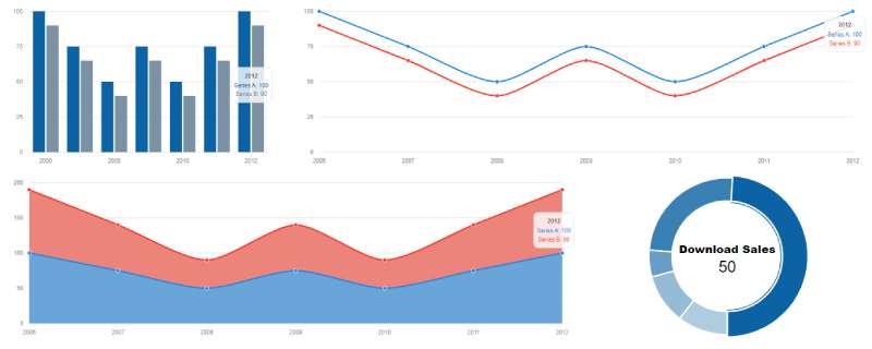
Raw data means nothing without visualization. Bootstrap charts examples show you how to turn numbers into bar graphs, line charts, pie charts, and interactive dashboards that users actually understand.
Chart.js paired with Bootstrap 5 is the most popular combination for building responsive data visualizations on the web.
This guide covers working code snippets for every major chart type. You’ll learn configuration options, color customization, animation effects, and accessibility best practices.
Copy the examples directly into your project. Modify the dataset values. Ship a professional-looking dashboard in hours instead of days.
What are Bootstrap Charts
Bootstrap charts are data visualization components built by combining the Bootstrap CSS framework with JavaScript charting libraries.
Chart.js, ApexCharts, and Highcharts are the most common libraries used for this purpose.
These charts render bar graphs, line charts, pie charts, and other graphical representations inside Bootstrap card containers or dashboard layouts.
The Bootstrap grid system handles positioning while the charting library manages canvas rendering and SVG output.
You get responsive charts that automatically adjust to different screen sizes without extra configuration.
Bootstrap charts examples
DevExpress Bootstrap Charts

Custom Bootstrap 4 Charts JS Gradient Examples

Bar Chart

Radar chart

Line chart using Bootstrap

Bootstrap 4 Charts

Ghc-Client-Bootstrap-Dashboard For Line Charts

Bootstrap SEO chart

Horizontal Bar Chart

Charting with Bootstrap, Chart JS

Equalizer Graph Charts

Chart.js in bootstrap modal

Polar Area Chart

CanvasJS Charts with Bootstrap 4 Layout Pie Chart

Mixed chart example

Bootstrap 4 Modal with Google Charts

Doughnut Chart

Responsive and Animated Pie Charts

Morris.js Responsive Charts with Bootstrap 4
Ionic angular-chart example

Bootstrap Chart js Responsive Line Chart Graph

Highcharts Donut w/ Angular

Matrix

How to Create Bootstrap Charts
What Libraries Work with Bootstrap for Charts?
Chart.js is the go-to option for most developers. Lightweight, well-documented, and works perfectly with Bootstrap 5.
ApexCharts offers more built-in chart types and better tooltip customization out of the box.
D3.js provides maximum flexibility but requires more frontend coding knowledge.
How to Install Chart.js with Bootstrap?
Two methods: CDN or npm.
CDN method (fastest):
<script src="https://cdn.jsdelivr.net/npm/chart.js"></script>
npm method:
npm install chart.js
Include Bootstrap’s CSS and JS files first, then add the Chart.js script.
What is the Basic HTML Structure for Bootstrap Charts?
Wrap your canvas element inside a Bootstrap container or card component.
<div class="card">
<div class="card-body">
<canvas id="myChart"></canvas>
</div>
</div>
The canvas element is where Chart.js renders the visualization.
Set a fixed height on the container or use the maintainAspectRatio option to control chart dimensions.
Bootstrap Bar Chart Examples
How to Create a Vertical Bar Chart in Bootstrap?
Vertical bar charts display dataset values as rectangular bars extending upward from the x-axis.
const ctx = document.getElementById('barChart').getContext('2d');
new Chart(ctx, {
type: 'bar',
data: {
labels: ['Jan', 'Feb', 'Mar', 'Apr', 'May'],
datasets: [{
label: 'Sales',
data: [12, 19, 3, 5, 2],
backgroundColor: '#0d6efd'
}]
}
});
The backgroundColor property accepts Bootstrap color variables or hex values.
How to Create a Horizontal Bar Chart in Bootstrap?
Change type: 'bar' to use the indexAxis: 'y' option.
new Chart(ctx, {
type: 'bar',
data: chartData,
options: {
indexAxis: 'y'
}
});
Horizontal bars work better for long category labels or comparing many items.
What are the Configuration Options for Bootstrap Bar Charts?
Key options for bar chart customization:
- borderRadius – rounds bar corners
- barThickness – controls bar width in pixels
- categoryPercentage – adjusts spacing between bar groups
- borderWidth – adds outline to bars
Stacked bar charts require setting stacked: true on both x and y axes in the scales configuration.
Bootstrap Line Chart Examples
How to Create a Basic Line Chart in Bootstrap?
Line charts connect data points with straight or curved lines, perfect for showing trends over time.
new Chart(ctx, {
type: 'line',
data: {
labels: ['Week 1', 'Week 2', 'Week 3', 'Week 4'],
datasets: [{
label: 'Revenue',
data: [65, 59, 80, 81],
borderColor: '#198754',
tension: 0.1
}]
}
});
The tension property controls line curvature. Set to 0 for straight lines, 0.4 for smooth curves.
How to Add Multiple Datasets to a Line Chart?
Pass an array of dataset objects to display multiple lines on one chart.
datasets: [
{
label: 'Product A',
data: [65, 59, 80, 81],
borderColor: '#0d6efd'
},
{
label: 'Product B',
data: [28, 48, 40, 19],
borderColor: '#dc3545'
}
]
Each dataset gets its own color, label, and style properties.
How to Style Line Charts with Bootstrap Colors?
Use Bootstrap’s CSS color variables for consistent styling across your dashboard.
Common Bootstrap 5 colors for charts:
- Primary:
#0d6efd - Success:
#198754 - Danger:
#dc3545 - Warning:
#ffc107 - Info:
#0dcaf0
Apply gradient fills using createLinearGradient() on the canvas context for more visual impact.
Bootstrap Pie Chart Examples
How to Create a Pie Chart in Bootstrap?
Pie charts show proportional data as slices of a circle.
new Chart(ctx, {
type: 'pie',
data: {
labels: ['Red', 'Blue', 'Yellow'],
datasets: [{
data: [300, 50, 100],
backgroundColor: ['#dc3545', '#0d6efd', '#ffc107']
}]
}
});
Keep pie charts to 5-7 slices maximum. More than that becomes hard to read.
What is the Difference Between Pie and Doughnut Charts in Bootstrap?
Doughnut charts are pie charts with a hole in the center.
Change type: 'pie' to type: 'doughnut' and adjust the cutout option to control hole size.
options: {
cutout: '60%'
}
Doughnut charts leave space for displaying totals or key metrics in the center using HTML overlay elements positioned with CSS.
Bootstrap Doughnut Chart Examples
How to Create a Doughnut Chart in Bootstrap?
Doughnut charts work identically to pie charts with one key difference: the hollow center.
new Chart(ctx, {
type: 'doughnut',
data: {
labels: ['Desktop', 'Mobile', 'Tablet'],
datasets: [{
data: [55, 35, 10],
backgroundColor: ['#0d6efd', '#198754', '#ffc107']
}]
},
options: {
cutout: '70%'
}
});
The cutout percentage controls hole size. Higher values create thinner rings.
Bootstrap Area Chart Examples
How to Create an Area Chart in Bootstrap?
Area charts are line charts with filled regions beneath the data points.
new Chart(ctx, {
type: 'line',
data: {
labels: ['Q1', 'Q2', 'Q3', 'Q4'],
datasets: [{
label: 'Revenue',
data: [30, 45, 60, 70],
fill: true,
backgroundColor: 'rgba(13, 110, 253, 0.2)',
borderColor: '#0d6efd'
}]
}
});
Set fill: true and use rgba colors with transparency for the background.
Bootstrap Radar Chart Examples
How to Create a Radar Chart in Bootstrap?
Radar charts display multivariate data on axes starting from the same point. Great for skill assessments or product comparisons.
new Chart(ctx, {
type: 'radar',
data: {
labels: ['Speed', 'Power', 'Defense', 'Accuracy', 'Stamina'],
datasets: [{
label: 'Player Stats',
data: [85, 70, 90, 75, 80],
backgroundColor: 'rgba(13, 110, 253, 0.2)',
borderColor: '#0d6efd'
}]
}
});
Bootstrap Polar Area Chart Examples
How to Create a Polar Area Chart in Bootstrap?
Polar area charts combine pie chart segments with varying radii based on data values.
new Chart(ctx, {
type: 'polarArea',
data: {
labels: ['Red', 'Green', 'Blue', 'Yellow'],
datasets: [{
data: [11, 16, 7, 14],
backgroundColor: ['#dc3545', '#198754', '#0d6efd', '#ffc107']
}]
}
});
Each segment extends outward proportionally to its value while maintaining equal angles.
Bootstrap Mixed Chart Examples
How to Combine Bar and Line Charts in Bootstrap?
Mixed charts overlay different chart types on a single canvas. Perfect for comparing trends against totals.
new Chart(ctx, {
type: 'bar',
data: {
labels: ['Jan', 'Feb', 'Mar', 'Apr'],
datasets: [
{
type: 'bar',
label: 'Sales',
data: [50, 60, 70, 80],
backgroundColor: '#0d6efd'
},
{
type: 'line',
label: 'Target',
data: [55, 65, 75, 85],
borderColor: '#dc3545'
}
]
}
});
Specify the type property within each dataset object to override the base chart type.
How to Make Bootstrap Charts Responsive
What CSS Classes Make Charts Responsive?
Wrap charts in Bootstrap’s ratio utility classes or use responsive design containers.
<div class="ratio ratio-16x9">
<canvas id="responsiveChart"></canvas>
</div>
Chart.js enables responsive behavior by default through the responsive: true option.
How to Handle Chart Resizing on Mobile Devices?
Use media queries to adjust chart container heights at different breakpoints.
Set maintainAspectRatio: false when you need fixed heights that don’t scale proportionally.
options: {
responsive: true,
maintainAspectRatio: false
}
The viewport width determines which layout rules apply to your chart wrapper.
How to Customize Bootstrap Chart Colors
What are the Default Bootstrap Color Variables for Charts?
Bootstrap 5 provides CSS custom properties for consistent color usage:
--bs-primary: #0d6efd--bs-secondary: #6c757d--bs-success: #198754--bs-danger: #dc3545--bs-warning: #ffc107
Access these via getComputedStyle(document.documentElement).getPropertyValue('--bs-primary').
How to Use Custom Color Palettes in Charts?
Create reusable color arrays for consistent chart color palette styling across your dashboard components.
const chartColors = {
blue: 'rgba(13, 110, 253, 0.8)',
green: 'rgba(25, 135, 84, 0.8)',
red: 'rgba(220, 53, 69, 0.8)'
};
Proper color contrast between chart elements improves readability and accessibility compliance.
How to Add Interactivity to Bootstrap Charts
How to Add Tooltips to Bootstrap Charts?
Chart.js includes built-in tooltip functionality enabled by default.
options: {
plugins: {
tooltip: {
backgroundColor: '#212529',
titleFont: { size: 14 },
bodyFont: { size: 12 },
padding: 12
}
}
}
Custom callbacks let you format tooltip content with currency symbols, percentages, or custom text.
How to Add Click Events to Chart Elements?
Use the onClick option to capture user interactions on chart segments or data points.
options: {
onClick: (event, elements) => {
if (elements.length > 0) {
const index = elements[0].index;
console.log('Clicked:', data.labels[index]);
}
}
}
These interactive elements enable drill-down functionality in dashboard applications.
How to Add Animations to Bootstrap Charts?
Chart.js provides animation options for chart rendering and data updates.
options: {
animation: {
duration: 1000,
easing: 'easeOutQuart'
}
}
Available easing functions: linear, easeInQuad, easeOutQuart, easeInOutCubic.
Subtle micro-interactions on hover states improve user experience without distracting from the data.
Bootstrap Chart Accessibility
What ARIA Labels Should Charts Include?
Add ARIA attributes to the canvas element for screen reader support.
<canvas id="myChart" role="img" aria-label="Sales data bar chart showing quarterly revenue"></canvas>
The role="img" attribute tells assistive technology this is a graphical element.
How to Make Chart Data Available to Screen Readers?
Provide an accessible table version of chart data for users who cannot see the visualization.
<table class="visually-hidden">
<caption>Quarterly Sales Data</caption>
<tr><th>Quarter</th><th>Revenue</th></tr>
<tr><td>Q1</td><td>$50,000</td></tr>
</table>
Bootstrap’s visually-hidden class hides the table visually while keeping it available to screen readers.
Full web accessibility compliance requires both visual and non-visual data representations.
FAQ on Bootstrap Charts Examples
What is the best charting library for Bootstrap?
Chart.js is the most popular choice. It’s lightweight, renders on canvas, and integrates smoothly with Bootstrap 5 components.
ApexCharts and Highcharts offer more features but add larger file sizes to your project.
How do I install Chart.js with Bootstrap?
Add the CDN link before your closing body tag: <script src="https://cdn.jsdelivr.net/npm/chart.js"></script>.
For npm projects, run npm install chart.js and import it into your Bootstrap application.
Are Bootstrap charts responsive by default?
Yes. Chart.js sets responsive: true by default, so charts resize automatically with their container.
Wrap your canvas in a Bootstrap grid column or card component for proper scaling across devices.
How do I change Bootstrap chart colors?
Set backgroundColor and borderColor properties in your dataset configuration. Use Bootstrap’s color variables like #0d6efd for primary blue.
RGBA values with transparency work best for overlapping elements.
Can I create real-time charts with Bootstrap?
Yes. Use the chart.update() method after modifying data arrays. Combine with API calls or WebSocket connections to fetch live data.
Set animation.duration: 0 for smoother real-time updates.
What chart types does Chart.js support?
Chart.js includes bar, line, pie, doughnut, radar, polar area, bubble, and scatter charts. Mixed charts combine multiple types on one canvas.
Plugins extend functionality for gauges, treemaps, and more.
How do I add legends to Bootstrap charts?
Legends display automatically based on dataset labels. Customize position with plugins.legend.position set to top, bottom, left, or right.
Hide legends entirely with display: false.
Can I export Bootstrap charts as images?
Yes. Use chart.toBase64Image() to convert the canvas to a PNG data URL. Trigger a download with a temporary anchor element.
This works for screenshots and report generation.
How do I handle chart click events?
Add an onClick callback in your options object. The function receives the click event and an array of active chart elements.
Use this for drill-down navigation or displaying detailed modal popups.
How do I make Bootstrap charts load faster?
Disable animations with animation: false for large datasets. Reduce data points where possible.
Use skeleton screens as placeholders while chart data loads asynchronously.
Conclusion
These Bootstrap charts examples give you production-ready code for every common chart type. Bar charts, doughnut charts, radar charts, mixed visualizations. All covered.
Chart.js handles canvas rendering while Bootstrap manages layout and styling. The combination works across desktop and mobile without extra configuration.
Start with basic chart initialization. Then add tooltip customization, legend positioning, and hover effects as your dashboard grows.
Dynamic chart updates through the update() method let you build real-time data visualizations. Axis labels, grid lines, and chart scales adjust automatically when datasets change.
Copy these snippets into your project. Swap in your own data structure. You’ll have visual analytics running in minutes, not days.