Your sidebar can make or break a web application’s navigation flow.
A poorly built side panel frustrates users. A well-crafted one keeps them engaged and moving through your content.
These Bootstrap sidebar examples cover the patterns that actually work in production, from fixed admin dashboards to responsive offcanvas menus for mobile.
You’ll find code snippets ready to copy, CSS customization techniques, and solutions for common implementation problems.
Whether you’re building with Bootstrap 5 or maintaining a legacy project, this guide walks through sidebar types, responsive behavior, multi-level navigation, and styling methods that match modern web design principles.
What is a Bootstrap Sidebar
A Bootstrap sidebar is a vertical navigation component positioned along the left or right edge of a webpage.
It provides persistent access to menu items, links, and content sections without taking up horizontal space in the main content area.
The sidebar works as part of the Bootstrap framework’s grid system, integrating with rows and columns to create structured admin dashboards, documentation sites, and web applications.
Mark Otto and Jacob Thornton designed Bootstrap with flexible components that adapt to different screen sizes through media queries.
The sidebar component follows this pattern. It can collapse on mobile devices, transform into an offcanvas panel, or remain fixed during scroll.
Bootstrap Sidebar Examples
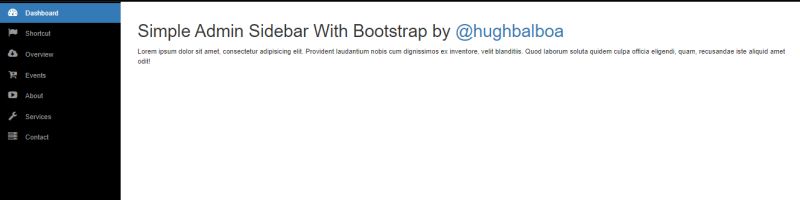
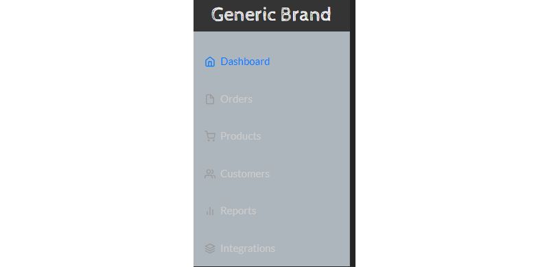
Bootstrap SideBar Menu
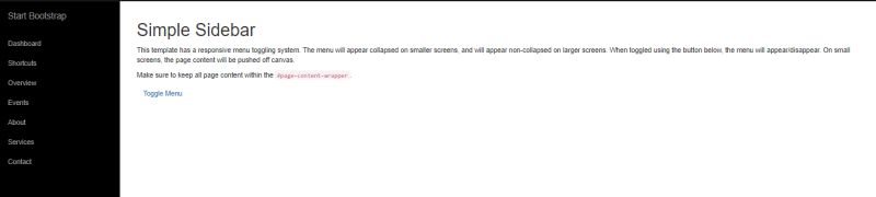
Collapsing Sidebar
Sidebar Transition
Bootstrap Sidebar Vertical Tabs Hover Effect
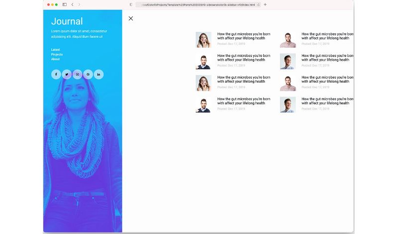
Colorlib Sidebar V10
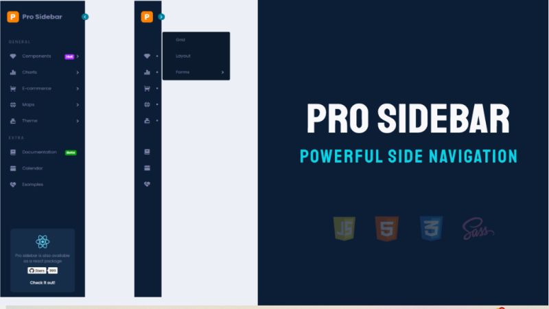
Pro Sidebar
Triangular Sidebar Menu

A Pen by Attila Albert
React Motion Sidebar
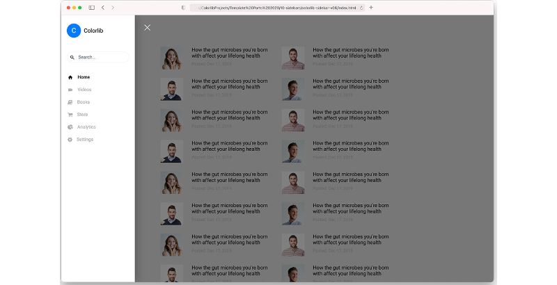
Colorlib Sidebar V06
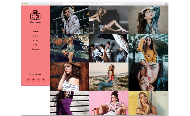
Capture – Clean And Elegant Looking Sidebar Design
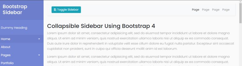
BootStrap Sidebar Toggle
Material Design – Sidebar

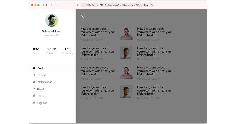
Colorlib Sidebar V01
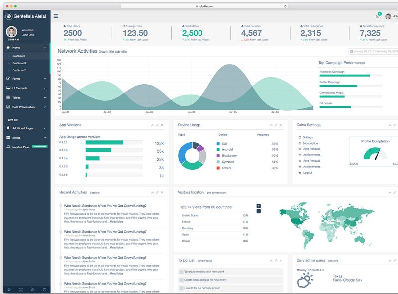
Gentelella – Sidebar With User’s Profile Image
Secret Project
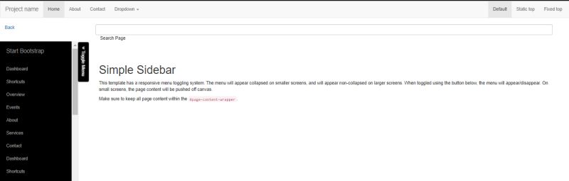
Quick Bootstrap Sidebar by Olumide Falomo
Fixed Bootstrap Sidebar
Stunning Bootstrap 4 Sidebar Menu
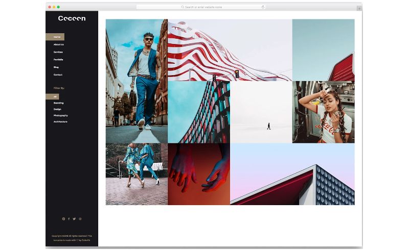
Cocoon – Bootstrap Sidebar With Rich Dark Theme
Bootstrap Sidebar by Truong Tran
How Bootstrap Sidebar Components Work
Bootstrap sidebars rely on a combination of HTML structure, CSS positioning, and JavaScript for toggle functionality.
The basic structure uses a nav element with nested unordered lists for menu items.
CSS handles the visual presentation. The position: fixed or position: sticky property keeps the sidebar visible during scroll.
Width is typically set between 240px and 280px for desktop views.
JavaScript controls the toggle button behavior. When users click the hamburger icon, event listeners add or remove CSS classes that show or hide the sidebar panel.
Bootstrap 5 introduced the offcanvas component specifically for this purpose, eliminating the need for custom scripts in many cases.
The framework uses data attributes like data-bs-toggle and data-bs-target to connect trigger buttons with sidebar elements.
What Makes a Good Bootstrap Sidebar
A functional sidebar balances usability with visual design.
Key characteristics include:
- Responsive behavior that adapts to viewport width changes
- Clear visual hierarchy with proper spacing between nav items
- Accessible markup using ARIA attributes for screen readers
- Smooth CSS transitions when opening and closing
- Touch-friendly targets sized at minimum 44×44 pixels
Performance matters too. Avoid heavy animations that cause layout shifts or slow rendering on mobile devices.
The sidebar should support keyboard navigation for users who cannot use a mouse.
Bootstrap Sidebar Types Based on Behavior
Sidebars fall into four main categories based on how they interact with page content and respond to user actions.
Each type serves different use cases and layout requirements.
What is a Fixed Bootstrap Sidebar
A fixed sidebar stays locked in position while the main content scrolls independently.
Uses position: fixed with top: 0, bottom: 0, and left: 0 values. Common in admin dashboards where constant menu access matters.
What is a Collapsible Bootstrap Sidebar
Collapsible sidebars shrink to icon-only mode or hide completely when triggered.
The Bootstrap accordion pattern works well for nested menu items. Toggle buttons control width transitions between expanded and collapsed states.
What is an Offcanvas Bootstrap Sidebar
Offcanvas sidebars slide in from the screen edge, overlaying the main content with a backdrop.
Bootstrap 5’s native offcanvas component handles this with built-in accessibility and responsive design support. Perfect for mobile-first layouts.
What is a Sticky Bootstrap Sidebar
Sticky sidebars scroll with the page until reaching a defined boundary, then lock in place.
Uses position: sticky with a top value. The sidebar must have a scrollable parent container with defined height for this to work properly.
Bootstrap Sidebar Examples by Use Case
Different projects require different sidebar configurations.
The examples below show practical implementations for common scenarios.
Bootstrap Sidebar for Admin Dashboards
Admin dashboards need multi-level navigation with icon support and collapsible sections.
Key features include:
- User profile section in the sidebar header
- Nested dropdown menus for sub-pages
- Bootstrap icons paired with text labels
- Badge indicators for notifications
- Dark theme option using
.sidebar-darkclass
CoreUI and MDBootstrap offer pre-built admin sidebar templates compatible with Bootstrap 5.
Bootstrap Sidebar for E-commerce Websites
E-commerce sidebars focus on product filtering and category navigation.
Common elements:
- Price range sliders using Bootstrap input groups
- Checkbox filters for product attributes
- Collapsible category trees
- Active filter tags with clear buttons
The sidebar width typically stays narrower (200-220px) to maximize product grid space.
Bootstrap Sidebar for Documentation Sites
Documentation sidebars require deep nesting and scroll position tracking.
Bootstrap’s Scrollspy plugin highlights the current section as users scroll through content. The sidebar often includes a search box at the top for quick navigation.
Version selectors and language toggles fit well in the sidebar header area.
Bootstrap Sidebar for Landing Pages
Landing pages typically use minimal sidebars that appear only on mobile via hamburger menu trigger.
Content includes:
- Primary navigation links
- Call-to-action buttons
- Contact form shortcut
- Social media icons
Keep the design clean. Avoid cluttering the sidebar with secondary information that distracts from conversion goals.
How to Create a Basic Bootstrap Sidebar
Start with a wrapper div containing both the sidebar and main content area.
The HTML structure follows this pattern:
“ <div class="d-flex"> <nav class="sidebar bg-dark"> <div class="sidebar-header"> <h3>Brand</h3> </div> <ul class="nav flex-column"> <li class="nav-item"> <a class="nav-link active" href="#">Dashboard</a> </li> <li class="nav-item"> <a class="nav-link" href="#">Settings</a> </li> </ul> </nav> <main class="content"> <!-- Page content --> </main> </div> `
Add these base styles to your stylesheet:
` .sidebar { width: 250px; min-height: 100vh; position: fixed; top: 0; left: 0; }
.content { margin-left: 250px; padding: 20px; width: 100%; } `
Include Bootstrap 5 via npm or CDN before your custom styles load.
The d-flex utility class creates the horizontal layout between sidebar and content regions.
How to Make a Bootstrap Sidebar Responsive
Responsive sidebars require breakpoint handling through CSS and JavaScript.
The standard approach hides the sidebar below 992px (lg breakpoint) and shows a toggle button instead.
` @media (max-width: 991.98px) { .sidebar { margin-left: -250px; transition: margin 0.3s ease; }
.sidebar.active { margin-left: 0; }
.content { margin-left: 0; } } `
Add a navbar with hamburger icon for mobile views.
The toggle script:
` document.getElementById('sidebarToggle').addEventListener('click', function() { document.querySelector('.sidebar').classList.toggle('active'); }); `
Bootstrap’s offcanvas component handles this automatically with data-bs-toggle=”offcanvas” attributes, eliminating custom JavaScript.
Test across Chrome, Firefox, Safari, and Edge for cross-browser compatibility.
How to Add Multi-Level Navigation to a Bootstrap Sidebar
Nested menu items use Bootstrap’s collapse component for expand/contract behavior.
` <li class="nav-item"> <a class="nav-link" data-bs-toggle="collapse" href="#submenu1"> Products <i class="bi bi-chevron-down"></i> </a> <div class="collapse" id="submenu1"> <ul class="nav flex-column ms-3"> <li class="nav-item"> <a class="nav-link" href="#">Category A</a> </li> <li class="nav-item"> <a class="nav-link" href="#">Category B</a> </li> </ul> </div> </li> `
The ms-3 class indents child items for clear visual hierarchy.
Add chevron rotation with CSS transitions:
` .nav-link[aria-expanded="true"] .bi-chevron-down { transform: rotate(180deg); } `
Limit nesting to three levels maximum. Deeper structures hurt user experience and become difficult to navigate on mobile.
How to Style a Bootstrap Sidebar with Custom CSS
Override Bootstrap’s default variables or write custom styles after the framework loads.
Common customizations:
` .sidebar { --sidebar-bg: #1a1a2e; --sidebar-link-color: #a0a0a0; --sidebar-link-hover: #ffffff; --sidebar-width: 260px;
background-color: var(–sidebar-bg); width: var(–sidebar-width); }
.sidebar .nav-link { color: var(–sidebar-link-color); padding: 12px 20px; border-radius: 4px; transition: all 0.2s ease; }
.sidebar .nav-link:hover, .sidebar .nav-link.active { color: var(–sidebar-link-hover); background-color: rgba(255, 255, 255, 0.1); } `
Use SVG icons instead of icon fonts for sharper rendering and smaller file sizes.
Add subtle micro-interactions on hover states to improve perceived quality.
Maintain adequate color contrast ratios (4.5:1 minimum) for accessibility compliance.
Bootstrap Sidebar Classes Reference
Essential Bootstrap utility classes for sidebar construction:
| Class | Purpose | | | | | .d-flex | Creates flex container for sidebar layout | | .flex-column | Stacks nav items vertically | | .nav | Base navigation component | | .nav-item | Individual menu item wrapper | | .nav-link | Clickable link styling | | .active | Highlights current page | | .collapse | Hides nested content by default | | .show | Displays collapsed content | | .position-fixed | Locks sidebar to viewport | | .position-sticky | Sticks after scroll threshold | | .bg-dark | Dark background color | | .bg-light | Light background color | | .text-white | White text for dark backgrounds | | .vh-100 | Full viewport height | | .overflow-auto | Enables scrolling for long menus |
The offcanvas component adds .offcanvas, .offcanvas-start, .offcanvas-end, and .offcanvas-backdrop classes.
Common Bootstrap Sidebar Implementation Mistakes
Avoid these frequent errors when building sidebars:
- Missing z-index values cause the sidebar to appear behind other elements; set z-index: 1000
or higher
- Forgetting overflow-y: auto
makes long menus inaccessible on shorter screens
- Omitting role=”navigation”
and aria-label attributes breaks screen reader support
- Hard-coded pixel widths without max-width: 100%
cause horizontal scroll on mobile
- Heavy CSS animations on sidebar transitions trigger layout thrashing and slow performance
- Not testing keyboard navigation leaves users unable to tab through menu items
- Placing the sidebar after main content in DOM order hurts accessibility; sidebar should come first
Check your implementation in Chrome DevTools device emulation before deploying.
Run Lighthouse audits to catch accessibility and performance issues early.
FAQ on Bootstrap Sidebar Examples
How do I create a sidebar in Bootstrap 5?
Use a flex container with a nav element for the sidebar and a main element for content. Apply position: fixed and set width to 250px. Add .nav and .flex-column classes to stack menu items vertically.
What is the best way to make a Bootstrap sidebar responsive?
Hide the sidebar below the lg breakpoint (992px) using CSS negative margins. Show a toggle button that triggers the offcanvas component or adds an .active class to slide the panel into view on mobile devices.
How do I add a toggle button to collapse a Bootstrap sidebar?
Add a button with data-bs-toggle=”offcanvas” and data-bs-target pointing to your sidebar ID. For custom implementations, use JavaScript event listeners to toggle CSS classes that control sidebar width and visibility.
Can I use Bootstrap sidebar with React or Vue?
Yes. Use React-Bootstrap or BootstrapVue component libraries for native integration. Both frameworks support sidebar patterns through nav components and offcanvas wrappers. You can also use vanilla Bootstrap classes with custom state management.
How do I make a fixed sidebar that stays visible on scroll?
Apply position: fixed with top: 0, left: 0, and height: 100vh to the sidebar element. Set overflow-y: auto for scrollable content. Offset your main content with matching margin-left value.
What is the difference between offcanvas and a regular sidebar?
A regular sidebar stays visible within the page layout. Offcanvas slides in from the screen edge and overlays content with a backdrop. Offcanvas works better for mobile user interface patterns where screen space is limited.
How do I add icons to Bootstrap sidebar menu items?
Place icon elements inside .nav-link before the text label. Use frontend icon libraries like Font Awesome or Bootstrap Icons. Add me-2 class to icons for proper spacing between icon and text.
How do I create a multi-level dropdown menu in a sidebar?
Nest a .collapse div inside each parent .nav-item. Use data-bs-toggle=”collapse” on the parent link. Style child items with ms-3 for indentation. Add chevron icons that rotate on expand using CSS keyframes.
Why is my Bootstrap sidebar overlapping the main content?
Your main content lacks proper margin offset. Add margin-left equal to sidebar width. Check z-index values if elements stack incorrectly. Verify your flex container uses d-flex class for proper horizontal layout.
How do I add a dark theme to my Bootstrap sidebar?
Apply .bg-dark and .text-white classes to the sidebar container. Override link colors with custom CSS variables. Use hover effects with rgba(255,255,255,0.1) backgrounds for subtle interaction feedback on nav items.
Conclusion
These Bootstrap sidebar examples give you working patterns for vertical navigation components across different project types.
Pick the sidebar behavior that matches your layout needs. Fixed for admin dashboards, offcanvas for mobile-first sites, sticky for documentation pages.
Start with the basic HTML structure and CSS positioning. Then layer in toggle functionality, multi-level menus, and custom styling as needed.
Test your implementation across screen sizes. Check keyboard navigation and screen reader support before shipping.
The sidebar code here works with vanilla Bootstrap 5 via CDN or npm. You can adapt these patterns for Vue, Laravel, or Next.js projects with minimal changes.
Download the source files from GitHub and modify them to fit your design system.


