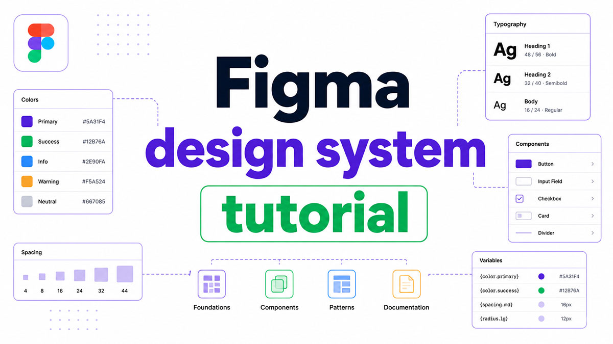
Most teams build the same components twice. Once in Figma, once in code, with no real connection between them.
A well-built Figma design system fixes that. This tutorial covers everything from foundations and design tokens to component variants, team library publishing, and developer handoff using Dev Mode.
By the end, you will know how to build a reusable component library that scales across products, supports light and dark mode through Figma Variables, and connects directly to your codebase.
No wasted components. No duplicate work. Just a system that actually holds up.
What Is a Figma Design System?
A Figma design system is a shared library of reusable components, color styles, text styles, effect styles, and design tokens that teams use to build consistent UI across products. It lives inside a dedicated Figma file and connects to product files through Figma’s team library feature.
This is different from a style guide. A style guide documents rules. A design system enforces them through linked, live components that update across every connected file the moment you publish a change.
What a Figma Design System Includes
Core parts every system needs:
- Component library: buttons, inputs, modals, cards, navigation patterns
- Color styles and Variables: primitive palette, semantic tokens, component-level tokens
- Text styles: every typographic role from Display down to Caption
- Effect styles: shadow levels, blur states
- Grid styles: column grids for mobile, tablet, and desktop frames
Figma’s library publishing feature is what turns a local file into a live system. Once published, any editor in the same Figma Organization can enable the library under Assets and start using components immediately.
How a Figma Design System Differs from a Style Guide
Key difference: a style guide is a PDF or static page. A design system is a live, connected infrastructure.
Have you seen the latest Figma statistics?
Discover comprehensive Figma statistics including revenue growth, market share, user demographics, and funding data.
Check them out →| Aspect | Style Guide | Figma Design System |
|---|---|---|
| Format | Static Document | Live Figma Library |
| Updates | Manual, Version-Controlled Separately | Pushed Automatically to All Linked Files |
| Enforcement | Relies on People Reading It | Built Into Components by Default |
| Developer Use | Reference Only | Direct Inspection via Figma Dev Mode |
If you want to go deeper on the structural differences, this breakdown of design system components covers how each layer connects.
Why Do Teams Build Design Systems in Figma?
Figma holds a 40.65% market share in UI design tools as of 2024, ahead of Sketch, Adobe XD, and InVision (Cropink, 2024). That dominance comes from one thing: it solves the collaboration problem that every other tool made worse.
Design systems built in Figma live where the design work actually happens. No exports, no version mismatches, no “which file is current.”
The Real Workflow Advantages
Figma’s multiplayer environment means designers, developers, and product managers work inside the same file at the same time. Figma’s 2025 Designer-Developer Trends report found that 84% of designers collaborate with developers at least weekly (Figma, 2025). A shared system file makes that collaboration functional rather than chaotic.
There are 4 specific reasons teams choose Figma for their design system:
- Team libraries push component updates to all linked product files simultaneously
- Figma Variables (released 2023) handle light/dark mode, brand themes, and density modes without duplicating components
- Dev Mode surfaces CSS, iOS, and Android code snippets directly from component frames
- The Figma REST API and plugin ecosystem connect the system to engineering pipelines via Tokens Studio and Style Dictionary
According to Figma’s S-1 filing, 95% of the Fortune 500 use Figma, with 13 million-plus monthly active users as of 2025 (Figma S-1, 2025). At that scale, teams cannot afford inconsistency. A design system is the mechanism that prevents it.
Validating designs before development reduces iteration cycles by 25%, avoiding substantial rework costs (UserTesting, 2025). A well-maintained Figma system makes that validation loop faster because every component is already tested and documented.
What Should You Set Up Before Building a Figma Design System?
Build the file structure and naming conventions before creating a single component. Teams that skip this step spend weeks doing remediation work later, rebinding color fills, renaming layers, and reorganizing pages across hundreds of frames.
How to Structure Your Figma Design System File
Create a dedicated design system file, separate from any product or project file. This is the source of truth. Product files link to it; they never contain the master components themselves.
Standard page structure that scales:
- Foundations: color, typography, spacing, grid, elevation tokens
- Components: atoms first, composites after, organized by category
- Documentation: anatomy frames, do/don’t examples, usage specs
- Playground: a scratchpad for testing new components before publishing
Set your base grid before drawing anything. The 8pt grid system is the standard in professional design systems. Every spacing value, component height, and padding value should be a multiple of 8 (or 4 for fine increments).
Naming Conventions That Scale
Naming is the most underestimated decision in a design system. Get it wrong and every handoff becomes a translation exercise between what designers call something and what engineers call it.
Use a BEM-inspired hierarchical format: Category/Component/Variant/State. For example: Forms/Input/Default/Error. Decide whether the system serves one product or multiple brands before finalizing token names, since multi-brand systems need a primitive-to-semantic-to-component token hierarchy from day one.
69.8% of teams had already adopted Figma Variables for token management by 2024, with another 19.3% planning to do so (Enstacked, 2024). That adoption rate makes consistent naming between Figma and the codebase more critical than ever.
How Do You Create Foundations in a Figma Design System?
Foundations are the base layer. Color, typography, spacing, elevation, and grid all live here. Build foundations before any component exists. Every component built after this step will inherit theming and mode-switching automatically.
Building a Color System with Figma Styles and Variables
Color in a modern Figma design system uses 3 tiers:
| Tier | Example Name | Purpose |
|---|---|---|
| Primitive | color/blue/500 | Raw Hex Values, No Semantic Meaning |
| Semantic | color/text/primary | Role-Based Aliases That Reference Primitives |
| Component | button/background/default | Component-Specific References to Semantic Tokens |
Semantic variables are where light/dark mode lives. When you switch modes in Figma, color/text/primary references a different primitive automatically. You do not create a second component set for dark mode.
Defining Typography Scales
Create text styles for every typographic role your product uses. A complete set covers 8-10 styles: Display, Heading 1 through Heading 4, Body Large, Body Small, Caption, and Label.
As of 2024, Figma Variables do not natively support typography tokens. Text styles remain the correct tool for typography until Figma ships that feature. Use a consistent naming pattern: Type/Display/Regular, Type/Body/Large.
Setting Up Spacing and Grid Tokens
Spacing tokens use Figma Number Variables. Define values at 4, 8, 12, 16, 24, 32, 48, and 64px. Name them spacing/100 through spacing/800 (scale naming avoids breaking changes when you add values later).
For grid styles, define 3 layouts: 4-column at 375px for mobile, 8-column at 768px for tablet, and 12-column at 1440px for desktop. These grid styles attach directly to frames and auto-apply to every designer using the library.
How Do You Build Components in Figma?
Start with atomic components. Buttons, inputs, icons, badges, and checkboxes come before any composite pattern. Build each atom correctly once and every composite built from it inherits the correct behavior.
Using Auto Layout for Responsive Components
Every component needs Auto Layout. No exceptions.
Without it, components break when text changes length, when content is added or removed, or when the viewport width shifts. Auto Layout makes components resize the way coded components actually behave, which makes the design-to-code gap significantly smaller.
Set horizontal and vertical padding as references to spacing tokens, not hardcoded values. This way, if your spacing scale changes, every component padding updates in one step.
Creating Variants and Component Properties
Figma Variants group all states of a component into one master component set. Build variants for these states as a minimum: Default, Hover, Focus, Disabled, and Error.
Component Properties reduce variant bloat. Use 3 property types:
- Text property: replaces static placeholder text with editable content per instance
- Boolean property: shows or hides optional child layers (icons, badges, helper text)
- Instance swap property: lets a designer swap a child component (like an icon) without detaching the parent
Taken together, these tools mean a Button component might need 5 variants instead of 40. That reduction directly cuts the maintenance cost of the system over time.
Building Composite Components from Atoms
A composite component nests atomic components as instances, not copies. An Input Field composite contains a Label atom, a Placeholder text layer, a Helper Text atom, and an Icon instance all inside one Auto Layout frame.
When the Label atom updates in the foundations layer, every Input Field across every product file that uses the library reflects the change automatically. That cascade is the core value of a well-structured component library.
IBM’s study of its Carbon Design System found 47% faster development time for simple forms when using a system’s composite components versus building from scratch (IBM / Figma, 2024). The time savings compound as the product grows.
How Do You Use Figma Variables for Design Tokens?
Figma Variables store values (color, number, string, boolean) that components reference directly. They replaced manual style management for anything that needs to change based on theme, brand, or density mode.
42.5% of teams say Figma Variables became their primary source of truth for design tokens in 2024 (Enstacked, 2024). That shift happened because Variables do something styles cannot: they support multiple modes in a single collection.
Setting Up Variable Collections and Modes
Organize Variables into 3 collections:
- Primitives: raw values only, no modes needed (
color/blue/500: #3B82F6) - Semantic: role-based aliases with Light and Dark modes, referencing primitives
- Spacing/Radius: Number Variables for all spatial values
Modes in Figma map directly to themes in code. color/surface/brand references color/blue/600 in Light mode and color/blue/400 in Dark mode. Switch modes in Figma, and the entire component set updates simultaneously without touching a single fill manually.
Connecting Variables to Tokens Studio for Code Handoff
Tokens Studio (a Figma plugin) reads the Variable structure and exports a JSON token file. Style Dictionary then transforms that file into CSS custom properties, iOS Swift constants, or Android resource files depending on the target platform.
This pipeline closes the naming gap between design and engineering. The token name color/text/primary in Figma becomes --color-text-primary in CSS. Same name. Same value. No manual re-entry on the development side.
Airbnb’s design infrastructure team uses a similar token pipeline to keep their Figma system and codebase synchronized across web, iOS, and Android simultaneously, reducing per-platform rework substantially.
How Do You Publish and Manage a Figma Team Library?
Publishing converts your local design system file into a shared library that other files can connect to. This is what turns a well-structured Figma file into an actual design infrastructure.
Publishing Updates Without Breaking Product Files
To publish: go to the Main Menu, select Libraries, then click Publish. Write a clear change description before confirming. Product file editors will see an “Update available” notification in their Assets panel, along with a diff view showing exactly what changed.
What to include in every publish description:
- Which components changed and why
- Any breaking changes (renamed layers, removed variants)
- Whether the update is safe to apply immediately or needs coordination
Product teams at companies like Atlassian treat publish notes as a changelog, tracking every update in a shared Notion doc linked from the library. That practice prevents the “surprise update” problem that erodes designer trust in the system.
Using Branches to Test Design System Changes
Figma’s branching feature creates an isolated copy of the design system file for testing updates before they reach production. Make the change in a branch, review it with stakeholders, then merge it back to main before publishing.
This is especially useful for breaking changes. Renaming a component or restructuring a variant set affects every product file using that component. A branch gives the team a safe environment to validate the change against real product screens before it ships.
Figma’s updated Library Analytics (released February 2025) now tracks Variable and style adoption alongside component usage, giving Organization and Enterprise teams clear data on which parts of the system are actually being used before making deprecation decisions (Figma, 2025).
How Do You Document a Figma Design System Inside Figma?
Documentation is not optional. A component library without clear usage rules gets misused, ignored, or duplicated by teams who can’t figure out how to use it correctly.
Figma’s built-in documentation tools cover most of what small and mid-size teams need without requiring a separate platform like Zeroheight or Notion.
Building Component Documentation Frames
Every component needs 3 documentation elements:
- Anatomy frame: labels each part of the component (label, icon, container, state indicator)
- Usage do/don’t examples: side-by-side frames showing correct and incorrect application
- Spec callouts: spacing values, padding, minimum touch targets, and color token references
Keep documentation on a dedicated page in the design system file, separate from the working component frames. Teams that mix scratchpad work and documentation on the same page end up with neither being trustworthy.
Using Component Descriptions and Links
Right-click any component or component set in Figma and select “Edit component description.” That description surfaces directly in the Assets panel when a designer searches for the component. No wiki-hunting required.
What to include in every component description:
- What the component is for (one sentence)
- When not to use it
- A link to deeper documentation (Storybook, Notion, or Zeroheight)
Google’s Material Design and Atlassian’s design system both host full documentation websites, which works well for large organizations with dedicated engineering resources. For smaller teams, housing documentation inside the Figma file gets the system in use faster with less overhead (Figma Learn, 2024).
Annotating Behavior and Interaction States
Figma’s annotation toolkit (updated 2024) lets designers add spec annotations directly to frames without using plugins or third-party tools.
Document 3 types of behavior alongside each component variant: trigger condition (what causes the state), visual change (what updates visually), and transition (animation duration and easing if applicable). Developers who have access to this context through Dev Mode ask significantly fewer clarification questions during implementation.
Forrester research found that Dev Mode, combined with clear component documentation, produced 85-90% testing time savings at one financial services organization (Forrester TEI, 2024). Annotation quality was cited as a direct factor in that reduction.
How Do You Hand Off a Figma Design System to Developers?
Figma Dev Mode changed how design-to-code handoff works. Redline specs are largely obsolete for teams using it. Developers inspect component frames directly, get code snippets in their target language, and access token values without waiting for a designer to annotate anything manually.
Forrester found Dev Mode delivered developer efficiency improvements worth $10 million over 3 years for a composite organization, alongside a 20-30% increase in developer output (Forrester TEI, 2024).
Using Figma Dev Mode for Code Inspection
Dev Mode surfaces 4 things developers need from every component frame:
- CSS, iOS SwiftUI, and Android Compose code snippets (selectable via dropdown)
- Spacing and padding values tied to token names, not raw pixel values
- Color values with the Variable name shown alongside the hex
- “Ready for dev” status indicators that show which frames are cleared for implementation
One company surveyed 200 developers after rolling out Dev Mode and found average savings of 98 minutes per week per developer (Forrester / Figma, 2024).
HP’s design system team (Veneer) reported that Dev Mode cut development time by 50% for certain projects and reduced context-switching that previously happened multiple times daily during build weeks (Figma Blog, 2024).
Exporting Design Tokens to Code
The token export pipeline has 3 steps:
Step 1. Tokens Studio plugin reads Figma Variables and exports a structured JSON file. Each token carries its name, value, and type.
Step 2. Style Dictionary transforms the JSON into platform-specific outputs: CSS custom properties, Swift constants, Kotlin resource files, or JavaScript objects depending on the target.
Step 3. The output files get committed to the engineering repository. Token name color/text/primary in Figma becomes --color-text-primary in CSS. Same name, same value, zero manual re-entry.
This pipeline closes the most common source of design-engineering drift. When a semantic token updates in Figma, the JSON export carries the new value directly into code without any designer-developer back-and-forth.
What Are the Most Common Figma Design System Mistakes?
Most design systems that fail don’t fail because the components were built wrong. They fail because of process decisions made before or during the build that accumulate into structural debt.
Product teams spend 34% of their development cycles recreating components that already exist elsewhere in the organization (UX Stalwarts, 2024). A poorly governed design system causes exactly this problem.
Building Before Defining Foundations
Starting components before token architecture is in place is the single most expensive structural mistake. Every component built without tokens carries hard-coded hex values across hundreds of layers.
When Atomize audited libraries built this way, re-binding every fill, stroke, and text color to proper tokens took a full week of remediation work (Atomize, 2024). An afternoon of token setup upfront would have prevented it entirely.
Over-Engineering Variants from Day One
Teams create component variant sets for every edge case they can imagine. The result: a library with hundreds of variants that no one can navigate.
| Mistake | What Happens | Fix |
|---|---|---|
| 40+ Button Variants at Launch | Library Becomes Unusable, Teams Build Outside the System | Start With 5 States, Add Variants When the Product Demands Them |
| Skipping Auto Layout | Components Break When Content Changes, Designs Don’t Match Code Behavior | Apply Auto Layout to Every Component Before Publishing |
| Local Styles Instead of Variables | Mode Switching (Dark/Light) Requires Manual Duplication | Use Variables for Any Value That Needs to Change by Context |
No Maintenance Plan After Launch
A design system without a maintenance process becomes outdated within 2-3 product cycles. Components diverge from what engineering is actually building. New designers create “unofficial” components outside the system because the official ones don’t cover their use cases.
Treat the design system as a product. It needs an owner, a roadmap, and a defined process for adding, updating, and retiring components. Libraries without a named owner drift predictably: components get added, nothing gets removed, and naming conventions diverge across contributors (Atomize, 2024).
Knapsack research found that design systems built in isolation from the product development process consistently see low adoption rates, with teams reverting to fragmented workflows within months (Knapsack, 2023).
How Do You Scale a Figma Design System for Multiple Brands or Products?
A single component library serving multiple brands is a different architecture problem than a single-product system. The components stay shared. The tokens diverge by brand.
Figma introduced Extended Collections at Schema 2025, allowing design system authors to publish a base system that other teams can extend with their own brand themes without forking the entire component library (Figma, 2025).
Multi-Brand Token Architecture
The correct structure uses 3 layers:
- Shared primitives: raw color, spacing, and radius values used by every brand
- Brand semantic tokens: separate Variable modes per brand, aliasing into the shared primitives
- Component tokens: component-specific references to semantic tokens, inherited automatically when brand mode switches
Condé Nast uses exactly this model across publications like Vogue, The New Yorker, and Bon Appetit. A single token named “prominent text” references a different font for each brand, while the underlying component library stays identical (Figma Blog, 2024).
Figma’s “Swap library” feature replaces one brand’s token set with another across an entire product file. That makes brand-switching a two-click operation rather than a manual find-and-replace across hundreds of layers.
Governance for Multi-Team Systems
Multi-product systems need explicit governance or they fragment within 6 months. 4 decisions need to be documented from the start:
- Who approves new component additions to the shared library
- Who owns the token file for each brand
- How breaking changes are communicated across teams
- What process a team follows when the system doesn’t cover their use case
Platform-specific libraries, brand-specific token files, and a shared foundational component library each serve different audiences. Teams subscribe only to what they need, which keeps the system relevant and reduces the noise of receiving update notifications for components they never use (Figma, 2025).
For teams working on designing a full website in Figma, having this governance model in place before scaling to a second product saves significant rework later. The architecture decisions made at the start of a multi-brand system determine how much friction every subsequent brand addition creates.
FAQ on Figma Design System Tutorial
What is a Figma design system?
A Figma design system is a shared library of reusable components, color styles, text styles, and design tokens that teams use to build consistent UI across products. It connects to product files through Figma’s team library publishing feature.
What should I build first in a Figma design system?
Build your token foundations first: color Variables, spacing tokens, and typography styles. Only after those are stable should you create your first component. Skipping this order results in hard-coded values across hundreds of layers that are expensive to fix later.
What is the difference between Figma styles and Figma Variables?
Styles define a single static value. Figma Variables support multiple modes, making them the right tool for light/dark themes, multi-brand systems, and density switching. Use Variables for anything that needs to change by context.
How do design tokens work in Figma?
Design tokens are named values stored in Figma Variables. They follow a 3-tier structure: primitive tokens hold raw values, semantic tokens assign roles, and component tokens reference semantics. Tokens Studio exports them as JSON for use in code.
How do I publish a Figma team library?
Go to Main Menu, select Libraries, then click Publish. Write a clear change description before confirming. Editors in the same Figma Organization can then enable the shared library under Assets and start using components immediately across any connected product file.
What is Figma Dev Mode and why does it matter?
Figma Dev Mode gives developers direct access to CSS, SwiftUI, and Compose code snippets from any component frame. It removes the need for manual redline specs and saves developers an average of 98 minutes per week, according to Forrester research (2024).
How do I create component variants in Figma?
Select a component, click “Add variant” in the right panel, then define property names and values for each state. Start with Default, Hover, Focus, Disabled, and Error. Use component properties to reduce variant bloat before adding more states.
How does Auto Layout affect design system components?
Auto Layout makes components resize the way coded components actually behave. Apply it to every component before publishing. Without it, nested components break when content changes length or when frames resize across different screen widths and viewport sizes.
How do I scale a Figma design system across multiple brands?
Keep one shared component library and use separate Variable modes per brand at the semantic token level. Figma’s swap library feature replaces one brand’s token set with another across an entire product file without touching any component directly.
What are the most common Figma design system mistakes?
The 3 most common mistakes are: building components before defining token foundations, skipping Auto Layout on early components, and treating the system as finished at launch. A design system without a maintenance plan becomes outdated within 2 to 3 product cycles.
Conclusion
This conclusion is for an article presenting a complete Figma design system tutorial, from token architecture to multi-brand scaling.
The pattern is consistent: teams that define primitive and semantic tokens before building components spend less time on rework and more time shipping.
Auto Layout, component variants, and Figma Variables are not optional extras. They are the structural decisions that determine how well your pattern library holds up across products and teams.
Publish your team library, document component states, and connect your token pipeline to code through Tokens Studio.
A design system is never truly finished. But built correctly in Figma, it becomes easier to maintain with every product cycle rather than harder.

Many of his resources are available on various design marketplaces. Over the years, he's worked with a range of clients and contributed to design publications like Designmodo, WebDesignerDepot, and Speckyboy, Slider Revolution among others.
- What is Backend in Web Development? - September 13, 2026
- What is Frontend Development? - September 11, 2026
- How to Make a Button in Figma: Design Best Practices - September 10, 2026

