Switches are the silent powerhouses of the interactive web. With a simple flick, they ignite action, toggle states, and declutter interfaces.
And when it comes to harnessing that potency in a Bootstrap ecosystem, Bootstrap toggle switch components come front and center—sleek, functional, and downright essential.
Diving in, you’re not just flipping a switch; you’re cultivating accessibility, celebrating responsiveness, and embracing the elegance of Bootstrap’s front-end wizardry.
It’s about more than a UI component; it’s a gateway to a seamless user experience, a nod to intuitive design.
By the end of this exploration, expect to master the depths—from the subtleties of CSS animations to the pragmatics of cross-browser compatibility.
Anticipate revelations of dynamic UI manipulation, and prepare to weave the very fabric of an interactive web tapestry.
Together, let’s illuminate the path to UI excellence, one toggle at a time.
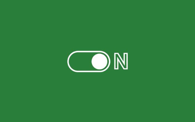
Bootstrap Toggle Switch Examples
Here’s something cool. You get two kinds of toggle switch styles. One’s a wired style, and the other’s flat. Want to make something that gives a neat experience? Get inspired by these examples.
CSS Toggle Switch With Text
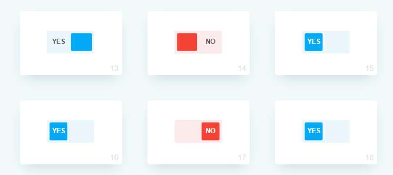
Need something short like “Yes” or “No”? You gotta see this toggle by Himalaya. 18 effects, each cooler than the last. Go from ordinary to wild with just a hint of sass that makes them pop.
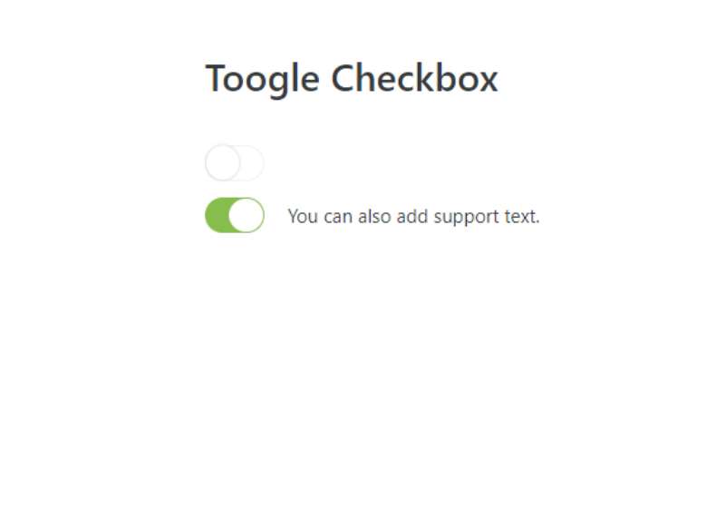
Bootstrap V4 Simple Checkbox Switch
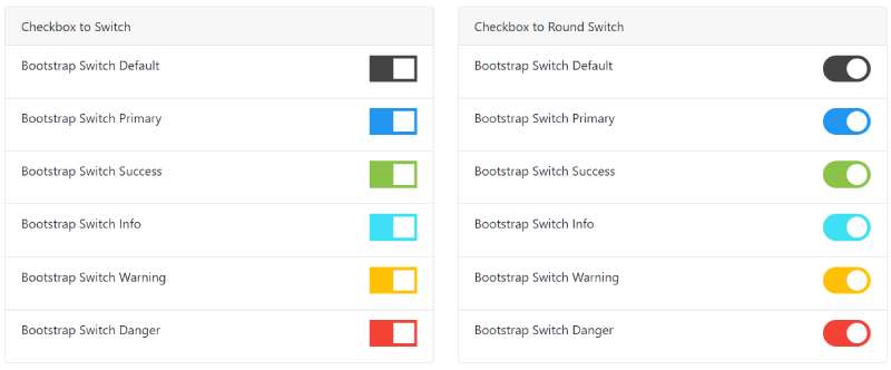
Bootstrap 4.0.0 snippet here! Designed by pradeep330, a simple checkbox switch. Using Bootstrap 4, no JavaScript needed. Toggle options on and off easily. Friendly for everyone.
Bootstrap 4 Toggle Switch Button
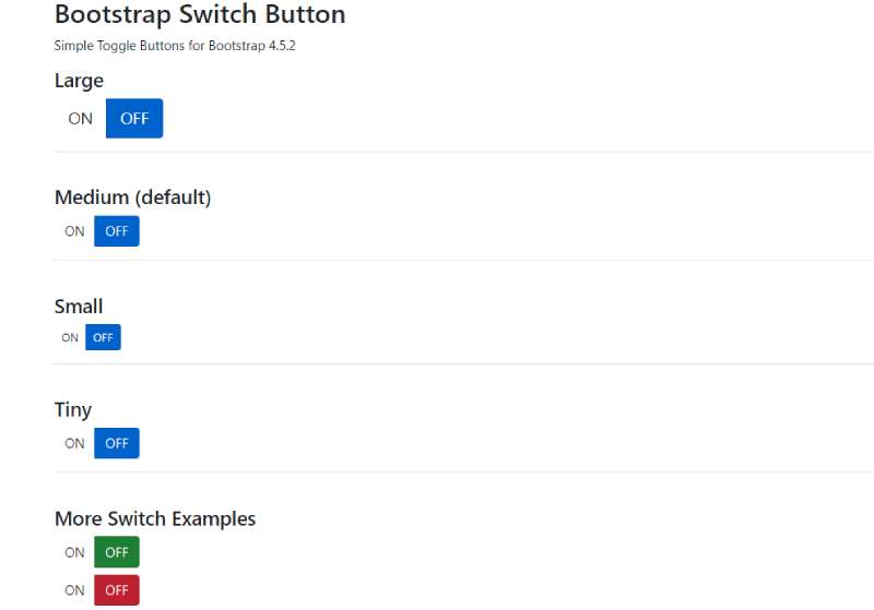
This set’s fun. Seven different toggle switches with the same smooth animations. All crafted with CSS3 and JS content. From large to tiny, you got it all. And three? They’re one of a kind.
Creating Differently Sized Toggle Buttons
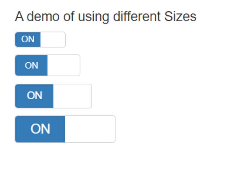
Want different sizes for your Bootstrap toggle switch? Use the data-size attribute and create the perfect fit. Play around and find what works best.
Toggle Switch with Rolling Label
Want to jazz up the toggle labels? Check out this crazy toggle by Jon. The label changes in unexpected ways, even the whole background of the page. Perfect for a big element in a full-screen site. If you’re looking for a twist, this is it.
Day and Night Toggle Button
Imagine a button that shifts the entire atmosphere of a page. The “Day and Night” toggle does just that. It’s got this awesome vibe, with clouds and stars setting up the mood. All the twinkling star effects and daytime warmth, they’re happening right inside that toggle button. Isn’t it rad?
Bootstrap 5 Custom Radio Toggle Buttons
Let’s talk Bootstrap for a second, specifically about Bootstrap 5 custom radio toggle buttons. This nifty piece is whipped up by the BBBootstrap Team, all within the Bootstrap 5 environment. Free and open source, baby! If you’ve got a project, no matter what it is, this Bootstrap toggle switch example will rock it.
Two Mood Toggle Example

Ever seen a toggle switch that wears its heart on its sleeve? Kate Higa’s Two Mood Toggle does exactly that. Simple JS action, but boy does it have emotion. One flip, and the mean face turns into a sad one. This isn’t just about the flip; it’s an entire mood dance. An impressive demo of element control in a Bootstrap toggle switch.
Using Different Colors For On Or True State
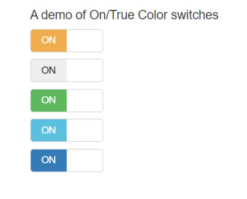
Why stick with blue? You’re free, free to pick any color that vibes with you. Your toggle switch doesn’t have to be the default boring shade. Get wild with the data-on-color attribute, and let your colors flow. Make that Bootstrap toggle switch a rainbow if you want!
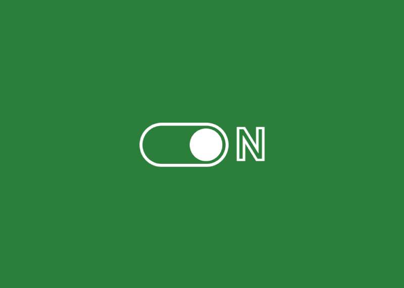
Accessible Toggle Switch with check
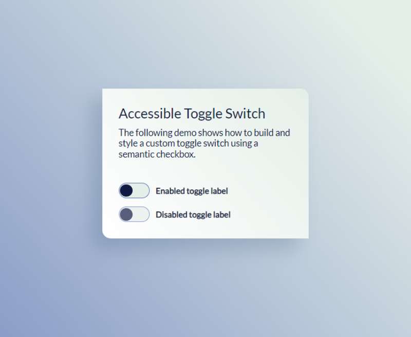
Lastly, here’s something beautiful and smart. Accessibility’s the name of the game here. Homer’s toggle is a testament to that. Not only is it stunning, but you can also toggle it with your keyboard. Hit the spacebar, and watch it dance. The blend of beauty and brains in this Bootstrap toggle switch is like music to your eyes. A class act, indeed.
Angular Bootstrap 4 Toggle Switch Button
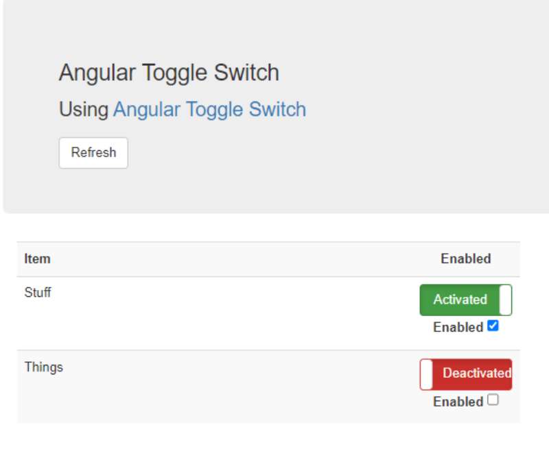
So, we’ve got this Angular Toggle Switch Button, right? It’s an HTML5 custom deal. The usual on and off? Nah, we’ve got “Activated” and “Deactivated” instead. Pretty slick if you ask me. Green means go, red means stop. Just like traffic lights. A Bootstrap toggle switch with a difference.
Neumorphic Toggle

Ever touched a cloud? This Neumorphic Toggle is pretty much like that. It’s a CSS toggle switch, and it’s all soft UI. Like, seriously plush. Halvves is behind this masterpiece, and it’s got shadows and highlights that make it feel almost real. Jump on the neumorphism trend and give it a spin.
Bootstrap 5 Toggle Switch Example
Here’s a how-to for ya. Need a toggle switch input with Bootstrap 5? This one’s got your back. It’s all about on/off, active/inactive. And it’s done in style with the Bootstrap 5 toggle switch. Everything you need to make a choice, right there.
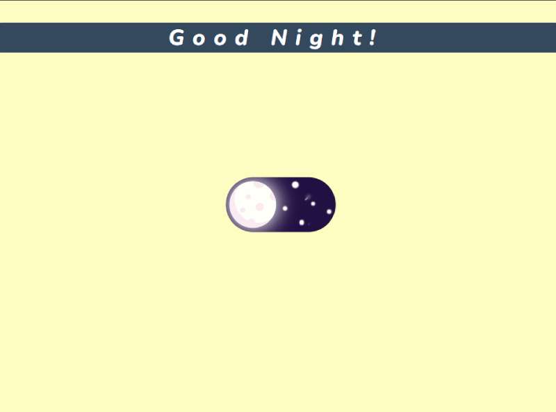
Sun And Moon Toggle Switch

Satyam’s giving us dark mode like you’ve never seen. We’re talking about sun and moon imagery. Bright yellow sun, blue sky, and then bam! A white moon with stars in a black sky. It’s like a day-to-night transformation with this Bootstrap toggle switch. Isn’t that just outta this world?
Bootstrap 4 iOS Like Toggle
Hey iOS users, you’re gonna dig this. It’s a Bootstrap 4 toggle switch that looks just like your iOS toggle button. Flips to green when it goes right. Some fancy before and after stuff going on here too. You can jazz it up with text, animations, whatever rocks your boat.
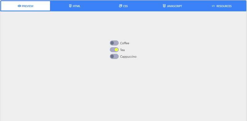
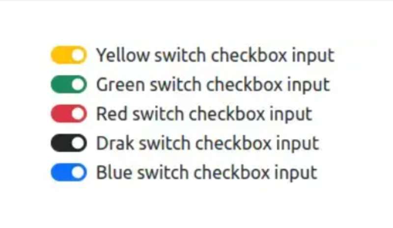
Converting Radio Buttons Into Toggle Switches
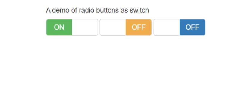
And for the finale, who said checkboxes should have all the fun? We’re converting radio buttons into toggle switches. Three radio buttons, and bam! You’ve got switches with all sorts of colors. All done with some data attributes. How about that for a Bootstrap toggle switch spin?
FAQ On Bootstrap Toggle Switch
How do I implement a Bootstrap toggle switch in my form?
Ah, slide into Bootstrap’s groovy toggle switches with ease. Start by dropping in some HTML for a checkbox input, sprinkle it with Bootstrap’s custom classes, and let some JS magic handle the state changes. It’s the perfect starter kit for dynamic form input design.
Can I customize the design of a Bootstrap toggle switch?
Totally. Unleash your inner style guru and tailor those toggle switches to your heart’s content. With CSS superpowers, tweak colors, sizes, and animations. It’s a chance to wave your personal flag in the front-end development scene.
Is there a way to handle the state of a Bootstrap toggle switch with JavaScript?
JavaScript’s got your back! Hook into the switch’s event handlers to watch for state changes. Then, it’s playtime—update your UI, synchronize with your backend, or trigger a confetti cannon. Dive deep into JavaScript event handling while keeping users engaged.
Are Bootstrap toggle switches accessible for users with disabilities?
Accessibility isn’t an afterthought—it’s a staple. Bootstrap’s framework has got your back with features that ensure your toggle switches are user-friendly for everyone. Make sure to leverage W3C standards to maintain that web accessibility like a pro.
How does a Bootstrap toggle switch work on mobile devices?
Bootstrap shines with its mobile-first philosophy. Toggle switches respond to taps and swipes on mobile just as easily as clicks on desktop, maintaining that sweet responsive design. Users can toggle on-the-go, no sweat, no fuss.
Can I make a Bootstrap toggle switch act like a radio button?
Sure thing. Bootstrap’s versatility lets you mimic a radio button’s behavior. Group your switches, add some custom JS, and voilà—radio-like toggles. Clever use of UI components creates an intuitive experience, no matter the pattern.
What’s the difference between a Bootstrap toggle switch and a checkbox?
It’s about user expectations—toggle switch means instant action, while a checkbox implies a decision to be later submitted. Both rock in their ways; it’s just about picking the right dance for your party.
How do I ensure my Bootstrap toggle switches are cross-browser compatible?
Stick to the Bootstrap playbook, and you’ll have cross-browser compatibility in the bag. Bootstrap’s got a knack for playing nice with different browsers, so stay within the lines, and you’ll be golden.
Are there any performance concerns with using Bootstrap toggle switches?
Keep it lean, and you won’t see a budge in performance. Bootstrap’s toggles are optimized for speed. Just be mindful not to jam-pack your page with more switches than a space shuttle dashboard.
Can I link a Bootstrap toggle switch to an external API?
APIs and Bootstrap toggle switches? They’re like peanut butter and jelly. Hook up your API in your JavaScript, and let your switches control the world—or at least the part of the digital world your API manages. The front-end framework is your launchpad for action.
Conclusion
And just like that, we snap the final chapter shut on our Bootstrap toggle switch saga. What a trip, right? Those switches flipped, flicked, and danced to the tune of our whim, echoing the ethos of user interface design.
Strap in. Your toolkit’s chock-full with treats now—custom switch styles, juice on dynamic UI manipulation, and those secret spices that make every user experience more intuitive. It’s powerful—knowing you can engineer such fluid interactive controls like second nature.
Here’s the kicker—go wild. Splash in some CSS animations, bind those JavaScript event handlers, and let that switch toggle not just states but evoke emotions. With this wisdom stitched into your workflow, ready for the web’s catwalk, let the spotlight follow where your cursor clicks. There’s magic in the toggle, my friend. It’s showtime!
If you liked this article about Bootstrap toggle switches, you should check out this article about Bootstrap icons.
There are also similar articles discussing Bootstrap buttons, Bootstrap navbars, Bootstrap modals, and Bootstrap forms.
And let’s not forget about articles on Bootstrap tables, Bootstrap cards, Bootstrap testimonial sliders, and Bootstrap progress bars.