Picture this: a sleek, smooth gliding visual on your website, where every slide offers a peek into someone’s authentic experience with your brand. That’s the power of a Bootstrap testimonial slider—it’s more than just a fancy flourish. It’s a trust-building powerhouse.
In the bustling digital arena, creating a space that sings praises from real users is non-negotiable. It’s the digital equivalent of word-of-mouth, a timeless trust signal.
Harnessing Bootstrap’s responsive design elements breathes life into these endorsements, crafting a user testimony showcase that flows as seamlessly on a smartphone as on a desktop.
Dive in, and we’ll journey through the nuts and bolts of integrating this dynamic testimonial slider into your own web tapestry.
From HTML testimonial templates to CSS3 animations, every twist and turn is designed to boost user engagement metrics through the roof.
By the final period, you’ll be locked and loaded with the know-how to deploy a client feedback slider that’s both captivating and conversion-friendly.
Expect actionable insights—think UI patterns sprinkled with front-end development tools—for an end result that’s anything but ordinary.
Bootstrap Testimonial Slider Examples
Bootstrap 4 Testimonial Slider Example By Clicking On The Client Photos
You know, slides and carousels are a classic duo, kind of like Batman and Robin. They team up to create efficiency and effectiveness. But here’s a twist: the Bootstrap testimonial slider in this example is a bit of a maverick. You’ve got your regular navigation arrows, sure, but clicking on client images? That’s what makes you slide from side to side. No regular testimonial slider does that. It’s like giving the steering wheel to you.
Bootstrap Testimonial Slider W3schools
Picture this: a sharp-edged Bootstrap testimonial slider, big and small, ready to be your quote area, no matter how little space you’ve got. Whether you need a gigantic testimonial slider template or just a small one, you can reshape it. It’s like playing with LEGO blocks but for your website.
Carousel V04
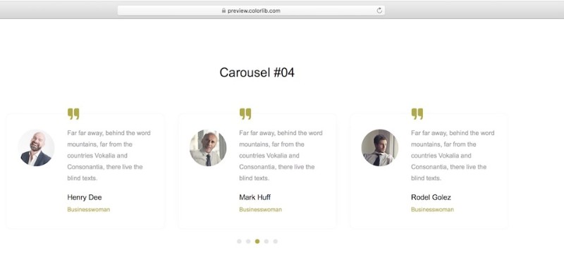
Here’s Carousel V04, an all-in-one solution. No matter who you are – a business, an agency, a freelancer, or running an eCommerce site – this Bootstrap testimonial slider can be your new best friend. It’s like the little black dress of testimonial sliders, clean and minimal, fitting with any theme.
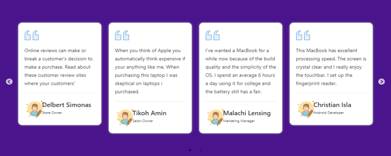
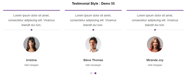
Bootstrap 4 Testimonials or People Review Slider

You need more than a Bootstrap testimonial slider. You need a people or user review slider, something that can show off celebrity messages or your mom’s favorite recipes. Fully responsive, this slider’s got it all: images, names, titles, statuses, taglines, and even logos. It’s the Swiss Army knife of sliders.
Bootstrap 4 Simple Testimonial Carousel Slider
Meet the Bootstrap 4 simple testimonial carousel slider, made by Ask SNB. It’s free, it’s open source, and it’s ready to slide into your project. This snippet’s like your favorite pair of jeans – comfortable, fits right, and looks good on just about anything.
Testimonial Slider Jquery Example
Now here’s a fancy one, a real eye-catcher, a Bootstrap testimonial slider that will grab your customers’ attention like a magnet. This one is sitting pretty in a contact form, waiting for you to enter your details. Its square edges and horizontal design make it perfect for helping people get in touch with you or your business. It’s not just a slider; it’s a communication gateway.
Owl Carousel 2 Testimonial

Last but not least, let’s talk 3D. This isn’t just any carousel slider; it’s got a 3D shadow effect that makes it pop. The client info’s separate, and the Bootstrap testimonial slider’s in a box-like structure. It’s like looking at your testimonials through a whole new lens. Imagine that, a focal point for your message and custom logo. How cool is that?
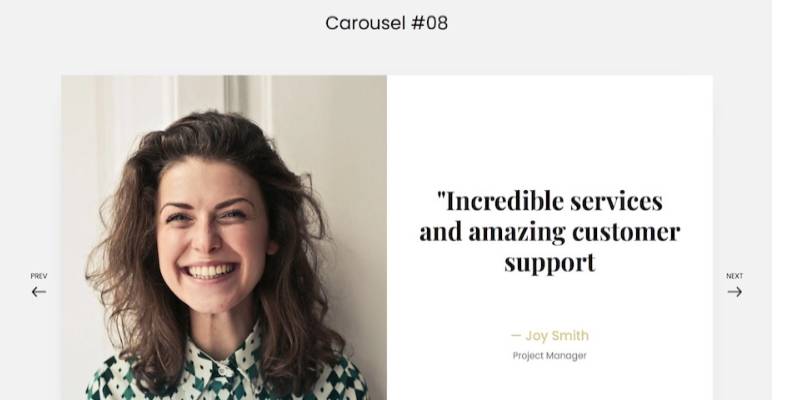
Carousel V08
Snore no more with those dull testimonial sliders! Carousel V08 is here to wake you up with a flavor that’s anything but ordinary. You see, this Bootstrap testimonial slider is not just for show. It’s got a unique design, cool transition animations, and an image section.
Display clients? Use it for users? Or even rebel and use it for something else altogether?
It’s like your own creative playground.
Bootstrap 4 Testimonial Slider Example With Beautiful UI

Oh, you’ll want to take a peek at this Bootstrap 4 testimonial slider. The side carousel structure? It’s like a dance, with images waltzing left and quotes twirling right. And all that white space! It makes it a breeze to read, as comfy as your favorite chair.
For a Bootstrap 4 testimonial slider, it’s a unique package, I’d say.
Beautiful Bootstrap Testimonial Slider Example
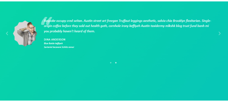
What’s in a text? A whole lot, if you’re talking about this Bootstrap testimonial slider. Here, the text is like a silent hero, maintaining the message’s focus, almost like a watermark. And those client image edges, smooth and sleek. The satisfying change effect, the splash of color, it’s something you’ve got to see.
It’s like a visual treat for your Bootstrap 4 business.
Testimonials Slider for Computer Doctor

Got a Computer Doctor website? Need a prescription for testimonials? This slider, created by darkos, is just what the doctor ordered. Built with HTML, CSS, and JavaScript, it’s a Bootstrap testimonial slider that lets you glide through feedback like a breeze.
It’s the right tool, specifically made for you.
Simple Slick Testimonial Slider
Swipe right, swipe left – we’re all swiping these days. So why not swipe your testimonials? Here’s a Bootstrap testimonial slider that’s hip with the times. Forget the navigation button; just swipe! And that box-like structure, you’ll notice it. When you hover, the mouse pointer turns into a hand icon, guiding you to swipe.
Simple, slick, and stylish.
Carousel V13

Tired of horizontal sliders? Feeling a little adventurous? Check out Carousel V13. Unlike most Bootstrap testimonial sliders, this one’s vertical. Ideal for photographers, designers, and anyone with a creative spark.
Go on, be different. Stand out from the crowd. Carousel V13 is your vertical way to go.
Employee Testimonial Examples
Ever seen a Bootstrap testimonial slider that greets you with a friendly wink? This one does. Rounded edges and a gentle color highlight tell you, “Go ahead, type here.” It’s like a digital handshake. And guess what? You can resize it with a click and drag at the right-bottom edge.
Kinda neat, don’t you think?
Bootstrap Carousel Testimonial Slider Example

So, you want something straightforward but with a flair of style? Check this Bootstrap Testimonial Carousel out. It’s like a fine box of chocolates designed by a CodePen user named Rick. You open it up, and there are slides of test evidence, one after another, popping on a separate screen.
Need words to insert and test? No worries. It’s there. It might just elevate your business, like taking a step up the success ladder.
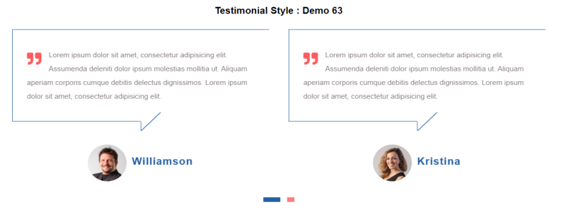
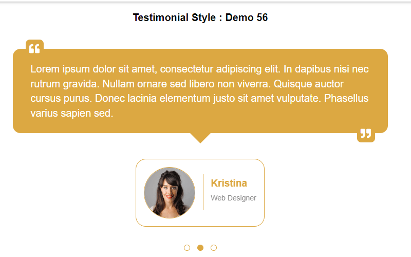
Client Testimonial Bootstrap 4 Slider Example
Imagine the world of Bootstrap testimonial sliders, but with a twist. Instead of the usual boxy appearance, how about circles? That’s right, circles! It’s more attractive and professional, you know. People remember images more than text. So why not grab an image of your important clients for a testimonial?
It’s like adding a splash of charisma to your CSS website design.
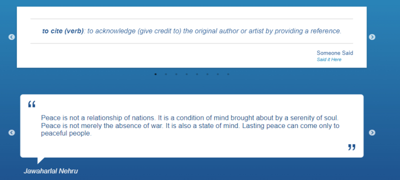
Testimonials Examples For Students
Question on your mind: Can you add a testimonial slider to the contact us form’s sidebar? The answer’s a big, bold yes! It’s like a cherry on top of a cake. It’s not just a Bootstrap testimonial slider; it’s a badge of credibility for your business.
Now that’s something cool for you, isn’t it?
Testimonial Slider Pure CSS

CSS-only and pure class, that’s what this testimonial slider is. Thanks to MAHESH AMBURE, you’ve got a slider crafted with HTML, CSS, and JavaScript. It’s more than a Bootstrap testimonial slider; it’s an engaging, dynamic way to showcase feedback and testimonials.
Want to jazz up your site or web applications? This pure CSS testimonial slider might just be the groove you’re looking for.
FAQ On Bootstrap Testimonial Slider
How do I integrate a Bootstrap testimonial slider into my website?
Ah, the integration game. It’s pretty straightforward. First off, include Bootstrap’s CSS and JS in your project. Then, get your hands on a HTML testimonial template.
Plug in your content, make sure jQuery’s in the mix if you’re going old school, et voilà – you’re showcasing customer quotes like a pro.
Can I customize the look of my Bootstrap testimonial slider?
Customization? Totally doable. The Bootstrap framework is like a sandbox. Dive into the CSS—tweak colors, fonts, borders. Play around with CSS3 animations for extra pizzazz.
Remember, it’s your design playground, go wild, but keep that user experience design (UX design) on point.
Are Bootstrap testimonial sliders mobile-friendly?
Mobile-friendly, by design! Bootstrap breathes responsiveness. It’s built to make sure your responsive testimonial carousel looks sharp on devices of all sizes. Your users get the same slick experience whether they’re on a phone, tablet, or desktop. Peace of mind, right there.
How do I add or remove testimonials from the slider?
Think of it like a playlist. To add, just slot in a new ‘slide’ with the client’s feedback into your HTML. Deleting? Just remove the slide you don’t need anymore. Easy updates mean your slider stays as fresh as your latest feedback.
What if the slider doesn’t work as expected on my site?
Okay, troubleshooting time. First, breathe. Check for common culprits: missing files, script conflicts, wrong Bootstrap version. Validate your markup, too. Tweak, test, repeat. If you hit a wall, community forums are goldmines and full of folks who’ve probably been there, done that.
How can I make the Bootstrap testimonial slider automatically cycle through testimonials?
It’s all about setting up your Bootstrap carousel right. There’s an option called data-ride="carousel" when initializing it that sets things in motion—literally.
Add that in, and your testimonials will glide from one to the next, no extra nudges needed. Just make sure not to accelerate to a blink and you’ll miss it speed.
Can I control the speed of the testimonial slider?
Speed’s in your hands. Bootstrap’s got options. Dive into the JavaScript and look for the interval option on your slider. Adjust that number to control how long each testimonial holds the stage. It’s a balancing act: enough time to read, snappy enough to keep attention.
Is it possible to add ratings or review scores to the slider?
Stars, scores, thumbs-up? All possible. Custom HTML can hold your rating system. Slot it into your testimonial format. Show it off with a bit of styling. Make sure it’s visually clear because those little stars pack a major credibility punch.
How do I ensure accessibility with a Bootstrap testimonial slider?
Accessibility is key, folks. Ensure your slider’s navigable via keyboard by adding proper ARIA attributes. Descriptive alt tags for images, pause on hover and focus, and clear controls—all these help to make your web accessibility standards a priority.
Can I use a Bootstrap testimonial slider for video testimonials?
Video testimonials, quite the engagement magnets! And yes, Bootstrap can handle it.
Embed your videos within the slides, test for performance hiccups—remember, bigger files can mean slower load times. Make sure to optimize for a smooth user interface elements experience.
Conclusion
So, we’ve zipped through the ins, outs, and twirl-arounds of crafting the perfect Bootstrap testimonial slider. It’s a slick trick for any site’s toolkit, right? Bringing those real, raw buzzwords from satisfied customers right to the digital forefront.
Tapping into responsive web design elements, we’ve spun a tale that stitches client feedback sliders into the very fabric of a website. Tailored to fit, just like your favorite jacket. We covered:
- Customization hacks,
- Mobile responsiveness,
- Automatic cycling, and
- Even throwing in a few stars for good measure.
Wrapping up, remember: this isn’t some set-it-and-forget-it gizmo. It’s a living section of your site. It breathes. It evolves. Keep it fresh. Keep it honest. And watch as it weaves that oh-so-crucial web of trust with every slide it serves up. Now, take these final nuggets of wisdom, and make that testimonial slider not just good, but stunningly effective.
If you liked this article about Bootstrap testimonial sliders, you should check out this article about Bootstrap icons.
There are also similar articles discussing Bootstrap buttons, Bootstrap navbars, Bootstrap modals, and Bootstrap forms.
And let’s not forget about articles on Bootstrap tables, Bootstrap cards, Bootstrap progress bars, and Bootstrap toggle switches.